TA Notes
- Pivot points, market structure & the three phases of major trends
- Supply & Demand, and Support & Resistance
- 1.3 - Reversal patterns, trend lines & channels
- 1.4 - Volume analysis, Wyckoff techniques & On-balance Volume
- 1.5 - RSI Divergence as a leading Indicator
- 1.6 - Fibonacci & retracement zones
- 1.7 - Candlestick & Pattern Analysis
- Index Confirmation
- Psychology & the Principle of Markets Discounting Everything
- Risk to reward, trade planning & risk management
- Term 1 Masterclass
- Complex divergence
- Hidden Divergence
- Directionally aligned divergence
- Pattern recognition for confluency
- Moving averages, SMA & EMA
- MACD
- Gaps
- Market Breadth
- Sentiment analysis
- Fibonacci extensions
- 2.10 - Fibonacci clusters & extension channels
- Term 2 master class
- Elliott Wave - General
- EW notes
- Elliott Wave — Impulse Waves
- Elliott Wave — Extended Waves
- Elliott Wave — Diagonal Waves
- Elliott Wave — Corrections: Zigzags
- Elliott Wave — Corrections: Flats
- Elliott Wave — Corrections: Triangles
- Elliott Wave — Complex Corrections: Double Three (WXY)
- Elliott Wave — Complex Corrections: Triple Three (WXYXZ)
- Elliott Wave — Trading Strategies
- Elliott Wave — Market Psychology & Trading Mindset
Pivot points, market structure & the three phases of major trends
Dow Theory — Foundation
Charles Dow is the grandfather of technical analysis. He co-founded the Dow Jones Industrial Average (1896, still running today) and the Wall Street Journal. His work was done without computers — all manually charted with pencil and paper.
The other three TA Titans built on Dow's work:
- Ralph Elliott — developed Elliott Wave Theory (wave structures driven by collective investor psychology). Dove deeper into the patterns within Dow's phases
- Richard Wyckoff — developed the Wyckoff Method, going deeper into exactly what accumulation and distribution phases look like (signature patterns)
- W.D. Gann — theories on price, time, and geometry. Everything runs on time cycles (life, weather, seasons — financial markets are no different)
The 6 Tenets of Dow Theory
Each tenet is covered in depth throughout the course. Summary:
- The averages discount everything — all available information (economic, political, market) is already reflected in price. "Buy the rumour, sell the news" — if you're hearing about it, professionals already knew
- The market has three trends — Primary (long-term), Secondary (medium-term), Minor (short-term). A common mistake: wanting to invest long-term but taking entries on minor short-term moves
- Primary trends have three phases — Accumulation, Public Participation, Excess/Distribution (this week's focus)
- A trend persists until its reversal is indicated — like Newton's first law: a trend stays in motion until acted upon. There are only three ways a trend can reverse (covered in Week 3)
- The averages must confirm one another — a trend needs confirmation from multiple sources, just like you'd research a major purchase from multiple angles, not just one data point
- Volume must confirm the trend — volume should rise with the trend. Big money can mask price action but they can't mask volume — you can't hide how many units were bought or sold
The Three Phases of a Primary Trend
A bull market is broken into three phases: Accumulation → Public Participation → Excess. Then it reverses through: Distribution → Public selling → Panic. Then it resets.
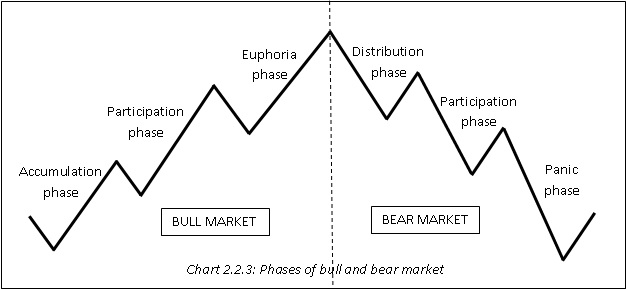
Phase 1: Accumulation
- Occurs after a prolonged decline or bear market
- Smart money / experienced investors start buying undervalued assets (just because something is down bad, doesn't mean it can't go down more)
- Market sentiment is very pessimistic — "this thing sucks", everyone expects it to keep going down
- Low trading volumes and gradual price stabilisation
- Key insight: "If everyone's bearish, who's left to sell?" — that's often where it finds a bottom
- Can last years (Microsoft went sideways for 14 years after the tech bubble, FMG went sideways for 10 years after the GFC)
The Spring / Liquidity Grab: During accumulation, big money often pushes price below the bottom of the range before sending it up. Why? Anyone who bought support had stop losses just underneath — big money grabs that liquidity, shakes people out, then sends it. If something breaks out of a major sideways range to the downside and pops straight back in — that's actually a sign of strength (a "spring"). The opposite applies to distribution: a pop above the range that falls back in is a sign of weakness.
Phase 2: Public Participation
- Momentum builds as more investors recognise the trend
- Media and public interest increases — some positive news articles, battle between bulls and bears
- Price rises significantly due to higher demand
- This is usually the longest phase — where the most gains come from
- Increased trading volumes
- Positive market sentiment, with a taste of euphoria toward the very end
- The really savvy investors get in early in this phase, majority get in mid-to-late
Phase 3: Excess
- Smart money begins selling at higher prices
- Can manifest as a blow-off top (fast spike then fast sell-off) or a long sideways distribution
- Overvaluation concerns arise but people start ignoring them ("maybe the market just likes it at this price")
- Sentiment is overly optimistic or euphoric — you'll struggle to find anyone saying anything bad about it. 90% bullish
- Declining trading volumes despite higher prices — price going up but volume not confirming (Tenet 6)
- Signs of reversal or instability may appear but average investors won't recognise them
The Sentiment Cycle
The emotional progression through the phases:
Bull market (going up): Disdain → Skepticism ("just a dead cat bounce") → Caution → Growing confidence → Conviction → Peak Greed/Euphoria
Bear market (coming down): Hope ("just another zig-zag") → Worry → Fear ("what have I done") → Disgust → Disdain
Peak fear at the bottom. Peak greed at the top. Every time.
Corrections Between Phases (Craig's Key Rule)
- After accumulation ends → expect a 1/3 to 2/3 pullback of the accumulation gains
- After public participation ends → expect a 1/3 to 2/3 pullback of the public participation gains
- After excess ends → you don't just correct the excess. You correct the ENTIRE move from the start of accumulation to the top of excess. These are the major resets (GFC wiped 57% off S&P, crypto cycles pull back 80%)
This is why getting caught buying in the excess phase is so dangerous — you're not just giving back the excess gains, you're giving back everything. It can take 6-13 years to recover.
Phases Within Phases (Fractal Nature)
Each major phase contains its own sub-phases of accumulation, public participation, and excess. The more you zoom in, the more sub-phases you see. This concept is the foundation of Elliott Wave Theory (Term 3).
Example: The S&P 500 since 2009 has a big accumulation, big public participation, and big excess phase. But within the big public participation, there were smaller accumulation, public, and excess sub-phases.
Commodity vs Equity Phase Differences
- Equities/Indices: Public participation is the dominant, longest phase. Accumulation and excess are often similar sizes
- Commodities (and commodity stocks like lithium, gold, uranium miners): The excess phase can be disproportionately massive — huge blow-off tops. Public participation can be relatively smaller
Examples
- Bitcoin 2018–2021: Sideways accumulation 2018-2020, public participation started when 20K broke (savvy ones got in at 12K), excess phase when everyone was talking about "who's buying next after Tesla" — they distributed into the good news
- Microsoft: Parabolic into 2000 tech bubble, crashed, went sideways for 14 years (accumulation), broke out ~$37 resistance, then public participation trending up
- FMG: Massive spike pre-GFC, crashed to $1, accumulated for 10 years at $1-7, broke out and ran to $23+
- Core Lithium: Went up 9,700% — but most holders didn't get out and gave it all back (lost 96% from top). Perfect example of why understanding excess phase matters
Pivot Points
If you cannot identify pivot points, you cannot identify market structure. If you cannot identify market structure, you cannot identify a trend. This is the literal backbone of technical analysis.
How to Identify Pivot Points
- Look for 3 candles moving in the opposite direction — this is not a textbook rule, it's a beginner-friendly method to stop you getting faked out on tiny moves. ~90-95% of pivot points will follow this rule
- They don't have to be 3 red or 3 green candles — they can be a mix of colours. You're looking for the overall direction changing (3 candles moving the opposite way to the primary move)
- Exceptions: During elevated market volatility, 1-2 very large candles can count as a pivot (e.g. a big bullish engulfing candle on its own)
- Craig's clarification: The 3-candle rule is a guide to prevent you marking 100 tiny pivots that add no value. What you're really looking for is significant peaks and significant troughs. If it's just undulating noise, you probably don't need a pivot there
Pivot Point Shapes
- V-shaped: Rapid, sharp reversal — price quickly changes direction. Most common
- U-shaped: Gradual shift — price hangs around the bottom/top sideways for a bit before reversing
Swing Highs and Swing Lows
Pivot points are also called swing points:
- Swing High (H): Pivot at the top where sellers step in — identifies resistance levels
- Swing Low (L): Pivot at the bottom where buyers step in — identifies support levels
Practical Tips for Marking Pivots
- Use the highlighter tool in TradingView (small dots) to mark pivots
- Colour code: green dots for lows/buyers, red dots for highs/sellers — green=go, red=stop
- Line chart trick: Switch from candles to line chart to more easily see pivots when the wicks and candles are clouding your judgment. It strips away the noise and shows the pivots clearly
- Hold Ctrl + click on a dot to drag-copy it (saves time vs recreating each one)
- Start on the weekly timeframe — Dow himself never traded below the daily because it was all manipulated noise. The lower you go, the harder it gets. Weekly for the first 6 weeks minimum
The 3 Types of Market Structure
There are only 3 things a market can do: go up, go down, or go sideways. The first thing you should do when pulling up any chart is identify pivot points, then identify market structure.
"Market structure is king" — when you go against market structure, that's when you lose.
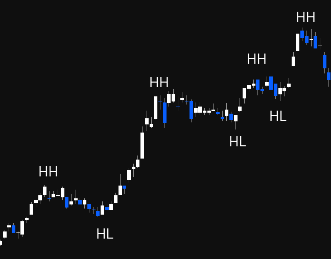
Bullish (HH / HL)
- The market is going up
- Marked by consistent higher highs and higher lows
- Pivot peaks are higher than the previous highs — signals increased demand and optimism (sellers selling higher each time)
- Pivot lows are higher than previous low — signals resilience, buyers stepping in higher each time (buyers believe it won't go back to the old price)
- Think: "Why are they buying at $18K when last time they didn't buy until $16K? Why are they selling at $20K when last time they sold at $18K?" — that's a strong uptrend
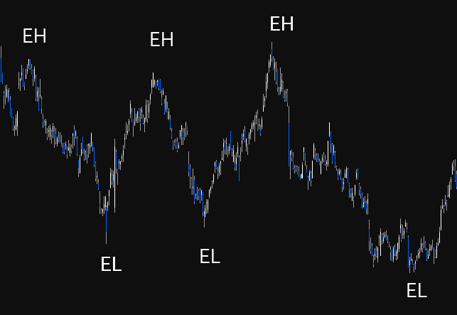
Consolidation (EH / EL)
- Market moving sideways
- No clear trend — equal highs (selling at roughly the same level) and equal lows (buying at roughly the same level)
- Traders look for breakouts (above EH = potential uptrend) or breakdowns (below EL = potential downtrend)
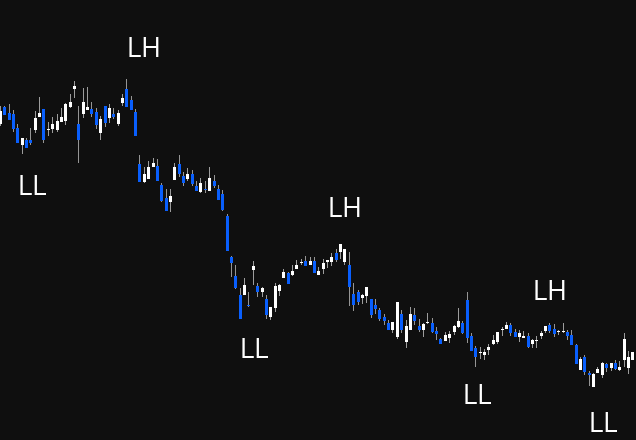
Bearish (LL / LH)
- The market is going down
- Lower Lows: each trough is lower than the previous — buyers waiting for lower prices each time
- Lower Highs: each peak is lower than the previous — sellers stepping in earlier each time, don't believe it will reach the previous high
- Think: "Why are they selling at $22K when last time they were selling at $23K? Why are they buying at $19K when last time they bought at $21K?"
- Can be good for shorting
Market Structure Change Confirmation
You need BOTH to confirm a change:
- Bullish change: need a higher high AND a higher low. Getting just a higher high with a lower low is NOT a change — buyers are still coming in lower (still bearish)
- Bearish change: need a lower low AND a lower high. Getting just a lower low without a lower high is NOT confirmed
Connecting Pivots
Draw a line connecting your pivot points to visually see the trend direction. This makes it obvious when you transition from uptrend → sideways → downtrend.
Transition Through Phases Using Market Structure
Markets transition: Uptrend (HH/HL) → Sideways (EH/EL) → Downtrend (LL/LH) and vice versa. The phases map directly: Accumulation = sideways (EH/EL), Public Participation = uptrend (HH/HL), Excess = potentially still making highs but with warning signs, Distribution = begins transition to LL/LH.
Supply & Demand, and Support & Resistance
Dow Theory Tenet 2: The Market Has Three Trends
The market moves in three distinct types of trend, each operating on a different timeframe. Understanding which trend you're looking at is critical — your timeframe must match your investment/trading goals.
Primary Trend (The Tide)
- The most significant and long-term trend — lasts months to years
- Most reliable for investment decisions because it's less prone to manipulation
- Two types: bull market (upward) and bear market (downward)
- Like the tides of the ocean — shows the long-term direction
- The primary trend cannot be stopped by any macro event. Wars, depressions, pandemics, financial crises — on the S&P 500's 100-year chart, they're all just blips on a trend that keeps going up
- If you're investing long-term (years), you should be looking at the 3-monthly (quarterly) timeframe or above
Secondary Trend (The Waves)
- Temporary movement in the opposite direction to the primary trend
- Lasts several weeks to several months (the example shown was ~7-8 months)
- Retraces approximately 1/3 to 2/3 (or half to two-thirds) of the primary trend's movement
- The "zag" in the zig-zag — if the primary trend is the zig (direction), the secondary trend is the zag (correction)
- Two types of corrections: sharp (fast V-shaped drops) or sideways (extended horizontal movements). Both are secondary corrections
- Key rule: The primary trend resumes when price surpasses the highest/lowest point of the secondary action. If it can't get back above that point and breaks the secondary low on increasing volume, it may signal a new primary bear trend rather than just a correction
- The 50% retracement level is emphasised by Dow Theory as particularly significant
Minor Trend (The Ripples)
- The shortest trend — lasts days to weeks
- Daily market fluctuations — compared to ripples on waves (can't predict which way they'll go)
- Erratic, can be manipulated, and is largely noise
- The only thing worth paying attention to within minor trends are horizontal lines on daily charts (support and resistance) — which is what this week covers
- Dow considered everything below the daily to be manipulated noise
How They Interact
The zig is the primary trend direction. The zag is the secondary correction. Within both, the minor trend creates the day-to-day ripples. When investing, you care about the primary. When trading, you're navigating the secondary and minor within the context of the primary.
Support & Resistance — Psychology
Support and resistance are fundamental concepts tied to the principles of supply and demand. They represent the battlegrounds where supply and demand forces collide.
Psychological Impact
| Support | Resistance |
|---|---|
| Price points where buyers typically step in, perceiving the asset as undervalued | Psychological barriers where sellers see the asset as overvalued |
| Traders associate these levels with safety nets, triggering buying pressure | Leads to increased selling pressure — hesitation, shorting, or profit-taking |
Breakouts and Failures
When support or resistance levels are breached, they signal shifts in sentiment — either stronger conviction (breakout) or panic selling (breakdown), leading to rapid price changes. Recognising these psychological shifts helps anticipate market moves.
Supply & Demand
Financial markets work exactly the same as any marketplace — it's all supply and demand. Think of it like a flea market, or bartering in Bali. Prices move based on the balance between willing buyers and willing sellers.
Key principle: For every buyer, there is a seller. For every seller, there is a buyer. It doesn't just magically go somewhere — when you're selling, someone else is buying because they think it's a good deal.
Demand Zones
- Areas where a large volume of buy orders accumulate
- Signal strong belief in potential price increases
- When price reaches a demand zone, it tends to stop falling because there are many buyers looking to purchase
- Think: only 2 Ferraris for sale at $100K but 100 people wanting to buy — bidding war pushes price up
Supply Zones
- Areas with concentrated sell orders
- Traders expect prices to decline due to perceived overvaluation
- When price reaches a supply zone, it may stop going up because there are too many sellers trying to get rid of their stuff
- Think: thousands of people trying to sell Ferraris at $100K — too many options, price can't go higher
Everything Has a Price
Even the worst-performing assets eventually reach a price where someone thinks it's cheap and demand steps in. Examples:
- AGL: From $28 down to $5 — "it's a dog, it's the worst" — but demand stepped in at $5 and it recovered to ~$12
- ZIP: From $14 down to ~$0.20 — at some point buyers perceived value, it bounced to ~$3
Support (Demand)
Support is a price level where an asset usually stops falling and starts to see more buying. It marks a point where the balance between supply and demand shifts in favour of demand.
Key Concept: Support is a ZONE, Not a Line
Never draw support as a single line — it doesn't work. Support is always a zone (a range) where historical buying interest has caused price reversals. Buyers don't step in at one exact price — they step in around an area.
Example: Buyers might step in at $208, $209, $212, $214, $211 — that's all a zone around $208-$214, not a precise price point.
Visualising Support
Think of it literally as people standing at different price levels willing to buy:
- $38: one person → weak support
- $33-$34: two people → bit of a demand zone
- $30: one more person → some support
- If $30 breaks, nobody until $24-$25 → price will fall quickly to the next cluster of buyers
- Below that, nobody until $9-$10 → another rapid drop
The gaps between clusters of buyers are where price moves fast — when support breaks, it falls to the next level where people are willing to buy.
How to Draw Support Zones
- Find your pivot points where buyers have stepped in (swing lows)
- Look for multiple pivot lows clustered around a similar horizontal area (like "dot to dot")
- Use the rectangle tool in TradingView (5th icon down → click arrow → Rectangle)
- Draw the rectangle encompassing as many of those candlestick wicks as possible
- Change the colour to green (Settings → Border → green, Background → green, lower transparency so candles are still visible)
- Add text label "Support" for quick identification
Support Key Points
- Analyse support on multiple timeframes — daily, weekly, monthly. Higher timeframe support is more reliable (monthly > weekly > daily > 4H > 1H)
- Identify major support — strong levels that have held over a long period and are respected by many traders
- Use support levels for determining entry points and setting stop losses
- If price breaks through support, it can trigger sell-offs as traders' stop losses get hit — price then falls to the next support zone
Resistance (Supply)
Resistance is a price level where an asset tends to stop rising due to selling pressure. It represents areas of supply where sellers are willing to exit.
Key Concept: Resistance is Also a ZONE
Same as support — resistance is always a zone, not a single line. Sellers step in around an area, not at one exact price.
Example: Sellers might step in at $228, $230, $232, $234 — that's all a zone around $230, not a precise price.
How to Draw Resistance Zones
- Find your pivot points where sellers have stepped in (swing highs)
- Look for multiple pivot highs clustered around a similar horizontal area
- Use the rectangle tool, encompassing as many candlestick highs/wicks as possible
- Change colour to red (Border → red, Background → red, lower transparency)
- Add text label "Resistance"
The Battle Between Bulls and Bears
Once you have support (green) and resistance (red) drawn, you can see the battle. Eventually one side wins:
- Sellers get exhausted → bulls win → breakout upward
- Buyers get exhausted → bears win → breakdown downward
Resistance/Support Flip (Role Reversal)
"If you can master this strategy, you can honestly make money on the market." — ASX Trader
A resistance/support flip occurs when a former resistance level becomes a new support level (or vice versa). This is one of the most powerful concepts in technical analysis.
How It Works
- Price approaches resistance repeatedly — sellers step in each time
- Eventually, sellers get exhausted — no more sellers left at that price
- Price breaks through resistance (breakout)
- Price comes back to test that old resistance level
- Those sellers have now become buyers — old resistance is now support
- The flip is confirmed
What It Signals (Two Buy Signals)
- Sellers are exhausted — they're no longer stepping in at that price
- Sellers have become buyers — the level that was previously seen as overvalued is now seen as undervalued
The Fake-Out Warning
If price breaks out of resistance but immediately pops back within the zone, that's a sign of weakness (fake-out), not a genuine breakout. The opposite also applies — breaking below support and popping straight back in is a sign of strength (this links to the "spring" concept from Week 1).
CBA Example — The Staircase
Commonwealth Bank's entire existence is essentially a series of resistance/support flips — climbing steps:
- $7 resistance → became support → $9.90 resistance → became support → and so on
- Tech bubble bottom support at $23-$25 zone → held during GFC (buyers stepped in at the same zone again across 10+ years)
- GFC top resistance at $60 → exhausted → broke through → during COVID drop, $60 became support (people saw it as cheap at $60 when they previously thought it was overvalued)
- As long as it keeps climbing steps (flipping resistance to support), it's in an uptrend. If it starts breaking below support floors, each floor becomes the next ceiling on the way down
Trading Strategies Using Support & Resistance
1. Breakout Strategy
Objective: Profit from significant price movements following a breakout of support or resistance.
- Buy when price breaks above resistance (sellers exhausted)
- Sell/short when price breaks below support (buyers exhausted)
- Stop loss: Just below the pivot low (for longs) or just above the pivot high (for shorts)
2. Pullback/Retest Strategy (Resistance/Support Flip)
Objective: Enter trades when price retraces to a support/resistance level after a breakout.
- Wait for breakout through resistance
- Wait for price to pull back and test old resistance as new support (the flip)
- Enter when it bounces off the new support
- This is probably the best strategy — it gives the ultimate risk:reward because you get two confirmations: (1) sellers exhausted, (2) sellers become buyers
- Stop loss below the new support zone
3. Range Trading Strategy
Objective: Profit from price fluctuations within a defined sideways range.
- Buy at support, sell at resistance — repeat until the range breaks
- When it breaks out → switch to breakout or pullback strategy
- ASX Trader's view: "I personally don't touch sideways markets." He only trades trending markets (bull or bear). Range trading can get messy — price doesn't always bounce cleanly off the boundaries
- Key insight: People don't lose money in bull or bear markets — they lose money in sideways markets. They keep trying to go long or short, keep getting stopped out, and lose trade after trade
1.3 - Reversal patterns, trend lines & channels
Dow Theory Tenet 4: The Trend Is Your Friend
A trend will persist until its reversal is indicated. Like Newton's first law — an object in motion stays in motion unless acted upon by an external force. A market trend stays in motion until external factors cause a shift (fundamental news, economic data, or exhaustion in buying/selling pressure).
Why Trend Recognition Matters
- Prevents emotional trading — instead of guessing tops and bottoms, follow the existing trend
- Improves risk management — place stop losses under pivot lows, falling with market structure
- Maximises profit potential — trading in the direction of the trend increases probability of success
- Stay with the trend until price action (and later, volume) confirms a change
The Three Reversal Patterns
There are ONLY three ways a trend can reverse. Every reversal pattern you'll ever see fits under one of these three. That "cheat sheet with 50 different reversal patterns"? They're all just versions of these three.
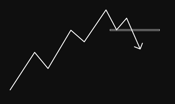
1. Double Top / Double Bottom
The most common reversal pattern. Often called the "M pattern" (tops) or "W pattern" (bottoms). You can make money literally just trading these — they're textbook and easy to identify.
Double Top formation:
- Price reaches a peak (point 1), retraces to a low (point 2)
- Rallies back up but fails to exceed the previous high — selling equal (point 3). First warning sign: "Why are they selling at the same price? Every previous time they sold higher"
- Declines and breaks below the support at point 2 (the "neckline"). First sell signal: sellers won. Buyers who stepped in at point 2 are no longer there
- Often retests the neckline as resistance (support/resistance flip) — because anyone who bought the dips now wants out if it gets back to their buy price
- Confirmation: when price breaks point 6 (below the retest low) = lower low, lower high, lower low = change of market structure
The psychology:
- Point 1 & 3: "I should have sold at $11. If it ever gets back there, I'll sell next time." The market gives second and third chances — it's uncanny how often this happens
- Point 2 vs 4: "They were willing to buy at $7.80 last time (point 2). Now they're not buying there. Where did those buyers disappear to?"
- The neckline break is pivotal: sellers at the same spot + buyers NOT at the same spot = bears won
Measured target: Distance from the double top to the neckline, projected downward from the neckline breakout point. That's your approximate target for the move.
Negation: If price gets back above the neckline, the double top is over — no longer expecting lower moves.
Double Bottom is the exact opposite. W-shaped. When you get big double bottoms over a large timeframe, they're textbook accumulation zones. Examples: FMG post-GFC ($1 double bottom), Apple ($13 double bottom), Cardano ($0.02 double bottom), Ethereum 2018-2020 double bottom.
For confirmation purposes, treat a double bottom exactly like a failure swing — the high between the two lows is the neckline, and confirmation is when you close above it.
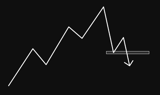
2. Non-Failure Swing (STRONGEST Reversal)
The most powerful reversal because you're not only breaking prior pivots but also getting a confirmed lower low, lower high, lower low (change of market structure).
Non-failure swing top:
- HH, HL, HH, HL pattern — uptrend proceeding normally
- Price makes a new high (point 5) — still going higher, all good
- Then drops below the previous higher low (point 4) — penetrates prior pivot. First warning sign
- This is where "buy the dip" gets dangerous — people keep buying the dip because it worked every other time. But when you can read market structure, you realise this is NOT the time to buy the dip. This is when big money distributes INTO the dip
- Rally back up but now forming a lower high (point 7) — second warning sign. "Why are they selling at $59K when every other time they sold at $64K, $61K?"
- Breaks below the prior low — confirmation. "This should be an absolute bargain. Why aren't they buying again?"
Two sell signals:
- Sell signal 1: When it breaks below the prior pivot (the first lower low)
- Sell signal 2 (stronger): When you get lower low + lower high + lower low = confirmed change of market structure
Why it's the strongest: Unlike the failure swing, a non-failure swing breaks through prior pivots AND gives you the full LL/LH/LL confirmation. The psychology flip is complete — people who were "buying the dip" every time are now watching it power straight through their buy levels.
Example: Bitcoin at $64K top and $30K bottom were both non-failure swings.
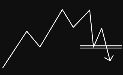
3. Failure Swing (LEAST Reliable)
How to identify (in a downtrend): The first sign is it fails to make a new low. Instead of continuing lower, it puts in a higher low. Then takes out the previous high.
How to identify (in an uptrend): The first sign is it fails to make a new high. Price makes a lower high, then breaks below the previous low.
Why it's called "failure" swing: Because the dominant trend failed to continue — it failed to make a new low (in a downtrend) or new high (in an uptrend).
Why it's the least reliable: It can just be an ABC correction (3 steps forward, 2 steps back). The market might bottom shortly after the failure swing exit and then continue the original trend. More depth on this comes with Fibonacci and zig-zag zones later in the course.
A head & shoulders pattern is just a version of a failure swing. Shoulder, head, other shoulder — it's the same structure.
Craig's Key Confirmation Rules (Apply to ALL Three)
The critical thing that's the same across all three reversal patterns:
- Regardless of whether the higher high or higher low comes first, you must close above the previous high (in a downtrend reversal) to get confirmation
- Use candle BODY closes, not wicks. Draw the confirmation line on the candle body. You need a candle close above that level, not just a wick
- Match your timeframe: Weekly close for swing trades (most reliable, sets you up for months). Daily close for shorter trades (changes structure every few weeks). Hourly for intraday (lasts only hours)
- Weekly confirms are much more reliable than daily. A weekly change of market structure holds for a long period. Daily can flip back and forth quickly
- Once market structure has changed, you DON'T need to wait for reversal confirmation again on pullbacks. After confirmation (bearish → bullish), pullbacks in a bullish structure are buying opportunities. You only need the full reversal confirmation once — when the trend actually changes direction
The Non-Failure vs Failure Naming (Craig's Simple Explanation)
In a downtrend:
- Failure swing: The first sign is it failed to make a new low. Then it takes out the high → confirmation
- Non-failure swing: It did NOT fail to make a new low first. Instead, the first sign is it took out the previous high. Then it makes a higher low. Then confirms by taking out the next high → confirmation
In both cases, the final confirmation step is the same: close above the previous high.
Trend Lines
Trend lines use the same concepts as horizontal support/resistance (above = resistance, below = support) but at an angle.
How to Draw a Bullish Trend Line
- Find the lowest point of the price
- Find the next 1-2 higher lows and connect a line across those points
- Draw the trend line below the price (it acts as support — the floor)
- Can include a mix of candle bodies or wicks — context is key
- Two points to draw, three points to confirm. The third touch validates the trend
How to Draw a Bearish Trend Line
- Find the highest point of the price
- Find the next 1-2 lower highs and connect a line across those points
- Draw the trend line above the price (it acts as resistance — the ceiling)
- Try to encompass as many touches as possible — the more data confirming the line, the stronger it is
Key Principles
Dow Theory states that the only valid trend lines are horizontal — because angled trend lines are subjective (open to interpretation depending on how you draw them). You can draw two completely different trend lines on the same chart and both could be "right."
Don't get caught up on exactly how the trend line is drawn. They're a signal, not gospel. What you're looking for is when the trend may be about to change. The confirmation is always the change of market structure (HH/HL or LL/LH), not the trend line break itself.
Trend line breakout + retest as support = same concept as horizontal S/R flips. Very common for broken trend lines to get retested.
Advanced Trend Lines
Acceleration & Deceleration (Angular Momentum):
- Upside acceleration = bullish, but if rate of ascent is excessive, it may not be self-sustaining (blow-off top / buying climax that collapses)
- Upside deceleration = bearish (candle ranges getting smaller and smaller — buying momentum fading)
- Downside acceleration = bearish, but may end in a selling climax
- Downside deceleration = bullish
Measured Target for Trend Line Breakouts: Take the maximum distance price has moved away from the trend line, and project that same distance from the breakout point. That's your minimum price target.
Hot tip: The easier it is and the more people that can spot the trend, the closer you are to it ending. When every man and his dog can see it, it probably won't hold.
Channels
A channel is a set of parallel trend lines (like train tracks) defined by the highs and lows of price action. They present great trading opportunities and help with risk management.
Three Types
- Ascending (bullish): Parallel upward lines — HH/HL. Buy at support (bottom line), sell at resistance (top line)
- Descending (bearish): Parallel downward lines — LL/LH. Short at resistance (top line), cover at support (bottom line)
- Sideways (neutral): Horizontal parallel lines — EH/EL. Buy at support, sell at resistance until breakout
How to Draw Channels
- In TradingView: left toolbar → Trend line → arrow → Parallel Channel
- Find the lowest point (for ascending) or highest point (for descending)
- Draw along the support touches, then drag up/down to encompass resistance touches
- Try to get as many touches on both lines as possible
The Midline
The dotted midline of a channel often acts as its own support/resistance level. Price frequently bounces off or rejects from the midline — the "return to mean."
Channel Validity
- Valid as long as price touches support at least twice and resistance at least three times (or vice versa)
- Breakout below support in an ascending channel signals potential reversal
- Breakout vs fake-out: If it breaks out and comes straight back in, it's probably a liquidity grab. If it breaks out and continues, it's a genuine breakout
Channel Exhaustion
If price fails to reach the upper line of an ascending channel, that's an early warning of trend exhaustion. The breach of the lower support line becomes more likely after a failure to reach the top.
S&P 500 100-Year Channel Example
Drawing a channel from the top of the Great Depression through the tech bubble on a 3-monthly chart shows that historically, when the S&P hits the upper channel resistance, it corrects back to at least the midline (dotted line). If things get really bad and oversold, it can come all the way back to the bottom channel line. This gives context for when things are at resistance, around the mean, or extremely undervalued.
1.4 - Volume analysis, Wyckoff techniques & On-balance Volume
Dow Theory Tenet 6: Volume Must Confirm the Trend
Volume is just the total number of shares/coins that changed hands in a period. Nothing more. It has nothing to do with price directly — it's simply how many units were traded. Think of volume as the fuel for the market — running on low fuel, it won't go far. Full tank, it'll keep going.
If volume is increasing along with the price trend, it suggests smart money is buying into the trend. Smart money owns billions and generates the majority of volume. If volume doesn't confirm the move, it's likely dumb money (untrained retail traders) moving the price.
The Four Price-Volume Relationships
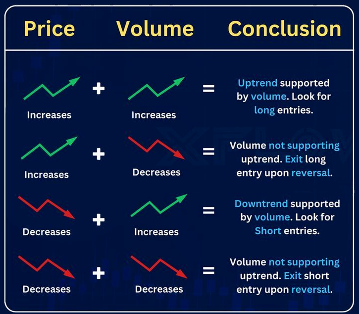
| Price | Volume | Signal | Meaning |
|---|---|---|---|
| Rising ↑ | Rising ↑ | Bullish — good for longs | Uptrend supported by volume. Stay in longs |
| Rising ↑ | Falling ↓ | Bearish — look to exit | Uptrend NOT supported by volume. Look to exit on further signs of reversal |
| Falling ↓ | Rising ↑ | Bearish — good for shorts | Downtrend supported by volume. Exit longs or look for shorts |
| Falling ↓ | Falling ↓ | Bullish — likely a pullback | Downtrend NOT supported. Probably just a correction/zag, not a new trend |
The biggest misconception: People think rising volume = good, falling volume = bad. Wrong. Rising volume just means the current trend is supported. If the trend is DOWN and volume is rising, that's confirming the downtrend — lots of people are still selling.
Key connection to Dow Theory: The secondary action (1/3-2/3 retracement) should happen on decreasing volume because it's a corrective move, not a new trend. Volume should support the primary trend, not the secondary correction.
Volume at Breakouts: Fake Out vs Breakout
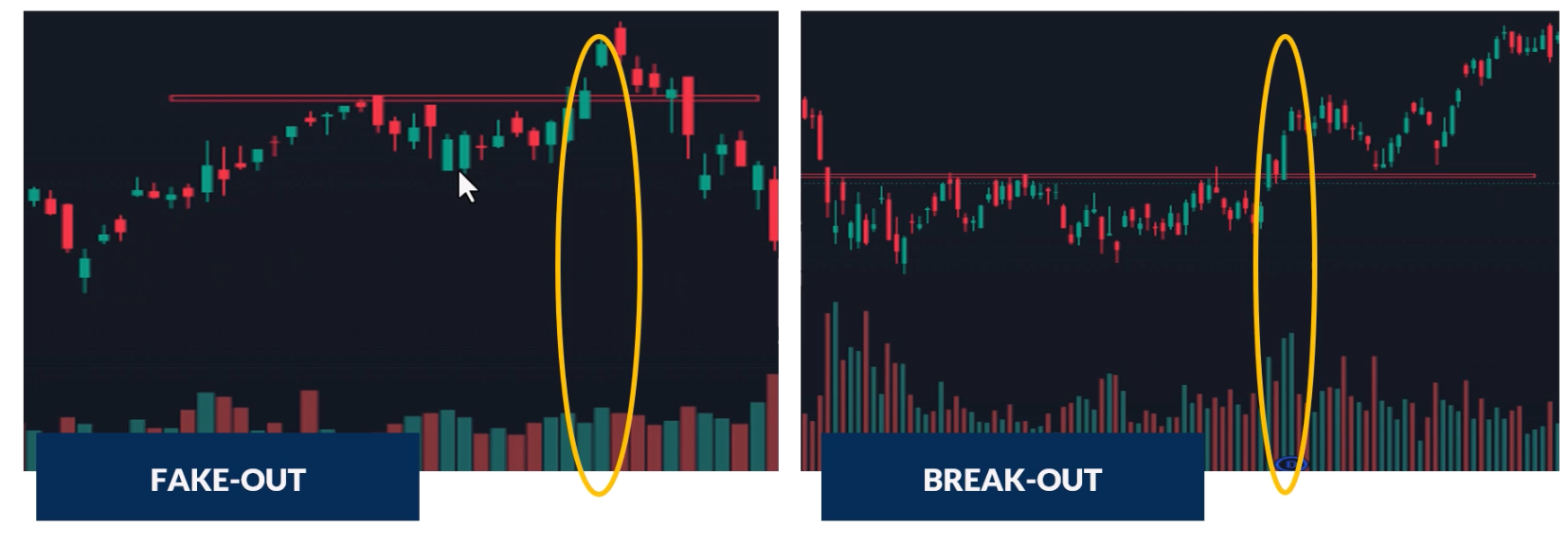
- High volume on breakout = genuine breakout. Volume confirms the move. Smart money is behind it
- Low or declining volume on breakout = likely fake out. Lack of interest, higher probability of false breakout
- Now whenever you see a change of market structure or break of S/R, check volume to confirm it's probably real
Volume at Support & Resistance
When there's high trading activity at support/resistance levels, those levels are more reliable — lots of investors treating them as buy/sell points means they'll likely continue to do so. High volume at support = probably going to hold. High volume at resistance = probably going to reject.
High Volume Spikes
High volume spikes tend to happen at extreme tops and extreme bottoms — that's where the most buyers and sellers are active:
- At bottoms: Capitulation — hesitant investors finally give up and massively sell. Volume spike marks the exhaustion of selling
- At tops: Exhaustion moves — climactic buying followed by sharp reversals
Wyckoff's Third Law: Effort vs Result
Richard Wyckoff (1873-1934), one of the TA Titans, developed a key principle about the relationship between volume (effort) and price movement (result).
Price-Volume Convergence (Effort = Result)
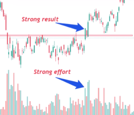
When both price and volume move in the same direction, market participants are in agreement. Large body candles + large volume = convergence. The current trend is likely to continue.
Gym analogy: If you go to the gym every day for 3 months (big effort), you should see your body change (big result). That's convergence — effort matches result.
Price-Volume Divergence (Effort ≠ Result)
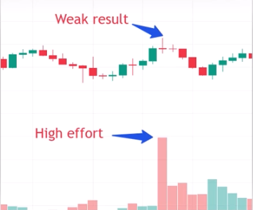
Small candle body + high volume = potential shift in market sentiment. The market required a lot of effort but barely moved — something is wrong. High volume doji candles are classic divergence signals and often precede reversals.
Gym analogy: If you go to the gym every day for 3 months (big effort) and look in the mirror and nothing's changed (no result) — something's up.
On-Balance Volume (OBV)
Created by Joseph Granville in 1963. His theory: changes in volume precede price movements. OBV is a leading indicator — it changes direction before price does.
How to Add OBV in TradingView
Indicators → search "OBV" → On Balance Volume → add. The blue line appears below the chart. Double-click anywhere blank on the chart to hide/show it quickly.
How OBV Works
OBV is a cumulative running total of volume — adding volume on up days, subtracting on down days:
- OBV line rising = volume on green candles is higher than volume on red candles = buying pressure = bullish
- OBV line falling = volume on red candles is higher than volume on green candles = selling pressure = bearish
- OBV line sideways = equal volume on up and down days = on par
The King & Queen Rule (CRITICAL)
"Price action is king. OBV is the queen. Listen to the king first, then see if the queen supports what the king is saying. Do NOT listen to the queen first."
Follow your price action first — market structure, reversal patterns, everything you've learned. Once you identify a setup, THEN check if OBV supports it. Do NOT look at OBV first and try to make the price action fit. You will get wrecked doing it backwards.
Detox your charts: Remove all indicators. Analyse price action clean. Only then add OBV to confirm. The price action is primary data, OBV is secondary.
The Five OBV Scenarios
1. Bullish Divergence Breakout: OBV reaches a new high while price approaches resistance → predicts price will break through resistance and head higher. OBV is leading — it's already broken out before price has.
2. Bearish Divergence Breakout: OBV hits a new low while price tests support → predicts price will break support and head lower. OBV already broke support before price did.
3. Bearish Divergence Reversal: Price rises to a new high while OBV hovers at or below the previous resistance level → predicts the rally will stall or reverse. Volume is NOT confirming the new highs. If price keeps making new highs but OBV keeps hitting a wall — that's bearish divergence.
4. Bullish Divergence Reversal: Price hits a new low while OBV stalls at or above the last support level → predicts the sell-off will stall or reverse. Price made a new low but volume didn't — something different, bullish divergence.
5. Convergence (Bullish or Bearish): OBV matches price action — when price goes up, OBV goes up; when price goes down, OBV goes down. This confirms the current trend is valid.
The Simple 95% Use Case
Most people (and this is perfectly valid) use OBV for one thing: does the OBV line do the same thing as price? When price makes HH/HL, does OBV also make HH/HL? If yes, volume confirms the move. If not, something's different. That alone is quite powerful as a confirmation tool.
Advanced OBV Strategies
Drawing TA on OBV
Everything you've learned from price action — support, resistance, trend lines, market structure — can be applied directly to the OBV line:
- Trend lines on OBV: Draw bullish/bearish trend lines on OBV just like on price. When OBV breaks its downtrend line, it can signal a reversal before price breaks its own trend line
- Support/resistance on OBV: Horizontal S/R zones work on OBV. When OBV breaks support that becomes resistance (same flip concept), it confirms the move
- Market structure on OBV: Look for HH/HL or LL/LH on the OBV line — it often changes structure before price does
OBV as Leading Indicator (Key Examples)
ASX Trader's Bitcoin call at $65K top: OBV broke its uptrend line while price was still making new highs. OBV had bearish divergence + trend break = exit signal. Price didn't actually break its trend until much lower (~$51K). OBV led the way.
Getting back in at the bottom: OBV broke its downtrend line and showed bullish divergence before price broke out. Combine downtrend break on OBV + bullish divergence = entry signal.
Avoiding Fake Rallies with OBV
When you see a rally and think it's a breakout — check if OBV has also broken its downtrend line. If OBV hasn't broken its decline, the rally is likely a fake. This stops you entering fake rallies. Match the actual breakout point on OBV (using a vertical line) with where price breaks out — they should align at the genuine breakout, not the fake ones.
Note: Fibonacci Clusters
The Fibonacci clusters lesson was included in this week's content but relates more to the Fibonacci & Retracement Zones topic. Key concept: overlay Fibonacci retracements from multiple timeframes (e.g. daily retracement + monthly retracement) to find "cluster zones" where multiple Fib levels overlap — these are stronger support/resistance zones than a single Fib level alone. Example: Microsoft's 618 from the COVID bottom overlapping with the 382 from the entire move created a powerful cluster support zone.
1.5 - RSI Divergence as a leading Indicator
What Is RSI?
The Relative Strength Index is a price momentum indicator — it measures price momentum only, nothing to do with volume. RSI is bounded between 0 and 100, like an elastic band that gets stretched between extremes and always snaps back.
Overbought & Oversold
- Above 70 = overbought. Above 80 = really overbought
- Below 30 = oversold. Below 20 = really oversold
- Between 30-70 = neutral
- RSI is considered "reset" when it moves from one extreme to the other (e.g. 70 down to 30)
Critical rule: Just because it's overbought doesn't mean it can't go higher. Just because it's oversold doesn't mean it can't go lower. Some of the BIGGEST moves happen when RSI is overbought or oversold. Don't sell just because it's overbought or buy just because it's oversold — that's using RSI as a lagging indicator and will get you wrecked.
RSI Reset Timing by Timeframe
- Hourly: Can reset from overbought to oversold within a single day
- Daily: Takes a few weeks of significant movement to reset
- Weekly: Can take several months (6+ months) to move from oversold to overbought
- A small pullback with a pivot is enough to reset RSI and allow the next leg up/down — the pullback doesn't have to be huge
How to Add RSI in TradingView
Indicators → search "RSI" → Relative Strength Index → add. Appears as a bounded chart below the price chart.
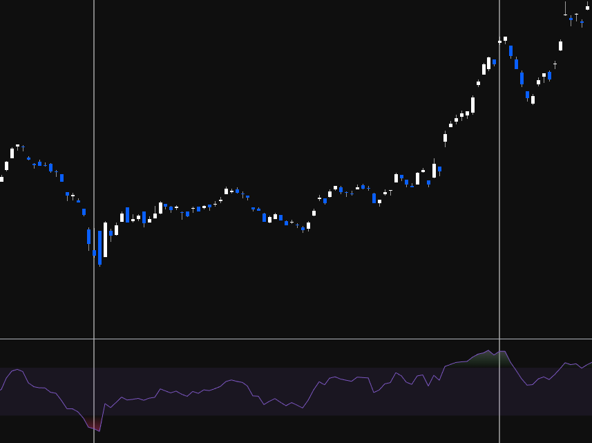
What Is Divergence?
Divergence is when price and the indicator (RSI) are going in opposite directions. It warns that the current price trend may be weakening and in some cases may lead to a reversal.
The running analogy: When you go for a run, at first you have all the energy and momentum. Over time, your body starts giving you signals — puffing, sweating, needing water — that you're weakening. Eventually you'll need to stop. The market works the same way. A trend is running strong, then RSI starts giving signals that momentum is fading. It doesn't mean the trend stops immediately, but it's warning you.
Using RSI for Divergence = Leading Indicator
If you use RSI for overbought/oversold, it's a lagging indicator (telling you what already happened). If you use RSI for divergence, it becomes a leading indicator — signalling what's likely to happen in the future. Every indicator the educator teaches is a leading indicator, because you can't make money on the past.
Divergence Can Mean Two Things
- Reversal — the trend actually reverses
- Range/Consolidation — price goes sideways to "chill" before continuing
Divergence does NOT always mean a reversal. It signals that something is changing, and the trend may consolidate OR reverse.
Two Types of Regular Divergence
| Bullish Divergence | Bearish Divergence | |
|---|---|---|
| Price | Makes a lower low | Makes a higher high |
| RSI | Makes a higher low | Makes a lower high |
| Meaning | Downtrend momentum weakening — potential reversal upward | Uptrend momentum weakening — potential reversal downward |
| Where found | Only at bottoms (in downtrends) | Only at tops (in uptrends) |
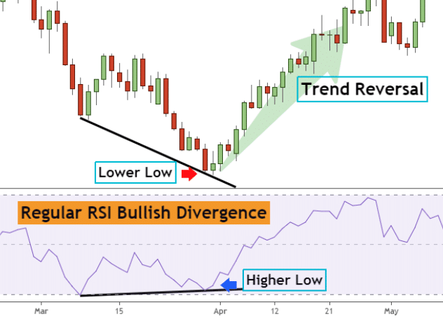
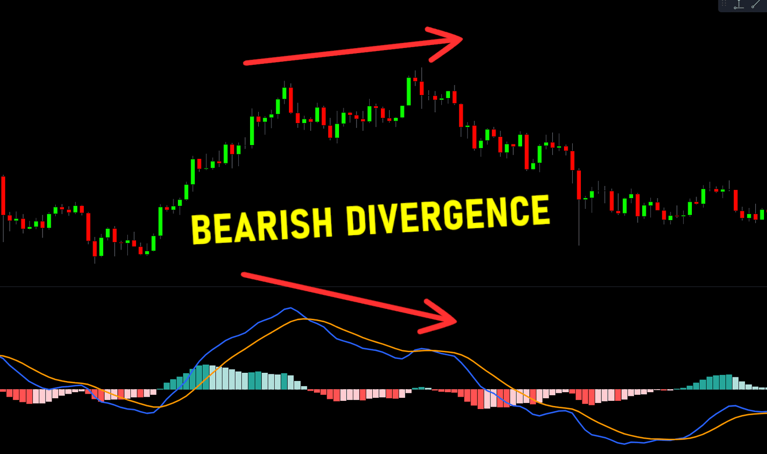
You can only look for bullish divergence in a downtrend (because you're looking for the bottom). You can only look for bearish divergence in an uptrend (because you're looking for the top). You can't find bearish divergence in a downtrend — it doesn't exist there.
Divergence Strength
There are three strengths of divergence — strong, medium, and weak. Strong divergences most often lead to major reversals. Weak divergences usually just produce a bounce.
Strong Divergence
- Bullish: Price makes a lower low, RSI makes a higher low
- Bearish: Price makes a higher high, RSI makes a lower high
- Most reliable — often leads to confirmed reversals
Medium Divergence
- Bullish: Price makes a double bottom (equal low), RSI makes a higher low
- Bearish: Price makes a double top (equal high), RSI makes a lower high
- Example: ASX Trader's Ethereum entry at ~$60 was based on medium bullish divergence (double bottom on price, higher low on RSI) + change of market structure through support
Weak Divergence
- Bullish: Price makes a lower low, RSI makes a double bottom (equal low)
- Bearish: Price makes a higher high, RSI makes a double top (equal high)
- Least reliable — more often leads to just a bounce followed by continuation, rather than a full reversal. Be careful if it rejects and keeps going
Steps to Find and Confirm Divergence
Step 1: Identify the Swing Points
Connect two low points on price (A and B). Then find the corresponding two swing lows on RSI. Are they going the same direction or opposite? If opposite = divergence.
Use the vertical line tool to match price pivots with RSI pivots — ensures you're looking at the right corresponding points.
Step 2: Assess Divergence Strength
Is it strong (lower low / higher low), medium (equal low / higher low), or weak (lower low / equal low)?
Step 3: Wait for Confirmation — DON'T Trade the Signal
Divergence alone is NOT an entry signal. It's an early warning. You need price action confirmation:
- A reversal pattern (failure swing, non-failure swing, double bottom)
- A change of market structure (HH/HL)
- A breakout through resistance or trend line break
- Even better: a combination of multiple confirmations
Step 4: Trade the TRIGGER, Not the Signal
The blinker analogy: Divergence is like a car's indicator/blinker. It signals the car is going to turn. But if you drove based on blinkers alone, you'd have an accident within a week — people put blinkers on wrong, too early, or not at all. Same with divergence. Sometimes the first divergence leads to a reversal. Sometimes it's the second, third, or fourth. You wait for the car to actually turn (change of market structure) before you act.
Signal = divergence. Trigger = change of market structure / reversal pattern / breakout. We trade triggers, not signals.
Do's and Don'ts for Drawing Divergence
Do's
- Draw divergence lines on extremes only (clear pivot points). The sharper the extreme, the better
- It's desirable for the first RSI extreme to be in the overbought or oversold zone (not in the middle of the range). Divergence from an extreme is more powerful
- The bigger the angle between the price line and the RSI line, the stronger the divergence
- Draw lines on candle bodies, not wicks — RSI follows bodies, not shadows
- Be consistent: if you connect two highs on price, connect the two corresponding highs on RSI. Use vertical lines to verify alignment
- Longer timeframes produce more reliable divergence. Monthly and weekly have fewer false signals than daily or hourly. Weekly divergence that builds over months signals something big (e.g. the S&P weekly bearish divergence before Trump tariffs and before COVID)
- Divergence isn't confirmed until a pivot is in. Until then, it's just potential divergence. You need the RSI to actually pivot for the divergence to be valid
- You can only count divergence after a "reset." RSI needs to have gone from one extreme to the other before you can start counting new divergence
Don'ts
- Don't trade divergence alone — wait for the trigger (price confirmation)
- Don't expect hourly divergence to produce a weekly-level reversal. Match your expectations to your timeframe
- Don't use multiple indicators that measure the same thing (e.g. RSI + MACD + Stochastic RSI = all price momentum). That gives you confirmation bias, not confirmation. They're all telling you the same thing in different ways
- Don't try to pick the exact top or bottom off divergence. "The glamour of wanting to pick the top or bottom is more about ego than profits"
Combining RSI with OBV
RSI measures price momentum. OBV measures volume momentum. These are different things, so using both is valid (unlike RSI + MACD which are both price momentum).
The ideal setup: RSI divergence confirmed by OBV divergence = two different signals both pointing the same direction. Enter on the change of market structure, hold until you get the opposite signal from either RSI or OBV.
This is what confluency means — multiple independent signals all telling you the same thing. The more confluency, the higher probability the trade works.
Craig's Key Insight: News Creates Catalysts for Moves That Were Already Due
The S&P 500 showed significant bearish divergence on the weekly timeframe before both the Trump tariff sell-off and COVID. The divergence was already signalling weakness — the news event just created the catalyst that expedited the pullback. "We were always going to pull back. The catalyst of the news made it happen much quicker."
This is why divergence is so powerful as a leading indicator — it shows you the setup before the trigger event occurs. By the time the news hits, the weakness was already there for weeks or months.
1.6 - Fibonacci & retracement zones
Understanding Fibonacci
The Fibonacci sequence — 0, 1, 1, 2, 3, 5, 8, 13, 21, 34, 55, 89… — is a series where each number is found by adding the two before it. Identified in the 13th century by Leonardo Fibonacci, though the sequence was known and used hundreds of years before (even in Egyptian architecture).
The Golden Ratio
The golden ratio 0.618 (or its inverse 1.618) is derived from the Fibonacci sequence and appears throughout nature — from atoms to galaxies, honeybee populations (female/male ratio = 1.618), sunflower spiral rotations, and even human body proportions (shoulder to fingertips ÷ elbow to fingertips ≈ 1.618). It's been used for centuries in art (Mona Lisa), architecture (pyramids), and design (Twitter logo).
The Fibonacci Levels
Dividing a number by the next in the sequence gives the key ratios:
- 21 ÷ 34 = 0.618 (61.8%)
- 21 ÷ 55 = 0.382 (38.2%)
The key retracement levels: 0%, 23.6%, 38.2%, 50%, 61.8%, 78.6%, 100%
Note: The 50% level is NOT actually a Fibonacci number. It's included because of Dow and Gann theory — and human psychology. If you see a "50% off" sale, you automatically gravitate towards it. Financial markets work the same — when something is half price, people perceive it as a bargain.
Fibonacci Retracement Strength — The "Discount" Framework
Each Fib level tells you something about the strength of the underlying trend. Think of it as a sale:
| Fib Level | Discount | Trend Strength | Meaning |
|---|---|---|---|
| 23.6% | ~24% off | Very strong | Buyers jumping in at a tiny discount — massive demand |
| 38.2% | ~38% off | Strong | Buyers stepping in at a modest discount — still strong demand |
| 50.0% | 50% off | Normal | Human psychology — half price attracts buyers naturally |
| 61.8% | ~62% off | Weak | Buyers waiting for a big discount before stepping in |
| 78.6% | ~79% off | Very weak | Needs to be nearly 80% off before anyone's interested |
| Below 100% | Full retrace | Reversal | No discount is enough — trend is over |
The key insight: If successive retracements go deeper and deeper (38.2 → 50 → 61.8 → break), the trend is weakening. Each time, buyers need a bigger discount before stepping in. When even an 80% sale won't attract buyers, the trend is done. This is how you can use Fibonacci to see a trend weakening before it fully reverses.
Example: Bitcoin showed successive retracements getting deeper — 382, then 500, then 618, then broke entirely. The trend was weakening with each leg, and Fibonacci showed it clearly.
How to Draw Fibonacci Retracement
In TradingView: Left toolbar → 2nd group down → arrow → Fib Retracement (or Alt+F shortcut).
In an Uptrend (Looking for Support)
- Identify market structure is bullish (HH/HL)
- Find the major swing low and major swing high
- Click from the low (100%) to the high (0%) — wick to wick
- The levels show where you can expect support on the pullback (23.6, 38.2, 50, 61.8, 78.6)
In a Downtrend (Looking for Resistance / Profit Targets)
- Identify market structure is bearish (LL/LH)
- Find the major swing high and major swing low
- Click from the high to the low
- The levels show where you can expect resistance on the bounce (where to take profit)
Critical Rule: Draw Wick to Wick
Always draw from the wick of the low to the wick of the high (or vice versa). Not candle bodies.
The Golden Pocket — The Zag Zone
The 382-618 zone is called the "golden pocket" or the "zag zone." This ties directly back to Dow Theory: the secondary action is a 1/3 to 2/3 retracement of the primary move. The Fibonacci 382-618 range IS that 1/3-2/3 zone.
Nine times out of ten, the zag will come down to the golden pocket.
Every zag (correction) in a trend should retrace back to somewhere in the 382-618 zone. This is where you look for:
- Support in an uptrend (buying opportunity)
- Resistance in a downtrend (profit-taking / exit point)
Using the Zag Zone for Profit Taking
The zag zone isn't just for entries — it's essential for exits. In a downtrend, when price bounces, expect the bounce to reach the 382-618 zone of the prior down move. That's where you take profit or look for weakness, because the bounce may just be a zag before more downside.
Only two things can happen at the zag zone:
- It's just a zag (correction) and the prior trend resumes → price rejects at 382-618
- It's the beginning of a new trend → price pushes through the 618 on increasing volume
If price gets above the 618 on strong volume, it becomes more likely the bottom is in and a new bull market is starting. Until then, treat every move into the zag zone as potentially just a correction.
The Forecasting Process
- Identify your zone — draw Fib from the move, mark the 382-618 zag zone
- Watch for weakness when price reaches the zone — bearish divergence on RSI and OBV, declining volume, reversal candlestick patterns
- Wait for confirmation — change of market structure (reversal pattern) at the zone
- React — take profit, exit, or enter based on the confirmed setup
If price retests the zag zone, drops out, then retests the bottom of the zone again — that's usually a sign the price will continue to fall away.
The Bread and Butter Setup — Combining Everything
ASX Trader's process for entries:
- Price moves into a Fibonacci support level (382, 500, or 618)
- The move into the level happens on lowering volume
- Bullish divergence appears on OBV
- Bullish divergence appears on RSI
- A change of market structure confirms the reversal (double bottom, failure swing, or non-failure swing)
That's the complete setup — Fibonacci level + weakening volume + OBV divergence + RSI divergence + reversal confirmation. Don't just buy because it's on a Fib level. Combine everything from the prior five weeks.
How Markets Move: Zigs, Zags & Three Steps Forward
The Zig-Zag Pattern
Markets never move in straight lines. They zig (move in the trend direction) and zag (retrace). The zag comes back to the golden pocket (382-618) before the next zig.
Apple example: From the tech bubble bottom in 2003, every single correction came down to the golden pocket zone — 618, 500, 618, 618, 382, 618 — and bounced. Knowing the golden pocket for a strong fundamental company like Apple, Microsoft, Google means knowing where to look for buys.
Three Steps Forward, Two Steps Back (Simplified Elliott Wave)
The market moves in a rhythm: one, two, three forward — then one, two back.
Each forward move consists of:
- Zig 1 → Zag 1 (golden pocket) → Zig 2 → Zag 2 (golden pocket) → Zig 3
That gives you three zigs with two zags between them. After the third zig:
- The market doesn't just correct the last zig — it corrects the entire three-zig move
- The correction comes back to the golden pocket of the WHOLE move (typically to the bottom of the "wave 4" area — the bottom third of the final zig)
Connecting to Dow Theory Phases
The three zigs ARE the three phases:
- Zig 1 = Accumulation (breakout from the base)
- Zig 2 = Public Participation (the big trending move)
- Zig 3 = Excess (the blow-off top)
- Then the whole-move correction = Distribution/Bear market (corrects back 1/3-2/3 of the entire move from accumulation bottom to excess top)
This pattern repeats fractally: three small zigs make one medium zig, three medium zigs make one large zig, and so on. The major correction events (tech bubble, GFC, COVID) are the "two steps back" from the bigger three-step pattern.
Fibonacci Clusters (Advanced Confluency)
A Fibonacci cluster is when multiple Fibonacci levels from different timeframes or different moves overlap at the same price area. This creates a much stronger support/resistance zone than any single Fib level.
How to Find Clusters
- Draw Fib retracement on the recent move (e.g. daily timeframe, COVID bottom to top)
- Zoom out and draw another Fib retracement on the larger move (e.g. monthly timeframe, entire trend)
- Look for where levels from both overlap — e.g. the 618 from the recent move aligning with the 382 from the whole move
- Draw a rectangle box around the cluster zone — that's your high-probability support/resistance area
Microsoft Example
The 618 retracement from the COVID bottom overlapped with the 382 from the entire move. This created a cluster zone. Microsoft (a trillion-dollar company) bounced off this cluster zone — two independent Fib levels both pointing to the same area of support.
Cluster zones are stronger than single Fib levels because you have multiple independent mathematical reasons to expect support/resistance at that price.
1.7 - Candlestick & Pattern Analysis
What Type of Trader Are You?
Before diving into candlesticks, you need to know which timeframe suits your personality. The candles you look at depend entirely on your trading style.
| Style | Timeframe | Hold Period | Risk | Reward | Stress | Best For |
|---|---|---|---|---|---|---|
| Position Trader | Weekly / Monthly | Months to years | Low | Low (slow) | Low | Long-term investors, relaxed personality |
| Swing Trader | Daily / Weekly | Days to weeks/months | Low-Med | Medium (takes time) | Low-Med | Patient traders, don't need daily results |
| Day Trader | 5min / 15min / 1hr | Within the day | Med-High | Higher (faster) | Higher | People who thrive on pressure |
| Scalper | 1min / 5min | Minutes to hours | High | High (immediate) | Very High | Adrenaline lovers, decisive under pressure |
Key insight: Your personality determines which style works. If you love roller coasters and spontaneity → scalping/day trading. If you prefer the beach and reading → swing/position trading. The educator started as a day trader (loved the rush, got fast feedback for learning), then transitioned to position trading as his life and priorities changed.
Match your chart timeframe to your style: Position trader = weekly/monthly. Swing trader = daily/weekly. Day trader = daily/hourly. Scalper = 1min/5min.
Anatomy of a Candlestick
Each candle gives four pieces of data: Open, Close, High, Low.
- Body = range between open and close
- Wicks/Shadows = the high and low extremes the price reached during the period
- Green/White = closing price was HIGHER than opening price (bullish)
- Red/Black = closing price was LOWER than opening price (bearish)
Multi-timeframe unpacking: A single daily candle can be unpacked by looking at the hourly/5min charts within that day. A bullish engulfing on the daily might show a clear downtrend reversal on the hourly. A bearish shooting star on the daily might show a strong downtrend on the 1-minute. This helps you understand what's actually happening inside each candle.
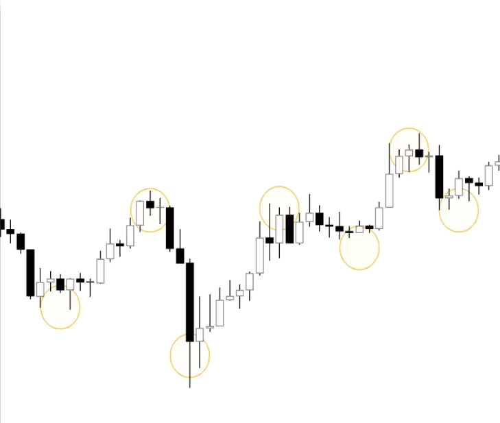
Candlestick Patterns
Reference Charts
| Bullish | Bearish |
|---|---|
 |
 |
 |
 |
 |
 |
No pattern works all the time — they represent tendencies, not guarantees. Always confirm with volume and other indicators.
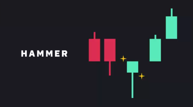
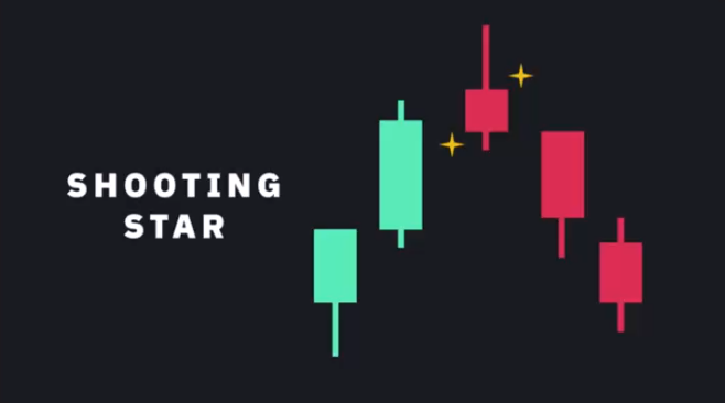
Single Candle Patterns
Marubozu ("Bald Head"): No or minimal wicks — open/close IS the high/low. Bullish marubozu = intense buying pressure throughout the session. Bearish marubozu = intense selling pressure. These are powerful trend confirmation candles.
Hammer / Shooting Star: Long wick at one end, small body. Hammer (bullish) = long lower wick at bottom of downtrend, buyers stepped in hard. Shooting Star (bearish) = long upper wick at top of uptrend, sellers pushed price back down. Can be either colour.
Spinning Tops / Dojis: Short body centered between long upper and lower wicks. Neutral — represents indecision between bulls and bears. What matters is the candle that follows: big green after a doji = bulls won. Big red = bears won.
Multi-Candle Patterns
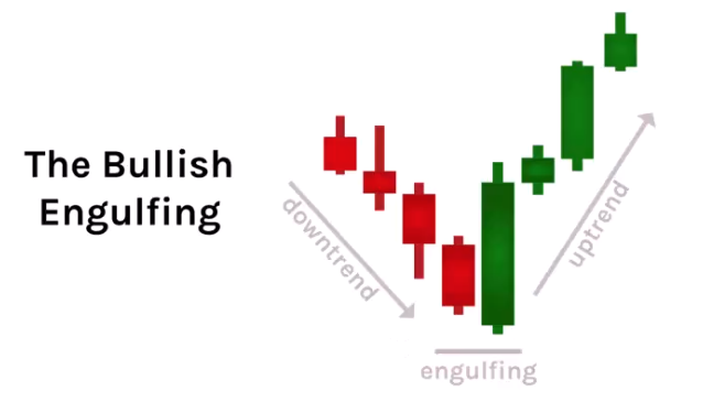
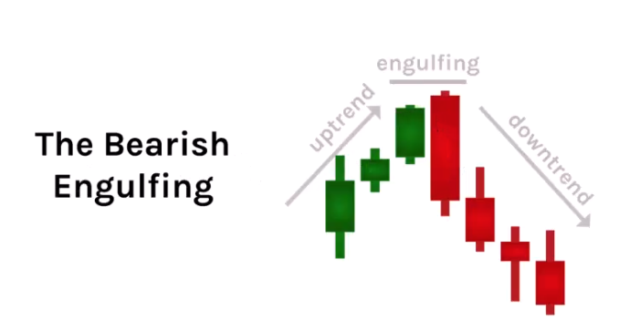
Bullish/Bearish Engulfing: Two candles where the second completely engulfs the first. Bullish engulfing at bottom of downtrend = reversal signal (buyers overwhelmed sellers). Bearish engulfing at top of uptrend = reversal signal. Look for high volume to confirm.
Inside Bar (Harami): Small candle completely inside the previous candle's range. Shows the trend is pausing — indecision. The next candle determines direction.
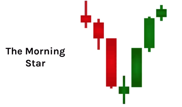
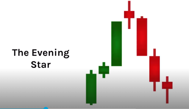
Morning Star / Evening Star: Three-candle reversal pattern. Morning star (bullish) = long red → doji/small body → long green. Evening star (bearish) = long green → doji/small body → long red. The doji shows the battle, the third candle shows who won.
Volume with Candlestick Patterns
- Reversal patterns (engulfing, hammers, stars) should have HIGH volume to confirm
- Climax/exhaustion candles at the end of trends often show extreme high volume
- Trend confirmation candles (marubozu) should be accompanied by strong volume in the trend direction
Chart Patterns
ASX Trader's honest take: "If I had to drop one lesson from the entire course, it would be this one." He's not a chart pattern trader — patterns can go either way and markets sometimes do the opposite because everyone is watching the same pattern. However, patterns complement other tools and provide useful common language.
The key principle: Don't just trade because you see a pattern. Unpack what's under the hood — it's all market structure. If you can identify pivot points and market structure, you don't technically need to know pattern names. But knowing the language helps communicate with other traders.
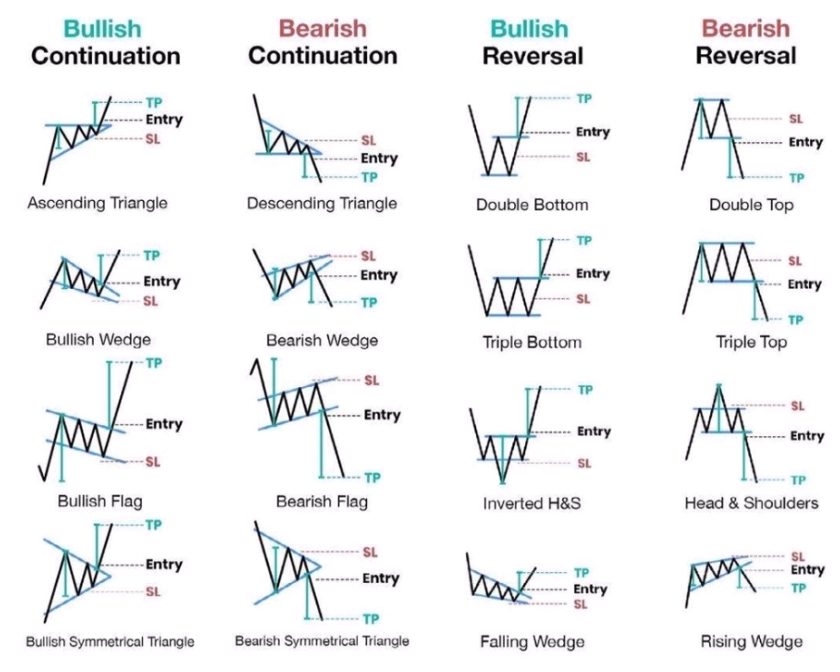
Continuation Patterns
Triangles
Converging price ranges showing a pause in the trend. Three types:
Symmetrical: Both lines converging at equal slopes. No directional bias — neutral consolidation. Direction depends on the breakout.
Ascending: Horizontal resistance + rising support (buyers stepping in higher each time). ~80% probability of upside breakout. Eventually sellers get exhausted.
Descending: Horizontal support + falling resistance (sellers stepping in lower each time). Eventually buyers get exhausted and it breaks down.
Elliott Wave connection: Triangles occur before the FINAL wave (wave 5 / excess phase). After a triangle breakout, expect one last push, then a correction. This is why triangle breakouts can trap retail traders — the move after the triangle might be short before rolling over.
Breakout vs fake-out: If a triangle breaks out and comes back within the pivot, it was likely a fake-out or a short excess phase. Check volume — breakout should be on high volume. Also check for divergence from the start to end of the triangle.
Flags & Pennants
Flags are short consolidation periods against the trend direction after a sharp impulse move (the "pole"). They're strong continuation patterns.
Bull Flag: Uptrend → sharp move up (pole, high volume) → consolidation down (flag, low volume) → breakout continuation (high volume). The flag should NOT retrace past the Fib 382 (maybe 500 max). If it goes to 618, it's too deep — it's not a flag, it's a weak trend.
Bear Flag: Downtrend → sharp move down → consolidation up to the zag zone (302-618) on low volume → breakdown on high volume.
Pennants: Same as flags but the consolidation forms a small symmetrical triangle instead of a channel. Also shouldn't retrace past 382.
Cup & Handle
Continuation pattern: prior uptrend → rounded bottom (the cup) → small pullback (the handle, which is basically a bull flag) → breakout. Handle should retrace to Fib 382, max 500. Handle must form on lowering volume. Breakout on increasing volume. Measured target = depth of the cup projected upward from the breakout.
Darvas Box (Rectangle)
Sideways consolidation with equal highs and equal lows. When it breaks out, check: is volume confirming? If breakout comes back within → liquidity grab (check OBV — was it going up on lowering volume?). If it breaks out and continues with strong volume → genuine breakout.
Reversal Patterns
Head & Shoulders / Inverse H&S
A head & shoulders is just a failure swing. Shoulder, head, shoulder = higher high, higher low, higher high, then lower high (the right shoulder fails to reach the head), then breaks the neckline.
Advanced H&S with volume and divergence:
- Left shoulder forms on increasing volume
- Head forms on LOWERING volume (weakness) + bearish divergence from left shoulder to head on RSI
- Right shoulder forms on LOWERING volume (dumb money buying the dip)
- Neckline break should come on increasing volume (sell pressure confirms)
- Measured target = distance from neckline to head
The neckline doesn't have to be horizontal — it can be diagonal.
Fractals: Each wave can have its own mini head & shoulders. Multiple small H&S patterns combine to form one large H&S (accumulation → public → excess → correction).
Wedges (ASX Trader's Favourite)
Converging trend lines both moving in the same direction (unlike triangles where they move in different directions).
Falling Wedge (Bullish): Both lines sloping down but converging. Tension builds as the trend tightens. Breakout to the upside on increasing volume. ASX Trader's favourite pattern — gives phenomenal risk:reward because you can enter on the breakout and place a tight stop loss. Target = back to the top of where the wedge started. Look for bullish divergence on both OBV and RSI as it comes down the wedge.
Rising Wedge (Bearish): Both lines sloping up but converging. Uptrend getting weaker. Should be going up on decreasing volume. Breakdown on strong volume.
Multi-Timeframe Candlestick Analysis
- Identify primary trend on higher timeframes (daily, weekly, monthly)
- Confirm on lower timeframes — look for consistent patterns aligning with the primary trend
- Spot entry/exit points on even lower timeframes (15min, 5min) for precise entries
- Detect confluences — a bullish reversal pattern on the daily, supported by a similar pattern on the 4-hour, with increased volume = strong setup
Example: A bullish engulfing on the daily = look inside and you might see a double bottom on the hourly. Two reversal signals confirming each other across timeframes.
Advanced Pattern Analysis — Combining Everything
The real power of patterns comes from combining them with volume and divergence:
For reversal patterns (H&S, wedges):
- Look for divergence on BOTH RSI and OBV as the pattern forms
- The reversal candles should have high volume
- The continuation into the pattern should show lowering volume (weakness)
- When you get divergence on price momentum AND volume momentum, plus a change of market structure = high probability setup
For continuation patterns (flags, triangles, boxes):
- The consolidation should happen on lowering volume
- The breakout should happen on increasing volume
- OBV should confirm the breakout (if OBV doesn't break out with price, it's likely a fake-out)
- Triangles = one more push before a correction (excess phase), so trade with awareness it might be short
Index Confirmation
Dow Theory Tenet 5: The Averages Must Confirm One Another
For a market trend to be valid, both the Dow Jones Industrial Average (DJIA) and the Dow Jones Transportation Average (DJTA) must move in the same direction. If one average makes new highs while the other doesn't, it suggests weakness in the trend — divergence between indices is a signal (blinker) that a reversal may be coming.
Fun fact: Charles Dow invented both the DJIA and the DJTA. The DJIA is the longest-running American index (originally 12 stocks, now 30, over 100 years old). When someone questions TA, remind them the longest-standing American index is named after the guy who invented it.
Historical DJI vs DJT Divergence — 6 out of 6 Major Tops
The educator demonstrated that EVERY major market top showed DJT divergence before the crash:
- 1987 Crash (worst crash in history) — DJI making new highs, DJT making new lows. Change of market structure on both confirmed → could have avoided the biggest crash in history
- 1989-90 Crash — DJI new highs, DJT new lows before ~25% drop
- 2000 Tech Bubble — DJI new high in Jan 2000, DJT had already made a lower high from May 1999
- 2007 GFC — DJI new high, DJT made new low. Before the dramatic drop
- COVID 2020 — DJI making higher highs, DJT making lower lows before the crash
- 2022 Bear Market — DJI new highs, DJT making lower highs during the top
Six out of six times before a major crash, the transportation average was a leading indicator showing non-confirmation. This is a third type of divergence (alongside RSI price divergence and OBV volume divergence).
How to Compare in TradingView
- Click the layout selector (top right corner, small box icon)
- Select split screen (two charts side by side)
- Type the second ticker (e.g. DJT) in the right panel
- Match timeframes on both charts — make sure both are daily, or both weekly
- Use vertical lines to align pivots and dates across charts — this shows you whether the highs/lows match
Modern Multi-Chart Confirmation
Dow only had two indices to compare. Today there are many. The same principle applies: if you're in a raging bull market, ALL related indices should be raging and making new highs at the same time.
S&P 500 vs Russell 2000
The Russell 2000 (small caps, IWM) should confirm the S&P 500 in a healthy bull market. If the S&P keeps making new highs but the Russell goes sideways or makes lower highs, that part of the trend is weakening — money isn't flowing into risk-on small caps.
Bitcoin vs Ethereum
Ethereum is a more risk-on asset than Bitcoin. In a healthy crypto bull market, both should be making new highs. Examples of non-confirmation:
- BTC bottom at $15K: Bitcoin made a new low, but Ethereum made a higher low → indices not confirming → bullish divergence signal that the downtrend was weakening
- BTC top at $64K: Ethereum made a new high, Bitcoin made a lower high → not confirming → weakness before the rollover
Sector → Individual Stock Flow
When a sector starts breaking out, you can find individual stocks within that sector that are also breaking out — double confirmation from two charts:
- Sector example (Utilities/AGL): The utility sector showed a Wyckoff accumulation at the Fib 618 + trend line support. When it broke out, ASX Trader found AGL within that sector also showing bullish divergence and a spring pattern → put 22% of portfolio in AGL at $5.20 → it went to $8+ while the broader market was collapsing. Just because NASDAQ/tech was going down didn't mean everything was
- Sector example (Uranium): The uranium sector completed a zag into the golden pocket zone. When it changed market structure (Aug 2023), individual uranium stocks like PDN (inverse H&S breakout), DYL (bull flag breakout), and Boss Energy (accumulation breakout) were all breaking out at the same time → confluency from sector + individual stocks
Best Stocks Break Out Before the Sector
The best fundamental companies within a sector often break out BEFORE the sector itself does. Big money flows into the best-of-the-best first.
Gold example (Northern Star): When gold was making lower lows and a triple bottom, Northern Star was already making higher lows → showing strength before the commodity itself reversed. RSI showed bullish divergence on gold at the same time. This is how the educator called the gold bottom — confluency from gold chart + gold miners chart + Northern Star chart + RSI divergence.
Confluency — The Core Principle
Definition: A confluence occurs when two or more structures come together to form a high-probability zone — like rivers joining into one channel.
In trading: Confluence is where multiple technical analysis methods give the same signal. The more reasons pointing the same direction, the higher probability the trade works.
ASX Trader's Rule
"I will never take a trade unless I have a minimum of three points of confluency." This is why he maintains high win percentages — not by being lucky, but by stacking evidence.
Bitcoin $15K Bottom — 7 Points of Confluency Example
The educator demonstrated this breakout had:
- Decline resistance broken (diagonal trend line)
- Horizontal resistance broken (major S/R level)
- Falling wedge pattern (bullish reversal)
- Change of market structure (HH/HL)
- Bullish divergence on RSI
- Volume supporting the move
- Ethereum not confirming new low (indices diverging = bullish)
Seven independent reasons all pointing to the same conclusion. You should be almost shocked when a trade with this much confluency doesn't work.
How to Think About Confluency
"Think of it like you're in front of a judge, building your case." Every signal is a piece of evidence. The more evidence you stack, the stronger your case. Don't take a trade because of one thing — you need market structure + indicators + multi-chart confirmation.
A trade with only one reason (e.g. "it changed market structure") is weak. A trade with five to seven reasons (market structure + S/R break + pattern + divergence + volume + index confirmation) is your highest-probability setup.
Types of Confluency
Single-chart confluency — multiple signals on the same chart:
- Trend line support + horizontal support + Fib level meeting at the same zone
- Reversal pattern + bullish divergence on RSI + bullish divergence on OBV
- Candlestick reversal + market structure change + volume confirmation
Multi-chart confluency — signals from related charts confirming each other:
- Index making new highs → sector within that index also making new highs → individual stock within that sector also breaking out
- Commodity chart (gold) bottoming + gold miners making higher lows + individual miner (Northern Star) breaking out
- Bitcoin changing structure + Ethereum not confirming new low
Non-Confirmations as Early Warning Signs
When sectors or stocks FAIL to confirm broader index moves, it's an early clue that a trend may be weakening, reversing, or masking deeper structural issues. It's the same concept as RSI or OBV divergence, just applied across charts instead of across indicators:
- If the broad market is making new highs but a key sector is going sideways → weakness
- If a commodity is making new lows but the miners aren't → the commodity trend is weakening
- If one crypto is making new lows but another isn't → the bear trend may be exhausting
It's not TA's fault when something goes wrong — it's human error. You can eliminate that error by finding bullish signals across multiple charts, not just one.
Psychology & the Principle of Markets Discounting Everything
Dow Theory Tenet 1: The Averages Discount Everything
All available information — economic, political, and market factors — is already reflected in the price. The market discounts everything except acts of God (black swans / unknown unknowns). Even then, the market absorbs, reacts, and adjusts to shocks fairly rapidly.
"If It's in the News, It's Old News"
Before something gets printed, someone had to find the information, run it by the editor, print the story — and they've told their family and friends first. There's probably a hundred people who found out before the public. By the time mass media publishes, the inner circle already knows.
"Buy the rumour, sell the fact" — investors buy when they hear rumours of good news, then sell once it's officially announced because the good news is already priced in. Insiders position early, then liquidate into public participation.
Real-World Examples
- Evolution Mining: Bad quarterly report caused a 10% gap down — but it marked the BOTTOM. The market had already priced in bad news during the prior decline. The actual quarterly wasn't as bad as what was already priced in, so it became a buy
- Bitcoin FTX Collapse: Should have been "the end of the world" — but it marked the bottom. So much bad news was already priced in that the horrific event became a buying opportunity
- Uranium stocks meltdown: 30% drop on terrible news — but it marked the bottom and tripled from there
The Insider Dynamic
Big money gets information before retail. They accumulate during pessimism. Once the bullish news is published, insiders are already liquidating into the public buying. The public joins in after information is published, contributing to the herding behaviour that causes the market to overreact. Eventually a top or bottom forms as the market runs out of buyers/sellers.
The Wall Street Cheat Sheet — Market Cycle Psychology
The market cycle is a repeating emotional cycle, just like seasons. When you think it can't get any hotter (euphoria), you're probably at the peak. When you think it can't get any colder (despair), you're probably at the bottom.
Bull Phase Emotions
Disbelief → Hope → Optimism → Belief → Thrill → Euphoria
- Disbelief (Accumulation): Prices hit bottom after prolonged bear market. Despair, pessimism, nobody talking about it. Big money enters
- Hope: Market starts recovering, optimism emerges. Beginning of public participation
- Optimism: Bull market gains momentum, FOMO starts, greed begins. Middle of public participation
- Belief → Thrill → Euphoria (Excess): Market reaches peak. Widespread belief it will continue indefinitely. Everyone is bullish. Calling anything bearish gets you ridiculed. Point of maximum financial risk
Bear Phase Emotions
Complacency → Anxiety → Denial → Panic → Capitulation → Anger → Depression
- Complacency (Fake rally/Zag zone): "Buy the dip, baby." Everyone thinks it's just a normal pullback. Underestimate risks
- Anxiety → Denial → Panic: Public participation of the bear market. Fear intensifies, losses mount, weak hands get out
- Capitulation → Anger → Depression: Bear market deepens. Selling at any price. Price capitulates first (fast drops), then time capitulates (sideways drift until people get bored and move to the next shiny object). Point of maximum financial opportunity
Smart Money vs Public Entry
| Phase | Who's Buying | Sentiment |
|---|---|---|
| Stealth (Accumulation) | Smart money | Nobody talking about it |
| Awareness (Early public) | Institutional investors | First media attention |
| Mania (Public + Excess) | Public, retailers, FOMO | Media frenzy, euphoria |
| Blow-off → Distribution | Smart money selling to public | Universal bullishness |
"Big money loves what you hate. Big money hates what you love." When you hate something, they typically love it. Do the opposite of the masses — the herd is always wrong at extremes.
Matching Sentiment to Phases
Use sentiment as another point of confluency with your TA:
- Accumulation phase → sentiment should be LOW (despair, pessimism)
- Public participation → sentiment should be GOOD but not euphoric
- Excess phase → sentiment should be EUPHORIC, universally one-sided bullish
- Distribution/bear → sentiment transitions through complacency → panic → despair
Emotions in Trading
Greed & Fear
Greed drives overvaluation during bull markets. Fear drives panic selling during bear markets. "The market can remain irrational longer than you can remain solvent." Everything can say it's expensive with divergence and lowering volume, but it can keep pushing up. Sometimes weakness leads to an immediate reversal; sometimes it takes the second, third, or fourth signal.
Herd Mentality
Investors follow the crowd assuming others have superior information. This leads to prices reaching levels they should never reach — both up and down. Be careful of the "it's cheap compared to where it was" trap: if something was at $100 but fundamentally should only be worth $10, then $20 is still expensive even though it's "80% off."
Media Influence
Fear sells better than positivity. Headlines are designed to be catchy and grab attention, not to be accurate. The educator, as a journalist himself, has seen editors change his titles to be more sensational.
Overreaction & Underreaction
Markets tend to overreact to news (exaggerated moves beyond fundamentals) and sometimes underreact (failing to fully adjust). Both create trading opportunities.
Elliott Wave Personality (Simplified)
Each wave has its own personality and sentiment signature. This connects phases + psychology + Fibonacci into one framework:
Impulse Waves (Bull Market)
Wave 1 (Accumulation): Fundamental news almost universally negative. Previous bear trend still considered strong. Sentiment bearish. Volume increases slightly but not enough to alert most analysts. Early adopters enter cautiously. More bears than bulls.
Wave 2 (Correction of Wave 1): News still bad. Bearish sentiment quickly rebuilds — "see, still a bear market." Volume LOWER than wave 1. Should not retrace more than 61.8% of wave 1. Falls in a three-wave pattern (ABC). Can never go below the start of wave 1 (universal rule — if it does, it's not wave 1).
Wave 3 (Public Participation): Usually the LARGEST and most powerful wave (in equities; in commodities, wave 5 can be larger). News turns positive. Prices rise quickly. Corrections short and shallow. Anyone waiting for a pullback misses the boat. By the midpoint, the public joins in. Taste of euphoria toward the top.
Wave 4 (Correction of Wave 3): Typically choppy and sideways (often a triangle). Retraces less than 38.2% of wave 3 — shallow correction. Volume well below wave 3. Good place to buy a pullback if you understand wave 5 is coming. Frustrating because of lack of progress.
Wave 5 (Excess): Final leg. News universally positive, everyone bullish. Volume LOWER than wave 3. Momentum indicators show DIVERGENCE (RSI and OBV divergence from wave 3 top to wave 5 top). Average investors finally buy in — right before the top. Bears get ridiculed.
Corrective Waves (Bear Market)
Wave A: Fundamental news still positive. Everyone thinks it's just a pullback — "buy the dip, baby." Increased volume on the down move.
Wave B (The Trap): Price rallies — seems like the bull market is resuming. Volume LOWER than wave A. Lures people back in, only to face disappointment. Temporary sentiment shift.
Wave C: Almost everyone realises the bear market is real. Fear and panic. Volume picks up. Capitulation at the end — last holdouts finally give up, marking the bottom.
Three Tools to Identify a Top
- Can you see you're in the third phase (excess/wave 5)?
- Is sentiment really bullish/euphoric?
- Do you have divergence on your indicators (RSI, OBV)?
If all three = yes → start taking profits. This is how the educator called tops on lithium, crypto in 2021, and other assets.
Sentiment Analysis Tools
AAII Sentiment Survey
Search "AAII sentiment" — weekly survey of where investors believe the market will be in 6 months. When bullish readings get into the high 40s-50s, markets often top. When bearish readings hit similar extremes, markets often bottom.
Fear & Greed Index
Search "fear and greed index" — CNN has one for stocks, Alternative.me has one for crypto. Shows current market sentiment on a scale from extreme fear to extreme greed.
VIX (Volatility Index)
The "fear gauge." When VIX spikes above ~45-50, it signals capitulation — historically these have marked bottoms (GFC bottom, COVID bottom, every major sell-off). When VIX is low and declining, the market is complacent and in a bull market.
Options Max Pain
Search "options max pain swaggy stocks" — shows the price where option sellers pay out the least. Markets often gravitate toward this price around expiry dates. Quadruple witching (3rd Friday of March, June, September, December) — most major market tops and bottoms happen around these dates.
Contrarian Investing — Putting It All Together
Buy when nobody is talking about it. Sell when everyone is talking about it.
The practical framework:
- Identify the accumulation phase (sentiment is terrible, nobody cares)
- Wait for the first HH/HL (change of market structure = beginning of public participation)
- Ride the public participation phase
- Watch for the three top signals (third phase visible + euphoric sentiment + divergence)
- Start taking profits during the excess phase
- Don't try to sell the exact top — just recognise you're in the excess phase and act accordingly
Examples: Bitcoin 2020-2021 cycle, Woodside Energy pre-GFC, ARK ETF blow-off, Netflix excess phase — all showed the same pattern of accumulation → public → excess → correction, with sentiment matching each phase perfectly.
Risk to reward, trade planning & risk management
Why Risk Management Matters
Effective risk management combined with TA is what separates consistent traders from gamblers. Losses are inherent in trading — thinking you'll never lose is like playing basketball and thinking you'll never miss a basket. The goal isn't to never lose; it's to manage losses so they don't destroy your account.
"I've never lost a trade. I've either won it or I've learned from it."
Correct Risk vs Over Risk
If you're checking your portfolio constantly, can't sleep, and get defensive when someone says something negative about your holdings — you're over-risked and emotionally attached. Correct risk management means you're calm, composed, data-driven, and goal-focused. The trade is just another number.
The Five Possible Outcomes of a Trade
Every trade has exactly five possible outcomes — nothing else can happen:
- Break even — no gain, no loss
- Win big — the money makers
- Win small
- Lose small
- Lose big — the account killers
The goal: eliminate #5 (big losses). If you eliminate big losses using stop losses, you're left with break even, small wins, small losses, and big wins. The small wins and small losses roughly cancel each other out. What's left? The big wins — your account growers.
The 1% Rule
Never risk more than 1% of your account on a single trade.
With a $100,000 account, if you're wrong you lose $1,000 (1%). You'd have to be wrong 100 times IN A ROW to blow your account. That's virtually impossible with any reasonable strategy.
The Math That Changes Everything
Losing strategy (no 1% rule): 10 trades, won 6 out of 10 (60% win rate), but had three big losses of $7-10K each. Result: -$1,000 despite winning 6 trades. Big losses wiped out big wins.
Winning strategy (with 1% rule + 3:1 ratio): 10 trades, won only 3 out of 10 (30% win rate). Every loss was $1,000 (1%). Wins were $3K, $3K, and $10K (3:1 minimum). Result: +$9,000 (9% account growth) despite winning only 3 trades.
You can be right only 30% of the time and still make money. This is the single most important concept in the course.
The 3:1 Risk-to-Reward Ratio
Never take a trade that doesn't pay a minimum 3:1. For every $1 risked (stop loss), aim to make at least $3 (take profit).
How It Works
- Entry: $100
- Stop loss: $95 (risking $5)
- Take profit: $115 (reward $15)
- R:R = $15 ÷ $5 = 3:1 ✓
This is like going to a casino where landing on black loses you $100, but landing on red wins you $300. You only need to be right 30% of the time to be profitable.
Setting Stop Loss
Place your stop loss just beyond a logical invalidation point — below a pivot low or support level for a long trade. If price hits your stop, your trade thesis is genuinely invalidated (market structure is no longer bullish). The stop should go where, if hit, you're objectively wrong.
Setting Take Profit
Use your toolkit: Fibonacci zag zones (382-618), horizontal resistance levels, measured move targets, channel boundaries. Look for where Fib levels align with other confluency points — that's your highest probability take-profit zone.
Why You Can't Take Every Breakout
Not every breakout gives you a 3:1 trade. If price breaks out and your stop is too far from the entry relative to the target, the R:R might only be 0.8:1 — can't take it. But if price gives you a pullback/retest first, your stop can go under the retest pivot, often giving you 3:1+. This is another reason the breakout+retest strategy is so powerful — it improves your R:R.
Breaking the Myth: Cheap vs Expensive
"Forget price. Focus on risk to reward." This is the most important takeaway from the entire course.
A "cheap" asset at $0.01 with a poor R:R is a BAD trade. An "expensive" asset at $500 with a great R:R is a GOOD trade. Your goal is NOT to buy low and sell high — it's to risk little and make more.
You could pay MORE for an asset and make MORE money if the R:R is better. Bitcoin at $100K with a 10:1 R:R is a better trade than Bitcoin at $3K with a 2:1 R:R.
Stop thinking: "What price did I pay?" Start thinking: "Where's my stop? Where's my target? What's my R:R?"
The Recipe for Success — The Complete Trade Checklist
You've been given all the ingredients across 10 weeks. Now here's the recipe card.
Non-Negotiables (Core Ingredients — Must Have ALL)
These are like flour, eggs, and milk for a cake. Without them, you don't have a trade.
| # | Non-Negotiable | Question |
|---|---|---|
| 1 | Market Structure | Is market structure on my side? (HH/HL for longs) |
| 2 | Reversal Pattern | Was there a double top/bottom, non-failure swing, or failure swing before the structure change? |
| 3 | Volume Confirmation | Is volume confirming the move? (OBV supporting the breakout) |
| 4 | Support/Resistance Break | Is it breaking through a major S/R level? (Dow Theory says you want it to break a significant level) |
| 5 | Minimum 3:1 R:R | Does the trade pay at least 3:1? If not, don't take it |
If you can't tick all five → no trade. Don't even look at the extras. No cake without the core ingredients.
Negotiables (The Icing — Makes It Better)
Once you have all five non-negotiables, these increase probability:
Signals/Blinkers (want at least 1, prefer 2):
- RSI divergence before the reversal?
- OBV divergence before the reversal?
Context:
- What phase are we in? (Buy at beginning of public participation, not in excess)
- For swing/position trades, are we coming out of accumulation?
Additional Confluency (the more the better):
- Bouncing off or breaking through a Fibonacci level?
- Breaking a trendline resistance / bouncing off trendline support?
- Another chart confirming the same thing? (Index, sector, related asset)
- Fibonacci cluster zone?
- Base or consolidation prior to breakout?
- Candlestick reversal pattern? (Engulfing, morning star, hammer)
- Chart pattern? (Falling wedge, cup & handle, inverse H&S, flag)
Stop Loss Validation:
- Is the trade invalidated where the stop loss sits?
- Is the stop under the pivot low?
Take Profit Validation:
- Fib retracement to find the zag zone?
- Fib levels aligning with confluency points?
The Bitcoin $18K Trade — Recipe in Action
The educator's real trade demonstrated the full checklist:
- ✅ Change of market structure (failure swing reversal)
- ✅ Falling wedge pattern (bullish reversal)
- ✅ Breaking back through major support (liquidity grab confirmed)
- ✅ Breaking through the zag zone of the prior move (not just correcting the last leg)
- ✅ Bullish divergence on weekly RSI
- ✅ Bullish divergence on weekly OBV
- ✅ Increasing volume on the breakout
- ✅ 3:1+ R:R with stop under pivot and TP at Fib zone
Eight reasons to be in, one minor negative (daily OBV didn't confirm). Way more evidence for than against. That's the standard you're aiming for.
Key Mindset Shifts
- Trading is not a get-rich-quick scheme. It takes years to master, just like any skill. People happily go to university for 4 years eating two-minute noodles, but expect to master trading in weeks
- The data in your journal tells the truth, not your feelings. If your journal shows you're better at swing trading than day trading, listen to the data
- Eliminate big losses and the rest takes care of itself. Small wins and small losses cancel out. Big wins are your account growers. If you never have big losses, you'll grow over time
- You're becoming the casino, not the gambler. The casino doesn't win every hand — it wins because the odds are stacked in its favour over hundreds of hands. That's what 3:1 R:R does for you
Term 1 Masterclass
End-of-term session combining everything from the 10-week course into practical application.
The Skill Hierarchy — Why the Course Is Sequenced This Way
Every skill builds on the one before it. The sequence isn't arbitrary — you can't do the later steps without mastering the earlier ones:
- Pivot Points → The absolute foundation. Can't do anything without these
- Market Structure → HH/HL, LL/LH, EH/EL. Requires pivot points. "Market structure is king"
- Reversal Patterns → Double top/bottom, non-failure swing, failure swing. Need to know when market structure flips
- Support & Resistance → Horizontal zones where buyers/sellers step in. Identifies key levels to break through
- Phases → Accumulation, public participation, excess. Where are we in the cycle? Don't buy the excess phase
- Volume & OBV → Is the move supported? Fuel for the market. Effort vs result
- RSI Divergence → Leading indicator — signals (blinkers) before the reversal confirms
- Fibonacci → Where will it retrace to? Zag zone targets. Trend strength assessment
- Candlestick Patterns → Complementary confirmation. Unpacking candles across timeframes
- Confluency → Combining everything together. Multiple rivers meeting at one point
- Stop Loss & Take Profit → Where am I wrong? Where am I taking profit? What's my R:R?
You should now be able to pull up ANY chart and analyse its short-term, medium-term, and long-term outlook using all these skills.
The Complete Trade Process — Step by Step
When you pull up a chart, this is the order of operations every time:
Step 1: Identify Market Structure
Mark your pivot points. Determine: is it HH/HL (bullish), LL/LH (bearish), or EH/EL (sideways)? Draw the line connecting pivots to see the trend direction. This comes first — always.
Step 2: Look for Reversal Patterns
Has there been a double top/bottom, non-failure swing, or failure swing? Is market structure changing? If market structure hasn't changed, there's no trade to take.
Step 3: Check Key Levels
Is it breaking through a major support/resistance zone? Draw your horizontal S/R zones (green for support, red for resistance). Is there a resistance/support flip happening?
Step 4: Assess the Phase
Where are we in the cycle? Accumulation = wait for breakout. Public participation = ideal entry zone. Excess = take profits, don't enter new positions.
Step 5: Check Your Blinkers
Does volume confirm the move? Is OBV supporting the breakout? Is there RSI divergence that preceded the reversal? At least one blinker, preferably two.
Step 6: Use Fibonacci
Where might it retrace to (zag zone)? Where are the key Fib levels? Does the 382/618 align with any horizontal S/R levels (cluster zone)?
Step 7: Look for Confluency
How many independent reasons support this trade? Pattern? Trend line? Another chart confirming? Candle pattern? Minimum 3 points of confluency.
Step 8: Plan Your Exit (Before You Enter)
Stop loss: Below the pivot low / invalidation point. Where is the trade objectively WRONG?
Take profit: Fib resistance zone, horizontal resistance, or measured move target. Where do Fib levels align with S/R confluency?
R:R check: Is it minimum 3:1? If not, wait for a pullback/retest to improve it. Don't force the trade.
Logan's Real Trade Breakdown — Every Skill Applied
An ex-student (1.5 years post-course, swing trader) broke down a live trade showing exactly how the 10-week toolkit applies:
Entry Identification
- Accumulation phase identified — long sideways range after a major downtrend
- Breakout through resistance — price broke above the accumulation range
- Didn't FOMO — missed the initial 40% move. Instead, drew an arrow showing "I'm waiting for the retest"
- Break and retest — price came back to old resistance, now becoming support
- Non-failure swing reversal — change of market structure on the retest
- Jumped to hourly for precise entry — used smaller timeframe to time the entry on a candle close above resistance
- Stop loss under the pivot — tight stop (~12%) under the retest low. Much better than 40% stop if he'd entered at the breakout
Confirmation Checks
- RSI divergence — bullish divergence formed during the sideways accumulation
- OBV broke out with price — volume confirmed the breakout (eliminates fake-out risk 9/10 times)
- Volume bars — increasing volume on the breakout candles
Profit Management
- Used Fibonacci — drew Fib levels to identify key resistance. 618 aligned with major horizontal S/R (confluency)
- Added to the position — when price broke through the 618 and retested it as support, he added more
- Raised Fibonacci — after each new leg, re-drew Fib from the new pivot to find the next target
- Weekly timeframe target — zoomed out to weekly, drew Fib from the head & shoulders top to the bottom. 618 aligned with major resistance zone = ultimate take-profit target
The Psychology Lesson
Logan was up ~60% and every part of him wanted to sell. But his journaling had identified "letting winners run" as his biggest weakness — he kept nailing entries but exiting too early. So before taking this trade, he made a promise: "I'm holding to my target no matter what."
The plan: partial profit at key resistance if it reaches there, full exit at the weekly Fib target. If it retraces, let it breathe in the zag zone (382-618). If it bounces off 382, add to position and raise stop loss. If it changes market structure to bearish, exit. Then if it later breaks out again → repeat the entire process (break, retest, enter, new target).
"You're never going to be angry at yourself or disappointed following the plan."
Post-Course Roadmap — Where to From Here
Trading
- Redo the 10-week material. Logan did this and had major light bulb moments the second time. Focus especially on pivot points, market structure, reversal patterns, Fibonacci, and S/R
- Set achievable goals. Logan's first goal was just $1,000. Once he hit that, he knew he could scale it. Start small, compound up. Don't pressure yourself to go full-time immediately
- Figure out your trader type through experience and journaling. Logan found swing trading suits his lifestyle. Day trade with a small allocation for fun/learning, but put most capital into what works for you
- Develop your own strategy. Every educator has a slightly different style — Craig is Elliott Wave heavy, Dave uses Fibonacci and breakout trades, Shane is pure Elliott Wave without indicators. Take what resonates from each and build YOUR system
- Prepare before every trade. You're going into battle. The other side is doing the opposite to you. Execute on data, not emotion
Psychology (The Real Edge)
- Paper trade first. It's boring because you want to make money NOW, but it builds confidence and removes the risk from learning. Use Moomoo's paper trading account alongside your real one — test strategies without real money
- Journal your wins AND losses. It took Logan 3-4 months to start journaling even after being told repeatedly. Once he did, he immediately found what was working and what wasn't. The boring stuff is what separates winners from losers
- Trade with less capital initially. Build confidence with small positions before scaling up. Going from $700 → $1K → $5K → $10K trades are all milestones. Don't dump $100K into the market before you've proven your strategy with $1K
- Letting winners run is Logan's biggest ongoing battle. He kept nailing entries but exiting early for quick profits. The fix: before entering, make a promise to yourself about the plan and stick to it
- Before entering any trade, know your exit. Both the stop loss (where am I wrong?) and the take profit (where am I done?). When you know both, the trade becomes mechanical and you can't panic
The Non-Negotiable Checklist (Quick Reference)
Before every trade, tick these off:
| ✅ | Non-Negotiable |
|---|---|
| ☐ | Market structure on my side |
| ☐ | Reversal pattern confirmed |
| ☐ | Volume confirming the move |
| ☐ | Breaking through major S/R level |
| ☐ | Minimum 3:1 risk-to-reward |
Then look for extras: RSI divergence? OBV divergence? Fibonacci level? Pattern? Multi-chart confirmation? Phase identification? The more you stack, the higher probability the trade works.
Key Quotes to Remember
- "Market structure is king" — everything else supports it
- "We don't trade signals, we trade triggers" — divergence is the blinker, market structure change is the turn
- "Forget price, focus on risk to reward" — the most important lesson from the entire course
- "I've never lost a trade — I've either won it or learned from it"
- "Big money loves what you hate, big money hates what you love"
- "You're never going to be angry at yourself or disappointed following the plan"
- "Think of yourself as the casino, not the gambler" — 3:1 R:R means you only need 30% win rate
- "If it's in the news, it's old news" — insiders are already positioned
- "If you can't handle the zags, you don't deserve the zigs"
Complex divergence
Recap: Regular Divergence Fundamentals
RSI is a price momentum indicator. Most people (90%) use it for overbought/oversold — but the biggest moves happen when RSI IS overbought/oversold. On larger timeframes (monthly/weekly), overbought/oversold readings can be meaningful. On daily and below, they're less reliable.
Key rule: Divergence must start from an overbought or oversold reading first. You don't get valid divergence in the neutral zone (30-70). The first extreme (overbought/oversold) establishes the baseline, then the next move creates the divergence.
Divergence strength recap:
- Strong: New low in price, higher low in RSI (or new high / lower high)
- Medium: Double bottom in price, higher low in RSI (or double top / lower high)
- Weak: New low in price, double bottom in RSI (or new high / double top)
Divergence means weakening, not necessarily reversal. It could lead to a sharp correction OR a sideways consolidation. Always trade the trigger (change of market structure), not the signal (divergence alone).
What Is Complex Divergence?
Complex divergence is when you get multiple divergence signals that combine together before a reversal occurs. Instead of one clean divergence → reversal, the market gives you several divergence signals in sequence.
You might get: strong → medium → weak before the actual reversal. Or three strongs. Or strong → weak. Any combination. The market is like your body during a long run — sometimes you get tired after the first signal and stop. Sometimes you push through several signals of fatigue before finally stopping.
This is exactly why you trade the trigger, not the signal. If you traded the first divergence signal every time, you'd get wrecked when the market produces two or three more before actually reversing. Each divergence signal says "weakening," but only the change of market structure says "reversed."
Practical Example
On the S&P 500 daily: price made higher high after higher high after higher high, while RSI made lower high, lower high, lower high. Three bearish divergence signals in a row. If you'd shorted on the first one — stopped out. Second one — stopped out again. It wasn't until the actual change of market structure (break below support) that the reversal confirmed. All the divergences were correct that the trend was weakening — the trigger was what told you WHEN.
Multiple Timeframe Divergence
Multiple timeframe divergence is where you look for divergence signals across different timeframes simultaneously. This is how you pinpoint major reversals and get precise entries on big moves.
The Fractal Principle
Each phase contains sub-phases. Each sub-phase contains its own divergence:
- Monthly: Divergence from top of public participation to top of excess phase
- Weekly: Within that monthly excess, there's its own accumulation → public → excess, with divergence from its public to its excess
- Daily: Within that weekly excess, same thing again
- 4-hour / 1-hour: Within the daily, same fractal pattern repeats
If you get divergence on the monthly AND the weekly AND the daily AND the hourly — you're looking at a major reversal, not just a small pullback.
How to Use It
Top-down approach (eagle → hawk):
- Start on the monthly — is there bearish divergence? If yes, the big trend is weakening
- Go to the weekly — is there also bearish divergence? If yes, the intermediate trend is weakening too
- Go to the daily — bearish divergence here too? The shorter-term trend is also weakening
- Go to the 4-hour or hourly — look for the actual reversal pattern and pinpoint your entry
You're looking at the big picture like an eagle, then zooming down like a hawk to pinpoint the exact entry. Your entry might be on the hourly, but you're trading a monthly reversal.
Why This Matters for Trade Size
If you have divergence only on the hourly, expect only an hourly-level pullback. If you have divergence on the monthly + weekly + daily + hourly, you're looking at a major multi-month reversal. The timeframe of the divergence tells you the magnitude of the expected move.
Real example (Bitcoin top): Monthly showed bearish divergence from the public to excess. Weekly showed the same. Daily showed the same. 4-hour showed a double top with bearish divergence. Hourly confirmed the reversal pattern. Entry was on the hourly, but the trade captured the entire monthly-level correction.
Real example (Bitcoin bottom): Monthly showed bullish divergence. Weekly confirmed. Daily confirmed. 4-hour showed bullish divergence. Hourly showed double bottom with change of market structure. Entry on the hourly captured the start of the entire new bull market.
Divergence to Convergence — When Has It Played Out?
This is the key concept most traders miss: how do you know when the divergence has finished playing out?
The Answer: When Divergence Returns to Convergence
- Convergence = price and RSI are doing the same thing (both making HH/HL or both making LL/LH) → GREEN = healthy
- Divergence = price and RSI are doing opposite things → RED = weakening
When a divergence phase returns to convergence, the signal has played out and the market is "back to normal."
The Green-Red-Green Framework
Map your chart into zones:
- Green zone (convergence): Price going up, RSI going up — they match. Trend is strong
- Red zone (divergence): Price still going up, but RSI starts going down — they don't match. Trend is weakening
- Green zone again (convergence): After the correction, price going down AND RSI going down — they match again. The divergence has played out
The Target: Back to Where Divergence Started
Wherever the divergence started from is where price tends to correct back to. The trend was strong up until the point of divergence. Everything after that point was a "fake" or weakening trend. The correction wipes out the weak portion and returns to where the trend was last genuinely strong.
S&P 500 Examples
- 1986-1987: Convergence (green) throughout the uptrend. Then divergence (red) started. The correction wiped out the entire divergence period — about 1-2 years of gains — and came back to where the divergence began
- Pre-GFC: Long period of convergence (green), then divergence (red) began. The GFC correction came ALL the way back to where the divergence started — even though price had gone much higher during the divergence period. The whole "fake" portion was corrected
How to Apply This
Use the green/red framework as another point of confluency:
- Mark where divergence started (draw a vertical line or horizontal level)
- That level is a potential target for the correction
- Combine with Fibonacci zag zone — if the divergence start point aligns with the 382-618 zone, that's powerful confluency
Steps to Find a Major Top
A practical step-by-step process:
- Monthly: Is there bearish divergence? (Higher price, lower RSI)
- Weekly: Confirm — also bearish divergence?
- Daily: Confirm — bearish divergence or double top with weakness?
- 4-Hour: Look for the excess phase of the excess phase — bearish divergence within the final push up
- Hourly: Pinpoint the actual reversal — look for change of market structure
Draw RSI divergence on candle BODIES, not wicks — RSI doesn't consider wicks.
Important Note: Tops Are Easier Than Bottoms
The educator finds it easier to identify tops of impulse moves than bottoms of corrections. Why? Impulse moves follow a predictable 5-wave pattern (accumulation → public → excess) with divergence from wave 3 to wave 5. Corrections can be complex — sharp, sideways, extended, shallow, deep — making the exact bottom harder to pinpoint. Corrections often end in the golden pocket (382-618), but WHERE within that zone is tricky.
Rules & Guidelines for Complex Divergence
- Always start on the largest timeframe and work your way down
- Divergence must start from an overbought or oversold extreme — not from the neutral zone
- Draw lines on candle bodies, not wicks — RSI follows bodies
- Multiple divergence signals don't mean "short now" — they mean the trend is weakening. Wait for the trigger
- The point where divergence started = your correction target — the trend was genuine up to that point
- Green (convergence) → Red (divergence) → Green (convergence) = the cycle is complete
- Divergence across multiple timeframes = bigger expected move — hourly divergence = hourly pullback. Monthly divergence = monthly-level correction
- Price action is still king — divergence is the blinker, not the turn
Hidden Divergence
Regular vs Hidden Divergence
| Regular Divergence | Hidden Divergence | |
|---|---|---|
| Signals | Potential reversal or consolidation | Potential continuation of existing trend |
| Bullish | Price: lower low, RSI: higher low | Price: higher low, RSI: lower low |
| Bearish | Price: higher high, RSI: lower high | Price: lower high, RSI: higher high |
| Context | Appears at the END of a trend | Appears WITHIN an established trend |
| Analogy | Body getting tired during a run — slowing down | Basketball team is down, but the players look energetic — comeback coming |
Key distinction: Regular divergence = the trend is weakening and may reverse. Hidden divergence = despite a temporary pullback, the underlying momentum is intact and the trend should continue.
Hidden Bullish Divergence
Requirements
- Must already be in an established uptrend (HH/HL). You cannot have hidden bullish divergence without an existing uptrend
- Price makes a higher low (buyers stepping in higher — normal uptrend behaviour)
- RSI makes a lower low (indicator resets more deeply — but this actually means more fuel for the next leg up)
What It Means
Even though RSI made a lower low (which looks bearish in isolation), the price made a higher low (which is bullish). The RSI is resetting — reloading energy for continuation. Think of it as the market catching its breath before the next push.
Confirmation Process
Without the confirmation, it's just POTENTIAL hidden bullish divergence. You keep an eye on it, and if market structure confirms, it becomes another green tick on your checklist.
Bitcoin COVID Bottom Example
From the $4K COVID bottom through the bull run, hidden bullish divergence appeared repeatedly at each pullback: higher low on price, lower low on RSI, continuation upward. It happened multiple times in sequence — each time the trend continued. Eventually, hidden bullish stopped appearing and regular bearish divergence began, signalling the trend was transitioning from continuation to potential reversal.
Hidden Bearish Divergence
Requirements
- Must already be in an established downtrend (LL/LH)
- Price makes a lower high (sellers stepping in lower — normal downtrend behaviour)
- RSI makes a higher high (indicator rallies but price doesn't follow — fake rallies)
What It Means
Even though RSI made a higher high (which looks bullish in isolation), the price only made a lower high. The "rally" is fake — the underlying bearish momentum is intact. The trend should continue down.
Confirmation
Same process as bullish but inverted:
The Battle: Regular vs Hidden
This is the critical practical concept. Regular bullish divergence and hidden bearish divergence can appear at the same time, creating a battle:
- Regular bullish says "potential reversal upward"
- Hidden bearish says "continuation of downtrend"
- Who wins? Whichever one gets confirmed by market structure
NVX example: Price made a new low with bullish RSI divergence (potential reversal). But then on the next rally, hidden bearish appeared (continuation signal). The battle was settled when price broke below the support level — hidden bearish won, and the downtrend continued.
Key takeaway: Regular bullish divergence doesn't always mean reversal — it can just be a bounce. That bounce can then create hidden bearish divergence, which continues the trend lower. This is why you NEVER trade divergence alone. Market structure confirms the winner.
Hidden Divergence Across Waves (Elliott Wave Context)
When Can You Have Hidden Bullish?
- Only when you're in an uptrend (above the change of market structure point)
- Between Wave 4 and Wave 2 — the zag zone pullbacks within the impulse
- Between Wave A of the correction and Wave 4 — the larger degree pullback
- NOT from sub-waves of different degrees — the pullbacks must be comparable
The Rule
As markets zig and zag, you can find hidden bullish from one zag zone to the previous zag zone (same degree). When you get the bigger "two steps back" (correcting the whole three-step move), you can find hidden bullish from that larger pullback back to the previous larger pullback.
The minute market structure changes to bearish → hidden bullish is invalidated. You can't have hidden bullish in a downtrend. Once the downtrend establishes, you start looking for hidden bearish instead.
Trading Strategies with Hidden Divergence
As Breakout Confirmation
When trading a breakout:
- Volume confirms the move ✓
- Hidden bullish divergence on the pullback before the breakout ✓
- Two blinkers saying "this should keep going" = higher probability breakout
You could enter on the early signal (yellow), but it's confirmed once it breaks the high (purple). Looking back, you see hidden bullish was telling you it was going to continue.
With Candlestick Patterns
If you get a pivot with bullish candlestick patterns (engulfing, morning star, hammer) at a support level AND hidden bullish divergence → multiple confluency points all saying "bounce and continue."
With Fibonacci
Stop Loss Placement
Rules & Guidelines
Directionally aligned divergence
What Is Directionally Aligned Slope Divergence?
Regular divergence = price and RSI going in opposite directions. Hidden divergence = continuation signal within a trend. Directionally aligned divergence = price and RSI going in the SAME direction, but at DIFFERENT RATES.
Both are going up — but price is going up at a 50° angle while RSI is only going up at a 20° angle. They're not opposing each other (so it's not regular divergence), but they're not in sync either. The rate of ascent (or descent) is different, and that difference = weakening momentum.
The Spectrum
| State | What's Happening | Signal |
|---|---|---|
| Full convergence | Same direction, same rate | Very bullish — strong trend |
| Directionally aligned divergence | Same direction, different rate | Weakening — trend losing steam |
| Regular divergence | Opposite directions | Trend may be about to reverse |
Think of it as a progression: convergence → directionally aligned → regular divergence → reversal. The trend starts healthy, begins to show cracks (directionally aligned), then the cracks widen (regular divergence), then it breaks (change of market structure).
Degree Matters
The greater the gap between the slopes, the more bearish (in an uptrend) or bullish (in a downtrend) it is. A slight difference is a mild warning. A massive gap where price is racing up at 60° but RSI is barely crawling at 10° is a strong warning — the trend is running on fumes.
How to Identify It
- Draw a trend line or channel on your price action — note the angle of ascent/descent
- Draw the same on your RSI — compare the angle
- If price is climbing at 45-50° but RSI is only climbing at 20-25° = directionally aligned divergence
- Where it starts = your correction target. The trend was genuinely strong before that point. Everything after is the "weak" portion that's likely to be corrected
S&P 500 COVID Bottom Example
From the COVID bottom, price and RSI went up at matching angles — convergence, healthy trend. Then price continued climbing steeply (45°+) while RSI started climbing at a flatter angle (~30°). That was directionally aligned divergence — the trend was weakening even though everything looked bullish on the surface. Eventually it moved into regular divergence, then changed market structure. The correction came back to the point where directionally aligned divergence started — the Fib 500 level aligned with it perfectly (two points of confluency for the target).
Bitcoin Example
Price going up in a parallel channel at a steep angle. RSI going up at a much flatter angle — directionally aligned divergence. The blinkers were on. When market structure changed (broke below support), the trade was confirmed — not just because of the structure break, but because the blinkers (directionally aligned divergence) had been warning beforehand.
The Three Types of Blinkers — Complete Framework
When you get a change of market structure, look back and ask: "Did it have its blinkers on?"
The blinkers can be any of:
- Regular divergence — price and RSI going opposite directions
- Hidden divergence — continuation signal within a trend (or the battle between hidden and regular)
- Directionally aligned divergence — same direction, different rate
If your change of market structure has at least one blinker type backing it up, you have more evidence. If it has multiple, even better. "Picture yourself in front of a judge — the more evidence, the stronger your case."
Applying All Three Divergence Types Together
For Reversals
The full progression of a topping process might look like:
- Convergence — everything matching, healthy trend (green)
- Directionally aligned — same direction but different rates (early warning)
- Hidden bullish battling regular bearish — the market is fighting between continuation and reversal
- Regular divergence — price going up, RSI going down (clear warning)
- Change of market structure — the trigger. Now look back and see all the blinkers that preceded it
- Convergence again — both going down together, confirming the new downtrend
For Breakouts
- Check: was there hidden bullish on the pullbacks before the breakout? If yes, the trend is strong and the breakout should be genuine
- After the breakout: don't panic on bearish divergence. Regular bearish often turns into hidden bullish — it's just the RSI resetting. 9 times out of 10, bearish divergence in a bull run is NOT the end. It resets, prints hidden bullish, and pumps again
- Wait for divergence → convergence to know who won (hidden bullish vs regular bearish). If convergence resumes on the upside (both making HH/HL), hidden bullish won and the trend continues
Key practical takeaway: Don't get freaked out by bearish divergence during a bull run. Regular bearish turns into hidden bullish, resets the RSI, and the trend continues. It's only a problem when it actually leads to a change of market structure.
For Pullback Entries
If you see directionally aligned divergence within a move up, you know a pullback is coming. Use it to:
- Identify the starting point of the weakness = your correction target
- Combine with Fibonacci (often the directionally aligned start point aligns with Fib levels)
- Wait for the pullback to reach that zone
- Look for a reversal pattern (double bottom + bullish divergence at the target)
- Enter on the change of market structure back up
NVX Example — The Full Battle
This example showed the complete interplay:
- Downtrend with convergence (both going down, matching)
- Regular bullish divergence appeared (potential reversal)
- But then hidden bearish appeared (continuation of downtrend)
- Battle between regular bullish and hidden bearish
- Hidden bearish won — price broke support and continued down
- Eventually regular bullish turned real → double bottom → convergence → breakout through support
- Uptrend established → directionally aligned divergence appeared (weakening)
- Pullback to the 382-618 zone (aligned with directionally aligned start point)
- Double bottom with bullish divergence at the target → re-entry
Rules & Summary
- Directionally aligned divergence is the EARLIEST warning — it appears before regular divergence. Most traders will never see it because they only look for opposing directions
- Same direction ≠ same strength. Just because both are going up doesn't mean the trend is healthy. Check the rates
- Where it starts = correction target. Combine with Fibonacci for confluency
- Don't sell on directionally aligned divergence alone — it's a signal, not a trigger. Wait for change of market structure, then look back and use it as evidence
- The progression: Convergence → Directionally aligned → Regular divergence → Change of structure. Not every trend goes through all stages — sometimes it skips straight to regular divergence
- Price action is ALWAYS primary. All three types of divergence (regular, hidden, directionally aligned) are secondary. They complement the primary — they don't replace it. Trade the trigger, not the signal
Pattern recognition for confluency
The Core Rule: Match the Right Divergence to the Right Pattern
| Pattern Type | Divergence to Look For | Why |
|---|---|---|
| Continuation (triangles, flags, rectangles) | Hidden divergence | Continuation patterns show trend strength. Hidden divergence = continuation of trend |
| Reversal (H&S, double tops, wedges) | Regular divergence | Reversal patterns show trend weakness. Regular divergence = weakening trend |
You cannot use hidden divergence on reversal patterns — hidden is continuation of the trend, but the trend hasn't flipped yet at the reversal point. Similarly, you wouldn't look for regular divergence to confirm a flag breakout — that's a continuation setup.
Continuation Patterns + Hidden Divergence
Ascending Triangle
Bullish reversal & continuation pattern — higher lows each move into horizontal resistance.
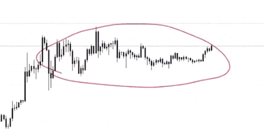
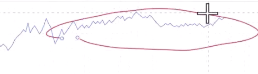
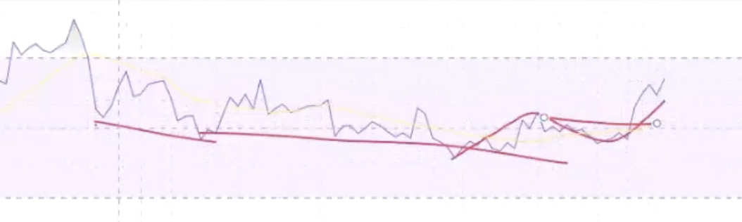
Descending Triangles
Just the opposite — prior downtrend → hitting support → sellers stepping in lower each time.
- Volume confirming the downtrend (lower lows in volume matching lower lows in price)
- Hidden bearish on the rallies within the triangle (lower high on price, higher high on RSI)
- Hidden bearish → convergence on the breakdown
- Change of market structure through support
Darvas Box (Rectangle)
A neutral formation that can be bullish or bearish.
- Look for a change of market structure WITHIN the box before the breakout — don't just trade the breakout alone
- RSI can show hidden bullish at the start / pre-box as extra confirmation
- Look for OBV to support the breakout — if OBV breaks out before price, that's a leading indicator
- If it breaks out and comes back in on low volume = liquidity grab, not genuine breakout
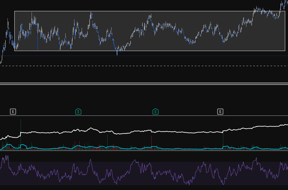
Bull Flag
Strong impulsive move forms the pole, then consolidation usually in the form of a channel.
- Measure Fibs from the first down change of market structure (reversal) to the top change of market structure. An impulse move (zig) is from the end of the last zag to the next zag
- Check if volume did NOT support the move down and DID support the move up
- Compare larger pivot points for hidden bullish divergence
- Flag should NOT retrace past the Fib 382 (maybe 500 max). Definitely not 618 — that's not a flag
- When you find a change of market structure at the end of the bull flag, look for:
- A break through a decline
- Low down volume
- RSI continuation (hidden bullish → convergence)
- Bounce off the 0.382 area
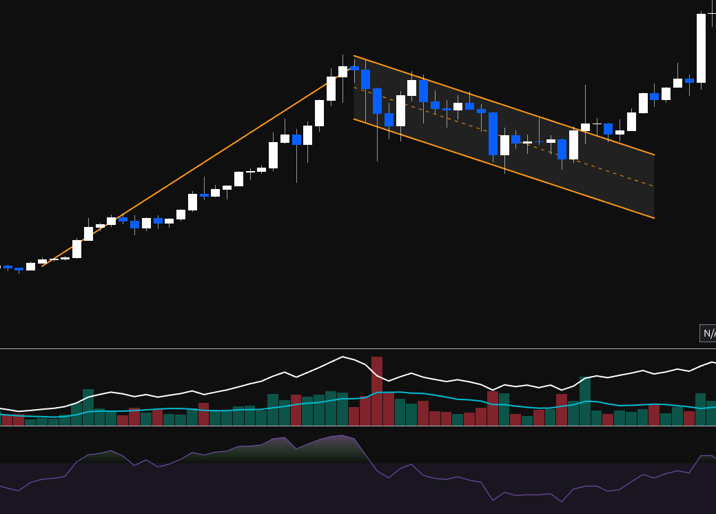
Reversal Patterns + Regular Divergence
Head & Shoulders
This is a bearish reversal pattern (failure swing).
- The left shoulder is formed on increasing positive volume
- Divergence is found from the top of the left shoulder to the top of the head
- The head will form on lowering / flat OBV, signalling weakness in the trend
- The right shoulder will be formed on even lower OBV, showing weakness in the dip buyers (dumb money buying the dip — thank you very much)
- When the neckline is broken, the pattern is confirmed and there should be increasing down volume on the sell-off (even lower OBV)
- The measured move is from the neckline to the top of the head
Inverse H&S warning: An inverse H&S might just be a zag retracement, not a major bottom. Make sure it breaks through the zag zone. If buyers step in at the 382-618 but don't break through, it could just be a corrective bounce.
Fractals: Each wave can top with a mini H&S. Multiple small H&S combine into one large H&S across the full accumulation → public → excess cycle.
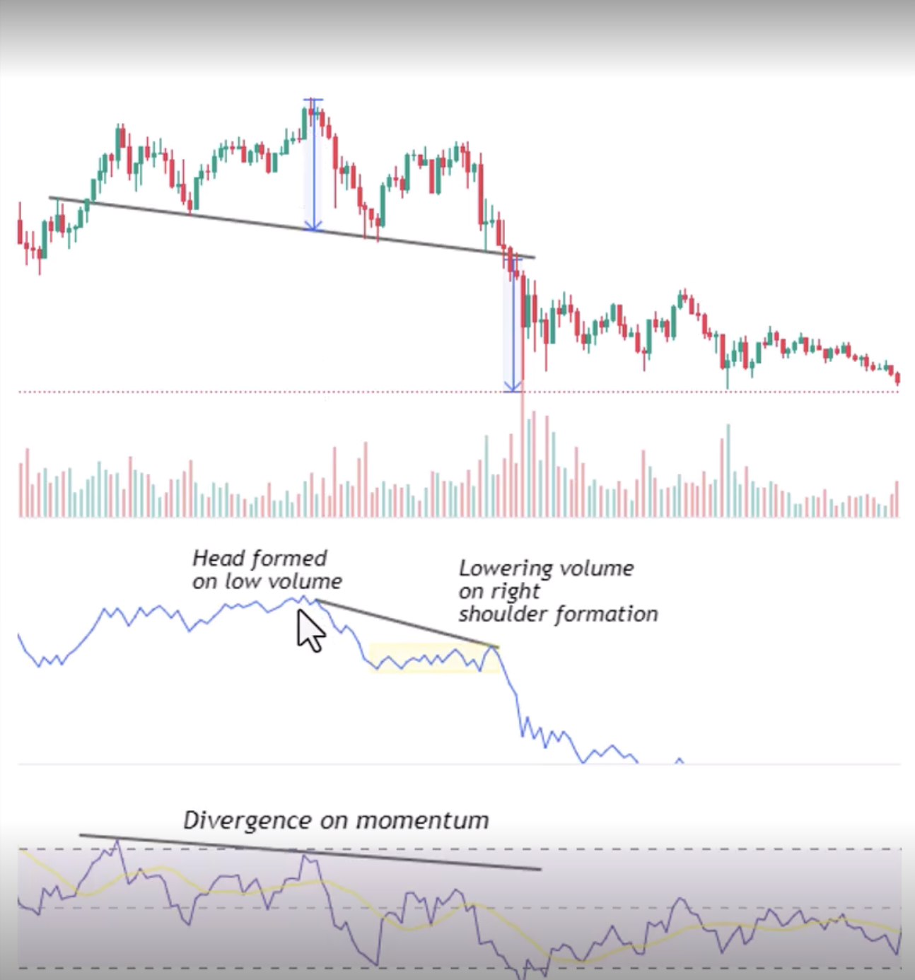
Double Tops / Bottoms
- When price makes an equal high (double top), RSI should be LOWER = bearish divergence (weakening trend)
- Volume: lowering volume on the second top. Volume confirms the zigs down but NOT the rallies back up (opposite of continuation)
- Divergence → convergence as it breaks the neckline
- No hidden divergence — this is a reversal pattern, only regular divergence applies
Falling Wedge (ASX Trader's Favourite)
- If a wedge starts forming into a zag zone, that should be the end of the ABC
- OBV should NOT support the move down and SHOULD support the move up
- Bullish divergence off the bottom of the wedge adds a point of confluency
- Hidden bullish divergence off the low if running into a zag zone (showing the larger uptrend will continue)
- Hidden bearish could be found at the top of the wedge if not at a bottom (within the wedge, showing the downtrend within the wedge is continuing — but this transitions into bullish divergence as the wedge exhausts)
- Two types: retracement wedge (had an uptrend, corrected down into zag zone) and bottom wedge (at the very bottom of a long downtrend, the final move / ending diagonal)
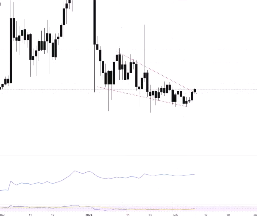
Summary: The Complete Pattern Fusion Framework
For Any Continuation Pattern
- Volume: Confirm the trend direction, don't confirm the corrections
- Hidden divergence: From the pullback pivots showing continuation
- Divergence → convergence on the breakout
- Change of market structure through the pattern boundary
For Any Reversal Pattern
- Volume: Don't confirm the trend direction (weakening), DO confirm the reversal direction
- Regular divergence: Showing the trend is weakening
- Divergence → convergence on the change of market structure
- No hidden divergence — the trend hasn't flipped yet at the pattern formation point
The Practical Takeaway
You're not trading because you see a pattern. You're trading because:
- Market structure confirms it ✓
- Volume profile supports it ✓
- The right type of divergence backs it up ✓
- Divergence has moved into convergence ✓
- You have confluency from multiple independent methods ✓
This is pattern fusion — combining the visual pattern with the underlying data (volume + divergence) to separate the genuine breakouts from the fake ones.
Moving averages, SMA & EMA
Moving Averages, SMA & EMA
Moving averages is a line that smooths out the price and can help gauge the general market direction
Moving averages are best used as a point of confluency and not as a single decision point (does the MA hit a zag zone or point of heavy resistance?)
The 50, 100 & 200 SMA can act as support and resistance
SMA vs EMA
| SMA (Simple Moving Average) | EMA (Exponential Moving Average) |
|---|---|
| Average of the price over the selected time period | Average of the price with more weight on the recent price |
| Best for long-term trends | Best for short-term trends |
| Slower, smoother — eliminates most fake-outs | Faster, more reactive — more prone to fake-outs |
| More lagging | Less lagging |
| Less volatile markets, stocks, swing/position trading | Volatile markets, crypto, day trading/scalping |
Why SMA for long-term? Dow Theory says ignore the noise of smaller timeframes — the primary trend is what matters. SMA's slower response suits that. EMA's faster reaction is better for volatile shorter timeframes where you need quicker signals.
Common lengths: 10, 20, 50, 100, 200 — can be applied to any timeframe.
How to Add in TradingView
Indicators → search "Moving Average Simple" or "Moving Average Exponential" → add. Double-click the line to change length and colour. Pro tip: In settings → Calculation → change timeframe from "Chart" to a fixed timeframe (e.g. "1 Month") so the MA stays consistent when you switch chart timeframes.
MA Strategies
Price Crossovers
When price crosses ABOVE the MA = bullish (like breaking through resistance). When it crosses BELOW = bearish (like breaking support). While above = uptrend. While below = downtrend.
Golden Cross / Death Cross
Not a great single strategy as moving averages are a lagging indicator
- Golden Cross: Buy when the 50 SMA crosses above the 200 SMA — indicates trend shifting up
- Death Cross: Sell when the 50 SMA crosses below the 200 SMA — indicates trend shifting down
Works well in trending markets, terrible in sideways markets. S&P 500 historical data: golden crosses at trend starts (1980, 2013) gave decade-long bull runs. But a golden cross in 2007 bought the top of the GFC. Death crosses on the S&P 500 have actually marked BOTTOMS more often than tops (because by the time the lagging indicator signals, the bear market is already over).
Combine with market structure — a golden cross during a confirmed HH/HL uptrend = confluency. A golden cross during EH/EL sideways = unreliable.
Buying on Hits / Trend Identifier
- In a trending market, the 200 SMA can be used as a buy-the-dip / sell-the-hit opportunity
- When all MAs (20, 50, 100, 200) are pointing in the same direction = strong healthy trend. When they're crossing over each other and going "all over the shop" = correction or sideways market
General MA Information
- Divergence between MA lines can help gauge the strength of a trend and how far "extended" it is — if the 20 is far from the 50, price has probably run too far too fast
- The angle of ascent or descent helps gauge how overextended a move is. Ideally 45° or less for a sustainable trend. Steep angles tend to correct back (mean reversion)
- Big money believe anything below the 200d is bad news and not worth touching, anything above is safe
- Mean reversion: When price gets too far from the MA, it tends to pull back toward it. This is especially visible on monthly charts where the 50 or 100 month MA has acted as a floor for decades on the S&P 500
How ASX Trader Uses Moving Averages
MAs are purely a confluency tool — just another data point, another river meeting the zone where buyers/sellers should step in. Not a standalone strategy.
Example process: Looking at a potential buy zone → check Fib retracement (Fib 500?) → check RSI divergence (bullish?) → check if a key MA is also at that same zone (100 SMA?) → if all three align at the same price area, that's three independent reasons to expect support. Add it to your trade plan checklist as another tick.
On the trade plan: "Also had the 100 SMA at the buy zone" — it's just one more piece of evidence for the judge.
MACD
General info
- Stands for Moving Average Convergence Divergence
- The MACD is a momentum indicator that shows the relationship between two moving averages
- The MACD line is calculated by subtracting the 26-period exponential moving average (EMA) from the 12-period EMA.
- The signal line is a nine-period EMA of the MACD line.
Commonly used to identify the changes in the strength, direction, momentum and direction of a trend
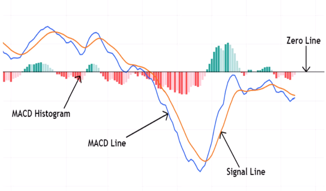
The MACD is made of 3 elements
- MACD line (blue - 12d minue 26d EMA)
- Signal line (orange - 9d EMA)
- Histogram - differences between the MACD & Signal line
Signals
- Bullish when MACD (blue) crosses above signal (orange)
- Bearish when MACD (blue) crosses below signal (orange)
- zero line cross - above bullish, below bearish
Histogram interpretation
- Growing bars - momentum increasing
- Shrinking bars - momentum decreasing
Gaps
Gaps
Why Gaps Occur
- Good/bad earning announcements that differ from market expectations
- News / geopolitical events
- Overall market sentiment shifts
- Order imbalances — big buy/sell orders from institutional traders
- Rumours — company partnering, leaked info, speculation
92% of gaps eventually get filled — so gaps are always good targets. If you know traders target them and they align with other areas of confluency (zag zone, S/R, Fibonacci), they're great profit-taking zones.
Types of Gaps
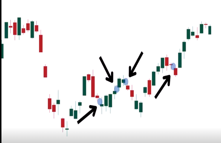
The natural sequence within a trend: Breakaway gap (start of trend) → Runaway gap (middle, public participation) → Exhaustion gap (end, excess phase reversal). Maps directly to accumulation breakout → public participation → excess.
Common Gaps
- Appears in a weak or calm market
- No reason or catalyst for the gap — just minor supply/demand imbalances, market noise, routine technical adjustments
- Often filled quickly — 100% of common gaps get filled
- Low volume — no significant surge in trading activity
- Useful for scalping — if something gaps up for no reason, there's a good chance it fills that day or within a few days. Look for nearby unfilled gaps as profit targets
- Real trade example: Sonic Healthcare gapped up for no reason → educator entered knowing the gap would fill → price came back and filled it same day, also filling a prior gap below. Then the next nearby unfilled gap above became the next target
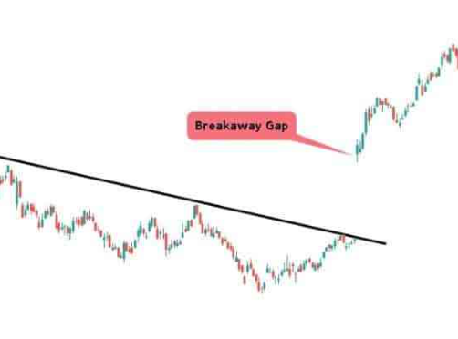
Breakaway Gaps
- Price suddenly breaks through a well-defined structure (support or resistance) in the form of a gap
- Usually confirms a breakout — signals the start of a new trend
- Happen at the end of a consolidation pattern or range and usually mark a new trend beginning
- Larger than common gaps — reflects a strong shift in market sentiment
- Usually followed with a significant increase in volume — confirms breakout strength
- Do NOT fill quickly — represents a decisive market move, price generally continues in the gap direction
- Stop loss: Below the gap for upward breaks, above the gap for downward breaks. The gap itself acts as S/R
- Usually caused by:
- Earnings reports (exceed or fail to meet expectations)
- News announcements (mergers, acquisitions, regulatory changes)
- Market sentiment shifts
- Technical breakouts (breaking key S/R where stop losses are clustered)
- A2 Milk example: Had THREE breakaway gaps in succession — each one gapped below a major support level on high volume. Earnings downgrade after earnings downgrade, each time breaking the next support. The high volume on each confirmed institutional money exiting
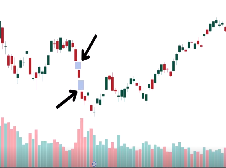
Runaway Gaps (Continuation / Measuring Gaps)
- Appears when the market is gaining or falling quickly — in the middle of an established trend
- Signals dominant buyers or sellers — high probability of continuation
- Usually NOT filled (until the trend eventually ends and the major correction begins)
- Followed with moderate to high volume — confirms trend strength
- Usually in the public participation phase — where the public starts getting involved and everyone piles on
- Measuring tool: The distance from the trend start to the runaway gap can be projected forward to estimate the potential remaining length of the trend (similar to a bull flag measured move)
- If you see a runaway gap, don't take profit at the next resistance — the trend still has momentum and should continue. It's telling you NOT to exit yet
- How to distinguish from exhaustion: Runaway gaps happen in the MIDDLE of the trend. If you're getting gaps at the PEAK after a long overextended run = exhaustion, not runaway
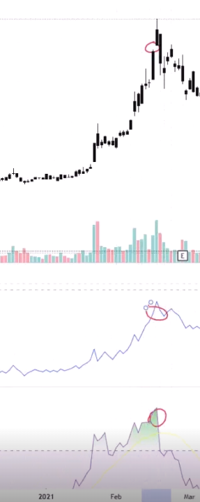
Exhaustion Gaps
If you gap and then pivot within a few days, it's most likely an exhaustion gap
- Occur near the end of an existing trend, after a prolonged price movement — the trend is reaching its climax
- Usually accompanied by a spike in volume — the final rush of buying/selling (capitulation or complete greed) before the trend reverses. This volume often includes retail traders, indicating the end of institutional interest
- Exhaustion gaps are likely to be filled quickly as the market corrects and reverses
- Signal a high probability of a trend reversal
- Can be used to enter a trade in the opposite direction — exhaustion gap at the bottom might be a good time to enter long
- Everything usually looks very overbought (RSI above 80) or the gap happens into bearish divergence
- How to confirm it's exhaustion:
- RSI very overbought when the gap occurs
- OBV/volume showing institutional money NOT confirming the move (lowering OBV = retailers driving it, not big money)
- Pivot within a few days (doji → bearish engulfing after the gap = classic exhaustion confirmation)
- Already at the excess phase of the trend
- Zip example: Breakaway gap (start) → Runaway gap (middle) → Exhaustion gap (end). RSI very overbought when the exhaustion gap occurred, followed immediately by a doji and bearish engulfing = confirmed exhaustion. Same pattern on NVX and LKE
Professional Gaps (Institutional Gaps)
- Caused by actions of institutions, usually from:
- Earnings reports
- Portfolio rebalancing based on macro trends
- Insider/privileged information or proprietary analysis
- Show sentiment and strategic decisions of institutional players
- Can remain unfilled for a long time if they reflect long-term institutional positioning — especially mining discoveries
- Usually after major announcements — e.g. PointsBet expanding to America, mining companies announcing discoveries
- These signal the very beginning of a new trend — institutional money flowing in
- In Australia, most common with miners making discoveries — institutions unpack the report, like what they see, and start buying. Sometimes takes days as they read more and keep buying
- PDN example: Went from $0.006 to $0.019 in one gap (tripled), then 10x within two days as institutions kept reading the report and buying. Eventually went to $0.30+ — nearly 100x. That gap never filled because it was a genuine major discovery
- 3DP example: Institutional money came in at $0.05, gapped up to $0.08, eventually went to ~$1
Fair Value Gaps (FVGs)
- A place where price has moved too quickly creating a void — most popular in crypto due to 24/7 trading (no normal gaps from market close/open)
- Not an actual gap on the chart — it's the difference between the top of one candle and the bottom of the candle two periods later, with a big candle in between. The "hidden gap" in the body of that middle candle
- Very popular in SMC (Smart Money Concepts) — all about imbalances and liquidity
- Usually filled quickly due to market seeking to correct the imbalance
- Volume: low volume gaps may fill quicker than high volume gaps
- Confluency power: If an FVG aligns with a golden pocket zone (382-618 Fibonacci), that's two independent reasons to expect a retracement to that area. Use FVGs as profit-taking targets when they align with your zag zone
- Crypto & Forex most-filled timeframes:
- 1 hour
- 15 min
- 5 min
- 3 min
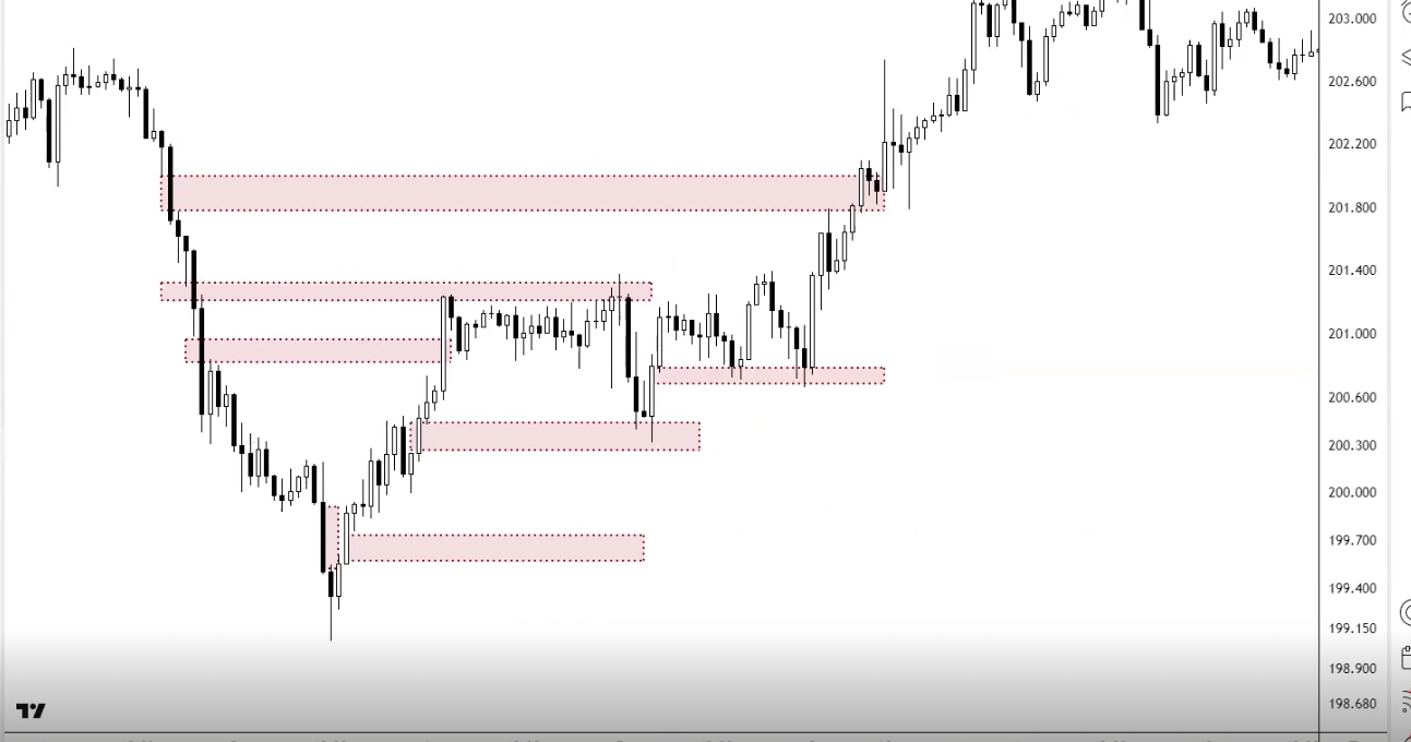
Using Gaps for Confluency
Gaps are another tool for your confluency checklist — another river meeting the zone:
- As targets: If there's an unfilled gap that aligns with your Fibonacci zag zone (382-618) and/or a horizontal S/R level = high-probability take-profit zone. "Profit taking is your zag zone. If you can combine that zag zone with an FVG or a gap, it's giving you more confluency to take your profit there"
- As entries: If a gap fill brings price down to a zone where you also have support, Fib level, and bullish divergence = entry confluency
- For trend identification: Breakaway gaps confirm breakouts. Runaway gaps confirm trend strength (don't exit yet). Exhaustion gaps warn of reversal (start looking to exit)
- Scalping with common gaps: If something gaps for no reason, look for nearby unfilled gaps as quick profit targets — they tend to fill within hours or days
Market Breadth
Overview
- Find potential highs or lows in the general market
- Divergence is a key way to spot market turns early and act as an early warning sign
Another simple way to check market breadth is checking sectors or large - mid - small caps (like btc against others)
AD line
- A line that is calculated by taking the difference between the number of advancing
- Can be used as a point of divergence, AD line may not have made a new high but price may have, signalling potential weakness
- Can be used like regular bearish / bullish divergence
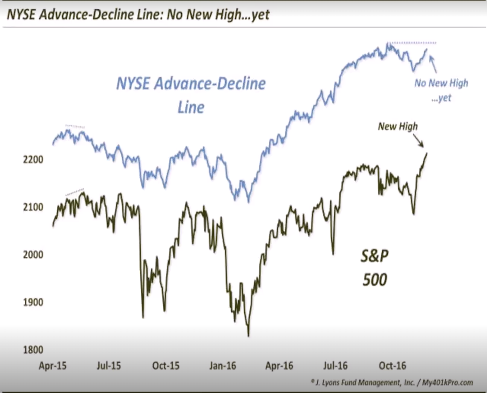
Above / Below EMA Oscilator (ABO)
The ABO indicator is great to see if there is another point of divergence
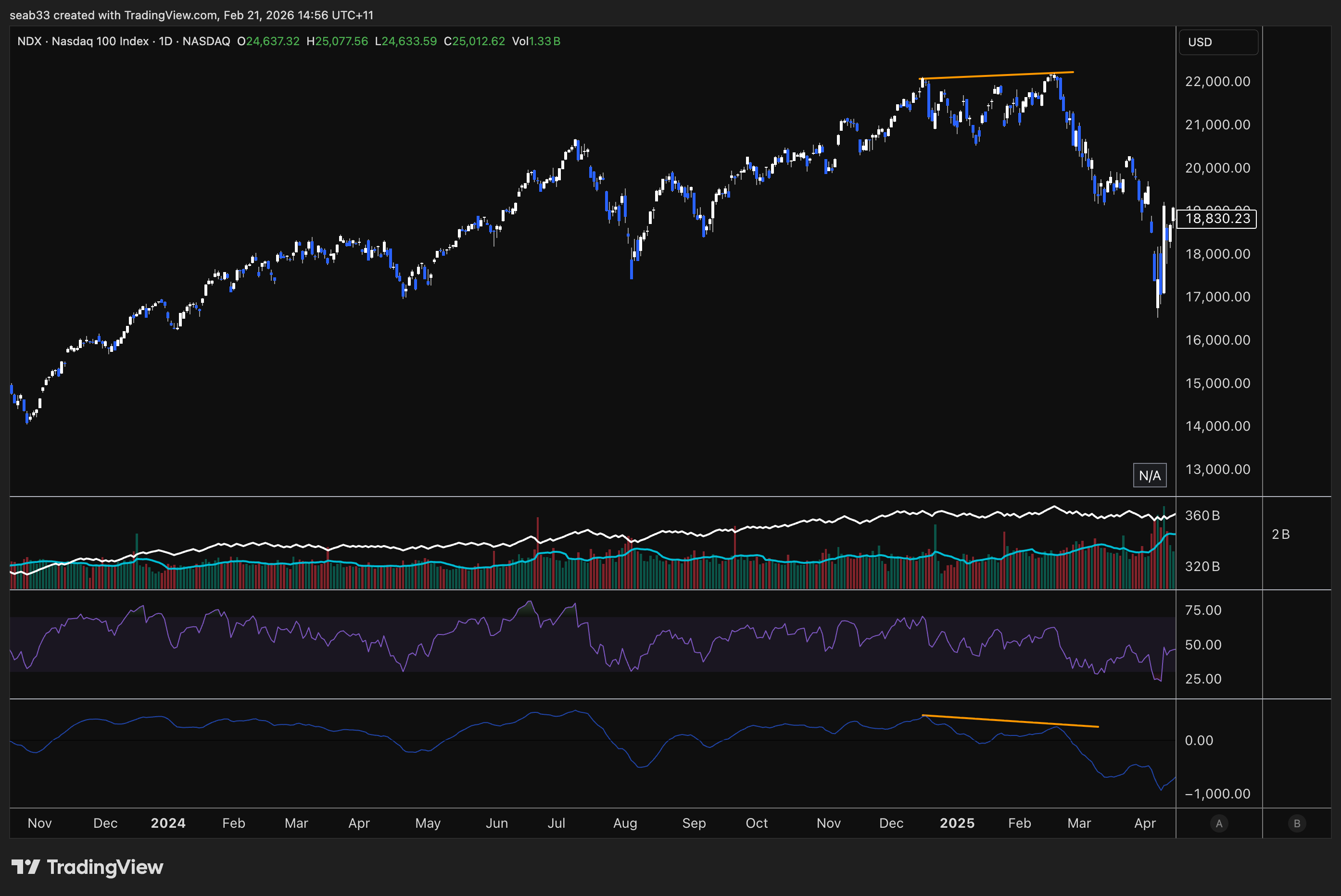
Sentiment analysis
Why Is Sentiment Important?
Sentiment reflects the collective emotions of market participants which can significantly influence market behaviour and price movements. Positive sentiment can drive buying pressure and negative sentiment can push price down. By analysing sentiment, traders and investors can predict potential market turning points, identify overbought and oversold conditions.
Understanding the behaviour of RETAIL investors and their tendency to crowd to one side of the market provides valuable insights. When retail sentiment reaches extremes and you anticipate potential market reversals, traders can PREPARE more effectively (tighten a stop loss, hedging).
Historical examples like the dot-com bubble, the 2008 financial crisis, and the cryptocurrency booms and busts highlight the impact of sentiment on market trends.
Being on One Side of the Boat
When a majority of retail is bullish or bearish, the market often likes to move in the opposite direction. When everyone is bullish, most of the buying pressure has already been used up. When everyone is bearish, most people have already sold or are down so bad they are ready to capitulate.
Smart money use these extremes as signals to take the opposite position. With most investors already committed, there are fewer new entrants to continue driving the trend, leading to a reversal.
Volatility Indexes (VIX)
The VIX (Volatility Index) reflects market sentiment. It is based on the S&P500 options market over the next 30 days. Expressed as an annualised percentage. Low VIX = low volatility expected (complacency). High VIX = high volatility expected (fear).
When the VIX peaks, this has often marked the bottom of the S&P500
| Ticker | Measures Volatility Of |
|---|---|
| VIX | S&P500 30d options implied volatility |
| XVI | AU200 30d options implied volatility |
| BVIV | BTC 30d options implied volatility |
VIX Key Levels & Historical Examples
- Below ~18: Bullish environment, everyone feeling comfortable
- Above ~30: Fear starting to come in
- Above ~45-50: Extreme fear / capitulation
S&P 500 VIX extremes:
- Oct 2008 (GFC bottom) — extreme VIX spike marked near the bottom (not exact, rolled slightly further before the actual bottom, but very close to capitulation)
- 23 March 2020 (COVID bottom) — VIX hit its high, marked the exact bottom
- Every other significant VIX spike (May 2010, Aug 2011, Aug 2015, late 2018, 2022) — each one marked at least a local bottom
VIX breakout pattern: Down, down, down, down → breakout above a declining trendline = volatility incoming. Look for breaks above declining resistance on the VIX as a warning of a correction ahead.
Australian XVI: Same concept. Single digits = very complacent (always ends in a spike). Above 20 = fear.
BTC BVIV: Above 75-100 = extreme greed (marked November 2021 top). Below 40-50 = fear (marked January 2023 bottom, August 2023 bottom).
Sentiment Surveys
AAII Sentiment Survey
Survey of individual investors measuring bullish/bearish/neutral expectations for the next 6 months (not current sentiment — where they believe the market will be).
- High 40s-50%+ bullish = often marks a market peak. Time to be careful
- High 40s-50%+ bearish = often marks a market bottom. Potential buying opportunity
- Find it: Google "AAII sentiment" → first result
NAAIM Exposure Index
Represents the average exposure to US equities reported by active investment managers (professional money managers, not retail).
- Shows how much institutional money is actually in the market
- Look for convergence: When NAAIM exposure matches price direction = healthy. When price goes up but NAAIM exposure drops = divergence (big money reducing exposure into the rally)
- Big money isn't always right, but it's worth knowing when they're reducing while retail is buying
- Find it: Google "NAAIM exposure index"
Smart Money vs Dumb Money Confidence
Compares institutional investor behaviour ("smart money") with retail investor behaviour ("dumb money").
- When smart money is bullish and dumb money is bearish = potential buying opportunity
- When smart money is bearish and dumb money is bullish = potential selling signal
- Look for divergence between the two lines — when they diverge, something is about to change
- Retailers are emotionally driven, institutions are data driven
Consumer Confidence Index (CCI)
The Consumer Confidence Index measures how optimistic or pessimistic consumers are regarding their expected financial situation and the overall economy. Based on surveys of a representative sample of consumers, used to predict consumer spending.
- Above 100 = consumers confident, more inclined to spend
- Below 100 = pessimistic, tendency to save more and consume less
- Extreme highs (tech bubble 2000, pre-GFC) often preceded recessions
- Extreme lows often aligned with market bottoms
- Find it: Google "consumer confidence index CCI"
Fear & Greed Index
Two versions — CNN for stocks, Alternative.me for crypto.
- Stock market: Uses market momentum, stock price breadth, put-call options, market volatility, safe haven demand, junk bond demand
- Crypto: Uses volatility, market momentum, social media, surveys, dominance, trends
Key Levels (Crypto)
- Above 90: Extreme greed / euphoria — often marks a local or major top
- Below 10: Extreme fear — often marks a local or major bottom
- Top 10% or bottom 10% = contrarian territory
Find it: Google "fear and greed index" — CNN (stocks) and Alternative.me (crypto) are the top two results.
Put-Call Ratio & Options
Put-Call Ratio
Compares the volume of put options (bearish bets) to call options (bullish bets).
- Greater than 1 (more puts than calls) = bearish sentiment
- Less than 1 (more calls than puts) = bullish sentiment
- Around 1 = neutral/balanced
- Contrarian indicator: Extremely high ratio = market overly bearish, could rebound. Extremely low = overly bullish, could pull back
Max Pain Theory
Max Pain is the price at which the largest number of option contracts expire worthless — causing maximum losses for option holders and minimum payouts for option sellers (Wall Street).
- The theory suggests price gravitates toward the Max Pain strike price at expiration
- Market makers may influence price toward Max Pain to maximise their profits (minimise payouts)
- It's always retailers vs Wall Street — Wall Street drives price to where they don't have to pay out billions
- Find it: Google "options max pain swaggy stocks"
Triple Witching
Simultaneous expiration of stock options, stock index futures, and stock index options. Occurs four times a year on the 3rd Friday of March, June, September, and December.
- Leads to increased volatility and trading volume
- Index funds and institutional investors rebalance portfolios
- Most major market tops and bottoms happen around these dates:
- Tech bubble bottom: October (just after September witching)
- Tech bubble top: March
- GFC top: September/October
- GFC bottom: March 2009
- COVID bottom: March 2020
- 2022 bear market top: December/January period
Always be careful for major turning points around end of March, June, September, December. After expiration, people place new bets for the next quarter — these quarterlies are often inflection points.
Advanced: Sentiment Divergence
Just like price vs RSI divergence, you can get divergence between price and sentiment indicators. When sentiment and price aren't matching, something is about to change.
Bullish Sentiment Divergence
Price makes a higher low but sentiment makes a new low (more fearful than before). If prices are holding up but people are MORE scared than last time → the bearish sentiment is overextended → potential reversal upward.
Bitcoin example: June 2022 low had extreme fear (below 10 on Fear & Greed). When Bitcoin made a new low in November, Fear & Greed only dropped to ~20 — a higher low in sentiment. Why weren't we as fearful on a new price low? → Divergence → marked the actual bottom.
S&P 500 example (March 2023 banking crisis): Silicon Valley Bank collapse, extreme fear sentiment. But price printed a higher low compared to the October 2022 low. News was terrible (extreme fear), but the chart wasn't confirming it with new lows → divergence between FA/news and TA → continuation upward.
Bearish Sentiment Divergence
Price makes a new high but sentiment makes a lower high (less greedy than before). Why isn't there euphoria if we're at new highs? → The bullish sentiment is fading → potential reversal downward.
The Rule
If the news is really bad, the charts should be making new lows. If they're not → divergence. If the news is really good, the charts should be making new highs. If they're not → divergence. When FA/news says one thing but TA says another, trust the TA and look for the divergence to resolve.
This applies to individual stocks too — if terrible news comes out but the stock makes a higher low, that's bullish divergence between fundamentals and technicals.
Fibonacci extensions
Purpose: To set price targets & support/resistance levels. While Fib retracements measure where price might retrace to, extensions project where price might extend to.
Fib extension levels expressed as ratios:
- 1.0 ← Important (typical C wave extension)
- 1.272
- 1.618 ← Important (strongest magnet)
- 2.0
- 2.618 ← Important
- 3.618
- 4.236
- 4.618
Just because price hits an extension level doesn't mean you automatically sell, but it can be a stronger sell signal if you see weakness approaching or hitting the zone.
If it's a weak move (corrective wave), the C wave usually only hits 1.0 or 1.618. In a parabolic trend, switching to log scale is highly recommended.
How to Draw Extensions
Three clicks: Swing low → swing high → next swing low (for projecting upside). You're selecting from the start to the end of the correction — not just swing high to low to high.
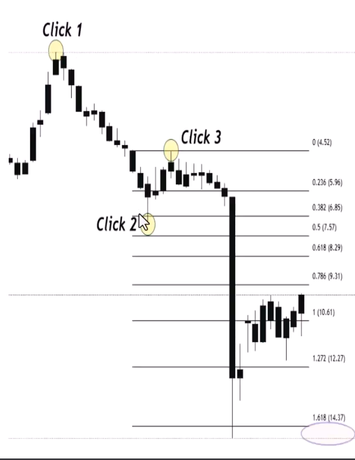
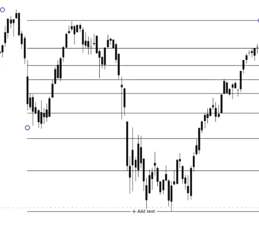
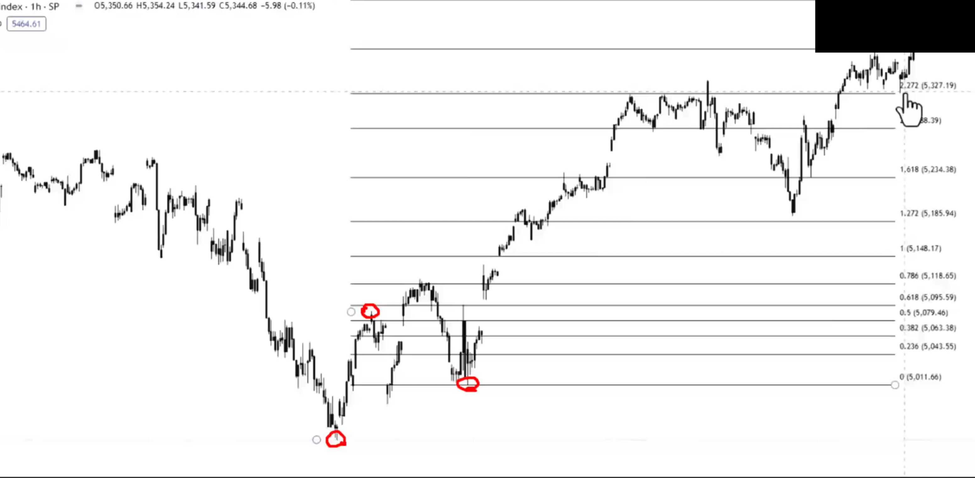
How Markets Move — Retracements + Extensions Together
The full cycle of using Fibonacci in a trending market:
Wave 1 (Accumulation breakout): First push up. Once it finalises, expect a deep retracement — typically down to the 618 or even 786 zone. Why deep? Nobody knows it's wave 1 yet — sentiment is still bearish, they think it's just a continuation of the downtrend.
Wave 2 (Deep zag): Comes down to the 618 zone. Once it bounces and takes out the wave 1 high, you can draw your trend-based Fib extension (bottom → top → pullback low) to project the next target. The 1.618 is the most common target for the next leg.
Wave 3 (Public participation): Extends up to the 1.618 target zone. Then you get another retracement — but this time it's typically shallower (382 or Fib 500) because the trend is now established and stronger. If wave 2 was deep, wave 4 is usually shallow (and vice versa).
Wave 4 (Shallow zag): Comes down to the 382 zone. Once it bounces and takes out the wave 3 high, draw another extension to project wave 5's target.
Wave 5 (Excess): Extends to the target, then you get the big correction of the whole move.
The Critical "Past the Zag Zone" Signal
If price comes down to the zag zone (382-618) and bounces = healthy, all good. But if it then rolls over, changes market structure, and breaks through the resistance-turned-support:
- You're NOT just retracing the last move — you're retracing ALL of it
- Get out the Fib retracement from the ENTIRE move (bottom of wave 1 to top of wave 5)
- Look for support in the 382-618 of the whole move
- Once buyers step in there + change of market structure + break back above the decline = re-entry
"The minute we go past the zag zone and resistance didn't become support, I know I'm not just retracing from here — I'm retracing all of it."
The Repeating Process
- Retracement to find buy zones (where will the zag end?)
- Extension to find targets (where will the next zig reach?)
- Check Fib strength (236 = very strong, 382 = strong, 500 = normal, 618 = weak)
- Repeat at each new zig-zag
- When the zag goes too deep (past the zag zone) → switch to retracing the whole move instead of just the last leg
70-80% of the time, buyers step in at the zag zone. The probabilities are in your favour. When they don't, the probabilities shift — and that's when you don't want to be trading it. Always trade probabilities — stack the chips, become the casino.
2.10 - Fibonacci clusters & extension channels
Advanced Fibonacci Clusters
In Term 1, you learned clusters from multiple retracements on different timeframes overlapping. Now you're combining retracements AND extensions at the same zone — the ultimate cluster.
What Are Advanced Clusters?
When a Fib retracement level (e.g. 382 from the whole move) aligns with a Fib extension level (e.g. 1.618 from the last ABC correction) at the same price area = extremely high-probability support or resistance zone.
You're getting two completely independent Fibonacci calculations pointing to the same price. That's not coincidence — that's the market telling you something.
Steps to Identify
- Identify the trend — determine the significant high and low points
- Draw Fib retracement from the start of the whole move to the end — mark the 382, 500, 618 zones
- Draw Fib extension from the last ABC correction (top → bottom → retracement high) — mark the 1.0, 1.618, 2.618 levels
- Find the clusters — look for where retracement and extension levels converge at the same price area
Ethereum Example — Calling the Bear Market Bottom
The educator demonstrated this on Ethereum's bear market:
- Price changed market structure bearish. Drew Fib retracement from the whole uptrend → identified the 382, 500, 618 as the zag zone for the entire move
- Price bounced off the zag zone of the last leg but then broke through → not just retracing the last move, retracing ALL of it. Switched to the full-move retracement
- Drew Fib extension from the ABC pattern (top → bottom → B wave retracement) → the 1.618 extension landed at the exact same price as the 382 retracement
- That became the high-conviction zone — the Fib cluster of 1.618 extension + 382 retracement
The bottom of Ethereum's bear market landed exactly on that cluster zone. Two independent Fibonacci calculations both pointing to the same price = the ultimate confluency.
Don't Just Put a Buy Order There
Even with a perfect cluster zone, you still need:
- Weakness signals coming into the zone (lowering volume, RSI divergence)
- Change of market structure off the zone (the car actually turning the corner)
- Blinkers on + trigger confirmed at the projected target
The cluster tells you WHERE it should turn. The indicators tell you it's WEAKENING into that zone. The market structure tells you it HAS turned. All three together = "you should be shocked when the trade doesn't go your way."
Fibonacci Extensions with Channels
Combining Fib extension targets with trend channel boundaries gives you precision take-profit zones.
How It Works
Channels = trendline + parallel line creating a range where prices oscillate. Fib extensions = projected price targets beyond a retracement. When the top (or bottom) of a channel aligns with a Fib extension level = high-probability rejection/take-profit zone.
Steps
- Identify the trend and draw your channel (connect higher lows for uptrend, draw parallel to form the channel)
- Draw Fib extension from the same trend (bottom → top → pullback)
- Look for convergence — where does a Fib extension level intersect with the upper or lower channel boundary?
- That intersection = your take-profit target
Uptrend Example
Channel drawn from higher lows with parallel at the highs. Fib extension from bottom → top → pullback showed the 1.0 level aligned with the top of the channel. That's where you'd look for rejection and take profit. Two independent methods (geometric channel + Fibonacci mathematics) both pointing to the same price.
Another Uptrend Example
Channel + Fib extension showed the 1.618 aligned with the top of the channel. Price hit the 1.618, rejected at the channel resistance, then fell out of the channel + changed market structure. Three confirmations to exit:
- Hit the Fib 1.618 target ✓
- Rejected at channel resistance ✓
- Changed market structure + fell out of channel ✓
"Nail in the coffin — hit all our zones, channel resistance, Fib 1.618, change of market structure. See you later."
Downtrend Example
Works identically in reverse. Channel drawn from lower highs, Fib extension projected downward. The 1.618 aligned with channel support = zone where you'd look to exit shorts or look for a reversal. When price hit the 1.618, bounced off channel support, and then changed market structure back out of the channel = trend over, look for a new direction.
Key Points
- Extension + channel targets are zones, not exact prices — sometimes a little short, sometimes a little long
- The actual confirmation/trigger is when price falls out of (or breaks above) the channel after hitting the Fib target
- These tools give you the WHERE (target zone). Market structure gives you the WHEN (trigger)
- Can be combined with clusters for triple confluency: Fib retracement + Fib extension + channel boundary all at the same price
Term 2 master class
The Course Architecture — What's Non-Negotiable vs Complementary
Term 1 Weeks 1-6: THE NON-NEGOTIABLES
Everything in the first six weeks is the foundation. If you're not doing ALL of these on every trade, you're missing a beat:
- Pivot points → market structure identification (Week 1)
- Support & resistance zones (Week 2)
- Failure swings & non-failure swings → confirmed reversals and entries (Week 3)
- Volume & OBV → supporting the move, effort vs result (Week 4)
- RSI divergence → early warning signals (blinkers) before triggers (Week 5)
- Fibonacci retracements → zag zones, trend strength, targets (Week 6)
Term 1 Weeks 7-9: COMPLEMENTARY TOOLS
These add confluency but aren't essential for a trade to exist:
- Candlestick patterns, chart patterns (Week 7)
- Index confirmation, multi-chart confluency (Week 8)
- Market psychology, sentiment, contrarian investing (Week 9)
Term 1 Week 10: RISK MANAGEMENT
Not about your entry — it's about how small your stop loss is. A later entry with a better R:R can be more profitable than an earlier entry with a wider stop.
Term 2: ADVANCED REFINEMENT
All of Term 2 builds on the non-negotiables:
- Three types of divergence — regular (reversal signal), hidden (continuation signal), directionally aligned (same direction, different rates = early warning). Complex divergence is where regular and hidden battle each other
- Multi-timeframe divergence — hidden bullish on the higher timeframe (continuation) + regular bullish on the lower timeframe (reversal entry) = precise entry for a big move
- Pattern recognition + divergence fusion — hidden divergence for continuation patterns, regular divergence for reversal patterns. Volume rules are OPPOSITE for each
- Moving averages — SMA for long-term, EMA for short-term. Used as confluency, not standalone
- Gaps — common (always fill), breakaway (new trend), runaway (continuation), exhaustion (reversal), professional (institutional), fair value (crypto imbalances)
- Market breadth — looking under the hood to see if stocks are actually participating in the index move
- Sentiment analysis — VIX, AAII, Fear & Greed, put-call ratio. Contrarian at extremes
- Fibonacci extensions & clusters — projecting targets, combining retracements + extensions for ultimate cluster zones
- Fibonacci extension channels — combining Fib targets with channel boundaries for precision take-profit
Log vs Linear — When to Use Each
Linear (default, first port of call):
- $10 move here = same size as $10 move there (dollar-based)
- Better for identifying accumulation/public/excess phases visually (accumulation looks flatter and longer, which is what you expect)
- Use for most standard analysis
Logarithmic (for long timeframes and large price ranges):
- 10% move here = same size as 10% move there (percentage-based)
- Much easier to see waves and chart detail when prices range from $3 to $50+
- Essential for crypto, uranium, lithium — anything with hundreds or thousands of percent moves
- Makes the detail of smaller early moves visible instead of being squashed at the bottom
Fibonacci in Log vs Linear — BOTH Are Valid
This was a key insight from the masterclass. When applying Fib retracements:
- Linear Fib 618 creates a resistance zone in dollar terms
- Log Fib 618 creates a resistance zone in percentage terms
- Both work as resistance — and they're at DIFFERENT price levels
Silver example: In linear, the 618 retracement created a major resistance cluster at one level. In log, the 618 created resistance at a different level (the percentage-based retracement). Both levels acted as genuine resistance on the chart. So drawing Fibs in both modes gives you TWO valid zones to watch.
Pro tip: To apply Fib in log scale in TradingView, open the Fib tool settings and check "log scale."
When to Switch
- Start in linear to identify phases and get the big picture
- Switch to log when dealing with very long timeframes, very large price ranges, or parabolic moves
- In log, a retracement that looks like 78.6% in linear might only be 50% in percentage terms — this changes your analysis of trend strength
Phase Analysis — Equities vs Commodities
In equities (tech, financials): The public participation phase is typically the largest. Excess phase is usually smaller.
In commodities (silver, gold, uranium): The excess phase is often the biggest — bigger than public participation. Commodities tend to have blow-off tops.
The alternation rule: If public participation is very extended (long duration), don't expect excess to also be very extended. One will be extended, the other normal. You rarely get both dramatically extended.
Wave 2 Deep / Wave 4 Shallow
- Wave 2 retracements are notoriously deep — 618, sometimes 786. Why? Nobody knows it's wave 1 yet. Sentiment is still bearish from the prior downtrend. Everyone thinks it's just a continuation of the bear market
- Wave 4 retracements tend to be shallower — 382 or Fib 500. The trend is now established and people are bullish, so they buy the dip earlier
This alternation is important for setting expectations and targets. If wave 2 was deep (618+), expect wave 4 to be shallow (382). If wave 2 was shallow (unusual), expect wave 4 to be deeper.
Channels as Confluency
Channels (trend lines + parallel lines) provide confluence with other tools:
- Maximise touches when drawing channels — the more times price respects the channel boundary, the more valid it is
- Channels don't beat S/R zones — a horizontal support/resistance zone with many touches is still the strongest level. Channels complement S/R, they don't replace it
- When a channel boundary aligns with a Fib level AND a horizontal S/R zone = triple confluency
- Break of channel + change of market structure + hit Fib target = the trend is over. The "nail in the coffin"
Three Channel Types (Preview for Elliott Wave)
- Base channel — drawn from the start
- Trend channel — drawn during the trend
- Final channel — drawn at the end
These will be covered in depth during Term 3.
The 50% Profit-Taking Strategy
When your trade hits the target zone:
- Take 50% off the table — lock in profit, remove risk
- Let the other 50% run — trail your stop loss and see where it goes
- If it continues beyond the target = bonus gains with zero risk (you've already banked profit)
- If it reverses = you've already taken half your profit and the trailing stop catches the rest
This removes the psychological battle of "should I sell all or hold all" — the answer is "both."
Preparing for Term 3: Elliott Wave
Everything from Term 1 and Term 2 translates directly:
| What You Know | What It Becomes in Elliott Wave |
|---|---|
| Accumulation | Wave 1 |
| First zag (deep) | Wave 2 |
| Public participation | Wave 3 |
| Second zag (shallow) | Wave 4 |
| Excess phase | Wave 5 |
| Correction (2 steps back) | ABC correction |
The internal counts work the same way — within wave 3, there's its own 1-2-3-4-5. Within that sub-wave 3, there's another 1-2-3-4-5. Fractals all the way down.
Corrections are where Elliott Wave gets really challenging — there are many different types. The course spends 4-5 weeks just on corrections because that's the hardest part.
The key thing you must feel comfortable with before starting Term 3: Accumulation → public participation → excess. If you can confidently identify the three phases, the numbering is just labelling what you already know.
Elliott Wave - General
General
When an initial pump then dump happens, how do you know if its a 1-2 or A-B?
- You must prepare by thinking the first impluse could be a 1 OR A, 2 OR B, and 3 OR C.
- A C has a much lower target then a 3 (use fib extensions)
- You either get a motive or corrective wave.
- Motive takes you in the primary wave of the overall movement
- Corrective takes you away from the primary trend.
Wave 1
Wave 2
- On the wave 2 retracement, you usually target the 0.5 to 0.786 due to it being a deeper pullback and people are still in denial / fear that the pull back is a fake out
Wave 3
- Minimum target using fib extensions is hitting or passing 1.618
- A wave 3 should breakout cleanly from a channel while a wave C usually stays within or may jump out and back in
Wave 4
Wave 5
Wave A
Wave B
Wave C
- Minimum target for a C wave is 0.618 with an ideal target between 1 and 1.236. If it extends past the 1.236, then it's most likely a wave 3
- Usual extension of a C wave is 0.618 and 1.236
EW notes
if the wave 1 is very powerful, it's likely the next waves won't be as big
- wave 3 cant be the smallest, therefore wave 5 would have to be very small
EG SOL
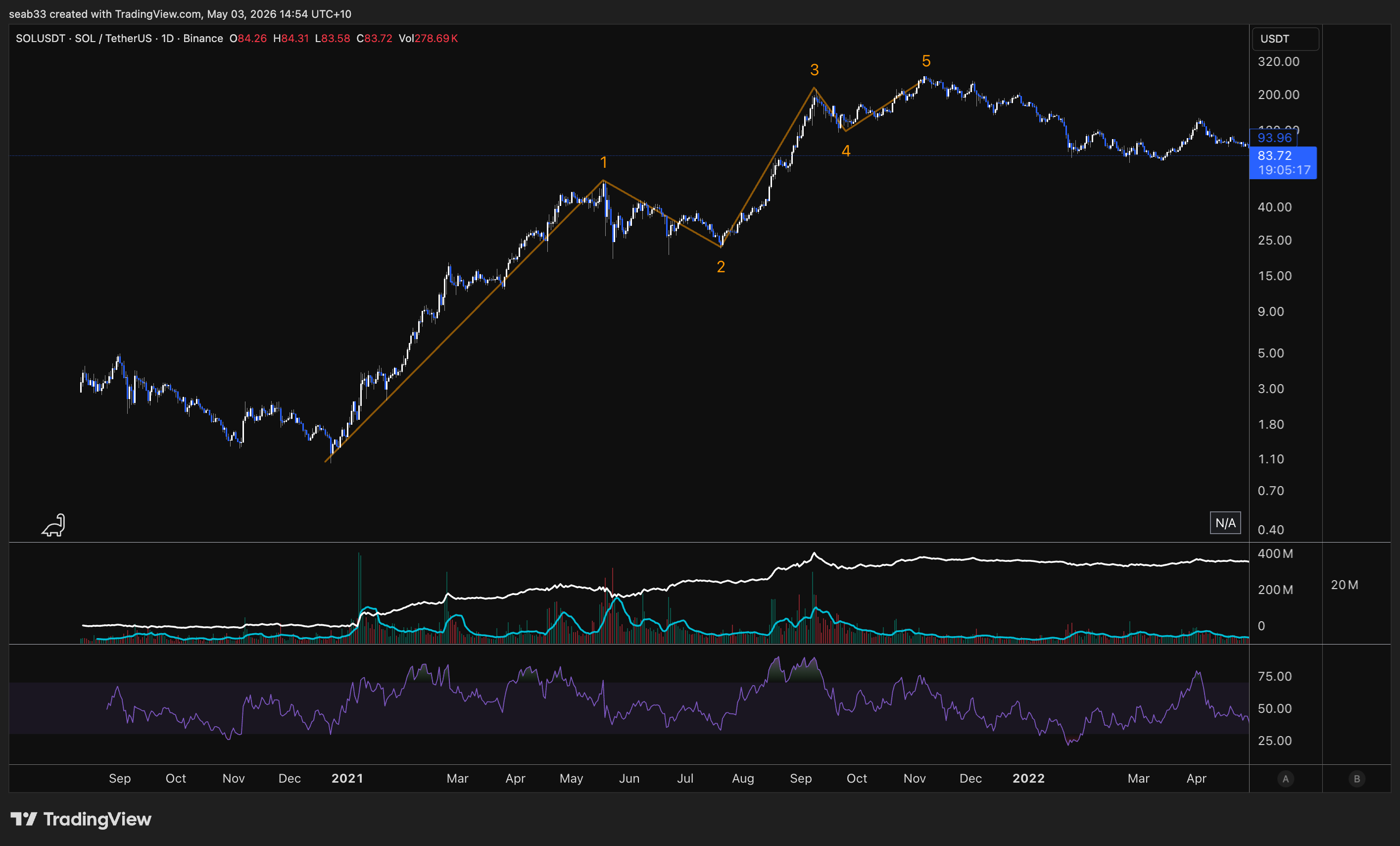
wave 2 is usually very deep because the bag holders who bought at the top of wave 5 are looking for any opportunity to get out so they sell thinking the wave 2 is about to make a new lower low
Elliott Wave — Impulse Waves
Predictive vs Reactive TA
Everything learned previously (market structure, S/R, divergence, volume, Fibonacci) is reactive TA — adapting to real-time market conditions. Elliott Wave is predictive — identifying recurring patterns and forecasting future price movements based on crowd psychology.
Think of it like a military general: reactive TA is adapting to real-time changes in battle. Elliott Wave is studying the enemy's past behaviour to predict their next moves BEFORE the battle. The best Elliotticians combine both — they use Elliott Wave for the prediction and reactive TA (divergence, volume, S/R, market structure) for the confirmation.
Critics mock Elliotticians for adjusting wave counts. That's actually the point — you have a predicted roadmap, and when the market deviates, you adjust. The wave count tells you when you're wrong and how wrong. Having rules means you know exactly when your analysis is invalidated.
History — Ralph Nelson Elliott
Developed in the 1930s by Ralph Nelson Elliott, an accountant who observed that markets trade in repetitive cycles driven by crowd psychology. He proposed that prices unfold in specific patterns: a five-wave motive phase in the trend direction, followed by a three-wave corrective phase against it. This eight-wave cycle repeats at every scale — fractals.
Being a Certified Elliott Wave Analyst (CEWA) or Master Certified (CEWA-M) is one of the most respected credentials in technical analysis.
The Complete Cycle
One complete cycle = 8 waves:
- Motive phase (5 waves): Labelled with NUMBERS (1, 2, 3, 4, 5) — moves in the direction of the trend
- Corrective phase (3 waves): Labelled with LETTERS (A, B, C) — moves against the trend
Quick identifier: Numbers = motive (with the trend). Letters = corrective (against the trend).
The motive phase contains three types: impulse waves (most common, covered here), extended waves (covered next), and diagonal waves (covered after that).
The Five Impulse Waves
Wave 1 — The Initial Move (Accumulation)
- Marks the beginning of a new trend, often after the previous trend has exhausted
- Rarely obvious at inception — sentiment is still bearish from the prior downtrend
- Lower investor confidence, market hasn't fully shifted yet
- Volume may be relatively low (sometimes high if institutional money enters)
- Often targets the zag zone of the previous correction (382, 500, or 618), or a 1:1 of the previous corrective wave, or 61.8% of the previous correction
- This is where you get your failure swings, non-failure swings, and inverse head & shoulders — the reversal patterns from the foundational course
Wave 2 — Deep Correction
- Corrects wave 1 but CANNOT retrace beyond the starting point of wave 1 (Rule #1 — not even by one cent, not even a wick)
- Typically a deep retracement: 50-61.8%, sometimes 78.6%
- Sentiment is still bearish — everyone thinks the bear market is still intact ("just another lower high")
- Volume tends to decrease (corrective move, lower participation)
- Often looks sharp and steep
- If wave 2 goes below the start of wave 1 → the count is INVALIDATED. Start over
Wave 3 — The Strongest Wave (Public Participation)
- Typically the most powerful and extended wave (in equities — in commodities, wave 5 can be larger)
- Strong market sentiment and widespread participation
- Sharp and rapid price increase with high volume
- Corrections within wave 3 are short-lived and shallow — anyone waiting for a pullback misses the boat
- The centre of wave 3 often looks nearly vertical
- Cannot be the shortest of waves 1, 3, and 5 (Rule #2 — doesn't have to be the longest, just can't be the shortest)
- Common Fibonacci extension targets from wave 1: 1.618 (most common, ~60-70% of the time), 2.0, 2.618, or even higher in strong trends. Can also be 1.0 (equal to wave 1) in weaker trends
Wave 4 — Shallow Correction
- Corrects wave 3 — usually less severe than wave 2
- Often takes the form of sideways consolidation (triangles, flats, choppy action)
- Cannot overlap with the price territory of wave 1 (Rule #3 — exception: diagonal patterns)
- Typically a shallow retracement: 23.6-38.2%, sometimes 50%. Rarely 61.8% (would risk overlapping wave 1)
- Volume well below wave 3
- Often frustrating — takes a long time, goes nowhere. "If you're feeling lost, you're probably in wave 4"
- Good place to buy a pullback if you understand wave 5 is coming
Wave 5 — The Final Push (Excess)
- Last wave in the impulse sequence — driven by the final burst of enthusiasm
- News is universally positive, everyone is bullish
- Often shows divergence on RSI (weakening momentum from wave 3 to wave 5)
- Volume may decline compared to wave 3 — suggests trend exhaustion
- Average investors finally buy in right before the top
- Can sometimes truncate — fail to move beyond the end of wave 3 (double top, then reversal)
The Three Cardinal Rules (CANNOT Be Broken)
| Rule | Description | If Violated |
|---|---|---|
| 1. Wave 2 cannot retrace more than 100% of wave 1 | Wave 2 cannot go below the starting point of wave 1 — not even by one cent | Wave count is invalidated — re-evaluate |
| 2. Wave 3 cannot be the shortest | Wave 3 doesn't have to be the longest, but it cannot be shorter than BOTH wave 1 and wave 5 | Wave count is invalidated — re-evaluate |
| 3. Wave 4 cannot overlap wave 1 | Wave 4 cannot enter the price territory of wave 1 (exception: diagonal patterns) | If not a diagonal, wave count is invalidated |
Additional Guidelines (Common But Not Mandatory)
Wave Extension: Usually one impulse wave (typically wave 3) will be significantly longer than the others. ~80-90% of impulse waves have at least one extended wave.
Truncation: Wave 5 sometimes fails to surpass wave 3 — creates a double top before reversing. Still a valid 5-wave count, just with a truncated wave 5.
Channels: Impulse waves often fit within parallel trend channels. Drawing a channel from wave 1 to wave 2, parallel to wave 3, can help identify wave 4 targets and wave 5 projections.
Alternation Rule: If wave 2 is simple/sharp (deep zigzag), expect wave 4 to be complex/sideways (flat, triangle). If wave 2 is complex, expect wave 4 to be simple. They should NOT look the same. This helps you anticipate what type of correction wave 4 will be based on what wave 2 looked like.
Fibonacci Targets for Each Wave
Wave 1 Targets
- 100% of the previous corrective wave (1:1)
- 61.8% of the previous corrective wave
- 38.2-61.8% retracement of the previous impulse (the zag zone)
Wave 2 Retracement Levels
- 38.2% — shallow, indicates very strong trend (less common for wave 2)
- 50% — moderate correction
- 61.8% — most common for wave 2 (deep correction, sentiment still bearish)
- 78.6% — deep but still valid (cannot reach 100%)
Wave 3 Extension Targets (from wave 1)
- 1.618 — the golden ratio, most common (~60-70% of the time)
- 2.0 — strong trends
- 2.618 — very strong trends
- 1.0 — equal to wave 1 (weaker trends — implies wave 5 must be small since wave 3 can't be shortest)
Wave 4 Retracement Levels (of wave 3)
- 23.6% — very shallow, strong trend
- 38.2% — typical for wave 4
- 50% — deeper but still common
- 61.8% — rare, risks overlapping wave 1 depending on the wave structure
Wave 5 Targets
- Equal to wave 1 — the most common target (especially when wave 3 was extended)
- 61.8% of waves 1+3 combined — very common. Measure wave 1 + wave 3 combined length, pull back to wave 4, project 61.8% = wave 5 target
- 1.618 of waves 1+3 combined — for extended wave 5s (common in commodities)
- 100% of wave 3 — less common, occurs in strong trends
- Real examples: The educator called the exact top on Lake Resources using the 1.618 of waves 1+3 combined, and CXO using the 1:1
Tips for Recognising Impulse Waves (Shane's Guide)
- Wave 2 is usually steep — the retracement looks quite sharp and strong
- Wave 3 is very easy to recognise — almost always increased volume, gaps, bullish technical indicators. Looks very sharp and strong with a high slope. The centre of wave 3 seems to have "vertical" signs
- Wave 4 makes a shallow retracement compared to wave 3. Seems to take longer, and the retracement is not as deep or strong as wave 2
- Wave 5 is less powerful and steeper than wave 3. Easier to find because it takes longer and moves shorter. Comes after wave 4 (the shallow, time-consuming correction)
Strategy: Focus on Corrections
The strategy is NOT to trade the impulse waves directly — it's to focus on corrective waves (waves 2, 4, and ABC), because those are the SIGNALS that tell you when to enter for the next motive wave. Identify how corrections develop, wait for them to complete, then position for the next impulse.
"Following these corrective waves, there are always opportunities with the next Motive Waves. So our strategy is to focus on corrective waves — they will be Signals for us to trade."
Elliott Wave — Extended Waves
One of the impulse waves (1, 3, or 5) is almost always significantly longer than the other two. That's the extended wave. Identifying which wave is extended changes your targets, your expectations, and your entire trade plan.
What Are Extended Waves?
An extended wave is an impulse wave that is significantly longer than the other two impulse waves in the same sequence. It travels a greater distance and takes more time to complete. Extensions typically display strong, rapid price movement with high volume and have clear internal subdivisions (their own 1-2-3-4-5 within the extended wave).
Most impulse waves (~90%) have at least one extended wave. Extensions typically occur in only one of the three actionary subwaves. When the extension is so pronounced that its subdivisions are nearly the same size as the other four waves, you get a 9-wave sequence instead of the normal 5. In those cases, it can be difficult to identify which wave extended — but under Elliott Wave rules, a count of 9 and a count of 5 have the same technical significance.
Which Wave Typically Extends?
| Market Type | Most Common Extension | Why |
|---|---|---|
| Equities & Forex | Wave 3 | Public participation — everyone recognises the trend and piles in. Highest volume, most vertical |
| Commodities | Wave 5 | Supply/demand dynamics, speculative demand, blow-off tops. Gold, silver, lithium, uranium all tend to have extended wave 5s |
| Emerging Tech / Low Market Cap | Wave 1 | Rare. Explosive initial move — new technology, very low market cap, massive fundamental shift. Bitcoin's early moves are a good example |
The Three Cardinal Rules Still Apply
Every rule from standard impulse waves applies to extended waves AND their internal subdivisions. You need to verify rules at BOTH levels:
- Wave 2 cannot retrace beyond wave 1's start — in the big picture AND within the extension
- Wave 3 cannot be the shortest — in the big picture AND within the extension
- Wave 4 cannot overlap wave 1 — in the big picture AND within the extension (exception: diagonals)
Wave 1 Extension
Rarity: Least common. Typically seen in emerging technologies (Bitcoin, new IPOs), very low market cap situations, or major fundamental shifts that cause an immediate explosive move.
What it looks like: 9 sub-waves making up wave 1, then relatively short waves 3 and 5 of equal length.
Fibonacci rules:
- If wave 1 is extended, waves 3 through 5 combined are often 61.8-78.6% of wave 1's length (less than 1:1 — if it were 1:1, that wave would also be extended)
- Waves 2 and 4 are very likely to be shallow (23.6-38.2% — bull flag territory)
- Wave 2 often ends at the level of the internal wave 4 of wave 1 (doesn't retrace below the sub-wave 4 within the extension)
- If wave 2 retraces more than 78.6% of wave 1, the extended wave 1 count becomes doubtful — possibly just an ABC instead
Wave 3 Extension
Frequency: Most common extension in equities and forex. This is your public participation phase — the heart of the trend.
What it looks like: Wave 3 has clear internal subdivisions (its own 1-2-3-4-5), is the most vertical portion of the chart, has the highest volume, and often shows gaps and bullish technical indicators. The centre of wave 3 looks nearly vertical.
Fibonacci targets for the extended wave 3:
- 1.618 of wave 1 — minimum for it to be considered an extension (~60-70% of the time)
- 2.0 of wave 1 — strong trends
- 2.618 of wave 1 — very strong trends
- 3.618-4.618 — extreme cases (rare but happens)
Other relationships when wave 3 extends:
- Wave 5 ≈ Wave 1 — the most important rule. If wave 3 is extended, waves 1 and 5 tend to be equal in length. This is your wave 5 target
- Wave 5 can also be approximately 61.8% of wave 3
- Waves 2 and 4 typically retrace 23.6-38.2% of the preceding wave (shallow — strong trend means dips get bought quickly)
- Wave 4 often ends near the level of the internal wave 4 within the extended wave 3 (not the big-picture wave 4 of wave 1)
After the impulse completes: The subsequent ABC correction will typically return to the territory of the extended wave 3 (i.e. the correction targets the area within the wave 3 extension).
Wave 5 Extension
Frequency: Second most common overall. Most common in commodities (gold, silver, lithium, uranium) due to their cyclical nature and speculative demand.
What it looks like: 9 sub-waves making up wave 5. It just keeps going up day after day — "these are the ones you wish you had in your portfolio." Waves 1 and 3 are normal (not extended). Often accompanied by divergence on momentum indicators early on, but then the divergence gets invalidated because the move is so powerful.
The blow-off top: Wave 5 extensions characteristically end in a blow-off top — rapid, unsustainable price increase followed by a sharp reversal. After the blow-off top, price can drop 20-30%+ in a single day. You do NOT want to be holding bags when a wave 5 blow-off ends.
Fibonacci targets for the extended wave 5:
- 1.618 to 4.618 of the total distance from the start of wave 1 to the end of wave 3
- To draw: Fib extension from wave 1 start → wave 3 end → wave 4 end → project forward
After the impulse completes: The correction after a wave 5 extension is typically severe. At minimum it returns to the territory of the wave 4 (within the extension), but often it retraces much further — sometimes wiping out the entire impulse move.
Commodities and divergence: In commodities with very extended wave 5s, divergence that appeared between waves 3 and 5 gets eventually invalidated because the wave 5 extension runs so hard. This is why divergence on its own isn't enough — you always need the change of market structure to confirm.
Extensions Within Extensions
Extensions can nest inside each other. In equities, the third wave of an extended third wave is often also extended — this is called "the third of the third." It's the most powerful, vertical section of the entire move.
In commodities, you can get a fifth wave extension of a fifth wave extension — the blow-off top within the blow-off top.
Sometimes you won't see the deeper subdivisions on the daily chart, but you'll find them on the hourly or 4-hour chart. The extension within the extension doesn't need to be visible on every timeframe.
Shane's Counting Secret — When Your Count Breaks the Rules
When you're counting and your wave 3 appears to be the shortest or your wave 4 overlaps wave 1, don't panic — relabel as an extension:
Incorrect count: Wave 1 up, wave 2 down, wave 3 up (but shorter than 1), wave 4 down (overlapping wave 1), wave 5 up → RULES BROKEN
Correct relabelling: What you labelled as waves 1 through 5 is actually just waves (1) and (2) of a larger extended wave 3. The "wave 3" you identified is actually just the start of the extension's internal count.
"Don't hesitate to get into the habit of labelling the early stages of third wave extensions." When your count doesn't work, the answer is almost always that you're inside an extension and need to adjust your degree.
Key insight: The corrective waves within an extension (sub-waves 2 and 4) tend to be smaller than the corrective waves of the original impulse. If sub-wave 2 of the extension is larger than the main wave 2, it's less common but not impossible — no rules are broken, it's just unusual.
Practical Tips
Use line charts when the candles are confusing. Switch from candlestick to line chart to see the wave structure more clearly. The waves become much easier to identify.
Start by finding the obvious waves first. Don't try to count from wave 1 upward. Instead, find wave 2 (the deepest retracement) and wave 4, then look for divergence between waves 3 and 5. Build your picture from the anchor points outward.
Channels for extensions:
- Base channel: Wave 1 end → wave 2 end, with a parallel from the wave 1 start. A break above this channel confirms wave 3 is underway
- Trend channel: Wave 1 end → wave 3 end, with a parallel from wave 2. Helps identify wave 4 targets and wave 5 projections
Ideal retracement zones:
- Wave 2: 50% to 78.6% (deep)
- Wave 4: 23.6% to 50% (shallow)
- These zones help confirm your count and set targets
Motive waves = 20% of the work, corrections = 80%. Impulses and extensions are the relatively easy part of Elliott Wave. Corrections are where it gets complex (zigzags, flats, triangles, combinations). The course spends most of its remaining time on corrections.
One big wave. If you have an extended wave, you usually won't have another etended wave as most of the "power" will have been used up by the extension and the next waves will usually be shorter then normal.
Elliott Wave — Diagonal Waves
The second type of motive wave. Unlike impulses, diagonals allow wave 4 to overlap wave 1 — the one exception to the golden rule. They form wedge-shaped patterns and always appear at the BEGINNING or END of a move, never the middle.
What Are Diagonals?
Diagonals are wedge-shaped five-wave patterns that belong to the motive phase (they move in the direction of the primary trend), but they are NOT impulse waves. The key distinction: wave 4 is allowed to overlap wave 1 in a diagonal. This is the only time that overlap rule is broken.
If you're counting and see a five-wave structure with overlap between waves 1 and 4, don't panic — it's probably a diagonal, not an invalid impulse count.
Where Can Diagonals Appear?
Diagonals either begin something or end something. They cannot appear in the middle of a move.
| Type | Position | What It Signals |
|---|---|---|
| Leading Diagonal | Wave 1 of an impulse, or Wave A of a zigzag | Beginning of a new trend |
| Ending Diagonal | Wave 5 of an impulse, or Wave C of a correction | End of a trend / exhaustion |
You can also get a diagonal on the wave 5 WITHIN a larger wave (e.g. wave 5 of wave 3), but the principle holds — it's ending that sub-wave.
Two Shapes: Contracting vs Expanding
Contracting diagonal: Widest at the start, narrowest at the end — looks like a falling/rising wedge. Wave 1 is the longest, wave 5 is the shortest. The more common type.
Expanding diagonal: Narrowest at the start, widest at the end — looks like a crocodile mouth or megaphone. Wave 1 is the shortest, wave 5 is the longest. Less common but powerful.
Internal Structure
Each wave within a diagonal can subdivide as either:
- 3-3-3-3-3 (each wave is a three-wave ABC structure) — more common
- 5-3-5-3-5 (actionary waves are five-wave impulses, corrective waves are three-wave) — less common
Both are valid. The 3-3-3-3-3 pattern means every sub-wave within the diagonal is corrective in nature (ABC, ABC, ABC, ABC, ABC), which is why diagonals look choppier and less impulsive than standard impulse waves.
Contracting Diagonal Rules
Leading (Wave 1 or Wave A)
| Rule | Description |
|---|---|
| Wave 1 is the longest | Sets the size — everything after is smaller |
| Wave 3 can't be the shortest | Same as standard impulse rule |
| Wave 5 must be the shortest | Because wave 1 is longest and wave 3 can't be shortest → wave 5 is shortest |
| Wave 2 can't go past wave 1's start | Standard rule |
| Wave 3 breaks past wave 1's end | This is the overlap — wave 3 enters wave 1 territory (allowed in diagonals) |
| Wave 4 usually breaks past wave 1's end | More overlap — normal for diagonals |
| Wave 5 can truncate | Wave 5 may fail to surpass wave 3 |
| Wave 2 can't be a triangle | Internal structure rule |
After a leading diagonal completes: Expect a correction (wave 2 or wave B), then a powerful wave 3 or wave C in the same direction. Leading diagonals are the beginning of something — often something big.
Ending (Wave 5 or Wave C)
Same structural rules as the leading version, but it appears at the END of a move. After an ending contracting diagonal completes, expect a sharp reversal in the opposite direction — the entire trend is exhausted.
Expanding Diagonal Rules
Leading (Wave 1 or Wave A)
| Rule | Description |
|---|---|
| Wave 1 is the shortest | Opposite of contracting — starts small |
| Wave 3 can't be the shortest | Standard rule — and wave 3 is longer than wave 1 but shorter than wave 5 |
| Wave 5 is the longest | The final wave is the biggest push |
| Wave 2 can't go past wave 1's start | Standard rule |
| Wave 4 can't go past wave 2's end | Keeps the expanding structure valid |
| Wave 4 is longer than wave 2 | Corrections get bigger as the pattern expands |
| Wave 5 always ends beyond wave 3 | No truncation allowed — wave 5 must be the longest |
| Wave 5 can overshoot or undershoot the trendline | These are called throw overs |
Expanding leading diagonals are considered riskier than contracting ones, but when they work, they signal the start of a major move.
Ending (Wave 5 or Wave C)
Same expanding structure but at the END of a move. After completion, expect a sharp reversal of the entire preceding trend.
Jesse Livermore's Accumulation Cylinder
The expanding leading diagonal is the same pattern Jesse Livermore called the accumulation cylinder — one of the earliest technical analysis concepts. Livermore identified this expanding wedge shape at the beginning of major trends: wave 1 (small), wave 3 (bigger), wave 5 (biggest) → then the breakout into wave 3 of the larger degree.
Apple on the monthly chart is one of the most famous examples — an expanding leading diagonal formed wave 1 before the stock went on its massive multi-year run. The S&P 500's historical yearly chart shows the same pattern at the start of the secular bull market.
If you ever see that crocodile mouth pattern at the start of a move, it could be the beginning of something very powerful.
Throw Overs
A throw over occurs when wave 5 of a diagonal briefly pushes beyond the trendline connecting waves 1 and 3 (in a contracting diagonal) or waves 2 and 4, before reversing dramatically.
Three outcomes for wave 5 at the trendline:
- Falls short (truncation) — doesn't reach the trendline
- Touches the trendline — standard completion
- Goes beyond the trendline — throw over
Throw Over Characteristics
- After a throw over, price reverses dramatically back in the opposite direction and reverts quickly to where the diagonal began
- The reversal can take one-third to one-half the time it took for the diagonal to form — so if the diagonal took 6 months, the reversal can happen in 2-3 months
- In a leading diagonal throw over: the reversal is simply wave 2 (or wave B), followed by a powerful wave 3 continuing in the original direction
- In an ending diagonal throw over: the reversal is a major ABC correction of the entire preceding impulse — this is the big one
Bear market example: A falling wedge (contracting ending diagonal) with a throw under — price breaks below the wedge, triggers stop losses on everyone buying the falling wedge, then reverses sharply back up through the entire pattern. Classic stop-loss hunt before the real reversal.
Real Chart Examples
Bitcoin COVID bottom: Leading contracting diagonal formed the base → wave 1, 2, 3, 4, 5 with overlap → ABC correction → then wave 3 took off massively
Bitcoin top (2021): Ending diagonal at the top of the entire move → wave 1, 2, 3, 4, 5 with overlap in a rising wedge → followed by the bear market correction
Bitcoin also had an ending diagonal in the C wave of the correction — same pattern but within the corrective phase, ending the C wave before the next impulse up
South32: Expanding leading diagonal → wave 1 smallest, wave 5 longest → crocodile mouth → then correction and takeoff
Apple monthly: Expanding leading diagonal formed wave 1 of the entire secular trend → one of the most famous examples in markets
S&P 500 yearly (log): Expanding leading diagonal at the very beginning of the long-term bull market → deep wave 2 retracement (786) → then the massive wave 3 followed
Quick Reference
| Feature | Contracting | Expanding |
|---|---|---|
| Shape | Wedge narrowing to apex | Crocodile mouth widening |
| Wave 1 | Longest | Shortest |
| Wave 5 | Shortest | Longest |
| Truncation | Possible on wave 5 | Not possible (wave 5 must be longest) |
| Throw overs | Can happen | Can happen |
| More common? | Yes | No (but more powerful when it appears) |
| Where found | Leading (wave 1/A) or Ending (wave 5/C) | Leading (wave 1/A) or Ending (wave 5/C) |
Elliott Wave — Corrections: Zigzags
Moving from the motive phase to the corrective phase. Corrections are where Elliott Wave gets hard — 80% of the difficulty. Zigzags are the first and most common corrective pattern.
The Corrective Phase — Overview
The complete Elliott Wave cycle is 8 waves: five motive (1-2-3-4-5) + three corrective (A-B-C). Everything covered so far — impulses, extensions, diagonals — was the motive phase. Now we unpack how markets correct.
Critical Misconception: Waves A and C Are Impulse Waves
Most people don't realise that waves A and C are impulse waves. They must subdivide into five waves and follow ALL the same rules as waves 1, 3, and 5 (wave 2 can't retrace past wave 1, wave 3 can't be shortest, wave 4 can't overlap wave 1 — unless it's a diagonal). They can also be extended or form diagonals.
Only waves 2, 4, and B are corrective waves (moving against the prevailing trend).
This is important because when price drops in five waves (not three), it's likely a wave A — not just a pullback. If it only drops in three waves, it's probably corrective within the trend. Fives = impulse direction. Threes = corrective.
The one exception: leading diagonals can move in waves of three (3-3-3-3-3), which can look corrective but are actually motive. That's what makes them tricky in real time.
Zigzag Correction (5-3-5)
A zigzag is a sharp three-wave corrective pattern labelled A-B-C, structured as five-three-five:
- Wave A: Five waves down (impulse or diagonal) — the initial drop
- Wave B: Three waves up (any corrective structure — flat, triangle, zigzag, complex) — the counter-trend bounce
- Wave C: Five waves down (impulse or diagonal) — the final leg that completes the correction
If the structure isn't five-then-three-then-five, it's not a zigzag.
Key Characteristics
- Zigzags are the sharpest type of correction — quick, decisive moves
- Most common corrective pattern and the easiest to identify and trade
- Wave C is typically at least as large as wave A, often extends to 1.618 or beyond
- Waves A and C can contain extensions and can form as diagonals (ending diagonals on wave C are common)
Fibonacci Targets for Wave C
Use the trend-based Fib extension tool: click from the start of wave A → end of wave A → end of wave B → project forward.
| Ratio | Description | Frequency |
|---|---|---|
| 1:1 | Wave C equals wave A in length — "partner leg" | Most common |
| 1.272 | Slight extension beyond wave A | Common |
| 1.618 | Wave C = 1.618 × wave A — stronger correction (golden ratio) | Very common |
| 0.618 | Wave C shorter than wave A — more common when wave B is shallow (e.g. triangle) | Less common |
| 2.0 | Significant extension | Uncommon |
| 2.618 | Extreme extension — really powerful bear moves | Rare (tech bubble, major crashes) |
Rule of thumb: Always check the 1:1 first, then the 1.618. These are your two primary targets. If wave B was a shallow correction (like a triangle), the 0.618 becomes more probable for wave C.
Real Examples
- Bitcoin 2013-2015 bear market: Wave C hit the 1.618 extension ($198 bottom)
- Bitcoin 2011 correction: Wave C hit the 1:1 — equal to wave A
- Ethereum: Three separate corrections all bottomed at the 1.618 — "Ethereum loves a 1.618"
- Apple GFC (2008): Zigzag correction, wave C hit 1.618, with an ending diagonal forming the final leg of wave C
- Apple tech bubble: Extreme bear market — wave C extended to the 2.618 with an ending diagonal at the bottom
- Bitcoin COVID correction: Wave C hit the 1.272
ABC Personality — What Each Wave Feels Like
Understanding the psychological character of each wave helps you confirm your wave count. If the sentiment doesn't match, your count might be wrong.
Wave A — "It's Just a Pullback"
- Fundamental news is still positive
- Most analysts see it as a healthy correction in a still-active bull market
- Market structure hasn't broken yet — technically could still be just another higher low
- Volume increases on the drop, implied volatility rises
- People who know charts start to exit, but the majority holds
- "Just a dip, buy it like the last one"
Wave B — "Told You So"
- Prices reverse higher — seen as resumption of the bull trend
- This is the right shoulder of a head & shoulders pattern in classical TA
- Volume during wave B should be lower than wave A (weak bounce)
- Fundamentals haven't turned negative yet but aren't improving
- Everyone who held through wave A feels vindicated: "See? I told you it was just a pullback, you idiot bears"
- This is the fake-out — people assume the trend will continue like it always has
Wave C — "Oh No"
- Prices drop impulsively in five waves — sharp and rapid
- Volume picks up significantly
- By wave 3 of wave C (the middle of the drop), almost everyone realises a bear market is entrenched
- Fear enters the market — sentiment flips bearish
- Wave C is typically at least as large as wave A, often extends to 1.618 or beyond
- People who held through wave A and wave B are now so deep in losses they can't bring themselves to sell — they start wishing they'd sold on the first drop
- If you haven't got fear in the market yet, you're probably not in wave C
Matching Sentiment to Wave Count
- Calling five waves up but no exuberance/euphoria? → You might not actually have five waves up
- Calling a completed ABC but no fear? → The correction might not be done
- Wave A can sometimes trigger extreme bearishness too (especially if wave A itself has an extended wave 5) — which then gets faded by the wave B bounce
The Distinction: Corrective or Impulsive?
The hardest question in real time: is this move corrective (ABC about to end) or impulsive (wave 1-2 of a new trend)?
After a zigzag completes: You don't know if you're getting wave 3 in the same direction (it was just a correction within the trend) or if the ABC was the entire correction and the trend resumes.
How to tell:
- If price then moves in five waves beyond the correction → it's impulse, the trend is resuming
- If price moves in three waves → it might be another corrective structure (W-X-Y, flat, etc.)
- Wave 4 can't enter wave 1 territory — if it does, your impulse count is invalid
- This is why you always look to take profit in the zag zone — because at the zag zone you don't know if it's wave 3 or wave C
Zigzags in Both Directions
Bullish zigzag (in a bear market correction): Five waves UP for A, three waves DOWN for B, five waves UP for C — a sharp rally within a larger downtrend.
Bearish zigzag (after a bull market impulse): Five waves DOWN for A, three waves UP for B, five waves DOWN for C — the standard correction after a five-wave advance.
The structure, rules, and Fibonacci relationships are identical regardless of direction.
What's Coming Next
Zigzags are just the first type of correction. Still to come:
- Flats (3-3-5 structure) — sideways corrections where wave B retraces most or all of wave A
- Triangles (3-3-3-3-3) — converging patterns that appear in wave 4 or wave B
- Complex corrections (W-X-Y, double/triple zigzags, combinations) — when simple corrections aren't enough
Corrections are where multiple possible counts exist simultaneously. Even experienced Elliotticians run 4-5 different scenarios during corrections and narrow down as the pattern develops. Impulses = relatively easy. Corrections = years of practice.
Elliott Wave — Corrections: Flats
The second type of correction. Where zigzags are sharp and fast, flats are sideways and time-consuming. Two different ways the market capitulates people — fear (zigzags) or boredom (flats).
Sharp vs Sideways Corrections
The market spends 80% of its time in corrections. Corrective patterns are time-consuming and their complexity increases as they unfold. If you can spot the END of a correction, your market timing improves dramatically.
| Type | Examples | How It Capitulates |
|---|---|---|
| Sharp | Zigzags, double/triple zigzags | Fast, violent drops — people panic sell |
| Sideways | Flats, triangles | Drawn out over weeks/months/years — people get bored and move their money elsewhere |
A sharp correction might take 10 candles to play out. A sideways correction can take 50+ candles. The most famous flat correction in history (S&P 500 tech bubble → GFC) played out over 10 years.
What Is a Flat Correction?
A flat is a three-wave corrective move labelled A-B-C, structured as 3-3-5:
- Wave A: Three waves (any corrective pattern EXCEPT a triangle — can be zigzag, flat, double three, etc.)
- Wave B: Three waves (any corrective pattern — usually a zigzag, but can include triangles)
- Wave C: Five waves (impulse or ending diagonal) — always motive
How to Distinguish Flat from Zigzag
| Feature | Zigzag | Flat |
|---|---|---|
| Structure | 5-3-5 | 3-3-5 |
| Wave A | Five waves (impulse) | Three waves (corrective) |
| Speed | Sharp and fast | Sideways and slow |
| Depth | Deep retracements (618+) | Shallow retracements (236-382) |
Key identification trick: If wave B moves up in three waves (not five), look back — did wave A also move in three waves? If yes, you're probably getting a flat correction and wave C (five waves) is coming. Threes followed by threes = flat incoming.
Three Types of Flat Corrections
1. Regular Flat
Wave B retraces at least 90% of wave A (but doesn't exceed wave A's start). Wave C ends at or slightly past wave A's end. Produces a sideways, range-bound appearance — roughly equal highs and equal lows.
Fibonacci relationships:
- Wave B = minimum 90% of wave A (must reach at least 90% to qualify)
- Wave C = 61.8%, 100%, or 123.6% of wave A
Flat corrections are typically shallow in the context of the larger trend — they tend to retrace to the Fib 236 or 382 of the preceding impulse. Rarely do they reach the 618. The trend is strong enough that it just needs time to consolidate before continuing.
Famous example: S&P 500 from 2000-2009 — wave A (tech bubble crash), wave B (2003-2007 recovery that almost reached the old highs), wave C (GFC crash that took out the lows). Played out over a decade. The wave B tricked everyone into thinking the bull market was back, then wave C fell off a cliff.
2. Expanded Flat (Irregular)
Wave B extends beyond the start of wave A (takes out the high in a bull market correction). Wave C then extends substantially beyond the end of wave A (takes out the low). This is the liquidity hunter — it gets everyone on both sides.
The trap: Wave B breaks to new highs → everyone goes long (change of market structure!) → then wave C reverses and stops them all out below the lows. "Put your entry where their stop loss is."
Fibonacci relationships:
- Wave B = 1.236 to 1.382 of wave A (the "pocket zone" — where wave B typically reverses)
- Wave C = 1.618 to 2.618 of wave A (measured from start of A to end of A, projected from end of B)
Wave C should show momentum divergence. When you see divergence on the C wave, the correction is likely ending.
Bitcoin example: Five waves up → wave A down → wave B up into the 1.272-1.382 pocket zone → wave C down to the Fib 2.0. Perfect expanded flat before continuation.
3. Running Flat
Wave B extends beyond the start of wave A (same as expanded flat — takes out the high). But wave C fails to reach the end of wave A (doesn't take out the low). The correction stays shallow — extremely bullish signal.
In a bull market: Takes out the high, doesn't take out the low. In a bear market: Takes out the low, doesn't take out the high.
Fibonacci relationships:
- Wave B = 1.236 to 1.382 of wave A (same pocket zone as expanded flat)
- Wave C = 61.8% of wave A is the key golden ratio target (often falls short of wave A's end)
Wave C should still show momentum divergence. The moment wave C goes beyond wave A's end, it can no longer be a running flat — it becomes an expanded flat instead.
S&P 500 example: Leading diagonal for wave 1 → running flat correction → wave B hit the 1.272 perfectly → wave C came down to approximately 1:1 but didn't take out the low → trend continued higher.
Quick Comparison
| Feature | Regular | Expanded | Running |
|---|---|---|---|
| Wave B vs Wave A start | Doesn't exceed (90%+ retrace) | Exceeds (1.236-1.382) | Exceeds (1.236-1.382) |
| Wave C vs Wave A end | At or slightly past | Substantially past | Falls short |
| Takes out highs? | No | Yes | Yes |
| Takes out lows? | Sometimes slightly | Yes (substantially) | No |
| Bullish implication | Neutral — sideways | Bearish trap first | Most bullish — shallow correction |
| Common name | — | Liquidity hunter | — |
Identifying Flats — Practical Tips
- If wave A moves in three waves (not five) → it's a flat, not a zigzag. Look for wave B to also be three waves, then wave C to be five waves
- Flat corrections are shallow in the larger trend context — typically Fib 236 to 382 retracements. If you're seeing 618+ retracement, it's more likely a zigzag
- Wave C is always impulsive — sharp, fast, five waves. Even in a boring sideways flat, wave C drops (or rises) rapidly. "C waves fall off a cliff"
- Wave C should have divergence — especially in expanded and running flats, look for momentum divergence on wave C to confirm the correction is ending
- If you're struggling to count waves — drop to a lower timeframe to see the subdivisions more clearly. Flats play out on every timeframe, from 1-minute to yearly
- Once you learn to see them, you'll see them everywhere — the educator demonstrated running flats, expanded flats, and regular flats all on the same chart within different sections
Elliott Wave — Corrections: Triangles
The third type of correction. Five-wave sideways pattern labelled A-B-C-D-E. Triangles only appear in one specific position — and that fact alone makes them one of the most useful predictive tools in Elliott Wave.
What Are Triangles?
Triangles are corrective five-wave patterns bound by converging or diverging trend lines, labelled A-B-C-D-E (letters, not numbers — because they're corrective). Each sub-wave is itself a corrective structure (typically zigzags), producing a sideways consolidation that gets progressively tighter.
Triangles are a sideways correction — they capitulate through time and boredom, not through sharp price drops.
Where Triangles Can Appear — The Golden Rule
Triangles always occur in the position prior to the final actionary wave. They can ONLY appear in:
- Wave 4 of an impulse (before the final wave 5)
- Wave B of a zigzag (before the final wave C)
Triangles CANNOT appear in wave 2. This is incredibly useful for predictive analysis:
- If you see a first move followed by a triangle → you're NOT in an impulse. You're in a correction (ABC), and all you're getting is a partner leg (wave C) before the correction ends
- If you see a triangle after three impulse waves → it's wave 4, and wave 5 (the final push) is coming
- After the triangle breakout, you know it's the LAST move in that direction before a major correction of the entire impulse
"Whenever you see triangles, make sure you're taking profits at the end of them."
Three Types of Triangles
1. Contracting Triangle (Symmetrical)
Both trend lines converge — widest at the start, narrowest at the end. Each wave is progressively smaller and more contained. The most common type.
2. Barrier Triangle (Ascending / Descending)
One side is flat (horizontal support or resistance), the other side converges toward it. This is the ascending triangle (flat top, rising lows) or descending triangle (flat bottom, lower highs) you already know from classical TA — they're actually Elliott Wave barrier triangles.
The flat boundary represents supply or demand that gets repeatedly tested. Each test eats away at that supply/demand until it finally breaks through.
3. Expanding Triangle
Trend lines diverge — narrowest at the start, widest at the end. Less common.
Running triangle: A variation of the contracting triangle where wave B exceeds the start of wave A (takes out the high/low). Similar concept to a running flat — extremely bullish/bearish signal.
The Inner Waves (A through E)
Each wave subdivides into a corrective three-wave pattern. ~90% of the time they're zigzags.
Wave A — "Just a Normal Correction"
- Sharp move against the trend (zigzag) — sets the initial boundary
- Nobody knows it's a triangle yet. Everyone thinks it's a standard ABC correction
- Comes down to the golden pocket (382-618) of the preceding trend
- People expect an ABC and continuation
Wave B — "We're Back On"
- Counter-move retracing a significant portion of wave A (typically 38.2-61.8% of wave A)
- People think the trend is resuming — change of market structure
- Does NOT surpass the flat boundary significantly in barrier triangles
- Now you have: impulse → correction → continuation. Looks like a normal trend
Wave C — "Wait, What?"
- Moves back down, surprising those who thought the trend resumed
- Smaller than wave A (in contracting triangles)
- Cannot exceed the end of wave A (otherwise it's not contracting)
- Often retraces 61.8-100% of wave B
- People start thinking: double top? Running flat? The count gets confusing
Wave D — "Maybe We're in a Triangle"
- Counter-move back up — shorter and weaker than wave B
- Does NOT reach beyond wave B's starting point (in contracting triangles)
- This is the first moment you can start to identify the triangle — you now have two points on each side to draw converging trend lines
- Running flat theory dies here because there aren't five waves down
- People start drawing triangle formations
Wave E — "Final Consolidation"
- Final wave, moves opposite to wave D — typically short and shallow
- Usually does NOT reach wave C's level
- Can end anywhere between the converging trend lines
- Marks the completion of the pattern — breakout imminent
- Wave E is the ONLY sub-wave that can itself be a triangle — creating a 9-wave triangle (4 zigzags + 1 triangle within wave E). This extends and drags out the consolidation even further
Triangle Characteristics
Volume: Diminishes progressively as the triangle forms — reflecting indecision. Upon breakout from wave E, volume surges, confirming resumption of the primary trend.
Alternation: Waves alternate between sharp and choppy. If wave A is a sharp zigzag, wave B might be more corrective and drifting. Wave C sharp again, wave D more relaxed.
The Thrust: After a wave 4 triangle completes, wave 5 often moves quickly and covers a distance similar to the triangle's widest part. Elliott called this the "thrust." It's usually an impulse but can be an ending diagonal. In strong markets, wave 5 after a triangle can be an extended fifth — the blow-off top.
Buyers/sellers converging: In an ascending triangle, buyers are stepping in at progressively higher levels (higher lows). In a descending triangle, sellers are stepping in at progressively lower levels (lower highs). The flat boundary is supply/demand being eaten away until it breaks.
Triangle Within a Triangle
Wave E can itself be a triangle, extending the pattern to 9 waves total (A, B, C, D, then a-b-c-d-e within wave E). This is how triangles get really drawn out.
Bitcoin bear market example (April-November 2018): Waves A, B, C, D were standard zigzags. Then wave E itself became a triangle (a-b-c-d-e), dragging the entire consolidation out to 6 months. The pattern was: zigzag, zigzag, zigzag, zigzag, triangle. Nine waves total before the final breakdown.
How People Get Fooled at Each Stage
| Wave | What People Think | Reality |
|---|---|---|
| A | "Normal pullback, buy the dip" | First leg of the triangle |
| B | "Trend is back! Change of market structure!" | Just a corrective bounce |
| C | "Double top? Running flat? Five waves down coming?" | Nope — only three waves, then reversal |
| D | "OK this is weird... maybe a triangle?" | First time you can identify the pattern |
| E | "Is it going to break out or break down?" | Final consolidation before the thrust |
Practical Trading Tips
- After a triangle breakout, it's the LAST move. Trade it for profit but have your exit planned — wave 5 after a triangle leads to a correction of the entire impulse. The educator traded the SHORT after the triangle breakout on BNB — once wave 5 completed and broke back through, the entire move got corrected
- Count five waves inside the triangle. A lot of people who don't know Elliott Wave miscount triangles. You need A-B-C-D-E (five corrective waves, each in threes) for it to be a valid triangle
- Triangles tell you what's coming next. If it's wave 4 → wave 5 thrust coming, then major correction. If it's wave B → wave C coming (often sharp and fast). Either way, you know the next move is the final one
- Use Fibonacci on the preceding impulse after the triangle completes. Once wave 5 finishes, you're retracing the whole impulse — measure from wave 1 start to wave 5 end and look for the zag zone (382-618)
- Wave 5 after a triangle can be short or extended. Sometimes it's just a quick thrust, sometimes it's a blow-off. You don't know which until it happens — but you know it's the last one
Elliott Wave — Complex Corrections: Double Three (WXY)
When simple corrections aren't enough, the market combines them. A double three is two simple corrective patterns stitched together by a connector wave — and it's why corrections can drag on far longer than anyone expects.
Simple vs Complex Corrections
All six corrective patterns fall into two categories:
| Simple (single pattern) | Complex (combined patterns) |
|---|---|
| Zigzag (5-3-5) | Double three / WXY (this lesson) |
| Regular flat (3-3-5) | Triple three / WXYXZ (next lesson) |
| Expanded flat (3-3-5) | |
| Running flat (3-3-5) | |
| Triangle (3-3-3-3-3) |
Simple corrections have a straightforward ABC structure. They're shorter, easier to analyse, and occur in clearer market conditions.
Complex corrections combine multiple simple corrections together using connecting waves. They're longer, more intricate, involve more waves and patterns, and typically occur in volatile or uncertain conditions requiring extended consolidation.
All a complex correction really is: multiple zigzags, flats, and/or triangles joined together.
Quick Recap — Simple Correction Characteristics
- Zigzags = sharp, deep corrections (Fib 500-618+). Structure: 5-3-5
- Flats = sideways, shallow corrections (Fib 236-382). Structure: 3-3-5
- Triangles = sideways consolidation, five waves (ABCDE). Can only appear in wave 4, wave B, or wave X
What Is a Double Three (WXY)?
A WXY is a combination of two simple corrective patterns connected by an X wave:
- W = first simple correction (zigzag OR flat — NOT a triangle)
- X = connecting wave (zigzag, flat, OR triangle — any corrective structure, typically smaller)
- Y = second simple correction (zigzag, flat, OR triangle)
Key rules for what can appear where:
| Position | Can Be | Can't Be |
|---|---|---|
| W | Zigzag, flat | Triangle (can't start with a triangle) |
| X | Zigzag, flat, triangle | — (anything goes) |
| Y | Zigzag, flat, triangle | — (triangles allowed at the end, just like wave E in a triangle) |
Each of W, X, and Y is itself an ABC structure (three waves). So the overall count is ABC-ABC-ABC = nine waves of corrective movement.
How to Identify a WXY
The key identifier: the market is moving in waves of three, not five.
If the first leg down isn't five waves (so it's not a zigzag's wave A), and it's not a 3-3 setting up a flat — look for three sets of ABCs connected together. Each individual ABC is a simple correction you already know how to identify. The WXY is just those simple corrections chained.
Practical approach:
- See a completed ABC → that's your W
- See a connecting wave (smaller correction) → that's your X
- See another completed ABC → that's your Y
- Label it WXY
The "isolation" technique: If you're struggling to see the pattern, mentally isolate each section. Take the first section alone — is it a zigzag? A flat? An expanded flat? Then take the second section alone — zigzag? Flat? Triangle? If each section is a valid simple correction on its own, and they're connected by a smaller corrective wave, you've got a WXY.
Common Combinations
Any combination of simple corrections is valid. Some real examples:
- Expanded flat + zigzag (Solana example — expanded flat took out the high then the low, connector, then zigzag with leading diagonal for the final leg)
- Flat + triangle (sideways flat correction → connector → triangle consolidation → breakout)
- Zigzag + zigzag (two sharp corrections connected — creates a deeper correction than a single zigzag)
- Zigzag + flat (sharp correction → connector → sideways consolidation)
- Flat + zigzag + leading diagonal (multiple patterns combining)
Key Characteristics
Corrective nature: WXY patterns are corrective — they move sideways or counter-trend. They are NOT impulse waves.
Typically sideways: Most WXY patterns produce big drawn-out sideways consolidations. This is how you get those massive periods where price goes nowhere for months or years. However, they CAN be deep corrections too — not always sideways.
Size relationship: The X wave is usually smaller than the W and Y waves. Pattern is: bigger → smaller → bigger.
Flexibility: Because W, X, and Y can each be different types of corrections, the pattern's appearance varies enormously. This is what makes them hard to identify — no two WXY patterns look the same.
Pattern extension: Sometimes after Y completes, the market keeps correcting with another X-Z, turning the WXY into a WXYXZ (triple three). This is covered in the next lesson.
Why Complex Corrections Matter
"It's a lot easier to pick a top than to pick a bottom."
Impulse waves are relatively straightforward — five waves up, maybe an extension or diagonal, clear rules. Picking tops with divergence, volume, and market structure works well.
But corrections can be a zigzag, a flat, a triangle, a WXY, a WXYXZ, or any combination. You might think the correction ended after a WXY, then another XZ comes and it keeps going. This is why:
- Corrections are 80% of the difficulty in Elliott Wave
- Even experienced Elliotticians run 4-5 different scenarios during corrections
- You're not expected to master this immediately — the educator admits he still isn't 100% comfortable with WXY patterns and finds WXYXZ very difficult
- Being aware these exist is more important than being able to identify them perfectly. When you see someone post a complex corrective count, you'll understand what they're doing
Practical Tips
- If the first move isn't five waves, it's not a zigzag. Look for whether you're getting waves of three instead — that points toward a flat, a WXY, or a leading diagonal
- Don't stress over complex corrections. Even experienced analysts struggle with these. Focus on identifying when the correction ENDS (change of market structure, divergence, volume confirmation) rather than trying to count every sub-wave perfectly
- Use isolation. If you can't see the pattern on the full chart, isolate each section and identify the simple correction within it
- Drop to lower timeframes if you're struggling to see the subdivisions
- The beauty of WXY: You're not always trying to find 5-3-5. Sometimes the market just moves in threes — and now you know why. It's combining simple corrections into a complex one
Elliott Wave — Complex Corrections: Triple Three (WXYXZ)
The most complex corrective pattern. Three simple corrections joined by two connector waves. This is how markets go sideways for years — accumulation and distribution zones are often WXYXZ patterns.
Recap: The Six Corrective Patterns
| # | Pattern | Type | Structure |
|---|---|---|---|
| 1 | Zigzag | Simple | 5-3-5 |
| 2 | Flat (regular, expanded, running) | Simple | 3-3-5 |
| 3 | Triangle | Simple | 3-3-3-3-3 |
| 4 | Double three (WXY) | Complex | Simple + X + Simple |
| 5 | Triple three (WXYXZ) | Complex | Simple + X + Simple + X + Simple |
These are the ONLY corrective patterns that exist in Elliott Wave. Every correction you'll ever see is one of these five categories (with flats having three sub-types).
What Is a Triple Three (WXYXZ)?
A WXYXZ combines three simple corrective patterns connected by two X waves:
- W = first simple correction
- X = first connecting wave
- Y = second simple correction
- X = second connecting wave
- Z = third simple correction
It's the same concept as a WXY but with one more corrective pattern bolted on. This is how you get massive, drawn-out sideways markets — corrections that span years or even a decade.
Rules for What Can Appear Where
| Position | Can Be | Can't Be |
|---|---|---|
| W | Zigzag, flat | Triangle (can't start with a triangle) |
| X (first) | Zigzag, flat | Triangle (not at this position) |
| Y | Zigzag, flat | Triangle (middle position) |
| X (second) | Zigzag, flat, triangle | — (triangle allowed here as it precedes the final wave) |
| Z | Zigzag, flat, triangle | — (triangle allowed as the final pattern, including triangle-within-triangle for 9 waves) |
General rule: The W and Y are often the same type (both zigzags or both flats). The X waves are typically smaller than the W, Y, and Z waves — alternation between long/expanded patterns and short/sharp connectors.
How to Identify a WXYXZ
The time test: If a correction is lasting far longer than previous simple corrections on the same chart, it's probably a combination. If previous zigzags and flats lasted 3-6 months and this correction has been going for 2+ years, you're almost certainly in a WXYXZ.
Compare to previous wave cycles on the same timeframe. If this correction is 5-10x longer than the simple ones, it's a combination.
The channel test: Long downward (or upward) channels that keep going wave after wave are often WXYXZ patterns. What looks like a five-wave impulse in a channel might actually be a combination of corrective waves joined together.
Key Characteristics
Prolonged consolidation: WXYXZ is all about TIME. Big money achieves capitulation through either sharp price moves (zigzags) or through exhausting time (WXYXZ). These are your massive accumulation zones and distribution zones.
Market indecision: The pattern reflects a market that can't decide its direction. Sideways, choppy, frustrating for everyone involved.
Alternation within the pattern: The individual waves typically alternate between long/drawn-out patterns and short/sharp ones. A sharp zigzag followed by a drawn-out flat followed by a quick connector followed by a triangle — mixing it up within the overall structure.
Liquidity grabs: Expanded flats and irregular flats within a WXYXZ create the "springs" and liquidity hunts you see in sideways markets. Price takes out the highs (stopping out shorts), then takes out the lows (stopping out longs), then takes out the highs again — all within one big corrective structure. Now you know why.
Real Examples
FMG (Fortescue) 2008-2018 — the textbook example: Went sideways for a full decade. The wave count: sharp zigzag down (W) → alternation to a drawn-out connector (X) → flat correction with leading diagonal (Y) → connector (X) → final move down (Z). Then the major bottom → wave 1, wave 2, wave 3 of the new bull market. A chart that looks like chaos becomes readable once you know WXYXZ exists.
Common combinations seen in real markets:
- Zigzag → connector → irregular flat → connector → triangle
- Expanded flat → connector → zigzag → connector → zigzag
- Zigzag → connector → zigzag → connector → flat
- Zigzag → connector → irregular flat → connector → normal flat (with liquidity grabs from the irregular flat stopping out longs before the breakout)
The Honest Truth About Complex Corrections
From the educator: "Don't sweat if you're confused. You're not supposed to do a 10-week course and walk out being able to count every complex correction. I still can't do these perfectly myself — and I've been doing it for three to four years. Sometimes I get them, but if you pulled up a big mess of a chart I wouldn't be able to count it there and then."
Shane (CEWA-M) spends 3-4 hours on a single chart to get the right count on complex corrections. If a Master Certified Elliott Wave Analyst needs hours, you shouldn't expect to do it in minutes.
What matters more than counting perfectly:
- Recognise that complex corrections exist — when you see a chart going sideways for years and wonder "what the hell is that," now you know. It's a WXYXZ
- Know that corrections can be prolonged — don't assume every correction is a simple zigzag. It might extend into a WXY, then further into a WXYXZ
- Use it for context — if you identify a massive accumulation zone as a WXYXZ, that gives you MORE reason to buy the breakout, because you know you're breaking out of a major corrective structure
- Focus on the END of the correction — rather than counting every sub-wave, look for change of market structure, divergence, and volume to tell you the correction is DONE. Then trade the breakout
- Be careful with downward channels — a five-wave move down in a channel might not be an impulse. It could be a WXYXZ combining multiple corrective waves. The fact that it's all moving in threes (not fives) tells you it's corrective
"I just see that and know it's corrective. I don't have to care about going in and doing every little count. I just know it's in a complex correction and then I'm looking for that change of market structure to get out of it."
This Completes the Corrective Phase
You now know every type of correction in Elliott Wave:
| Simple | Complex |
|---|---|
| Zigzag (sharp, deep, 5-3-5) | Double three / WXY |
| Flat — regular, expanded, running (sideways, shallow, 3-3-5) | Triple three / WXYXZ |
| Triangle (sideways, ABCDE, wave 4 or B only) |
Every correction in every market on every timeframe is one of these patterns or a combination of them. Impulses are the easy 20%. Corrections are the hard 80%.
Elliott Wave — Trading Strategies
Combining predictive Elliott Wave analysis with reactive TA (divergence, volume, market structure, Fibonacci) to find high-probability entries, place intelligent stop losses, and set precise profit targets.
Stop Loss Placement Using Invalidation Levels
Elliott Wave's three cardinal rules give you exact prices where your wave count is WRONG. Use these as stop loss levels — not arbitrary percentages or arbitrary pivots.
Wave 2 Stop Loss
Place below the start of wave 1. Wave 2 cannot retrace more than 100% of wave 1. If price goes below wave 1's origin, the count is invalidated — exit.
Why not just below the wave 2 pivot? Because wave 2 might not be finished. You could get a bounce, think wave 3 has started, then price drops back for an expanded flat or deeper retracement before the REAL wave 3. By placing the stop at the wave 1 origin, you give the trade breathing room while protecting against full invalidation.
South32 example: Wave 1 completed, ABC correction for wave 2, change of market structure → entry. Stop loss goes below the wave 1 origin, not below the wave 2 pivot. If wave 2 extends into an expanded flat before wave 3, you're still in the trade.
Wave 4 Stop Loss
Place just below the top of wave 1. Wave 4 cannot overlap wave 1's price territory (in an impulse). The moment it does, the impulse count is invalidated.
Bitcoin example: Wave 1, 2, 3 identified. Wave 4 pulls back. Entry taken on change of market structure. Stop loss placed just into wave 1 territory — not below the wave 4 pivot. This gives breathing room for the correction to complete while knowing that if wave 4 enters wave 1 territory, it's corrective (ABC), not an impulse wave 4-5.
Wave 5 Stop Loss
Place below wave 4. Once wave 5 breaks above wave 3, price shouldn't return below wave 4. If it does, the structure is invalid.
ABC Correction Stop Loss (Shorting)
Place above wave B. After change of market structure to the downside (lower low, lower high, lower low), enter short with stop above B.
Only two ways this stop gets hit:
- Expanded flat — wave B of the larger correction exceeds wave A's start
- Expanded triangle — rare
Everything else (zigzags, running flats, regular flats, normal triangles) won't reach above B. So the odds are heavily stacked in your favour.
Trailing Stops as Waves Develop
- After wave 3 completes → move stop to below the end of wave 2 (locking in gains)
- After wave 4 completes and wave 5 breaks above wave 3 → move stop to below wave 4
- Keep raising the stop to below each major pivot point as the trend progresses
Give breathing room: Don't place stops exactly at the invalidation level — add a small buffer for wicks and market noise.
Entry Strategies
Entry After Wave 2 (Best Risk:Reward)
This is the highest-value entry — you capture wave 3 (strongest) and wave 5.
How:
- Identify wave 1 completion and wave 2 retracement (typically deep: 50-61.8%, sometimes 78.6%)
- Look for wave 2 to reach the golden pocket (382-618 Fib retracement of wave 1)
- Wait for change of market structure out of the wave 2 low — don't buy blindly at a Fib level
- Optional: drop to a lower timeframe for a more precise entry on the change of market structure
- Stop loss below wave 1 origin (invalidation) or below wave 2 pivot (tighter, riskier)
Great Depression example: Leading diagonal for wave 1 → deep wave 2 retracement to the 786 → change of market structure back through support/resistance → entry → stop below wave 2 → ride wave 3.
Entry During Wave 4 (Moderate)
Captures wave 5 — not as strong as wave 3 but still profitable.
How:
- Wave 3 completed, wave 4 pulling back
- Wave 4 typically retraces 38.2-50% of wave 3 (shallower than wave 2)
- Wait for change of market structure off the zag zone
- Stop loss below wave 4 pivot, or partial stop there + full stop below wave 1 territory (full invalidation)
- If wave 4 enters wave 1 territory → 100% invalidated for an impulse, exit everything
Entry at the End of an ABC Correction (The Complete Setup)
Captures the next impulse wave after the correction ends. This is the "bread and butter" trade.
How:
- Five waves up completed (1-2-3-4-5)
- ABC correction underway — project wave C target using trend-based Fib extension (1:1 most common, 1.618 for stronger corrections)
- Combine C wave target with Fib retracement of the entire impulse → look for Fib cluster (e.g. Fib 500 retracement + Fib 1:1 extension at the same price)
- Add channel support if applicable
- Wait for reversal signals at the cluster zone: double bottom, bullish divergence on RSI, bullish divergence on OBV, volume declining into the low
- Wait for change of market structure — don't buy before the reversal confirms
- Stop loss below the Fib cluster zone
Apple example: Five waves up → ABC correction → Fib 500 retracement aligned with Fib 1:1 extension = Fib cluster → double bottom at the cluster → bullish divergence on RSI and OBV → change of market structure → entry at ~$1,690 with stop below → rode the entire next impulse wave.
Key principle: At the end of an ABC, you don't know if it's the start of a new impulse (wave 1-2-3-4-5) or just a zigzag (wave C completing). Take partial profits at the 1:1 extension level — if it's wave C it ends there, if it's wave 3 you still have exposure for the rest.
Profit Targets Using Fibonacci Extensions
Wave 3 Target
From: Start of wave 1 → end of wave 1 → end of wave 2 (trend-based Fib extension, three clicks)
| Target | When |
|---|---|
| 1.618 | Most common (~60-70%). First target to watch |
| 2.618 | Strong trends. Second target if 1.618 breaks |
| 1.0 | If wave 1 and 3 are equal — implies wave 5 will be the extended wave |
Confirmation at target: Look for bearish divergence, rising wedge, and volume declining as price approaches the 1.618. If weakness appears at the target zone, take profit.
Apple example: Wave 3 hit the 1.618 with bearish divergence and a rising wedge into the target. Textbook profit-taking zone.
Wave 5 Target
Method 1 — 618 of waves 1+3 combined: Fib extension from start of wave 1 → end of wave 3 → end of wave 4. The 618 level is the most common wave 5 target.
Method 2 — Wave 5 = Wave 1: Use the measuring tool to copy wave 1's length and project from wave 4. Most common when wave 3 was extended.
Method 3 — 1.618 of waves 1+3: For extended wave 5s (commodities blow-off tops).
If wave 3 was already very extended, wave 5 is typically short (382 or even just a small thrust). If wave 3 was not extended, wave 5 might be the blow-off.
Wave C Target (Corrections)
From: Start of wave A → end of wave A → end of wave B (trend-based Fib extension)
| Target | When |
|---|---|
| 1:1 | Most common — wave C equals wave A ("partner leg") |
| 1.618 | Stronger corrections |
| 0.618 | When wave B was shallow (triangle) |
| 2.618 | Extreme bear markets (tech bubble) |
Combine with: Fib retracement of the entire impulse + channel support for Fib clusters.
Ethereum example: ABC correction → Fib 1:1 extension aligned with channel support at ~$900 → projected target hit, signs of life appeared, reversal followed.
Triangle Breakout Target
Critical: Measure from the end of the impulse (where the trend ended before the triangle) to the end of the correction (where wave E ends) — NOT from wave A of the triangle.
This is the biggest mistake people make — they take the Fib extension from wave A instead of from where the preceding impulse ended. Because they don't understand Elliott Wave structure, their levels are wrong.
From: End of preceding impulse → start of triangle (wave 3 top) → end of wave E. Project 382, 618, or 1.0.
If wave 3 was already extended, the triangle breakout (wave 5) is often shallow — just the 382 Fib. These are the quick "thrust" moves that get immediately sold.
BNB example: Ascending triangle in wave 4 → breakout → only reached the 382 before reversing → then corrected the entire impulse.
Bitcoin bear market example: Descending triangle in wave B (with triangle-within-triangle for wave E) → C wave projected from impulse end through correction end → hit the 618 to the dollar.
The Complete Trade Process
- Identify where you are in the wave count (predictive TA)
- Project targets using Fibonacci extensions (where should the next wave go?)
- Wait for reactive TA confirmation at the target zone (divergence, volume, weakness signals)
- Wait for change of market structure (the actual trigger — don't trade signals, trade triggers)
- Enter with stop loss at the invalidation level (not an arbitrary level)
- Trail stops as waves complete, raising them to each new invalidation level
- Take partial profits at the first target (1:1 or 1.618), let the rest run with a trailing stop
"It's always about trying to get that ultimate confluency for where to buy or where to sell. Predictive TA gives you the roadmap. Reactive TA gives you the confirmation. Combine them together."
Elliott Wave — Market Psychology & Trading Mindset
Elliott Wave patterns are a visual representation of collective human emotion — fear, greed, optimism, despair. Understanding the psychology behind each wave helps you confirm your count AND master your own emotions as a trader.
Psychology of Each Wave
Wave 1 — Early Optimism / Smart Money Enters
Market mood: Cautious, skeptical. Coming off a bearish phase. Only the most informed traders (institutional, smart money) are buying based on improving fundamentals or technical signals. The broader market hasn't caught on.
What you see: Low volume, tentative rally. Most participants still feel bearish. When you go long, the majority will think you're wrong.
Your psychology:
- Trust your analysis — if the chart says buy, buy. Don't wait for others to confirm
- Use small position sizes and scale in gradually
- Going against the crowd feels uncomfortable. That discomfort is often a good sign
- You can always add to your position as the trade establishes itself
Wave 2 — Profit Taking / "Is It Real?"
Market mood: Early buyers take profits. The market is still predominantly bearish. Many believe the rally was just a temporary bounce — "another lower high." Big battle between real trend change and false breakout.
What you see: Significant retracement (50-78.6% of wave 1). Skepticism increases. People sell expecting further declines.
Your psychology:
- Markets zig and zag — pullbacks are normal. As long as price bounces off key zones, the thesis holds
- Stick to your stop loss strategy. Don't make emotional decisions
- Use Fibonacci retracement levels to identify potential re-entry points
- If you missed wave 1, wave 2 is your second chance to enter
Wave 3 — FOMO / Herd Mentality
Market mood: Dramatic psychological shift from skepticism to full optimism. Previous resistance levels break. FOMO becomes prevalent. Optimism snowballs.
What you see: Substantial volume increase. Mainstream media starts reporting the rally. Retail investors and latecomers pile in. Strong economic/fundamental data reinforces the narrative. "Bitcoin is going to $1M because BlackRock..." "Uranium is taking off because nuclear plants..."
Your psychology:
- Don't get carried away — stick to position sizing and risk management
- Don't chase the market. If you missed the early part, wait for a zag (pullback) instead of buying up 50%
- Plan your exit NOW. This may be wave 3, or it may only be wave C. Have a plan for both
- Take partial profits as the market rises
Wave 4 — Caution / "Where Am I?"
Market mood: Cautious optimism. Some traders take profits after the wave 3 explosion. Confusion — many traders aren't sure if the trend is continuing or ending. Wave 4 is typically the wave where "if you don't know where you are, you're probably in wave 4."
What you see: Reduced momentum, consolidation, shallow pullback. Lower volume. Triangles, flags, sideways chop. People sitting on phenomenal gains locking some in.
Your psychology:
- Patience is key — wave 4 is corrective before the final push
- Don't be too quick to close everything — wave 5 may still come
- Watch for consolidation patterns (triangles, flags) that indicate trend continuation
- Manage risk with stop losses but remain open to further upside
Wave 5 — Euphoria / Overconfidence
Market mood: Extreme bullishness. Greed and euphoria dominate. Even fundamentals may not support the continued rise — price climbs because everyone is confident it will. Mania phase. Irrational exuberance.
What you see: Speculative buying. Retail investors who missed everything buying aggressively. Fear & Greed Index at extreme greed. Sentiment indicators maxed. Divergence on RSI and OBV — momentum is weakening while price makes new highs. Rockets and moon emojis everywhere.
Your psychology:
- Watch for exhaustion — this wave typically marks the trend's end
- Lock in profits gradually. Don't get greedy
- Divergence on momentum indicators (RSI, MACD) + declining volume = the rally is losing strength
- Mentally and strategically prepare for a significant correction
Wave A — "Just a Dip" / Initial Disbelief
Market mood: The decline is seen as a normal pullback. Most participants still believe the uptrend is intact. Sentiment is still bullish. "Buy the dip" mentality in full force — because every other time, buying the dip worked.
What you see: Moderate selling pressure. Many still hold positions. No change of market structure yet.
Your psychology:
- Accept that the rally has likely ended if market structure changes
- Don't fight the data — follow it
- Use stop losses. Protect capital
- "The dippity dip dip dip" — it keeps dipping because this time buying the dip doesn't work
Wave B — Bull Trap / False Hope
Market mood: Counter-trend rally. Investors start buying again thinking the market is resuming its bullish trend. Hope and optimism that the correction was just a temporary blip. "I told you so, you idiot bears!"
What you see: Briefly bullish sentiment. Weaker rally than previous waves. Lower volume. Technical indicators fail to confirm strength. This is the right shoulder of a head & shoulders pattern.
Your psychology:
- Understand wave B is a temporary rebound — nothing goes down in a straight line either
- Don't get caught in the bull trap — don't buy just because it bounced
- Wait for change of market structure before re-entering. Buy because of confirmed trend change, not because of a bounce
Wave C — Capitulation / "It's Over"
Market mood: Pessimism at its peak. Traders capitulate, selling at a loss. Everyone who held through A and B finally panics. "The market is done." Blood on the streets.
What you see: Impulsive five-wave decline. Sharp and rapid. Volume picks up. Fear dominates sentiment.
Your psychology:
- Stay disciplined — if you didn't exit earlier, stick to your stop loss and plan
- Don't panic sell at the worst time — that's exactly what capitulation is
- Wave C often presents the best buying opportunities for the next cycle
- "Be fearful when others are greedy, and greedy when others are fearful"
Five Principles for Trading Psychology
1. Trust the Process
Markets move in cycles. Elliott Waves are a visual map of collective emotion — fear, greed, optimism, despair. Every rally has a correction. Every crash has its end.
- Wave 2 and wave 4 corrections are opportunities, not threats
- Don't abandon your analysis because of temporary market noise
- See beyond immediate price movements — the market is cyclical
- Stay calm during corrections. Remain detached during euphoria
2. Use Confirmations — Trade Triggers, Not Signals
The most common mistake: acting too early based on a hunch. Without confirming a wave's end through market structure, support levels, reversal patterns, and momentum indicators, you risk entering prematurely.
- Never enter without change of market structure — the trigger, not the signal
- Use multiple indicators: Fibonacci levels + divergence + volume + price support + index confirmation
- Confirmation adds objectivity and reduces emotional decisions
- Patience might mean watching the market rise without you — but it prevents the greater pain of entering prematurely
- "It's like surfing — you can't expect perfect waves every single day"
3. Stay Flexible
Elliott Waves aren't perfect. Markets don't always behave predictably. What looks like a clear wave 3 could become an extended wave 1. A C wave could extend into a WXY.
- Always run multiple scenarios: plan A, plan B, plan C
- Re-evaluate regularly as new data unfolds — "as more data comes, we may have to evolve what we thought"
- A rigid mind blocks success — the educator expected Bitcoin rejection at $30K, adapted when the data changed, and rode the bull run instead
- The best traders combine Elliott Wave (predictive) with foundational TA (reactive) — the reactive data tells you which scenario is playing out
- Accept that no wave count is 100% guaranteed. Certainty doesn't exist. It's all about high probabilities
- "We are always trying to be the casino. Stack the chips in our favour. It becomes a numbers game."
4. Self-Awareness — Journal Your Emotions
Elliott Waves mirror not just market psychology but YOUR psychology. Track your emotions to spot patterns that sabotage your trading.
What to journal for every trade:
- Your mood when entering
- Your confidence level (1-10)
- Your reasoning (data-driven or emotional?)
- Notes on what you were feeling
What you might discover:
- Times when you felt least confident (buying wave 2 dips) might be your best trades
- Times when you felt most confident (wave 5 euphoria breakouts) might be your worst
- You might tend to panic sell during wave C corrections → set predefined stop losses BEFORE emotions hit
- You might over-trade during wave 3 due to FOMO → set position sizing rules in advance
The three pillars of trading: Skills + Risk Management + Psychology. If you're not tracking all three, you're not doing it right.
5. Reflection Is the Key to Growth
After every trade: what worked well? What didn't? Pick ONE thing to improve next time. Small steps lead to great success.
- You can't fix everything at once — focus on one weakness per trading period
- If you don't know what to fix, you can't get better
- Mindfulness practices (meditation, focused breathing) improve emotional control in high-stress moments
- Some professional traders won't go out on weekends before big trading days — they know clouded judgment costs money
- Make sure you're in a good headspace before making trading decisions
The Synergy
Understanding how collective emotions drive market movements lets you ANTICIPATE future patterns. Mastering your personal psychology gives you the internal tools to NAVIGATE those patterns without self-destructing.
Technical mastery + psychological mastery = consistent long-term success.
Elliott Wave provides the roadmap. Your psychology determines whether you follow it or panic off course.