Investing & Trading
- TA Notes
- Pivot points, market structure & the three phases of major trends
- Supply & Demand, and Support & Resistance
- 1.3 - Reversal patterns, trend lines & channels
- 1.4 - Volume analysis, Wyckoff techniques & On-balance Volume
- 1.5 - RSI Divergence as a leading Indicator
- 1.6 - Fibonacci & retracement zones
- 1.7 - Candlestick & Pattern Analysis
- Index Confirmation
- Psychology & the Principle of Markets Discounting Everything
- Risk to reward, trade planning & risk management
- Term 1 Masterclass
- Complex divergence
- Hidden Divergence
- Directionally aligned divergence
- Pattern recognition for confluency
- Moving averages, SMA & EMA
- MACD
- Gaps
- Market Breadth
- Sentiment analysis
- Fibonacci extensions
- 2.10 - Fibonacci clusters & extension channels
- Term 2 master class
- Elliott Wave - General
- EW notes
- Elliott Wave — Impulse Waves
- Elliott Wave — Extended Waves
- Elliott Wave — Diagonal Waves
- Elliott Wave — Corrections: Zigzags
- Elliott Wave — Corrections: Flats
- Elliott Wave — Corrections: Triangles
- Elliott Wave — Complex Corrections: Double Three (WXY)
- Elliott Wave — Complex Corrections: Triple Three (WXYXZ)
- Elliott Wave — Trading Strategies
- Elliott Wave — Market Psychology & Trading Mindset
- ASX Trader (Dave) - Trade analysis
- Fundamental Analysis Course
- Module 1: The Lassonde Curve & The 10 Stages of a Mining Company
- Module 2: JORC Code & The Resource / Reserve Hierarchy
- Module 3: Ore Grades, Cut-Offs & What "Good" Actually Looks Like
- Module 4: Reading Drill Result Announcements
- Module 5: Economic Studies (Scoping, PFS, DFS)
- Module 6: Capital Structure, Dilution & The Share Register
- Module 7: Catalysts & The Catalyst Calendar
- Module 8: Red Flags, Green Flags & Sneaky Tactics
- Module 9: Macro Overlay — Commodity Cycles & The ASX Small-Cap Resource Cycle
- Module 10: Putting It Together — The "FA Story" and TA Confluence
- Company Fundamental Analysis
- PC Gold Ltd (ASX: PC2)
- Elevra Lithium Ltd (ASX: ELV)
- Galan Lithium Ltd (ASX: GLN)
- Solstice Minerals Ltd (ASX: SLS)
- Minerals 260 Ltd (ASX: MI6)
- Bison Resources Ltd (ASX: BSR)
- Torque Metals Ltd (ASX: TOR)
- Greatland Resources Limited (ASX:GGP / AIM:GGP)
- Patterns
- Fundamental notes
- Crypto Bookmarks & Fees
- Risks & Mitigation
- Watch lists
- Metrics to enter
- Sunday scan checklist
- Stonk Links
- Long term ideas
- Tips & Useful Info
TA Notes
Pivot points, market structure & the three phases of major trends
Dow Theory — Foundation
Charles Dow is the grandfather of technical analysis. He co-founded the Dow Jones Industrial Average (1896, still running today) and the Wall Street Journal. His work was done without computers — all manually charted with pencil and paper.
The other three TA Titans built on Dow's work:
- Ralph Elliott — developed Elliott Wave Theory (wave structures driven by collective investor psychology). Dove deeper into the patterns within Dow's phases
- Richard Wyckoff — developed the Wyckoff Method, going deeper into exactly what accumulation and distribution phases look like (signature patterns)
- W.D. Gann — theories on price, time, and geometry. Everything runs on time cycles (life, weather, seasons — financial markets are no different)
The 6 Tenets of Dow Theory
Each tenet is covered in depth throughout the course. Summary:
- The averages discount everything — all available information (economic, political, market) is already reflected in price. "Buy the rumour, sell the news" — if you're hearing about it, professionals already knew
- The market has three trends — Primary (long-term), Secondary (medium-term), Minor (short-term). A common mistake: wanting to invest long-term but taking entries on minor short-term moves
- Primary trends have three phases — Accumulation, Public Participation, Excess/Distribution (this week's focus)
- A trend persists until its reversal is indicated — like Newton's first law: a trend stays in motion until acted upon. There are only three ways a trend can reverse (covered in Week 3)
- The averages must confirm one another — a trend needs confirmation from multiple sources, just like you'd research a major purchase from multiple angles, not just one data point
- Volume must confirm the trend — volume should rise with the trend. Big money can mask price action but they can't mask volume — you can't hide how many units were bought or sold
The Three Phases of a Primary Trend
A bull market is broken into three phases: Accumulation → Public Participation → Excess. Then it reverses through: Distribution → Public selling → Panic. Then it resets.
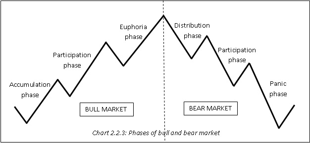
Phase 1: Accumulation
- Occurs after a prolonged decline or bear market
- Smart money / experienced investors start buying undervalued assets (just because something is down bad, doesn't mean it can't go down more)
- Market sentiment is very pessimistic — "this thing sucks", everyone expects it to keep going down
- Low trading volumes and gradual price stabilisation
- Key insight: "If everyone's bearish, who's left to sell?" — that's often where it finds a bottom
- Can last years (Microsoft went sideways for 14 years after the tech bubble, FMG went sideways for 10 years after the GFC)
The Spring / Liquidity Grab: During accumulation, big money often pushes price below the bottom of the range before sending it up. Why? Anyone who bought support had stop losses just underneath — big money grabs that liquidity, shakes people out, then sends it. If something breaks out of a major sideways range to the downside and pops straight back in — that's actually a sign of strength (a "spring"). The opposite applies to distribution: a pop above the range that falls back in is a sign of weakness.
Phase 2: Public Participation
- Momentum builds as more investors recognise the trend
- Media and public interest increases — some positive news articles, battle between bulls and bears
- Price rises significantly due to higher demand
- This is usually the longest phase — where the most gains come from
- Increased trading volumes
- Positive market sentiment, with a taste of euphoria toward the very end
- The really savvy investors get in early in this phase, majority get in mid-to-late
Phase 3: Excess
- Smart money begins selling at higher prices
- Can manifest as a blow-off top (fast spike then fast sell-off) or a long sideways distribution
- Overvaluation concerns arise but people start ignoring them ("maybe the market just likes it at this price")
- Sentiment is overly optimistic or euphoric — you'll struggle to find anyone saying anything bad about it. 90% bullish
- Declining trading volumes despite higher prices — price going up but volume not confirming (Tenet 6)
- Signs of reversal or instability may appear but average investors won't recognise them
The Sentiment Cycle
The emotional progression through the phases:
Bull market (going up): Disdain → Skepticism ("just a dead cat bounce") → Caution → Growing confidence → Conviction → Peak Greed/Euphoria
Bear market (coming down): Hope ("just another zig-zag") → Worry → Fear ("what have I done") → Disgust → Disdain
Peak fear at the bottom. Peak greed at the top. Every time.
Corrections Between Phases (Craig's Key Rule)
- After accumulation ends → expect a 1/3 to 2/3 pullback of the accumulation gains
- After public participation ends → expect a 1/3 to 2/3 pullback of the public participation gains
- After excess ends → you don't just correct the excess. You correct the ENTIRE move from the start of accumulation to the top of excess. These are the major resets (GFC wiped 57% off S&P, crypto cycles pull back 80%)
This is why getting caught buying in the excess phase is so dangerous — you're not just giving back the excess gains, you're giving back everything. It can take 6-13 years to recover.
Phases Within Phases (Fractal Nature)
Each major phase contains its own sub-phases of accumulation, public participation, and excess. The more you zoom in, the more sub-phases you see. This concept is the foundation of Elliott Wave Theory (Term 3).
Example: The S&P 500 since 2009 has a big accumulation, big public participation, and big excess phase. But within the big public participation, there were smaller accumulation, public, and excess sub-phases.
Commodity vs Equity Phase Differences
- Equities/Indices: Public participation is the dominant, longest phase. Accumulation and excess are often similar sizes
- Commodities (and commodity stocks like lithium, gold, uranium miners): The excess phase can be disproportionately massive — huge blow-off tops. Public participation can be relatively smaller
Examples
- Bitcoin 2018–2021: Sideways accumulation 2018-2020, public participation started when 20K broke (savvy ones got in at 12K), excess phase when everyone was talking about "who's buying next after Tesla" — they distributed into the good news
- Microsoft: Parabolic into 2000 tech bubble, crashed, went sideways for 14 years (accumulation), broke out ~$37 resistance, then public participation trending up
- FMG: Massive spike pre-GFC, crashed to $1, accumulated for 10 years at $1-7, broke out and ran to $23+
- Core Lithium: Went up 9,700% — but most holders didn't get out and gave it all back (lost 96% from top). Perfect example of why understanding excess phase matters
Pivot Points
If you cannot identify pivot points, you cannot identify market structure. If you cannot identify market structure, you cannot identify a trend. This is the literal backbone of technical analysis.
How to Identify Pivot Points
- Look for 3 candles moving in the opposite direction — this is not a textbook rule, it's a beginner-friendly method to stop you getting faked out on tiny moves. ~90-95% of pivot points will follow this rule
- They don't have to be 3 red or 3 green candles — they can be a mix of colours. You're looking for the overall direction changing (3 candles moving the opposite way to the primary move)
- Exceptions: During elevated market volatility, 1-2 very large candles can count as a pivot (e.g. a big bullish engulfing candle on its own)
- Craig's clarification: The 3-candle rule is a guide to prevent you marking 100 tiny pivots that add no value. What you're really looking for is significant peaks and significant troughs. If it's just undulating noise, you probably don't need a pivot there
Pivot Point Shapes
- V-shaped: Rapid, sharp reversal — price quickly changes direction. Most common
- U-shaped: Gradual shift — price hangs around the bottom/top sideways for a bit before reversing
Swing Highs and Swing Lows
Pivot points are also called swing points:
- Swing High (H): Pivot at the top where sellers step in — identifies resistance levels
- Swing Low (L): Pivot at the bottom where buyers step in — identifies support levels
Practical Tips for Marking Pivots
- Use the highlighter tool in TradingView (small dots) to mark pivots
- Colour code: green dots for lows/buyers, red dots for highs/sellers — green=go, red=stop
- Line chart trick: Switch from candles to line chart to more easily see pivots when the wicks and candles are clouding your judgment. It strips away the noise and shows the pivots clearly
- Hold Ctrl + click on a dot to drag-copy it (saves time vs recreating each one)
- Start on the weekly timeframe — Dow himself never traded below the daily because it was all manipulated noise. The lower you go, the harder it gets. Weekly for the first 6 weeks minimum
The 3 Types of Market Structure
There are only 3 things a market can do: go up, go down, or go sideways. The first thing you should do when pulling up any chart is identify pivot points, then identify market structure.
"Market structure is king" — when you go against market structure, that's when you lose.
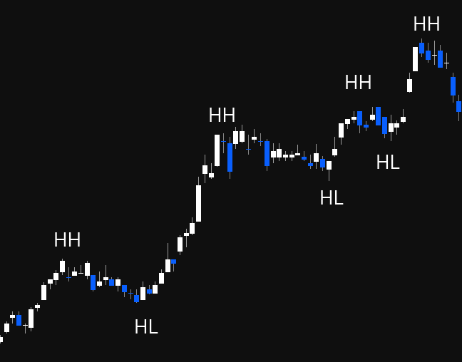
Bullish (HH / HL)
- The market is going up
- Marked by consistent higher highs and higher lows
- Pivot peaks are higher than the previous highs — signals increased demand and optimism (sellers selling higher each time)
- Pivot lows are higher than previous low — signals resilience, buyers stepping in higher each time (buyers believe it won't go back to the old price)
- Think: "Why are they buying at $18K when last time they didn't buy until $16K? Why are they selling at $20K when last time they sold at $18K?" — that's a strong uptrend
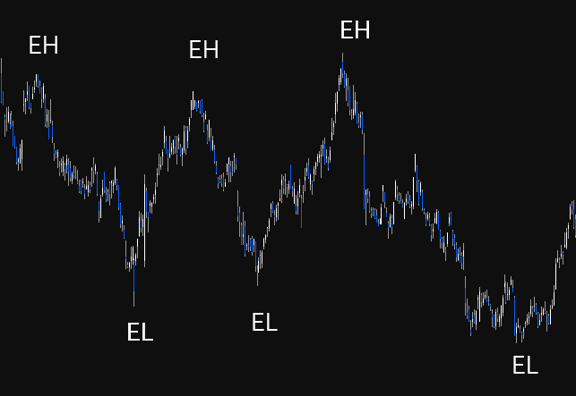
Consolidation (EH / EL)
- Market moving sideways
- No clear trend — equal highs (selling at roughly the same level) and equal lows (buying at roughly the same level)
- Traders look for breakouts (above EH = potential uptrend) or breakdowns (below EL = potential downtrend)
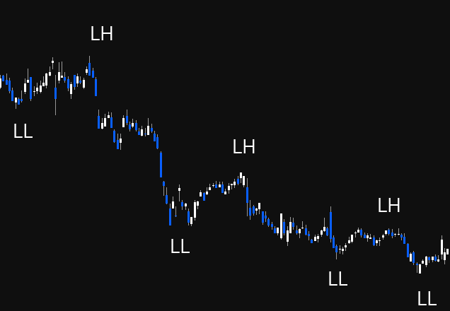
Bearish (LL / LH)
- The market is going down
- Lower Lows: each trough is lower than the previous — buyers waiting for lower prices each time
- Lower Highs: each peak is lower than the previous — sellers stepping in earlier each time, don't believe it will reach the previous high
- Think: "Why are they selling at $22K when last time they were selling at $23K? Why are they buying at $19K when last time they bought at $21K?"
- Can be good for shorting
Market Structure Change Confirmation
You need BOTH to confirm a change:
- Bullish change: need a higher high AND a higher low. Getting just a higher high with a lower low is NOT a change — buyers are still coming in lower (still bearish)
- Bearish change: need a lower low AND a lower high. Getting just a lower low without a lower high is NOT confirmed
Connecting Pivots
Draw a line connecting your pivot points to visually see the trend direction. This makes it obvious when you transition from uptrend → sideways → downtrend.
Transition Through Phases Using Market Structure
Markets transition: Uptrend (HH/HL) → Sideways (EH/EL) → Downtrend (LL/LH) and vice versa. The phases map directly: Accumulation = sideways (EH/EL), Public Participation = uptrend (HH/HL), Excess = potentially still making highs but with warning signs, Distribution = begins transition to LL/LH.
Supply & Demand, and Support & Resistance
Dow Theory Tenet 2: The Market Has Three Trends
The market moves in three distinct types of trend, each operating on a different timeframe. Understanding which trend you're looking at is critical — your timeframe must match your investment/trading goals.
Primary Trend (The Tide)
- The most significant and long-term trend — lasts months to years
- Most reliable for investment decisions because it's less prone to manipulation
- Two types: bull market (upward) and bear market (downward)
- Like the tides of the ocean — shows the long-term direction
- The primary trend cannot be stopped by any macro event. Wars, depressions, pandemics, financial crises — on the S&P 500's 100-year chart, they're all just blips on a trend that keeps going up
- If you're investing long-term (years), you should be looking at the 3-monthly (quarterly) timeframe or above
Secondary Trend (The Waves)
- Temporary movement in the opposite direction to the primary trend
- Lasts several weeks to several months (the example shown was ~7-8 months)
- Retraces approximately 1/3 to 2/3 (or half to two-thirds) of the primary trend's movement
- The "zag" in the zig-zag — if the primary trend is the zig (direction), the secondary trend is the zag (correction)
- Two types of corrections: sharp (fast V-shaped drops) or sideways (extended horizontal movements). Both are secondary corrections
- Key rule: The primary trend resumes when price surpasses the highest/lowest point of the secondary action. If it can't get back above that point and breaks the secondary low on increasing volume, it may signal a new primary bear trend rather than just a correction
- The 50% retracement level is emphasised by Dow Theory as particularly significant
Minor Trend (The Ripples)
- The shortest trend — lasts days to weeks
- Daily market fluctuations — compared to ripples on waves (can't predict which way they'll go)
- Erratic, can be manipulated, and is largely noise
- The only thing worth paying attention to within minor trends are horizontal lines on daily charts (support and resistance) — which is what this week covers
- Dow considered everything below the daily to be manipulated noise
How They Interact
The zig is the primary trend direction. The zag is the secondary correction. Within both, the minor trend creates the day-to-day ripples. When investing, you care about the primary. When trading, you're navigating the secondary and minor within the context of the primary.
Support & Resistance — Psychology
Support and resistance are fundamental concepts tied to the principles of supply and demand. They represent the battlegrounds where supply and demand forces collide.
Psychological Impact
| Support | Resistance |
|---|---|
| Price points where buyers typically step in, perceiving the asset as undervalued | Psychological barriers where sellers see the asset as overvalued |
| Traders associate these levels with safety nets, triggering buying pressure | Leads to increased selling pressure — hesitation, shorting, or profit-taking |
Breakouts and Failures
When support or resistance levels are breached, they signal shifts in sentiment — either stronger conviction (breakout) or panic selling (breakdown), leading to rapid price changes. Recognising these psychological shifts helps anticipate market moves.
Supply & Demand
Financial markets work exactly the same as any marketplace — it's all supply and demand. Think of it like a flea market, or bartering in Bali. Prices move based on the balance between willing buyers and willing sellers.
Key principle: For every buyer, there is a seller. For every seller, there is a buyer. It doesn't just magically go somewhere — when you're selling, someone else is buying because they think it's a good deal.
Demand Zones
- Areas where a large volume of buy orders accumulate
- Signal strong belief in potential price increases
- When price reaches a demand zone, it tends to stop falling because there are many buyers looking to purchase
- Think: only 2 Ferraris for sale at $100K but 100 people wanting to buy — bidding war pushes price up
Supply Zones
- Areas with concentrated sell orders
- Traders expect prices to decline due to perceived overvaluation
- When price reaches a supply zone, it may stop going up because there are too many sellers trying to get rid of their stuff
- Think: thousands of people trying to sell Ferraris at $100K — too many options, price can't go higher
Everything Has a Price
Even the worst-performing assets eventually reach a price where someone thinks it's cheap and demand steps in. Examples:
- AGL: From $28 down to $5 — "it's a dog, it's the worst" — but demand stepped in at $5 and it recovered to ~$12
- ZIP: From $14 down to ~$0.20 — at some point buyers perceived value, it bounced to ~$3
Support (Demand)
Support is a price level where an asset usually stops falling and starts to see more buying. It marks a point where the balance between supply and demand shifts in favour of demand.
Key Concept: Support is a ZONE, Not a Line
Never draw support as a single line — it doesn't work. Support is always a zone (a range) where historical buying interest has caused price reversals. Buyers don't step in at one exact price — they step in around an area.
Example: Buyers might step in at $208, $209, $212, $214, $211 — that's all a zone around $208-$214, not a precise price point.
Visualising Support
Think of it literally as people standing at different price levels willing to buy:
- $38: one person → weak support
- $33-$34: two people → bit of a demand zone
- $30: one more person → some support
- If $30 breaks, nobody until $24-$25 → price will fall quickly to the next cluster of buyers
- Below that, nobody until $9-$10 → another rapid drop
The gaps between clusters of buyers are where price moves fast — when support breaks, it falls to the next level where people are willing to buy.
How to Draw Support Zones
- Find your pivot points where buyers have stepped in (swing lows)
- Look for multiple pivot lows clustered around a similar horizontal area (like "dot to dot")
- Use the rectangle tool in TradingView (5th icon down → click arrow → Rectangle)
- Draw the rectangle encompassing as many of those candlestick wicks as possible
- Change the colour to green (Settings → Border → green, Background → green, lower transparency so candles are still visible)
- Add text label "Support" for quick identification
Support Key Points
- Analyse support on multiple timeframes — daily, weekly, monthly. Higher timeframe support is more reliable (monthly > weekly > daily > 4H > 1H)
- Identify major support — strong levels that have held over a long period and are respected by many traders
- Use support levels for determining entry points and setting stop losses
- If price breaks through support, it can trigger sell-offs as traders' stop losses get hit — price then falls to the next support zone
Resistance (Supply)
Resistance is a price level where an asset tends to stop rising due to selling pressure. It represents areas of supply where sellers are willing to exit.
Key Concept: Resistance is Also a ZONE
Same as support — resistance is always a zone, not a single line. Sellers step in around an area, not at one exact price.
Example: Sellers might step in at $228, $230, $232, $234 — that's all a zone around $230, not a precise price.
How to Draw Resistance Zones
- Find your pivot points where sellers have stepped in (swing highs)
- Look for multiple pivot highs clustered around a similar horizontal area
- Use the rectangle tool, encompassing as many candlestick highs/wicks as possible
- Change colour to red (Border → red, Background → red, lower transparency)
- Add text label "Resistance"
The Battle Between Bulls and Bears
Once you have support (green) and resistance (red) drawn, you can see the battle. Eventually one side wins:
- Sellers get exhausted → bulls win → breakout upward
- Buyers get exhausted → bears win → breakdown downward
Resistance/Support Flip (Role Reversal)
"If you can master this strategy, you can honestly make money on the market." — ASX Trader
A resistance/support flip occurs when a former resistance level becomes a new support level (or vice versa). This is one of the most powerful concepts in technical analysis.
How It Works
- Price approaches resistance repeatedly — sellers step in each time
- Eventually, sellers get exhausted — no more sellers left at that price
- Price breaks through resistance (breakout)
- Price comes back to test that old resistance level
- Those sellers have now become buyers — old resistance is now support
- The flip is confirmed
What It Signals (Two Buy Signals)
- Sellers are exhausted — they're no longer stepping in at that price
- Sellers have become buyers — the level that was previously seen as overvalued is now seen as undervalued
The Fake-Out Warning
If price breaks out of resistance but immediately pops back within the zone, that's a sign of weakness (fake-out), not a genuine breakout. The opposite also applies — breaking below support and popping straight back in is a sign of strength (this links to the "spring" concept from Week 1).
CBA Example — The Staircase
Commonwealth Bank's entire existence is essentially a series of resistance/support flips — climbing steps:
- $7 resistance → became support → $9.90 resistance → became support → and so on
- Tech bubble bottom support at $23-$25 zone → held during GFC (buyers stepped in at the same zone again across 10+ years)
- GFC top resistance at $60 → exhausted → broke through → during COVID drop, $60 became support (people saw it as cheap at $60 when they previously thought it was overvalued)
- As long as it keeps climbing steps (flipping resistance to support), it's in an uptrend. If it starts breaking below support floors, each floor becomes the next ceiling on the way down
Trading Strategies Using Support & Resistance
1. Breakout Strategy
Objective: Profit from significant price movements following a breakout of support or resistance.
- Buy when price breaks above resistance (sellers exhausted)
- Sell/short when price breaks below support (buyers exhausted)
- Stop loss: Just below the pivot low (for longs) or just above the pivot high (for shorts)
2. Pullback/Retest Strategy (Resistance/Support Flip)
Objective: Enter trades when price retraces to a support/resistance level after a breakout.
- Wait for breakout through resistance
- Wait for price to pull back and test old resistance as new support (the flip)
- Enter when it bounces off the new support
- This is probably the best strategy — it gives the ultimate risk:reward because you get two confirmations: (1) sellers exhausted, (2) sellers become buyers
- Stop loss below the new support zone
3. Range Trading Strategy
Objective: Profit from price fluctuations within a defined sideways range.
- Buy at support, sell at resistance — repeat until the range breaks
- When it breaks out → switch to breakout or pullback strategy
- ASX Trader's view: "I personally don't touch sideways markets." He only trades trending markets (bull or bear). Range trading can get messy — price doesn't always bounce cleanly off the boundaries
- Key insight: People don't lose money in bull or bear markets — they lose money in sideways markets. They keep trying to go long or short, keep getting stopped out, and lose trade after trade
1.3 - Reversal patterns, trend lines & channels
Dow Theory Tenet 4: The Trend Is Your Friend
A trend will persist until its reversal is indicated. Like Newton's first law — an object in motion stays in motion unless acted upon by an external force. A market trend stays in motion until external factors cause a shift (fundamental news, economic data, or exhaustion in buying/selling pressure).
Why Trend Recognition Matters
- Prevents emotional trading — instead of guessing tops and bottoms, follow the existing trend
- Improves risk management — place stop losses under pivot lows, falling with market structure
- Maximises profit potential — trading in the direction of the trend increases probability of success
- Stay with the trend until price action (and later, volume) confirms a change
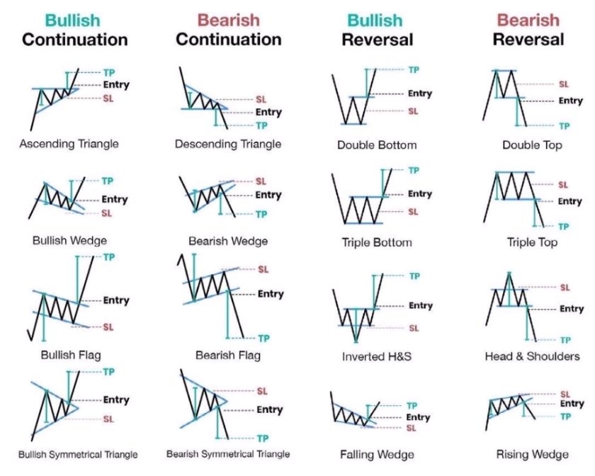
The Three Reversal Patterns
There are ONLY three ways a trend can reverse. Every reversal pattern you'll ever see fits under one of these three. That "cheat sheet with 50 different reversal patterns"? They're all just versions of these three.
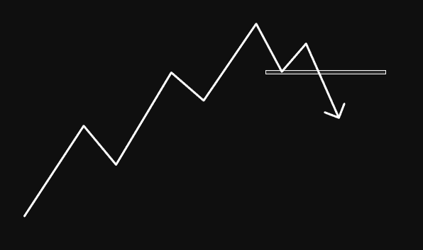
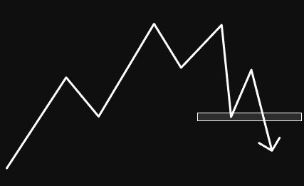
1. Double Top / Double Bottom
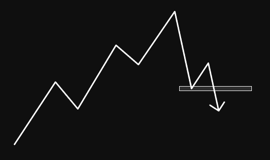
The most common reversal pattern. Often called the "M pattern" (tops) or "W pattern" (bottoms). You can make money literally just trading these — they're textbook and easy to identify.
Double Top formation:
- Price reaches a peak (point 1), retraces to a low (point 2)
- Rallies back up but fails to exceed the previous high — selling equal (point 3). First warning sign: "Why are they selling at the same price? Every previous time they sold higher"
- Declines and breaks below the support at point 2 (the "neckline"). First sell signal: sellers won. Buyers who stepped in at point 2 are no longer there
- Often retests the neckline as resistance (support/resistance flip) — because anyone who bought the dips now wants out if it gets back to their buy price
- Confirmation: when price breaks point 6 (below the retest low) = lower low, lower high, lower low = change of market structure
The psychology:
- Point 1 & 3: "I should have sold at $11. If it ever gets back there, I'll sell next time." The market gives second and third chances — it's uncanny how often this happens
- Point 2 vs 4: "They were willing to buy at $7.80 last time (point 2). Now they're not buying there. Where did those buyers disappear to?"
- The neckline break is pivotal: sellers at the same spot + buyers NOT at the same spot = bears won
Measured target: Distance from the double top to the neckline, projected downward from the neckline breakout point. That's your approximate target for the move.
Negation: If price gets back above the neckline, the double top is over — no longer expecting lower moves.
Double Bottom is the exact opposite. W-shaped. When you get big double bottoms over a large timeframe, they're textbook accumulation zones. Examples: FMG post-GFC ($1 double bottom), Apple ($13 double bottom), Cardano ($0.02 double bottom), Ethereum 2018-2020 double bottom.
For confirmation purposes, treat a double bottom exactly like a failure swing — the high between the two lows is the neckline, and confirmation is when you close above it.
2. Non-Failure Swing (STRONGEST Reversal)
The most powerful reversal because you're not only breaking prior pivots but also getting a confirmed lower low, lower high, lower low (change of market structure).
Non-failure swing top:
- HH, HL, HH, HL pattern — uptrend proceeding normally
- Price makes a new high (point 5) — still going higher, all good
- Then drops below the previous higher low (point 4) — penetrates prior pivot. First warning sign
- This is where "buy the dip" gets dangerous — people keep buying the dip because it worked every other time. But when you can read market structure, you realise this is NOT the time to buy the dip. This is when big money distributes INTO the dip
- Rally back up but now forming a lower high (point 7) — second warning sign. "Why are they selling at $59K when every other time they sold at $64K, $61K?"
- Breaks below the prior low — confirmation. "This should be an absolute bargain. Why aren't they buying again?"
Two sell signals:
- Sell signal 1: When it breaks below the prior pivot (the first lower low)
- Sell signal 2 (stronger): When you get lower low + lower high + lower low = confirmed change of market structure
Why it's the strongest: Unlike the failure swing, a non-failure swing breaks through prior pivots AND gives you the full LL/LH/LL confirmation. The psychology flip is complete — people who were "buying the dip" every time are now watching it power straight through their buy levels.
Example: Bitcoin at $64K top and $30K bottom were both non-failure swings.
3. Failure Swing (LEAST Reliable)
How to identify (in a downtrend): The first sign is it fails to make a new low. Instead of continuing lower, it puts in a higher low. Then takes out the previous high.
How to identify (in an uptrend): The first sign is it fails to make a new high. Price makes a lower high, then breaks below the previous low.
Why it's called "failure" swing: Because the dominant trend failed to continue — it failed to make a new low (in a downtrend) or new high (in an uptrend).
Why it's the least reliable: It can just be an ABC correction (3 steps forward, 2 steps back). The market might bottom shortly after the failure swing exit and then continue the original trend. More depth on this comes with Fibonacci and zig-zag zones later in the course.
A head & shoulders pattern is just a version of a failure swing. Shoulder, head, other shoulder — it's the same structure.
Craig's Key Confirmation Rules (Apply to ALL Three)
The critical thing that's the same across all three reversal patterns:
- Regardless of whether the higher high or higher low comes first, you must close above the previous high (in a downtrend reversal) to get confirmation
- Use candle BODY closes, not wicks. Draw the confirmation line on the candle body. You need a candle close above that level, not just a wick
- Match your timeframe: Weekly close for swing trades (most reliable, sets you up for months). Daily close for shorter trades (changes structure every few weeks). Hourly for intraday (lasts only hours)
- Weekly confirms are much more reliable than daily. A weekly change of market structure holds for a long period. Daily can flip back and forth quickly
- Once market structure has changed, you DON'T need to wait for reversal confirmation again on pullbacks. After confirmation (bearish → bullish), pullbacks in a bullish structure are buying opportunities. You only need the full reversal confirmation once — when the trend actually changes direction
The Non-Failure vs Failure Naming (Craig's Simple Explanation)
In a downtrend:
- Failure swing: The first sign is it failed to make a new low. Then it takes out the high → confirmation
- Non-failure swing: It did NOT fail to make a new low first. Instead, the first sign is it took out the previous high. Then it makes a higher low. Then confirms by taking out the next high → confirmation
In both cases, the final confirmation step is the same: close above the previous high.
Trend Lines
Trend lines use the same concepts as horizontal support/resistance (above = resistance, below = support) but at an angle.
How to Draw a Bullish Trend Line
- Find the lowest point of the price
- Find the next 1-2 higher lows and connect a line across those points
- Draw the trend line below the price (it acts as support — the floor)
- Can include a mix of candle bodies or wicks — context is key
- Two points to draw, three points to confirm. The third touch validates the trend
How to Draw a Bearish Trend Line
- Find the highest point of the price
- Find the next 1-2 lower highs and connect a line across those points
- Draw the trend line above the price (it acts as resistance — the ceiling)
- Try to encompass as many touches as possible — the more data confirming the line, the stronger it is
Key Principles
Dow Theory states that the only valid trend lines are horizontal — because angled trend lines are subjective (open to interpretation depending on how you draw them). You can draw two completely different trend lines on the same chart and both could be "right."
Don't get caught up on exactly how the trend line is drawn. They're a signal, not gospel. What you're looking for is when the trend may be about to change. The confirmation is always the change of market structure (HH/HL or LL/LH), not the trend line break itself.
Trend line breakout + retest as support = same concept as horizontal S/R flips. Very common for broken trend lines to get retested.
Advanced Trend Lines
Acceleration & Deceleration (Angular Momentum):
- Upside acceleration = bullish, but if rate of ascent is excessive, it may not be self-sustaining (blow-off top / buying climax that collapses)
- Upside deceleration = bearish (candle ranges getting smaller and smaller — buying momentum fading)
- Downside acceleration = bearish, but may end in a selling climax
- Downside deceleration = bullish
Measured Target for Trend Line Breakouts: Take the maximum distance price has moved away from the trend line, and project that same distance from the breakout point. That's your minimum price target.
Hot tip: The easier it is and the more people that can spot the trend, the closer you are to it ending. When every man and his dog can see it, it probably won't hold.
Channels
A channel is a set of parallel trend lines (like train tracks) defined by the highs and lows of price action. They present great trading opportunities and help with risk management.
Three Types
- Ascending (bullish): Parallel upward lines — HH/HL. Buy at support (bottom line), sell at resistance (top line)
- Descending (bearish): Parallel downward lines — LL/LH. Short at resistance (top line), cover at support (bottom line)
- Sideways (neutral): Horizontal parallel lines — EH/EL. Buy at support, sell at resistance until breakout
How to Draw Channels
- In TradingView: left toolbar → Trend line → arrow → Parallel Channel
- Find the lowest point (for ascending) or highest point (for descending)
- Draw along the support touches, then drag up/down to encompass resistance touches
- Try to get as many touches on both lines as possible
The Midline
The dotted midline of a channel often acts as its own support/resistance level. Price frequently bounces off or rejects from the midline — the "return to mean."
Channel Validity
- Valid as long as price touches support at least twice and resistance at least three times (or vice versa)
- Breakout below support in an ascending channel signals potential reversal
- Breakout vs fake-out: If it breaks out and comes straight back in, it's probably a liquidity grab. If it breaks out and continues, it's a genuine breakout
Channel Exhaustion
If price fails to reach the upper line of an ascending channel, that's an early warning of trend exhaustion. The breach of the lower support line becomes more likely after a failure to reach the top.
S&P 500 100-Year Channel Example
Drawing a channel from the top of the Great Depression through the tech bubble on a 3-monthly chart shows that historically, when the S&P hits the upper channel resistance, it corrects back to at least the midline (dotted line). If things get really bad and oversold, it can come all the way back to the bottom channel line. This gives context for when things are at resistance, around the mean, or extremely undervalued.
1.4 - Volume analysis, Wyckoff techniques & On-balance Volume
Dow Theory Tenet 6: Volume Must Confirm the Trend
Volume is just the total number of shares/coins that changed hands in a period. Nothing more. It has nothing to do with price directly — it's simply how many units were traded. Think of volume as the fuel for the market — running on low fuel, it won't go far. Full tank, it'll keep going.
If volume is increasing along with the price trend, it suggests smart money is buying into the trend. Smart money owns billions and generates the majority of volume. If volume doesn't confirm the move, it's likely dumb money (untrained retail traders) moving the price.
The Four Price-Volume Relationships
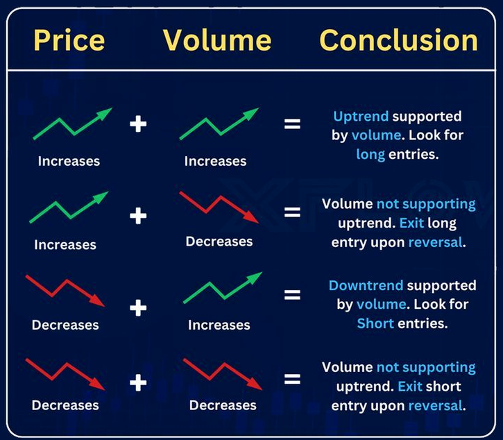
| Price | Volume | Signal | Meaning |
|---|---|---|---|
| Rising ↑ | Rising ↑ | Bullish — good for longs | Uptrend supported by volume. Stay in longs |
| Rising ↑ | Falling ↓ | Bearish — look to exit | Uptrend NOT supported by volume. Look to exit on further signs of reversal |
| Falling ↓ | Rising ↑ | Bearish — good for shorts | Downtrend supported by volume. Exit longs or look for shorts |
| Falling ↓ | Falling ↓ | Bullish — likely a pullback | Downtrend NOT supported. Probably just a correction/zag, not a new trend |
The biggest misconception: People think rising volume = good, falling volume = bad. Wrong. Rising volume just means the current trend is supported. If the trend is DOWN and volume is rising, that's confirming the downtrend — lots of people are still selling.
Key connection to Dow Theory: The secondary action (1/3-2/3 retracement) should happen on decreasing volume because it's a corrective move, not a new trend. Volume should support the primary trend, not the secondary correction.
Volume at Breakouts: Fake Out vs Breakout
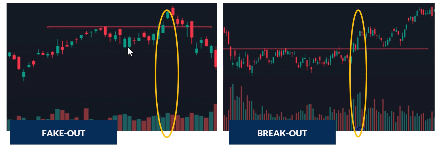
- High volume on breakout = genuine breakout. Volume confirms the move. Smart money is behind it
- Low or declining volume on breakout = likely fake out. Lack of interest, higher probability of false breakout
- Now whenever you see a change of market structure or break of S/R, check volume to confirm it's probably real
Volume at Support & Resistance
When there's high trading activity at support/resistance levels, those levels are more reliable — lots of investors treating them as buy/sell points means they'll likely continue to do so. High volume at support = probably going to hold. High volume at resistance = probably going to reject.
High Volume Spikes
High volume spikes tend to happen at extreme tops and extreme bottoms — that's where the most buyers and sellers are active:
- At bottoms: Capitulation — hesitant investors finally give up and massively sell. Volume spike marks the exhaustion of selling
- At tops: Exhaustion moves — climactic buying followed by sharp reversals
Wyckoff's Third Law: Effort vs Result
Richard Wyckoff (1873-1934), one of the TA Titans, developed a key principle about the relationship between volume (effort) and price movement (result).
Price-Volume Convergence (Effort = Result)
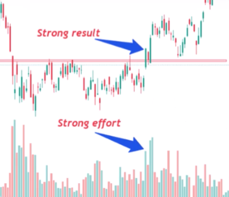
When both price and volume move in the same direction, market participants are in agreement. Large body candles + large volume = convergence. The current trend is likely to continue.
Gym analogy: If you go to the gym every day for 3 months (big effort), you should see your body change (big result). That's convergence — effort matches result.
Price-Volume Divergence (Effort ≠ Result)
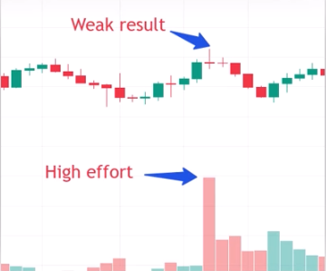
Small candle body + high volume = potential shift in market sentiment. The market required a lot of effort but barely moved — something is wrong. High volume doji candles are classic divergence signals and often precede reversals.
Gym analogy: If you go to the gym every day for 3 months (big effort) and look in the mirror and nothing's changed (no result) — something's up.
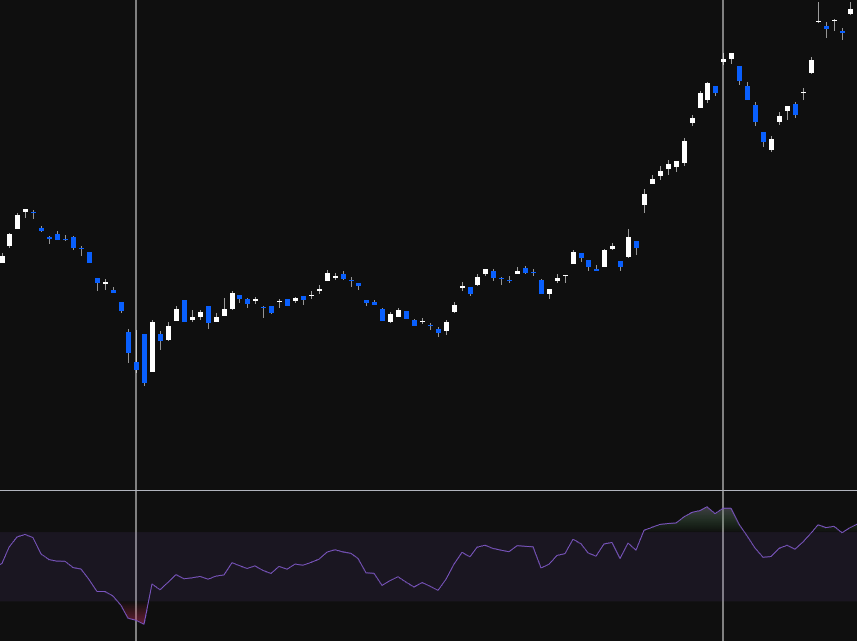
On-Balance Volume (OBV)
Created by Joseph Granville in 1963. His theory: changes in volume precede price movements. OBV is a leading indicator — it changes direction before price does.
How to Add OBV in TradingView
Indicators → search "OBV" → On Balance Volume → add. The blue line appears below the chart. Double-click anywhere blank on the chart to hide/show it quickly.
How OBV Works
OBV is a cumulative running total of volume — adding volume on up days, subtracting on down days:
- OBV line rising = volume on green candles is higher than volume on red candles = buying pressure = bullish
- OBV line falling = volume on red candles is higher than volume on green candles = selling pressure = bearish
- OBV line sideways = equal volume on up and down days = on par
The King & Queen Rule (CRITICAL)
"Price action is king. OBV is the queen. Listen to the king first, then see if the queen supports what the king is saying. Do NOT listen to the queen first."
Follow your price action first — market structure, reversal patterns, everything you've learned. Once you identify a setup, THEN check if OBV supports it. Do NOT look at OBV first and try to make the price action fit. You will get wrecked doing it backwards.
Detox your charts: Remove all indicators. Analyse price action clean. Only then add OBV to confirm. The price action is primary data, OBV is secondary.
The Five OBV Scenarios
1. Bullish Divergence Breakout: OBV reaches a new high while price approaches resistance → predicts price will break through resistance and head higher. OBV is leading — it's already broken out before price has.
2. Bearish Divergence Breakout: OBV hits a new low while price tests support → predicts price will break support and head lower. OBV already broke support before price did.
3. Bearish Divergence Reversal: Price rises to a new high while OBV hovers at or below the previous resistance level → predicts the rally will stall or reverse. Volume is NOT confirming the new highs. If price keeps making new highs but OBV keeps hitting a wall — that's bearish divergence.
4. Bullish Divergence Reversal: Price hits a new low while OBV stalls at or above the last support level → predicts the sell-off will stall or reverse. Price made a new low but volume didn't — something different, bullish divergence.
5. Convergence (Bullish or Bearish): OBV matches price action — when price goes up, OBV goes up; when price goes down, OBV goes down. This confirms the current trend is valid.
The Simple 95% Use Case
Most people (and this is perfectly valid) use OBV for one thing: does the OBV line do the same thing as price? When price makes HH/HL, does OBV also make HH/HL? If yes, volume confirms the move. If not, something's different. That alone is quite powerful as a confirmation tool.
Advanced OBV Strategies
Drawing TA on OBV
Everything you've learned from price action — support, resistance, trend lines, market structure — can be applied directly to the OBV line:
- Trend lines on OBV: Draw bullish/bearish trend lines on OBV just like on price. When OBV breaks its downtrend line, it can signal a reversal before price breaks its own trend line
- Support/resistance on OBV: Horizontal S/R zones work on OBV. When OBV breaks support that becomes resistance (same flip concept), it confirms the move
- Market structure on OBV: Look for HH/HL or LL/LH on the OBV line — it often changes structure before price does
OBV as Leading Indicator (Key Examples)
ASX Trader's Bitcoin call at $65K top: OBV broke its uptrend line while price was still making new highs. OBV had bearish divergence + trend break = exit signal. Price didn't actually break its trend until much lower (~$51K). OBV led the way.
Getting back in at the bottom: OBV broke its downtrend line and showed bullish divergence before price broke out. Combine downtrend break on OBV + bullish divergence = entry signal.
Avoiding Fake Rallies with OBV
When you see a rally and think it's a breakout — check if OBV has also broken its downtrend line. If OBV hasn't broken its decline, the rally is likely a fake. This stops you entering fake rallies. Match the actual breakout point on OBV (using a vertical line) with where price breaks out — they should align at the genuine breakout, not the fake ones.
Note: Fibonacci Clusters
The Fibonacci clusters lesson was included in this week's content but relates more to the Fibonacci & Retracement Zones topic. Key concept: overlay Fibonacci retracements from multiple timeframes (e.g. daily retracement + monthly retracement) to find "cluster zones" where multiple Fib levels overlap — these are stronger support/resistance zones than a single Fib level alone. Example: Microsoft's 618 from the COVID bottom overlapping with the 382 from the entire move created a powerful cluster support zone.
1.5 - RSI Divergence as a leading Indicator
What Is RSI?
The Relative Strength Index is a price momentum indicator — it measures price momentum only, nothing to do with volume. RSI is bounded between 0 and 100, like an elastic band that gets stretched between extremes and always snaps back.
Overbought & Oversold
- Above 70 = overbought. Above 80 = really overbought
- Below 30 = oversold. Below 20 = really oversold
- Between 30-70 = neutral
- RSI is considered "reset" when it moves from one extreme to the other (e.g. 70 down to 30)
Critical rule: Just because it's overbought doesn't mean it can't go higher. Just because it's oversold doesn't mean it can't go lower. Some of the BIGGEST moves happen when RSI is overbought or oversold. Don't sell just because it's overbought or buy just because it's oversold — that's using RSI as a lagging indicator and will get you wrecked.
RSI Reset Timing by Timeframe
- Hourly: Can reset from overbought to oversold within a single day
- Daily: Takes a few weeks of significant movement to reset
- Weekly: Can take several months (6+ months) to move from oversold to overbought
- A small pullback with a pivot is enough to reset RSI and allow the next leg up/down — the pullback doesn't have to be huge
How to Add RSI in TradingView
Indicators → search "RSI" → Relative Strength Index → add. Appears as a bounded chart below the price chart.
What Is Divergence?
Divergence is when price and the indicator (RSI) are going in opposite directions. It warns that the current price trend may be weakening and in some cases may lead to a reversal.
The running analogy: When you go for a run, at first you have all the energy and momentum. Over time, your body starts giving you signals — puffing, sweating, needing water — that you're weakening. Eventually you'll need to stop. The market works the same way. A trend is running strong, then RSI starts giving signals that momentum is fading. It doesn't mean the trend stops immediately, but it's warning you.
Using RSI for Divergence = Leading Indicator
If you use RSI for overbought/oversold, it's a lagging indicator (telling you what already happened). If you use RSI for divergence, it becomes a leading indicator — signalling what's likely to happen in the future. Every indicator the educator teaches is a leading indicator, because you can't make money on the past.
Divergence Can Mean Two Things
- Reversal — the trend actually reverses
- Range/Consolidation — price goes sideways to "chill" before continuing
Divergence does NOT always mean a reversal. It signals that something is changing, and the trend may consolidate OR reverse.
Two Types of Regular Divergence
| Bullish Divergence | Bearish Divergence | |
|---|---|---|
| Price | Makes a lower low | Makes a higher high |
| RSI | Makes a higher low | Makes a lower high |
| Meaning | Downtrend momentum weakening — potential reversal upward | Uptrend momentum weakening — potential reversal downward |
| Where found | Only at bottoms (in downtrends) | Only at tops (in uptrends) |
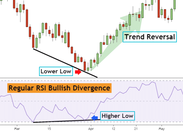
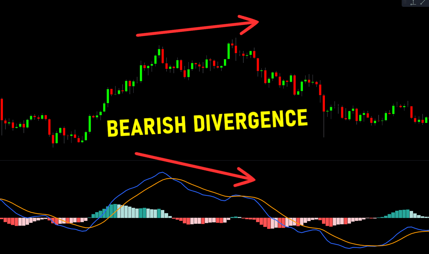
You can only look for bullish divergence in a downtrend (because you're looking for the bottom). You can only look for bearish divergence in an uptrend (because you're looking for the top). You can't find bearish divergence in a downtrend — it doesn't exist there.
Divergence Strength
There are three strengths of divergence — strong, medium, and weak. Strong divergences most often lead to major reversals. Weak divergences usually just produce a bounce.
Strong Divergence
- Bullish: Price makes a lower low, RSI makes a higher low
- Bearish: Price makes a higher high, RSI makes a lower high
- Most reliable — often leads to confirmed reversals
Medium Divergence
- Bullish: Price makes a double bottom (equal low), RSI makes a higher low
- Bearish: Price makes a double top (equal high), RSI makes a lower high
- Example: ASX Trader's Ethereum entry at ~$60 was based on medium bullish divergence (double bottom on price, higher low on RSI) + change of market structure through support
Weak Divergence
- Bullish: Price makes a lower low, RSI makes a double bottom (equal low)
- Bearish: Price makes a higher high, RSI makes a double top (equal high)
- Least reliable — more often leads to just a bounce followed by continuation, rather than a full reversal. Be careful if it rejects and keeps going
Steps to Find and Confirm Divergence
Step 1: Identify the Swing Points
Connect two low points on price (A and B). Then find the corresponding two swing lows on RSI. Are they going the same direction or opposite? If opposite = divergence.
Use the vertical line tool to match price pivots with RSI pivots — ensures you're looking at the right corresponding points.
Step 2: Assess Divergence Strength
Is it strong (lower low / higher low), medium (equal low / higher low), or weak (lower low / equal low)?
Step 3: Wait for Confirmation — DON'T Trade the Signal
Divergence alone is NOT an entry signal. It's an early warning. You need price action confirmation:
- A reversal pattern (failure swing, non-failure swing, double bottom)
- A change of market structure (HH/HL)
- A breakout through resistance or trend line break
- Even better: a combination of multiple confirmations
Step 4: Trade the TRIGGER, Not the Signal
The blinker analogy: Divergence is like a car's indicator/blinker. It signals the car is going to turn. But if you drove based on blinkers alone, you'd have an accident within a week — people put blinkers on wrong, too early, or not at all. Same with divergence. Sometimes the first divergence leads to a reversal. Sometimes it's the second, third, or fourth. You wait for the car to actually turn (change of market structure) before you act.
Signal = divergence. Trigger = change of market structure / reversal pattern / breakout. We trade triggers, not signals.
Do's and Don'ts for Drawing Divergence
Do's
- Draw divergence lines on extremes only (clear pivot points). The sharper the extreme, the better
- It's desirable for the first RSI extreme to be in the overbought or oversold zone (not in the middle of the range). Divergence from an extreme is more powerful
- The bigger the angle between the price line and the RSI line, the stronger the divergence
- Draw lines on candle bodies, not wicks — RSI follows bodies, not shadows
- Be consistent: if you connect two highs on price, connect the two corresponding highs on RSI. Use vertical lines to verify alignment
- Longer timeframes produce more reliable divergence. Monthly and weekly have fewer false signals than daily or hourly. Weekly divergence that builds over months signals something big (e.g. the S&P weekly bearish divergence before Trump tariffs and before COVID)
- Divergence isn't confirmed until a pivot is in. Until then, it's just potential divergence. You need the RSI to actually pivot for the divergence to be valid
- You can only count divergence after a "reset." RSI needs to have gone from one extreme to the other before you can start counting new divergence
Don'ts
- Don't trade divergence alone — wait for the trigger (price confirmation)
- Don't expect hourly divergence to produce a weekly-level reversal. Match your expectations to your timeframe
- Don't use multiple indicators that measure the same thing (e.g. RSI + MACD + Stochastic RSI = all price momentum). That gives you confirmation bias, not confirmation. They're all telling you the same thing in different ways
- Don't try to pick the exact top or bottom off divergence. "The glamour of wanting to pick the top or bottom is more about ego than profits"
Combining RSI with OBV
RSI measures price momentum. OBV measures volume momentum. These are different things, so using both is valid (unlike RSI + MACD which are both price momentum).
The ideal setup: RSI divergence confirmed by OBV divergence = two different signals both pointing the same direction. Enter on the change of market structure, hold until you get the opposite signal from either RSI or OBV.
This is what confluency means — multiple independent signals all telling you the same thing. The more confluency, the higher probability the trade works.
Craig's Key Insight: News Creates Catalysts for Moves That Were Already Due
The S&P 500 showed significant bearish divergence on the weekly timeframe before both the Trump tariff sell-off and COVID. The divergence was already signalling weakness — the news event just created the catalyst that expedited the pullback. "We were always going to pull back. The catalyst of the news made it happen much quicker."
This is why divergence is so powerful as a leading indicator — it shows you the setup before the trigger event occurs. By the time the news hits, the weakness was already there for weeks or months.
1.6 - Fibonacci & retracement zones
Understanding Fibonacci
The Fibonacci sequence — 0, 1, 1, 2, 3, 5, 8, 13, 21, 34, 55, 89… — is a series where each number is found by adding the two before it. Identified in the 13th century by Leonardo Fibonacci, though the sequence was known and used hundreds of years before (even in Egyptian architecture).
The Golden Ratio
The golden ratio 0.618 (or its inverse 1.618) is derived from the Fibonacci sequence and appears throughout nature — from atoms to galaxies, honeybee populations (female/male ratio = 1.618), sunflower spiral rotations, and even human body proportions (shoulder to fingertips ÷ elbow to fingertips ≈ 1.618). It's been used for centuries in art (Mona Lisa), architecture (pyramids), and design (Twitter logo).
The Fibonacci Levels
Dividing a number by the next in the sequence gives the key ratios:
- 21 ÷ 34 = 0.618 (61.8%)
- 21 ÷ 55 = 0.382 (38.2%)
The key retracement levels: 0%, 23.6%, 38.2%, 50%, 61.8%, 78.6%, 100%
Note: The 50% level is NOT actually a Fibonacci number. It's included because of Dow and Gann theory — and human psychology. If you see a "50% off" sale, you automatically gravitate towards it. Financial markets work the same — when something is half price, people perceive it as a bargain.
Fibonacci Retracement Strength — The "Discount" Framework
Each Fib level tells you something about the strength of the underlying trend. Think of it as a sale:
| Fib Level | Discount | Trend Strength | Meaning |
|---|---|---|---|
| 23.6% | ~24% off | Very strong | Buyers jumping in at a tiny discount — massive demand |
| 38.2% | ~38% off | Strong | Buyers stepping in at a modest discount — still strong demand |
| 50.0% | 50% off | Normal | Human psychology — half price attracts buyers naturally |
| 61.8% | ~62% off | Weak | Buyers waiting for a big discount before stepping in |
| 78.6% | ~79% off | Very weak | Needs to be nearly 80% off before anyone's interested |
| Below 100% | Full retrace | Reversal | No discount is enough — trend is over |
The key insight: If successive retracements go deeper and deeper (38.2 → 50 → 61.8 → break), the trend is weakening. Each time, buyers need a bigger discount before stepping in. When even an 80% sale won't attract buyers, the trend is done. This is how you can use Fibonacci to see a trend weakening before it fully reverses.
Example: Bitcoin showed successive retracements getting deeper — 382, then 500, then 618, then broke entirely. The trend was weakening with each leg, and Fibonacci showed it clearly.
How to Draw Fibonacci Retracement
In TradingView: Left toolbar → 2nd group down → arrow → Fib Retracement (or Alt+F shortcut).
In an Uptrend (Looking for Support)
- Identify market structure is bullish (HH/HL)
- Find the major swing low and major swing high
- Click from the low (100%) to the high (0%) — wick to wick
- The levels show where you can expect support on the pullback (23.6, 38.2, 50, 61.8, 78.6)
In a Downtrend (Looking for Resistance / Profit Targets)
- Identify market structure is bearish (LL/LH)
- Find the major swing high and major swing low
- Click from the high to the low
- The levels show where you can expect resistance on the bounce (where to take profit)
Critical Rule: Draw Wick to Wick
Always draw from the wick of the low to the wick of the high (or vice versa). Not candle bodies.
The Golden Pocket — The Zag Zone
The 382-618 zone is called the "golden pocket" or the "zag zone." This ties directly back to Dow Theory: the secondary action is a 1/3 to 2/3 retracement of the primary move. The Fibonacci 382-618 range IS that 1/3-2/3 zone.
Nine times out of ten, the zag will come down to the golden pocket.
Every zag (correction) in a trend should retrace back to somewhere in the 382-618 zone. This is where you look for:
- Support in an uptrend (buying opportunity)
- Resistance in a downtrend (profit-taking / exit point)
Using the Zag Zone for Profit Taking
The zag zone isn't just for entries — it's essential for exits. In a downtrend, when price bounces, expect the bounce to reach the 382-618 zone of the prior down move. That's where you take profit or look for weakness, because the bounce may just be a zag before more downside.
Only two things can happen at the zag zone:
- It's just a zag (correction) and the prior trend resumes → price rejects at 382-618
- It's the beginning of a new trend → price pushes through the 618 on increasing volume
If price gets above the 618 on strong volume, it becomes more likely the bottom is in and a new bull market is starting. Until then, treat every move into the zag zone as potentially just a correction.
The Forecasting Process
- Identify your zone — draw Fib from the move, mark the 382-618 zag zone
- Watch for weakness when price reaches the zone — bearish divergence on RSI and OBV, declining volume, reversal candlestick patterns
- Wait for confirmation — change of market structure (reversal pattern) at the zone
- React — take profit, exit, or enter based on the confirmed setup
If price retests the zag zone, drops out, then retests the bottom of the zone again — that's usually a sign the price will continue to fall away.
The Bread and Butter Setup — Combining Everything
ASX Trader's process for entries:
- Price moves into a Fibonacci support level (382, 500, or 618)
- The move into the level happens on lowering volume
- Bullish divergence appears on OBV
- Bullish divergence appears on RSI
- A change of market structure confirms the reversal (double bottom, failure swing, or non-failure swing)
That's the complete setup — Fibonacci level + weakening volume + OBV divergence + RSI divergence + reversal confirmation. Don't just buy because it's on a Fib level. Combine everything from the prior five weeks.
How Markets Move: Zigs, Zags & Three Steps Forward
The Zig-Zag Pattern
Markets never move in straight lines. They zig (move in the trend direction) and zag (retrace). The zag comes back to the golden pocket (382-618) before the next zig.
Apple example: From the tech bubble bottom in 2003, every single correction came down to the golden pocket zone — 618, 500, 618, 618, 382, 618 — and bounced. Knowing the golden pocket for a strong fundamental company like Apple, Microsoft, Google means knowing where to look for buys.
Three Steps Forward, Two Steps Back (Simplified Elliott Wave)
The market moves in a rhythm: one, two, three forward — then one, two back.
Each forward move consists of:
- Zig 1 → Zag 1 (golden pocket) → Zig 2 → Zag 2 (golden pocket) → Zig 3
That gives you three zigs with two zags between them. After the third zig:
- The market doesn't just correct the last zig — it corrects the entire three-zig move
- The correction comes back to the golden pocket of the WHOLE move (typically to the bottom of the "wave 4" area — the bottom third of the final zig)
Connecting to Dow Theory Phases
The three zigs ARE the three phases:
- Zig 1 = Accumulation (breakout from the base)
- Zig 2 = Public Participation (the big trending move)
- Zig 3 = Excess (the blow-off top)
- Then the whole-move correction = Distribution/Bear market (corrects back 1/3-2/3 of the entire move from accumulation bottom to excess top)
This pattern repeats fractally: three small zigs make one medium zig, three medium zigs make one large zig, and so on. The major correction events (tech bubble, GFC, COVID) are the "two steps back" from the bigger three-step pattern.
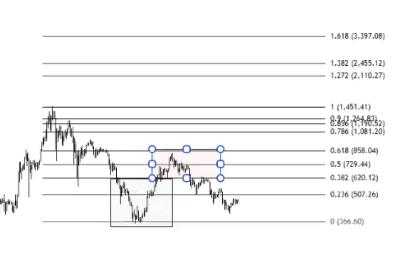
Fibonacci Clusters (Advanced Confluency)
A Fibonacci cluster is when multiple Fibonacci levels from different timeframes or different moves overlap at the same price area. This creates a much stronger support/resistance zone than any single Fib level.
How to Find Clusters
- Draw Fib retracement on the recent move (e.g. daily timeframe, COVID bottom to top)
- Zoom out and draw another Fib retracement on the larger move (e.g. monthly timeframe, entire trend)
- Look for where levels from both overlap — e.g. the 618 from the recent move aligning with the 382 from the whole move
- Draw a rectangle box around the cluster zone — that's your high-probability support/resistance area
Microsoft Example
The 618 retracement from the COVID bottom overlapped with the 382 from the entire move. This created a cluster zone. Microsoft (a trillion-dollar company) bounced off this cluster zone — two independent Fib levels both pointing to the same area of support.
Cluster zones are stronger than single Fib levels because you have multiple independent mathematical reasons to expect support/resistance at that price.
1.7 - Candlestick & Pattern Analysis
What Type of Trader Are You?
Before diving into candlesticks, you need to know which timeframe suits your personality. The candles you look at depend entirely on your trading style.
| Style | Timeframe | Hold Period | Risk | Reward | Stress | Best For |
|---|---|---|---|---|---|---|
| Position Trader | Weekly / Monthly | Months to years | Low | Low (slow) | Low | Long-term investors, relaxed personality |
| Swing Trader | Daily / Weekly | Days to weeks/months | Low-Med | Medium (takes time) | Low-Med | Patient traders, don't need daily results |
| Day Trader | 5min / 15min / 1hr | Within the day | Med-High | Higher (faster) | Higher | People who thrive on pressure |
| Scalper | 1min / 5min | Minutes to hours | High | High (immediate) | Very High | Adrenaline lovers, decisive under pressure |
Key insight: Your personality determines which style works. If you love roller coasters and spontaneity → scalping/day trading. If you prefer the beach and reading → swing/position trading. The educator started as a day trader (loved the rush, got fast feedback for learning), then transitioned to position trading as his life and priorities changed.
Match your chart timeframe to your style: Position trader = weekly/monthly. Swing trader = daily/weekly. Day trader = daily/hourly. Scalper = 1min/5min.
Anatomy of a Candlestick
Each candle gives four pieces of data: Open, Close, High, Low.
- Body = range between open and close
- Wicks/Shadows = the high and low extremes the price reached during the period
- Green/White = closing price was HIGHER than opening price (bullish)
- Red/Black = closing price was LOWER than opening price (bearish)
Multi-timeframe unpacking: A single daily candle can be unpacked by looking at the hourly/5min charts within that day. A bullish engulfing on the daily might show a clear downtrend reversal on the hourly. A bearish shooting star on the daily might show a strong downtrend on the 1-minute. This helps you understand what's actually happening inside each candle.
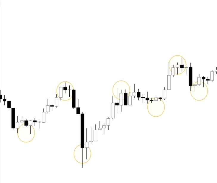
Candlestick Patterns
Reference Charts
| Bullish | Bearish |
|---|---|
 |
 |
 |
 |
 |
 |
No pattern works all the time — they represent tendencies, not guarantees. Always confirm with volume and other indicators.
Single Candle Patterns
Marubozu ("Bald Head"): No or minimal wicks — open/close IS the high/low. Bullish marubozu = intense buying pressure throughout the session. Bearish marubozu = intense selling pressure. These are powerful trend confirmation candles.
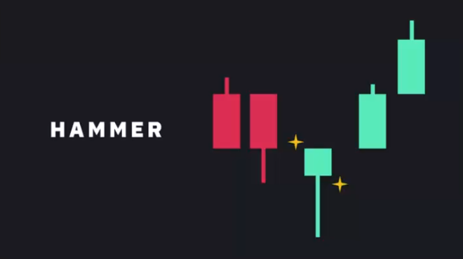
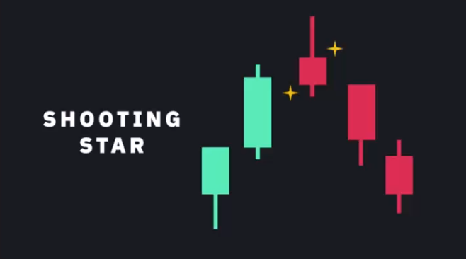
Hammer / Shooting Star: Long wick at one end, small body. Hammer (bullish) = long lower wick at bottom of downtrend, buyers stepped in hard. Shooting Star (bearish) = long upper wick at top of uptrend, sellers pushed price back down. Can be either colour.
Spinning Tops / Dojis: Short body centered between long upper and lower wicks. Neutral — represents indecision between bulls and bears. What matters is the candle that follows: big green after a doji = bulls won. Big red = bears won.
Multi-Candle Patterns
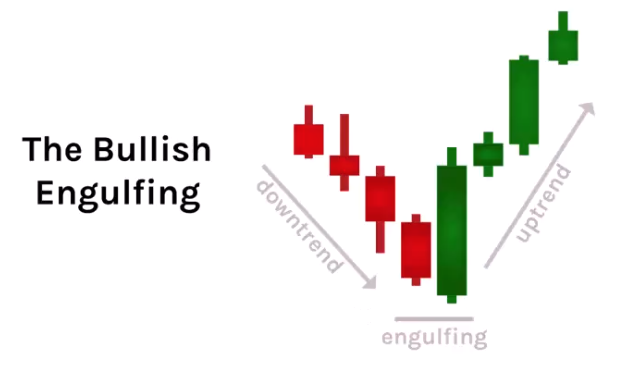
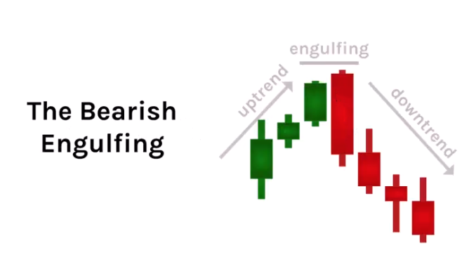
Bullish/Bearish Engulfing: Two candles where the second completely engulfs the first. Bullish engulfing at bottom of downtrend = reversal signal (buyers overwhelmed sellers). Bearish engulfing at top of uptrend = reversal signal. Look for high volume to confirm.
Inside Bar (Harami): Small candle completely inside the previous candle's range. Shows the trend is pausing — indecision. The next candle determines direction.
Morning Star / Evening Star: Three-candle reversal pattern. Morning star (bullish) = long red → doji/small body → long green. Evening star (bearish) = long green → doji/small body → long red. The doji shows the battle, the third candle shows who won.
Volume with Candlestick Patterns
- Reversal patterns (engulfing, hammers, stars) should have HIGH volume to confirm
- Climax/exhaustion candles at the end of trends often show extreme high volume
- Trend confirmation candles (marubozu) should be accompanied by strong volume in the trend direction
Chart Patterns
ASX Trader's honest take: "If I had to drop one lesson from the entire course, it would be this one." He's not a chart pattern trader — patterns can go either way and markets sometimes do the opposite because everyone is watching the same pattern. However, patterns complement other tools and provide useful common language.
The key principle: Don't just trade because you see a pattern. Unpack what's under the hood — it's all market structure. If you can identify pivot points and market structure, you don't technically need to know pattern names. But knowing the language helps communicate with other traders.
Continuation Patterns
Triangles
Converging price ranges showing a pause in the trend. Three types:
Symmetrical: Both lines converging at equal slopes. No directional bias — neutral consolidation. Direction depends on the breakout.
Ascending: Horizontal resistance + rising support (buyers stepping in higher each time). ~80% probability of upside breakout. Eventually sellers get exhausted.
Descending: Horizontal support + falling resistance (sellers stepping in lower each time). Eventually buyers get exhausted and it breaks down.
Elliott Wave connection: Triangles occur before the FINAL wave (wave 5 / excess phase). After a triangle breakout, expect one last push, then a correction. This is why triangle breakouts can trap retail traders — the move after the triangle might be short before rolling over.
Breakout vs fake-out: If a triangle breaks out and comes back within the pivot, it was likely a fake-out or a short excess phase. Check volume — breakout should be on high volume. Also check for divergence from the start to end of the triangle.
Flags & Pennants
Flags are short consolidation periods against the trend direction after a sharp impulse move (the "pole"). They're strong continuation patterns.
Bull Flag: Uptrend → sharp move up (pole, high volume) → consolidation down (flag, low volume) → breakout continuation (high volume). The flag should NOT retrace past the Fib 382 (maybe 500 max). If it goes to 618, it's too deep — it's not a flag, it's a weak trend.
Bear Flag: Downtrend → sharp move down → consolidation up to the zag zone (302-618) on low volume → breakdown on high volume.
Pennants: Same as flags but the consolidation forms a small symmetrical triangle instead of a channel. Also shouldn't retrace past 382.
Cup & Handle
Continuation pattern: prior uptrend → rounded bottom (the cup) → small pullback (the handle, which is basically a bull flag) → breakout. Handle should retrace to Fib 382, max 500. Handle must form on lowering volume. Breakout on increasing volume. Measured target = depth of the cup projected upward from the breakout.
Darvas Box (Rectangle)
Sideways consolidation with equal highs and equal lows. When it breaks out, check: is volume confirming? If breakout comes back within → liquidity grab (check OBV — was it going up on lowering volume?). If it breaks out and continues with strong volume → genuine breakout.
Reversal Patterns
Head & Shoulders / Inverse H&S
A head & shoulders is just a failure swing. Shoulder, head, shoulder = higher high, higher low, higher high, then lower high (the right shoulder fails to reach the head), then breaks the neckline.
Advanced H&S with volume and divergence:
- Left shoulder forms on increasing volume
- Head forms on LOWERING volume (weakness) + bearish divergence from left shoulder to head on RSI
- Right shoulder forms on LOWERING volume (dumb money buying the dip)
- Neckline break should come on increasing volume (sell pressure confirms)
- Measured target = distance from neckline to head
The neckline doesn't have to be horizontal — it can be diagonal.
Fractals: Each wave can have its own mini head & shoulders. Multiple small H&S patterns combine to form one large H&S (accumulation → public → excess → correction).
Wedges (ASX Trader's Favourite)
Converging trend lines both moving in the same direction (unlike triangles where they move in different directions).
Falling Wedge (Bullish): Both lines sloping down but converging. Tension builds as the trend tightens. Breakout to the upside on increasing volume. ASX Trader's favourite pattern — gives phenomenal risk:reward because you can enter on the breakout and place a tight stop loss. Target = back to the top of where the wedge started. Look for bullish divergence on both OBV and RSI as it comes down the wedge.
Rising Wedge (Bearish): Both lines sloping up but converging. Uptrend getting weaker. Should be going up on decreasing volume. Breakdown on strong volume.
Multi-Timeframe Candlestick Analysis
- Identify primary trend on higher timeframes (daily, weekly, monthly)
- Confirm on lower timeframes — look for consistent patterns aligning with the primary trend
- Spot entry/exit points on even lower timeframes (15min, 5min) for precise entries
- Detect confluences — a bullish reversal pattern on the daily, supported by a similar pattern on the 4-hour, with increased volume = strong setup
Example: A bullish engulfing on the daily = look inside and you might see a double bottom on the hourly. Two reversal signals confirming each other across timeframes.
Advanced Pattern Analysis — Combining Everything
The real power of patterns comes from combining them with volume and divergence:
For reversal patterns (H&S, wedges):
- Look for divergence on BOTH RSI and OBV as the pattern forms
- The reversal candles should have high volume
- The continuation into the pattern should show lowering volume (weakness)
- When you get divergence on price momentum AND volume momentum, plus a change of market structure = high probability setup
For continuation patterns (flags, triangles, boxes):
- The consolidation should happen on lowering volume
- The breakout should happen on increasing volume
- OBV should confirm the breakout (if OBV doesn't break out with price, it's likely a fake-out)
- Triangles = one more push before a correction (excess phase), so trade with awareness it might be short
Index Confirmation
Dow Theory Tenet 5: The Averages Must Confirm One Another
For a market trend to be valid, both the Dow Jones Industrial Average (DJIA) and the Dow Jones Transportation Average (DJTA) must move in the same direction. If one average makes new highs while the other doesn't, it suggests weakness in the trend — divergence between indices is a signal (blinker) that a reversal may be coming.
Fun fact: Charles Dow invented both the DJIA and the DJTA. The DJIA is the longest-running American index (originally 12 stocks, now 30, over 100 years old). When someone questions TA, remind them the longest-standing American index is named after the guy who invented it.
Historical DJI vs DJT Divergence — 6 out of 6 Major Tops
The educator demonstrated that EVERY major market top showed DJT divergence before the crash:
- 1987 Crash (worst crash in history) — DJI making new highs, DJT making new lows. Change of market structure on both confirmed → could have avoided the biggest crash in history
- 1989-90 Crash — DJI new highs, DJT new lows before ~25% drop
- 2000 Tech Bubble — DJI new high in Jan 2000, DJT had already made a lower high from May 1999
- 2007 GFC — DJI new high, DJT made new low. Before the dramatic drop
- COVID 2020 — DJI making higher highs, DJT making lower lows before the crash
- 2022 Bear Market — DJI new highs, DJT making lower highs during the top
Six out of six times before a major crash, the transportation average was a leading indicator showing non-confirmation. This is a third type of divergence (alongside RSI price divergence and OBV volume divergence).
How to Compare in TradingView
- Click the layout selector (top right corner, small box icon)
- Select split screen (two charts side by side)
- Type the second ticker (e.g. DJT) in the right panel
- Match timeframes on both charts — make sure both are daily, or both weekly
- Use vertical lines to align pivots and dates across charts — this shows you whether the highs/lows match
Modern Multi-Chart Confirmation
Dow only had two indices to compare. Today there are many. The same principle applies: if you're in a raging bull market, ALL related indices should be raging and making new highs at the same time.
S&P 500 vs Russell 2000
The Russell 2000 (small caps, IWM) should confirm the S&P 500 in a healthy bull market. If the S&P keeps making new highs but the Russell goes sideways or makes lower highs, that part of the trend is weakening — money isn't flowing into risk-on small caps.
Bitcoin vs Ethereum
Ethereum is a more risk-on asset than Bitcoin. In a healthy crypto bull market, both should be making new highs. Examples of non-confirmation:
- BTC bottom at $15K: Bitcoin made a new low, but Ethereum made a higher low → indices not confirming → bullish divergence signal that the downtrend was weakening
- BTC top at $64K: Ethereum made a new high, Bitcoin made a lower high → not confirming → weakness before the rollover
Sector → Individual Stock Flow
When a sector starts breaking out, you can find individual stocks within that sector that are also breaking out — double confirmation from two charts:
- Sector example (Utilities/AGL): The utility sector showed a Wyckoff accumulation at the Fib 618 + trend line support. When it broke out, ASX Trader found AGL within that sector also showing bullish divergence and a spring pattern → put 22% of portfolio in AGL at $5.20 → it went to $8+ while the broader market was collapsing. Just because NASDAQ/tech was going down didn't mean everything was
- Sector example (Uranium): The uranium sector completed a zag into the golden pocket zone. When it changed market structure (Aug 2023), individual uranium stocks like PDN (inverse H&S breakout), DYL (bull flag breakout), and Boss Energy (accumulation breakout) were all breaking out at the same time → confluency from sector + individual stocks
Best Stocks Break Out Before the Sector
The best fundamental companies within a sector often break out BEFORE the sector itself does. Big money flows into the best-of-the-best first.
Gold example (Northern Star): When gold was making lower lows and a triple bottom, Northern Star was already making higher lows → showing strength before the commodity itself reversed. RSI showed bullish divergence on gold at the same time. This is how the educator called the gold bottom — confluency from gold chart + gold miners chart + Northern Star chart + RSI divergence.
Confluency — The Core Principle
Definition: A confluence occurs when two or more structures come together to form a high-probability zone — like rivers joining into one channel.
In trading: Confluence is where multiple technical analysis methods give the same signal. The more reasons pointing the same direction, the higher probability the trade works.
ASX Trader's Rule
"I will never take a trade unless I have a minimum of three points of confluency." This is why he maintains high win percentages — not by being lucky, but by stacking evidence.
Bitcoin $15K Bottom — 7 Points of Confluency Example
The educator demonstrated this breakout had:
- Decline resistance broken (diagonal trend line)
- Horizontal resistance broken (major S/R level)
- Falling wedge pattern (bullish reversal)
- Change of market structure (HH/HL)
- Bullish divergence on RSI
- Volume supporting the move
- Ethereum not confirming new low (indices diverging = bullish)
Seven independent reasons all pointing to the same conclusion. You should be almost shocked when a trade with this much confluency doesn't work.
How to Think About Confluency
"Think of it like you're in front of a judge, building your case." Every signal is a piece of evidence. The more evidence you stack, the stronger your case. Don't take a trade because of one thing — you need market structure + indicators + multi-chart confirmation.
A trade with only one reason (e.g. "it changed market structure") is weak. A trade with five to seven reasons (market structure + S/R break + pattern + divergence + volume + index confirmation) is your highest-probability setup.
Types of Confluency
Single-chart confluency — multiple signals on the same chart:
- Trend line support + horizontal support + Fib level meeting at the same zone
- Reversal pattern + bullish divergence on RSI + bullish divergence on OBV
- Candlestick reversal + market structure change + volume confirmation
Multi-chart confluency — signals from related charts confirming each other:
- Index making new highs → sector within that index also making new highs → individual stock within that sector also breaking out
- Commodity chart (gold) bottoming + gold miners making higher lows + individual miner (Northern Star) breaking out
- Bitcoin changing structure + Ethereum not confirming new low
Non-Confirmations as Early Warning Signs
When sectors or stocks FAIL to confirm broader index moves, it's an early clue that a trend may be weakening, reversing, or masking deeper structural issues. It's the same concept as RSI or OBV divergence, just applied across charts instead of across indicators:
- If the broad market is making new highs but a key sector is going sideways → weakness
- If a commodity is making new lows but the miners aren't → the commodity trend is weakening
- If one crypto is making new lows but another isn't → the bear trend may be exhausting
It's not TA's fault when something goes wrong — it's human error. You can eliminate that error by finding bullish signals across multiple charts, not just one.
Psychology & the Principle of Markets Discounting Everything
Dow Theory Tenet 1: The Averages Discount Everything
All available information — economic, political, and market factors — is already reflected in the price. The market discounts everything except acts of God (black swans / unknown unknowns). Even then, the market absorbs, reacts, and adjusts to shocks fairly rapidly.
"If It's in the News, It's Old News"
Before something gets printed, someone had to find the information, run it by the editor, print the story — and they've told their family and friends first. There's probably a hundred people who found out before the public. By the time mass media publishes, the inner circle already knows.
"Buy the rumour, sell the fact" — investors buy when they hear rumours of good news, then sell once it's officially announced because the good news is already priced in. Insiders position early, then liquidate into public participation.
Real-World Examples
- Evolution Mining: Bad quarterly report caused a 10% gap down — but it marked the BOTTOM. The market had already priced in bad news during the prior decline. The actual quarterly wasn't as bad as what was already priced in, so it became a buy
- Bitcoin FTX Collapse: Should have been "the end of the world" — but it marked the bottom. So much bad news was already priced in that the horrific event became a buying opportunity
- Uranium stocks meltdown: 30% drop on terrible news — but it marked the bottom and tripled from there
The Insider Dynamic
Big money gets information before retail. They accumulate during pessimism. Once the bullish news is published, insiders are already liquidating into the public buying. The public joins in after information is published, contributing to the herding behaviour that causes the market to overreact. Eventually a top or bottom forms as the market runs out of buyers/sellers.
The Wall Street Cheat Sheet — Market Cycle Psychology
The market cycle is a repeating emotional cycle, just like seasons. When you think it can't get any hotter (euphoria), you're probably at the peak. When you think it can't get any colder (despair), you're probably at the bottom.
Bull Phase Emotions
Disbelief → Hope → Optimism → Belief → Thrill → Euphoria
- Disbelief (Accumulation): Prices hit bottom after prolonged bear market. Despair, pessimism, nobody talking about it. Big money enters
- Hope: Market starts recovering, optimism emerges. Beginning of public participation
- Optimism: Bull market gains momentum, FOMO starts, greed begins. Middle of public participation
- Belief → Thrill → Euphoria (Excess): Market reaches peak. Widespread belief it will continue indefinitely. Everyone is bullish. Calling anything bearish gets you ridiculed. Point of maximum financial risk
Bear Phase Emotions
Complacency → Anxiety → Denial → Panic → Capitulation → Anger → Depression
- Complacency (Fake rally/Zag zone): "Buy the dip, baby." Everyone thinks it's just a normal pullback. Underestimate risks
- Anxiety → Denial → Panic: Public participation of the bear market. Fear intensifies, losses mount, weak hands get out
- Capitulation → Anger → Depression: Bear market deepens. Selling at any price. Price capitulates first (fast drops), then time capitulates (sideways drift until people get bored and move to the next shiny object). Point of maximum financial opportunity
Smart Money vs Public Entry
| Phase | Who's Buying | Sentiment |
|---|---|---|
| Stealth (Accumulation) | Smart money | Nobody talking about it |
| Awareness (Early public) | Institutional investors | First media attention |
| Mania (Public + Excess) | Public, retailers, FOMO | Media frenzy, euphoria |
| Blow-off → Distribution | Smart money selling to public | Universal bullishness |
"Big money loves what you hate. Big money hates what you love." When you hate something, they typically love it. Do the opposite of the masses — the herd is always wrong at extremes.
Matching Sentiment to Phases
Use sentiment as another point of confluency with your TA:
- Accumulation phase → sentiment should be LOW (despair, pessimism)
- Public participation → sentiment should be GOOD but not euphoric
- Excess phase → sentiment should be EUPHORIC, universally one-sided bullish
- Distribution/bear → sentiment transitions through complacency → panic → despair
Emotions in Trading
Greed & Fear
Greed drives overvaluation during bull markets. Fear drives panic selling during bear markets. "The market can remain irrational longer than you can remain solvent." Everything can say it's expensive with divergence and lowering volume, but it can keep pushing up. Sometimes weakness leads to an immediate reversal; sometimes it takes the second, third, or fourth signal.
Herd Mentality
Investors follow the crowd assuming others have superior information. This leads to prices reaching levels they should never reach — both up and down. Be careful of the "it's cheap compared to where it was" trap: if something was at $100 but fundamentally should only be worth $10, then $20 is still expensive even though it's "80% off."
Media Influence
Fear sells better than positivity. Headlines are designed to be catchy and grab attention, not to be accurate. The educator, as a journalist himself, has seen editors change his titles to be more sensational.
Overreaction & Underreaction
Markets tend to overreact to news (exaggerated moves beyond fundamentals) and sometimes underreact (failing to fully adjust). Both create trading opportunities.
Elliott Wave Personality (Simplified)
Each wave has its own personality and sentiment signature. This connects phases + psychology + Fibonacci into one framework:
Impulse Waves (Bull Market)
Wave 1 (Accumulation): Fundamental news almost universally negative. Previous bear trend still considered strong. Sentiment bearish. Volume increases slightly but not enough to alert most analysts. Early adopters enter cautiously. More bears than bulls.
Wave 2 (Correction of Wave 1): News still bad. Bearish sentiment quickly rebuilds — "see, still a bear market." Volume LOWER than wave 1. Should not retrace more than 61.8% of wave 1. Falls in a three-wave pattern (ABC). Can never go below the start of wave 1 (universal rule — if it does, it's not wave 1).
Wave 3 (Public Participation): Usually the LARGEST and most powerful wave (in equities; in commodities, wave 5 can be larger). News turns positive. Prices rise quickly. Corrections short and shallow. Anyone waiting for a pullback misses the boat. By the midpoint, the public joins in. Taste of euphoria toward the top.
Wave 4 (Correction of Wave 3): Typically choppy and sideways (often a triangle). Retraces less than 38.2% of wave 3 — shallow correction. Volume well below wave 3. Good place to buy a pullback if you understand wave 5 is coming. Frustrating because of lack of progress.
Wave 5 (Excess): Final leg. News universally positive, everyone bullish. Volume LOWER than wave 3. Momentum indicators show DIVERGENCE (RSI and OBV divergence from wave 3 top to wave 5 top). Average investors finally buy in — right before the top. Bears get ridiculed.
Corrective Waves (Bear Market)
Wave A: Fundamental news still positive. Everyone thinks it's just a pullback — "buy the dip, baby." Increased volume on the down move.
Wave B (The Trap): Price rallies — seems like the bull market is resuming. Volume LOWER than wave A. Lures people back in, only to face disappointment. Temporary sentiment shift.
Wave C: Almost everyone realises the bear market is real. Fear and panic. Volume picks up. Capitulation at the end — last holdouts finally give up, marking the bottom.
Three Tools to Identify a Top
- Can you see you're in the third phase (excess/wave 5)?
- Is sentiment really bullish/euphoric?
- Do you have divergence on your indicators (RSI, OBV)?
If all three = yes → start taking profits. This is how the educator called tops on lithium, crypto in 2021, and other assets.
Sentiment Analysis Tools
AAII Sentiment Survey
Search "AAII sentiment" — weekly survey of where investors believe the market will be in 6 months. When bullish readings get into the high 40s-50s, markets often top. When bearish readings hit similar extremes, markets often bottom.
Fear & Greed Index
Search "fear and greed index" — CNN has one for stocks, Alternative.me has one for crypto. Shows current market sentiment on a scale from extreme fear to extreme greed.
VIX (Volatility Index)
The "fear gauge." When VIX spikes above ~45-50, it signals capitulation — historically these have marked bottoms (GFC bottom, COVID bottom, every major sell-off). When VIX is low and declining, the market is complacent and in a bull market.
Options Max Pain
Search "options max pain swaggy stocks" — shows the price where option sellers pay out the least. Markets often gravitate toward this price around expiry dates. Quadruple witching (3rd Friday of March, June, September, December) — most major market tops and bottoms happen around these dates.
Contrarian Investing — Putting It All Together
Buy when nobody is talking about it. Sell when everyone is talking about it.
The practical framework:
- Identify the accumulation phase (sentiment is terrible, nobody cares)
- Wait for the first HH/HL (change of market structure = beginning of public participation)
- Ride the public participation phase
- Watch for the three top signals (third phase visible + euphoric sentiment + divergence)
- Start taking profits during the excess phase
- Don't try to sell the exact top — just recognise you're in the excess phase and act accordingly
Examples: Bitcoin 2020-2021 cycle, Woodside Energy pre-GFC, ARK ETF blow-off, Netflix excess phase — all showed the same pattern of accumulation → public → excess → correction, with sentiment matching each phase perfectly.
Risk to reward, trade planning & risk management
Why Risk Management Matters
Effective risk management combined with TA is what separates consistent traders from gamblers. Losses are inherent in trading — thinking you'll never lose is like playing basketball and thinking you'll never miss a basket. The goal isn't to never lose; it's to manage losses so they don't destroy your account.
"I've never lost a trade. I've either won it or I've learned from it."
Correct Risk vs Over Risk
If you're checking your portfolio constantly, can't sleep, and get defensive when someone says something negative about your holdings — you're over-risked and emotionally attached. Correct risk management means you're calm, composed, data-driven, and goal-focused. The trade is just another number.
The Five Possible Outcomes of a Trade
Every trade has exactly five possible outcomes — nothing else can happen:
- Break even — no gain, no loss
- Win big — the money makers
- Win small
- Lose small
- Lose big — the account killers
The goal: eliminate #5 (big losses). If you eliminate big losses using stop losses, you're left with break even, small wins, small losses, and big wins. The small wins and small losses roughly cancel each other out. What's left? The big wins — your account growers.
The 1% Rule
Never risk more than 1% of your account on a single trade.
With a $100,000 account, if you're wrong you lose $1,000 (1%). You'd have to be wrong 100 times IN A ROW to blow your account. That's virtually impossible with any reasonable strategy.
The Math That Changes Everything
Losing strategy (no 1% rule): 10 trades, won 6 out of 10 (60% win rate), but had three big losses of $7-10K each. Result: -$1,000 despite winning 6 trades. Big losses wiped out big wins.
Winning strategy (with 1% rule + 3:1 ratio): 10 trades, won only 3 out of 10 (30% win rate). Every loss was $1,000 (1%). Wins were $3K, $3K, and $10K (3:1 minimum). Result: +$9,000 (9% account growth) despite winning only 3 trades.
You can be right only 30% of the time and still make money. This is the single most important concept in the course.
The 3:1 Risk-to-Reward Ratio
Never take a trade that doesn't pay a minimum 3:1. For every $1 risked (stop loss), aim to make at least $3 (take profit).
How It Works
- Entry: $100
- Stop loss: $95 (risking $5)
- Take profit: $115 (reward $15)
- R:R = $15 ÷ $5 = 3:1 ✓
This is like going to a casino where landing on black loses you $100, but landing on red wins you $300. You only need to be right 30% of the time to be profitable.
Setting Stop Loss
Place your stop loss just beyond a logical invalidation point — below a pivot low or support level for a long trade. If price hits your stop, your trade thesis is genuinely invalidated (market structure is no longer bullish). The stop should go where, if hit, you're objectively wrong.
Setting Take Profit
Use your toolkit: Fibonacci zag zones (382-618), horizontal resistance levels, measured move targets, channel boundaries. Look for where Fib levels align with other confluency points — that's your highest probability take-profit zone.
Why You Can't Take Every Breakout
Not every breakout gives you a 3:1 trade. If price breaks out and your stop is too far from the entry relative to the target, the R:R might only be 0.8:1 — can't take it. But if price gives you a pullback/retest first, your stop can go under the retest pivot, often giving you 3:1+. This is another reason the breakout+retest strategy is so powerful — it improves your R:R.
Breaking the Myth: Cheap vs Expensive
"Forget price. Focus on risk to reward." This is the most important takeaway from the entire course.
A "cheap" asset at $0.01 with a poor R:R is a BAD trade. An "expensive" asset at $500 with a great R:R is a GOOD trade. Your goal is NOT to buy low and sell high — it's to risk little and make more.
You could pay MORE for an asset and make MORE money if the R:R is better. Bitcoin at $100K with a 10:1 R:R is a better trade than Bitcoin at $3K with a 2:1 R:R.
Stop thinking: "What price did I pay?" Start thinking: "Where's my stop? Where's my target? What's my R:R?"
The Recipe for Success — The Complete Trade Checklist
You've been given all the ingredients across 10 weeks. Now here's the recipe card.
Non-Negotiables (Core Ingredients — Must Have ALL)
These are like flour, eggs, and milk for a cake. Without them, you don't have a trade.
| # | Non-Negotiable | Question |
|---|---|---|
| 1 | Market Structure | Is market structure on my side? (HH/HL for longs) |
| 2 | Reversal Pattern | Was there a double top/bottom, non-failure swing, or failure swing before the structure change? |
| 3 | Volume Confirmation | Is volume confirming the move? (OBV supporting the breakout) |
| 4 | Support/Resistance Break | Is it breaking through a major S/R level? (Dow Theory says you want it to break a significant level) |
| 5 | Minimum 3:1 R:R | Does the trade pay at least 3:1? If not, don't take it |
If you can't tick all five → no trade. Don't even look at the extras. No cake without the core ingredients.
Negotiables (The Icing — Makes It Better)
Once you have all five non-negotiables, these increase probability:
Signals/Blinkers (want at least 1, prefer 2):
- RSI divergence before the reversal?
- OBV divergence before the reversal?
Context:
- What phase are we in? (Buy at beginning of public participation, not in excess)
- For swing/position trades, are we coming out of accumulation?
Additional Confluency (the more the better):
- Bouncing off or breaking through a Fibonacci level?
- Breaking a trendline resistance / bouncing off trendline support?
- Another chart confirming the same thing? (Index, sector, related asset)
- Fibonacci cluster zone?
- Base or consolidation prior to breakout?
- Candlestick reversal pattern? (Engulfing, morning star, hammer)
- Chart pattern? (Falling wedge, cup & handle, inverse H&S, flag)
Stop Loss Validation:
- Is the trade invalidated where the stop loss sits?
- Is the stop under the pivot low?
Take Profit Validation:
- Fib retracement to find the zag zone?
- Fib levels aligning with confluency points?
The Bitcoin $18K Trade — Recipe in Action
The educator's real trade demonstrated the full checklist:
- ✅ Change of market structure (failure swing reversal)
- ✅ Falling wedge pattern (bullish reversal)
- ✅ Breaking back through major support (liquidity grab confirmed)
- ✅ Breaking through the zag zone of the prior move (not just correcting the last leg)
- ✅ Bullish divergence on weekly RSI
- ✅ Bullish divergence on weekly OBV
- ✅ Increasing volume on the breakout
- ✅ 3:1+ R:R with stop under pivot and TP at Fib zone
Eight reasons to be in, one minor negative (daily OBV didn't confirm). Way more evidence for than against. That's the standard you're aiming for.
Key Mindset Shifts
- Trading is not a get-rich-quick scheme. It takes years to master, just like any skill. People happily go to university for 4 years eating two-minute noodles, but expect to master trading in weeks
- The data in your journal tells the truth, not your feelings. If your journal shows you're better at swing trading than day trading, listen to the data
- Eliminate big losses and the rest takes care of itself. Small wins and small losses cancel out. Big wins are your account growers. If you never have big losses, you'll grow over time
- You're becoming the casino, not the gambler. The casino doesn't win every hand — it wins because the odds are stacked in its favour over hundreds of hands. That's what 3:1 R:R does for you
Term 1 Masterclass
End-of-term session combining everything from the 10-week course into practical application.
The Skill Hierarchy — Why the Course Is Sequenced This Way
Every skill builds on the one before it. The sequence isn't arbitrary — you can't do the later steps without mastering the earlier ones:
- Pivot Points → The absolute foundation. Can't do anything without these
- Market Structure → HH/HL, LL/LH, EH/EL. Requires pivot points. "Market structure is king"
- Reversal Patterns → Double top/bottom, non-failure swing, failure swing. Need to know when market structure flips
- Support & Resistance → Horizontal zones where buyers/sellers step in. Identifies key levels to break through
- Phases → Accumulation, public participation, excess. Where are we in the cycle? Don't buy the excess phase
- Volume & OBV → Is the move supported? Fuel for the market. Effort vs result
- RSI Divergence → Leading indicator — signals (blinkers) before the reversal confirms
- Fibonacci → Where will it retrace to? Zag zone targets. Trend strength assessment
- Candlestick Patterns → Complementary confirmation. Unpacking candles across timeframes
- Confluency → Combining everything together. Multiple rivers meeting at one point
- Stop Loss & Take Profit → Where am I wrong? Where am I taking profit? What's my R:R?
You should now be able to pull up ANY chart and analyse its short-term, medium-term, and long-term outlook using all these skills.
The Complete Trade Process — Step by Step
When you pull up a chart, this is the order of operations every time:
Step 1: Identify Market Structure
Mark your pivot points. Determine: is it HH/HL (bullish), LL/LH (bearish), or EH/EL (sideways)? Draw the line connecting pivots to see the trend direction. This comes first — always.
Step 2: Look for Reversal Patterns
Has there been a double top/bottom, non-failure swing, or failure swing? Is market structure changing? If market structure hasn't changed, there's no trade to take.
Step 3: Check Key Levels
Is it breaking through a major support/resistance zone? Draw your horizontal S/R zones (green for support, red for resistance). Is there a resistance/support flip happening?
Step 4: Assess the Phase
Where are we in the cycle? Accumulation = wait for breakout. Public participation = ideal entry zone. Excess = take profits, don't enter new positions.
Step 5: Check Your Blinkers
Does volume confirm the move? Is OBV supporting the breakout? Is there RSI divergence that preceded the reversal? At least one blinker, preferably two.
Step 6: Use Fibonacci
Where might it retrace to (zag zone)? Where are the key Fib levels? Does the 382/618 align with any horizontal S/R levels (cluster zone)?
Step 7: Look for Confluency
How many independent reasons support this trade? Pattern? Trend line? Another chart confirming? Candle pattern? Minimum 3 points of confluency.
Step 8: Plan Your Exit (Before You Enter)
Stop loss: Below the pivot low / invalidation point. Where is the trade objectively WRONG?
Take profit: Fib resistance zone, horizontal resistance, or measured move target. Where do Fib levels align with S/R confluency?
R:R check: Is it minimum 3:1? If not, wait for a pullback/retest to improve it. Don't force the trade.
Logan's Real Trade Breakdown — Every Skill Applied
An ex-student (1.5 years post-course, swing trader) broke down a live trade showing exactly how the 10-week toolkit applies:
Entry Identification
- Accumulation phase identified — long sideways range after a major downtrend
- Breakout through resistance — price broke above the accumulation range
- Didn't FOMO — missed the initial 40% move. Instead, drew an arrow showing "I'm waiting for the retest"
- Break and retest — price came back to old resistance, now becoming support
- Non-failure swing reversal — change of market structure on the retest
- Jumped to hourly for precise entry — used smaller timeframe to time the entry on a candle close above resistance
- Stop loss under the pivot — tight stop (~12%) under the retest low. Much better than 40% stop if he'd entered at the breakout
Confirmation Checks
- RSI divergence — bullish divergence formed during the sideways accumulation
- OBV broke out with price — volume confirmed the breakout (eliminates fake-out risk 9/10 times)
- Volume bars — increasing volume on the breakout candles
Profit Management
- Used Fibonacci — drew Fib levels to identify key resistance. 618 aligned with major horizontal S/R (confluency)
- Added to the position — when price broke through the 618 and retested it as support, he added more
- Raised Fibonacci — after each new leg, re-drew Fib from the new pivot to find the next target
- Weekly timeframe target — zoomed out to weekly, drew Fib from the head & shoulders top to the bottom. 618 aligned with major resistance zone = ultimate take-profit target
The Psychology Lesson
Logan was up ~60% and every part of him wanted to sell. But his journaling had identified "letting winners run" as his biggest weakness — he kept nailing entries but exiting too early. So before taking this trade, he made a promise: "I'm holding to my target no matter what."
The plan: partial profit at key resistance if it reaches there, full exit at the weekly Fib target. If it retraces, let it breathe in the zag zone (382-618). If it bounces off 382, add to position and raise stop loss. If it changes market structure to bearish, exit. Then if it later breaks out again → repeat the entire process (break, retest, enter, new target).
"You're never going to be angry at yourself or disappointed following the plan."
Post-Course Roadmap — Where to From Here
Trading
- Redo the 10-week material. Logan did this and had major light bulb moments the second time. Focus especially on pivot points, market structure, reversal patterns, Fibonacci, and S/R
- Set achievable goals. Logan's first goal was just $1,000. Once he hit that, he knew he could scale it. Start small, compound up. Don't pressure yourself to go full-time immediately
- Figure out your trader type through experience and journaling. Logan found swing trading suits his lifestyle. Day trade with a small allocation for fun/learning, but put most capital into what works for you
- Develop your own strategy. Every educator has a slightly different style — Craig is Elliott Wave heavy, Dave uses Fibonacci and breakout trades, Shane is pure Elliott Wave without indicators. Take what resonates from each and build YOUR system
- Prepare before every trade. You're going into battle. The other side is doing the opposite to you. Execute on data, not emotion
Psychology (The Real Edge)
- Paper trade first. It's boring because you want to make money NOW, but it builds confidence and removes the risk from learning. Use Moomoo's paper trading account alongside your real one — test strategies without real money
- Journal your wins AND losses. It took Logan 3-4 months to start journaling even after being told repeatedly. Once he did, he immediately found what was working and what wasn't. The boring stuff is what separates winners from losers
- Trade with less capital initially. Build confidence with small positions before scaling up. Going from $700 → $1K → $5K → $10K trades are all milestones. Don't dump $100K into the market before you've proven your strategy with $1K
- Letting winners run is Logan's biggest ongoing battle. He kept nailing entries but exiting early for quick profits. The fix: before entering, make a promise to yourself about the plan and stick to it
- Before entering any trade, know your exit. Both the stop loss (where am I wrong?) and the take profit (where am I done?). When you know both, the trade becomes mechanical and you can't panic
The Non-Negotiable Checklist (Quick Reference)
Before every trade, tick these off:
| ✅ | Non-Negotiable |
|---|---|
| ☐ | Market structure on my side |
| ☐ | Reversal pattern confirmed |
| ☐ | Volume confirming the move |
| ☐ | Breaking through major S/R level |
| ☐ | Minimum 3:1 risk-to-reward |
Then look for extras: RSI divergence? OBV divergence? Fibonacci level? Pattern? Multi-chart confirmation? Phase identification? The more you stack, the higher probability the trade works.
Key Quotes to Remember
- "Market structure is king" — everything else supports it
- "We don't trade signals, we trade triggers" — divergence is the blinker, market structure change is the turn
- "Forget price, focus on risk to reward" — the most important lesson from the entire course
- "I've never lost a trade — I've either won it or learned from it"
- "Big money loves what you hate, big money hates what you love"
- "You're never going to be angry at yourself or disappointed following the plan"
- "Think of yourself as the casino, not the gambler" — 3:1 R:R means you only need 30% win rate
- "If it's in the news, it's old news" — insiders are already positioned
- "If you can't handle the zags, you don't deserve the zigs"
Complex divergence
Recap: Regular Divergence Fundamentals
RSI is a price momentum indicator. Most people (90%) use it for overbought/oversold — but the biggest moves happen when RSI IS overbought/oversold. On larger timeframes (monthly/weekly), overbought/oversold readings can be meaningful. On daily and below, they're less reliable.
Key rule: Divergence must start from an overbought or oversold reading first. You don't get valid divergence in the neutral zone (30-70). The first extreme (overbought/oversold) establishes the baseline, then the next move creates the divergence.
Divergence strength recap:
- Strong: New low in price, higher low in RSI (or new high / lower high)
- Medium: Double bottom in price, higher low in RSI (or double top / lower high)
- Weak: New low in price, double bottom in RSI (or new high / double top)
Divergence means weakening, not necessarily reversal. It could lead to a sharp correction OR a sideways consolidation. Always trade the trigger (change of market structure), not the signal (divergence alone).
What Is Complex Divergence?
Complex divergence is when you get multiple divergence signals that combine together before a reversal occurs. Instead of one clean divergence → reversal, the market gives you several divergence signals in sequence.
You might get: strong → medium → weak before the actual reversal. Or three strongs. Or strong → weak. Any combination. The market is like your body during a long run — sometimes you get tired after the first signal and stop. Sometimes you push through several signals of fatigue before finally stopping.
This is exactly why you trade the trigger, not the signal. If you traded the first divergence signal every time, you'd get wrecked when the market produces two or three more before actually reversing. Each divergence signal says "weakening," but only the change of market structure says "reversed."
Practical Example
On the S&P 500 daily: price made higher high after higher high after higher high, while RSI made lower high, lower high, lower high. Three bearish divergence signals in a row. If you'd shorted on the first one — stopped out. Second one — stopped out again. It wasn't until the actual change of market structure (break below support) that the reversal confirmed. All the divergences were correct that the trend was weakening — the trigger was what told you WHEN.
Multiple Timeframe Divergence
Multiple timeframe divergence is where you look for divergence signals across different timeframes simultaneously. This is how you pinpoint major reversals and get precise entries on big moves.
The Fractal Principle
Each phase contains sub-phases. Each sub-phase contains its own divergence:
- Monthly: Divergence from top of public participation to top of excess phase
- Weekly: Within that monthly excess, there's its own accumulation → public → excess, with divergence from its public to its excess
- Daily: Within that weekly excess, same thing again
- 4-hour / 1-hour: Within the daily, same fractal pattern repeats
If you get divergence on the monthly AND the weekly AND the daily AND the hourly — you're looking at a major reversal, not just a small pullback.
How to Use It
Top-down approach (eagle → hawk):
- Start on the monthly — is there bearish divergence? If yes, the big trend is weakening
- Go to the weekly — is there also bearish divergence? If yes, the intermediate trend is weakening too
- Go to the daily — bearish divergence here too? The shorter-term trend is also weakening
- Go to the 4-hour or hourly — look for the actual reversal pattern and pinpoint your entry
You're looking at the big picture like an eagle, then zooming down like a hawk to pinpoint the exact entry. Your entry might be on the hourly, but you're trading a monthly reversal.
Why This Matters for Trade Size
If you have divergence only on the hourly, expect only an hourly-level pullback. If you have divergence on the monthly + weekly + daily + hourly, you're looking at a major multi-month reversal. The timeframe of the divergence tells you the magnitude of the expected move.
Real example (Bitcoin top): Monthly showed bearish divergence from the public to excess. Weekly showed the same. Daily showed the same. 4-hour showed a double top with bearish divergence. Hourly confirmed the reversal pattern. Entry was on the hourly, but the trade captured the entire monthly-level correction.
Real example (Bitcoin bottom): Monthly showed bullish divergence. Weekly confirmed. Daily confirmed. 4-hour showed bullish divergence. Hourly showed double bottom with change of market structure. Entry on the hourly captured the start of the entire new bull market.
Divergence to Convergence — When Has It Played Out?
This is the key concept most traders miss: how do you know when the divergence has finished playing out?
The Answer: When Divergence Returns to Convergence
- Convergence = price and RSI are doing the same thing (both making HH/HL or both making LL/LH) → GREEN = healthy
- Divergence = price and RSI are doing opposite things → RED = weakening
When a divergence phase returns to convergence, the signal has played out and the market is "back to normal."
The Green-Red-Green Framework
Map your chart into zones:
- Green zone (convergence): Price going up, RSI going up — they match. Trend is strong
- Red zone (divergence): Price still going up, but RSI starts going down — they don't match. Trend is weakening
- Green zone again (convergence): After the correction, price going down AND RSI going down — they match again. The divergence has played out
The Target: Back to Where Divergence Started
Wherever the divergence started from is where price tends to correct back to. The trend was strong up until the point of divergence. Everything after that point was a "fake" or weakening trend. The correction wipes out the weak portion and returns to where the trend was last genuinely strong.
S&P 500 Examples
- 1986-1987: Convergence (green) throughout the uptrend. Then divergence (red) started. The correction wiped out the entire divergence period — about 1-2 years of gains — and came back to where the divergence began
- Pre-GFC: Long period of convergence (green), then divergence (red) began. The GFC correction came ALL the way back to where the divergence started — even though price had gone much higher during the divergence period. The whole "fake" portion was corrected
How to Apply This
Use the green/red framework as another point of confluency:
- Mark where divergence started (draw a vertical line or horizontal level)
- That level is a potential target for the correction
- Combine with Fibonacci zag zone — if the divergence start point aligns with the 382-618 zone, that's powerful confluency
Steps to Find a Major Top
A practical step-by-step process:
- Monthly: Is there bearish divergence? (Higher price, lower RSI)
- Weekly: Confirm — also bearish divergence?
- Daily: Confirm — bearish divergence or double top with weakness?
- 4-Hour: Look for the excess phase of the excess phase — bearish divergence within the final push up
- Hourly: Pinpoint the actual reversal — look for change of market structure
Draw RSI divergence on candle BODIES, not wicks — RSI doesn't consider wicks.
Important Note: Tops Are Easier Than Bottoms
The educator finds it easier to identify tops of impulse moves than bottoms of corrections. Why? Impulse moves follow a predictable 5-wave pattern (accumulation → public → excess) with divergence from wave 3 to wave 5. Corrections can be complex — sharp, sideways, extended, shallow, deep — making the exact bottom harder to pinpoint. Corrections often end in the golden pocket (382-618), but WHERE within that zone is tricky.
Rules & Guidelines for Complex Divergence
- Always start on the largest timeframe and work your way down
- Divergence must start from an overbought or oversold extreme — not from the neutral zone
- Draw lines on candle bodies, not wicks — RSI follows bodies
- Multiple divergence signals don't mean "short now" — they mean the trend is weakening. Wait for the trigger
- The point where divergence started = your correction target — the trend was genuine up to that point
- Green (convergence) → Red (divergence) → Green (convergence) = the cycle is complete
- Divergence across multiple timeframes = bigger expected move — hourly divergence = hourly pullback. Monthly divergence = monthly-level correction
- Price action is still king — divergence is the blinker, not the turn
Hidden Divergence
Regular vs Hidden Divergence
| Regular Divergence | Hidden Divergence | |
|---|---|---|
| Signals | Potential reversal or consolidation | Potential continuation of existing trend |
| Bullish | Price: lower low, RSI: higher low | Price: higher low, RSI: lower low |
| Bearish | Price: higher high, RSI: lower high | Price: lower high, RSI: higher high |
| Context | Appears at the END of a trend | Appears WITHIN an established trend |
| Analogy | Body getting tired during a run — slowing down | Basketball team is down, but the players look energetic — comeback coming |
Key distinction: Regular divergence = the trend is weakening and may reverse. Hidden divergence = despite a temporary pullback, the underlying momentum is intact and the trend should continue.
Hidden Bullish Divergence
Requirements
- Must already be in an established uptrend (HH/HL). You cannot have hidden bullish divergence without an existing uptrend
- Price makes a higher low (buyers stepping in higher — normal uptrend behaviour)
- RSI makes a lower low (indicator resets more deeply — but this actually means more fuel for the next leg up)
What It Means
Even though RSI made a lower low (which looks bearish in isolation), the price made a higher low (which is bullish). The RSI is resetting — reloading energy for continuation. Think of it as the market catching its breath before the next push.
Confirmation Process
Without the confirmation, it's just POTENTIAL hidden bullish divergence. You keep an eye on it, and if market structure confirms, it becomes another green tick on your checklist.
Bitcoin COVID Bottom Example
From the $4K COVID bottom through the bull run, hidden bullish divergence appeared repeatedly at each pullback: higher low on price, lower low on RSI, continuation upward. It happened multiple times in sequence — each time the trend continued. Eventually, hidden bullish stopped appearing and regular bearish divergence began, signalling the trend was transitioning from continuation to potential reversal.
Hidden Bearish Divergence
Requirements
- Must already be in an established downtrend (LL/LH)
- Price makes a lower high (sellers stepping in lower — normal downtrend behaviour)
- RSI makes a higher high (indicator rallies but price doesn't follow — fake rallies)
What It Means
Even though RSI made a higher high (which looks bullish in isolation), the price only made a lower high. The "rally" is fake — the underlying bearish momentum is intact. The trend should continue down.
Confirmation
Same process as bullish but inverted:
The Battle: Regular vs Hidden
This is the critical practical concept. Regular bullish divergence and hidden bearish divergence can appear at the same time, creating a battle:
- Regular bullish says "potential reversal upward"
- Hidden bearish says "continuation of downtrend"
- Who wins? Whichever one gets confirmed by market structure
NVX example: Price made a new low with bullish RSI divergence (potential reversal). But then on the next rally, hidden bearish appeared (continuation signal). The battle was settled when price broke below the support level — hidden bearish won, and the downtrend continued.
Key takeaway: Regular bullish divergence doesn't always mean reversal — it can just be a bounce. That bounce can then create hidden bearish divergence, which continues the trend lower. This is why you NEVER trade divergence alone. Market structure confirms the winner.
Hidden Divergence Across Waves (Elliott Wave Context)
When Can You Have Hidden Bullish?
- Only when you're in an uptrend (above the change of market structure point)
- Between Wave 4 and Wave 2 — the zag zone pullbacks within the impulse
- Between Wave A of the correction and Wave 4 — the larger degree pullback
- NOT from sub-waves of different degrees — the pullbacks must be comparable
The Rule
As markets zig and zag, you can find hidden bullish from one zag zone to the previous zag zone (same degree). When you get the bigger "two steps back" (correcting the whole three-step move), you can find hidden bullish from that larger pullback back to the previous larger pullback.
The minute market structure changes to bearish → hidden bullish is invalidated. You can't have hidden bullish in a downtrend. Once the downtrend establishes, you start looking for hidden bearish instead.
Trading Strategies with Hidden Divergence
As Breakout Confirmation
When trading a breakout:
- Volume confirms the move ✓
- Hidden bullish divergence on the pullback before the breakout ✓
- Two blinkers saying "this should keep going" = higher probability breakout
You could enter on the early signal (yellow), but it's confirmed once it breaks the high (purple). Looking back, you see hidden bullish was telling you it was going to continue.
With Candlestick Patterns
If you get a pivot with bullish candlestick patterns (engulfing, morning star, hammer) at a support level AND hidden bullish divergence → multiple confluency points all saying "bounce and continue."
With Fibonacci
Stop Loss Placement
Rules & Guidelines
Directionally aligned divergence
What Is Directionally Aligned Slope Divergence?
Regular divergence = price and RSI going in opposite directions. Hidden divergence = continuation signal within a trend. Directionally aligned divergence = price and RSI going in the SAME direction, but at DIFFERENT RATES.
Both are going up — but price is going up at a 50° angle while RSI is only going up at a 20° angle. They're not opposing each other (so it's not regular divergence), but they're not in sync either. The rate of ascent (or descent) is different, and that difference = weakening momentum.
The Spectrum
| State | What's Happening | Signal |
|---|---|---|
| Full convergence | Same direction, same rate | Very bullish — strong trend |
| Directionally aligned divergence | Same direction, different rate | Weakening — trend losing steam |
| Regular divergence | Opposite directions | Trend may be about to reverse |
Think of it as a progression: convergence → directionally aligned → regular divergence → reversal. The trend starts healthy, begins to show cracks (directionally aligned), then the cracks widen (regular divergence), then it breaks (change of market structure).
Degree Matters
The greater the gap between the slopes, the more bearish (in an uptrend) or bullish (in a downtrend) it is. A slight difference is a mild warning. A massive gap where price is racing up at 60° but RSI is barely crawling at 10° is a strong warning — the trend is running on fumes.
How to Identify It
- Draw a trend line or channel on your price action — note the angle of ascent/descent
- Draw the same on your RSI — compare the angle
- If price is climbing at 45-50° but RSI is only climbing at 20-25° = directionally aligned divergence
- Where it starts = your correction target. The trend was genuinely strong before that point. Everything after is the "weak" portion that's likely to be corrected
S&P 500 COVID Bottom Example
From the COVID bottom, price and RSI went up at matching angles — convergence, healthy trend. Then price continued climbing steeply (45°+) while RSI started climbing at a flatter angle (~30°). That was directionally aligned divergence — the trend was weakening even though everything looked bullish on the surface. Eventually it moved into regular divergence, then changed market structure. The correction came back to the point where directionally aligned divergence started — the Fib 500 level aligned with it perfectly (two points of confluency for the target).
Bitcoin Example
Price going up in a parallel channel at a steep angle. RSI going up at a much flatter angle — directionally aligned divergence. The blinkers were on. When market structure changed (broke below support), the trade was confirmed — not just because of the structure break, but because the blinkers (directionally aligned divergence) had been warning beforehand.
The Three Types of Blinkers — Complete Framework
When you get a change of market structure, look back and ask: "Did it have its blinkers on?"
The blinkers can be any of:
- Regular divergence — price and RSI going opposite directions
- Hidden divergence — continuation signal within a trend (or the battle between hidden and regular)
- Directionally aligned divergence — same direction, different rate
If your change of market structure has at least one blinker type backing it up, you have more evidence. If it has multiple, even better. "Picture yourself in front of a judge — the more evidence, the stronger your case."
Applying All Three Divergence Types Together
For Reversals
The full progression of a topping process might look like:
- Convergence — everything matching, healthy trend (green)
- Directionally aligned — same direction but different rates (early warning)
- Hidden bullish battling regular bearish — the market is fighting between continuation and reversal
- Regular divergence — price going up, RSI going down (clear warning)
- Change of market structure — the trigger. Now look back and see all the blinkers that preceded it
- Convergence again — both going down together, confirming the new downtrend
For Breakouts
- Check: was there hidden bullish on the pullbacks before the breakout? If yes, the trend is strong and the breakout should be genuine
- After the breakout: don't panic on bearish divergence. Regular bearish often turns into hidden bullish — it's just the RSI resetting. 9 times out of 10, bearish divergence in a bull run is NOT the end. It resets, prints hidden bullish, and pumps again
- Wait for divergence → convergence to know who won (hidden bullish vs regular bearish). If convergence resumes on the upside (both making HH/HL), hidden bullish won and the trend continues
Key practical takeaway: Don't get freaked out by bearish divergence during a bull run. Regular bearish turns into hidden bullish, resets the RSI, and the trend continues. It's only a problem when it actually leads to a change of market structure.
For Pullback Entries
If you see directionally aligned divergence within a move up, you know a pullback is coming. Use it to:
- Identify the starting point of the weakness = your correction target
- Combine with Fibonacci (often the directionally aligned start point aligns with Fib levels)
- Wait for the pullback to reach that zone
- Look for a reversal pattern (double bottom + bullish divergence at the target)
- Enter on the change of market structure back up
NVX Example — The Full Battle
This example showed the complete interplay:
- Downtrend with convergence (both going down, matching)
- Regular bullish divergence appeared (potential reversal)
- But then hidden bearish appeared (continuation of downtrend)
- Battle between regular bullish and hidden bearish
- Hidden bearish won — price broke support and continued down
- Eventually regular bullish turned real → double bottom → convergence → breakout through support
- Uptrend established → directionally aligned divergence appeared (weakening)
- Pullback to the 382-618 zone (aligned with directionally aligned start point)
- Double bottom with bullish divergence at the target → re-entry
Rules & Summary
- Directionally aligned divergence is the EARLIEST warning — it appears before regular divergence. Most traders will never see it because they only look for opposing directions
- Same direction ≠ same strength. Just because both are going up doesn't mean the trend is healthy. Check the rates
- Where it starts = correction target. Combine with Fibonacci for confluency
- Don't sell on directionally aligned divergence alone — it's a signal, not a trigger. Wait for change of market structure, then look back and use it as evidence
- The progression: Convergence → Directionally aligned → Regular divergence → Change of structure. Not every trend goes through all stages — sometimes it skips straight to regular divergence
- Price action is ALWAYS primary. All three types of divergence (regular, hidden, directionally aligned) are secondary. They complement the primary — they don't replace it. Trade the trigger, not the signal
Pattern recognition for confluency
The Core Rule: Match the Right Divergence to the Right Pattern
| Pattern Type | Divergence to Look For | Why |
|---|---|---|
| Continuation (triangles, flags, rectangles) | Hidden divergence | Continuation patterns show trend strength. Hidden divergence = continuation of trend |
| Reversal (H&S, double tops, wedges) | Regular divergence | Reversal patterns show trend weakness. Regular divergence = weakening trend |
You cannot use hidden divergence on reversal patterns — hidden is continuation of the trend, but the trend hasn't flipped yet at the reversal point. Similarly, you wouldn't look for regular divergence to confirm a flag breakout — that's a continuation setup.
Continuation Patterns + Hidden Divergence
Ascending Triangle
Bullish reversal & continuation pattern — higher lows each move into horizontal resistance.
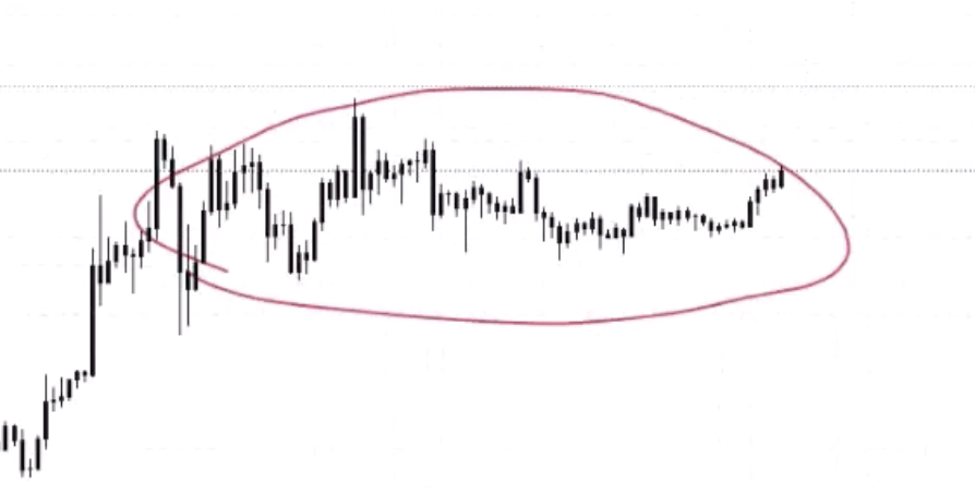
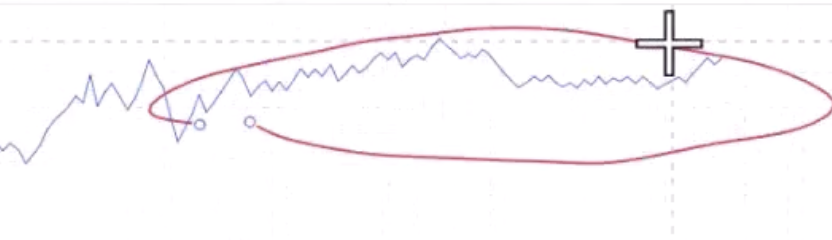
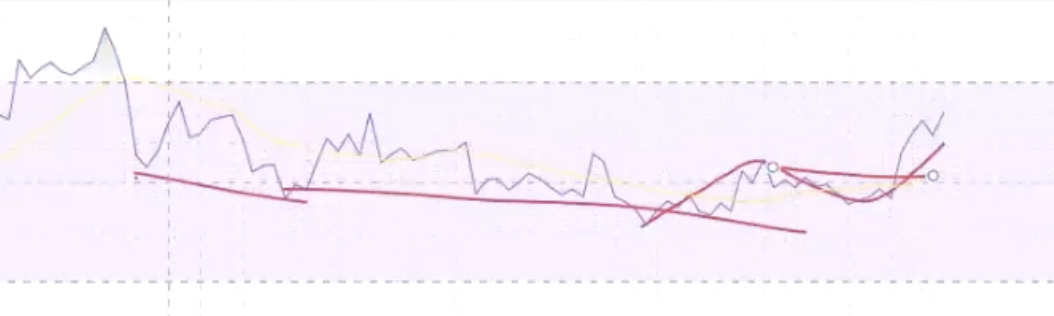
Descending Triangles
Just the opposite — prior downtrend → hitting support → sellers stepping in lower each time.
- Volume confirming the downtrend (lower lows in volume matching lower lows in price)
- Hidden bearish on the rallies within the triangle (lower high on price, higher high on RSI)
- Hidden bearish → convergence on the breakdown
- Change of market structure through support
Darvas Box (Rectangle)
A neutral formation that can be bullish or bearish.
- Look for a change of market structure WITHIN the box before the breakout — don't just trade the breakout alone
- RSI can show hidden bullish at the start / pre-box as extra confirmation
- Look for OBV to support the breakout — if OBV breaks out before price, that's a leading indicator
- If it breaks out and comes back in on low volume = liquidity grab, not genuine breakout
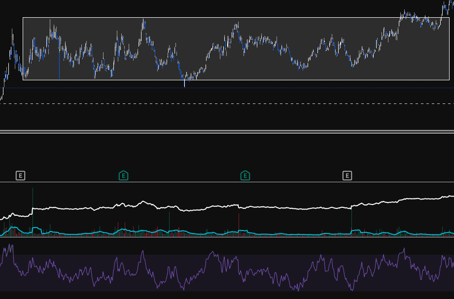
Bull Flag
Strong impulsive move forms the pole, then consolidation usually in the form of a channel.
- Measure Fibs from the first down change of market structure (reversal) to the top change of market structure. An impulse move (zig) is from the end of the last zag to the next zag
- Check if volume did NOT support the move down and DID support the move up
- Compare larger pivot points for hidden bullish divergence
- Flag should NOT retrace past the Fib 382 (maybe 500 max). Definitely not 618 — that's not a flag
- When you find a change of market structure at the end of the bull flag, look for:
- A break through a decline
- Low down volume
- RSI continuation (hidden bullish → convergence)
- Bounce off the 0.382 area
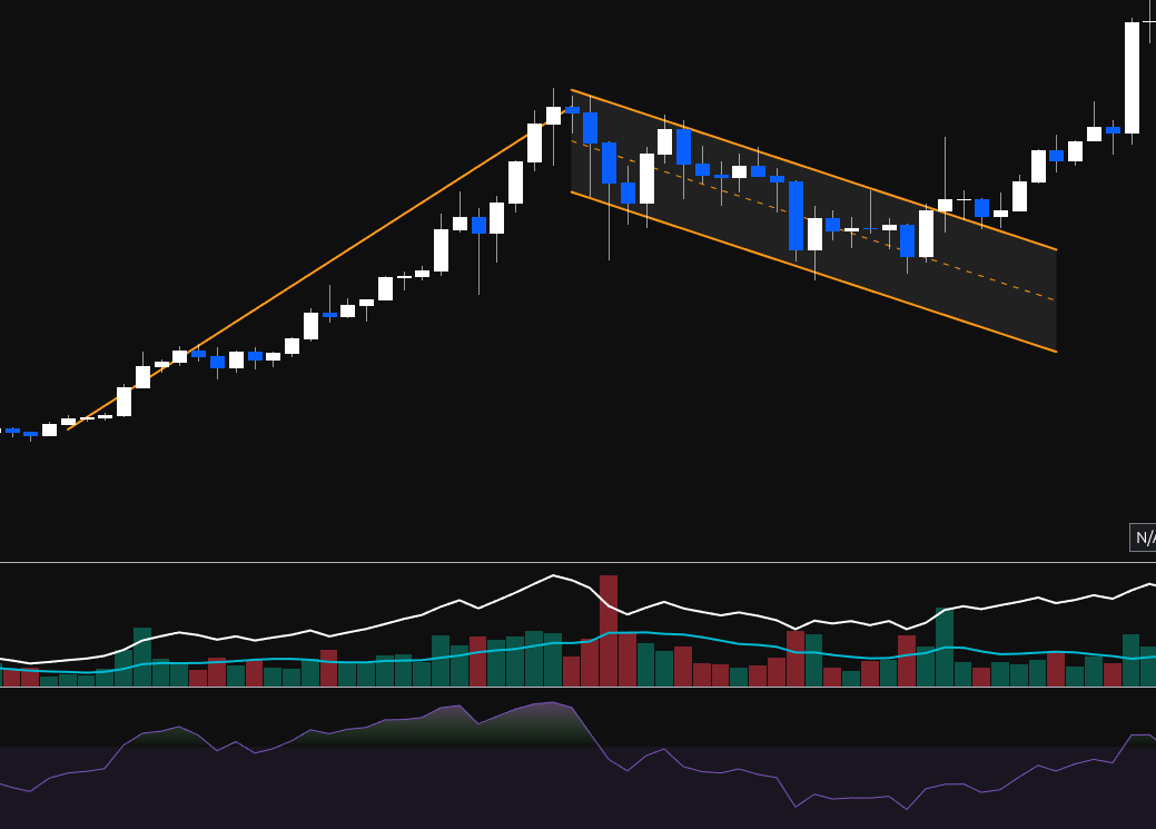
Reversal Patterns + Regular Divergence
Head & Shoulders
This is a bearish reversal pattern (failure swing).
- The left shoulder is formed on increasing positive volume
- Divergence is found from the top of the left shoulder to the top of the head
- The head will form on lowering / flat OBV, signalling weakness in the trend
- The right shoulder will be formed on even lower OBV, showing weakness in the dip buyers (dumb money buying the dip — thank you very much)
- When the neckline is broken, the pattern is confirmed and there should be increasing down volume on the sell-off (even lower OBV)
- The measured move is from the neckline to the top of the head
Inverse H&S warning: An inverse H&S might just be a zag retracement, not a major bottom. Make sure it breaks through the zag zone. If buyers step in at the 382-618 but don't break through, it could just be a corrective bounce.
Fractals: Each wave can top with a mini H&S. Multiple small H&S combine into one large H&S across the full accumulation → public → excess cycle.
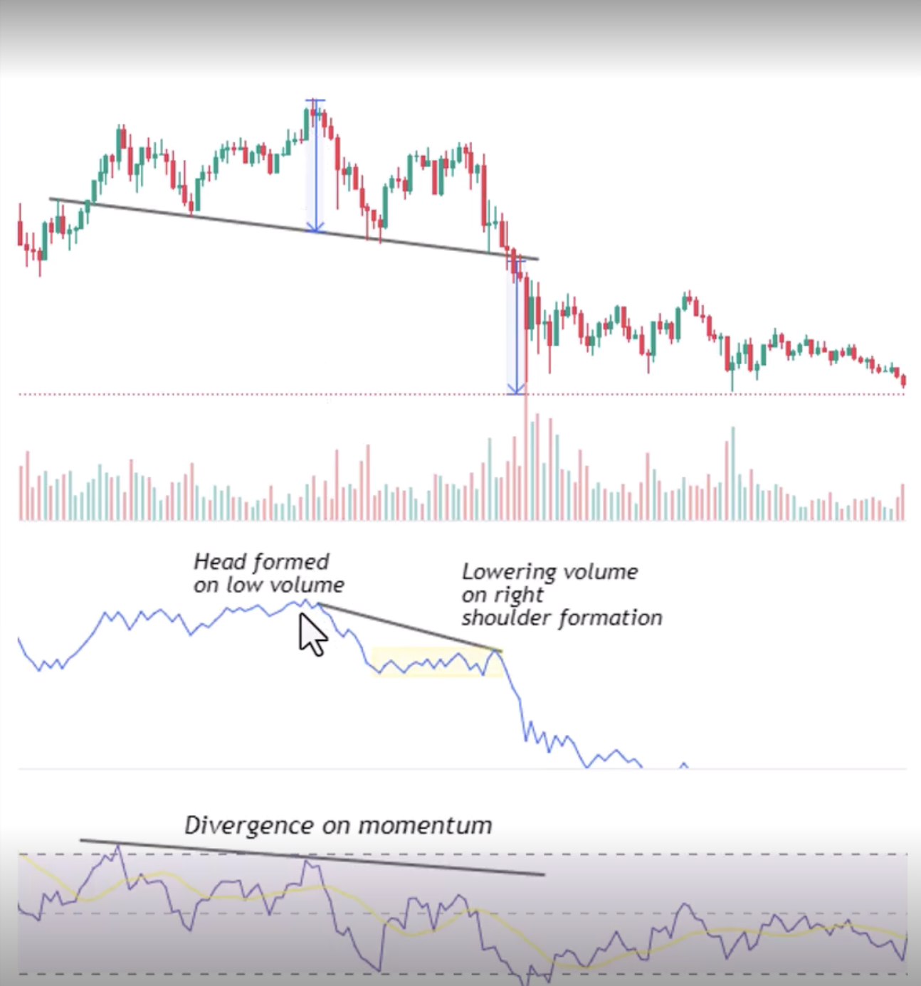
Double Tops / Bottoms
- When price makes an equal high (double top), RSI should be LOWER = bearish divergence (weakening trend)
- Volume: lowering volume on the second top. Volume confirms the zigs down but NOT the rallies back up (opposite of continuation)
- Divergence → convergence as it breaks the neckline
- No hidden divergence — this is a reversal pattern, only regular divergence applies
Falling Wedge (ASX Trader's Favourite)
- If a wedge starts forming into a zag zone, that should be the end of the ABC
- OBV should NOT support the move down and SHOULD support the move up
- Bullish divergence off the bottom of the wedge adds a point of confluency
- Hidden bullish divergence off the low if running into a zag zone (showing the larger uptrend will continue)
- Hidden bearish could be found at the top of the wedge if not at a bottom (within the wedge, showing the downtrend within the wedge is continuing — but this transitions into bullish divergence as the wedge exhausts)
- Two types: retracement wedge (had an uptrend, corrected down into zag zone) and bottom wedge (at the very bottom of a long downtrend, the final move / ending diagonal)
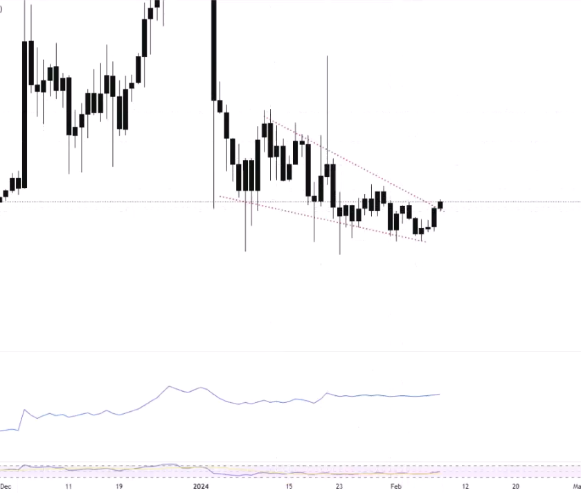
Summary: The Complete Pattern Fusion Framework
For Any Continuation Pattern
- Volume: Confirm the trend direction, don't confirm the corrections
- Hidden divergence: From the pullback pivots showing continuation
- Divergence → convergence on the breakout
- Change of market structure through the pattern boundary
For Any Reversal Pattern
- Volume: Don't confirm the trend direction (weakening), DO confirm the reversal direction
- Regular divergence: Showing the trend is weakening
- Divergence → convergence on the change of market structure
- No hidden divergence — the trend hasn't flipped yet at the pattern formation point
The Practical Takeaway
You're not trading because you see a pattern. You're trading because:
- Market structure confirms it ✓
- Volume profile supports it ✓
- The right type of divergence backs it up ✓
- Divergence has moved into convergence ✓
- You have confluency from multiple independent methods ✓
This is pattern fusion — combining the visual pattern with the underlying data (volume + divergence) to separate the genuine breakouts from the fake ones.
Moving averages, SMA & EMA
Moving Averages, SMA & EMA
Moving averages is a line that smooths out the price and can help gauge the general market direction
Moving averages are best used as a point of confluency and not as a single decision point (does the MA hit a zag zone or point of heavy resistance?)
The 50, 100 & 200 SMA can act as support and resistance
SMA vs EMA
| SMA (Simple Moving Average) | EMA (Exponential Moving Average) |
|---|---|
| Average of the price over the selected time period | Average of the price with more weight on the recent price |
| Best for long-term trends | Best for short-term trends |
| Slower, smoother — eliminates most fake-outs | Faster, more reactive — more prone to fake-outs |
| More lagging | Less lagging |
| Less volatile markets, stocks, swing/position trading | Volatile markets, crypto, day trading/scalping |
Why SMA for long-term? Dow Theory says ignore the noise of smaller timeframes — the primary trend is what matters. SMA's slower response suits that. EMA's faster reaction is better for volatile shorter timeframes where you need quicker signals.
Common lengths: 10, 20, 50, 100, 200 — can be applied to any timeframe.
How to Add in TradingView
Indicators → search "Moving Average Simple" or "Moving Average Exponential" → add. Double-click the line to change length and colour. Pro tip: In settings → Calculation → change timeframe from "Chart" to a fixed timeframe (e.g. "1 Month") so the MA stays consistent when you switch chart timeframes.
MA Strategies
Price Crossovers
When price crosses ABOVE the MA = bullish (like breaking through resistance). When it crosses BELOW = bearish (like breaking support). While above = uptrend. While below = downtrend.
Golden Cross / Death Cross
Not a great single strategy as moving averages are a lagging indicator
- Golden Cross: Buy when the 50 SMA crosses above the 200 SMA — indicates trend shifting up
- Death Cross: Sell when the 50 SMA crosses below the 200 SMA — indicates trend shifting down
Works well in trending markets, terrible in sideways markets. S&P 500 historical data: golden crosses at trend starts (1980, 2013) gave decade-long bull runs. But a golden cross in 2007 bought the top of the GFC. Death crosses on the S&P 500 have actually marked BOTTOMS more often than tops (because by the time the lagging indicator signals, the bear market is already over).
Combine with market structure — a golden cross during a confirmed HH/HL uptrend = confluency. A golden cross during EH/EL sideways = unreliable.
Buying on Hits / Trend Identifier
- In a trending market, the 200 SMA can be used as a buy-the-dip / sell-the-hit opportunity
- When all MAs (20, 50, 100, 200) are pointing in the same direction = strong healthy trend. When they're crossing over each other and going "all over the shop" = correction or sideways market
General MA Information
- Divergence between MA lines can help gauge the strength of a trend and how far "extended" it is — if the 20 is far from the 50, price has probably run too far too fast
- The angle of ascent or descent helps gauge how overextended a move is. Ideally 45° or less for a sustainable trend. Steep angles tend to correct back (mean reversion)
- Big money believe anything below the 200d is bad news and not worth touching, anything above is safe
- Mean reversion: When price gets too far from the MA, it tends to pull back toward it. This is especially visible on monthly charts where the 50 or 100 month MA has acted as a floor for decades on the S&P 500
How ASX Trader Uses Moving Averages
MAs are purely a confluency tool — just another data point, another river meeting the zone where buyers/sellers should step in. Not a standalone strategy.
Example process: Looking at a potential buy zone → check Fib retracement (Fib 500?) → check RSI divergence (bullish?) → check if a key MA is also at that same zone (100 SMA?) → if all three align at the same price area, that's three independent reasons to expect support. Add it to your trade plan checklist as another tick.
On the trade plan: "Also had the 100 SMA at the buy zone" — it's just one more piece of evidence for the judge.
MACD
General info
- Stands for Moving Average Convergence Divergence
- The MACD is a momentum indicator that shows the relationship between two moving averages
- The MACD line is calculated by subtracting the 26-period exponential moving average (EMA) from the 12-period EMA.
- The signal line is a nine-period EMA of the MACD line.
Commonly used to identify the changes in the strength, direction, momentum and direction of a trend
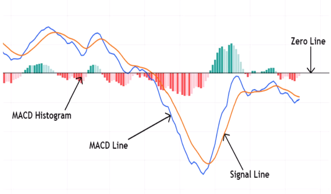
The MACD is made of 3 elements
- MACD line (blue - 12d minue 26d EMA)
- Signal line (orange - 9d EMA)
- Histogram - differences between the MACD & Signal line
Signals
- Bullish when MACD (blue) crosses above signal (orange)
- Bearish when MACD (blue) crosses below signal (orange)
- zero line cross - above bullish, below bearish
Histogram interpretation
- Growing bars - momentum increasing
- Shrinking bars - momentum decreasing
Gaps
Gaps
Why Gaps Occur
- Good/bad earning announcements that differ from market expectations
- News / geopolitical events
- Overall market sentiment shifts
- Order imbalances — big buy/sell orders from institutional traders
- Rumours — company partnering, leaked info, speculation
92% of gaps eventually get filled — so gaps are always good targets. If you know traders target them and they align with other areas of confluency (zag zone, S/R, Fibonacci), they're great profit-taking zones.
Types of Gaps
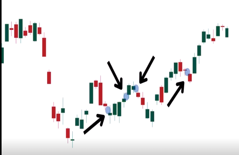
The natural sequence within a trend: Breakaway gap (start of trend) → Runaway gap (middle, public participation) → Exhaustion gap (end, excess phase reversal). Maps directly to accumulation breakout → public participation → excess.
Common Gaps
- Appears in a weak or calm market
- No reason or catalyst for the gap — just minor supply/demand imbalances, market noise, routine technical adjustments
- Often filled quickly — 100% of common gaps get filled
- Low volume — no significant surge in trading activity
- Useful for scalping — if something gaps up for no reason, there's a good chance it fills that day or within a few days. Look for nearby unfilled gaps as profit targets
- Real trade example: Sonic Healthcare gapped up for no reason → educator entered knowing the gap would fill → price came back and filled it same day, also filling a prior gap below. Then the next nearby unfilled gap above became the next target
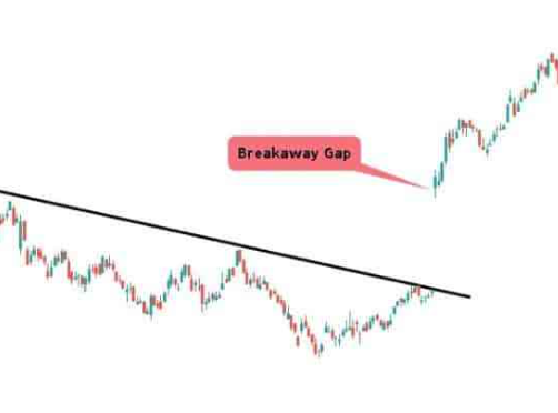
Breakaway Gaps
- Price suddenly breaks through a well-defined structure (support or resistance) in the form of a gap
- Usually confirms a breakout — signals the start of a new trend
- Happen at the end of a consolidation pattern or range and usually mark a new trend beginning
- Larger than common gaps — reflects a strong shift in market sentiment
- Usually followed with a significant increase in volume — confirms breakout strength
- Do NOT fill quickly — represents a decisive market move, price generally continues in the gap direction
- Stop loss: Below the gap for upward breaks, above the gap for downward breaks. The gap itself acts as S/R
- Usually caused by:
- Earnings reports (exceed or fail to meet expectations)
- News announcements (mergers, acquisitions, regulatory changes)
- Market sentiment shifts
- Technical breakouts (breaking key S/R where stop losses are clustered)
- A2 Milk example: Had THREE breakaway gaps in succession — each one gapped below a major support level on high volume. Earnings downgrade after earnings downgrade, each time breaking the next support. The high volume on each confirmed institutional money exiting
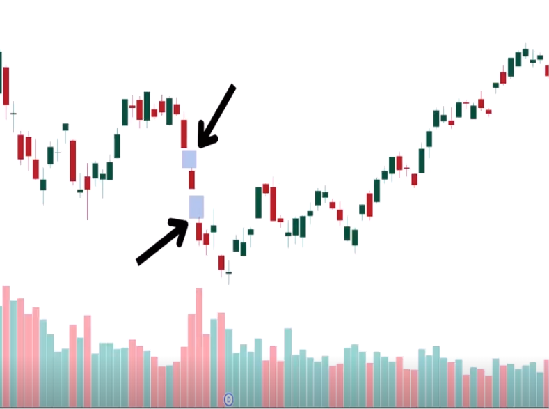
Runaway Gaps (Continuation / Measuring Gaps)
- Appears when the market is gaining or falling quickly — in the middle of an established trend
- Signals dominant buyers or sellers — high probability of continuation
- Usually NOT filled (until the trend eventually ends and the major correction begins)
- Followed with moderate to high volume — confirms trend strength
- Usually in the public participation phase — where the public starts getting involved and everyone piles on
- Measuring tool: The distance from the trend start to the runaway gap can be projected forward to estimate the potential remaining length of the trend (similar to a bull flag measured move)
- If you see a runaway gap, don't take profit at the next resistance — the trend still has momentum and should continue. It's telling you NOT to exit yet
- How to distinguish from exhaustion: Runaway gaps happen in the MIDDLE of the trend. If you're getting gaps at the PEAK after a long overextended run = exhaustion, not runaway
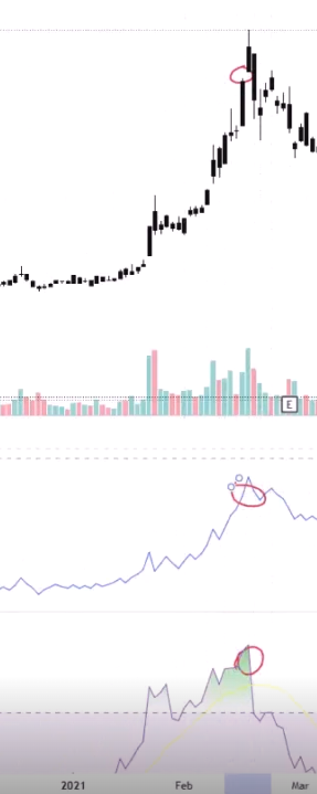
Exhaustion Gaps
If you gap and then pivot within a few days, it's most likely an exhaustion gap
- Occur near the end of an existing trend, after a prolonged price movement — the trend is reaching its climax
- Usually accompanied by a spike in volume — the final rush of buying/selling (capitulation or complete greed) before the trend reverses. This volume often includes retail traders, indicating the end of institutional interest
- Exhaustion gaps are likely to be filled quickly as the market corrects and reverses
- Signal a high probability of a trend reversal
- Can be used to enter a trade in the opposite direction — exhaustion gap at the bottom might be a good time to enter long
- Everything usually looks very overbought (RSI above 80) or the gap happens into bearish divergence
- How to confirm it's exhaustion:
- RSI very overbought when the gap occurs
- OBV/volume showing institutional money NOT confirming the move (lowering OBV = retailers driving it, not big money)
- Pivot within a few days (doji → bearish engulfing after the gap = classic exhaustion confirmation)
- Already at the excess phase of the trend
- Zip example: Breakaway gap (start) → Runaway gap (middle) → Exhaustion gap (end). RSI very overbought when the exhaustion gap occurred, followed immediately by a doji and bearish engulfing = confirmed exhaustion. Same pattern on NVX and LKE
Professional Gaps (Institutional Gaps)
- Caused by actions of institutions, usually from:
- Earnings reports
- Portfolio rebalancing based on macro trends
- Insider/privileged information or proprietary analysis
- Show sentiment and strategic decisions of institutional players
- Can remain unfilled for a long time if they reflect long-term institutional positioning — especially mining discoveries
- Usually after major announcements — e.g. PointsBet expanding to America, mining companies announcing discoveries
- These signal the very beginning of a new trend — institutional money flowing in
- In Australia, most common with miners making discoveries — institutions unpack the report, like what they see, and start buying. Sometimes takes days as they read more and keep buying
- PDN example: Went from $0.006 to $0.019 in one gap (tripled), then 10x within two days as institutions kept reading the report and buying. Eventually went to $0.30+ — nearly 100x. That gap never filled because it was a genuine major discovery
- 3DP example: Institutional money came in at $0.05, gapped up to $0.08, eventually went to ~$1
Fair Value Gaps (FVGs)
- A place where price has moved too quickly creating a void — most popular in crypto due to 24/7 trading (no normal gaps from market close/open)
- Not an actual gap on the chart — it's the difference between the top of one candle and the bottom of the candle two periods later, with a big candle in between. The "hidden gap" in the body of that middle candle
- Very popular in SMC (Smart Money Concepts) — all about imbalances and liquidity
- Usually filled quickly due to market seeking to correct the imbalance
- Volume: low volume gaps may fill quicker than high volume gaps
- Confluency power: If an FVG aligns with a golden pocket zone (382-618 Fibonacci), that's two independent reasons to expect a retracement to that area. Use FVGs as profit-taking targets when they align with your zag zone
- Crypto & Forex most-filled timeframes:
- 1 hour
- 15 min
- 5 min
- 3 min
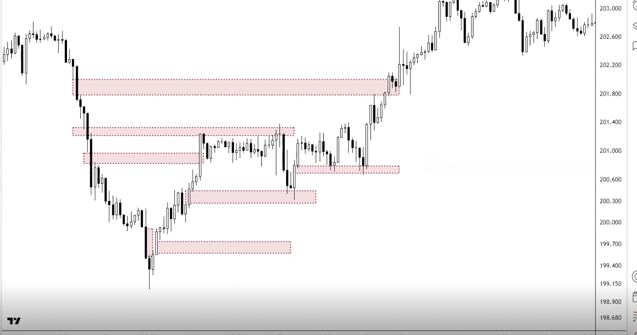
Using Gaps for Confluency
Gaps are another tool for your confluency checklist — another river meeting the zone:
- As targets: If there's an unfilled gap that aligns with your Fibonacci zag zone (382-618) and/or a horizontal S/R level = high-probability take-profit zone. "Profit taking is your zag zone. If you can combine that zag zone with an FVG or a gap, it's giving you more confluency to take your profit there"
- As entries: If a gap fill brings price down to a zone where you also have support, Fib level, and bullish divergence = entry confluency
- For trend identification: Breakaway gaps confirm breakouts. Runaway gaps confirm trend strength (don't exit yet). Exhaustion gaps warn of reversal (start looking to exit)
- Scalping with common gaps: If something gaps for no reason, look for nearby unfilled gaps as quick profit targets — they tend to fill within hours or days
Market Breadth
Overview
- Find potential highs or lows in the general market
- Divergence is a key way to spot market turns early and act as an early warning sign
Another simple way to check market breadth is checking sectors or large - mid - small caps (like btc against others)
AD line
- A line that is calculated by taking the difference between the number of advancing
- Can be used as a point of divergence, AD line may not have made a new high but price may have, signalling potential weakness
- Can be used like regular bearish / bullish divergence
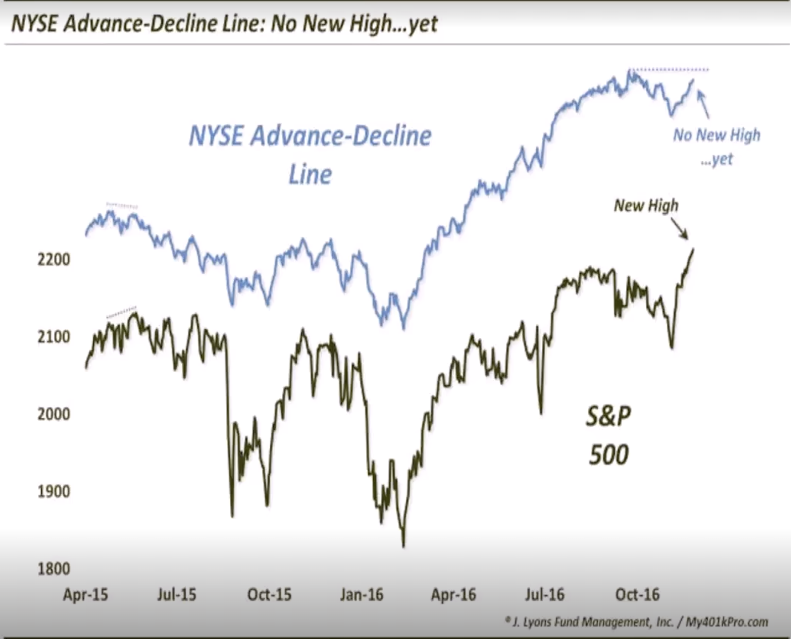
Above / Below EMA Oscilator (ABO)
The ABO indicator is great to see if there is another point of divergence
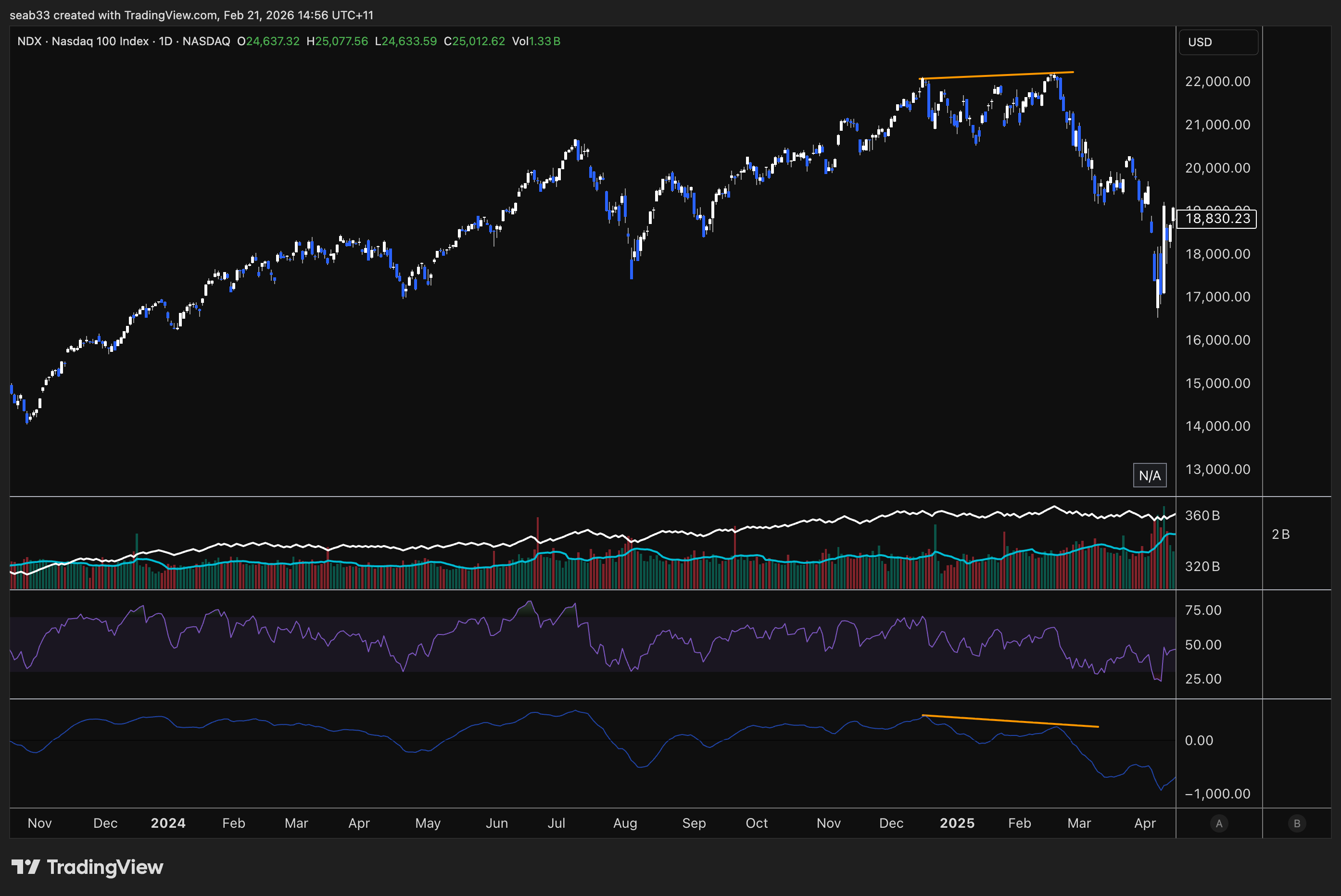
Sentiment analysis
Why Is Sentiment Important?
Sentiment reflects the collective emotions of market participants which can significantly influence market behaviour and price movements. Positive sentiment can drive buying pressure and negative sentiment can push price down. By analysing sentiment, traders and investors can predict potential market turning points, identify overbought and oversold conditions.
Understanding the behaviour of RETAIL investors and their tendency to crowd to one side of the market provides valuable insights. When retail sentiment reaches extremes and you anticipate potential market reversals, traders can PREPARE more effectively (tighten a stop loss, hedging).
Historical examples like the dot-com bubble, the 2008 financial crisis, and the cryptocurrency booms and busts highlight the impact of sentiment on market trends.
Being on One Side of the Boat
When a majority of retail is bullish or bearish, the market often likes to move in the opposite direction. When everyone is bullish, most of the buying pressure has already been used up. When everyone is bearish, most people have already sold or are down so bad they are ready to capitulate.
Smart money use these extremes as signals to take the opposite position. With most investors already committed, there are fewer new entrants to continue driving the trend, leading to a reversal.
Volatility Indexes (VIX)
The VIX (Volatility Index) reflects market sentiment. It is based on the S&P500 options market over the next 30 days. Expressed as an annualised percentage. Low VIX = low volatility expected (complacency). High VIX = high volatility expected (fear).
When the VIX peaks, this has often marked the bottom of the S&P500
| Ticker | Measures Volatility Of |
|---|---|
| VIX | S&P500 30d options implied volatility |
| XVI | AU200 30d options implied volatility |
| BVIV | BTC 30d options implied volatility |
VIX Key Levels & Historical Examples
- Below ~18: Bullish environment, everyone feeling comfortable
- Above ~30: Fear starting to come in
- Above ~45-50: Extreme fear / capitulation
S&P 500 VIX extremes:
- Oct 2008 (GFC bottom) — extreme VIX spike marked near the bottom (not exact, rolled slightly further before the actual bottom, but very close to capitulation)
- 23 March 2020 (COVID bottom) — VIX hit its high, marked the exact bottom
- Every other significant VIX spike (May 2010, Aug 2011, Aug 2015, late 2018, 2022) — each one marked at least a local bottom
VIX breakout pattern: Down, down, down, down → breakout above a declining trendline = volatility incoming. Look for breaks above declining resistance on the VIX as a warning of a correction ahead.
Australian XVI: Same concept. Single digits = very complacent (always ends in a spike). Above 20 = fear.
BTC BVIV: Above 75-100 = extreme greed (marked November 2021 top). Below 40-50 = fear (marked January 2023 bottom, August 2023 bottom).
Sentiment Surveys
AAII Sentiment Survey
Survey of individual investors measuring bullish/bearish/neutral expectations for the next 6 months (not current sentiment — where they believe the market will be).
- High 40s-50%+ bullish = often marks a market peak. Time to be careful
- High 40s-50%+ bearish = often marks a market bottom. Potential buying opportunity
- Find it: Google "AAII sentiment" → first result
NAAIM Exposure Index
Represents the average exposure to US equities reported by active investment managers (professional money managers, not retail).
- Shows how much institutional money is actually in the market
- Look for convergence: When NAAIM exposure matches price direction = healthy. When price goes up but NAAIM exposure drops = divergence (big money reducing exposure into the rally)
- Big money isn't always right, but it's worth knowing when they're reducing while retail is buying
- Find it: Google "NAAIM exposure index"
Smart Money vs Dumb Money Confidence
Compares institutional investor behaviour ("smart money") with retail investor behaviour ("dumb money").
- When smart money is bullish and dumb money is bearish = potential buying opportunity
- When smart money is bearish and dumb money is bullish = potential selling signal
- Look for divergence between the two lines — when they diverge, something is about to change
- Retailers are emotionally driven, institutions are data driven
Consumer Confidence Index (CCI)
The Consumer Confidence Index measures how optimistic or pessimistic consumers are regarding their expected financial situation and the overall economy. Based on surveys of a representative sample of consumers, used to predict consumer spending.
- Above 100 = consumers confident, more inclined to spend
- Below 100 = pessimistic, tendency to save more and consume less
- Extreme highs (tech bubble 2000, pre-GFC) often preceded recessions
- Extreme lows often aligned with market bottoms
- Find it: Google "consumer confidence index CCI"
Fear & Greed Index
Two versions — CNN for stocks, Alternative.me for crypto.
- Stock market: Uses market momentum, stock price breadth, put-call options, market volatility, safe haven demand, junk bond demand
- Crypto: Uses volatility, market momentum, social media, surveys, dominance, trends
Key Levels (Crypto)
- Above 90: Extreme greed / euphoria — often marks a local or major top
- Below 10: Extreme fear — often marks a local or major bottom
- Top 10% or bottom 10% = contrarian territory
Find it: Google "fear and greed index" — CNN (stocks) and Alternative.me (crypto) are the top two results.
Put-Call Ratio & Options
Put-Call Ratio
Compares the volume of put options (bearish bets) to call options (bullish bets).
- Greater than 1 (more puts than calls) = bearish sentiment
- Less than 1 (more calls than puts) = bullish sentiment
- Around 1 = neutral/balanced
- Contrarian indicator: Extremely high ratio = market overly bearish, could rebound. Extremely low = overly bullish, could pull back
Max Pain Theory
Max Pain is the price at which the largest number of option contracts expire worthless — causing maximum losses for option holders and minimum payouts for option sellers (Wall Street).
- The theory suggests price gravitates toward the Max Pain strike price at expiration
- Market makers may influence price toward Max Pain to maximise their profits (minimise payouts)
- It's always retailers vs Wall Street — Wall Street drives price to where they don't have to pay out billions
- Find it: Google "options max pain swaggy stocks"
Triple Witching
Simultaneous expiration of stock options, stock index futures, and stock index options. Occurs four times a year on the 3rd Friday of March, June, September, and December.
- Leads to increased volatility and trading volume
- Index funds and institutional investors rebalance portfolios
- Most major market tops and bottoms happen around these dates:
- Tech bubble bottom: October (just after September witching)
- Tech bubble top: March
- GFC top: September/October
- GFC bottom: March 2009
- COVID bottom: March 2020
- 2022 bear market top: December/January period
Always be careful for major turning points around end of March, June, September, December. After expiration, people place new bets for the next quarter — these quarterlies are often inflection points.
Advanced: Sentiment Divergence
Just like price vs RSI divergence, you can get divergence between price and sentiment indicators. When sentiment and price aren't matching, something is about to change.
Bullish Sentiment Divergence
Price makes a higher low but sentiment makes a new low (more fearful than before). If prices are holding up but people are MORE scared than last time → the bearish sentiment is overextended → potential reversal upward.
Bitcoin example: June 2022 low had extreme fear (below 10 on Fear & Greed). When Bitcoin made a new low in November, Fear & Greed only dropped to ~20 — a higher low in sentiment. Why weren't we as fearful on a new price low? → Divergence → marked the actual bottom.
S&P 500 example (March 2023 banking crisis): Silicon Valley Bank collapse, extreme fear sentiment. But price printed a higher low compared to the October 2022 low. News was terrible (extreme fear), but the chart wasn't confirming it with new lows → divergence between FA/news and TA → continuation upward.
Bearish Sentiment Divergence
Price makes a new high but sentiment makes a lower high (less greedy than before). Why isn't there euphoria if we're at new highs? → The bullish sentiment is fading → potential reversal downward.
The Rule
If the news is really bad, the charts should be making new lows. If they're not → divergence. If the news is really good, the charts should be making new highs. If they're not → divergence. When FA/news says one thing but TA says another, trust the TA and look for the divergence to resolve.
This applies to individual stocks too — if terrible news comes out but the stock makes a higher low, that's bullish divergence between fundamentals and technicals.
Fibonacci extensions
Purpose: To set price targets & support/resistance levels. While Fib retracements measure where price might retrace to, extensions project where price might extend to.
Fib extension levels expressed as ratios:
- 1.0 ← Important (typical C wave extension)
- 1.272
- 1.618 ← Important (strongest magnet)
- 2.0
- 2.618 ← Important
- 3.618
- 4.236
- 4.618
Just because price hits an extension level doesn't mean you automatically sell, but it can be a stronger sell signal if you see weakness approaching or hitting the zone.
If it's a weak move (corrective wave), the C wave usually only hits 1.0 or 1.618. In a parabolic trend, switching to log scale is highly recommended.
How to Draw Extensions
Three clicks: Swing low → swing high → next swing low (for projecting upside). You're selecting from the start to the end of the correction — not just swing high to low to high.
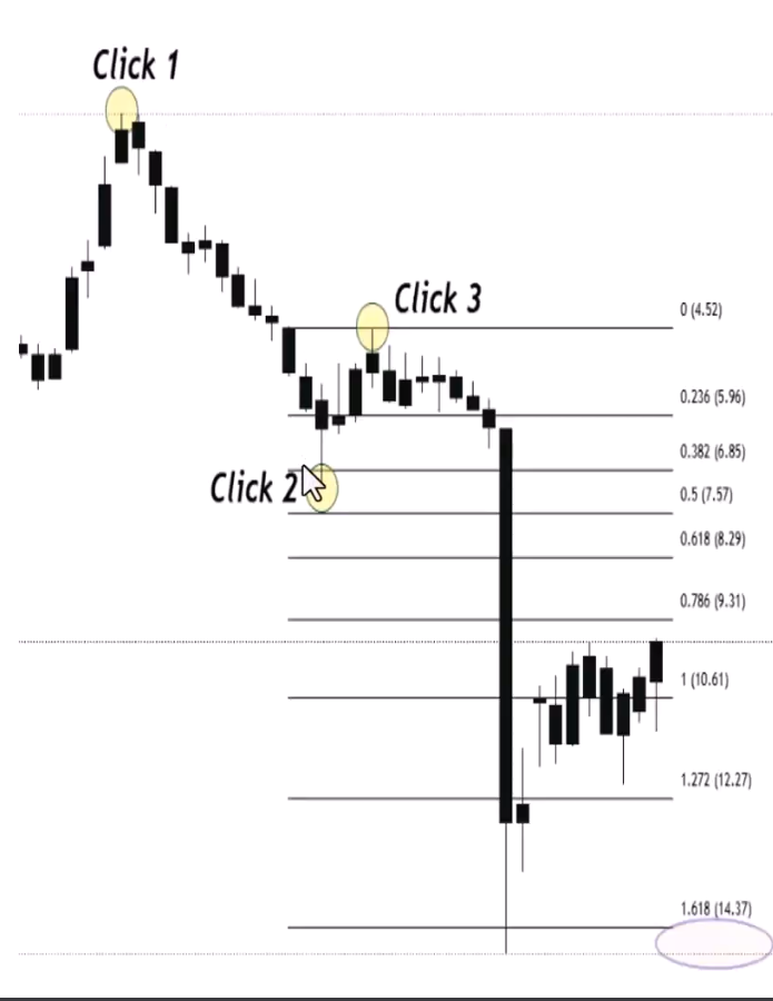
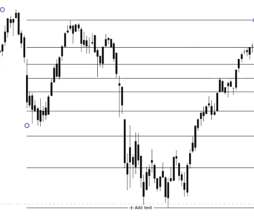
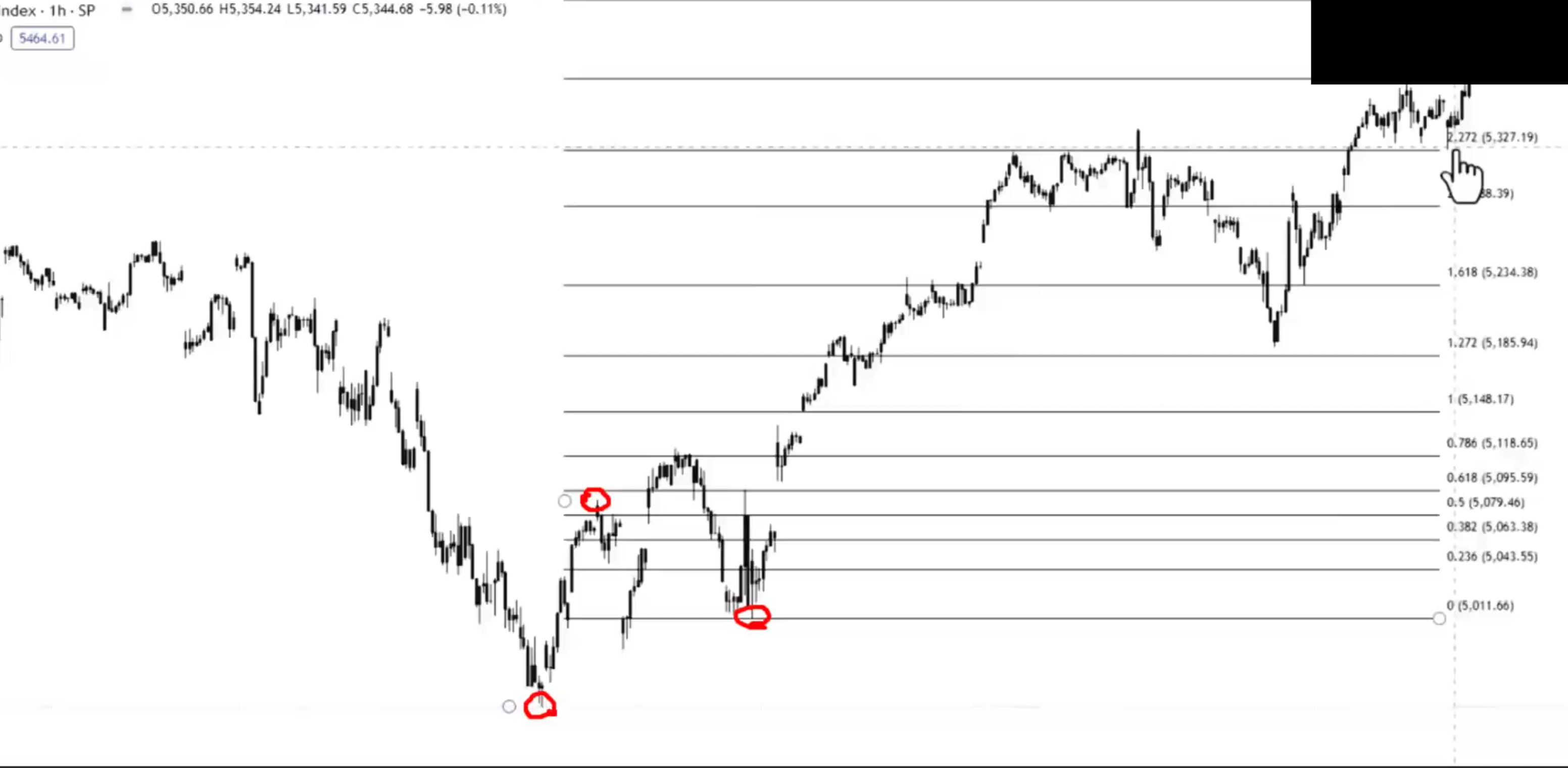
How Markets Move — Retracements + Extensions Together
The full cycle of using Fibonacci in a trending market:
Wave 1 (Accumulation breakout): First push up. Once it finalises, expect a deep retracement — typically down to the 618 or even 786 zone. Why deep? Nobody knows it's wave 1 yet — sentiment is still bearish, they think it's just a continuation of the downtrend.
Wave 2 (Deep zag): Comes down to the 618 zone. Once it bounces and takes out the wave 1 high, you can draw your trend-based Fib extension (bottom → top → pullback low) to project the next target. The 1.618 is the most common target for the next leg.
Wave 3 (Public participation): Extends up to the 1.618 target zone. Then you get another retracement — but this time it's typically shallower (382 or Fib 500) because the trend is now established and stronger. If wave 2 was deep, wave 4 is usually shallow (and vice versa).
Wave 4 (Shallow zag): Comes down to the 382 zone. Once it bounces and takes out the wave 3 high, draw another extension to project wave 5's target.
Wave 5 (Excess): Extends to the target, then you get the big correction of the whole move.
The Critical "Past the Zag Zone" Signal
If price comes down to the zag zone (382-618) and bounces = healthy, all good. But if it then rolls over, changes market structure, and breaks through the resistance-turned-support:
- You're NOT just retracing the last move — you're retracing ALL of it
- Get out the Fib retracement from the ENTIRE move (bottom of wave 1 to top of wave 5)
- Look for support in the 382-618 of the whole move
- Once buyers step in there + change of market structure + break back above the decline = re-entry
"The minute we go past the zag zone and resistance didn't become support, I know I'm not just retracing from here — I'm retracing all of it."
The Repeating Process
- Retracement to find buy zones (where will the zag end?)
- Extension to find targets (where will the next zig reach?)
- Check Fib strength (236 = very strong, 382 = strong, 500 = normal, 618 = weak)
- Repeat at each new zig-zag
- When the zag goes too deep (past the zag zone) → switch to retracing the whole move instead of just the last leg
70-80% of the time, buyers step in at the zag zone. The probabilities are in your favour. When they don't, the probabilities shift — and that's when you don't want to be trading it. Always trade probabilities — stack the chips, become the casino.
2.10 - Fibonacci clusters & extension channels
Advanced Fibonacci Clusters
In Term 1, you learned clusters from multiple retracements on different timeframes overlapping. Now you're combining retracements AND extensions at the same zone — the ultimate cluster.
What Are Advanced Clusters?
When a Fib retracement level (e.g. 382 from the whole move) aligns with a Fib extension level (e.g. 1.618 from the last ABC correction) at the same price area = extremely high-probability support or resistance zone.
You're getting two completely independent Fibonacci calculations pointing to the same price. That's not coincidence — that's the market telling you something.
Steps to Identify
- Identify the trend — determine the significant high and low points
- Draw Fib retracement from the start of the whole move to the end — mark the 382, 500, 618 zones
- Draw Fib extension from the last ABC correction (top → bottom → retracement high) — mark the 1.0, 1.618, 2.618 levels
- Find the clusters — look for where retracement and extension levels converge at the same price area
Ethereum Example — Calling the Bear Market Bottom
The educator demonstrated this on Ethereum's bear market:
- Price changed market structure bearish. Drew Fib retracement from the whole uptrend → identified the 382, 500, 618 as the zag zone for the entire move
- Price bounced off the zag zone of the last leg but then broke through → not just retracing the last move, retracing ALL of it. Switched to the full-move retracement
- Drew Fib extension from the ABC pattern (top → bottom → B wave retracement) → the 1.618 extension landed at the exact same price as the 382 retracement
- That became the high-conviction zone — the Fib cluster of 1.618 extension + 382 retracement
The bottom of Ethereum's bear market landed exactly on that cluster zone. Two independent Fibonacci calculations both pointing to the same price = the ultimate confluency.
Don't Just Put a Buy Order There
Even with a perfect cluster zone, you still need:
- Weakness signals coming into the zone (lowering volume, RSI divergence)
- Change of market structure off the zone (the car actually turning the corner)
- Blinkers on + trigger confirmed at the projected target
The cluster tells you WHERE it should turn. The indicators tell you it's WEAKENING into that zone. The market structure tells you it HAS turned. All three together = "you should be shocked when the trade doesn't go your way."
Fibonacci Extensions with Channels
Combining Fib extension targets with trend channel boundaries gives you precision take-profit zones.
How It Works
Channels = trendline + parallel line creating a range where prices oscillate. Fib extensions = projected price targets beyond a retracement. When the top (or bottom) of a channel aligns with a Fib extension level = high-probability rejection/take-profit zone.
Steps
- Identify the trend and draw your channel (connect higher lows for uptrend, draw parallel to form the channel)
- Draw Fib extension from the same trend (bottom → top → pullback)
- Look for convergence — where does a Fib extension level intersect with the upper or lower channel boundary?
- That intersection = your take-profit target
Uptrend Example
Channel drawn from higher lows with parallel at the highs. Fib extension from bottom → top → pullback showed the 1.0 level aligned with the top of the channel. That's where you'd look for rejection and take profit. Two independent methods (geometric channel + Fibonacci mathematics) both pointing to the same price.
Another Uptrend Example
Channel + Fib extension showed the 1.618 aligned with the top of the channel. Price hit the 1.618, rejected at the channel resistance, then fell out of the channel + changed market structure. Three confirmations to exit:
- Hit the Fib 1.618 target ✓
- Rejected at channel resistance ✓
- Changed market structure + fell out of channel ✓
"Nail in the coffin — hit all our zones, channel resistance, Fib 1.618, change of market structure. See you later."
Downtrend Example
Works identically in reverse. Channel drawn from lower highs, Fib extension projected downward. The 1.618 aligned with channel support = zone where you'd look to exit shorts or look for a reversal. When price hit the 1.618, bounced off channel support, and then changed market structure back out of the channel = trend over, look for a new direction.
Key Points
- Extension + channel targets are zones, not exact prices — sometimes a little short, sometimes a little long
- The actual confirmation/trigger is when price falls out of (or breaks above) the channel after hitting the Fib target
- These tools give you the WHERE (target zone). Market structure gives you the WHEN (trigger)
- Can be combined with clusters for triple confluency: Fib retracement + Fib extension + channel boundary all at the same price
Term 2 master class
The Course Architecture — What's Non-Negotiable vs Complementary
Term 1 Weeks 1-6: THE NON-NEGOTIABLES
Everything in the first six weeks is the foundation. If you're not doing ALL of these on every trade, you're missing a beat:
- Pivot points → market structure identification (Week 1)
- Support & resistance zones (Week 2)
- Failure swings & non-failure swings → confirmed reversals and entries (Week 3)
- Volume & OBV → supporting the move, effort vs result (Week 4)
- RSI divergence → early warning signals (blinkers) before triggers (Week 5)
- Fibonacci retracements → zag zones, trend strength, targets (Week 6)
Term 1 Weeks 7-9: COMPLEMENTARY TOOLS
These add confluency but aren't essential for a trade to exist:
- Candlestick patterns, chart patterns (Week 7)
- Index confirmation, multi-chart confluency (Week 8)
- Market psychology, sentiment, contrarian investing (Week 9)
Term 1 Week 10: RISK MANAGEMENT
Not about your entry — it's about how small your stop loss is. A later entry with a better R:R can be more profitable than an earlier entry with a wider stop.
Term 2: ADVANCED REFINEMENT
All of Term 2 builds on the non-negotiables:
- Three types of divergence — regular (reversal signal), hidden (continuation signal), directionally aligned (same direction, different rates = early warning). Complex divergence is where regular and hidden battle each other
- Multi-timeframe divergence — hidden bullish on the higher timeframe (continuation) + regular bullish on the lower timeframe (reversal entry) = precise entry for a big move
- Pattern recognition + divergence fusion — hidden divergence for continuation patterns, regular divergence for reversal patterns. Volume rules are OPPOSITE for each
- Moving averages — SMA for long-term, EMA for short-term. Used as confluency, not standalone
- Gaps — common (always fill), breakaway (new trend), runaway (continuation), exhaustion (reversal), professional (institutional), fair value (crypto imbalances)
- Market breadth — looking under the hood to see if stocks are actually participating in the index move
- Sentiment analysis — VIX, AAII, Fear & Greed, put-call ratio. Contrarian at extremes
- Fibonacci extensions & clusters — projecting targets, combining retracements + extensions for ultimate cluster zones
- Fibonacci extension channels — combining Fib targets with channel boundaries for precision take-profit
Log vs Linear — When to Use Each
Linear (default, first port of call):
- $10 move here = same size as $10 move there (dollar-based)
- Better for identifying accumulation/public/excess phases visually (accumulation looks flatter and longer, which is what you expect)
- Use for most standard analysis
Logarithmic (for long timeframes and large price ranges):
- 10% move here = same size as 10% move there (percentage-based)
- Much easier to see waves and chart detail when prices range from $3 to $50+
- Essential for crypto, uranium, lithium — anything with hundreds or thousands of percent moves
- Makes the detail of smaller early moves visible instead of being squashed at the bottom
Fibonacci in Log vs Linear — BOTH Are Valid
This was a key insight from the masterclass. When applying Fib retracements:
- Linear Fib 618 creates a resistance zone in dollar terms
- Log Fib 618 creates a resistance zone in percentage terms
- Both work as resistance — and they're at DIFFERENT price levels
Silver example: In linear, the 618 retracement created a major resistance cluster at one level. In log, the 618 created resistance at a different level (the percentage-based retracement). Both levels acted as genuine resistance on the chart. So drawing Fibs in both modes gives you TWO valid zones to watch.
Pro tip: To apply Fib in log scale in TradingView, open the Fib tool settings and check "log scale."
When to Switch
- Start in linear to identify phases and get the big picture
- Switch to log when dealing with very long timeframes, very large price ranges, or parabolic moves
- In log, a retracement that looks like 78.6% in linear might only be 50% in percentage terms — this changes your analysis of trend strength
Phase Analysis — Equities vs Commodities
In equities (tech, financials): The public participation phase is typically the largest. Excess phase is usually smaller.
In commodities (silver, gold, uranium): The excess phase is often the biggest — bigger than public participation. Commodities tend to have blow-off tops.
The alternation rule: If public participation is very extended (long duration), don't expect excess to also be very extended. One will be extended, the other normal. You rarely get both dramatically extended.
Wave 2 Deep / Wave 4 Shallow
- Wave 2 retracements are notoriously deep — 618, sometimes 786. Why? Nobody knows it's wave 1 yet. Sentiment is still bearish from the prior downtrend. Everyone thinks it's just a continuation of the bear market
- Wave 4 retracements tend to be shallower — 382 or Fib 500. The trend is now established and people are bullish, so they buy the dip earlier
This alternation is important for setting expectations and targets. If wave 2 was deep (618+), expect wave 4 to be shallow (382). If wave 2 was shallow (unusual), expect wave 4 to be deeper.
Channels as Confluency
Channels (trend lines + parallel lines) provide confluence with other tools:
- Maximise touches when drawing channels — the more times price respects the channel boundary, the more valid it is
- Channels don't beat S/R zones — a horizontal support/resistance zone with many touches is still the strongest level. Channels complement S/R, they don't replace it
- When a channel boundary aligns with a Fib level AND a horizontal S/R zone = triple confluency
- Break of channel + change of market structure + hit Fib target = the trend is over. The "nail in the coffin"
Three Channel Types (Preview for Elliott Wave)
- Base channel — drawn from the start
- Trend channel — drawn during the trend
- Final channel — drawn at the end
These will be covered in depth during Term 3.
The 50% Profit-Taking Strategy
When your trade hits the target zone:
- Take 50% off the table — lock in profit, remove risk
- Let the other 50% run — trail your stop loss and see where it goes
- If it continues beyond the target = bonus gains with zero risk (you've already banked profit)
- If it reverses = you've already taken half your profit and the trailing stop catches the rest
This removes the psychological battle of "should I sell all or hold all" — the answer is "both."
Preparing for Term 3: Elliott Wave
Everything from Term 1 and Term 2 translates directly:
| What You Know | What It Becomes in Elliott Wave |
|---|---|
| Accumulation | Wave 1 |
| First zag (deep) | Wave 2 |
| Public participation | Wave 3 |
| Second zag (shallow) | Wave 4 |
| Excess phase | Wave 5 |
| Correction (2 steps back) | ABC correction |
The internal counts work the same way — within wave 3, there's its own 1-2-3-4-5. Within that sub-wave 3, there's another 1-2-3-4-5. Fractals all the way down.
Corrections are where Elliott Wave gets really challenging — there are many different types. The course spends 4-5 weeks just on corrections because that's the hardest part.
The key thing you must feel comfortable with before starting Term 3: Accumulation → public participation → excess. If you can confidently identify the three phases, the numbering is just labelling what you already know.
Elliott Wave - General
General
When an initial pump then dump happens, how do you know if its a 1-2 or A-B?
- You must prepare by thinking the first impluse could be a 1 OR A, 2 OR B, and 3 OR C.
- A C has a much lower target then a 3 (use fib extensions)
- You either get a motive or corrective wave.
- Motive takes you in the primary wave of the overall movement
- Corrective takes you away from the primary trend.
Wave 1
Wave 2
- On the wave 2 retracement, you usually target the 0.5 to 0.786 due to it being a deeper pullback and people are still in denial / fear that the pull back is a fake out
Wave 3
- Minimum target using fib extensions is hitting or passing 1.618
- A wave 3 should breakout cleanly from a channel while a wave C usually stays within or may jump out and back in
Wave 4
Wave 5
Wave A
Wave B
Wave C
- Minimum target for a C wave is 0.618 with an ideal target between 1 and 1.236. If it extends past the 1.236, then it's most likely a wave 3
- Usual extension of a C wave is 0.618 and 1.236
EW notes
if the wave 1 is very powerful, it's likely the next waves won't be as big
- wave 3 cant be the smallest, therefore wave 5 would have to be very small
EG SOL
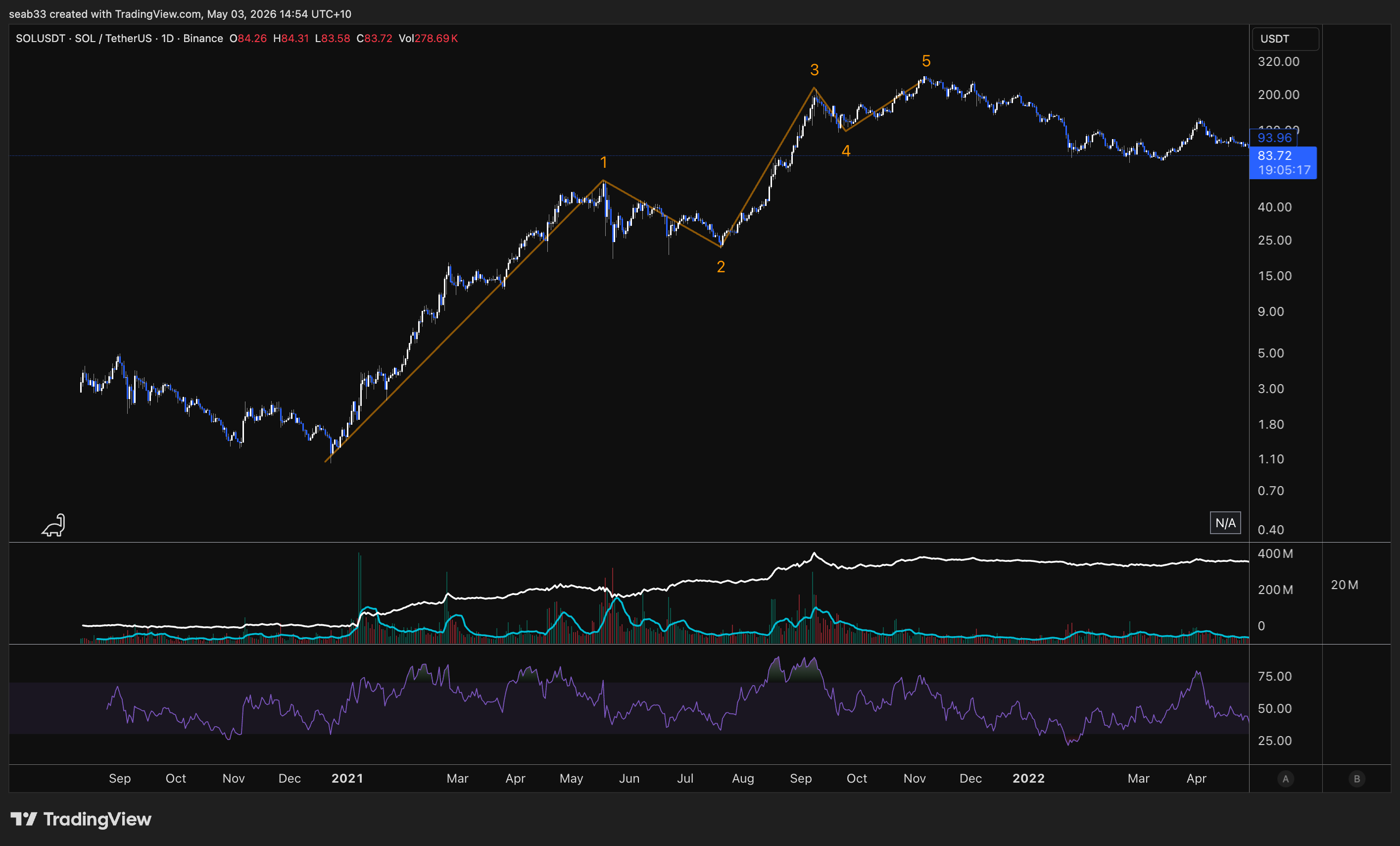
wave 2 is usually very deep because the bag holders who bought at the top of wave 5 are looking for any opportunity to get out so they sell thinking the wave 2 is about to make a new lower low
Elliott Wave — Impulse Waves
Predictive vs Reactive TA
Everything learned previously (market structure, S/R, divergence, volume, Fibonacci) is reactive TA — adapting to real-time market conditions. Elliott Wave is predictive — identifying recurring patterns and forecasting future price movements based on crowd psychology.
Think of it like a military general: reactive TA is adapting to real-time changes in battle. Elliott Wave is studying the enemy's past behaviour to predict their next moves BEFORE the battle. The best Elliotticians combine both — they use Elliott Wave for the prediction and reactive TA (divergence, volume, S/R, market structure) for the confirmation.
Critics mock Elliotticians for adjusting wave counts. That's actually the point — you have a predicted roadmap, and when the market deviates, you adjust. The wave count tells you when you're wrong and how wrong. Having rules means you know exactly when your analysis is invalidated.
History — Ralph Nelson Elliott
Developed in the 1930s by Ralph Nelson Elliott, an accountant who observed that markets trade in repetitive cycles driven by crowd psychology. He proposed that prices unfold in specific patterns: a five-wave motive phase in the trend direction, followed by a three-wave corrective phase against it. This eight-wave cycle repeats at every scale — fractals.
Being a Certified Elliott Wave Analyst (CEWA) or Master Certified (CEWA-M) is one of the most respected credentials in technical analysis.
The Complete Cycle
One complete cycle = 8 waves:
- Motive phase (5 waves): Labelled with NUMBERS (1, 2, 3, 4, 5) — moves in the direction of the trend
- Corrective phase (3 waves): Labelled with LETTERS (A, B, C) — moves against the trend
Quick identifier: Numbers = motive (with the trend). Letters = corrective (against the trend).
The motive phase contains three types: impulse waves (most common, covered here), extended waves (covered next), and diagonal waves (covered after that).
The Five Impulse Waves
Wave 1 — The Initial Move (Accumulation)
- Marks the beginning of a new trend, often after the previous trend has exhausted
- Rarely obvious at inception — sentiment is still bearish from the prior downtrend
- Lower investor confidence, market hasn't fully shifted yet
- Volume may be relatively low (sometimes high if institutional money enters)
- Often targets the zag zone of the previous correction (382, 500, or 618), or a 1:1 of the previous corrective wave, or 61.8% of the previous correction
- This is where you get your failure swings, non-failure swings, and inverse head & shoulders — the reversal patterns from the foundational course
Wave 2 — Deep Correction
- Corrects wave 1 but CANNOT retrace beyond the starting point of wave 1 (Rule #1 — not even by one cent, not even a wick)
- Typically a deep retracement: 50-61.8%, sometimes 78.6%
- Sentiment is still bearish — everyone thinks the bear market is still intact ("just another lower high")
- Volume tends to decrease (corrective move, lower participation)
- Often looks sharp and steep
- If wave 2 goes below the start of wave 1 → the count is INVALIDATED. Start over
Wave 3 — The Strongest Wave (Public Participation)
- Typically the most powerful and extended wave (in equities — in commodities, wave 5 can be larger)
- Strong market sentiment and widespread participation
- Sharp and rapid price increase with high volume
- Corrections within wave 3 are short-lived and shallow — anyone waiting for a pullback misses the boat
- The centre of wave 3 often looks nearly vertical
- Cannot be the shortest of waves 1, 3, and 5 (Rule #2 — doesn't have to be the longest, just can't be the shortest)
- Common Fibonacci extension targets from wave 1: 1.618 (most common, ~60-70% of the time), 2.0, 2.618, or even higher in strong trends. Can also be 1.0 (equal to wave 1) in weaker trends
Wave 4 — Shallow Correction
- Corrects wave 3 — usually less severe than wave 2
- Often takes the form of sideways consolidation (triangles, flats, choppy action)
- Cannot overlap with the price territory of wave 1 (Rule #3 — exception: diagonal patterns)
- Typically a shallow retracement: 23.6-38.2%, sometimes 50%. Rarely 61.8% (would risk overlapping wave 1)
- Volume well below wave 3
- Often frustrating — takes a long time, goes nowhere. "If you're feeling lost, you're probably in wave 4"
- Good place to buy a pullback if you understand wave 5 is coming
Wave 5 — The Final Push (Excess)
- Last wave in the impulse sequence — driven by the final burst of enthusiasm
- News is universally positive, everyone is bullish
- Often shows divergence on RSI (weakening momentum from wave 3 to wave 5)
- Volume may decline compared to wave 3 — suggests trend exhaustion
- Average investors finally buy in right before the top
- Can sometimes truncate — fail to move beyond the end of wave 3 (double top, then reversal)
The Three Cardinal Rules (CANNOT Be Broken)
| Rule | Description | If Violated |
|---|---|---|
| 1. Wave 2 cannot retrace more than 100% of wave 1 | Wave 2 cannot go below the starting point of wave 1 — not even by one cent | Wave count is invalidated — re-evaluate |
| 2. Wave 3 cannot be the shortest | Wave 3 doesn't have to be the longest, but it cannot be shorter than BOTH wave 1 and wave 5 | Wave count is invalidated — re-evaluate |
| 3. Wave 4 cannot overlap wave 1 | Wave 4 cannot enter the price territory of wave 1 (exception: diagonal patterns) | If not a diagonal, wave count is invalidated |
Additional Guidelines (Common But Not Mandatory)
Wave Extension: Usually one impulse wave (typically wave 3) will be significantly longer than the others. ~80-90% of impulse waves have at least one extended wave.
Truncation: Wave 5 sometimes fails to surpass wave 3 — creates a double top before reversing. Still a valid 5-wave count, just with a truncated wave 5.
Channels: Impulse waves often fit within parallel trend channels. Drawing a channel from wave 1 to wave 2, parallel to wave 3, can help identify wave 4 targets and wave 5 projections.
Alternation Rule: If wave 2 is simple/sharp (deep zigzag), expect wave 4 to be complex/sideways (flat, triangle). If wave 2 is complex, expect wave 4 to be simple. They should NOT look the same. This helps you anticipate what type of correction wave 4 will be based on what wave 2 looked like.
Fibonacci Targets for Each Wave
Wave 1 Targets
- 100% of the previous corrective wave (1:1)
- 61.8% of the previous corrective wave
- 38.2-61.8% retracement of the previous impulse (the zag zone)
Wave 2 Retracement Levels
- 38.2% — shallow, indicates very strong trend (less common for wave 2)
- 50% — moderate correction
- 61.8% — most common for wave 2 (deep correction, sentiment still bearish)
- 78.6% — deep but still valid (cannot reach 100%)
Wave 3 Extension Targets (from wave 1)
- 1.618 — the golden ratio, most common (~60-70% of the time)
- 2.0 — strong trends
- 2.618 — very strong trends
- 1.0 — equal to wave 1 (weaker trends — implies wave 5 must be small since wave 3 can't be shortest)
Wave 4 Retracement Levels (of wave 3)
- 23.6% — very shallow, strong trend
- 38.2% — typical for wave 4
- 50% — deeper but still common
- 61.8% — rare, risks overlapping wave 1 depending on the wave structure
Wave 5 Targets
- Equal to wave 1 — the most common target (especially when wave 3 was extended)
- 61.8% of waves 1+3 combined — very common. Measure wave 1 + wave 3 combined length, pull back to wave 4, project 61.8% = wave 5 target
- 1.618 of waves 1+3 combined — for extended wave 5s (common in commodities)
- 100% of wave 3 — less common, occurs in strong trends
- Real examples: The educator called the exact top on Lake Resources using the 1.618 of waves 1+3 combined, and CXO using the 1:1
Tips for Recognising Impulse Waves (Shane's Guide)
- Wave 2 is usually steep — the retracement looks quite sharp and strong
- Wave 3 is very easy to recognise — almost always increased volume, gaps, bullish technical indicators. Looks very sharp and strong with a high slope. The centre of wave 3 seems to have "vertical" signs
- Wave 4 makes a shallow retracement compared to wave 3. Seems to take longer, and the retracement is not as deep or strong as wave 2
- Wave 5 is less powerful and steeper than wave 3. Easier to find because it takes longer and moves shorter. Comes after wave 4 (the shallow, time-consuming correction)
Strategy: Focus on Corrections
The strategy is NOT to trade the impulse waves directly — it's to focus on corrective waves (waves 2, 4, and ABC), because those are the SIGNALS that tell you when to enter for the next motive wave. Identify how corrections develop, wait for them to complete, then position for the next impulse.
"Following these corrective waves, there are always opportunities with the next Motive Waves. So our strategy is to focus on corrective waves — they will be Signals for us to trade."
Elliott Wave — Extended Waves
One of the impulse waves (1, 3, or 5) is almost always significantly longer than the other two. That's the extended wave. Identifying which wave is extended changes your targets, your expectations, and your entire trade plan.
What Are Extended Waves?
An extended wave is an impulse wave that is significantly longer than the other two impulse waves in the same sequence. It travels a greater distance and takes more time to complete. Extensions typically display strong, rapid price movement with high volume and have clear internal subdivisions (their own 1-2-3-4-5 within the extended wave).
Most impulse waves (~90%) have at least one extended wave. Extensions typically occur in only one of the three actionary subwaves. When the extension is so pronounced that its subdivisions are nearly the same size as the other four waves, you get a 9-wave sequence instead of the normal 5. In those cases, it can be difficult to identify which wave extended — but under Elliott Wave rules, a count of 9 and a count of 5 have the same technical significance.
Which Wave Typically Extends?
| Market Type | Most Common Extension | Why |
|---|---|---|
| Equities & Forex | Wave 3 | Public participation — everyone recognises the trend and piles in. Highest volume, most vertical |
| Commodities | Wave 5 | Supply/demand dynamics, speculative demand, blow-off tops. Gold, silver, lithium, uranium all tend to have extended wave 5s |
| Emerging Tech / Low Market Cap | Wave 1 | Rare. Explosive initial move — new technology, very low market cap, massive fundamental shift. Bitcoin's early moves are a good example |
The Three Cardinal Rules Still Apply
Every rule from standard impulse waves applies to extended waves AND their internal subdivisions. You need to verify rules at BOTH levels:
- Wave 2 cannot retrace beyond wave 1's start — in the big picture AND within the extension
- Wave 3 cannot be the shortest — in the big picture AND within the extension
- Wave 4 cannot overlap wave 1 — in the big picture AND within the extension (exception: diagonals)
Wave 1 Extension
Rarity: Least common. Typically seen in emerging technologies (Bitcoin, new IPOs), very low market cap situations, or major fundamental shifts that cause an immediate explosive move.
What it looks like: 9 sub-waves making up wave 1, then relatively short waves 3 and 5 of equal length.
Fibonacci rules:
- If wave 1 is extended, waves 3 through 5 combined are often 61.8-78.6% of wave 1's length (less than 1:1 — if it were 1:1, that wave would also be extended)
- Waves 2 and 4 are very likely to be shallow (23.6-38.2% — bull flag territory)
- Wave 2 often ends at the level of the internal wave 4 of wave 1 (doesn't retrace below the sub-wave 4 within the extension)
- If wave 2 retraces more than 78.6% of wave 1, the extended wave 1 count becomes doubtful — possibly just an ABC instead
Wave 3 Extension
Frequency: Most common extension in equities and forex. This is your public participation phase — the heart of the trend.
What it looks like: Wave 3 has clear internal subdivisions (its own 1-2-3-4-5), is the most vertical portion of the chart, has the highest volume, and often shows gaps and bullish technical indicators. The centre of wave 3 looks nearly vertical.
Fibonacci targets for the extended wave 3:
- 1.618 of wave 1 — minimum for it to be considered an extension (~60-70% of the time)
- 2.0 of wave 1 — strong trends
- 2.618 of wave 1 — very strong trends
- 3.618-4.618 — extreme cases (rare but happens)
Other relationships when wave 3 extends:
- Wave 5 ≈ Wave 1 — the most important rule. If wave 3 is extended, waves 1 and 5 tend to be equal in length. This is your wave 5 target
- Wave 5 can also be approximately 61.8% of wave 3
- Waves 2 and 4 typically retrace 23.6-38.2% of the preceding wave (shallow — strong trend means dips get bought quickly)
- Wave 4 often ends near the level of the internal wave 4 within the extended wave 3 (not the big-picture wave 4 of wave 1)
After the impulse completes: The subsequent ABC correction will typically return to the territory of the extended wave 3 (i.e. the correction targets the area within the wave 3 extension).
Wave 5 Extension
Frequency: Second most common overall. Most common in commodities (gold, silver, lithium, uranium) due to their cyclical nature and speculative demand.
What it looks like: 9 sub-waves making up wave 5. It just keeps going up day after day — "these are the ones you wish you had in your portfolio." Waves 1 and 3 are normal (not extended). Often accompanied by divergence on momentum indicators early on, but then the divergence gets invalidated because the move is so powerful.
The blow-off top: Wave 5 extensions characteristically end in a blow-off top — rapid, unsustainable price increase followed by a sharp reversal. After the blow-off top, price can drop 20-30%+ in a single day. You do NOT want to be holding bags when a wave 5 blow-off ends.
Fibonacci targets for the extended wave 5:
- 1.618 to 4.618 of the total distance from the start of wave 1 to the end of wave 3
- To draw: Fib extension from wave 1 start → wave 3 end → wave 4 end → project forward
After the impulse completes: The correction after a wave 5 extension is typically severe. At minimum it returns to the territory of the wave 4 (within the extension), but often it retraces much further — sometimes wiping out the entire impulse move.
Commodities and divergence: In commodities with very extended wave 5s, divergence that appeared between waves 3 and 5 gets eventually invalidated because the wave 5 extension runs so hard. This is why divergence on its own isn't enough — you always need the change of market structure to confirm.
Extensions Within Extensions
Extensions can nest inside each other. In equities, the third wave of an extended third wave is often also extended — this is called "the third of the third." It's the most powerful, vertical section of the entire move.
In commodities, you can get a fifth wave extension of a fifth wave extension — the blow-off top within the blow-off top.
Sometimes you won't see the deeper subdivisions on the daily chart, but you'll find them on the hourly or 4-hour chart. The extension within the extension doesn't need to be visible on every timeframe.
Shane's Counting Secret — When Your Count Breaks the Rules
When you're counting and your wave 3 appears to be the shortest or your wave 4 overlaps wave 1, don't panic — relabel as an extension:
Incorrect count: Wave 1 up, wave 2 down, wave 3 up (but shorter than 1), wave 4 down (overlapping wave 1), wave 5 up → RULES BROKEN
Correct relabelling: What you labelled as waves 1 through 5 is actually just waves (1) and (2) of a larger extended wave 3. The "wave 3" you identified is actually just the start of the extension's internal count.
"Don't hesitate to get into the habit of labelling the early stages of third wave extensions." When your count doesn't work, the answer is almost always that you're inside an extension and need to adjust your degree.
Key insight: The corrective waves within an extension (sub-waves 2 and 4) tend to be smaller than the corrective waves of the original impulse. If sub-wave 2 of the extension is larger than the main wave 2, it's less common but not impossible — no rules are broken, it's just unusual.
Practical Tips
Use line charts when the candles are confusing. Switch from candlestick to line chart to see the wave structure more clearly. The waves become much easier to identify.
Start by finding the obvious waves first. Don't try to count from wave 1 upward. Instead, find wave 2 (the deepest retracement) and wave 4, then look for divergence between waves 3 and 5. Build your picture from the anchor points outward.
Channels for extensions:
- Base channel: Wave 1 end → wave 2 end, with a parallel from the wave 1 start. A break above this channel confirms wave 3 is underway
- Trend channel: Wave 1 end → wave 3 end, with a parallel from wave 2. Helps identify wave 4 targets and wave 5 projections
Ideal retracement zones:
- Wave 2: 50% to 78.6% (deep)
- Wave 4: 23.6% to 50% (shallow)
- These zones help confirm your count and set targets
Motive waves = 20% of the work, corrections = 80%. Impulses and extensions are the relatively easy part of Elliott Wave. Corrections are where it gets complex (zigzags, flats, triangles, combinations). The course spends most of its remaining time on corrections.
One big wave. If you have an extended wave, you usually won't have another etended wave as most of the "power" will have been used up by the extension and the next waves will usually be shorter then normal.
Elliott Wave — Diagonal Waves
The second type of motive wave. Unlike impulses, diagonals allow wave 4 to overlap wave 1 — the one exception to the golden rule. They form wedge-shaped patterns and always appear at the BEGINNING or END of a move, never the middle.
What Are Diagonals?
Diagonals are wedge-shaped five-wave patterns that belong to the motive phase (they move in the direction of the primary trend), but they are NOT impulse waves. The key distinction: wave 4 is allowed to overlap wave 1 in a diagonal. This is the only time that overlap rule is broken.
If you're counting and see a five-wave structure with overlap between waves 1 and 4, don't panic — it's probably a diagonal, not an invalid impulse count.
Where Can Diagonals Appear?
Diagonals either begin something or end something. They cannot appear in the middle of a move.
| Type | Position | What It Signals |
|---|---|---|
| Leading Diagonal | Wave 1 of an impulse, or Wave A of a zigzag | Beginning of a new trend |
| Ending Diagonal | Wave 5 of an impulse, or Wave C of a correction | End of a trend / exhaustion |
You can also get a diagonal on the wave 5 WITHIN a larger wave (e.g. wave 5 of wave 3), but the principle holds — it's ending that sub-wave.
Two Shapes: Contracting vs Expanding
Contracting diagonal: Widest at the start, narrowest at the end — looks like a falling/rising wedge. Wave 1 is the longest, wave 5 is the shortest. The more common type.
Expanding diagonal: Narrowest at the start, widest at the end — looks like a crocodile mouth or megaphone. Wave 1 is the shortest, wave 5 is the longest. Less common but powerful.
Internal Structure
Each wave within a diagonal can subdivide as either:
- 3-3-3-3-3 (each wave is a three-wave ABC structure) — more common
- 5-3-5-3-5 (actionary waves are five-wave impulses, corrective waves are three-wave) — less common
Both are valid. The 3-3-3-3-3 pattern means every sub-wave within the diagonal is corrective in nature (ABC, ABC, ABC, ABC, ABC), which is why diagonals look choppier and less impulsive than standard impulse waves.
Contracting Diagonal Rules
Leading (Wave 1 or Wave A)
| Rule | Description |
|---|---|
| Wave 1 is the longest | Sets the size — everything after is smaller |
| Wave 3 can't be the shortest | Same as standard impulse rule |
| Wave 5 must be the shortest | Because wave 1 is longest and wave 3 can't be shortest → wave 5 is shortest |
| Wave 2 can't go past wave 1's start | Standard rule |
| Wave 3 breaks past wave 1's end | This is the overlap — wave 3 enters wave 1 territory (allowed in diagonals) |
| Wave 4 usually breaks past wave 1's end | More overlap — normal for diagonals |
| Wave 5 can truncate | Wave 5 may fail to surpass wave 3 |
| Wave 2 can't be a triangle | Internal structure rule |
After a leading diagonal completes: Expect a correction (wave 2 or wave B), then a powerful wave 3 or wave C in the same direction. Leading diagonals are the beginning of something — often something big.
Ending (Wave 5 or Wave C)
Same structural rules as the leading version, but it appears at the END of a move. After an ending contracting diagonal completes, expect a sharp reversal in the opposite direction — the entire trend is exhausted.
Expanding Diagonal Rules
Leading (Wave 1 or Wave A)
| Rule | Description |
|---|---|
| Wave 1 is the shortest | Opposite of contracting — starts small |
| Wave 3 can't be the shortest | Standard rule — and wave 3 is longer than wave 1 but shorter than wave 5 |
| Wave 5 is the longest | The final wave is the biggest push |
| Wave 2 can't go past wave 1's start | Standard rule |
| Wave 4 can't go past wave 2's end | Keeps the expanding structure valid |
| Wave 4 is longer than wave 2 | Corrections get bigger as the pattern expands |
| Wave 5 always ends beyond wave 3 | No truncation allowed — wave 5 must be the longest |
| Wave 5 can overshoot or undershoot the trendline | These are called throw overs |
Expanding leading diagonals are considered riskier than contracting ones, but when they work, they signal the start of a major move.
Ending (Wave 5 or Wave C)
Same expanding structure but at the END of a move. After completion, expect a sharp reversal of the entire preceding trend.
Jesse Livermore's Accumulation Cylinder
The expanding leading diagonal is the same pattern Jesse Livermore called the accumulation cylinder — one of the earliest technical analysis concepts. Livermore identified this expanding wedge shape at the beginning of major trends: wave 1 (small), wave 3 (bigger), wave 5 (biggest) → then the breakout into wave 3 of the larger degree.
Apple on the monthly chart is one of the most famous examples — an expanding leading diagonal formed wave 1 before the stock went on its massive multi-year run. The S&P 500's historical yearly chart shows the same pattern at the start of the secular bull market.
If you ever see that crocodile mouth pattern at the start of a move, it could be the beginning of something very powerful.
Throw Overs
A throw over occurs when wave 5 of a diagonal briefly pushes beyond the trendline connecting waves 1 and 3 (in a contracting diagonal) or waves 2 and 4, before reversing dramatically.
Three outcomes for wave 5 at the trendline:
- Falls short (truncation) — doesn't reach the trendline
- Touches the trendline — standard completion
- Goes beyond the trendline — throw over
Throw Over Characteristics
- After a throw over, price reverses dramatically back in the opposite direction and reverts quickly to where the diagonal began
- The reversal can take one-third to one-half the time it took for the diagonal to form — so if the diagonal took 6 months, the reversal can happen in 2-3 months
- In a leading diagonal throw over: the reversal is simply wave 2 (or wave B), followed by a powerful wave 3 continuing in the original direction
- In an ending diagonal throw over: the reversal is a major ABC correction of the entire preceding impulse — this is the big one
Bear market example: A falling wedge (contracting ending diagonal) with a throw under — price breaks below the wedge, triggers stop losses on everyone buying the falling wedge, then reverses sharply back up through the entire pattern. Classic stop-loss hunt before the real reversal.
Real Chart Examples
Bitcoin COVID bottom: Leading contracting diagonal formed the base → wave 1, 2, 3, 4, 5 with overlap → ABC correction → then wave 3 took off massively
Bitcoin top (2021): Ending diagonal at the top of the entire move → wave 1, 2, 3, 4, 5 with overlap in a rising wedge → followed by the bear market correction
Bitcoin also had an ending diagonal in the C wave of the correction — same pattern but within the corrective phase, ending the C wave before the next impulse up
South32: Expanding leading diagonal → wave 1 smallest, wave 5 longest → crocodile mouth → then correction and takeoff
Apple monthly: Expanding leading diagonal formed wave 1 of the entire secular trend → one of the most famous examples in markets
S&P 500 yearly (log): Expanding leading diagonal at the very beginning of the long-term bull market → deep wave 2 retracement (786) → then the massive wave 3 followed
Quick Reference
| Feature | Contracting | Expanding |
|---|---|---|
| Shape | Wedge narrowing to apex | Crocodile mouth widening |
| Wave 1 | Longest | Shortest |
| Wave 5 | Shortest | Longest |
| Truncation | Possible on wave 5 | Not possible (wave 5 must be longest) |
| Throw overs | Can happen | Can happen |
| More common? | Yes | No (but more powerful when it appears) |
| Where found | Leading (wave 1/A) or Ending (wave 5/C) | Leading (wave 1/A) or Ending (wave 5/C) |
Elliott Wave — Corrections: Zigzags
Moving from the motive phase to the corrective phase. Corrections are where Elliott Wave gets hard — 80% of the difficulty. Zigzags are the first and most common corrective pattern.
The Corrective Phase — Overview
The complete Elliott Wave cycle is 8 waves: five motive (1-2-3-4-5) + three corrective (A-B-C). Everything covered so far — impulses, extensions, diagonals — was the motive phase. Now we unpack how markets correct.
Critical Misconception: Waves A and C Are Impulse Waves
Most people don't realise that waves A and C are impulse waves. They must subdivide into five waves and follow ALL the same rules as waves 1, 3, and 5 (wave 2 can't retrace past wave 1, wave 3 can't be shortest, wave 4 can't overlap wave 1 — unless it's a diagonal). They can also be extended or form diagonals.
Only waves 2, 4, and B are corrective waves (moving against the prevailing trend).
This is important because when price drops in five waves (not three), it's likely a wave A — not just a pullback. If it only drops in three waves, it's probably corrective within the trend. Fives = impulse direction. Threes = corrective.
The one exception: leading diagonals can move in waves of three (3-3-3-3-3), which can look corrective but are actually motive. That's what makes them tricky in real time.
Zigzag Correction (5-3-5)
A zigzag is a sharp three-wave corrective pattern labelled A-B-C, structured as five-three-five:
- Wave A: Five waves down (impulse or diagonal) — the initial drop
- Wave B: Three waves up (any corrective structure — flat, triangle, zigzag, complex) — the counter-trend bounce
- Wave C: Five waves down (impulse or diagonal) — the final leg that completes the correction
If the structure isn't five-then-three-then-five, it's not a zigzag.
Key Characteristics
- Zigzags are the sharpest type of correction — quick, decisive moves
- Most common corrective pattern and the easiest to identify and trade
- Wave C is typically at least as large as wave A, often extends to 1.618 or beyond
- Waves A and C can contain extensions and can form as diagonals (ending diagonals on wave C are common)
Fibonacci Targets for Wave C
Use the trend-based Fib extension tool: click from the start of wave A → end of wave A → end of wave B → project forward.
| Ratio | Description | Frequency |
|---|---|---|
| 1:1 | Wave C equals wave A in length — "partner leg" | Most common |
| 1.272 | Slight extension beyond wave A | Common |
| 1.618 | Wave C = 1.618 × wave A — stronger correction (golden ratio) | Very common |
| 0.618 | Wave C shorter than wave A — more common when wave B is shallow (e.g. triangle) | Less common |
| 2.0 | Significant extension | Uncommon |
| 2.618 | Extreme extension — really powerful bear moves | Rare (tech bubble, major crashes) |
Rule of thumb: Always check the 1:1 first, then the 1.618. These are your two primary targets. If wave B was a shallow correction (like a triangle), the 0.618 becomes more probable for wave C.
Real Examples
- Bitcoin 2013-2015 bear market: Wave C hit the 1.618 extension ($198 bottom)
- Bitcoin 2011 correction: Wave C hit the 1:1 — equal to wave A
- Ethereum: Three separate corrections all bottomed at the 1.618 — "Ethereum loves a 1.618"
- Apple GFC (2008): Zigzag correction, wave C hit 1.618, with an ending diagonal forming the final leg of wave C
- Apple tech bubble: Extreme bear market — wave C extended to the 2.618 with an ending diagonal at the bottom
- Bitcoin COVID correction: Wave C hit the 1.272
ABC Personality — What Each Wave Feels Like
Understanding the psychological character of each wave helps you confirm your wave count. If the sentiment doesn't match, your count might be wrong.
Wave A — "It's Just a Pullback"
- Fundamental news is still positive
- Most analysts see it as a healthy correction in a still-active bull market
- Market structure hasn't broken yet — technically could still be just another higher low
- Volume increases on the drop, implied volatility rises
- People who know charts start to exit, but the majority holds
- "Just a dip, buy it like the last one"
Wave B — "Told You So"
- Prices reverse higher — seen as resumption of the bull trend
- This is the right shoulder of a head & shoulders pattern in classical TA
- Volume during wave B should be lower than wave A (weak bounce)
- Fundamentals haven't turned negative yet but aren't improving
- Everyone who held through wave A feels vindicated: "See? I told you it was just a pullback, you idiot bears"
- This is the fake-out — people assume the trend will continue like it always has
Wave C — "Oh No"
- Prices drop impulsively in five waves — sharp and rapid
- Volume picks up significantly
- By wave 3 of wave C (the middle of the drop), almost everyone realises a bear market is entrenched
- Fear enters the market — sentiment flips bearish
- Wave C is typically at least as large as wave A, often extends to 1.618 or beyond
- People who held through wave A and wave B are now so deep in losses they can't bring themselves to sell — they start wishing they'd sold on the first drop
- If you haven't got fear in the market yet, you're probably not in wave C
Matching Sentiment to Wave Count
- Calling five waves up but no exuberance/euphoria? → You might not actually have five waves up
- Calling a completed ABC but no fear? → The correction might not be done
- Wave A can sometimes trigger extreme bearishness too (especially if wave A itself has an extended wave 5) — which then gets faded by the wave B bounce
The Distinction: Corrective or Impulsive?
The hardest question in real time: is this move corrective (ABC about to end) or impulsive (wave 1-2 of a new trend)?
After a zigzag completes: You don't know if you're getting wave 3 in the same direction (it was just a correction within the trend) or if the ABC was the entire correction and the trend resumes.
How to tell:
- If price then moves in five waves beyond the correction → it's impulse, the trend is resuming
- If price moves in three waves → it might be another corrective structure (W-X-Y, flat, etc.)
- Wave 4 can't enter wave 1 territory — if it does, your impulse count is invalid
- This is why you always look to take profit in the zag zone — because at the zag zone you don't know if it's wave 3 or wave C
Zigzags in Both Directions
Bullish zigzag (in a bear market correction): Five waves UP for A, three waves DOWN for B, five waves UP for C — a sharp rally within a larger downtrend.
Bearish zigzag (after a bull market impulse): Five waves DOWN for A, three waves UP for B, five waves DOWN for C — the standard correction after a five-wave advance.
The structure, rules, and Fibonacci relationships are identical regardless of direction.
What's Coming Next
Zigzags are just the first type of correction. Still to come:
- Flats (3-3-5 structure) — sideways corrections where wave B retraces most or all of wave A
- Triangles (3-3-3-3-3) — converging patterns that appear in wave 4 or wave B
- Complex corrections (W-X-Y, double/triple zigzags, combinations) — when simple corrections aren't enough
Corrections are where multiple possible counts exist simultaneously. Even experienced Elliotticians run 4-5 different scenarios during corrections and narrow down as the pattern develops. Impulses = relatively easy. Corrections = years of practice.
Elliott Wave — Corrections: Flats
The second type of correction. Where zigzags are sharp and fast, flats are sideways and time-consuming. Two different ways the market capitulates people — fear (zigzags) or boredom (flats).
Sharp vs Sideways Corrections
The market spends 80% of its time in corrections. Corrective patterns are time-consuming and their complexity increases as they unfold. If you can spot the END of a correction, your market timing improves dramatically.
| Type | Examples | How It Capitulates |
|---|---|---|
| Sharp | Zigzags, double/triple zigzags | Fast, violent drops — people panic sell |
| Sideways | Flats, triangles | Drawn out over weeks/months/years — people get bored and move their money elsewhere |
A sharp correction might take 10 candles to play out. A sideways correction can take 50+ candles. The most famous flat correction in history (S&P 500 tech bubble → GFC) played out over 10 years.
What Is a Flat Correction?
A flat is a three-wave corrective move labelled A-B-C, structured as 3-3-5:
- Wave A: Three waves (any corrective pattern EXCEPT a triangle — can be zigzag, flat, double three, etc.)
- Wave B: Three waves (any corrective pattern — usually a zigzag, but can include triangles)
- Wave C: Five waves (impulse or ending diagonal) — always motive
How to Distinguish Flat from Zigzag
| Feature | Zigzag | Flat |
|---|---|---|
| Structure | 5-3-5 | 3-3-5 |
| Wave A | Five waves (impulse) | Three waves (corrective) |
| Speed | Sharp and fast | Sideways and slow |
| Depth | Deep retracements (618+) | Shallow retracements (236-382) |
Key identification trick: If wave B moves up in three waves (not five), look back — did wave A also move in three waves? If yes, you're probably getting a flat correction and wave C (five waves) is coming. Threes followed by threes = flat incoming.
Three Types of Flat Corrections
1. Regular Flat
Wave B retraces at least 90% of wave A (but doesn't exceed wave A's start). Wave C ends at or slightly past wave A's end. Produces a sideways, range-bound appearance — roughly equal highs and equal lows.
Fibonacci relationships:
- Wave B = minimum 90% of wave A (must reach at least 90% to qualify)
- Wave C = 61.8%, 100%, or 123.6% of wave A
Flat corrections are typically shallow in the context of the larger trend — they tend to retrace to the Fib 236 or 382 of the preceding impulse. Rarely do they reach the 618. The trend is strong enough that it just needs time to consolidate before continuing.
Famous example: S&P 500 from 2000-2009 — wave A (tech bubble crash), wave B (2003-2007 recovery that almost reached the old highs), wave C (GFC crash that took out the lows). Played out over a decade. The wave B tricked everyone into thinking the bull market was back, then wave C fell off a cliff.
2. Expanded Flat (Irregular)
Wave B extends beyond the start of wave A (takes out the high in a bull market correction). Wave C then extends substantially beyond the end of wave A (takes out the low). This is the liquidity hunter — it gets everyone on both sides.
The trap: Wave B breaks to new highs → everyone goes long (change of market structure!) → then wave C reverses and stops them all out below the lows. "Put your entry where their stop loss is."
Fibonacci relationships:
- Wave B = 1.236 to 1.382 of wave A (the "pocket zone" — where wave B typically reverses)
- Wave C = 1.618 to 2.618 of wave A (measured from start of A to end of A, projected from end of B)
Wave C should show momentum divergence. When you see divergence on the C wave, the correction is likely ending.
Bitcoin example: Five waves up → wave A down → wave B up into the 1.272-1.382 pocket zone → wave C down to the Fib 2.0. Perfect expanded flat before continuation.
3. Running Flat
Wave B extends beyond the start of wave A (same as expanded flat — takes out the high). But wave C fails to reach the end of wave A (doesn't take out the low). The correction stays shallow — extremely bullish signal.
In a bull market: Takes out the high, doesn't take out the low. In a bear market: Takes out the low, doesn't take out the high.
Fibonacci relationships:
- Wave B = 1.236 to 1.382 of wave A (same pocket zone as expanded flat)
- Wave C = 61.8% of wave A is the key golden ratio target (often falls short of wave A's end)
Wave C should still show momentum divergence. The moment wave C goes beyond wave A's end, it can no longer be a running flat — it becomes an expanded flat instead.
S&P 500 example: Leading diagonal for wave 1 → running flat correction → wave B hit the 1.272 perfectly → wave C came down to approximately 1:1 but didn't take out the low → trend continued higher.
Quick Comparison
| Feature | Regular | Expanded | Running |
|---|---|---|---|
| Wave B vs Wave A start | Doesn't exceed (90%+ retrace) | Exceeds (1.236-1.382) | Exceeds (1.236-1.382) |
| Wave C vs Wave A end | At or slightly past | Substantially past | Falls short |
| Takes out highs? | No | Yes | Yes |
| Takes out lows? | Sometimes slightly | Yes (substantially) | No |
| Bullish implication | Neutral — sideways | Bearish trap first | Most bullish — shallow correction |
| Common name | — | Liquidity hunter | — |
Identifying Flats — Practical Tips
- If wave A moves in three waves (not five) → it's a flat, not a zigzag. Look for wave B to also be three waves, then wave C to be five waves
- Flat corrections are shallow in the larger trend context — typically Fib 236 to 382 retracements. If you're seeing 618+ retracement, it's more likely a zigzag
- Wave C is always impulsive — sharp, fast, five waves. Even in a boring sideways flat, wave C drops (or rises) rapidly. "C waves fall off a cliff"
- Wave C should have divergence — especially in expanded and running flats, look for momentum divergence on wave C to confirm the correction is ending
- If you're struggling to count waves — drop to a lower timeframe to see the subdivisions more clearly. Flats play out on every timeframe, from 1-minute to yearly
- Once you learn to see them, you'll see them everywhere — the educator demonstrated running flats, expanded flats, and regular flats all on the same chart within different sections
Elliott Wave — Corrections: Triangles
The third type of correction. Five-wave sideways pattern labelled A-B-C-D-E. Triangles only appear in one specific position — and that fact alone makes them one of the most useful predictive tools in Elliott Wave.
What Are Triangles?
Triangles are corrective five-wave patterns bound by converging or diverging trend lines, labelled A-B-C-D-E (letters, not numbers — because they're corrective). Each sub-wave is itself a corrective structure (typically zigzags), producing a sideways consolidation that gets progressively tighter.
Triangles are a sideways correction — they capitulate through time and boredom, not through sharp price drops.
Where Triangles Can Appear — The Golden Rule
Triangles always occur in the position prior to the final actionary wave. They can ONLY appear in:
- Wave 4 of an impulse (before the final wave 5)
- Wave B of a zigzag (before the final wave C)
Triangles CANNOT appear in wave 2. This is incredibly useful for predictive analysis:
- If you see a first move followed by a triangle → you're NOT in an impulse. You're in a correction (ABC), and all you're getting is a partner leg (wave C) before the correction ends
- If you see a triangle after three impulse waves → it's wave 4, and wave 5 (the final push) is coming
- After the triangle breakout, you know it's the LAST move in that direction before a major correction of the entire impulse
"Whenever you see triangles, make sure you're taking profits at the end of them."
Three Types of Triangles
1. Contracting Triangle (Symmetrical)
Both trend lines converge — widest at the start, narrowest at the end. Each wave is progressively smaller and more contained. The most common type.
2. Barrier Triangle (Ascending / Descending)
One side is flat (horizontal support or resistance), the other side converges toward it. This is the ascending triangle (flat top, rising lows) or descending triangle (flat bottom, lower highs) you already know from classical TA — they're actually Elliott Wave barrier triangles.
The flat boundary represents supply or demand that gets repeatedly tested. Each test eats away at that supply/demand until it finally breaks through.
3. Expanding Triangle
Trend lines diverge — narrowest at the start, widest at the end. Less common.
Running triangle: A variation of the contracting triangle where wave B exceeds the start of wave A (takes out the high/low). Similar concept to a running flat — extremely bullish/bearish signal.
The Inner Waves (A through E)
Each wave subdivides into a corrective three-wave pattern. ~90% of the time they're zigzags.
Wave A — "Just a Normal Correction"
- Sharp move against the trend (zigzag) — sets the initial boundary
- Nobody knows it's a triangle yet. Everyone thinks it's a standard ABC correction
- Comes down to the golden pocket (382-618) of the preceding trend
- People expect an ABC and continuation
Wave B — "We're Back On"
- Counter-move retracing a significant portion of wave A (typically 38.2-61.8% of wave A)
- People think the trend is resuming — change of market structure
- Does NOT surpass the flat boundary significantly in barrier triangles
- Now you have: impulse → correction → continuation. Looks like a normal trend
Wave C — "Wait, What?"
- Moves back down, surprising those who thought the trend resumed
- Smaller than wave A (in contracting triangles)
- Cannot exceed the end of wave A (otherwise it's not contracting)
- Often retraces 61.8-100% of wave B
- People start thinking: double top? Running flat? The count gets confusing
Wave D — "Maybe We're in a Triangle"
- Counter-move back up — shorter and weaker than wave B
- Does NOT reach beyond wave B's starting point (in contracting triangles)
- This is the first moment you can start to identify the triangle — you now have two points on each side to draw converging trend lines
- Running flat theory dies here because there aren't five waves down
- People start drawing triangle formations
Wave E — "Final Consolidation"
- Final wave, moves opposite to wave D — typically short and shallow
- Usually does NOT reach wave C's level
- Can end anywhere between the converging trend lines
- Marks the completion of the pattern — breakout imminent
- Wave E is the ONLY sub-wave that can itself be a triangle — creating a 9-wave triangle (4 zigzags + 1 triangle within wave E). This extends and drags out the consolidation even further
Triangle Characteristics
Volume: Diminishes progressively as the triangle forms — reflecting indecision. Upon breakout from wave E, volume surges, confirming resumption of the primary trend.
Alternation: Waves alternate between sharp and choppy. If wave A is a sharp zigzag, wave B might be more corrective and drifting. Wave C sharp again, wave D more relaxed.
The Thrust: After a wave 4 triangle completes, wave 5 often moves quickly and covers a distance similar to the triangle's widest part. Elliott called this the "thrust." It's usually an impulse but can be an ending diagonal. In strong markets, wave 5 after a triangle can be an extended fifth — the blow-off top.
Buyers/sellers converging: In an ascending triangle, buyers are stepping in at progressively higher levels (higher lows). In a descending triangle, sellers are stepping in at progressively lower levels (lower highs). The flat boundary is supply/demand being eaten away until it breaks.
Triangle Within a Triangle
Wave E can itself be a triangle, extending the pattern to 9 waves total (A, B, C, D, then a-b-c-d-e within wave E). This is how triangles get really drawn out.
Bitcoin bear market example (April-November 2018): Waves A, B, C, D were standard zigzags. Then wave E itself became a triangle (a-b-c-d-e), dragging the entire consolidation out to 6 months. The pattern was: zigzag, zigzag, zigzag, zigzag, triangle. Nine waves total before the final breakdown.
How People Get Fooled at Each Stage
| Wave | What People Think | Reality |
|---|---|---|
| A | "Normal pullback, buy the dip" | First leg of the triangle |
| B | "Trend is back! Change of market structure!" | Just a corrective bounce |
| C | "Double top? Running flat? Five waves down coming?" | Nope — only three waves, then reversal |
| D | "OK this is weird... maybe a triangle?" | First time you can identify the pattern |
| E | "Is it going to break out or break down?" | Final consolidation before the thrust |
Practical Trading Tips
- After a triangle breakout, it's the LAST move. Trade it for profit but have your exit planned — wave 5 after a triangle leads to a correction of the entire impulse. The educator traded the SHORT after the triangle breakout on BNB — once wave 5 completed and broke back through, the entire move got corrected
- Count five waves inside the triangle. A lot of people who don't know Elliott Wave miscount triangles. You need A-B-C-D-E (five corrective waves, each in threes) for it to be a valid triangle
- Triangles tell you what's coming next. If it's wave 4 → wave 5 thrust coming, then major correction. If it's wave B → wave C coming (often sharp and fast). Either way, you know the next move is the final one
- Use Fibonacci on the preceding impulse after the triangle completes. Once wave 5 finishes, you're retracing the whole impulse — measure from wave 1 start to wave 5 end and look for the zag zone (382-618)
- Wave 5 after a triangle can be short or extended. Sometimes it's just a quick thrust, sometimes it's a blow-off. You don't know which until it happens — but you know it's the last one
Elliott Wave — Complex Corrections: Double Three (WXY)
When simple corrections aren't enough, the market combines them. A double three is two simple corrective patterns stitched together by a connector wave — and it's why corrections can drag on far longer than anyone expects.
Simple vs Complex Corrections
All six corrective patterns fall into two categories:
| Simple (single pattern) | Complex (combined patterns) |
|---|---|
| Zigzag (5-3-5) | Double three / WXY (this lesson) |
| Regular flat (3-3-5) | Triple three / WXYXZ (next lesson) |
| Expanded flat (3-3-5) | |
| Running flat (3-3-5) | |
| Triangle (3-3-3-3-3) |
Simple corrections have a straightforward ABC structure. They're shorter, easier to analyse, and occur in clearer market conditions.
Complex corrections combine multiple simple corrections together using connecting waves. They're longer, more intricate, involve more waves and patterns, and typically occur in volatile or uncertain conditions requiring extended consolidation.
All a complex correction really is: multiple zigzags, flats, and/or triangles joined together.
Quick Recap — Simple Correction Characteristics
- Zigzags = sharp, deep corrections (Fib 500-618+). Structure: 5-3-5
- Flats = sideways, shallow corrections (Fib 236-382). Structure: 3-3-5
- Triangles = sideways consolidation, five waves (ABCDE). Can only appear in wave 4, wave B, or wave X
What Is a Double Three (WXY)?
A WXY is a combination of two simple corrective patterns connected by an X wave:
- W = first simple correction (zigzag OR flat — NOT a triangle)
- X = connecting wave (zigzag, flat, OR triangle — any corrective structure, typically smaller)
- Y = second simple correction (zigzag, flat, OR triangle)
Key rules for what can appear where:
| Position | Can Be | Can't Be |
|---|---|---|
| W | Zigzag, flat | Triangle (can't start with a triangle) |
| X | Zigzag, flat, triangle | — (anything goes) |
| Y | Zigzag, flat, triangle | — (triangles allowed at the end, just like wave E in a triangle) |
Each of W, X, and Y is itself an ABC structure (three waves). So the overall count is ABC-ABC-ABC = nine waves of corrective movement.
How to Identify a WXY
The key identifier: the market is moving in waves of three, not five.
If the first leg down isn't five waves (so it's not a zigzag's wave A), and it's not a 3-3 setting up a flat — look for three sets of ABCs connected together. Each individual ABC is a simple correction you already know how to identify. The WXY is just those simple corrections chained.
Practical approach:
- See a completed ABC → that's your W
- See a connecting wave (smaller correction) → that's your X
- See another completed ABC → that's your Y
- Label it WXY
The "isolation" technique: If you're struggling to see the pattern, mentally isolate each section. Take the first section alone — is it a zigzag? A flat? An expanded flat? Then take the second section alone — zigzag? Flat? Triangle? If each section is a valid simple correction on its own, and they're connected by a smaller corrective wave, you've got a WXY.
Common Combinations
Any combination of simple corrections is valid. Some real examples:
- Expanded flat + zigzag (Solana example — expanded flat took out the high then the low, connector, then zigzag with leading diagonal for the final leg)
- Flat + triangle (sideways flat correction → connector → triangle consolidation → breakout)
- Zigzag + zigzag (two sharp corrections connected — creates a deeper correction than a single zigzag)
- Zigzag + flat (sharp correction → connector → sideways consolidation)
- Flat + zigzag + leading diagonal (multiple patterns combining)
Key Characteristics
Corrective nature: WXY patterns are corrective — they move sideways or counter-trend. They are NOT impulse waves.
Typically sideways: Most WXY patterns produce big drawn-out sideways consolidations. This is how you get those massive periods where price goes nowhere for months or years. However, they CAN be deep corrections too — not always sideways.
Size relationship: The X wave is usually smaller than the W and Y waves. Pattern is: bigger → smaller → bigger.
Flexibility: Because W, X, and Y can each be different types of corrections, the pattern's appearance varies enormously. This is what makes them hard to identify — no two WXY patterns look the same.
Pattern extension: Sometimes after Y completes, the market keeps correcting with another X-Z, turning the WXY into a WXYXZ (triple three). This is covered in the next lesson.
Why Complex Corrections Matter
"It's a lot easier to pick a top than to pick a bottom."
Impulse waves are relatively straightforward — five waves up, maybe an extension or diagonal, clear rules. Picking tops with divergence, volume, and market structure works well.
But corrections can be a zigzag, a flat, a triangle, a WXY, a WXYXZ, or any combination. You might think the correction ended after a WXY, then another XZ comes and it keeps going. This is why:
- Corrections are 80% of the difficulty in Elliott Wave
- Even experienced Elliotticians run 4-5 different scenarios during corrections
- You're not expected to master this immediately — the educator admits he still isn't 100% comfortable with WXY patterns and finds WXYXZ very difficult
- Being aware these exist is more important than being able to identify them perfectly. When you see someone post a complex corrective count, you'll understand what they're doing
Practical Tips
- If the first move isn't five waves, it's not a zigzag. Look for whether you're getting waves of three instead — that points toward a flat, a WXY, or a leading diagonal
- Don't stress over complex corrections. Even experienced analysts struggle with these. Focus on identifying when the correction ENDS (change of market structure, divergence, volume confirmation) rather than trying to count every sub-wave perfectly
- Use isolation. If you can't see the pattern on the full chart, isolate each section and identify the simple correction within it
- Drop to lower timeframes if you're struggling to see the subdivisions
- The beauty of WXY: You're not always trying to find 5-3-5. Sometimes the market just moves in threes — and now you know why. It's combining simple corrections into a complex one
Elliott Wave — Complex Corrections: Triple Three (WXYXZ)
The most complex corrective pattern. Three simple corrections joined by two connector waves. This is how markets go sideways for years — accumulation and distribution zones are often WXYXZ patterns.
Recap: The Six Corrective Patterns
| # | Pattern | Type | Structure |
|---|---|---|---|
| 1 | Zigzag | Simple | 5-3-5 |
| 2 | Flat (regular, expanded, running) | Simple | 3-3-5 |
| 3 | Triangle | Simple | 3-3-3-3-3 |
| 4 | Double three (WXY) | Complex | Simple + X + Simple |
| 5 | Triple three (WXYXZ) | Complex | Simple + X + Simple + X + Simple |
These are the ONLY corrective patterns that exist in Elliott Wave. Every correction you'll ever see is one of these five categories (with flats having three sub-types).
What Is a Triple Three (WXYXZ)?
A WXYXZ combines three simple corrective patterns connected by two X waves:
- W = first simple correction
- X = first connecting wave
- Y = second simple correction
- X = second connecting wave
- Z = third simple correction
It's the same concept as a WXY but with one more corrective pattern bolted on. This is how you get massive, drawn-out sideways markets — corrections that span years or even a decade.
Rules for What Can Appear Where
| Position | Can Be | Can't Be |
|---|---|---|
| W | Zigzag, flat | Triangle (can't start with a triangle) |
| X (first) | Zigzag, flat | Triangle (not at this position) |
| Y | Zigzag, flat | Triangle (middle position) |
| X (second) | Zigzag, flat, triangle | — (triangle allowed here as it precedes the final wave) |
| Z | Zigzag, flat, triangle | — (triangle allowed as the final pattern, including triangle-within-triangle for 9 waves) |
General rule: The W and Y are often the same type (both zigzags or both flats). The X waves are typically smaller than the W, Y, and Z waves — alternation between long/expanded patterns and short/sharp connectors.
How to Identify a WXYXZ
The time test: If a correction is lasting far longer than previous simple corrections on the same chart, it's probably a combination. If previous zigzags and flats lasted 3-6 months and this correction has been going for 2+ years, you're almost certainly in a WXYXZ.
Compare to previous wave cycles on the same timeframe. If this correction is 5-10x longer than the simple ones, it's a combination.
The channel test: Long downward (or upward) channels that keep going wave after wave are often WXYXZ patterns. What looks like a five-wave impulse in a channel might actually be a combination of corrective waves joined together.
Key Characteristics
Prolonged consolidation: WXYXZ is all about TIME. Big money achieves capitulation through either sharp price moves (zigzags) or through exhausting time (WXYXZ). These are your massive accumulation zones and distribution zones.
Market indecision: The pattern reflects a market that can't decide its direction. Sideways, choppy, frustrating for everyone involved.
Alternation within the pattern: The individual waves typically alternate between long/drawn-out patterns and short/sharp ones. A sharp zigzag followed by a drawn-out flat followed by a quick connector followed by a triangle — mixing it up within the overall structure.
Liquidity grabs: Expanded flats and irregular flats within a WXYXZ create the "springs" and liquidity hunts you see in sideways markets. Price takes out the highs (stopping out shorts), then takes out the lows (stopping out longs), then takes out the highs again — all within one big corrective structure. Now you know why.
Real Examples
FMG (Fortescue) 2008-2018 — the textbook example: Went sideways for a full decade. The wave count: sharp zigzag down (W) → alternation to a drawn-out connector (X) → flat correction with leading diagonal (Y) → connector (X) → final move down (Z). Then the major bottom → wave 1, wave 2, wave 3 of the new bull market. A chart that looks like chaos becomes readable once you know WXYXZ exists.
Common combinations seen in real markets:
- Zigzag → connector → irregular flat → connector → triangle
- Expanded flat → connector → zigzag → connector → zigzag
- Zigzag → connector → zigzag → connector → flat
- Zigzag → connector → irregular flat → connector → normal flat (with liquidity grabs from the irregular flat stopping out longs before the breakout)
The Honest Truth About Complex Corrections
From the educator: "Don't sweat if you're confused. You're not supposed to do a 10-week course and walk out being able to count every complex correction. I still can't do these perfectly myself — and I've been doing it for three to four years. Sometimes I get them, but if you pulled up a big mess of a chart I wouldn't be able to count it there and then."
Shane (CEWA-M) spends 3-4 hours on a single chart to get the right count on complex corrections. If a Master Certified Elliott Wave Analyst needs hours, you shouldn't expect to do it in minutes.
What matters more than counting perfectly:
- Recognise that complex corrections exist — when you see a chart going sideways for years and wonder "what the hell is that," now you know. It's a WXYXZ
- Know that corrections can be prolonged — don't assume every correction is a simple zigzag. It might extend into a WXY, then further into a WXYXZ
- Use it for context — if you identify a massive accumulation zone as a WXYXZ, that gives you MORE reason to buy the breakout, because you know you're breaking out of a major corrective structure
- Focus on the END of the correction — rather than counting every sub-wave, look for change of market structure, divergence, and volume to tell you the correction is DONE. Then trade the breakout
- Be careful with downward channels — a five-wave move down in a channel might not be an impulse. It could be a WXYXZ combining multiple corrective waves. The fact that it's all moving in threes (not fives) tells you it's corrective
"I just see that and know it's corrective. I don't have to care about going in and doing every little count. I just know it's in a complex correction and then I'm looking for that change of market structure to get out of it."
This Completes the Corrective Phase
You now know every type of correction in Elliott Wave:
| Simple | Complex |
|---|---|
| Zigzag (sharp, deep, 5-3-5) | Double three / WXY |
| Flat — regular, expanded, running (sideways, shallow, 3-3-5) | Triple three / WXYXZ |
| Triangle (sideways, ABCDE, wave 4 or B only) |
Every correction in every market on every timeframe is one of these patterns or a combination of them. Impulses are the easy 20%. Corrections are the hard 80%.
Elliott Wave — Trading Strategies
Combining predictive Elliott Wave analysis with reactive TA (divergence, volume, market structure, Fibonacci) to find high-probability entries, place intelligent stop losses, and set precise profit targets.
Stop Loss Placement Using Invalidation Levels
Elliott Wave's three cardinal rules give you exact prices where your wave count is WRONG. Use these as stop loss levels — not arbitrary percentages or arbitrary pivots.
Wave 2 Stop Loss
Place below the start of wave 1. Wave 2 cannot retrace more than 100% of wave 1. If price goes below wave 1's origin, the count is invalidated — exit.
Why not just below the wave 2 pivot? Because wave 2 might not be finished. You could get a bounce, think wave 3 has started, then price drops back for an expanded flat or deeper retracement before the REAL wave 3. By placing the stop at the wave 1 origin, you give the trade breathing room while protecting against full invalidation.
South32 example: Wave 1 completed, ABC correction for wave 2, change of market structure → entry. Stop loss goes below the wave 1 origin, not below the wave 2 pivot. If wave 2 extends into an expanded flat before wave 3, you're still in the trade.
Wave 4 Stop Loss
Place just below the top of wave 1. Wave 4 cannot overlap wave 1's price territory (in an impulse). The moment it does, the impulse count is invalidated.
Bitcoin example: Wave 1, 2, 3 identified. Wave 4 pulls back. Entry taken on change of market structure. Stop loss placed just into wave 1 territory — not below the wave 4 pivot. This gives breathing room for the correction to complete while knowing that if wave 4 enters wave 1 territory, it's corrective (ABC), not an impulse wave 4-5.
Wave 5 Stop Loss
Place below wave 4. Once wave 5 breaks above wave 3, price shouldn't return below wave 4. If it does, the structure is invalid.
ABC Correction Stop Loss (Shorting)
Place above wave B. After change of market structure to the downside (lower low, lower high, lower low), enter short with stop above B.
Only two ways this stop gets hit:
- Expanded flat — wave B of the larger correction exceeds wave A's start
- Expanded triangle — rare
Everything else (zigzags, running flats, regular flats, normal triangles) won't reach above B. So the odds are heavily stacked in your favour.
Trailing Stops as Waves Develop
- After wave 3 completes → move stop to below the end of wave 2 (locking in gains)
- After wave 4 completes and wave 5 breaks above wave 3 → move stop to below wave 4
- Keep raising the stop to below each major pivot point as the trend progresses
Give breathing room: Don't place stops exactly at the invalidation level — add a small buffer for wicks and market noise.
Entry Strategies
Entry After Wave 2 (Best Risk:Reward)
This is the highest-value entry — you capture wave 3 (strongest) and wave 5.
How:
- Identify wave 1 completion and wave 2 retracement (typically deep: 50-61.8%, sometimes 78.6%)
- Look for wave 2 to reach the golden pocket (382-618 Fib retracement of wave 1)
- Wait for change of market structure out of the wave 2 low — don't buy blindly at a Fib level
- Optional: drop to a lower timeframe for a more precise entry on the change of market structure
- Stop loss below wave 1 origin (invalidation) or below wave 2 pivot (tighter, riskier)
Great Depression example: Leading diagonal for wave 1 → deep wave 2 retracement to the 786 → change of market structure back through support/resistance → entry → stop below wave 2 → ride wave 3.
Entry During Wave 4 (Moderate)
Captures wave 5 — not as strong as wave 3 but still profitable.
How:
- Wave 3 completed, wave 4 pulling back
- Wave 4 typically retraces 38.2-50% of wave 3 (shallower than wave 2)
- Wait for change of market structure off the zag zone
- Stop loss below wave 4 pivot, or partial stop there + full stop below wave 1 territory (full invalidation)
- If wave 4 enters wave 1 territory → 100% invalidated for an impulse, exit everything
Entry at the End of an ABC Correction (The Complete Setup)
Captures the next impulse wave after the correction ends. This is the "bread and butter" trade.
How:
- Five waves up completed (1-2-3-4-5)
- ABC correction underway — project wave C target using trend-based Fib extension (1:1 most common, 1.618 for stronger corrections)
- Combine C wave target with Fib retracement of the entire impulse → look for Fib cluster (e.g. Fib 500 retracement + Fib 1:1 extension at the same price)
- Add channel support if applicable
- Wait for reversal signals at the cluster zone: double bottom, bullish divergence on RSI, bullish divergence on OBV, volume declining into the low
- Wait for change of market structure — don't buy before the reversal confirms
- Stop loss below the Fib cluster zone
Apple example: Five waves up → ABC correction → Fib 500 retracement aligned with Fib 1:1 extension = Fib cluster → double bottom at the cluster → bullish divergence on RSI and OBV → change of market structure → entry at ~$1,690 with stop below → rode the entire next impulse wave.
Key principle: At the end of an ABC, you don't know if it's the start of a new impulse (wave 1-2-3-4-5) or just a zigzag (wave C completing). Take partial profits at the 1:1 extension level — if it's wave C it ends there, if it's wave 3 you still have exposure for the rest.
Profit Targets Using Fibonacci Extensions
Wave 3 Target
From: Start of wave 1 → end of wave 1 → end of wave 2 (trend-based Fib extension, three clicks)
| Target | When |
|---|---|
| 1.618 | Most common (~60-70%). First target to watch |
| 2.618 | Strong trends. Second target if 1.618 breaks |
| 1.0 | If wave 1 and 3 are equal — implies wave 5 will be the extended wave |
Confirmation at target: Look for bearish divergence, rising wedge, and volume declining as price approaches the 1.618. If weakness appears at the target zone, take profit.
Apple example: Wave 3 hit the 1.618 with bearish divergence and a rising wedge into the target. Textbook profit-taking zone.
Wave 5 Target
Method 1 — 618 of waves 1+3 combined: Fib extension from start of wave 1 → end of wave 3 → end of wave 4. The 618 level is the most common wave 5 target.
Method 2 — Wave 5 = Wave 1: Use the measuring tool to copy wave 1's length and project from wave 4. Most common when wave 3 was extended.
Method 3 — 1.618 of waves 1+3: For extended wave 5s (commodities blow-off tops).
If wave 3 was already very extended, wave 5 is typically short (382 or even just a small thrust). If wave 3 was not extended, wave 5 might be the blow-off.
Wave C Target (Corrections)
From: Start of wave A → end of wave A → end of wave B (trend-based Fib extension)
| Target | When |
|---|---|
| 1:1 | Most common — wave C equals wave A ("partner leg") |
| 1.618 | Stronger corrections |
| 0.618 | When wave B was shallow (triangle) |
| 2.618 | Extreme bear markets (tech bubble) |
Combine with: Fib retracement of the entire impulse + channel support for Fib clusters.
Ethereum example: ABC correction → Fib 1:1 extension aligned with channel support at ~$900 → projected target hit, signs of life appeared, reversal followed.
Triangle Breakout Target
Critical: Measure from the end of the impulse (where the trend ended before the triangle) to the end of the correction (where wave E ends) — NOT from wave A of the triangle.
This is the biggest mistake people make — they take the Fib extension from wave A instead of from where the preceding impulse ended. Because they don't understand Elliott Wave structure, their levels are wrong.
From: End of preceding impulse → start of triangle (wave 3 top) → end of wave E. Project 382, 618, or 1.0.
If wave 3 was already extended, the triangle breakout (wave 5) is often shallow — just the 382 Fib. These are the quick "thrust" moves that get immediately sold.
BNB example: Ascending triangle in wave 4 → breakout → only reached the 382 before reversing → then corrected the entire impulse.
Bitcoin bear market example: Descending triangle in wave B (with triangle-within-triangle for wave E) → C wave projected from impulse end through correction end → hit the 618 to the dollar.
The Complete Trade Process
- Identify where you are in the wave count (predictive TA)
- Project targets using Fibonacci extensions (where should the next wave go?)
- Wait for reactive TA confirmation at the target zone (divergence, volume, weakness signals)
- Wait for change of market structure (the actual trigger — don't trade signals, trade triggers)
- Enter with stop loss at the invalidation level (not an arbitrary level)
- Trail stops as waves complete, raising them to each new invalidation level
- Take partial profits at the first target (1:1 or 1.618), let the rest run with a trailing stop
"It's always about trying to get that ultimate confluency for where to buy or where to sell. Predictive TA gives you the roadmap. Reactive TA gives you the confirmation. Combine them together."
Elliott Wave — Market Psychology & Trading Mindset
Elliott Wave patterns are a visual representation of collective human emotion — fear, greed, optimism, despair. Understanding the psychology behind each wave helps you confirm your count AND master your own emotions as a trader.
Psychology of Each Wave
Wave 1 — Early Optimism / Smart Money Enters
Market mood: Cautious, skeptical. Coming off a bearish phase. Only the most informed traders (institutional, smart money) are buying based on improving fundamentals or technical signals. The broader market hasn't caught on.
What you see: Low volume, tentative rally. Most participants still feel bearish. When you go long, the majority will think you're wrong.
Your psychology:
- Trust your analysis — if the chart says buy, buy. Don't wait for others to confirm
- Use small position sizes and scale in gradually
- Going against the crowd feels uncomfortable. That discomfort is often a good sign
- You can always add to your position as the trade establishes itself
Wave 2 — Profit Taking / "Is It Real?"
Market mood: Early buyers take profits. The market is still predominantly bearish. Many believe the rally was just a temporary bounce — "another lower high." Big battle between real trend change and false breakout.
What you see: Significant retracement (50-78.6% of wave 1). Skepticism increases. People sell expecting further declines.
Your psychology:
- Markets zig and zag — pullbacks are normal. As long as price bounces off key zones, the thesis holds
- Stick to your stop loss strategy. Don't make emotional decisions
- Use Fibonacci retracement levels to identify potential re-entry points
- If you missed wave 1, wave 2 is your second chance to enter
Wave 3 — FOMO / Herd Mentality
Market mood: Dramatic psychological shift from skepticism to full optimism. Previous resistance levels break. FOMO becomes prevalent. Optimism snowballs.
What you see: Substantial volume increase. Mainstream media starts reporting the rally. Retail investors and latecomers pile in. Strong economic/fundamental data reinforces the narrative. "Bitcoin is going to $1M because BlackRock..." "Uranium is taking off because nuclear plants..."
Your psychology:
- Don't get carried away — stick to position sizing and risk management
- Don't chase the market. If you missed the early part, wait for a zag (pullback) instead of buying up 50%
- Plan your exit NOW. This may be wave 3, or it may only be wave C. Have a plan for both
- Take partial profits as the market rises
Wave 4 — Caution / "Where Am I?"
Market mood: Cautious optimism. Some traders take profits after the wave 3 explosion. Confusion — many traders aren't sure if the trend is continuing or ending. Wave 4 is typically the wave where "if you don't know where you are, you're probably in wave 4."
What you see: Reduced momentum, consolidation, shallow pullback. Lower volume. Triangles, flags, sideways chop. People sitting on phenomenal gains locking some in.
Your psychology:
- Patience is key — wave 4 is corrective before the final push
- Don't be too quick to close everything — wave 5 may still come
- Watch for consolidation patterns (triangles, flags) that indicate trend continuation
- Manage risk with stop losses but remain open to further upside
Wave 5 — Euphoria / Overconfidence
Market mood: Extreme bullishness. Greed and euphoria dominate. Even fundamentals may not support the continued rise — price climbs because everyone is confident it will. Mania phase. Irrational exuberance.
What you see: Speculative buying. Retail investors who missed everything buying aggressively. Fear & Greed Index at extreme greed. Sentiment indicators maxed. Divergence on RSI and OBV — momentum is weakening while price makes new highs. Rockets and moon emojis everywhere.
Your psychology:
- Watch for exhaustion — this wave typically marks the trend's end
- Lock in profits gradually. Don't get greedy
- Divergence on momentum indicators (RSI, MACD) + declining volume = the rally is losing strength
- Mentally and strategically prepare for a significant correction
Wave A — "Just a Dip" / Initial Disbelief
Market mood: The decline is seen as a normal pullback. Most participants still believe the uptrend is intact. Sentiment is still bullish. "Buy the dip" mentality in full force — because every other time, buying the dip worked.
What you see: Moderate selling pressure. Many still hold positions. No change of market structure yet.
Your psychology:
- Accept that the rally has likely ended if market structure changes
- Don't fight the data — follow it
- Use stop losses. Protect capital
- "The dippity dip dip dip" — it keeps dipping because this time buying the dip doesn't work
Wave B — Bull Trap / False Hope
Market mood: Counter-trend rally. Investors start buying again thinking the market is resuming its bullish trend. Hope and optimism that the correction was just a temporary blip. "I told you so, you idiot bears!"
What you see: Briefly bullish sentiment. Weaker rally than previous waves. Lower volume. Technical indicators fail to confirm strength. This is the right shoulder of a head & shoulders pattern.
Your psychology:
- Understand wave B is a temporary rebound — nothing goes down in a straight line either
- Don't get caught in the bull trap — don't buy just because it bounced
- Wait for change of market structure before re-entering. Buy because of confirmed trend change, not because of a bounce
Wave C — Capitulation / "It's Over"
Market mood: Pessimism at its peak. Traders capitulate, selling at a loss. Everyone who held through A and B finally panics. "The market is done." Blood on the streets.
What you see: Impulsive five-wave decline. Sharp and rapid. Volume picks up. Fear dominates sentiment.
Your psychology:
- Stay disciplined — if you didn't exit earlier, stick to your stop loss and plan
- Don't panic sell at the worst time — that's exactly what capitulation is
- Wave C often presents the best buying opportunities for the next cycle
- "Be fearful when others are greedy, and greedy when others are fearful"
Five Principles for Trading Psychology
1. Trust the Process
Markets move in cycles. Elliott Waves are a visual map of collective emotion — fear, greed, optimism, despair. Every rally has a correction. Every crash has its end.
- Wave 2 and wave 4 corrections are opportunities, not threats
- Don't abandon your analysis because of temporary market noise
- See beyond immediate price movements — the market is cyclical
- Stay calm during corrections. Remain detached during euphoria
2. Use Confirmations — Trade Triggers, Not Signals
The most common mistake: acting too early based on a hunch. Without confirming a wave's end through market structure, support levels, reversal patterns, and momentum indicators, you risk entering prematurely.
- Never enter without change of market structure — the trigger, not the signal
- Use multiple indicators: Fibonacci levels + divergence + volume + price support + index confirmation
- Confirmation adds objectivity and reduces emotional decisions
- Patience might mean watching the market rise without you — but it prevents the greater pain of entering prematurely
- "It's like surfing — you can't expect perfect waves every single day"
3. Stay Flexible
Elliott Waves aren't perfect. Markets don't always behave predictably. What looks like a clear wave 3 could become an extended wave 1. A C wave could extend into a WXY.
- Always run multiple scenarios: plan A, plan B, plan C
- Re-evaluate regularly as new data unfolds — "as more data comes, we may have to evolve what we thought"
- A rigid mind blocks success — the educator expected Bitcoin rejection at $30K, adapted when the data changed, and rode the bull run instead
- The best traders combine Elliott Wave (predictive) with foundational TA (reactive) — the reactive data tells you which scenario is playing out
- Accept that no wave count is 100% guaranteed. Certainty doesn't exist. It's all about high probabilities
- "We are always trying to be the casino. Stack the chips in our favour. It becomes a numbers game."
4. Self-Awareness — Journal Your Emotions
Elliott Waves mirror not just market psychology but YOUR psychology. Track your emotions to spot patterns that sabotage your trading.
What to journal for every trade:
- Your mood when entering
- Your confidence level (1-10)
- Your reasoning (data-driven or emotional?)
- Notes on what you were feeling
What you might discover:
- Times when you felt least confident (buying wave 2 dips) might be your best trades
- Times when you felt most confident (wave 5 euphoria breakouts) might be your worst
- You might tend to panic sell during wave C corrections → set predefined stop losses BEFORE emotions hit
- You might over-trade during wave 3 due to FOMO → set position sizing rules in advance
The three pillars of trading: Skills + Risk Management + Psychology. If you're not tracking all three, you're not doing it right.
5. Reflection Is the Key to Growth
After every trade: what worked well? What didn't? Pick ONE thing to improve next time. Small steps lead to great success.
- You can't fix everything at once — focus on one weakness per trading period
- If you don't know what to fix, you can't get better
- Mindfulness practices (meditation, focused breathing) improve emotional control in high-stress moments
- Some professional traders won't go out on weekends before big trading days — they know clouded judgment costs money
- Make sure you're in a good headspace before making trading decisions
The Synergy
Understanding how collective emotions drive market movements lets you ANTICIPATE future patterns. Mastering your personal psychology gives you the internal tools to NAVIGATE those patterns without self-destructing.
Technical mastery + psychological mastery = consistent long-term success.
Elliott Wave provides the roadmap. Your psychology determines whether you follow it or panic off course.
ASX Trader (Dave) - Trade analysis
DMP
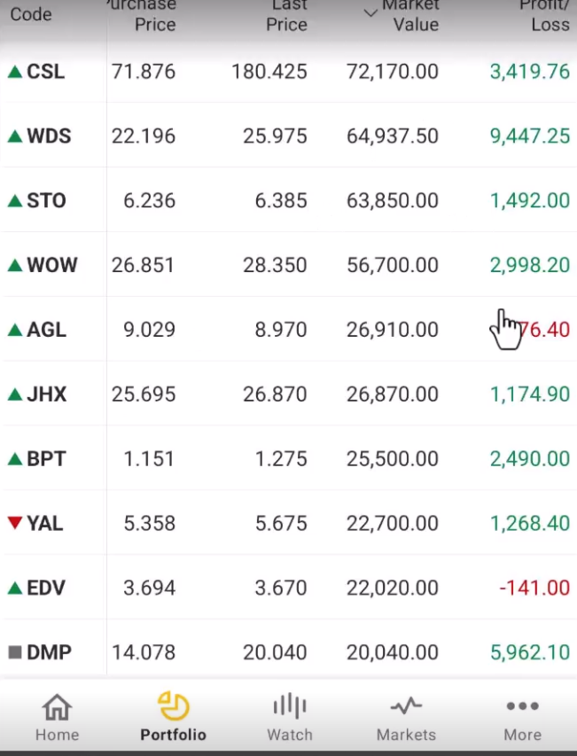
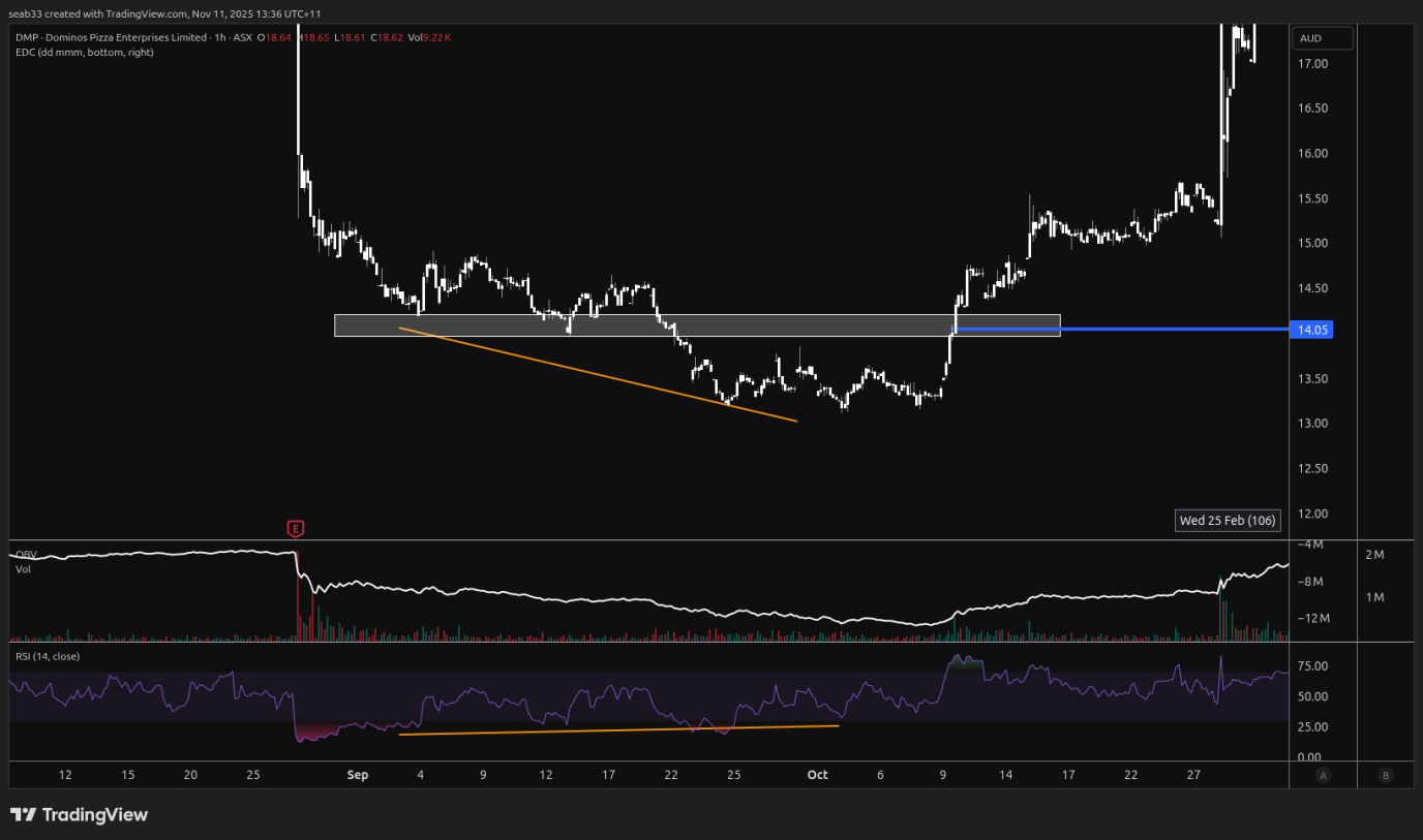
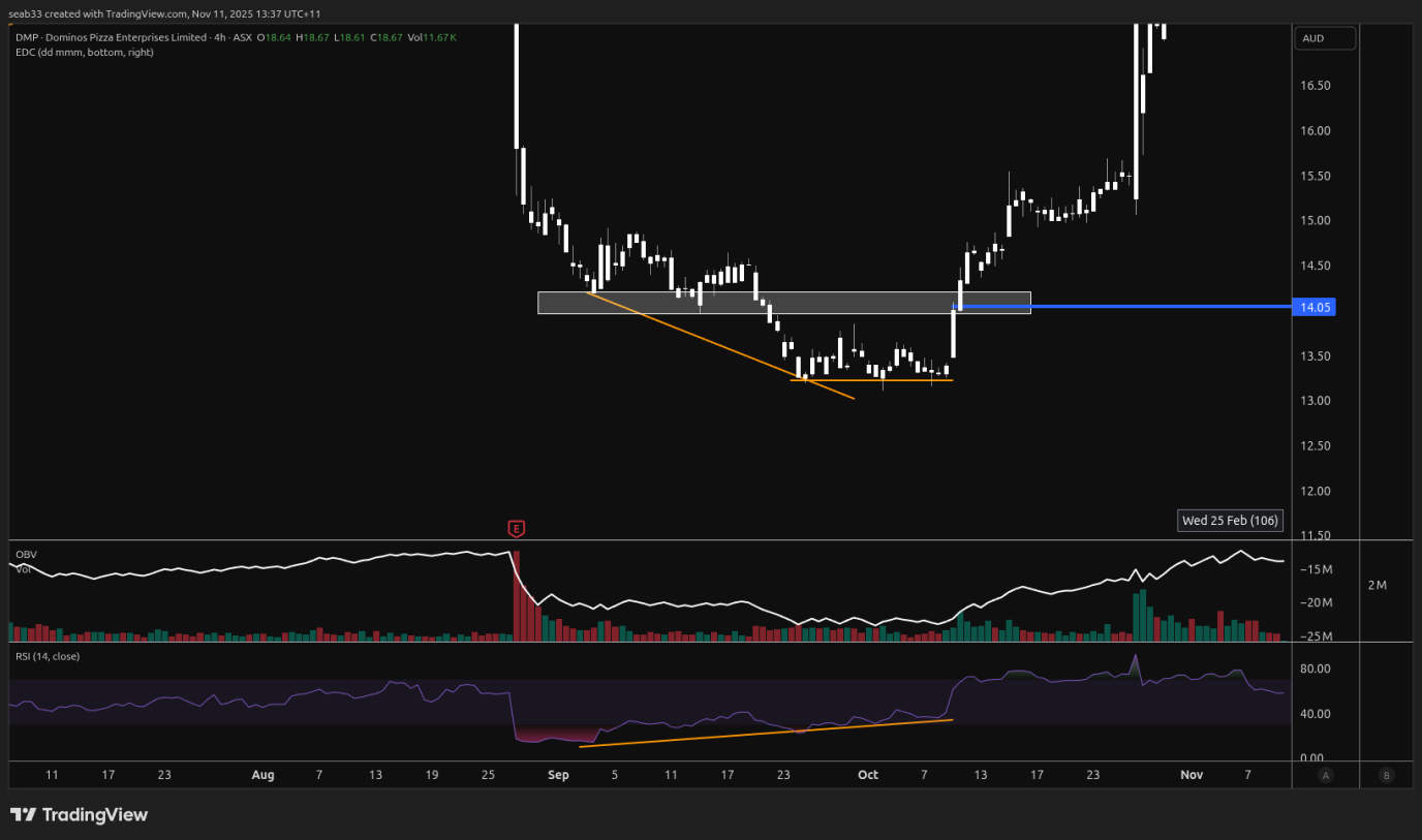
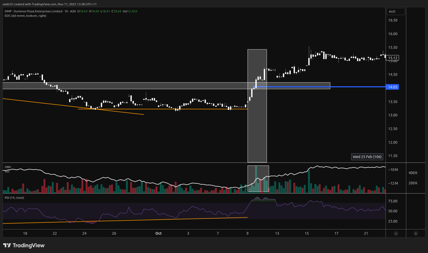
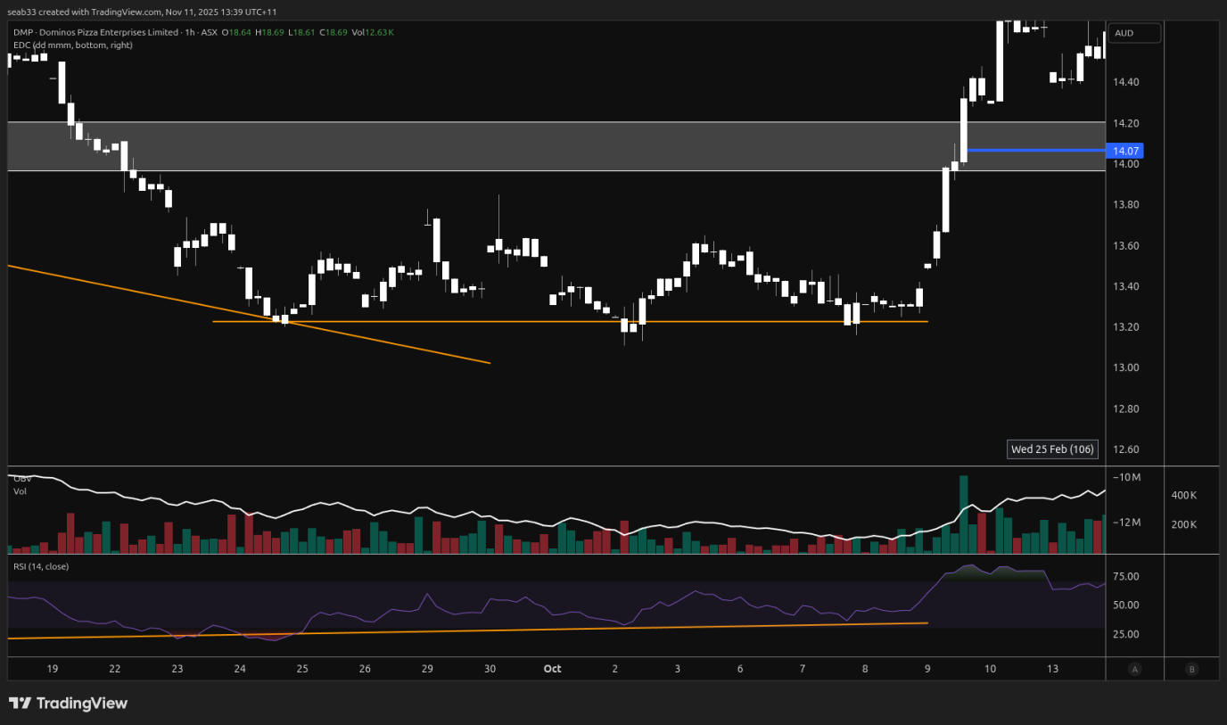
YAL
Summary
- Liquidity grab
- Bullish div on the RSI
- OBV didn't confirm new low
- OBV rose when price was rising back out of liquidity grab
Entry

Big picture there was a liquidity grab on the 23rd of oct (last wick down)
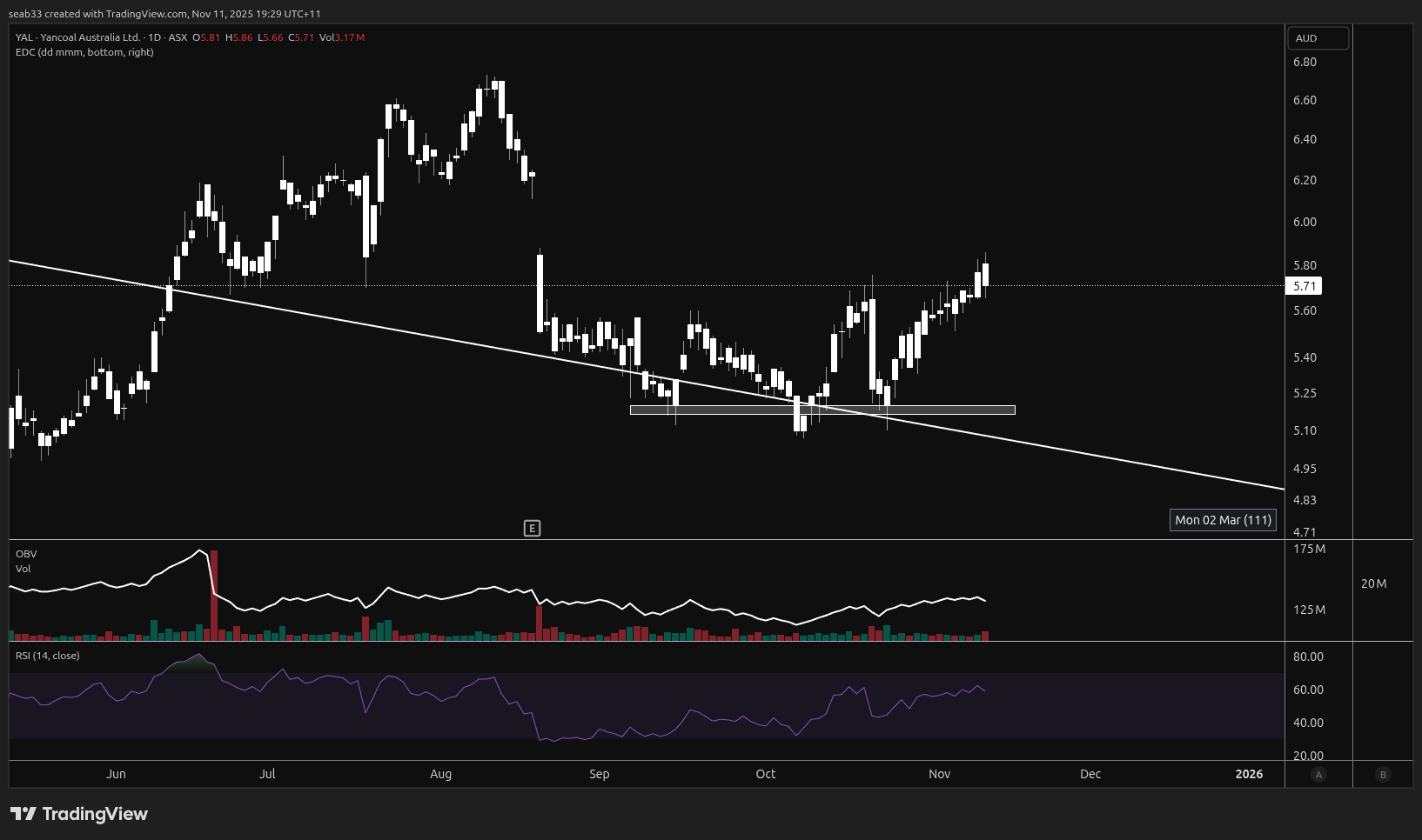
Looking closer at the liqudity grab, there was bullish div on the rsi, OBV barely confirmed the new low and on the way up, OBV confirmed the move on the way up
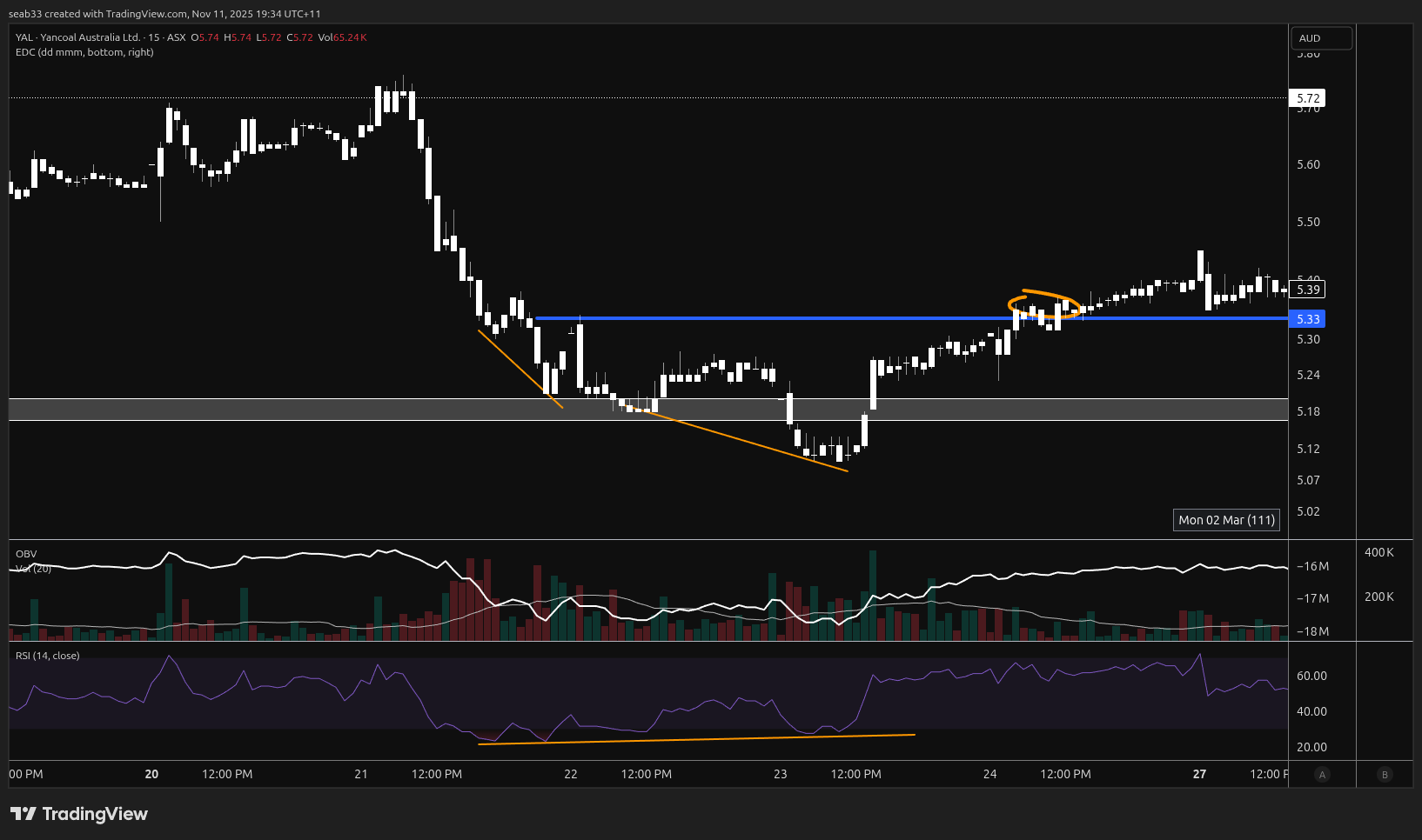
OBV zoomed in
CSL
Summary
- Bullish div on RSI
- COMS
- Bounce at long term support
- Right at .5 fib zone
On the 5 min, we can see the bullish div on the RSI before the COMS
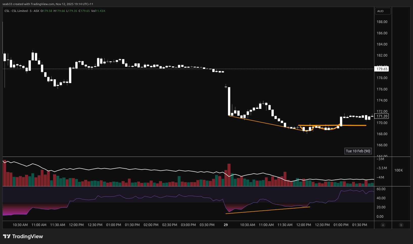
On the BIG timeframe, there was:
- Long term support
- Was right at the .5 fib zone on the log chart
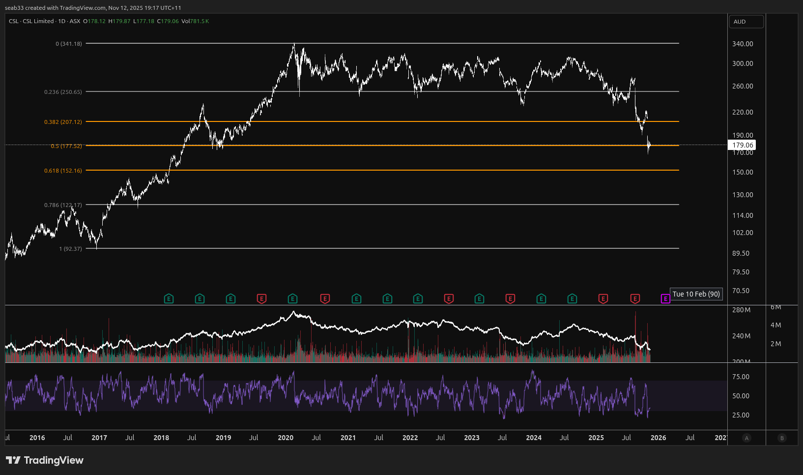
Main reasons for entry
General
- COMS
- Break through diagonal trend line
- Support turned into resisistance, now broken back through (BTC 2023 bottom)
- Patterns
- Falling wedge
- Market structure (HH - HL)
- Bullish div on RSI
- OBV supporting move
- Indicies not confirming a low (HH on eth, while LL on BTC) / (gold breaking up, buy gold miner but use gold price as decisions)
- Price at fib zone
- Price at moving average
- Sector breaking up out of accumulation, stonk showing signs of a bottom (AGL & Utilities 2021)
Crypto specific
- BTC pair must also be following price
BRN
Summary:
- Price gapped into RSI bearish divergence
- Doji - Indecision candle, followed by a bearish candle
- Gap up was filled within 1-2 days (extrely bearish)
- Island reversal (gap up and gap back down leaving an island)
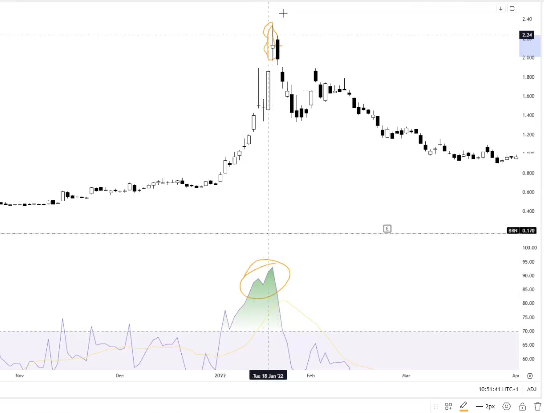
CXO
Summary
- Previous zigs and zags bouced off the zag zone (good sign of continuation), next push up and back down did NOT buy off the zag zone and just fell thought
- Break support for two reasons - grab liquidity or continue the trend. If it broke up and right back down this would most likely NOT be to continue the trend
- Exhaustion gap filled quickly
- Gapped into bearish divergence on the RSI
- Price made a new high but OBV didn't make a new high
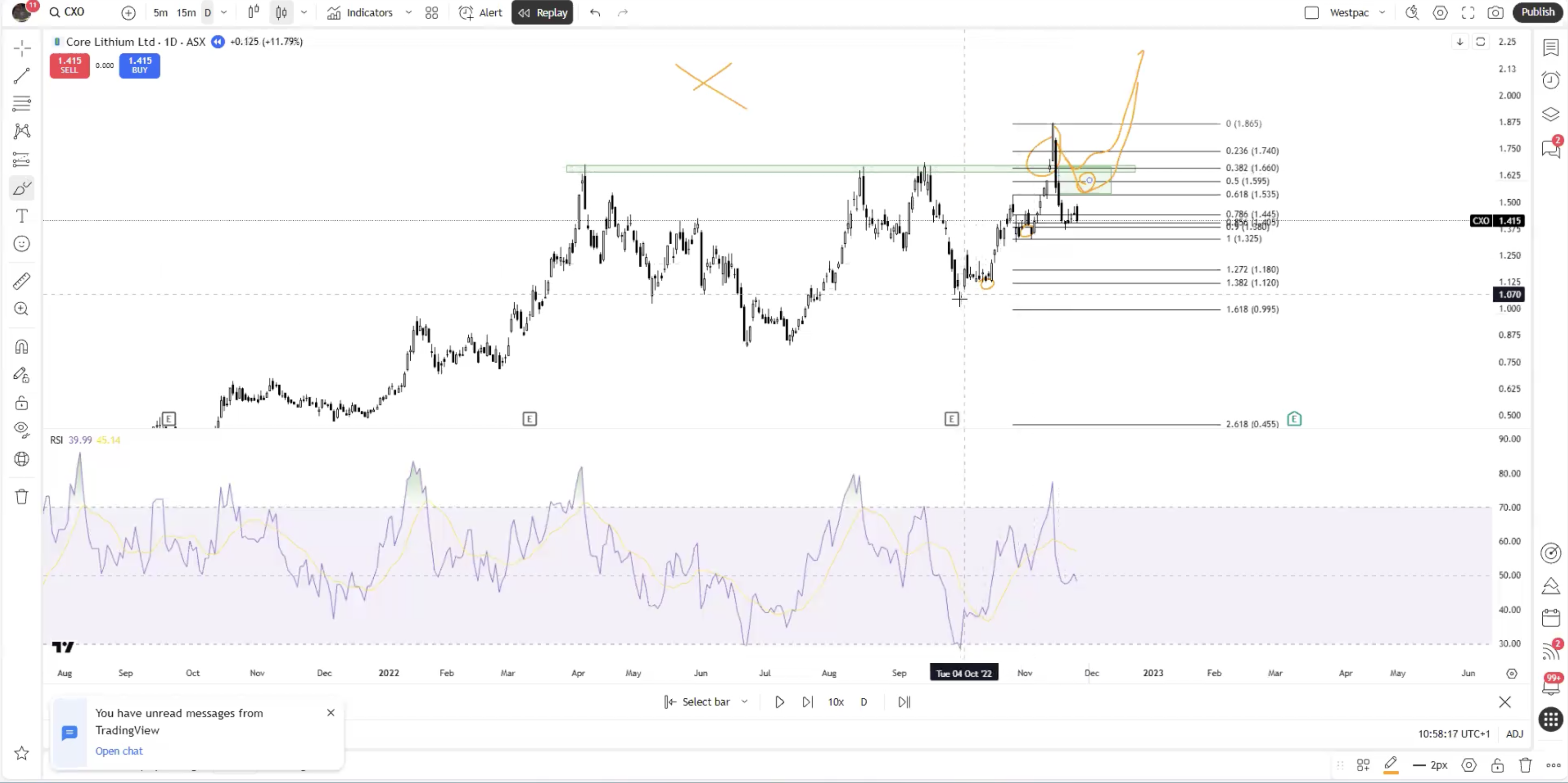
LKE
Summary
- Big green candle into an indecision candle (doji) followed by big red candle that wipes out all gains (bearish)
- Bounced back into the zag zone and fell back down (bearish)
- COMS
- Gap up (body closes, not wicks) - exhaustion gap that was filled 1-2 days later (bearish)
- Gap into overbought RSI
- Did a 100x in 2 years
- Hit the 1.618 extension
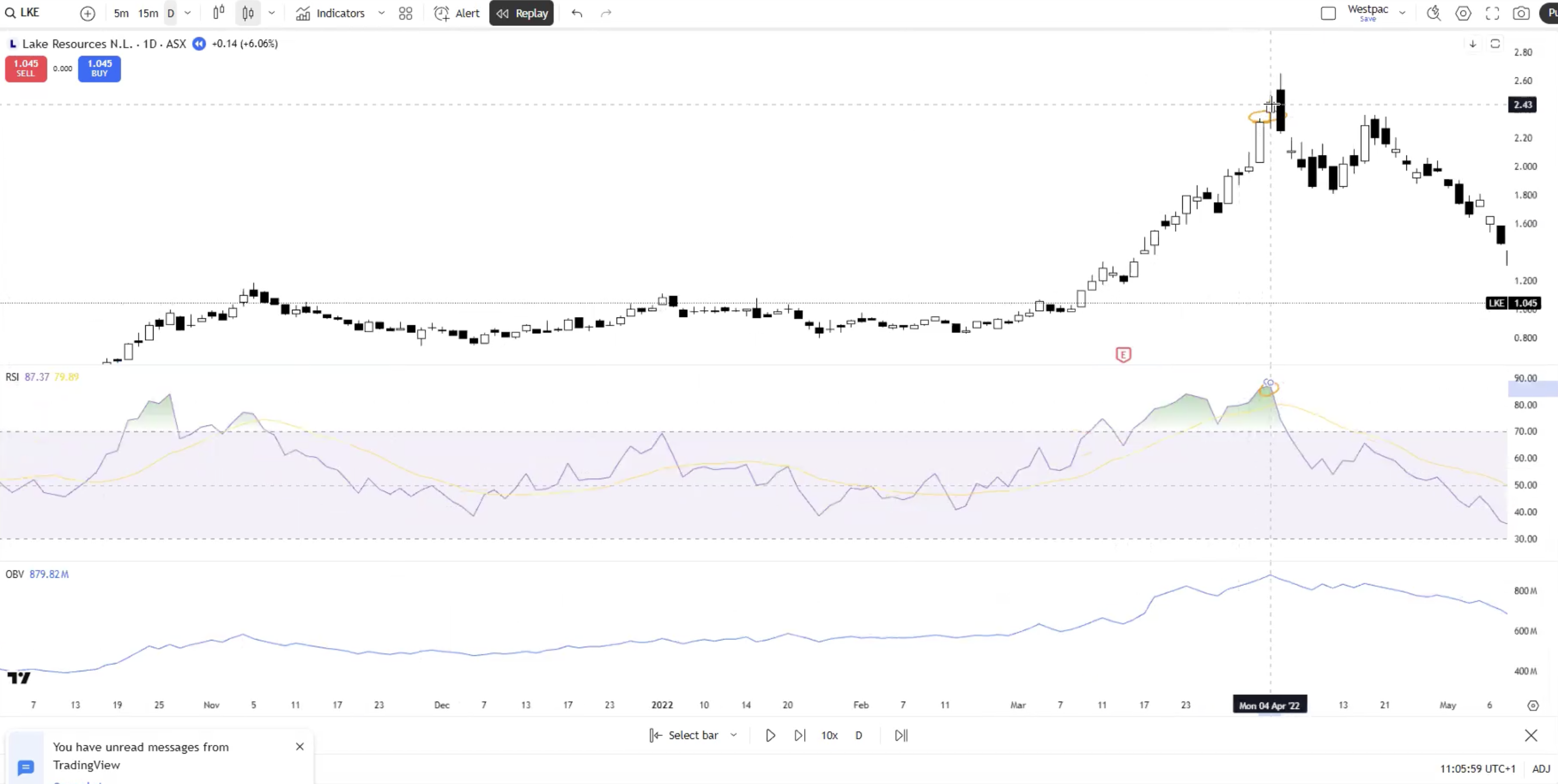
MSTR
Summary
- Blow off top
- Exhaustion gap filled within 1-2 days
- Bounced back into the 0.618, quick push above then fell back down (break support for two reasons... to grab liquidity or continue the trend)
- Area that was support is now resistance
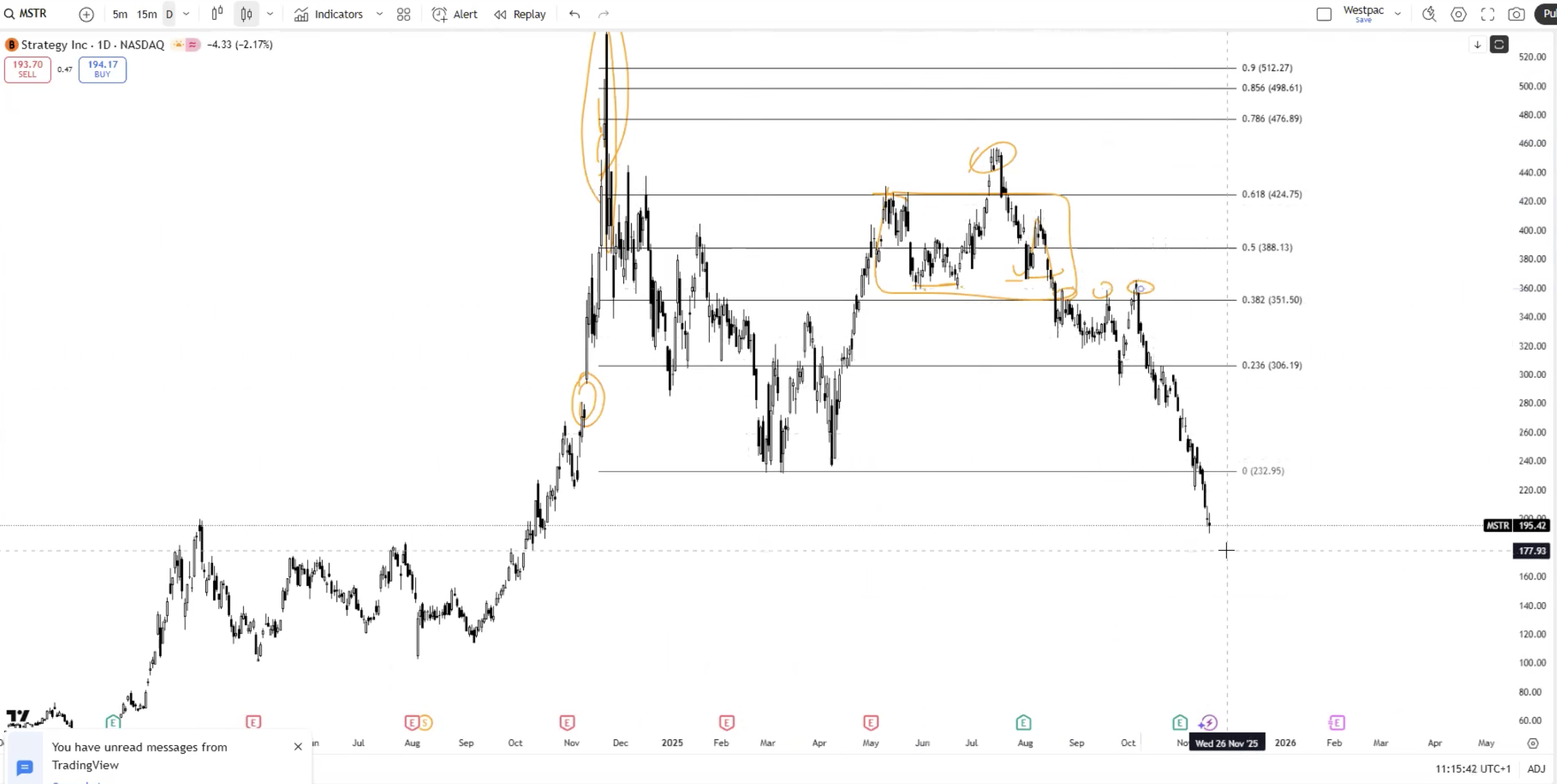
Fundamental Analysis Course
Module 1: The Lassonde Curve & The 10 Stages of a Mining Company
Why this is the most important framework
The Lassonde Curve — named after Pierre Lassonde, founder of Franco-Nevada — plots a typical mining company's market cap over its lifecycle, from grassroots exploration to production decline. It looks like two peaks separated by a deep valley.
- First peak: discovery / maiden resource excitement
- Valley: the "orphan period" or "valley of death" during studies, permitting, and financing
- Second peak: production ramp-up and cash flow realisation
- Decline: as reserves deplete
Most retail investors buy the first peak (discovery hype), get smashed in the valley, and capitulate at the bottom. Sophisticated capital buys the valley and rides the second peak. The framework's value is letting you recognise which peak/valley you are standing in right now.
Every other module in this course feeds back into this curve.
The 10 stages
Stage 1 — Concept / Grassroots
- Typical MC: under $5m, often $2–3m shells
- What's happening: tenement pegging, geophysics, soil/stream sediment sampling, mapping. No drilling yet.
- Catalysts: essentially none. Tenement grants, MOUs, "JV signed" announcements.
- SP behaviour: drifts; pumped briefly on cheap PR.
- Reality: you are buying a story, a postcode, and management. 95%+ never advance past this stage.
Stage 2 — Drilling Begins
- Typical MC: $5–20m
- What's happening: maiden drill program. Usually RC (reverse circulation) for cost reasons before diamond core.
- Catalysts: "rig mobilised", "drilling commenced", "first hole completed", "assays pending".
- SP behaviour: the drill speculation ramp — SP often runs before assays return as punters position for a hit.
- Reality: ~90% of maiden programs return nothing economically meaningful. The pre-assay ramp is often the entire trade.
- ASX example: BSR (Bison Resources) post-IPO in late 2025 — early drilling on its WA gold tenements with the SP running into anticipated first assays. TOR (Torque Metals) is similar — early-stage drilling with drill-for-equity contractor arrangements (a green flag, see Module 6/8).
Stage 3 — Discovery
- Typical MC: $20–100m+, sometimes much more in hot commodity cycles
- What's happening: high-grade hits in multiple holes, geological continuity emerging, step-out drilling extending the mineralised footprint.
- Catalysts: every assay batch is market-moving. Comparisons to nearby tier-1 deposits.
- SP behaviour: THE FIRST PEAK. 5x to 50x moves possible in weeks. This is the dopamine spike.
- Trap: many discoveries don't substantiate at scale. Step-out drilling reveals grade falls off, mineralisation pinches, or it's a one-pod wonder.
- ASX example: PC2 (PC Gold) — Stage 3/4 NT gold discovery with high-grade hits driving repeated re-rates through 2025 into early 2026. The hallmarks were there: multiple consistent intercepts, geological continuity, step-outs extending the footprint, and a tight cap structure (Module 6) that translated grade hits into market cap moves.
Stage 4 — Resource Definition
- Typical MC: $50–200m
- What's happening: closely-spaced drilling to define a JORC-compliant resource. Metallurgical testwork begins.
- Catalysts: maiden JORC resource is a major re-rate event. Subsequent upgrades (Inferred → Indicated → Measured) are progressively less impactful.
- SP behaviour: can hold or drift higher into maiden resource, then often sells the news.
- ASX example: MI6 (Minerals 260) — defining resources at its WA gold and base-metal projects. PC2 transitions through this stage as it works toward a maiden JORC resource (planned for mid-2026).
Stage 5 — Scoping Study
- Typical MC: flat or starting to soften
- What's happening: conceptual economic study, ±35–50% accuracy. Tests whether the project is worth progressing.
- Catalysts: scoping study results.
- SP behaviour: muted. Market starts thinking about capex, dilution, permitting timelines. The valley begins.
Stage 6 — PFS (Pre-Feasibility Study)
- Typical MC: often down 30–60% from discovery peak
- What's happening: ±20–25% accuracy. Mining method selected, processing flowsheet designed, infrastructure costed.
- Catalysts: PFS results. Capex sticker shock is real and frequent.
- SP behaviour: deep valley. This is where capital raises hurt most because the SP is depressed.
Stage 7 — DFS (Definitive / Bankable Feasibility Study)
- Typical MC: starting to recover if economics are robust
- What's happening: ±10–15% accuracy. Lender-ready engineering. Reserves declared from Indicated/Measured resources after applying Modifying Factors (Module 2).
- Catalysts: DFS results, Final Investment Decision (FID), financing close, offtake agreements.
- SP behaviour: bottom of the valley typically here or just before. This is where smart money accumulates — the project is de-risked but the market hasn't re-rated yet.
- ASX example: SLS (Solstice Minerals) sits in the studies/DFS region for parts of its portfolio — the kind of stock that grinds in the valley while the work gets done. The opportunity is recognising stocks where the work is progressing (catalysts being delivered, no red flags from Module 8) but the SP hasn't responded yet.
Stage 8 — Financing & Construction
- Typical MC: re-rating
- What's happening: debt + equity + offtake/streaming/royalty package finalised. Construction begins. EPC contractor mobilised.
- Catalysts: financing close, ground-breaking, construction milestones, first ore on ROM pad.
- SP behaviour: grinds higher with milestones. Setbacks are punished hard.
- Watch out: 30–50% capex blowouts are common, not exceptional. Schedule slippage is the norm.
- ASX example: GLN (Galan Lithium) — Phase 1 construction completed 31 March 2026 on time and on budget (the exception, not the rule). Note that GLN's recent re-rate from ~$0.09 in mid-2025 to ~$0.47 in January 2026 was the Lassonde second peak build — sophisticated capital (Clean Elements) bought the valley at $0.11 and the same fund paid 3.7x more per share five months later (covered in Module 6).
Stage 9 — Commissioning & Ramp-Up
- Typical MC: significant re-rate
- What's happening: plant commissioning, first concentrate / doré / cathode, ramp toward nameplate capacity.
- Catalysts: first product, first revenue, first cash flow, achievement of nameplate.
- SP behaviour: THE SECOND PEAK builds here. But ramp problems are normal — recovery shortfalls, throughput issues, grade reconciliation problems — and can crater the SP temporarily.
- ASX example: GLN crosses from Stage 8 into Stage 9 in Q2 2026 as it processes first brine and produces first lithium chloride concentrate. This transition is the most volatile point of the curve — get commissioning right and the second peak builds quickly; commissioning problems can crater the SP and force dilutive raises at compressed prices.
Stage 10 — Production & Depletion
- Typical MC: tied to commodity price × production × remaining reserves
- What's happening: steady-state production, reserve replacement battle, expansion studies, M&A.
- Catalysts: quarterlies (production, AISC, cash position, hedge book), reserve updates, exploration around mine, M&A.
- SP behaviour: tracks commodity price + operational delivery. Depletion without replacement = terminal decline.
- ASX example: ELV (Elevra Lithium) — Quebec hard-rock producer. Through 2024–early 2025, ELV traded in the typical Stage 10 producer pattern: SP tracking spodumene price, operational delivery measured quarterly, reserves and grade updates as recurring catalysts. This is where commodity-cycle plays compound — a producer can 5–10x on the underlying commodity moving without doing anything new operationally.
A reference map of typical Lassonde positions
This is a snapshot — stocks move along the curve over time, sometimes forward, sometimes backward, occasionally sideways for years. Use it as a way of orienting any new ticker quickly:
| Stage | Typical MC | Risk profile | Position sizing default | ASX examples (April 2026) |
|---|---|---|---|---|
| 1 — Concept | <$5m | Lottery | 0.5–2% | Most $2–3m shells |
| 2 — Drilling | $5–20m | Lottery | 0.5–2% | BSR, TOR (early drilling) |
| 3 — Discovery | $20–100m+ | High volatility, asymmetric | 2–4% | PC2 |
| 4 — Resource def | $50–200m | High volatility | 2–4% | MI6, PC2 (transitioning) |
| 5 — Scoping | flat / softening | Orphan period | 2–5% | varies |
| 6 — PFS | -30 to -60% from peak | Deep valley | 2–5% | varies |
| 7 — DFS | recovering | Smart money zone | 2–5% | SLS (parts of portfolio) |
| 8 — Construction | re-rating | Execution risk | 3–6% | GLN (entering Stage 9) |
| 9 — Commissioning | significant re-rate | Ramp risk | 3–6% | GLN (Q2 2026 onwards) |
| 10 — Production | commodity × tonnes | Macro-driven | 5–10% | ELV |
(Position sizes are defaults — Module 10 covers sizing in detail. They depend on conviction, total mining allocation, and your risk tolerance.)
Why the valley exists (and why it's the opportunity)
- No catalysts. Discovery dopamine has worn off. Months of nothing while consultants run studies.
- Capital raises. PFS/DFS work costs millions. Issued at deep discounts because SP is weak. Existing holders get diluted.
- Capex sticker shock. $200m–$2bn+ capex numbers scare retail.
- Time. 3–7 years from discovery to first production is typical. Retail attention does not last that long.
- Permitting. Indigenous Land Use Agreements, environmental approvals, water licences, native title — glacial pace, especially in WA and NT.
The valley is where 10m → 100m+ MC stories actually get built. Not at the discovery pop (gambling), but at the bottom of the valley when a real project with real economics is being de-risked and the market hasn't woken up yet.
The GLN case study is worth internalising here. In mid-2025, lithium was deeply out of favour, GLN's SP had collapsed from $1.70+ in 2022 to ~$0.09. Most retail had capitulated. That August, a specialist lithium fund (Clean Elements) did 77 days of due diligence and put $20m in at $0.11 — a 21% premium to market. Five months later, after Phase 1 construction had visibly progressed, the same fund paid $0.41 in another placement at premium-to-VWAP pricing. The valley was where the asymmetric trade existed; by the time mainstream coverage and broker upgrades arrived, the easy money had been made.
Where 10m → 100m MCs come from (honestly)
Three legitimate paths:
- Discovery (Stages 2 → 3). Highest-conviction trade if you're early. Lowest probability per attempt. Lottery economics — most go nowhere; the rare ones go 20-50x.
- Re-rating from valley (Stages 7 → 9). Lower upside per stage but much higher probability if you've done the work. The "boring" path that compounds.
- Commodity cycle. A producer (Stage 10) can 5–10x just because the underlying commodity moved. Macro overlay — covered in Module 9.
A fourth path that exists but is harder to time: takeover. Mid-tier or major acquires the developer at a 20–80% premium. Often happens at Stage 6–8. (GLN rejected a US$150m takeover bid from Huayou + Renault in late 2024 — sometimes management sees more value standalone, sometimes they're wrong.)
Using AI tools to research mining stocks — a 2-stage workflow
A practical note that's worth flagging early because most retail are now using AI tools (ChatGPT, Claude, Gemini, Grok, etc.) to research stocks and getting burned by it.
What AI is good at
- Explaining frameworks and concepts (the Lassonde Curve, JORC categories, capex intensities, what AISC means)
- Summarising publicly disclosed information if it has been fed the actual document
- Comparing similar concepts side-by-side (hard rock vs brine, Inferred vs Indicated, scoping vs PFS)
- Generating questions you should be asking about a stock
- Pattern recognition once you describe what you're seeing
What AI is bad at and routinely gets wrong
- Specific drill intercepts and assay results — these get hallucinated frequently
- Current cap structure — SOI counts, recent placements, options outstanding are often stale or invented
- Recent share prices and market caps — without a search tool, models work from training data that's months to years out of date
- Identity of management, directors, major holders — gets people confused, mixes up similarly-named companies
- Specific tenement boundaries, geology, drill hole IDs — these are often invented if the model is asked confidently
- Recent ASX announcements — not in training data; fabricated when extrapolated from older info
The 2-stage workflow
Stage 1 — Frame the question with AI. Use the AI to:
- Explain the framework relevant to the stock (Lassonde stage, study type, deposit type, jurisdiction)
- Generate a list of specific questions you need answered
- Identify what good and bad would look like for that specific situation
- Compare it conceptually to similar companies you already understand
Stage 2 — Verify every specific fact against primary sources. That means:
- The company's ASX announcements page directly (not summarised by AI)
- The most recent quarterly Appendix 5B (Section 8 cash burn, Section 1.2 cash position)
- The most recent annual report and any maiden resource / scoping / PFS / DFS document
- Director announcements (Appendix 3Y) for on-market buying / selling
- The Top 20 holders list at the back of the annual report
The AI-research failure mode is doing Stage 1 and skipping Stage 2 — letting the AI confidently tell you that a company has X tonnes at Y g/t when it has neither. The number sounds plausible. It isn't. Every specific number, name, or date that matters to your decision must be verified from the company's own ASX disclosures. No exceptions.
A simple rule: if you're about to put real money behind a fact, that fact has to be linked back to a specific ASX document you've actually read. If the AI gave it to you and you can't find it on the ASX announcements page, treat it as not real until proven otherwise.
Practical exercise
For every ASX mining stock you're tracking, write down:
- What stage is it at?
- What was its peak MC and when?
- Where on the curve is it sitting now relative to its peak?
- What's the next genuine catalyst that could move it?
- What ASX document did you verify each of those answers from?
If you can't answer all five, you don't actually know the company well enough to size a position.
What I'm uncertain about
- MC ranges by stage vary massively by commodity, jurisdiction, and macro cycle. The numbers above are typical Australian junior patterns over the last decade — treat as rough guide, not law.
- The Lassonde Curve is a heuristic. Plenty of companies skip stages, fail at any stage, or backslide. A discovery can de-rate to below pre-discovery levels if step-out drilling disappoints.
- Timeframes have been getting longer in WA due to permitting bottlenecks. 3–7 years discovery-to-production is increasingly optimistic for new projects.
- The ASX examples cited above are illustrative of stage positions as at April 2026 — they will move along the curve over time. Re-classify them yourself when you re-read this in 6 months.
Module 2: JORC Code & The Resource / Reserve Hierarchy
Why this matters
The JORC Code is the rulebook for how Australian-listed mining companies report exploration results, mineral resources, and ore reserves. It is the single biggest source of retail confusion and the single biggest place companies legally mislead unsophisticated investors.
If you can't read a JORC table and explain what each category means, you are gambling — not investing — in mining.
The basics
- JORC = Joint Ore Reserves Committee
- Current code: JORC Code 2012 (released December 2012). A revised version has been in consultation for several years; check the JORC website for current status.
- Mandatory for all ASX-listed companies reporting exploration results, resources, or reserves.
- Aligned to the international CRIRSCO template, so JORC, NI 43-101 (Canada), SAMREC (South Africa), PERC (Europe) and SK-1300 (US SEC) are broadly equivalent though not identical. (More on the differences later in this module.)
The hierarchy (most important diagram in mining)
EXPLORATION RESULTS
↓
(geological confidence increases ↓)
INFERRED RESOURCE → INDICATED RESOURCE → MEASURED RESOURCE
↓ ↓
(apply Modifying Factors)
↓ ↓
PROBABLE RESERVE PROVED RESERVE
Two key rules baked into this diagram:
- Inferred resources cannot be converted directly to reserves. They must first be upgraded to Indicated or Measured via additional drilling. This is a hard rule and one of the most common things companies blur in their wording.
- Reserves require Modifying Factors to be applied. A resource is a geological estimate; a reserve is an economic statement that the rock can be mined and processed profitably under defined assumptions.
Resource categories
Inferred Resource
- Lowest geological confidence.
- Drill spacing wide (often hundreds of metres).
- Tonnage and grade are estimated based on limited sampling.
- Cannot be used in reserve calculations.
- Cannot be used in PFS or DFS economics (with very narrow exceptions).
- Can be used in Scoping Studies — which is one reason scoping studies are not bankable.
Indicated Resource
- Moderate confidence.
- Drill spacing tight enough that geological and grade continuity can reasonably be assumed.
- Can be converted to Probable Reserves after Modifying Factors.
- Required basis for PFS economics.
Measured Resource
- Highest geological confidence.
- Very tight drill spacing, often supported by trenching, channel sampling, or underground development.
- Can be converted to Proved Reserves (or Probable, depending on confidence in Modifying Factors).
Sub-categories you'll see
Modifiers like "in-situ" vs "extractable", "open-pittable" vs "underground", or constraints by depth or pit shell. Read carefully — companies sometimes report a big global resource then quietly disclose only a fraction is within an economic pit shell.
Reserve categories
Probable Reserve
- Derived from Indicated (or sometimes Measured) Resources after applying Modifying Factors.
- Lower confidence than Proved.
Proved Reserve
- Derived from Measured Resources after applying Modifying Factors.
- Highest confidence economic mining inventory.
The Modifying Factors
To convert a resource to a reserve, the Competent Person must apply realistic assumptions about:
- Mining (method, dilution, recovery, geotech)
- Processing (metallurgical recovery, throughput)
- Metallurgical (test work supporting flowsheet)
- Infrastructure (power, water, roads, port access)
- Economic (commodity price, opex, capex, royalties, taxes)
- Marketing (offtake potential, product specifications)
- Legal (tenements, mining leases)
- Environmental (approvals, rehabilitation)
- Social (community agreements, ILUAs)
- Governmental (royalty regimes, foreign investment rules)
If any of these don't stack up, the resource cannot become a reserve. Many "huge resources" never become reserves because of metallurgy, infrastructure, or social licence.
Competent Person (CP) requirement
Every public report of exploration results, resources, or reserves must:
- Be signed off by a Competent Person — a member of AusIMM, AIG, or a recognised overseas equivalent (RPEQ, etc.).
- Have at least 5 years' relevant experience in the style of mineralisation/deposit type and the activity being reported.
- Include a named consent statement that the CP has reviewed and approved the form and context of the announcement.
If the CP statement is missing, vague about credentials, or the CP is the company's CEO with no relevant background — that's a flag.
Reading a JORC resource table
A standard table looks like:
| Category | Tonnes (Mt) | Grade (g/t Au) | Contained Au (Moz) |
|---|---|---|---|
| Measured | 5.0 | 2.5 | 0.40 |
| Indicated | 12.0 | 1.8 | 0.69 |
| Inferred | 25.0 | 1.4 | 1.13 |
| Total | 42.0 | 1.65 | 2.22 |
What to actually look at:
- % of resource that is Inferred. If it's 60%+, the headline ounces are largely speculative. Many junior "1Moz+" announcements are 70-90% Inferred.
- Cut-off grade applied. Always disclosed in the announcement footnotes. A resource at 0.3 g/t cut-off vs 0.8 g/t cut-off describes a fundamentally different deposit.
- Top-cut applied. Were extreme high-grade assays capped (e.g., capped at 30 g/t)? If not, the average grade may be skewed by a few bonanza intercepts.
- Density assumption. Tonnage = volume × density. Wrong density = wrong tonnage.
- Constraints. Was the resource constrained inside a pit shell at a given commodity price? At what price?
Common gotchas (where companies legally mislead)
"Exploration Target"
This is NOT a JORC resource. It's a conceptual range (e.g., "10–25 Mt at 1.5–2.5 g/t Au"). The JORC code allows it but requires explicit wording that it is conceptual, not a resource estimate, and based on insufficient drilling. Companies often headline this and bury the disclaimer.
Historical Estimates
Often quoted by companies that have just acquired old projects. Not JORC-compliant unless re-validated by a Competent Person under the 2012 Code. Headlines like "historical resource of 500,000 oz" are essentially marketing until JORC-validated. Covered in detail in the foreign-and-historical-estimates section below.
"Ore"
Strictly, "ore" means rock that is economically extractable — i.e., reserve-quality. Companies use "ore" loosely for inferred resources, which is technically non-compliant. Watch the language.
Resource on resource on resource
Multiple updates in a year, each headlined as if it's a fresh discovery, when it's the same deposit being re-drilled and re-categorised. Look at how the Indicated + Measured tonnes are growing, not just the headline total.
"No new drilling, just changed parameters" — the parameter-shuffle MRE
This is one of the more important patterns to recognise because it looks like progress and isn't.
A Mineral Resource Estimate (MRE) update can grow the headline resource without any new drilling at all, simply by changing the input parameters:
- Lowering the cut-off grade — sweeps in more low-grade material that was previously below cut-off
- Raising the assumed commodity price — extends the economic pit shell, capturing more material at depth or at the edges
- Loosening the geological continuity assumption — links blocks of mineralisation that were previously separate
- Changing the top-cut — letting bonanza intercepts have more influence on the average grade
- Re-classifying based on revised drill spacing rules — moving material from Inferred to Indicated without new drilling, on the basis of the geologist's revised judgment
None of this is necessarily wrong. Cut-offs should reflect current commodity prices. Geological models do get refined. But when an MRE update grows materially without new drilling, the right read is "the same rock has been re-described" — not "we've discovered more ore."
How to spot it
When an MRE update is announced:
- Read the methodology section. It will state how many new holes were drilled since the last update. If the answer is "none" or "very few", the change is parametric.
- Compare the cut-off used. A drop from 0.5 g/t to 0.3 g/t can grow tonnage 30–50% on the same drilling.
- Compare the commodity price assumption. If the price assumption moved from $1500/oz to $2500/oz, the pit shell and economics expand without any geological change.
- Look at the Indicated + Measured tonnage in particular. Adding Inferred tonnes is easier than adding I+M tonnes. The latter requires real new drill data.
- Read the Competent Person statement. It will (or should) note any methodology changes.
Example of what this looks like in announcements
A company reports: "Updated MRE delivers 35% increase in contained gold, project now hosts 2.7 Moz Au." Reading the body:
- Same number of drill holes as the prior MRE
- Cut-off lowered from 0.5 g/t to 0.3 g/t
- Gold price assumption lifted from US$1800/oz to US$2400/oz
- Top-cut raised from 25 g/t to 50 g/t
- Pit shell expanded as a result of the higher price
The deposit is exactly the same. The headline 35% growth is parametric. The Indicated + Measured fraction may even be lower than before (because the new Inferred tonnes added at lower cut-off are likely Inferred-only).
A genuine resource upgrade would include a meaningful new drilling campaign, with hole counts and metres drilled since the prior estimate disclosed in the methodology section.
When parameter changes are legitimate
They aren't always misleading. If gold prices have genuinely doubled, lowering the cut-off and re-running the pit shell is the correct technical response — the prior MRE was conservative for current conditions. The flag isn't "they changed parameters." The flag is "they changed parameters and headlined it as a resource growth event without making clear what drove the change."
The honest version of the same announcement would be: "MRE re-stated under updated price and cut-off assumptions; headline tonnage increased 35% with no change to the underlying geology or drilling."
The promotional version is: "Resource grows 35%."
Same numbers, different read. The body of the announcement is where the truth lives.
Foreign and historical estimates — what they are and how to read them
A common situation: an ASX company acquires a project that already has a resource estimate calculated under a non-JORC code (Canada's NI 43-101, the US SEC's SK-1300, South Africa's SAMREC, etc.) or under no modern code at all (a "historical estimate" from the 1980s, 1990s, or earlier).
These cannot be reported as a JORC resource, but ASX does allow them to be disclosed under specific rules.
The CRIRSCO family
The Committee for Mineral Reserves International Reporting Standards (CRIRSCO) sets a template that JORC, NI 43-101, SK-1300, SAMREC, PERC, and others all derive from. They share the same hierarchy (Inferred → Indicated → Measured for resources, Probable → Proved for reserves) and the same conceptual framework around Modifying Factors and Competent Persons (or "Qualified Persons" in the North American codes).
The codes are conceptually equivalent but not identical. Differences exist in:
- Specific drill spacing requirements for each classification
- The level of detail required in technical reports
- Filing and disclosure mechanisms
- The application of classification judgment in marginal cases
NI 43-101 (Canada)
National Instrument 43-101 is Canada's mandatory mineral disclosure standard, in force since 2001. Reports are signed off by a "Qualified Person" (the Canadian equivalent of a Competent Person), filed publicly on SEDAR+, and tend to be more detailed than the equivalent ASX disclosures.
Key practical points:
- NI 43-101 technical reports are typically more comprehensive — they include detailed sections on geology, drill data, QA/QC, metallurgical testwork, and economic analysis
- They're publicly downloadable from SEDAR+ (sedarplus.ca) at no charge
- The Indicated → Measured threshold under NI 43-101 is broadly aligned with JORC, though application can differ
- A NI 43-101 resource is the closest international cousin to a JORC resource
SK-1300 (US SEC)
The US SEC modernised its mineral disclosure rules in 2018 (effective 2021), replacing the old "Industry Guide 7" — which was famously restrictive (it didn't allow companies to disclose Resources at all, only Reserves). SK-1300 brought the US into rough alignment with JORC and NI 43-101.
- Uses "Qualified Person" terminology
- Allows Resource and Reserve reporting in the same hierarchy
- Filed via the SEC's EDGAR system
- Slightly more conservative in some areas than JORC/NI 43-101
SAMREC (South Africa) and PERC (Europe)
Functionally similar to JORC for African and European projects respectively. PERC tends to be more common for European projects (especially Sweden, Finland, Spain, Portugal). SAMREC is the standard for South African and many sub-Saharan African operations.
ASX Listing Rule 5.12 — how foreign estimates get reported
ASX Listing Rule 5.12 allows a company to disclose a foreign estimate (an estimate calculated under NI 43-101, SK-1300, SAMREC, or another recognised foreign code) but with strict requirements:
- The estimate is not classified as a JORC resource until a Competent Person reviews and signs off
- The company must clearly state that it is not reported in accordance with JORC Code 2012
- The company must disclose whether a Competent Person has done sufficient work to consider the estimate JORC-compliant — and if not, what work is required to bring it up to JORC standard
- The company must state that the estimate must not be relied upon in the same way as a JORC-compliant resource
This is why ASX announcements about foreign-acquired projects often include a long disclaimer paragraph alongside the foreign estimate numbers.
Why this matters legitimately
The use case is straightforward: a company acquires a project that already has, say, an NI 43-101 resource from a prior Canadian or TSX listing. On day one of the acquisition, the company can disclose that the project hosts X tonnes at Y g/t under NI 43-101. They then commission a Competent Person to do the work — usually 6 to 18 months — to convert the estimate to JORC. This work involves reviewing the underlying drill data, validating QA/QC, sometimes drilling twin holes, and producing a fresh CP report.
Letting the market price in the underlying value during this transition is reasonable. Forcing the company to keep a known resource secret for 18 months would be the wrong outcome.
Where to be careful
Pre-2014 NI 43-101 reports used slightly different rules. Always check the date of the foreign estimate report. Reports from the early 2000s may have been calculated under standards that are now considered loose by current practice.
Historical estimates are different from foreign estimates. A historical estimate is a pre-modern-code calculation — a 1980s calculation, a 1990s calculation, a Soviet GKZ resource — that doesn't conform to any current code. ASX allows these to be disclosed under Listing Rule 5.12 too, but with even stricter disclaimers. The qualification typically reads something like: "the historical estimate is not reported in accordance with the JORC Code 2012 and a Competent Person has not done sufficient work to classify the historical estimate as a Mineral Resource in accordance with the JORC Code 2012."
Treat historical estimates with significantly more scepticism than NI 43-101 or SK-1300 estimates. The methodology, sampling, and assays underpinning them often don't meet modern standards. Re-validation frequently results in significant downgrades.
What to expect when foreign estimates get converted to JORC
A few rules of thumb:
- The JORC version is usually the same size or smaller than the foreign estimate, rarely larger
- Material classified as Indicated under NI 43-101 may be reclassified as Inferred under JORC because of differing application of confidence judgment
- Old historical estimates frequently lose 20–40% of their headline tonnage on JORC re-validation, sometimes more
- Grades may be revised downward if top-cuts get applied where they weren't before, or if old assays from inadequate QA/QC procedures get excluded
- The re-stated JORC number is the one you should use for valuation; the foreign estimate is for orientation
Do not extrapolate from headline foreign estimates. Wait for the JORC re-statement, then re-anchor your valuation.
The perpetual-foreign-estimate pattern (covered in Module 8)
Some companies disclose a foreign estimate at acquisition and never seem to deliver the JORC version. 12 months pass, then 18, then 24, with quarterly reports continuing to mention "the JORC re-statement is in progress." This is a behavioral red flag covered in detail in Module 8 — at minimum it raises the question of why the JORC work is taking so long, and at worst it suggests the company knows the JORC version will be substantially smaller than the foreign estimate they keep referring to.
Why "10Moz" doesn't mean what you think
A 10Moz Au resource sounds enormous. But:
- If 70% is Inferred, you have 3Moz of bankable rock until further drilling.
- If grade is 0.6 g/t, the project is marginal at best (gold).
- If cut-off was set at 0.3 g/t, lifting the cut-off to 0.8 g/t might leave you with 2Moz.
- If the deposit is at 800m depth and the company is a $20m junior, no one is mining it for 15 years.
- If it's in a jurisdiction with permitting/sovereign risk, it might never be mined.
- If it's reported as a NI 43-101 estimate that hasn't been JORC-validated, the JORC version may be smaller.
- If the headline grew through parameter shuffle rather than new drilling, the deposit hasn't changed.
Resource size without context is meaningless. This is the most common retail mistake in mining.
Practical exercise
Pull up the latest resource update from any ASX gold or copper junior you follow. Answer:
- What % of the contained metal is Inferred vs Indicated vs Measured?
- What cut-off grade was used? What was used in the prior estimate?
- Was a top-cut applied? At what value? Same as prior estimate?
- Is the resource constrained inside a pit shell? At what commodity price?
- Who is the Competent Person and are they independent of the company?
- How many new drill holes / metres have been drilled since the prior estimate? If "none", the headline change is parametric.
- Is any part of the disclosed resource a foreign estimate or historical estimate, not yet JORC-validated?
If you can answer these for every position you hold, you're ahead of 95% of retail.
What I'm uncertain about
- Whether the JORC 2012 Code revision (long in consultation) has been finalised at the time you're reading this. Worth checking the JORC website (jorc.org) for current status.
- Specific recent ASX enforcement actions — there have been periodic crackdowns on misleading resource statements but I'd want to verify recent specifics rather than name them from memory.
- Specific application differences between JORC and NI 43-101 in marginal cases. The high-level framework above is solid; for specific edge cases, refer to the actual code documents.
- The 20–40% downgrade rule of thumb for historical estimate re-validation is anecdotal and varies enormously by deposit. Some are fine; some collapse to nothing.
Module 3: Ore Grades, Cut-Offs & What "Good" Actually Looks Like
Why this matters
A resource is just tonnage × grade. The grade tells you whether the project is economic. Without grade context, you can't tell a tier-1 deposit from a moose pasture.
This module gives you benchmarks by commodity so when you see a drill hit or resource update, you immediately know whether it's interesting or marketing.
Key concepts first
Cut-off grade
The minimum grade above which rock is classified as economic to mine. Below cut-off = waste.
- Lower cut-off = more tonnes, lower average grade
- Higher cut-off = fewer tonnes, higher average grade
- Companies can manipulate the headline by adjusting cut-off. Always check the footnote.
Strip ratio
Open-pit mining only. Tonnes of waste that must be moved per tonne of ore.
- 1:1 = excellent (ore right at surface)
- 3:1 to 5:1 = typical for most metals
- 8:1+ = high cost; only justified for high-grade or high-value ore
- 15:1+ = usually marginal at best
Recovery rate
% of contained metal that can actually be extracted through processing.
- 90–95% = excellent (typical for clean sulphides)
- 70–85% = average
- <60% = problematic ("refractory" ore — needs expensive processing like roasting, pressure oxidation, or fine grinding)
Head grade vs in-situ grade
- In-situ grade = grade of rock in the ground (the resource grade)
- Head grade = grade of rock fed to the processing plant
- They're often different because of dilution from waste rock during mining and selective mining (taking only the best stuff first in early years).
Mining dilution
Waste rock that gets mixed with ore during extraction. Typically 5–15% in open pit, sometimes more in narrow-vein underground. Reduces head grade vs in-situ.
Grade benchmarks by commodity
Gold (g/t Au)
| Context | Grade |
|---|---|
| Bulk-tonnage open pit | 0.5–1.5 g/t |
| Average open pit | 1–3 g/t |
| High-grade open pit | 3–5 g/t |
| Underground average | 4–8 g/t |
| High-grade underground | 8–15 g/t |
| Bonanza | 30+ g/t |
| World-class deposit | usually >5 g/t with scale, or 1–2 g/t at very large scale (Cadia, Boddington) |
Cut-off grades typically:
- Open pit: 0.3–0.8 g/t
- Underground: 2–4 g/t
ASX framing: PC2 drill intercepts in the 5–15 g/t Au range over meaningful widths place it in the high-grade open pit / underground crossover zone — well above marginal, well above the cut-off. MI6 discoveries in similar high-grade ranges. The grade range matters more than any single eye-catching intercept — Module 4 covers how to read drill announcements properly.
Copper (% Cu)
| Deposit type | Typical grade |
|---|---|
| Porphyry (large open pit) | 0.3–0.8% Cu |
| World-class porphyry | >0.6% Cu with billion-tonne scale |
| IOCG (Olympic Dam style) | variable; 0.5–2% Cu often with Au, U, REE credits |
| Sediment-hosted (Zambian/Congo style) | 1–5% Cu |
| Underground vein | 1–5% Cu typical |
Often quoted as CuEq (copper equivalent) — combines Cu with by-product credits (Au, Ag, Mo). Always check the assumptions: which prices, which recoveries, are by-product recoveries realistic? See the dedicated section below — equivalent grades are the single most common misread in mining announcements.
Lithium
Spodumene (hard rock): measured in % Li₂O
- Greenbushes (WA, world's best): ~2.0%+ Li₂O
- Pilgangoora, Mt Marion, Wodgina: 1.0–1.5% Li₂O typical
- Cut-off: 0.5–0.7% Li₂O
- Below 1% is generally marginal in the current market
Brine (Salar): measured in mg/L Li or ppm
- Atacama (Chile, world's best): 1500–2700 mg/L
- Argentine salars: typically 200–800 mg/L
- Mg:Li ratio matters — high magnesium = expensive processing
ASX framing: GLN's Hombre Muerto West sits at 859 mg/L average (with recent tests hitting 981 mg/L) — upper tier for Argentine brines, but well below Atacama. Critically, the Mg:Li ratio is low at HMW, which is why the project is economic where higher-grade salars with worse impurity profiles aren't. ELV's spodumene operation in Quebec operates in the typical 1.0–1.5% Li₂O range; the economics there depend on hard-rock conversion costs and spodumene pricing more than on grade differentiation.
Sedimentary / clay: newer, no proven commercial production at scale (yet). Treat with skepticism.
Nickel
Sulphide nickel: % Ni
- 0.5–1% = marginal
- 1–2% = average
- 2%+ = high grade
- World-class: Voisey's Bay, Norilsk, Mt Keith
Laterite nickel: % Ni (different processing — HPAL or ferronickel)
- 0.8–1.5% typical
- Capex-intensive; HPAL plants have a brutal history of cost overruns and operational issues
Iron Ore (% Fe)
- DSO (Direct Shipping Ore): >58% Fe is the rough benchmark for sale
- Premium: >62% Fe (the Pilbara benchmark)
- Magnetite concentrates: 65–70% Fe after beneficiation
- Hematite from raw mining: 55–62% typical
- Below 50%: marginal without significant beneficiation
Impurities matter as much as grade — silica, alumina, phosphorus all carry penalties. Discounts and premiums are real money.
Rare Earths (REE)
Reported as TREO% (Total Rare Earth Oxide). But TREO alone is misleading.
- TREO grade: 1–5% typical for hard rock; 0.05–0.2% for ionic clay deposits (much lower but easier to process)
- The split matters more than total grade. What % of the TREO is the magnet rare earths — Nd, Pr, Dy, Tb? Cerium and Lanthanum are oversupplied and worth little.
- "NdPr%" of TREO is the key second number. >20% is good.
- Mt Weld and Mountain Pass are world-class because of grade and split.
Uranium (U₃O₈ or % eU₃O₈)
- 0.05–0.1% U₃O₈ (500–1000 ppm): low grade but mineable in Australia (e.g., in-situ leach amenable)
- 0.2–1% U₃O₈: average to good
- 1%+ U₃O₈: world-class (Athabasca Basin, Canada)
- Cigar Lake / McArthur River: 15%+ U₃O₈ (the only deposits in this league globally)
Silver (g/t Ag)
Often a by-product. As primary commodity:
- 50–150 g/t Ag = average
- 150–400 g/t = high grade
- 500+ g/t = bonanza
Silver-equivalent (AgEq) calculations are common — same caveats as CuEq below.
Zinc / Lead (% Zn, % Pb)
Usually reported together as Pb+Zn% or as Zn-equivalent:
- 5% Pb+Zn = marginal
- 8–12% Pb+Zn = average
- 15%+ Pb+Zn = high grade
- Often by-product silver credits
Equivalent grades — the recurring trap
This is the single most common way mining announcements mislead retail. It deserves a dedicated section because it sits at the intersection of every other concept in this module.
What equivalent grades are
When a deposit contains multiple commodities, companies often report a single "equivalent" grade by converting all by-products into units of the primary commodity at assumed prices and recoveries.
So a deposit with 1.0 g/t Au, 5 g/t Ag, and 0.5% Cu might be reported as "1.8 g/t AuEq" or "8.5 g/t AgEq" or "1.1% CuEq" depending on which metal the company chooses as the primary.
Why this is a trap
The headline equivalent grade can be misleading in three different directions, and you need to check all three:
1. Price assumptions. The conversion uses commodity prices set by the company. If gold is priced at US$3000/oz and copper at US$10,000/t in the calculation, the equivalent figure looks great. If gold drops to US$2000/oz, the "AuEq" calculation no longer reflects reality. Always check the price deck in the footnote and ask: do these prices look conservative, current, or aggressive?
2. Recovery assumptions. Different metals recover at different rates from the same ore. Gold might recover at 92%, copper at 88%, silver at 75%. If the company assumes 90% recovery across all metals to simplify the equivalent calculation, the number is inflated. Real plants don't recover all metals equally.
3. By-product reality. Some by-product credits never get realised because:
- The off-take agreement doesn't pay for them (gold credits in copper concentrate are paid; rare earth credits often aren't)
- The processing flowsheet doesn't actually recover them at scale
- Smelter terms charge penalties that consume part of the credit value
- The market for the by-product is too thin or volatile to monetise reliably
The "low primary grade hidden by big credits" pattern
When you see a low equivalent grade for the primary metal, it usually means the actual primary grade is much worse than what the equivalent suggests.
Example pattern: a company announces "1.5 g/t AuEq" sounds reasonable for an open pit. But when you read the footnotes:
- Actual gold grade: 0.4 g/t
- The remaining 1.1 g/t AuEq comes from silver, lead, and zinc credits
- The economics are now entirely dependent on silver/lead/zinc prices, recoveries, and concentrate marketability — not gold
This is structurally different from a project that's actually 1.5 g/t Au with no by-products. The risk profile is different. The investor case is different. But the headline reads identically.
How to read equivalent-grade announcements
Always do this short check:
- What's the primary metal grade alone? The footnotes will state it. If they don't, that itself is a flag.
- What's the by-product split? What % of the equivalent is coming from each metal?
- What price deck is used? Are those prices current, lagged, or forward?
- What recoveries are assumed? Are they consistent with the metallurgical testwork actually done?
- Does the off-take or smelter pay for those by-products? Polymetallic concentrates have notoriously complex terms.
If the actual primary grade is below the marginal threshold for that commodity (Module 3 benchmarks above), the project's economics live or die on the by-products — even if the equivalent number looks healthy.
When equivalent grades are legitimate
They are not always misleading. A genuine polymetallic deposit (think Olympic Dam — copper, gold, uranium, REE, silver) genuinely produces all those metals and the equivalent is a useful summary measure. A genuine VMS deposit (zinc, lead, copper, silver, gold) is sold as a polymetallic concentrate and the equivalent reflects realised value.
The trap is when equivalent grades get used to dress up a project where the primary metal isn't economic on its own and the by-product credits are speculative.
One-line rule
Always check the primary grade alone. If the primary alone is below the marginal threshold, the equivalent grade is doing real work in the announcement — find out exactly what work, before the equivalent goes into your thesis.
How to spot a tier-1 deposit in 30 seconds
A tier-1 deposit generally combines:
- Scale — billion-tonne+ for porphyry, 100Mt+ for sulphide-hosted base metals, multi-Moz for gold
- Grade — well above the marginal threshold for that deposit type (and on the primary metal, not equivalent)
- Strip ratio — favourable, especially in early years
- Metallurgy — clean, high recovery, no refractory issues
- Infrastructure — close to power, water, roads, port
- Jurisdiction — Australia, Canada, USA, Scandinavia, parts of South America are tier-1; many parts of Africa/Asia carry sovereign risk discounts
If a deposit checks 5/6 of those, it'll get built. If it checks 2/6, it'll bounce around as a "story" stock for years.
How to spot a marginal deposit
- Primary metal grade close to or below the cut-off for that commodity
- Headline grade is an "equivalent" grade that's doing heavy lifting from speculative by-products
- Strip ratio above 6:1 for non-precious metals
- Metallurgical recovery below 75%
- Remote with no infrastructure
- Sovereign risk jurisdiction
- High capex relative to projected NPV (capex > NPV is a red flag)
These projects often "become economic" only at peak commodity prices, then disappear when prices normalise.
The grade-tonnage trade-off
Big and low-grade vs small and high-grade — both can work, but not always for the same investor.
- Large/low-grade (e.g., porphyry copper at 0.5%): high capex, long mine life, leverage to commodity price, harder to permit. Good for majors, harder for juniors.
- Small/high-grade (e.g., narrow-vein gold at 15 g/t): lower capex, shorter mine life, faster payback, easier to permit. Good for juniors and mid-tiers.
A junior pursuing a 1bn tonne porphyry needs $2bn capex — they will get diluted to oblivion or sell to a major. A junior with a 500koz high-grade UG project at 8 g/t can self-fund construction.
Match the deposit to the company's ability to develop it.
Practical exercise
For every deposit you're tracking, write down:
- Commodity and deposit type
- Resource grade and where it sits on the benchmark above
- If reported as an equivalent grade — what's the primary metal grade alone?
- Strip ratio (if open pit)
- Recovery rate from met testwork
- Cut-off applied to the resource
- Is this a tier-1, tier-2, or marginal deposit?
If grade context is missing from your thesis, you are speculating on the story, not the rock.
What I'm uncertain about
- "Marginal" thresholds shift with commodity prices. A 1 g/t Au open pit was uneconomic at $400/oz gold; it's clearly economic at $3000+/oz. Always think in current/forward price context.
- REE economics are unusually complex because pricing varies enormously across the 17 elements and end-market demand is policy-driven (magnet demand for EVs, wind turbines, defence). Specific cut-offs change with NdPr pricing.
- Lithium grade thresholds have moved a lot through the 2022–2025 cycle; some marginal projects that were viable at $80k/t spodumene are deeply uneconomic at $700/t. Verify against current commodity prices.
- Equivalent grade conventions vary by company and broker. The math is simple in principle but the assumptions are everything. When in doubt, ignore the equivalent and look at the primary metal grade alone.
Module 4: Reading Drill Result Announcements
Why this matters
Drill result announcements are where companies most actively shape perception. The headlines are often technically accurate but designed to obscure what an experienced reader would immediately spot.
Learning to read drill results properly is the single highest-leverage skill in junior mining investing. Get this right and you avoid 80% of the traps.
The standard format
A drill result announcement typically headlines an intercept like this:
"PRG02 returned 24m @ 3.5 g/t Au from 85m, including 6m @ 11.2 g/t Au from 92m"
You need to decode every part of that:
- PRG02 — hole identifier
- 24m — down-hole length of the intercept
- 3.5 g/t Au — length-weighted average grade across that 24m
- from 85m — depth at which the intercept starts
- including — a sub-interval within the parent intercept (almost always the high-grade core)
- 6m @ 11.2 g/t Au from 92m — that high-grade core
What's not in the headline:
- True width
- Hole orientation and dip
- Rock type / mineralisation style
- Whether top-cut was applied
- Recovery / RQD (rock quality)
- Assay method
These are usually in the JORC Table 1 appendix, which retail rarely reads. Read it.
Length-weighted vs grade-weighted
Headline grade is length-weighted:
weighted grade = Σ(interval_i × grade_i) / Σ(interval_i)
Example: 24m intercept made of:
- 18m @ 1.0 g/t (low-grade halo)
- 6m @ 11.0 g/t (high-grade core)
Length-weighted = (18×1.0 + 6×11.0) / 24 = (18 + 66) / 24 = 3.5 g/t
Looks like a uniform 24m of 3.5 g/t mineralisation. Reality: 6m of bonanza surrounded by marginal halo. Whether you can mine that depends entirely on geometry, mining method, and selectivity.
Always read the "including" sub-intervals to see what's really there.
Down-hole length vs true width
Drilling is often angled to intersect mineralisation perpendicular (or as close as possible). The reported intercept is down-hole length — the actual length of drilled core.
True width is the actual thickness of the mineralised body measured perpendicular to its strike and dip.
If the hole is drilled at an angle to the mineralisation:
- Hole drilled exactly perpendicular: true width = down-hole length
- Hole drilled at 45° to mineralisation: true width ≈ down-hole length × 0.7
- Hole drilled subparallel (worst case): down-hole length wildly exaggerates true width
Companies are required to disclose true width or state it cannot be determined. When you see "true width estimated at ~70% of reported length", apply that mentally to all intercepts.
When the announcement says nothing about true width, check the long-section diagram (if provided) and figure it out yourself.
Gram-metres (g·m) — the universal currency
Professional analysts rank holes by gram-metres (or %·m for base metals):
g·m = grade × down-hole length
So 24m @ 3.5 g/t = 84 g·m
This single number lets you compare holes across different deposits, different widths, different grades.
Rough benchmarks for gold drill holes:
- <20 g·m = barely interesting
- 20–50 g·m = solid intercept
- 50–100 g·m = strong hole
- 100–500 g·m = exceptional
- 500+ g·m = world-class / company-making
For copper porphyry: %·m equivalent (e.g., 200m @ 0.6% Cu = 120 %·m).
Use g·m to cut through the marketing. A "100m @ 0.5 g/t" intercept (50 g·m) is being sold as more impressive than "5m @ 12 g/t" (60 g·m), but the latter is actually a better hit — and far easier to mine.
Drilling-type taxonomy — what kind of hole are you looking at?
Not all drill holes have the same purpose, and the same intercept means very different things depending on what kind of drilling produced it. This is the most under-appreciated part of reading announcements properly.
Grade control drilling
- Purpose: confirm the grade and geometry of ore immediately about to be mined — typically 1–6 months ahead of mining
- Spacing: very tight, often 5–10m
- Where you see it: producers (Stage 10) and projects in late commissioning (Stage 9)
- What it tells the market: very little new about the deposit. The ore was already in the reserve. Grade control just confirms the model.
- Headline grade is usually high because the drilling is happening inside high-grade ore that's already classified as Indicated/Measured. That's by design — they're not going to grade-control drill barren rock.
- Read: unless the grade control results materially differ (positively or negatively) from the reserve model, this is a routine operational update, not a discovery event.
Infill drilling
- Purpose: raise the geological confidence of an existing resource — typically converting Inferred to Indicated, or Indicated to Measured
- Spacing: moderate, 25–50m typically
- Where you see it: Stage 4–7 (resource definition through DFS)
- What it tells the market: confirms the deposit. Strike rate is typically very high (you're drilling inside known mineralisation).
- Headline is usually a high hit rate — "12 of 12 holes intersected mineralisation" is normal for infill, not exceptional
- Read: valuable for resource confidence and converting categories, but doesn't grow the deposit. The catalyst is the resource update that follows, not the individual hole results.
Step-out drilling (sometimes called "extension drilling")
- Purpose: test whether mineralisation continues beyond the known boundary of the resource — along strike, at depth, or in a parallel structure
- Spacing: wider, 50–200m typically, depending on the deposit type
- Where you see it: Stage 3–4 (discovery through resource definition)
- What it tells the market: real new information. A successful step-out grows the deposit. A failed step-out defines the edge.
- Strike rate is much lower — geology pinches, faults intervene, grade falls off — so successful step-outs deserve attention
- Read: the most informative single category of drilling. A 50 g·m step-out hole 200m beyond the known boundary is more valuable than a 100 g·m infill hole inside the known zone.
Exploration drilling (greenfield / regional)
- Purpose: test a new prospect that isn't part of an existing resource — geophysical anomaly, surface geochemistry, structural target, satellite deposit
- Spacing: very wide, often 100–500m
- Where you see it: Stage 1–3 (concept through discovery), and around producing operations seeking new ore
- Strike rate: low. Most exploration holes return nothing.
- Read: when an exploration hole hits, the asymmetric return is enormous. A discovery hole on a greenfield target is the biggest single catalyst in mining (Stage 3 from Module 1). When it misses, the SP can decay fast as the prospect is de-risked downward.
Why the distinction matters
The same announcement reading "drill program returns 30m @ 4 g/t Au" tells you completely different things depending on which type of drilling produced it:
- Grade control: routine, no SP impact (already in the reserve)
- Infill: confirms the model, modest SP impact (resource confidence improvement priced separately)
- Step-out: material SP impact (deposit is bigger than the prior boundary)
- Exploration: potentially huge SP impact (new discovery)
The announcement headline rarely tells you which kind of drilling produced the intercept. The body and the supporting plan-view diagrams will. Read them.
A useful framing: ask "is this hole inside or outside the existing resource boundary?" If inside, treat it as routine confirmation. If outside, treat it as new information, and ask how far outside and in what direction.
Common cherry-picking and obfuscation patterns
1. "Up to" reporting in headlines
"Up to 45 g/t Au returned from drilling"
That's a single peak assay over a 1m sample interval. The actual intercept might be 1m @ 45 g/t with 19m of barren rock either side. Always look for the weighted intercept, not the peak assay.
2. Loose "includes" wrapping
A 50m parent intercept at 0.4 g/t with a 1m core at 12 g/t lets the company headline either:
- "50m @ 0.7 g/t including 1m @ 12 g/t" (sounds bulk-mineable)
- Or just "1m @ 12 g/t" (sounds high-grade)
Same hole, two stories. Both true. Neither tells you if the deposit has scale and grade together.
3. Composite reporting hiding internal waste
A reported "20m @ 2.0 g/t" intercept might actually be:
- 5m @ 6 g/t
- 10m @ 0.1 g/t (essentially waste)
- 5m @ 4 g/t
Composited, it averages 2.0 g/t and looks like a single zone. In reality, two separate thin lodes with waste between them. Mining selectively to avoid the waste is much more expensive.
Look at the assay table in the appendix. The granular metre-by-metre assays tell the truth.
4. No top-cut applied
A rogue 200 g/t assay in a single sample can lift a 30m intercept from 1.5 g/t to 8 g/t on paper. Best-practice resource estimation applies a top-cut (e.g., cap all assays at 30 g/t). Drill result announcements don't usually apply top-cuts because doing so kills the headline. Mentally cap any single-metre assay above ~5x the bulk grade.
5. Hole orientation games
A hole drilled subparallel to a vein system will produce huge down-hole intercepts that have small true widths. "100m @ 5 g/t" sounds amazing but if true width is 8m, it's a far less impressive hole.
6. Selective announcement timing
The good holes get headlined immediately. The poor holes from the same program get bundled into a quarterly months later, or never reported individually. Cross-reference the program's planned holes (in earlier announcements) against the holes that were actually reported on. If they drilled 30 holes and you've only seen results from 12, the other 18 weren't great.
7. Mislabelling the drilling type
A subset of the prior issue. Companies sometimes describe routine infill drilling as if it were step-out or discovery, hoping the reader doesn't check the plan view. The plan-view diagram will show whether holes are inside or outside the existing resource shell. If the diagram is omitted or unclear, that's a flag.
Headline vs body — the discipline
Most retail read the headline of a drill announcement and stop. That's the trap. The body of the announcement contains the qualifications, the what-isn't-said, and frequently the actual story.
What to read in the body, in order
- The intercept table — every reported intercept with hole ID, from-to depths, length, grade, and (ideally) true width. Compare reported holes against the program plan announced earlier — what holes are missing?
- The methodology / collar table — hole positions, dips, azimuths. Lets you reconstruct geometry vs true width.
- The geological description — does the company describe the rock type, structural setting, alteration? Vague descriptions are a flag.
- The plan view and long-section diagrams — where are the holes in space? Are they inside or outside prior drilling? In what direction does the resource grow?
- The forward plan section — what does the company say about next steps, next drilling, next assays? This is where catalysts get telegraphed.
- The JORC Table 1 appendix — sampling, sample preparation, QA/QC, lab procedures, top-cut treatment, density assumptions.
The "no headline" tell
Sometimes a company drills a program, waits, and then publishes results in a quarterly activities report rather than a dedicated drill-results announcement. The absence of a headline announcement is itself information. If the same company would have headlined a strong intercept, the lack of a headline often means the results were below expectations.
The contrast pattern looks like this. Two companies drill maiden holes in the same week:
- Company A publishes a dedicated ASX announcement titled "Strong Discovery Hole Confirms High-Grade Mineralisation" with a plan view, long section, and 5 holes with grades, prefacing future drilling
- Company B mentions the program in passing in their quarterly: "drilling has been completed at site X with results currently being interpreted"
A is making the most of strong results. B is downplaying weak ones. The body of the announcements (or the absence of an announcement) tells you which is which.
The "body matches headline" check
A good announcement is one where the body confirms and elaborates on what the headline claims. The headline says "exceptional intercept"; the body shows hole-by-hole assays that include exceptional intercepts. The headline says "step-out drilling extends mineralisation 200m"; the body shows a plan view with the new holes plotted 200m beyond the prior boundary.
A bad announcement is one where the body softens the headline:
- Headline: "Significant new gold zone discovered"
- Body: 1m @ 4 g/t in a single hole, no follow-up drilled, geology speculative, true width unclear
If you can't reconcile the headline to specific data points in the body, the announcement is doing more work as marketing than as information.
Cross-reference against other companies' announcements on the same district
When a company in a known mineral district announces results, look at what the neighbours are saying. Often other companies on adjacent tenements publish results that contextualise — sometimes they show the structure pinches out, or grades fall off in a particular direction, or a metallurgical issue is more widespread than originally implied. The full picture rarely lives in one company's announcement.
What a good drill announcement looks like
Green flags when reading:
- True width is disclosed for each intercept
- Long sections and plan view diagrams included
- Multiple holes, in step-out configuration, all showing economic intercepts
- Grade continuity along strike and at depth, not just one bonanza pod
- Geological description matches a known deposit model
- JORC Table 1 is detailed and consistent with prior announcements
- Assay table provided as an appendix
- Independent CP signs off
- Drilling type explicitly stated (step-out vs infill vs exploration)
- Forward plan section identifies the next batch of catalysts
When you see all of that, you're looking at a serious result. When you see "up to" headlines, no diagrams, and one big intercept with everything else "pending", treat the announcement as marketing.
A practical reading checklist
For every drill result announcement, answer:
- What type of drilling produced this intercept — grade control, infill, step-out, or exploration?
- What's the headline intercept in g·m?
- What's the true width vs down-hole length?
- Is the headline a single hole or multiple holes?
- Where does the hole sit — inside the existing resource boundary or outside?
- What's the high-grade core stripped out, vs the parent interval?
- Are there any single-metre assays driving the average?
- How many holes from the program are still pending? Why?
- Does the body of the announcement substantively support the headline, or does it walk it back?
- Does the geology match the deposit model the company is selling?
You will be ahead of 95% of retail if you do this for every announcement on every stock you hold.
Pre-event positioning patterns
The drill result trade is well-known and well-played:
- Pre-drilling ramp: SP runs as the market positions for assays, often 20–100% above pre-news levels.
- Assay window: depending on lab queues and program size, results can take weeks. SP often peaks 1–5 days before the actual announcement as insiders/anticipators take profit.
- Sell the news: even good results often see a SP fade because the "best case" was already priced in.
- Surprise upside: genuinely exceptional holes (200+ g·m for gold) trigger fresh leg up because they exceeded the priced-in best case.
Don't confuse "good drill result" with "good trade". The trade depends on what was already priced in.
What I'm uncertain about
- Lab turnaround times have varied considerably with commodity cycle activity (gold/lithium booms cause queue delays). A "results expected in 4 weeks" guidance can stretch to 8+ weeks during peak cycles.
- ASX continuous disclosure thresholds for what constitutes price-sensitive vs not have been refined a few times — companies retain meaningful discretion in batching results.
- The drilling-type taxonomy above is conventional but the boundaries are fuzzy. A "step-out" hole at 30m beyond the boundary is still partially confirming continuity rather than testing entirely new ground. Use the framework as a guide to reading announcements, not as a hard classification.
Module 5: Economic Studies (Scoping, PFS, DFS)
Why this matters
Economic studies are the company's formal pitch that a deposit can be turned into a profitable mine. They are also where the most consequential lies-by-omission happen — base case prices set 30% above spot, capex estimates that consistently understate by 30–50%, NPV calculations that ignore real-world ramp problems.
Read every study with the assumption that it represents the company's most optimistic internally-defensible case. Then mentally degrade it.
The three studies, in order
Scoping Study (in Canada: PEA — Preliminary Economic Assessment)
- Accuracy: ±35–50%
- Cost: $200k – $1m
- Timeline: 3–6 months
- Resource categories allowed: Inferred, Indicated, Measured (yes, Inferred is allowed at this stage — important caveat)
- Purpose: "Is this worth taking further?"
- Output: rough capex, opex, NPV, IRR, mine plan concept
- NOT bankable. Cannot be used to raise project debt.
PFS (Pre-Feasibility Study)
- Accuracy: ±20–25%
- Cost: $2m – $10m
- Timeline: 9–18 months
- Resource categories allowed: Indicated and Measured only (Inferred excluded from reserves and economics)
- Purpose: "Is this technically and economically robust?"
- Output: maiden Ore Reserves declared, refined capex/opex, NPV, IRR with sensitivities
- Bankable for some lenders, but most still want DFS.
DFS / BFS (Definitive / Bankable Feasibility Study)
- Accuracy: ±10–15%
- Cost: $10m – $50m+
- Timeline: 12–24 months
- Resource categories allowed: Indicated and Measured only
- Purpose: "This is the project we will build."
- Output: detailed engineering, procurement-ready BOMs, refined reserves, lender-grade economics
- Bankable for project finance. The basis for FID (Final Investment Decision).
The scoping → PFS resource confidence step-up — why it matters
The progression from Scoping to PFS is not just an accuracy tightening. It's a fundamental change in what categories of resource can carry the economics.
Scoping studies are allowed to use Inferred resources in the production schedule and NPV calculation. This is one reason scoping economics often look better than the equivalent PFS economics on the same deposit — Inferred resources get included in the mine plan that won't survive into the PFS.
PFS and DFS are not allowed to use Inferred resources in reserves or in the economic case (with extremely narrow exceptions). When the project moves from scoping to PFS, all the Inferred tonnage that was carrying production in years 6–15 gets removed, replaced only by what's been upgraded to Indicated or Measured by additional drilling.
The practical consequence is that NPV often falls between scoping and PFS not because the project is worse, but because the rules tightened. A scoping study showing a 15-year mine life on a deposit that's 70% Inferred will become a PFS showing a 6-year mine life on the same deposit unless the company does the infill drilling required to upgrade Inferred → Indicated.
The "PFS-downgraded-to-scoping" tactic
A pattern worth flagging: a company has previously released a scoping study with strong numbers, then quietly re-classifies subsequent work as a "scoping update" rather than progressing to PFS. The reason is usually that the PFS-allowable resource (Indicated + Measured only) wouldn't support the economics the scoping showed.
Another version: a project that has been at PFS-stage in prior announcements gets walked back into a "revised scoping study" without explanation. That's a signal the PFS-grade economics didn't work, and the company is trying to reset to a less rigorous standard.
When you see a study labelled in unusual terms — "preliminary economic update", "scoping refresh", "concept study" — read carefully. The labelling matters because the rules differ. A scoping study with 70% Inferred in the production schedule is a different document from a PFS based only on Indicated and Measured.
Key outputs in every study
NPV (Net Present Value)
The discounted value of all future cash flows from the project, minus initial capex.
- Usually presented as post-tax NPV at 5–8% discount rate
- Pre-tax NPV is also often shown — pre-tax NPV is always higher; companies sometimes lead with pre-tax for the bigger number
- Sensitive to commodity price assumption and discount rate
Rule of thumb: project NPV should be at least 2–3x capex for a developer-stage company. NPV = capex means barely worth building.
IRR (Internal Rate of Return)
The discount rate at which NPV = 0. Measures capital efficiency.
- <15% IRR: marginal, hard to finance
- 15–25%: solid project
- 25–40%: strong project
- 40%+: excellent (or assumptions are aggressive)
- 60%+: assumptions are almost certainly aggressive — verify the price deck and capex
Capex
Initial capital expenditure to build the project.
- Pre-production capex: actual build cost
- Sustaining capex: ongoing capital to maintain production through mine life (added separately to AISC)
Always check what's included. Some studies exclude:
- Owner's costs (the company's own salaries, financing fees)
- Working capital
- Contingency below industry-standard levels
- Land acquisition / royalty buyouts
- Power/water infrastructure if "to be provided by third party"
Opex (Operating Cost)
Cost per tonne of ore processed or per unit of metal produced. Usually presented as:
- $/t ore (mining + processing)
- C1 cash cost (direct production cost per unit)
- AISC (all-in sustaining cost — see below)
AISC (All-In Sustaining Cost)
Originally a World Gold Council metric (2013), now used loosely across commodities. Includes:
- Cash production costs
- Royalties
- Sustaining capex
- Site G&A
- Reclamation accruals
It does NOT include:
- Initial capex
- Exploration capex (unless sustaining)
- Corporate G&A (sometimes)
- Income tax
- Interest expense
Different companies calculate AISC differently. Compare AISC across companies with caution.
For a project to be robust, AISC should sit comfortably below the long-term commodity price. AISC at 80% of spot = healthy margin. AISC at 95% of spot = no margin, no resilience.
Payback Period
Years until cumulative cash flow recovers initial capex.
- <2 years: excellent
- 2–4 years: solid
- 4–6 years: marginal
- 6+ years: high risk in a cyclical commodity
Mine Life (LOM — Life of Mine)
Years of production at planned throughput based on current reserves.
- <5 years: short, hard to attract debt
- 7–15 years: typical for mid-tier projects
- 20+ years: tier-1 reliability
LOM extends if exploration adds resources and conversion to reserves continues.
Natural run rate — what plants actually do
A concept that doesn't appear in most studies but matters enormously for how you read them.
Natural run rate is the throughput a plant actually achieves in steady-state operation, independent of nameplate. It's almost always different from nameplate, and the direction of the difference depends on the plant's history.
Below nameplate (most plants in the first 1–3 years):
- Recovery shortfalls require slower throughput
- Bottlenecks in specific circuit components
- Ore hardness exceeds design assumptions
- Mining can't deliver enough ore at design grade
At nameplate (well-engineered plants reaching design after 12–24 months):
- The original design parameters were realistic
- Operations team has worked through commissioning issues
Above nameplate (mature operations with optimisation):
- Bottleneck debottlenecking
- Operator skill has improved beyond design assumptions
- Mining is delivering above-grade ore consistently
The Bellevue Gold case is the canonical example of a plant that operated materially below nameplate for an extended period — design said one tonnes-per-year, actual was meaningfully lower. This delta drives everything: AISC rises (fixed costs across less production), revenue falls, payback extends, dilution risk increases.
How to read announcements about run rate
When a producer or commissioning project reports actual throughput vs nameplate, what you're looking for is:
- The trajectory. Is throughput improving quarter-on-quarter, or stuck below nameplate?
- The reason. "Plant down for scheduled maintenance" vs "ongoing recovery optimisation" vs "ore characteristics different from design" — each implies a different fix and a different timeline.
- The forward guidance. Has management revised guidance down? Multiple guidance revisions in the same direction is a tell.
- The cash flow consequence. AISC at actual throughput vs design is the real margin you can model.
Studies typically don't quantify natural run rate explicitly. You back it out from the production guidance and the historical achievement vs guidance. A project guiding 5 ktpa nameplate but historically achieving 4 ktpa has a natural run rate around 4 ktpa, and the economics need to be re-cut at that level.
Sensitivity tables — where to focus
Every study includes a sensitivity table showing how NPV/IRR changes with input changes:
| Sensitivity | -20% | Base | +20% |
|---|---|---|---|
| Commodity price | $X | $Y | $Z |
| Capex | |||
| Opex | |||
| FX rate | |||
| Discount rate |
Where to focus:
- Commodity price assumption. What price did they use? If the base case price is above current spot, the project is more sensitive than it appears at first glance. Recalculate NPV at current spot prices.
- Capex sensitivity. A project with NPV that flips negative on +20% capex is a very fragile project, given that 30–50% capex blowouts are normal.
- Discount rate. Most companies use 5–8%. Use 10% as a stress test for junior/risky projects.
Capex blowout — the pattern that always repeats
Capex estimates almost always rise from study to study, then again from DFS to actual build:
| Stage | Typical capex vs final actual |
|---|---|
| Scoping | 40–70% of final actual |
| PFS | 60–85% of final actual |
| DFS | 75–95% of final actual |
| Final actual | 100% (often more) |
This is not because companies are stupid. It's because:
- Engineering detail increases over time, finding scope that wasn't visible earlier
- Inflation in steel, copper, labour, EPC contracts
- Permitting conditions add infrastructure (water treatment, dust suppression, road upgrades)
- Currency moves
- Site conditions different from assumed (geotech, hydrology)
Stress-test every DFS by adding 25–35% to capex and see if the project still works at current spot commodity prices.
Capex tactics worth recognising
Plant relocation / refurb capex savings — usually less than advertised
A company acquires a second-hand processing plant from a closed operation, plans to disassemble, transport, and re-erect it on their site, and headlines a major capex saving versus building new.
The reality is usually:
- Disassembly and transport costs are larger than headline implies. Cranes, trucking, port logistics, storage at destination — all expensive
- Component condition varies. Mills, crushers, and tanks may need refurbishment, replacement liners, new motors. The "refurbed" plant frequently needs $20–50m of work to be operational
- Site-specific modifications — every site has different ore characteristics, climate, layout. The plant has to be re-engineered to match. This is engineering work that wasn't in the headline saving
- Permitting for a re-located plant can take longer than for a new build, because regulators look at it as a new installation
- Lead time to get it operational is often longer than building new — disassembly takes time, components arrive in the wrong order, re-engineering reveals issues during reassembly
The BML (Bellevue Gold's predecessor approach for some assets) and similar refurb projects in the gold and base metals sector have had mixed track records. Some saved money. Several didn't. The pattern is that the headline saving is usually 60–70% of the eventual reality after refurbishment.
If a company headlines significant capex savings via a refurb, ask:
- Where was the plant before? What condition?
- What's the refurbishment scope and budget? Is it included in the headline capex?
- What's the lead time from acquisition to first ore — and is that realistic?
- Has the company done this before? What was their track record?
Staged capex deferral
A company splits the project into Phase 1 (low capex) and Phase 2 (higher capex, deferred to later years and supposedly funded from Phase 1 cash flow). The headline NPV often combines both phases.
This looks fundable. In reality:
- Phase 1 cash flow rarely materialises at the predicted level because of the natural-run-rate / ramp-up issues described above
- Phase 2 capex is rarely funded purely from Phase 1 cash flow — requires another raise or debt facility
- The headline NPV depends on Phase 2 actually happening — but Phase 2 frequently gets indefinitely deferred when commodity prices fall, when Phase 1 underperforms, or when management changes
- Sub-scale operations result when Phase 2 is permanently deferred — Phase 1 alone rarely has the economics to justify the overheads
The Santana Minerals (SMI) staged approach to its Bendigo-Ophir gold project is a recent example of staged development being announced with the intent to fund expansion from operating cash flow. The honest read on staged capex deferral is: model Phase 1 standalone and treat Phase 2 as optionality, not part of the base case. If Phase 1 NPV alone doesn't justify the build, the headline phased NPV is doing more work than it should be.
Stockpile inclusion in mine plan
Some studies fold low-grade stockpile (rock that's been mined but not processed because it's below cut-off grade for current operations) into the production schedule for late mine life. The rationale is that as commodity prices rise or processing costs fall, the stockpile becomes economic to process.
This can be legitimate. It can also be padding to extend headline mine life and total contained metal. Tells:
- Stockpile economics are based on a future commodity price assumption that's higher than current spot
- The metallurgical recovery on stockpiled material is assumed to be the same as fresh ore (often it's lower because the rock has weathered)
- The stockpile contributes meaningfully to LOM tonnes but minimally to NPV (because it's late in life and discounted)
- The stockpile inclusion is in the body of the announcement but not in the Reserves table
The LGM (an example flagged in industry commentary) included stockpile material in their mine plan in a way that materially extended LOM headlines. When the stockpile was excluded, the project mine life was meaningfully shorter and the economics weaker.
If a study includes a stockpile in the production schedule, ask:
- What % of total contained metal comes from stockpile vs fresh ore?
- What recovery is assumed on the stockpile?
- What commodity price is required for stockpile processing to be economic?
- Is the stockpile in the Reserve, or is it sitting outside the Reserve as a notional add-on?
Permitting and environmental — what timelines are normal
A common misread: a "two-year environmental permitting process" gets framed as a delay or a problem.
A two-year environmental baseline study and approval process is normal in Australia for any new mining project of meaningful scale. It is not a delay caused by activism, government incompetence, or company failure. It's the standard regulatory timeline for:
- 12 months of seasonal environmental baseline data (flora, fauna, water, air, noise) — minimum required
- Government agency review of the EIS (Environmental Impact Statement)
- Public consultation periods
- Indigenous Land Use Agreement (ILUA) negotiation if not already in place
- Conditions of approval being negotiated and finalised
Examples like ALM (Alma Metals) and JJ-style projects through the standard permitting cycle take 18–30 months as a matter of course, not as exceptions. The right question isn't "why is permitting taking so long" — it's "is permitting on schedule for a normal Australian permitting timeline?"
When a company guides "first production 2027" for a project that hasn't started baseline environmental work yet in 2026, that timeline is unrealistic regardless of how confident the company sounds. The regulator dictates the floor on this timeline, not the company. Be sceptical of any project guidance that compresses the environmental timeline below 18 months from baseline start to approval.
Hidden games to watch for
1. Optimistic commodity price deck
The most common manipulation. Industry-standard practice is to use the consensus 5-year forward curve or current spot, whichever is more conservative. Some studies use:
- Long-term incentive prices (the price required to justify new supply) — fine in theory, but optimistic
- "Analyst consensus" cherry-picked from bullish forecasts
- Spot price during a temporary price spike
Always recalculate NPV at current spot. If the project doesn't work, the study is selling you a price view, not a project.
2. Aggressive recovery rates
Met testwork on a few drill samples extrapolated to 90%+ recovery. Real plants typically achieve 5–10% below pilot test rates in early years, sometimes never reach pilot rates.
3. Optimistic ramp profile
Assuming nameplate capacity in Year 1 or even Year 2. Most plants ramp slower — especially complex flowsheets. Stress test with a 12–24 month ramp.
4. Excluding pre-production capitalised costs
Owner's team costs during construction, working capital, financing fees can add 10–20% to total capital required to first cash flow.
5. Cherry-picking the best mine plan years for production guidance
"Average annual production: 200 koz Au" might be true over 10 years but Year 1–3 might be 280 koz (high-grade core mined first) and Year 8–10 might be 130 koz. Most analyst valuations rely on the headline number.
6. Single-product NPV when by-products are required
A copper project with by-product gold credits often shows two NPVs — copper-only and copper+gold. The copper+gold NPV is usually headlined. If the gold credit doesn't materialise (lower grade than predicted, lower recovery), the project economics collapse.
7. "Phased development"
Splitting the project into Phase 1 (small, low-capex) and Phase 2 (larger, capex deferred to later years from operating cash flow). Looks fundable. In reality, Phase 2 often gets indefinitely deferred when commodity prices fall, leaving a sub-scale operation. (Covered in detail above.)
What a good study looks like
Green flags:
- Base case commodity prices at or below current spot
- Conservative ramp assumption (12+ months to nameplate)
- Adequate contingency (15%+ on capex)
- Met recoveries based on locked-cycle pilot tests, not just bench-scale
- Reasonable strip ratio assumptions through life of mine, not just early years
- Sensitivity to -20% commodity price still shows positive NPV at 8% discount
- AISC well below long-term commodity price
- Published assumptions fully transparent
- Stockpile contribution disclosed clearly if any
- Permitting timeline realistic vs jurisdictional norms
- If refurb plant: refurbishment scope and budget clearly itemised within capex
When you see all of that, the study is being run as engineering, not marketing.
How to read a study in 30 minutes
- Read the announcement headline numbers (NPV, IRR, capex, AISC, LOM)
- Find the commodity price assumption. Compare to current spot.
- Find the discount rate. Re-mentally apply 10% if 5–8% used.
- Read the capex breakdown. Note contingency level and what's excluded.
- Read the sensitivity table. Stress to -20% commodity price and +25% capex simultaneously. Does NPV survive?
- Read the production schedule. Is Year 1 production materially higher than LOM average? (High-grading early years.)
- Compare PFS → DFS capex if both are out. What was the blowout?
- Check who did the study. Tier-1 consultancy (SRK, AMC, Lycopodium, GR Engineering, etc.) carries more weight than in-house or unknown consultants.
- Check the resource categories used. Scoping using Inferred — flag. PFS/DFS using only Indicated/Measured — correct.
- Check for stockpile contribution and refurb plant elements in the mine plan and capex.
Practical exercise
For any study published on a stock you follow, answer:
- What commodity price was used vs current spot?
- What's the NPV/capex ratio?
- What's the IRR pre-tax and post-tax?
- What contingency was applied to capex?
- If you stress capex +25% and price -20%, does NPV stay positive?
- What's the AISC vs current commodity price?
- What % of contained metal in the mine plan comes from Inferred (scoping only) or stockpile?
- What's the natural run rate assumption — does the production schedule assume nameplate in Year 1, or a graduated ramp?
If those answers don't make the project look investable, the company will need either a commodity price tailwind or an M&A bid to make money for shareholders.
What I'm uncertain about
- "Industry-standard" capex contingency varies (10–25%) and there's genuine disagreement among consultants about the right level.
- AISC methodology variations between companies are significant enough that direct comparisons require careful normalisation. World Gold Council guidance helps for gold; less standardised for other commodities.
- Specific consultant reputations shift over time. A few prominent names have had project blowouts that hurt their credibility — worth checking recent track record on similar projects.
- Refurb plant track records vary enormously; the 60–70% headline savings rule of thumb is a generalisation, not a hard rule. Some refurbs have come in close to budget and ramped well.
- Permitting timelines vary by jurisdiction within Australia (WA vs Qld vs NT vs SA) and have been getting longer in recent years. The 18–30 month rule of thumb is a starting point, not a guarantee.
Module 6: Capital Structure, Dilution & The Share Register
Why this matters
A great deposit owned by a company with a broken capital structure will not make you money. A mediocre deposit owned by a company with a tight register, aligned management, and disciplined capital management can.
Most retail focus on the project. The professionals focus on the cap table first, then the project. The cap table tells you how the company has been valued and treated by people with more information than you. Read it that way and capital structure becomes the most information-dense part of any FA Story.
This module rewrites the Module 6 framework around a single organising idea: every component of capital structure is a signal about how informed money has chosen to participate in the company. The mechanics matter, but the signal-reading is what generates edge.
What the cap table tells you that the project doesn't
The project description is the company's pitch. It's the story management wants you to hear. The cap table is the record of every decision informed money has made about the project — at what price, on what terms, with what conviction.
Three contrasts illustrate why this matters more than the project page on the corporate website:
Contrast 1. Two gold juniors with identical-looking projects. Junior A's most recent placement was at a 20% discount to VWAP with one free option for every two shares. Junior B's most recent placement was at a 2% premium to VWAP with no options attached, and the same specialist cornerstone fund participated three times in 18 months at progressively higher prices. The projects look identical. The signal from the cap tables is opposite.
Contrast 2. Two lithium developers. Developer A has 1.5bn fully-diluted shares after raising through the bear market at progressively lower prices, with major dilution overhang from cheap options. Developer B has 200m shares with directors having materially added to their positions on-market with their own cash over the past 12 months. The deposit could be the same; the per-share economics on a re-rate are dramatically different.
Contrast 3. Two copper explorers, both Stage 3 with strong drill results. Explorer A has a tight register dominated by long-only specialist resources funds. Explorer B has a top-20 register dominated by trading desks and short-term promotional money. A's SP holds gains; B's SP collapses on every up-day as the trading money rotates out.
The project doesn't tell you any of this. The cap table does.
The discipline this module is teaching: read every component of capital structure as a signal, not just as a number. Who participated, at what price, on what terms, in what direction over time? Those four questions give you more about a company's quality than any drill announcement.
The components, briefly
You need to know the mechanics, but the mechanics are the easy part. We'll cover them once and then spend the rest of the module on what they signal.
Shares on issue (SOI)
Options
Performance rights / performance shares
Zero-strike (or near-zero) options that vest on milestones — maiden resource, completing DFS, first production, share price targets. Pure dilution when they vest, no cash inflow.
Convertible notes / loans
Debt that converts to equity at a set price (often a discount to market). Common in distressed financing situations. Watch for floor conversion prices and "ratchet" or "death spiral" structures with no floor.
Escrowed shares
Fully diluted SOI
SOI + all unexercised options + performance rights + convertible note conversion shares. This is the number that matters. Use fully diluted MC as your real valuation metric, not headline MC.
A company with 200m SOI at 10c (MC = $20m) but 100m unexercised options at 5c, 50m performance rights, and a $5m convertible at 8c is actually:
- 200m + 100m + 50m + 62.5m = 412.5m fully diluted
- Fully diluted MC at 10c = $41.25m
- Real ownership share is half what the headline suggests
The mechanical job is to compute this number for every position. The interesting job is reading what the structure tells you.
Reading the share register as a signal
Pull the Top 20 shareholders list (in the annual report, the half-yearly report, and quarterly Computershare/NSX updates).
What concentration tells you
- Top 20 holding %
- Above 80%: very concentrated. Concentration can be a strength (aligned long-term holders) or a weakness (one big seller can crater the SP). Read it in context.
- 60–80%: concentrated. Look at who the holders are.
- 40–60%: broadly held. Liquidity is usually adequate. Lower risk of single-holder selling crashes.
- Below 40%: retail-heavy. Volatile. Subject to sentiment swings and sector rotation.
Who is on the register
The names on the register tell you what kind of money has done DD on the company. Categorise as:
Specialist resources funds. Institutional money that exclusively or primarily invests in mining. Names you'll see on Australian small-cap registers include Acadian, Regal, Tribeca, Lowell, Paradice, L1 Capital, Collins St, RCF, Resource Capital Funds, Sprott. Specialist money on the register is a strong signal — these funds have analysts who do real DD on resource quality, capital structure, and management. They don't take small positions in companies they haven't validated.
Generalist institutional money. Pension funds, sovereign wealth funds, generalist long-only funds. Less rigorous on resource-specific factors but signals that the company has reached scale. Generalist money tends to follow specialist money into a name; rarely leads.
Strategic investors / corporates. A major mining company taking a 5–15% stake (e.g., a tier-1 producer buying into a junior in their commodity). The strongest possible signal — a strategic has more information than anyone, and a position taken at premium to market is a near-direct vote of asset quality.
Trading desks. Macquarie, UBS, JP Morgan, Goldman Sachs nominees. These are usually short-term holders, often arbitrage or facilitation positions. Their presence isn't a signal of conviction.
Nominee accounts. HSBC Nominees, Citicorp Nominees, JP Morgan Nominees, BNP Paribas Nominees — these obscure real ownership. Substantial holder notices (below) are how you find out who's really behind them.
Vendor / promoter shares. Original founders or vendors who took shares as consideration for the asset. Often in escrow at IPO; watch for escrow expiry dates. Vendor shares are a neutral signal — sometimes vendors are aligned long-term holders, sometimes they're sellers waiting for escrow to lift.
Director holdings — the alignment signal
From the annual report, directors' shareholdings are disclosed. What to look for:
- Meaningful absolute holding. Directors with millions of shares acquired with their own money are aligned. Directors with grant-only holdings (i.e., shares received as compensation, not bought) are less aligned.
- Recent on-market buying. Disclosed via Appendix 3Y filings. Directors buying shares on-market at current prices, with their own cash, is the strongest single alignment signal in the register.
- Director participation in placements is not the same as on-market buying. Directors putting their own money into a placement at the placement price (often a discount to market) is positive — but it's not as strong as buying on-market at full price. Many directors participate in placements only to maintain their percentage holding; that's a defensive posture, not a conviction position.
- Director selling. Disclosed via Appendix 3Y. Directors selling material amounts on-market is a tell, especially if it occurs after a positive announcement. Always check the explanation.
Substantial holder notices — the dynamic signal
Required disclosure when a holder reaches 5% of SOI, and again on every 1% change up or down (Chapter 6C of Corporations Act).
These are gold for tracking what informed money is doing in real time:
- Initial substantial holder notices (a fund crossing 5%) tell you who has just built a meaningful position. Match the name against your specialist/generalist/strategic categorisation above.
- Subsequent change notices show you whether the holder is accumulating further or trimming. A specialist fund that goes from 5% to 7% over six months is increasing conviction. The same fund going from 7% to 5% is reducing conviction.
- Ceasing to be a substantial holder notices (dropping below 5%) tell you when a meaningful holder has exited. Worth checking against the SP action that followed.
The 3% creep provision
A specific mechanism worth knowing about because it shows up periodically in active register stocks:
Holders above 19.9% of a company are normally subject to takeover provisions and can't accumulate freely. But the "creep" exception under Section 611 of the Corporations Act allows a holder to acquire up to 3% of the company every 6 months without triggering takeover provisions, provided they've been above 19.9% for at least the prior 6 months.
So a holder at, say, 22% can buy up to 25% in the next 6 months under the creep provision, then up to 28% in the 6 months after that, and so on.
Why this matters:
- A persistent ~3% accumulation pattern by a major holder over consecutive 6-month windows is the creep provision in action
- This is a signal of intent — the holder is positioning for influence or potential control
- It often precedes a formal takeover offer, a board push, or a strategic move
- The CAY (Cazaly Resources) creep accumulation pattern observed in some periods is a worked example of how the mechanic plays out
Track the substantial holder notices on stocks with one or more major holders above 19.9%. The 3% creep is one of the cleanest tells of strategic intent in the entire ASX register.
How juniors raise capital — and what each method signals
The mechanism matters less than what the choice of mechanism tells you about the state of the company and the demand for its paper.
Placement (most common)
Typical placement structure:
- 10–25% discount to recent VWAP
- Often includes free options ("sweeteners")
- Funds typically arrive within days of completion
- Brokers take 4–6% fee
The signal in placement pricing. A placement priced at a steep discount with free options attached is a placement where demand was weak — the broker had to discount and sweeten to fill the book. A placement priced at a small discount with no options is a placement where demand was strong. A placement priced at a premium to VWAP is the rarest and strongest signal — demand exceeded supply at full pricing.
The premium-to-VWAP placement — the strongest demand signal
- A specialist or strategic investor has done substantial DD and concluded the asset is worth more than the current SP
- The investor was prepared to compete for allocation rather than negotiate for a discount
- Other investors in the placement got the same premium pricing — the broker didn't have to discount to fill the book
- Often associated with cornerstone arrangements where the lead investor has effectively pre-committed at a premium and the rest of the book follows
The Galan Lithium (GLN) story is the cleanest worked example available in 2025–2026. Two placements in five months:
- August 2025: Clean Elements Fund (specialist lithium fund), $20m at A$0.11 per share, 21% premium to last close, after a 77-day technical and legal DD period
- January 2026: $40m institutional placement plus $1m director placement at A$0.41 per share, 2% premium to 5-day VWAP and premium to 10 and 15-day VWAPs, Clean Elements participating again, directors committing own cash, Canaccord Genuity as lead manager
The same cornerstone investor paid 3.7x more per share over five months at premium pricing on both occasions. That's a cap-structure signal you don't get from drill results, broker reports, or chart analysis. It's a specialist fund with deeper information than the public market putting real money behind a specific operational view.
What to read in any placement announcement
Every placement announcement lets you extract these signals:
- Pricing vs VWAP. Discount or premium? Compared to which VWAP window (5-day, 10-day, 15-day)?
- Discount or premium to last close? Standard placements run 13–20% below last close even when they're at premium to VWAP, because of the typical SP run before placement.
- Who's the lead manager? Tier-1 brokers (Canaccord Genuity, Bell Potter, Petra Capital, Morgans, Macquarie, Euroz Hartleys) carry more weight than unknown brokers.
- Which institutions participated, and were any of them existing holders? Re-participation by a known cornerstone is a stronger signal than first-time generalist participation.
- Did directors participate, and at what scale? Director participation with own cash, especially material amounts, is positive.
- What attaching options (if any)? Heavy options attached suggests weak demand. No options or modest options at high strike suggests strong demand.
- What's the use of funds? Specific milestones (Phase 1 expansion, infill drilling for resource update) are positive. Generic "working capital and general corporate purposes" is a flag — usually means the company doesn't have specific milestones to fund.
ASX Listing Rule 7.1 and 7.1A
Companies can issue up to 15% of their SOI without shareholder approval in any rolling 12-month period (Rule 7.1). Smaller companies (broadly, MC below ~$300m and not in S&P/ASX 300) can seek shareholder approval at AGM for an additional 10% capacity, taking total to 25% in 12 months (Rule 7.1A).
If you see 7.1A approval on the AGM agenda, the company is signalling "we expect to raise capital aggressively over the next 12 months." It's not necessarily bad — it might just be prudent capacity for known capex needs — but it tells you to expect placements within the year.
SPP (Share Purchase Plan)
A pro-rata offer to existing retail shareholders. Capped at $30,000 per holder. Often attached to a placement (institutions get the placement, retail gets the SPP at the same price) to soften the optics of dilution.
SPP take-up rates are a tell. Heavy retail take-up (oversubscribed SPPs) suggests retail enthusiasm; light take-up suggests retail isn't interested at the offer price.
Rights Issue
A pro-rata offer to all shareholders.
- Renounceable: rights can be sold on-market if you don't want to participate
- Non-renounceable: rights expire worthless if not exercised — forces you to participate or accept dilution
Rights issues are usually deeply discounted (30%+ below SP) to ensure take-up. They're often a sign of difficulty raising capital through institutional placement at acceptable terms.
Convertible note / loan
Debt-style instrument that converts to equity. Used when the company can't easily place at acceptable terms. Often a sign of distress.
The danger structure is the death spiral convertible: a convertible note where the conversion price is set at a discount to the prevailing share price at the time of conversion. If the SP falls, the conversion price falls, more shares are issued for the same dollar amount of debt, the SP falls further, and so on. Avoid companies that have these structures in place.
Streaming / royalty financing
Sell future production at a discount, or sell a royalty on revenue, in exchange for upfront cash. Non-dilutive but encumbers the project. Wheaton Precious Metals, Franco-Nevada, Royal Gold are the major streamers.
The signal from streaming is mixed:
- Positive read: non-dilutive financing, often at attractive terms relative to equity dilution
- Negative read: the streamer takes a permanent slice of project economics; some forms of streaming are effectively perpetual
For developers, a streaming arrangement is often the right call — preserving equity in exchange for a fixed cost of capital. For producers, streaming is rarely necessary and is sometimes a sign that conventional debt or equity wasn't available.
Drill-for-equity contractor arrangements
A specific arrangement worth flagging because it's a green flag pattern often missed by retail.
The structure: a drilling contractor accepts payment in shares (or a mix of cash and shares) rather than full cash. The contractor effectively bets their own labour cost on the success of the program — they get paid more if the drilling produces results that lift the SP, and less if it doesn't.
Why it's a green flag:
- The contractor has done their own DD on the project and concluded the asset is worth taking a position in
- The company is demonstrating capital discipline by stretching cash through equity instead of burning it on contractor invoices
- The arrangement aligns the contractor's incentive with the shareholder's interest
- Contractor share-and-cash arrangements are most common at small junior explorers (e.g., TOR-style structures, PGO-style structures) where every dollar of cash matters
Caveats: small drill-for-equity arrangements (a few hundred thousand dollars worth) are positive signals. Large-scale ones can become problematic if the contractor needs to liquidate large parcels at times that don't suit the company.
Flow-through shares (Canadian projects)
If a company has a Canadian project (or an Australian-Canadian dual-listing), you may see flow-through shares in the capital structure.
The mechanic: under Canadian tax law, exploration expenditure on Canadian projects can be "flowed through" from the company to investors as a tax deduction. Investors in flow-through shares effectively pay a premium for the shares because they get a tax benefit equivalent to a deduction equal to the share purchase price. The company gets the cash to spend on Canadian exploration; the investor gets the tax benefit.
Why this matters for ASX investors:
The flow-through premium is a real cap-structure positive when used appropriately — it's effectively non-Australian-investor money paying a premium for tax benefits the Australian holder doesn't capture, with the entire value of the deal accruing to the project rather than to dilution.
Cash position and runway — the Section 8 calculation
This is the single most useful 2-minute calculation in mining. Every quarterly Appendix 5B has the data; most retail don't read it.
The Section 8 method
Open the Appendix 5B for the most recent quarter. Look at:
- Section 1.2 — Cash and cash equivalents at quarter end. This is current cash on hand.
- Section 1.5 — Net cash from / (used in) operating activities. This is operating cash burn for the quarter (negative for nearly all explorers and developers).
- Section 2.6 — Net cash from / (used in) investing activities. This is exploration spend, equipment purchases, and project capex (negative for nearly all explorers and developers).
- Section 8 — Estimated cash available for future operating activities. This explicitly states the company's calculation of how many quarters of runway they have at current burn rates.
Or do it yourself:
Quarterly burn = absolute value of (Section 1.5 + Section 2.6)
Runway in quarters = Section 1.2 / Quarterly burn
What runway tells you
- Below 2 quarters: capital raise is imminent. Markets price this in well before the announcement. SP weakness in this regime is partly anticipatory dilution.
- 2–4 quarters: capital raise is on the horizon. Watch for the typical pattern: positive announcement → SP run → trading halt → placement.
- 4–8 quarters: company has flexibility to time a raise. They can wait for a positive catalyst to lift the SP before raising.
- Above 8 quarters: company is well-funded relative to current burn. Unlikely to need to raise in the near term unless burn rate accelerates (e.g., entering DFS or construction).
Why this beats almost any other dilution prediction
Every other framework for predicting capital raises is fuzzier. Some companies telegraph in their corporate presentations; some don't. Some companies are opportunistic; some are predictable. But the cash-and-burn calculation is mechanical — once you have it, the timing window for the next raise is constrained to a 1–2 quarter range.
The same calculation applied to your entire mining portfolio every quarter tells you which positions are about to face dilution and which aren't. Position sizing should reflect that.
What's not in Section 8
A few caveats:
- Operating activities don't include construction capex. A developer entering construction will have a step-change in cash burn that won't be reflected in the prior quarter's Section 8 number. Read the company's construction guidance separately.
- Some companies use "non-recurring" framings to make recurring spend look temporary. If a company says quarterly G&A is "elevated due to one-off costs" for three consecutive quarters, the costs aren't one-off.
- Drawdown of facilities and prepayments can extend cash without a placement. Authium-style prepayments (the GLN US$6m facility example) and similar arrangements can defer dilution.
Capital raises as entry timing — the contrarian angle
Most retail treat capital raises as bad news. The discounted SPP, the dilution, the SP weakness around the announcement — all feel negative. But for the contrarian investor, capital raise windows are often the best entry points in the entire mining cycle.
The pattern
A junior runs a capital raise. Process:
- Trading halt called
- Placement is bookbuilt with institutions over 24–48 hours
- Trading halt lifts; placement at, say, 15% discount to last close
- SPP follows for retail at the same price
- SP trades around the placement price for several weeks as placement stock unlocks and gets sold by short-term holders
- Eventually the placement supply gets absorbed and the SP recovers
For a contrarian investor, the period between placement and supply absorption is often the best entry point. The dilution has happened, the discounted shares are in weak hands rotating out, the structural overhang is visible to everyone, and there's no near-term need for further dilution. You're buying after the bad news has already been priced in.
When this works and when it doesn't
The pattern works when:
- The capital raise was for a clear milestone-driven purpose
- The company is fundamentally sound (FA Story still holds)
- The placement was supported by quality money (specialist funds, strategics, directors)
- The macro for the commodity hasn't deteriorated
The pattern fails when:
- The capital raise was distress-driven (avoiding insolvency rather than funding milestones)
- The placement was supported only by retail-style investors and short-term funds
- The macro is deteriorating (more dilution likely to come)
- The fundamentals were the reason for the raise (project doesn't work as advertised)
The signal in placement quality
A key tell that the entry-timing trade is set up properly: the placement was at premium to VWAP and supported by specialist money. Those are the placements that get absorbed quickly because the holders aren't selling at a loss. The SP recovers within weeks, not months.
A placement at heavy discount with retail-heavy support and free attaching options is a placement where the supply pressure persists for months. Don't enter on the assumption that supply will absorb quickly.
How to use this in your process
Three rules:
- Don't be afraid of capital raise weakness on quality companies. It's often the best entry window in the cycle.
- Don't buy capital raise weakness on weak companies. The dilution is a symptom, not an opportunity.
- Wait until the trading halt has lifted and the SPP period is closing before deciding. That's typically 2–4 weeks after the placement. By then, the supply dynamics are visible.
Patterns of capital raising by stage
| Stage | Typical raise pattern | What to watch |
|---|---|---|
| 1 — Concept | $1–3m placements every 6–12 months | Dilution accumulating without milestones |
| 2 — Drilling | $3–8m to fund drilling, often before each program | Pre-drilling raises locked in adequate cash |
| 3 — Discovery | Larger raise ($10–30m) immediately after the discovery hole, at premium to pre-discovery price | Quality of cornerstone support |
| 4 — Resource definition | $5–15m to fund infill drilling and metallurgy | Whether the resource update justifies the dilution |
| 5–6 — Studies | $5–20m to fund PFS/DFS work; SP often weak so dilution is heavy | Premium-to-VWAP raises here are exceptionally strong signals |
| 7 — DFS complete | The big one: $50–500m+ project finance package (debt + equity + offtake/streaming) | Equity component vs debt vs streaming mix |
| 8–9 — Construction | Cost overrun raises, often deeply dilutive at depressed SPs | Watch for staged drawdown facilities |
| 10 — Production | Reserve replacement exploration funded from cash flow; minimal further dilution if managed well | Any equity raise at this stage is a flag |
The capital raise immediately after a positive announcement is a recurring pattern. The good news pumps the SP, the placement gets done at the higher price, dilution is "less bad" than it would have been. Watch for ASX trading halts within 1–3 days of major positive announcements.
The signals from how a company raises capital — consolidated
Strong positive signals:
Yellow flags:
- Heavy free options attached (signals demand was weak)
- Placement at significant discount with no specialist cornerstone
- Vague use-of-funds (general working capital)
- 7.1A capacity sought when there's no obvious milestone-driven need
Red flags:
- "Death spiral" convertibles with floating conversion prices and no floor
- Repeated raises with no stated milestone progress between them
- Insider participation suspiciously timed (raise immediately before a major positive announcement)
- Capital raised vastly exceeds disclosed funding requirements (overcapitalisation = SP overhang)
- Placements consistently priced below previous placements (the value is being destroyed structurally)
Practical exercise
For every junior you hold or are considering, build out:
- Current SOI
- Total options + performance rights = pending dilution
- Fully diluted SOI and fully diluted MC
- Top 20 holding % and identifiable institutions on register, categorised (specialist / generalist / strategic / trading / nominee / vendor)
- Director holdings and recent on-market buying/selling activity (Appendix 3Y filings)
- Substantial holder change pattern over the past 12 months — who's accumulating, who's exiting?
- Section 8 cash burn calculation — current runway in quarters
- Last 3 capital raises: dates, amounts, prices vs VWAP at the time, dilution %, who participated
- Were any of those raises at premium to VWAP? Who were the cornerstone investors? Have they participated again at higher prices?
If you can't reproduce this from memory for any holding, you don't actually understand what you own. The cap structure is half the FA Story.
What I'm uncertain about
- ASX Listing Rules 7.1 and 7.1A have been amended over time; verify current % thresholds and eligibility criteria on the ASX Listing Rules site if you need precision.
- The retail SPP cap was increased from $15k to $30k some years ago; $30k is the current figure but worth confirming.
- Substantial holder threshold is 5% under Corporations Act Chapter 6C; this is stable but technical disclosure timing rules have been refined periodically.
- The 3% creep provision technical mechanics around the qualifying period (the 6-month "above 19.9%" requirement) have edge cases worth verifying for any specific situation. The framework is broadly correct but precision matters in active register stocks.
- Flow-through share mechanics are Canadian tax law specifics; verify with reference to Canadian Income Tax Act provisions if you're modelling a specific structure precisely. The framework above is the simplified view.
- "Specialist resources fund" categorisation is a judgment call. The named funds are well-known examples but individual fund mandates change over time. Verify each fund's current strategy if it's material to your thesis.
Module 7: Catalysts & The Catalyst Calendar
Why this matters
Mining stocks don't move on time. They move on events. Between events, they drift, decay, and bleed sentiment. Map the events ahead of time and you know when to be in, when to be out, and what to expect.
The retail mistake is owning a stock through the dead time between catalysts. The professional approach is to enter ahead of high-conviction catalysts and exit after them — or to enter the orphan period and wait for the next catalyst cycle to lift the SP.
What is a catalyst?
A catalyst is a discrete event that changes the market's information set about a company's value or risk. It must be:
- Identifiable — you know it's coming
- Time-bound — there's a window when it'll arrive
- Material — capable of moving the SP meaningfully
Vague things like "exploration upside" or "macro tailwinds" are not catalysts. They are themes.
The catalyst hierarchy by stage
Stage 1–2 (Concept → Drilling)
- Tenement grants
- Geophysical survey results
- Drilling commencement
- First-hole results
- "Visual indicators" announcements (often fluff but can move SP)
Catalyst potency: low to moderate. Drill commencement runs are predictable; visual results are unreliable as a fundamental signal but can drive 20–50% SP moves.
ASX framing: BSR post-IPO 2025 is a classic Stage 2 catalyst pattern — drill commencement, first hole, assay results in sequence over 3–6 months. TOR runs the same playbook with the additional drill-for-equity contractor structure as a green flag.
Stage 3 (Discovery)
- Discovery hole assays — the most asymmetric catalyst in mining
- Step-out hole assays confirming continuity
- Geophysics extending the prospective footprint
Catalyst potency: very high. A genuine discovery hole can 5–10x a junior in days.
ASX framing: PC2 through 2025 — successive high-grade Au intercepts, each batch market-moving, step-out drilling extending the footprint. The Stage 3 catalyst flow is the most concentrated information rate in mining.
Stage 4 (Resource Definition)
- Maiden JORC resource — major re-rate event
- Resource upgrades (Inferred → Indicated)
- Metallurgical testwork results
Catalyst potency: high for maiden, declining for subsequent upgrades.
ASX framing: PC2's maiden JORC resource (planned mid-2026) is the next major catalyst. MI6 has been delivering resource upgrades and metallurgical results across its portfolio.
Stage 5–6 (Scoping → PFS)
- Scoping study results
- PFS results
- Permitting application lodgement
- Strategic investor announcement
- Offtake MOUs
Catalyst potency: mixed. Study results often disappoint vs hyped expectations (capex sticker shock). Offtake MOUs are usually overhyped relative to their actual binding force — see Module 4 on reading the body of announcements vs the headline.
Stage 7 (DFS)
- DFS results
- Final Investment Decision (FID)
- Permitting approvals
- Financing milestones (mandate signed, term sheet, drawdown)
- Binding offtakes
Catalyst potency: high. This is where the orphan period ends if the project is real.
Stage 8 (Construction)
- Ground-breaking
- Major equipment orders / arrivals
- First ore on ROM pad
- Construction milestones (mill installation, tailings dam complete, etc.)
- Schedule/budget updates (often negative)
Catalyst potency: moderate. Each milestone is a small re-rate. Cost overrun announcements are heavily punished.
ASX framing: GLN delivered the rare "construction completed on time and on budget" milestone on 31 March 2026. The default expectation should be the opposite — 30–50% capex blowouts and schedule slippage are the norm — so the absence of bad news at this stage is itself information.
Stage 9 (Commissioning)
- First concentrate / doré / cathode produced
- First sale / first revenue
- First positive cash flow quarter
- Achievement of nameplate capacity
Catalyst potency: very high. The second peak of the Lassonde curve builds here.
ASX framing: GLN's Q2 2026 first lithium chloride concentrate production is a company-defining milestone. The Stage 9 transition is when the market starts pricing the asset on cash flow rather than NPV — a different valuation regime entirely.
Stage 10 (Production)
- Quarterly activities reports (the heartbeat of producer SPs)
- Production guidance updates
- AISC reporting
- Reserve updates
- Dividend announcements
- Exploration results around mine
- M&A activity
Catalyst potency: moderate per event, but cumulative and consistent.
ASX framing: ELV through 2025–2026 — quarterly production and AISC become the core read on the stock. Macro overlay (Module 9) drives most of the SP movement; quarterly delivery either confirms or undermines the thesis the macro is implying.
Recurring scheduled catalysts (every ASX-listed company)
Build these into your calendar for every position:
Quarterly Activities Report (Appendix 5B)
Due dates: within 1 month of quarter end:
- Q1 (Jan–Mar): due 30 April
- Q2 (Apr–Jun): due 31 July
- Q3 (Jul–Sep): due 31 October
- Q4 (Oct–Dec): due 31 January
Contains: cash position, cash flow, quarterly activities, project updates, exploration spend.
For producers: production volume, AISC, sales, hedging position. The most important regular catalyst for any producer.
The Section 8 read — every Appendix 5B has a section showing actual quarterly cash burn (operating + investing). Divide cash on hand by that burn rate to get quarters of runway. This single calculation predicts cap raise timing better than almost anything else (covered in Module 6).
Half-yearly and Full-year financial reports
- Half-year (HY): typically March (for Dec year-end) or September (for Jun year-end)
- Full-year: typically August (Jun year-end) or February (Dec year-end)
AGM
Usually November for Dec year-end companies. May for Jun year-end. Sets up:
- 7.1A capacity vote
- Director re-election
- Performance rights grants
- Often a forward strategy presentation
Annual Mineral Resource and Ore Reserve Statement
ASX Listing Rule 5.21 requires an annual update. Often released alongside the annual report. Track resource/reserve growth year-over-year — this is where reserve depletion vs replacement becomes visible.
How to build a catalyst calendar
For each stock, track in a single document or spreadsheet:
| Date / Window | Event | Type | Conviction | Expected SP impact |
|---|---|---|---|---|
| 2026-Q2 | First lithium chloride production (GLN example) | One-off | Very high | Major re-rate if successful; major fall if delayed |
| 2026-mid | Maiden JORC resource (PC2 example) | One-off | High | +50–100% |
| 2026-Q4 | Scoping/PFS study results | One-off | Medium | +20–40% (if positive) |
| Quarterly | Drill assay batches | Recurring | Variable | -10 to +30% |
| 2026-10-31 | Sept quarterly | Scheduled | Low base case | Cash position read |
Update monthly as company guidance shifts. Most companies telegraph their next 6 months in their quarterly investor presentations — read those.
Pre-event positioning patterns
The catalyst trade is well-understood and well-played. Recurring patterns:
Run-up into catalyst
SP often rises in the 2–8 weeks before a known catalyst as positioning builds. This is the cleanest part of the trade.
Sell-the-news
On the day of (or 1–2 days after) the catalyst, even good results often see SP fade as positioned holders take profit. Standard pattern especially for known/expected results.
Surprise upside
When results materially exceed the priced-in best case, you get a fresh leg up after the initial sell-the-news fade. Discovery holes far above expectations, DFS economics significantly above PFS, met recoveries 5%+ above pilot — these can re-rate.
Surprise downside
Cap-ex blowouts, met recovery shortfalls, permitting denials, delayed financing — punished hard, often -30% to -60% in a session. Recovery can take years.
How to use catalysts in position sizing
A position with a known catalyst within 8 weeks should be sized differently from a position with no catalyst for 12 months.
Crude framework:
- Pre-catalyst position (≤8 weeks out): can be sized to your full conviction allocation
- Mid-cycle position (catalyst 3–6 months away): half of full allocation; add into the catalyst window
- Orphan period position (no catalyst within 6 months): quarter allocation max; you're being paid for time risk via lower entry price, not catalyst risk
This naturally aligns position size with the rate at which information arrives.
What kills a catalyst trade
Slippage
Companies miss guided dates. A "Q2 2026 PFS" routinely becomes Q3, then Q4. Every quarter of slippage is a quarter of dilution risk and SP decay.
Pre-leak
Information sometimes leaks. The SP runs ahead of the announcement, and by the time results are public, the trade is over. Watch for unexplained volume / SP moves in the days before scheduled events. ASX speeding tickets ("Aware?" letters) are a tell.
Better-priced alternatives
Even a positive result can fail to move the SP if the market has already moved past it. A good DFS in a hot lithium market in 2022 moved stocks 50%+. The same DFS in 2025's bear market barely moved the SP.
Macro override
A perfect drill result during a commodity crash can be ignored entirely. Sentiment and macro determine whether the catalyst actually translates to SP movement.
When the absence of a catalyst is itself the catalyst
Some companies announce nothing because there is nothing to announce. This is structurally different from a company in the orphan period waiting for a known event. Tells:
- Quarterly activities reports that copy-paste content from previous quarters. Phrases like "drilling continues at site X" or "metallurgical testwork progressing" recurring verbatim across multiple quarters indicate the project is dormant. Change the date and the announcement could be from 18 months ago.
- No drill rig on site for an extended period despite quarterly references implying work is ongoing.
- Cash burn that doesn't match the activities described — if the quarterly activity report describes active drilling but the Section 6 spend on exploration is below what a rig program would cost, the activity is overstated.
- Management remuneration high relative to actual progress — covered in Module 6/8.
The dormant company is the worst trade in mining. The thesis dies of slow attrition rather than a single bad event. By the time you realise nothing has happened in 18 months, the SP has bled half its value and the cap structure has dilated through funding rounds.
Practical exercise
For every position in your portfolio:
- List the next 3 catalysts in chronological order
- Estimate the date window for each
- Assign a conviction level (high/medium/low)
- Estimate plausible SP impact ranges (positive and negative)
- Identify which catalyst you're being paid to wait for
- Re-read the last 4 quarterly activities reports — does each one describe substantively new progress, or are phrases recurring verbatim?
If you can't list 3 catalysts within the next 12 months for a stock you hold, you're holding a story with no scheduled events to validate or invalidate it. That's not investing — that's a time-decay trade against your own capital.
Cross-reference: ASX continuous disclosure
Under ASX Listing Rule 3.1, listed companies must immediately disclose information that a reasonable person would expect to materially affect the SP, subject to certain carve-outs (incomplete proposals, confidential negotiations, etc.).
This means catalysts cannot be "saved up" for AGM season. When something material happens, it must be announced. The exceptions are where companies wedge new "material" news into already-scheduled releases (like quarterlies) to make the news look less significant.
Watch for material content buried in the body of quarterlies that wasn't pre-announced — that's a deliberate framing choice. (Module 4 covers reading announcement bodies vs headlines as a discipline.)
What I'm uncertain about
- Specific quarterly due dates can be extended in unusual circumstances (e.g., COVID-related extensions in 2020). Default to the dates above.
- The threshold for what triggers continuous disclosure is a judgment call and ASIC has periodically issued enforcement actions where they disagreed with companies' interpretations. Recent specifics worth verifying if you need precision.
- Catalyst potency varies enormously with the broader macro cycle. The same announcement that drives a 50% re-rate in a bull market may drive a 10% bounce in a bear market. Module 9 covers how to read the cycle backdrop.
Module 8: Red Flags, Green Flags & Sneaky Tactics
Why this matters
Junior mining is the most retail-hostile sector on the ASX. The structures are complex, the disclosure is technical, the time horizons are long, and the promoters are professional. Most of what's done is technically legal. Some of it is genuinely fraudulent. All of it is designed to make money for the company, the promoters, the directors, and the broker pipeline — sometimes alongside shareholders, sometimes at their expense.
Your job is to learn the patterns. Once you can spot them, you can quickly disqualify 80% of the junior universe and concentrate work on the 20% worth analysing.
This module rewrites the original red-flag list around a different organising principle. The original was a checklist of items. The rewrite is a framework of behavioural patterns built around a single meta-question: why does this company exist, and who benefits from its current structure? Once you can answer that question for any junior, the specific flags become consequences of the answer rather than a list to memorise.
The meta-question: why does this company exist?
Every ASX-listed junior exists for a reason. The reason is not always "to develop a profitable mining project for shareholders." Many companies exist because:
- The shell was acquired by promoters as a pre-listed vehicle for a story they wanted to tell
- The directors are receiving meaningful remuneration regardless of project progress
- The capital structure provides ongoing liquidity to founders and seed investors
- The company is a regulatory shelter for prior-stage investments that need exit liquidity
- The company exists to recycle capital through repeat raises with each cycle's hot commodity
These motivations are not necessarily fraudulent. Some are explicitly disclosed in the prospectus. But they shape every decision the company makes about announcements, capital raises, and disclosure framing — and none of them are aligned with a long-term shareholder buying at current prices.
The single most useful question to ask of any junior is:
"If shareholders fully understood what this company is and isn't, would the share price be higher or lower?"
If the answer is higher, you've found a fundamental-price gap candidate (Module 10). The information disadvantage runs in your favour — you know more than the average market participant.
If the answer is lower, you've found a junior whose current price depends on shareholders not paying attention. The information disadvantage runs against you — the company is selling a story that doesn't survive scrutiny.
Most retail mistakes in junior mining come from owning the second category while believing it's the first. Every behavioural pattern below is a way to identify which category you're actually looking at.
Behavioural pattern 1: The dormant-company tell
This is the most expensive pattern in retail mining because it kills capital through slow attrition rather than visible loss. Years can pass with nothing happening; the SP bleeds 5–10% per quarter on dilution and decay; by the time the shareholder realises, the cumulative loss is 50–70%.
What it looks like
The company files quarterly activities reports that read like prior quarters' reports. The same project descriptions recur with minor wording variations. The same forward-looking statements ("further drilling to be conducted in coming quarters", "metallurgical testwork progressing", "permitting discussions ongoing", "the asset remains in our secure facility") appear verbatim across multiple quarters.
A worked example pattern: a company holds a uranium concentrate inventory in a secure facility while waiting for prices to recover. Quarter after quarter, the announcement reads "the [material] remains in our secure storage facility, awaiting market conditions for sale." Change the date and the announcement could be from 18 months ago.
Why this pattern persists
The company has no material new activity. Genuine progress would generate dedicated announcements (drill commencement, assay results, study commencement, study results, permitting milestones). Copy-paste quarterly reporting is a fallback when the activity to report doesn't exist.
The company keeps the lights on because the shell has value. Directors continue to be paid. The cap structure can be tapped for further raises when needed. The story can be relabelled if the commodity goes out of favour. None of these require actual project progress.
How to detect it
- Re-read the last 4–6 quarterly activities reports side by side. Open them in tabs. If the same paragraphs recur across multiple quarters, the company is dormant.
- Look for drill rig activity. A company with active drilling will name the rig contractor, the metres drilled, the campaign budget, the assay turnaround timeline. A company with no drilling will use vague language: "exploration activities are progressing", "drilling is being planned", "rig mobilisation is anticipated."
- Check Section 6 of the Appendix 5B against described activities. If the announcement claims active drilling but the exploration spend is below what a single-rig program costs ($150–400k per quarter at minimum for an active program), the activity is overstated.
- Compare director remuneration to project progress. A board collecting $300k+ each in a $20m MC company that hasn't produced a substantive announcement in 12 months is a signal that the company exists primarily to pay the board.
- Check ASX announcements page. A 12-month period with only quarterly reports and AGM notices, no operational announcements, is dormant.
What this means for your portfolio
The dormant company is the worst trade in mining because it dies slowly. There's no single bad announcement to react to. The thesis dies of attrition while the SP bleeds and the cap structure dilutes. By the time you've waited "just one more quarter" three times, two years have passed and the loss is structural.
Run the dormant-company check on every junior in your portfolio quarterly. If it triggers, exit before you've sunk another year's wait into a position that isn't going anywhere.
Behavioural pattern 2: The announcement-headline mismatch
The body of an announcement either supports its headline or quietly walks it away. Reading both — and comparing how different companies in the same district handle similar news — tells you what kind of operator you're dealing with.
What it looks like
Two companies drill comparable programs in the same week. Their announcements differ in revealing ways:
Company A (strong-results posture): dedicated ASX announcement titled "Significant high-grade intercepts confirm continuity of XYZ deposit." The body includes hole-by-hole assays, a plan view showing the new holes plotted relative to prior drilling, a long section, true widths disclosed, geological description, comparison to the deposit model, and a forward plan section identifying the next batch of holes and assays.
Company B (weak-results posture): a passing mention in their quarterly report — "drilling has been completed at site X, with results currently being interpreted." No dedicated announcement. No plan view. No hole-by-hole data. The forward plan is vague.
The two announcements are about similar work. The difference is what each company is willing to put a spotlight on. A is making the most of strong results. B is downplaying weak ones.
Why the pattern works
Announcement style is a high-fidelity signal of underlying results because it costs nothing to make. A company with strong results has every incentive to lead with them — bigger headlines, more diagrams, more data, more forward guidance. A company with weak results has every incentive to bury them — less prominent placement, less data, vague language, deferred follow-up.
The asymmetry between the two postures is much larger than the underlying difference in geological results. A 30m @ 2 g/t hole gets a dedicated announcement at one company and a one-line mention at another, depending on whether the hole was the best or the worst of the program.
How to detect it
- For every operational announcement in your portfolio, do the body-vs-headline check from Module 4. Does the body confirm and elaborate on the headline, or soften it?
- Track which companies in your sector consistently make the most of their announcements vs which consistently bury content. Over multiple announcements, the pattern becomes obvious.
- Watch for the "no headline" tell. When a company drills a program and reports it only inside a quarterly, that's typically because the results didn't justify a standalone announcement. The absence is itself information.
- Cross-reference against neighbours. When a company in a known mineral district publishes underwhelming results while neighbouring companies on adjacent tenements publish stronger ones, that's a signal about the specific tenement, not the district.
What this means for your portfolio
You can build a quality-of-disclosure ranking across your watchlist. Companies that consistently lead with strong, data-rich announcements are doing the work. Companies that consistently bury content are managing perception around results that don't speak for themselves. Position sizing should reflect the difference.
Behavioural pattern 3: The repeat-IPO cluster
Some promoters and management teams recur across multiple junior mining IPOs over time, often in clusters, often with similar capital structures, similar story arcs, and similar outcomes.
What it looks like
Three or more new ASX listings appear within a 12-month window with overlapping management, similar promoter networks, similar broker syndicates, comparable capital structures (heavy seed and promoter shares, generous escrow lifting on similar timelines), and stories pitched to whatever commodity is currently in vogue.
The pattern is observable in real time during late-cycle phases. When uranium is hot, you'll see clusters of uranium-themed listings. When gold is hot, gold-themed listings. The same promoter networks reactivate around whatever has retail attention.
Why the pattern works for the promoters
The ASX listing process is the most expensive part of getting a small mining company to market. Once a shell exists with a story attached, the marginal cost of promoting it to retail is comparatively small. Promoters who've successfully listed multiple juniors have process efficiencies — broker relationships, IPO investor lists, marketing templates, story frameworks — that make repeated listings cheaper and more reliable than building a single project to a meaningful outcome.
For the promoter, the IPO itself is often the trade. Seed shares acquired at fractions of a cent are listed at $0.20 with escrow expiring 12–24 months later. The successful exit is the escrow lift, not the project's eventual mine development.
How to detect it
- Look up the last 5 directorships of every board member. ASIC's company register will show. If a director has been on the board of 4+ junior mining IPOs in the past decade, all of which are now sub-$10m MC, you're looking at a repeat-IPO operator.
- Check the lead manager. The same broker syndicates appear repeatedly across these clusters. Some brokers specialise in this kind of listing — that's a signal in itself.
- Look at the seed investor list in the prospectus. Many of these clusters share seed investors across companies. The same names recur across multiple prospectuses.
- Compare prospectus wording across recent IPOs. Story templates often recur with the commodity name swapped out.
- Watch for unusual listing volume in a single commodity over a short window. A cluster of 5 lithium IPOs in the same 6-month window of 2022 was a tell. The same applies to other commodities at different points in the cycle.
What this means for your portfolio
The repeat-IPO cluster isn't always fatal — sometimes good projects come through these structures. But the base rate of success is low, and the structural incentives are misaligned with shareholders. Default to scepticism. The single project that proves viable is the exception, not the rule. If you're going to participate, do so with the working assumption that the IPO itself is the promoter's trade and your edge is finding the rare cluster member where the underlying project is actually viable.
Behavioural pattern 4: The PFS-to-scoping downgrade
A specific tactic that signals the project's real economics didn't survive the discipline of a PFS framework.
What it looks like
A company has previously released a scoping study with strong headline numbers. The expected next step is a PFS. Instead, subsequent announcements label the work as a "scoping update", "revised scoping study", "preliminary economic update", or "concept study refresh". The PFS doesn't materialise. The labelling stays at scoping-grade indefinitely.
Why the pattern works for the company
Scoping studies are allowed to use Inferred resources in the production schedule and economic case. PFS studies are not (Module 5). When a project's headline scoping economics depend on Inferred tonnes carrying production years 6–15, the PFS-grade economics on the same deposit will be materially weaker — shorter mine life, lower NPV, less attractive financing case.
Rather than publish a PFS that walks back the scoping headlines, the company stays at scoping-grade and continues to refer to the original numbers. The market remembers the strong scoping numbers; the absence of a worse PFS is invisible.
The market mostly forgives the lack of progress. The company keeps fundability optionality without testing whether the project actually withstands PFS-grade scrutiny.
How to detect it
- Track the labelling of consecutive economic studies on the same project. Scoping → PFS is the normal progression. Scoping → Scoping update → Scoping refresh is the pattern.
- Compare Inferred percentage in the resource that drives the economics. If a meaningful percentage of contained metal in the production schedule is Inferred, the scoping economics depend on tonnes that won't survive into a PFS.
- Check the timeline. A company that completed scoping 24+ months ago with no PFS in sight is either dormant on study work or unable to PFS-validate the project economics.
- Look at the management commentary. Honest companies will explicitly say "we are progressing infill drilling to upgrade Inferred to Indicated for PFS purposes." Companies running the downgrade tactic will avoid mentioning the resource confidence step-up.
What this means for your portfolio
A scoping study with strong headlines that hasn't progressed to PFS within 18 months should be re-modelled at PFS-allowable resource categories. If the project doesn't work at Indicated + Measured only, the scoping headlines are overstating the project's real value.
Behavioural pattern 5: The perpetual-foreign-estimate
The Module 2 cross-reference. A company acquires a project that already has a resource calculated under NI 43-101, SK-1300, SAMREC, or another non-JORC code, and discloses it on ASX under Listing Rule 5.12. The expected next step is a JORC re-statement, typically 6–18 months. The pattern is when this re-statement never quite arrives.
What it looks like
Quarter after quarter, the company refers to the foreign estimate in investor presentations, marketing material, and broker briefings. Each quarterly mentions that "JORC re-classification work is progressing" or "Competent Person review is ongoing." The timeline keeps slipping. 12 months pass, then 18, then 24. The foreign estimate stays the only resource statement on the project.
Why the pattern works for the company
The foreign estimate is usually the most favourable version of the deposit's tonnes and grade. If the JORC re-statement comes in materially smaller (which, per Module 2, is the typical pattern — historical estimates often lose 20–40% on JORC re-validation), the company has to publish that smaller number and the SP re-rates downward.
By staying perpetually mid-process, the company keeps the favourable foreign estimate as the live reference point in retail's mind without ever taking the SP hit of the JORC version.
How to detect it
- Track the time elapsed since acquisition. A foreign estimate that hasn't been JORC-restated 18+ months after acquisition warrants direct questioning.
- Read the Competent Person's commentary in successive quarterlies. Honest companies will quantify the work remaining (additional twin-hole drilling, density work, QA/QC review). Pattern-running companies will use vague language without specific milestones.
- Compare the foreign estimate scale to the project's drill budget. If the foreign estimate is substantial but the JORC re-statement work has had minimal funding allocated, the company isn't actually trying to deliver the JORC version.
- Look for partial JORC restatements. A company that JORC-restates only the highest-grade portion of the deposit (cherry-picking the part most likely to validate at scale) while leaving the rest as foreign estimate is running a sub-pattern of the same tactic.
What this means for your portfolio
A perpetual foreign estimate should be valued at zero in your model until JORC-restated. Any premium the SP carries on the foreign estimate is risk you're absorbing without compensation. If the company can't or won't deliver the JORC re-statement within a reasonable window, the most likely reason is that the JORC version doesn't support the foreign estimate's scale.
Behavioural pattern 6: The capital-raise-after-positive-news
Pattern: positive announcement → SP runs 30–80% on the day → trading halt the next morning → capital raise priced at small discount to the elevated SP. Common, legal, but tells you the capital raise was already prepared and the announcement was timed to optimise the placement price.
How to detect it
- Time between positive announcement and trading halt. If less than 5 trading days, the raise was almost certainly preparation-complete before the announcement.
- Cross-reference against the prior 6 months of capital raises. If the company has used this pattern repeatedly, it's structural.
- Look at the cash position before the raise. A company with 2–3 quarters of runway is in normal-pre-raise territory; a positive announcement timed to land just before the raise is the classic optimisation. A company with 6+ quarters of runway who still raises after positive news is using the news to capture higher pricing on dilution that wasn't urgent.
- Watch the placement participants. A genuine cornerstone-led raise after positive news has a specialist fund taking the lead at the elevated price. A weaker pattern has the raise dominated by short-term placement money rotating out within weeks.
What this means for your portfolio
The pattern itself isn't a hard red flag — it's standard operating procedure across the junior space. But the quality of the pattern matters. A company doing this consistently with quality cornerstone support, alongside genuine project milestones, is just optimising treasury management. A company doing this with poor placement support and no underlying project progress is using the announcement cycle to manage their cap structure rather than to build the project.
(Cross-reference: the entry-timing trade discussed in Module 6 — the period after the placement when the dilution has been absorbed and the SP recovers is often the best entry window for quality companies.)
Behavioural pattern 7: The transformational acquisition pivot
A company in a declining sector announces a "transformational" acquisition into a hot sector. Lithium 2022. Uranium 2024. Gold 2025. New tickers, new logos, new website — same management, new dilution. The acquired asset is usually low-quality (the good ones don't need rescue listings).
How to detect it
- Check the company history. Has the commodity focus changed multiple times in the past decade?
- Check who the asset was acquired from. Often a private vendor associated with directors or seed investors — a related-party transaction dressed up as a strategic pivot.
- Check the consideration paid. Often a large parcel of shares at a price that makes the vendors substantial holders of the post-acquisition company. Look at the dilution caused by the acquisition vs the value being acquired.
- Check the technical work supporting the acquired asset. Often a thin technical report, sometimes a foreign estimate (cross-ref Pattern 5), often a prior-stage project that didn't progress under previous owners for reasons that haven't been addressed.
Behavioural pattern 8: Shell recycling
Companies that have been listed for 15+ years, changed names 3+ times, pivoted from gold to lithium to uranium to whatever's hot. Same management, same shell, new story. The shell was kept alive specifically because being already-listed is valuable for promoters, not because the underlying business has continuity.
How to detect it
- Look at the company history on ASX. Frequent name/ticker changes are the tell.
- Check directorship continuity. If the same director has been on the board through 3 commodity pivots and 2 name changes, the shell has been passed through cycles.
- Look at IPO date vs current commodity focus. A company listed in 2007 as a uranium explorer, that became a graphite play in 2014, a cobalt play in 2017, a lithium play in 2021, and is now a critical-minerals play in 2025, is a shell that's been re-themed 4 times.
Other red flags worth knowing
These are the patterns that don't quite warrant the deep-dive treatment above but matter as part of the disqualification process. Most are technically covered in other modules; flagged here for completeness.
Death spiral convertibles
Convertible notes where the conversion price floats at a discount to the prevailing SP, with no floor. If the SP falls, more shares are issued for the same dollar of debt, the SP falls further, and so on. (Module 6.) Avoid companies that have these structures in place.
Going concern emphasis in the auditor's report
The auditor flags "material uncertainty regarding the company's ability to continue as a going concern" — i.e., they may run out of money. Read the audit report on page 1 of the financial statements. Any going concern emphasis is a serious flag.
Auditor changes mid-year
Auditors don't usually walk away from clients without reason.
Heavy free options attached to placements
Cross-reference Module 6. Multiple free options per share suggest weak demand at the placement and persistent dilution overhang afterward.
Related-party tenement / asset deals
The company acquires an asset from an entity associated with a director, often for shares + cash. The vendor is a separate legal entity but the beneficial owner is a director or their associate. Sometimes legitimate; often grossly overpriced. Check the Annexure to the deal in the announcement.
"Up to" reporting in headlines
Cross-reference Module 4. "Up to 35 g/t Au returned from drilling" always means a single peak assay, not a weighted intercept.
Promotional language without backing data
"World-class", "company-making", "transformational", "tier-1 potential", "elephant in the room" — language that belongs in marketing decks, not technical announcements. Legitimate technical announcements describe what was found in measured terms.
Excessive director remuneration
Directors paid $400k+ each in a $20m MC company that hasn't drilled a hole in 12 months. Total board + KMP comp above 5% of MC for a non-producer is excessive.
Selective announcement timing
Bad news released on Friday afternoon, on a major news day, or after market close. Good news released first thing in the morning, sometimes simultaneous with an investor roadshow.
Buried material content in quarterlies
Material new information disclosed within a 30-page quarterly rather than as a standalone announcement. Less likely to attract market attention or regulatory scrutiny than a dedicated release.
"Non-binding MOU" headlines
Headlined as offtake or partnership. Buried in body: "non-binding", "subject to negotiation", "conditional on completion of feasibility study, financing, and regulatory approvals". Often nothing comes of it.
Performance rights vesting on share price targets
Performance rights that vest when SP reaches specified levels align insiders with hitting short-term SP marks, which can be done via promotion rather than fundamental delivery.
"Strategic review" language
"The Company is undertaking a strategic review of its asset portfolio." Often code for "we're trying to sell this and haven't found a buyer." Sometimes preludes a major impairment.
Hidden royalty stack
The project has multiple royalties already encumbering it: government royalty, vendor royalty from previous owner, streaming agreement, native title benefits. A 10% combined royalty burden destroys margin.
Foreign jurisdiction asset with onshore-only listing
The asset is in a high-risk jurisdiction but the company is ASX-listed because that's where retail capital is easiest. Sovereign risk, expropriation risk, and security risks may not be priced in.
ASX queries / speeding tickets
ASX issues "please explain" notices when SP or volume moves unusually. Frequent queries signal either market manipulation, leaks, or careless disclosure. Search for "ASX query", "Aware Letter", "Price and Volume Query" on the company's announcements page.
Resource update with shifted parameters
Cross-reference Module 2 — "no new drilling, just changed parameters" pattern. Resource grows year-over-year because the cut-off was lowered, not because new mineralisation was found.
Stockpile inclusion in mine plan
Cross-reference Module 5. Late-life stockpile processing folded into headline LOM, often economic only at favourable price assumptions, sometimes with recovery assumptions higher than realistic for weathered material.
Selective benchmarking
Comparing your project to globally famous deposits with very different geology, jurisdiction, or scale. Always read which deposits are being used as comparators and check whether the geology is genuinely analogous.
Backdated or revised guidance
Production guidance revised down repeatedly. Cost guidance revised up. Each revision presented as "due to one-off factors". After three revisions, the issues aren't one-off — they're structural.
What a green-flag company actually looks like
The inverse of the patterns above. A green-flag company exhibits multiple of these characteristics simultaneously:
On the cap structure (Module 6)
On the project (Modules 2–5)
- Conservative assumptions in studies (commodity price at or below current spot, met recoveries supported by locked-cycle pilot tests, contingency 15%+ on capex, ramp profile of 12+ months)
- Resource and reserve growth year-over-year through actual drilling, not parameter changes
- Independent technical reports signed off by reputable consultants (SRK, AMC, Mining Plus, Snowden, CSA Global, Lycopodium, GR Engineering, Wood)
- Binding offtake with credible counterparty (not "non-binding MOU")
On management and disclosure
- Strong technical board with executives who've been through full Stage 1→10 cycles
- Stable senior management — same MD, CFO, Exploration Manager for 3+ years
- No-drama announcement style — technical announcements written by geologists, not marketers, with specific data, sober tone, full JORC Table 1
- Forward plan sections that identify next milestones with realistic timeframes
- No frequent ASX queries
On corporate behaviour
- Project progresses through Lassonde stages on a defensible timeline
- Capital raises align with milestone delivery, not announcement-cycle optimisation
- Directors don't sell into positive news
- Quarterly reports describe substantively new progress quarter on quarter, not copy-paste content
A junior that exhibits 8+ of these characteristics simultaneously is rare. When you find one, the FA Story (Module 10) is much easier to write because the cap structure and the disclosure pattern are aligned with shareholder interests rather than working against them.
Sneaky tactics — the consolidated taxonomy
Beyond the major behavioural patterns above, smaller tactics are worth recognising:
- The "transformational acquisition" pivot (covered above as Pattern 7)
- Reverse takeover (RTO) shell games — live ASX shells sold to vendors who reverse-list private assets into them. Sometimes legitimate (faster than IPO) but often involve poor-quality assets that couldn't pass IPO due diligence.
- The 7.1A overhang — companies seek 7.1A approval at AGM "for flexibility" then quietly use it months later. The capacity itself signals dilution coming.
- Capital raise straddled across positive announcements (covered above as Pattern 6)
- Selective announcement timing (Friday afternoons for bad news, Monday mornings for good)
- Buried material content in quarterlies
- Non-binding MOU headlines
- Performance rights vesting on SP targets
- Resource update with shifted parameters (Module 2 cross-ref)
- "Strategic review" language
- Internal name changes hiding history (Pattern 8)
- "Spin-out" of unwanted asset — parent company spins off a non-core asset to existing shareholders as a separate listing. Often the spin-out has poor economics; the parent kept the good stuff.
- Paid promotion / sponsored research — large portion of "research" coverage on small-cap miners is paid for by the company. Some research houses disclose this clearly; many bury it. Any "Buy" recommendation with a 12-month price target 3–5x current SP on a Stage 1–3 company with no revenue is almost certainly paid coverage.
- Nearology plays — pegging ground next to a major's discovery and running on "in the same belt as [tier-1 deposit]" marketing. The geology is rarely the same — the major's geology team had pick of the best ground.
ASIC and ASX enforcement context
The line between aggressive promotion and securities fraud is jurisdictionally specific. ASX has historically been more permissive than the US SEC, though this is changing slowly.
What's worth knowing about the regulatory backdrop:
- ASIC (Australian Securities and Investments Commission) is the corporate regulator. They handle continuous disclosure breaches, misleading statements, market manipulation cases, and director duty breaches.
- ASX runs the listing rules and conducts initial review of disclosure issues, often via "speeding tickets" (Aware Letters / Price and Volume queries) before escalating to ASIC.
- The continuous disclosure regime (Listing Rule 3.1) requires immediate disclosure of price-sensitive information, with carve-outs for incomplete proposals and confidential negotiations. The threshold for what qualifies as price-sensitive is judgment-based and ASIC has periodically issued enforcement actions where they disagreed with companies' interpretations.
- Resource and reserve reporting has been the subject of multiple ASIC enforcement campaigns over the years, including specific actions around misleading exploration target disclosures, foreign estimate disclaimers, and inferred-resource economic studies. The pattern is periodic crackdowns followed by lighter touch periods.
- Class actions by shareholders are an alternative enforcement mechanism — the major plaintiff law firms (Slater and Gordon, Maurice Blackburn, Shine Lawyers) regularly bring continuous disclosure class actions against ASX-listed companies that have re-rated sharply downward after disclosure events.
For any specific borderline case, check the ASIC media releases page for recent enforcement actions involving similar conduct. This is the most reliable way to gauge current regulatory tolerance.
The 10-question disqualification checklist
Before doing any deeper work on a junior, run these 10 quick checks. If 3+ red flags appear, move on. The whole point of the checklist is efficiency — most of the junior universe should be disqualified before you spend serious analytical time on it.
- ☐ Has the company changed names / pivoted commodities in the last 5 years?
- ☐ Are there ASX queries / speeding tickets in the last 12 months?
- ☐ Going concern emphasis in latest auditor's report?
- ☐ Director / CFO turnover in the last 12 months?
- ☐ Headline grades reported as "up to" rather than weighted intercepts?
- ☐ Reliance on non-JORC (foreign or historical) estimates in marketing material that hasn't been re-validated within 18 months of acquisition?
- ☐ Any related-party asset transactions in the last 24 months?
- ☐ Capital raise within 5 trading days of major positive announcement, recurring as a pattern?
- ☐ Director remuneration exceeds 5% of MC for a non-producer?
- ☐ Recent quarterly activity reports use copy-paste language across multiple quarters?
A junior that triggers on 5+ of these is almost certainly not investable. A junior that triggers on 3–4 needs a much higher conviction reason to proceed. A junior that triggers on 0–2 is worth deeper analytical work.
Practical exercise
For every position currently in your portfolio, run the 10-question checklist. Be honest about the answers — if you can't immediately answer one, that's the question to research first.
For each position that triggers 3+ red flags:
- Decide whether you have a specific reason that overrides the flags, or whether the position should be exited
- If exiting, set a specific timeline (next 30 days; out by end of quarter)
- If holding, document the override reason in your FA Story so you can re-test it next quarter
The discipline isn't to never own flagged stocks — sometimes the asymmetric upside justifies the risk. The discipline is to know which positions have flags and to size accordingly. A position with 4 red flags should be a 1% allocation, not a 5% one.
Final framing
The single best question to ask of any junior is the meta-question from the start of this module: "If shareholders fully understood what this company is and isn't, would the share price be higher or lower?"
Every behavioural pattern, every red flag, every sneaky tactic in this module is a way to identify cases where the answer is "lower" — where the current SP depends on shareholders not paying attention to specific things.
The practical edge in junior mining isn't picking winners. It's avoiding losers. The 80% of the universe you disqualify with the framework above is where most retail capital goes to die. The 20% you spend real analytical time on is where the work pays off.
If you can do the disqualification quickly and focus your hours on the smaller set of genuine candidates, you'll be ahead of almost every retail investor in the sector.
What I'm uncertain about
- ASIC and ASX enforcement intensity varies over time. Some periods see active crackdowns on misleading resource statements; others see lighter touch. Check ASIC media releases for recent examples if you're researching a borderline case.
- Specific consultant reputations shift over time. The list of "reputable independents" earlier in the module is current as I understand it but worth verifying recent project track records.
- The line between aggressive promotion and securities fraud is jurisdictionally specific. ASX has historically been more permissive than the US SEC, though this is changing slowly.
- The behavioural patterns above are observational generalisations from market history. They don't apply uniformly — some companies that exhibit elements of these patterns are still legitimate. The framework is a screening tool, not a categorical rule. Use it to allocate analytical time, not to make final investment decisions in isolation.
- Repeat-IPO clusters and shell recycling are particularly subjective to identify. The framework above is conservative — when in doubt, treat the situation as a flag and require a higher conviction reason to proceed.
Module 9: Macro Overlay — Commodity Cycles & The ASX Small-Cap Resource Cycle
Why this matters
The same project gets a 5x valuation in a bull cycle and a 0.2x valuation in a bear cycle. Commodity cycles dominate everything else. A great project at the wrong point in the cycle will lose you money. A mediocre project at the right point in the cycle can multi-bag.
Most retail focus only on company-specific factors. The professionals build their thesis around the cycle first, then pick the best vehicles within it.
The two cycles you need to understand
1. The commodity cycle (10–15 years)
The underlying physical commodity moves through long cycles of:
- Underinvestment → supply tightness → price spike → over-investment → oversupply → price crash → underinvestment
These are driven by mine development lead times (5–15 years from discovery to production) and capital allocation that lags price signals by years.
2. The ASX small-cap resource cycle (3–7 years)
Driven by retail capital flows, broker IPO pipelines, and sector sentiment. Tends to lag the commodity cycle by 12–24 months at the start of a bull, then leads at the top by 6–12 months.
When both cycles align bullishly, juniors print money for everyone. When they diverge, only the best projects survive.
Why mining is so cyclical
Demand inelasticity in the short run
Industrial users can't quickly substitute most metals. Copper users need copper. Lithium users need lithium. So short-run demand barely responds to price.
Supply inelasticity in the short run
You can't build a copper mine in 2 years. From discovery to first production: typically 7–15 years for a major. From production decision to first metal: 3–6 years for a development-ready project. Supply responds to price with massive lag.
Result: prices overshoot in both directions
- Tight markets → spike to multiples of long-run average
- Surplus markets → crash below all-in costs of the marginal producer
This is structural, not cyclical noise.
Structural vs narrative-driven supply and demand
This is the single most useful distinction in macro mining analysis. Most commodities are at any moment driven by some mix of structural factors (real, long-cycle) and narrative factors (sentiment, headlines, positioning). Knowing which is which prevents trading the wrong thesis.
Structural drivers
These are the long-cycle forces that determine the actual physics and economics of supply and demand:
- Mine development lead times (5–15 years from discovery to production)
- Mine depletion rates (existing mines depleting their reserves at known rates)
- Capex required to bring on new supply (incentive prices)
- Geological constraints (where economic deposits actually exist; how grades have been trending; how much exploration has been funded over the past decade)
- Long-term demand drivers (EV adoption, grid build, demographic-driven consumption, urbanisation)
- Substitution economics (when does aluminium replace copper; when does sodium-ion replace lithium-ion)
These move slowly. They don't show up in headlines. They drive 5–10 year price trends.
Narrative drivers
These are the short-cycle forces that move prices in the next quarters and shape sentiment:
- Specific announcements ("Country X bans exports of commodity Y", "Producer Z guides production lower")
- Geopolitical events (sanctions, conflicts, election outcomes)
- Speculative positioning (CFTC reports showing extreme long or short concentration)
- Specific stimulus programs ("China announces $X billion infrastructure program")
- Regulatory shifts (US Inflation Reduction Act, EU Critical Raw Materials Act)
- Broker upgrades and downgrades
- Investor letters and conferences
These move fast. They're loud. They drive 1–6 month price action.
Why the distinction matters
A move that's structural is usually durable. A move that's purely narrative is usually mean-reverting.
Consider two cases of a 30% commodity price rise:
Case A — narrative-driven: "Country exports of metal X get banned for 3 months due to political dispute. Spot price rises 30%." Reading: the underlying production capacity exists; once the dispute resolves, supply returns. Mean-reverting move; don't chase juniors at the top of the spike.
Case B — structural: "Major copper mine in Chile faces 5-year permitting delay; Indonesian nickel grades have been declining for 18 quarters; lithium hard rock incentive price is now above spot for sustained periods." Reading: the supply curve has shifted, not just temporarily disrupted. Higher prices are more likely to persist; juniors with fundable projects can re-rate durably.
The mistake is treating a narrative move as if it were structural and piling into late-stage juniors who only work at peak prices. The reverse mistake is treating a structural move as if it were narrative and selling into the early innings of a cycle.
How to read the difference
Three questions clarify which kind of move you're looking at:
- Has the supply curve actually shifted, or is supply just temporarily disrupted? Mine closures vs export bans vs strikes are different. A mine closure that requires 3 years to restart is structural. A strike that resolves in 6 weeks is narrative.
- Has demand been re-rated based on durable factors, or based on near-term sentiment? A change in EV adoption forecasts based on 5-year manufacturing build-out is structural. A change based on this quarter's Tesla sales is narrative.
- Are the major producers responding with capex commitments? Producers don't move on narrative. When they announce major capex programs to expand or open new mines, they're confirming a structural read. When they keep capex flat through a price rise, they're treating the rise as narrative.
The commodities most prone to dangerous narrative-led moves are the ones that get hot on social media and in financial press: rare earths, uranium, lithium during peaks, gold during panics. The commodities most consistently structural in their moves are bulk industrial metals (copper, iron ore) where the supply economics dominate over headlines.
Reading the underlying commodity
You cannot invest in mining without watching the commodity itself. The minimum:
Where to track prices
- Gold/Silver: LBMA, COMEX (CME futures)
- Copper, Aluminium, Zinc, Nickel, Lead, Tin: LME (London Metal Exchange)
- Iron Ore: Singapore Exchange (SGX) 62% Fe futures, Platts IODEX
- Lithium: Fastmarkets, Benchmark Mineral Intelligence (subscriber data, but quoted in trade press); spodumene CIF China is the key Australian benchmark
- Rare Earths: Shanghai Metal Markets, Argus, Asian Metal — the market is opaque and Chinese-dominated
- Uranium: UxC, TradeTech (spot and term prices reported weekly)
- Coking coal / Thermal coal: Platts, Argus, IHS
What to watch
- Spot price vs forward curve — contango (forwards above spot) suggests storage costs/expected supply growth; backwardation (forwards below spot) suggests tightness
- Inventory levels — LME warehouse stocks, SHFE stocks, major producer inventories
- CFTC Commitment of Traders reports (for futures) — speculative positioning
- Major producer guidance — quarterly updates from the supermajors give early supply signals
- Chinese demand data — especially copper, iron ore, steel, lithium — China is 50%+ of most base metal demand
Incentive price
The commodity price required to justify building the next marginal mine. If spot is above incentive price, new supply is coming. If spot is below, supply tightens.
Rough current incentive prices (these change with input costs and grade benchmarks — verify if precision matters):
- Copper: ~$10,000–12,000/t for new tier-2 projects
- Gold: ~$1,800–2,200/oz for new mid-tier projects
- Lithium spodumene: ~$1,500–2,500/t for new hard rock projects
- Nickel: ~$22,000–28,000/t for new sulphide projects
When spot trades persistently below incentive, the cycle's bottom is forming. When spot trades far above, the top is approaching.
The China commodity manipulation playbook
China has been running variations of the same playbook on multiple commodities for the better part of 40 years. Recognising it is essential for any commodity where China is the dominant producer or consumer. The pattern works because it relies on differential time horizons — China can play decades; Western juniors and even majors can't.
The playbook in stages
Stage 1 — Build dominance. China invests heavily in domestic production capacity (rare earths, lithium chemicals, gallium, germanium, graphite, vanadium, magnesium, tungsten, antimony) or in offshore acquisitions (copper in Africa, lithium in South America, nickel in Indonesia). The investments are often loss-making at the time on a stand-alone basis but build production share.
Stage 2 — Suppress prices to crush competition. Once dominant, China expands supply or tolerates oversupply, pushing prices below the all-in cost of Western producers. Western projects close, mothball, or fail to be financed. The marginal cost curve effectively becomes determined by Chinese producers.
Stage 3 — Wait out the lag. Mining is a slow industry. New projects take 5–15 years to bring online. Once Western capacity is depleted and the next development cycle hasn't started yet, China's dominance becomes structural rather than just market-share-based.
Stage 4 — Tighten supply selectively when leverage is needed. Through export bans, quotas, environmental crackdowns, or "operational issues" at strategic facilities. Prices spike. Western governments and companies panic. Funding flows to Western alternatives, but at a 5-15 year lead time before any meaningful new capacity comes online.
Stage 5 — Allow Western capacity to be partially built, then crush again. Once Western governments have funded some alternatives and incentive prices are high enough that projects look fundable, China can release capacity, allow exports to resume, or expand its own production to undercut the new Western entrants before they reach steady state.
Where you can see this pattern
- Rare earths: dominant since the 1990s; periodic export quota cuts; the 2010 export restriction to Japan; the 2024 export controls on certain processing technologies
- Tungsten, antimony, gallium, germanium, graphite: dominance + selective export controls in 2023–2024
- Lithium chemicals: rapid expansion of Chinese refining capacity 2020–2023, contributing to the 2023–2025 lithium price collapse that killed many Western projects
- Magnesium, silicon metal: periodic supply tightening linked to electricity rationing in Chinese provinces
- Steel-grade iron ore: China's pricing leverage as the dominant buyer
What this means for ASX investors
A few practical implications:
-
Be very cautious about the back end of the cycle in any commodity China dominates. The price spike phase looks great for juniors but Chinese capacity can be released faster than Western projects can come online. The window between Western project FID and Western project commissioning is exactly when China's response can crush the trade.
-
Distinguish between commodities China can crush and commodities it can't. China can crush rare earths, lithium chemicals, graphite, antimony — they have or can build the supply. China cannot crush, e.g., Athabasca-grade uranium (geology dominates), Chilean copper (geography dominates), Western Australian iron ore (China is the buyer, not the seller).
-
Watch Western policy responses. Critical mineral lists, defence stockpiling, IRA-style subsidies, EU Critical Raw Materials Act — these are the response that creates the next investable cycle. But the policy response leads and the actual incentive prices can take years to translate to project economics.
-
The "China is going to be cut off" thesis is a real structural change but a slow one. Western re-shoring of critical minerals supply is a multi-decade project, not a 12-month trade. The juniors that benefit are the ones still standing in 2030, not necessarily the ones up 200% in 2026.
Why the playbook works
China's central planning gives them a longer time horizon than Western capital markets. A Chinese state-owned enterprise can absorb 5–10 years of losses to build dominance; a Western junior cannot. A Western board cannot defend a project that's losing money for three years to a stockholder base looking for quarterly results.
This is the structural reality of the resource sector. The ASX investor who ignores it will repeatedly buy Western critical mineral juniors at the top of supply-driven price spikes and watch them get crushed when the supply dynamic flips.
The thin-thematic premium
Some commodities are so small in dollar terms that even modest capital inflows produce extreme price moves and extreme junior valuations. This phenomenon — the thin-thematic premium — is worth understanding because the same projects that look "cheap" can become expensive in a hurry, and the same projects that look "expensive" can crash hard when the thematic capital rotates out.
Examples of thin-thematic markets
- Tin: annual market ~$8–10bn USD; a few hundred million dollars of fund flow can move the entire space. ASX names like MLX (Metals X), ELT (Elementos), SRZ (Stellar Resources) and others have moved 5–10x in tin price spikes.
- Antimony: even smaller; <$3bn annual market. China dominates; supply concerns drive episodic price moves.
- Tungsten: small market; defence-driven buying creates premiums.
- Vanadium, magnesium, germanium, gallium: very small markets; thematic capital can create dramatic valuation swings.
- Smaller rare earths: specific elements like dysprosium, terbium have tiny markets and extreme price volatility.
- Index inclusion effects: when a uranium ETF gets bigger or a thematic ETF rebalances, individual junior stocks can see step-function volume changes. DYL (Deep Yellow) is an example where index/ETF flows have driven significant moves alongside the underlying uranium thesis.
How the thin-thematic premium works
When thematic capital decides a particular small commodity is "the next thing":
- A small dollar inflow chases a small number of listed names
- Liquidity-constrained trading drives extreme price moves
- Junior valuations re-rate to multiples of underlying NPV
- Capital raises become easy and oversubscribed
- IPO pipeline floods in to capture the premium
When the thematic capital rotates out:
- Same dynamics in reverse
- Even structurally good projects see their valuations collapse
- Capital raises become impossible or punitively dilutive
- The IPO pipeline dries up overnight
The trade implication
The thin-thematic trade is real, but it's a trading position, not an investment thesis. Treat thin commodities as cyclical thematic plays where:
- Position sizing is smaller than for major commodity exposure
- Entries are during the early thematic phase (before the IPO pipeline floods)
- Exits are when the thematic capital is clearly broad-based and IPOs are pricing at premium multiples
- Position duration is months to a couple of years, not 5+ year holds
The juniors that survive the thematic bust are usually the ones that were going to be built anyway based on the underlying economics. The ones that needed peak-of-cycle pricing to be funded usually don't make it through to the next cycle.
A useful test: at the long-term mean price for the commodity (not the spike price), is the project still economic? If yes, the thin-thematic move is just timing. If no, you're trading the thematic and need an exit plan.
The ASX small-cap resource cycle phases
Phase 1 — Capitulation (after a bust)
- Junior valuations 70–95% off prior peaks
- Capital raises difficult, deeply discounted, often involve free options
- Brokers reduce coverage
- Companies hibernate; no drilling, minimum activity to maintain tenements
- Acquirers pick up assets at distressed prices
- What to do: accumulate quality survivors at the bottom; ignore broken companies
Phase 2 — Stealth recovery
- Commodity prices begin rising
- Producers re-rate first (operating leverage to commodity price)
- Junior capital raises easier but still at premium to lows
- Brokers re-introduce coverage
- M&A activity picks up
- What to do: focus on near-production developers (Stage 7–8); they convert commodity move directly into equity value
Phase 3 — Broad bull
- Producers fully re-rated; multiples expanding
- Developers re-rated as projects look bankable at higher prices
- Explorers begin to move on hopes of being next discovery
- IPOs accelerate
- What to do: sell into developers, rotate into earlier-stage explorers selectively
Phase 4 — Mania
- Anything with the right commodity in its name moves
- Quality differentiation collapses; trash trades alongside good companies
- IPO pipeline floods the market
- Capital raises oversubscribed at premium pricing with no options attached
- What to do: reduce exposure across the board; raise cash. This is when the best risk/reward is on selling.
Phase 5 — Bust
- Commodity peak passes; spot starts falling
- Broker enthusiasm fades
- Mania-priced IPOs collapse first; then Stage 1–3 explorers; then developers
- Dilutive raises return; SOIs balloon
- Capitulation resets the cycle
- What to do: preserve capital; if you're heavy, you've already failed
Macro factors that drive commodities
USD strength
Most commodities priced in USD. Strong USD = headwind for commodity prices (dollar buys more of the same physical good). Weak USD = tailwind.
Watch DXY (US Dollar Index) — sustained above 105 is generally bearish for commodities; sustained below 95 is bullish.
Real interest rates
Real rates = nominal rates – inflation. Particularly important for gold:
- Rising real rates → headwind for gold (it pays no yield, opportunity cost rises)
- Falling real rates → tailwind for gold
Real rate proxy: 10-year US TIPS yield.
Inflation
Generally supportive of commodities — they're real assets. But the relationship is messier than the bumper-sticker version: high inflation can also crush demand, which hurts industrial metals.
Chinese demand
~50%+ of global copper, iron ore, aluminium, nickel demand. Chinese property starts, infrastructure spend, and EV production are direct demand drivers.
China stimulus = bullish for industrial metals. China credit tightening = bearish.
Energy transition supply story
Long-cycle bullish thesis: copper, lithium, nickel, cobalt, rare earths, uranium, silver all have demand growth from EV / battery / grid / nuclear / solar / wind buildout. The demand story is more reliable than the supply response timing.
Geopolitics / sovereign supply concentration
Some commodities are heavily concentrated in single jurisdictions:
- DRC: ~70% of cobalt
- China: ~85% of rare earth refining
- Indonesia: ~50% of nickel
- Russia: significant palladium, nickel, aluminium
- Niger / Kazakhstan: significant uranium
Disruption in a concentrated source = price spike. This is actively driving Western "friendshoring" capital — including ASX explorers in friendly jurisdictions.
How macro feeds back to junior valuations
The transmission goes:
Commodity price ↑
↓
Producer cash flows ↑ → Producer SP re-rates
↓
Producers initiate exploration / M&A → Developer SP re-rates
↓
Higher developer multiples re-rate explorers in same commodity
↓
Brokers initiate coverage on more juniors → IPO pipeline opens
↓
Retail capital flows in → SP-and-volume rotation through the sector
The lag from each step to the next is months. By the time retail is buying juniors, the early money is already rotating to the next cycle's leaders.
Track the producers in your commodity of interest. They are the canary in the coal mine for the rest of the sector.
Sector rotation patterns
When one commodity tops, capital often rotates to whichever commodity is "next". Rough recent pattern:
- 2020–2022: Lithium mania
- 2023: Lithium top, capital rotates
- 2023–2024: Uranium re-rate
- 2024–2025: Gold re-rate, rare earths
- 2025–2026: Copper themes building (verify timing/state at point of reading)
Don't fight the rotation. If your commodity has had its move and capital is rotating elsewhere, even good projects will see SP decay until rotation returns to that commodity.
How to use macro in your process
Step 1 — Identify which commodities are in early-cycle vs late-cycle
Look at prices vs incentive levels, inventory trends, and producer behaviour (cap-ex announcements signal late-cycle; defensive cap-ex cuts signal late-bear).
Step 2 — Distinguish structural drivers from narrative drivers
For each commodity in the portfolio, ask: is the current price level supported by structural supply/demand factors, or by short-term narrative? Position sizing should reflect this — heavier in structural moves, lighter and shorter-duration in narrative moves.
Step 3 — Allocate weighting between commodities accordingly
Heavier in early-cycle commodities, lighter in late-cycle ones. Avoid commodities mid-bust unless you have very long horizon.
Step 4 — Pick stage within commodity to match cycle phase
- Early bull: producers and near-production developers
- Mid bull: developers and resource-stage explorers
- Late bull: rotate out of explorers into producers (defensive), or to cash
Step 5 — Apply the China-dominance check for relevant commodities
If China dominates supply or demand for your commodity, factor in the playbook risk. Be especially cautious about late-stage juniors where the thesis depends on sustained supply tightness.
Step 6 — Stress test individual stocks at lower commodity prices
Even in a bull cycle, your individual position thesis must work at -20% commodity price. Otherwise you're betting on the macro, not the company.
Practical exercise
For each commodity you have exposure to:
- Where is the spot price vs incentive price for that commodity?
- Where are inventory levels (rising, falling, neutral)?
- What are the major producers saying about supply growth?
- What's the demand growth narrative and is it credible?
- Is the current price level structural or narrative-driven?
- Does China dominate supply, demand, or refining for this commodity?
- Is this a thin-thematic market that's prone to extreme valuation swings?
- Which phase of the small-cap cycle is the ASX universe in for this commodity?
- Does your individual stock match the cycle phase (producer vs developer vs explorer)?
If the answers don't align — e.g., you own a Stage 2 explorer in a commodity at peak mania, or a late-stage critical-mineral developer that needs sustained Chinese supply tightness to be economic — you're misaligned with the cycle.
What I'm uncertain about
- Specific incentive prices change with input cost inflation, grade trends, and discount rate environment. The ranges above are rough; use as direction, not precision.
- Sector rotation timing is impossible to call precisely. The pattern that "commodity X follows Y" is much weaker than narrative suggests.
- China's demand share for various commodities is gradually shifting as their economy rebalances. The 50%+ share for base metals is broadly current but trending differently for different commodities.
- The energy transition supply story has been narrative-rich for years but actual demand growth has often disappointed vs forecasts (especially EV adoption rates outside China). Be skeptical of long-dated demand projections.
- The China playbook framing above is a generalisation. Individual commodity dynamics differ. Use it as a lens, not as a predictive model.
- Thin-thematic premium dynamics are real but also genuinely opportunistic — sometimes the thematic move is also the start of a structural change. Tin in 2024–2025 had elements of both. The framework is most useful for distinguishing pure thematic moves from durable shifts.
Module 10: Putting It Together — The "FA Story" and TA Confluence
Why this matters
Modules 1–9 give you the components. This module shows you how to assemble them into a coherent thesis for any individual stock, and how to use technical analysis as the timing layer on top of the fundamental layer.
Without this synthesis, you have fragments of analysis. With it, you have a structured, repeatable process that scales across your whole portfolio.
The FA Story — what it is
An "FA Story" is a one-pager that summarises everything material about a stock into a coherent narrative. It forces you to:
- State your thesis clearly
- Identify what would invalidate it
- Quantify upside, downside, and time horizon
- Track catalysts that will validate or kill the thesis
If you can't write the FA Story for a stock, you don't understand it well enough to own it.
The FA Story template
For every position (or candidate position), fill out:
1. Company snapshot
- Ticker, name, current MC, fully diluted MC, cash position
- Project location, jurisdiction, commodity, deposit type
- Current Lassonde Curve stage (Module 1)
2. Asset summary
- Resource: tonnage, grade, contained metal, % Inferred vs I+M (Module 2)
- Reserves (if any): grade, tonnes, mine life
- Where the deposit sits on the grade benchmark for this commodity (Module 3)
- Strip ratio, recovery, cut-off (Module 3)
- Met characteristics — clean / refractory / complex flowsheet
- Tier-1 / tier-2 / marginal classification
3. Economics (if past PFS)
- NPV, IRR, capex, AISC, payback, LOM (Module 5)
- Commodity price assumption vs current spot
- Sensitivity at -20% price and +25% capex
- Construction lead time
4. Capital structure
- SOI, options, performance rights, fully diluted SOI
- Top 20 holding %
- Identifiable institutions on register
- Director on-market activity
- Cash runway in quarters
- Likely next capital raise size and timing
- Estimated dilution from current to first cash flow
5. Catalysts
- Next 3 catalysts in chronological order with dates
- Conviction level and expected SP impact for each
- Current pricing-in level (is the catalyst already in the SP, or not?)
6. Macro positioning
- Commodity cycle phase for the relevant commodity
- Spot price vs incentive price
- Stock's stage matches cycle phase? (Module 9)
7. Red and green flags
- Any flags from Module 8 checklist
- Independent net assessment
8. Thesis statement (one paragraph)
"Stock X is a Stage [N] [commodity] [deposit type] in [jurisdiction] trading at [MC] vs estimated [intrinsic value/peer multiple]. The thesis is that [catalyst path] over the next [time horizon] will re-rate the SP because [specific drivers]. Downside is bounded by [floor scenario] because [reason]. The thesis is invalidated if [specific events]."
9. Position sizing
- Conviction level
- Stage-appropriate sizing (see below)
- Entry price plan and exit conditions
10. Risks
- Top 3 specific risks (not generic "commodity price risk")
- Hedging or position management response to each
If you can fill this out for every stock you own, your portfolio is built on actual analysis. If you can't, parts of your portfolio are built on vibes.
The fundamental-price gap pattern — the highest-conviction asymmetric setup
This is worth elevating to its own framework piece because it's the most reliable asymmetric setup in mining and most retail miss it.
What the pattern is
A stock is trading at a market cap that's significantly below the intrinsic value implied by its underlying fundamentals — but the market hasn't caught up because:
- The macro cycle for that commodity has been out of favour for an extended period
- The company has been quiet (no recent catalysts to drive coverage)
- The valley-of-death dynamics (Module 1) have crushed the SP while the project itself has been progressing
- Specialist money knows the asset is real, retail has moved on, and the broker pipeline hasn't woken up yet
The gap closes when one or more of: a commodity cycle turn, a specific catalyst, a strategic event (cornerstone investor, takeover bid), or a broker initiation reawakens market attention.
How to identify the pattern
Three things have to align:
- The fundamentals genuinely justify a higher valuation. Resource quality, project economics, capital structure, jurisdiction — all have to stand up to scrutiny. The deposit has to be real, the economics have to be defensible, and the path to value has to be visible.
- The price has been compressed by something other than fundamental deterioration. Cycle, time, neglect, or rotation — not the project breaking. If the project has actually deteriorated, the gap is justified, not an opportunity.
- A catalyst exists that could close the gap. Something has to wake the market up. Without that, "cheap" can stay "cheap" for years.
Worked examples to recognise
The pattern recurs across cycles. A few archetypal cases that industry observers have flagged in 2025–2026 as displaying the fundamental-price gap:
- PGO (Pacgold) and similar — gold explorers/developers in good jurisdictions trading well below the implied value of their drilled-out resources, because the gold sector was out of favour earlier in the cycle and the broker pipeline hadn't reactivated
- QML (Queensland Mining Corp) and similar — small-cap producers/near-producers where the market cap had fallen below replacement value of the producing assets
- CNB (Carnaby Resources) and similar — copper and base metal developers where the macro re-rate hadn't yet flowed through to the SP
- GRL (Godolphin Resources) and similar — multi-commodity explorers in tier-1 jurisdictions trading at distressed multiples relative to their resource scale and grade
The specific tickers will rotate over time. The pattern doesn't.
Why the gap exists
Three structural reasons:
- Mining capital is highly cyclical. Generalist money rotates in and out of the sector. When the sector is out of favour, even the highest-quality juniors trade at distressed multiples. When the sector is in favour, even mediocre juniors trade above intrinsic value.
- Information arrival in mining is lumpy. A stock that's done good work on a project but hasn't had a major catalyst in 18 months effectively disappears from the market's mind. The work gets done, the value accrues, but no one is paying attention.
- Broker coverage follows price, not fundamentals. Small-cap brokers initiate coverage when stocks are moving up and drop coverage when stocks are moving down. The result is that the lowest-attention period is often when the fundamentals are quietly improving the most.
The trade structure
The fundamental-price gap is the closest thing to free money in mining, but only if you do the work properly. Three rules:
Rule 1: Verify the fundamentals before getting interested in the price. A "cheap" stock is only interesting if the fundamentals are actually good. Run the FA Story. Check resource quality (Module 2/3), check capital structure (Module 6), check for red flags (Module 8). If the stock is cheap because it deserves to be, walk away.
Rule 2: Identify the specific catalyst that could close the gap. A cycle turn is a catalyst, but it's a slow one. A specific company catalyst (PFS, FID, takeover bid, cornerstone investor) is faster and more identifiable. The best fundamental-price gap setups have at least one identifiable catalyst within 6–12 months.
Rule 3: Size for time, not just outcome. Even with the right setup, the gap can take 12–24 months to close. Position sizing should reflect that you're being paid for time as well as for outcome. Don't go heavy and don't expect immediate validation.
When the pattern fails
Most often when:
- The fundamentals were actually weaker than they looked, and the cheap price was correct
- The catalyst gets pushed back repeatedly and the cycle turns against the commodity before the catalyst arrives
- A capital raise during the orphan period dilutes the per-share value and resets the math
- The stock gets de-listed or the company pivots into something unrelated (Module 8 transformational acquisition pattern)
A failed fundamental-price gap is usually an FA Story problem (you got the fundamentals wrong) or a timing problem (the catalyst arrived too late). Both are post-mortem-able.
Why it's the highest-conviction setup retail consistently miss
The pattern requires three uncomfortable things:
- Buying in the absence of momentum (the trend is sideways or down, not up)
- Holding through quiet periods (months between catalysts; SP barely moves)
- Trusting your own work over market sentiment (the market is telling you the stock is worth less than your analysis says it is)
Most retail can't do this. They want momentum, they want validation, they want short time horizons. The fundamental-price gap rewards the opposite — patience, conviction, and the discipline to ignore short-term price action when the underlying fundamentals are actually strengthening.
This is why the pattern persists. If most retail could execute it, the gap wouldn't exist.
Position sizing by stage
Risk is fundamentally different by stage. Sizing should reflect that.
Stage 1–2 (Concept / Early Drilling)
- Max 0.5–2% per position of total mining allocation
- Lottery economics: most go to zero; rare ones 20–50x
- Treat each position as a near-write-off; size to make the win meaningful but the loss survivable
Stage 3–4 (Discovery / Resource Definition)
- 2–4% per position
- High volatility, high information arrival rate
- Trim into strength after major catalysts; redeploy on pullbacks
Stage 5–7 (Studies / DFS)
- 2–5% per position
- The orphan period — long time horizons, limited catalysts
- Size for time as much as outcome
- The fundamental-price gap pattern often appears here. A stock that's done good work but hasn't had a re-rate event yet, in an out-of-favour sector, is the prototype.
Stage 8–9 (Construction / Commissioning)
- 3–6% per position
- Highest reward-to-risk if execution is on track
- Cap-ex blowouts and ramp problems are the main risks; trim if they appear
Stage 10 (Production)
- 5–10% per position if conviction is high
- Lower risk, lower per-stock upside, but compounds via dividends and reserves growth
- Suitable as portfolio anchors
These are defaults. Risk-tolerant investors can lean heavier in earlier stages; risk-averse investors should bias to producers.
Total mining sector exposure
A defensible cap on total mining sector exposure as % of total portfolio depends on your circumstances, but most professional resources investors keep total mining exposure under 30–50% of equity portfolio outside of bull-cycle peaks.
TA — what it actually does for you
Technical analysis tells you nothing about whether a stock is fundamentally cheap or expensive. It tells you about:
- Trend — what direction is the SP moving in
- Momentum — is the move accelerating or fading
- Support / resistance — where price has historically reacted
- Volume — is the move backed by participation or thin
- Sentiment / positioning — through indicators like RSI, accumulation/distribution
TA is the timing layer on top of FA. FA tells you what to buy; TA tells you when.
Practical TA for mining FA investors
You don't need to be a chartist. The minimum useful kit:
1. Trend identification
- 50-day and 200-day moving averages
- "200dMA rising" = uptrend; "200dMA falling" = downtrend
- Don't fight the 200dMA
2. Support and resistance
- Prior swing highs and lows
- Round numbers (psychological levels)
- Levels of major capital raises (often act as resistance — placement shareholders often sell at break-even)
3. Volume
- Major moves on heavy volume = real
- Major moves on thin volume = suspect (often reverse)
- Volume on breakouts is critical confirmation
4. Relative strength
- Is the stock outperforming or underperforming peers and the commodity?
- Outperformance suggests something is being priced in that you don't yet see
- Underperformance suggests the opposite
5. Accumulation patterns
- Long sideways range with occasional volume spikes = often institutional accumulation
- Watch for breakouts above the range
- The fundamental-price gap often shows this pattern just before the gap closes — quiet accumulation by specialist money before the catalyst hits
6. Distribution patterns
- Failed rallies on heavy volume
- Lower highs after a sustained uptrend
- Often precede major down moves
What you don't need
Most chart patterns (head and shoulders, cup and handle, etc.), Elliott Waves, Fibonacci retracement debates, and the entire indicator soup. They add complexity without much edge for fundamentally-driven mining investing.
FA + TA confluence — the actual playbook
Setup A: FA bullish, TA bullish
- Strong fundamentals
- Uptrend, above 200dMA, recent breakout on volume
- Action: full position size, add on pullbacks to support
Setup B: FA bullish, TA bearish (the orphan trap / fundamental-price gap)
- Strong fundamentals
- Downtrend, below 200dMA, no buying interest
- Action: This is where the fundamental-price gap pattern lives. Wait, but watch. Even a great FA story can take 6–18 months to find a bid in a downtrend. Build a watchlist and start a small position when you see signs of accumulation (volume spikes on no news, sideways range starting to compress); don't go heavy until trend turns or a specific catalyst is imminent.
Setup C: FA neutral, TA bullish
- Mediocre fundamentals
- Stock is moving on momentum / sector rotation / promotion
- Action: if you're trading, take a small position with tight stop. If you're investing, ignore.
Setup D: FA bearish, TA bullish (the trap)
- Weak fundamentals (poor grade, poor jurisdiction, poor management)
- Stock running on hype
- Action: avoid. The eventual reckoning is brutal.
Setup E: FA bearish, TA bearish
- Avoid. Don't bottom-fish broken companies.
The best risk-adjusted setups come from Setup A and from Setup B after the trend turns or a catalyst is identified.
When to sell
Selling is the part most investors are worst at. Pre-define exit conditions for every position:
Sell conditions worth respecting
- Thesis invalidated — the specific catalyst path you bought for has failed
- Position size too large — winning positions can grow into oversized concentrations; trim back to plan
- Better opportunity — capital is fungible; if you find a clearly better setup, rotate
- Macro cycle has turned — trim into late-cycle mania regardless of how good a specific story still looks
- Capital raise dilution — significant unexpected dilution may invalidate your math; recheck the FA Story
- The gap has closed — for a fundamental-price gap trade, when the SP has re-rated to roughly fair value, the asymmetric edge is gone. Rotate to the next gap.
Sell conditions NOT worth respecting
- "It's down 20%" — only sell on thesis change, not price action alone
- "I want to lock in profits" — only relevant if you've hit your price target or thesis playing out
- "Someone on Twitter said it's a fraud" — do your own work
- Any single-day move
The best mining investments often look bad for periods between catalysts. Selling on price weakness alone is how retail consistently gives up the second peak of the Lassonde curve.
Building and maintaining the system
This is a practice, not a one-off exercise.
Weekly
- Skim ASX announcements for all holdings (15 min)
- Update catalyst calendar with new dates / slippage
- Note any unusual SP / volume action — particularly accumulation patterns on holdings with fundamental-price gap setups
Monthly
- Re-read FA Story for each holding; mark anything stale
- Update macro view on each commodity
- Review portfolio sector allocation vs cycle
- Scan for new fundamental-price gap candidates in commodities you understand
Quarterly
- Read the Appendix 5B for each holding in detail
- Update cash runway calculations
- Re-check fully diluted MC after any raises
Annually
- Read every annual report for every holding (yes, all of it — financial notes especially)
- Re-test thesis from scratch
- Cull positions you wouldn't initiate today
Final perspective
The course brief talked about creating a "well-rounded skill set" and an "FA Story" that integrates everything. Here's the honest version:
The framework is straightforward. The execution is a multi-year discipline. You will get things wrong — sometimes you'll lose 50%+ on a position despite doing the work. The point isn't to be right every time. The point is to:
- Have a thesis that's structured, falsifiable, and defensible
- Size positions so individual losses don't wipe you out
- Hold long enough for catalysts to play out
- Sell when thesis breaks, not when SP wobbles
- Repeat across enough positions that variance averages out
Mining is a sector where the math punishes the lazy and rewards the patient. Most retail are neither. If you actually do the FA Story work for every position, hold size discipline, and respect cycles, you'll be ahead of the vast majority.
The fundamental-price gap is the highest-leverage edge in this entire framework — but it's only available if you've internalised everything else. Module 1's stage framework, Module 2's resource literacy, Module 3's grade context, Module 4's drill reading, Module 5's economic study analysis, Module 6's capital structure reading, Module 7's catalyst calendaring, Module 8's flag detection, and Module 9's macro overlay all have to be working together for you to identify a fundamental-price gap correctly. Skip any one and you'll mistake a value trap for an opportunity.
Practical exercise — your first FA Story
Pick one stock from your current ASX mining holdings. Build the full FA Story above using only ASX-disclosed information (announcements, quarterlies, annual report, presentations). Spend at least 4 hours on it.
When done, ask yourself: "If I had to defend this position to a sceptical professional investor in 30 minutes, do I have the answers?"
If the answer is yes, you've internalised the framework. If no, the gaps tell you what to research next.
Practical exercise — finding a fundamental-price gap candidate
Separately, pick a commodity you understand and want to be long over the next cycle. Then:
- List every ASX small-cap producer/developer/explorer in that commodity
- Filter to those in tier-1 or tier-2 jurisdictions with no major Module 8 red flags
- Filter to those whose SP is in the bottom third of its 2-year range
- For the survivors, build a quick FA Story and identify whether the fundamentals justify a higher valuation
- For the candidates that pass the fundamental check, identify the specific catalyst that could close the gap
- Size positions to your conviction in the work, with the expectation that you may wait 12–18 months for validation
This exercise generates the actionable watchlist for the next cycle leg. Most retail will not do this work. That's exactly why the gap exists.
What I'm uncertain about
- Position sizing recommendations are conventional ranges; your circumstances (total wealth, time horizon, dependents, risk tolerance) should drive your specific allocations.
- TA effectiveness in junior mining is debatable. The signal-to-noise is lower than in liquid large-caps because thin trading and concentrated holders can drive moves unrelated to fundamentals or technicals. Use TA as a tiebreaker, not a primary driver.
- The "weekly/monthly/quarterly/annual" cadence above is a starting framework. Some periods of intense activity (live drill programs, study release windows) require daily attention; quiet periods need much less.
- The fundamental-price gap pattern is real but the specific tickers cited above will rotate over time. The pattern doesn't generalise to "any cheap-looking stock"; the specific conditions (genuine fundamentals, identifiable catalyst, cycle-driven compression) all have to be present. Most candidates that look like the pattern are actually value traps.
Where to go from here
You now have:
- The Lassonde Curve framework (Module 1)
- JORC literacy + foreign estimates (Module 2)
- Grade context + equivalent grades (Module 3)
- Drill result decoding + drilling-type taxonomy (Module 4)
- Economic study analysis + operational realities (Module 5)
- Capital structure analysis (Module 6)
- Catalyst calendaring + dormant-company detection (Module 7)
- Red flag detection + behavioral patterns (Module 8)
- Macro overlay + structural-vs-narrative + China playbook (Module 9)
- Synthesis, position sizing, and the fundamental-price gap (Module 10)
The next step is applying it to real stocks. Not in theory — in your actual portfolio, with real money at stake. The framework only becomes valuable when you've used it enough that it becomes second nature.
When you're ready, bring me specific companies, specific announcements, or specific scenarios and we'll work through them together using the framework.
Company Fundamental Analysis
PC Gold Ltd (ASX: PC2)
Report date: 23 April 2026 Framework: The 10-module ASX mining FA course
TL;DR — What actually happened to this stock
PC Gold did not do a mine restart and it did not get acquired.
The re-rate is a textbook Stage 3 discovery peak of the Lassonde Curve (Module 1) superimposed on a historic gold bull market. Specifically:
- Already had a real project at IPO (821koz JORC gold resource on a granted, permitted mining lease) — not a typical grassroots punt
- Drilled a genuinely exceptional hole (25m @ 36.83 g/t Au) in early 2026 that defined a new high-grade zone
- Secured Macquarie Mining Finance as a cornerstone in a $24m February 2026 placement at a premium to the 15-day VWAP — a tier-1 validator
- All happening in a raging gold bull market with gold around USD $4,700+/oz
IPO price: $0.25 (21 Oct 2025). ATH: $1.19 (10 Apr 2026). That's roughly 4.7x in under 6 months. A small portion of that is fundamental re-rating; most of it is discovery narrative + gold macro + tight register.
Whether it's still a buy at current prices is a separate question — one this report deliberately doesn't answer for you.
1. Company snapshot (Module 1, 6)
| Field | Value |
|---|---|
| Ticker | ASX: PC2 |
| Listed | 21 October 2025 |
| IPO price | $0.25 ($13.5m raised) |
| Current price (~23 Apr 2026) | ~$1.15 |
| ATH | $1.19 (10 Apr 2026) |
| 52-week low | $0.21 (30 Oct 2025) |
| Market cap (approx) | ~$385m |
| Project | Spring Hill Gold Project, Pine Creek, NT |
| Ownership | 100% (via TM Gold Pty Ltd) |
| Commodity | Gold |
| Jurisdiction | Northern Territory, Australia (Tier-1) |
| Lassonde stage | Stage 3–4: Discovery confirmed, resource expansion, PFS targeted late 2026 |
Note: exact SOI / fully diluted figures need to be pulled from their latest Appendix 3B and quarterly — I'd verify before any sizing decision. Based on the $385m MC at ~$1.15, implied SOI is around 335m shares.
2. Asset summary (Modules 2 and 3)
The existing JORC resource (at IPO)
| Category | Tonnes | Grade | Contained Au |
|---|---|---|---|
| Indicated | — | — | 424 koz |
| Inferred | — | — | 397 koz |
| Total | 25.6 Mt | 1.0 g/t Au | 821 koz |
Cut-off: 0.5 g/t Au.
Reading this through the Module 2 lens:
- 48% of contained ounces are Inferred — meaningful but not alarming. A big chunk of the valuation case rests on converting that Inferred to Indicated.
- 1.0 g/t Au at 0.5 g/t cut-off — this is a bulk-tonnage, low-grade open pit deposit by Module 3's grade framework. Typical for Pine Creek historical production. Not tier-1 grade in isolation.
- Exploration Target of 1–2 Moz on top of the 821koz resource — this is conceptual per JORC rules, not a resource.
What makes the project more interesting than the headline grade suggests:
- ~97% metallurgical recovery from bulk sampling, confirmed free-milling gold (Module 3 green flag — simple flowsheet, low processing risk)
- ~45% grade uplift from photon assay vs fire assay on historical samples — indicates coarse gold that traditional fire assay was missing (i.e., the true grade is likely higher than the reported 1.0 g/t once re-assayed)
- Located in Pine Creek province which historically hosts 20Moz+ of gold, so the geological setting is proven
- Near-surface oxide gold — easier mining, lower capex processing
What makes it less interesting:
- 1.0 g/t average grade is marginal for an open pit in a normal gold price environment. It's only comfortably economic at the current elevated gold price.
- The Exploration Target range (1–2 Moz) is wide and conceptual.
3. The drilling catalyst chain (Module 4, 7)
This is where the re-rate came from. Here's the timeline of material drilling announcements since IPO:
Oct 2025 — IPO
Listed at $0.25. First announcements confirm visible gold at Lasagne zone and extension drilling underway.
Nov 2025
- First material drill results from ongoing resource-definition program
- $1m drill-for-equity agreement with DDH1 (non-cash financing — Module 6 note: that's a mild dilution signal but avoids cash burn and signals contractor confidence)
- Promising drill results from Lasagne target, with 300m strike length defined on Macau Extension
Jan 2026 — resource-definition campaign update
- 16,000m+ of drilling completed
- Visible gold in 5 holes, 30m-wide mineralised zones reported
- Intercepts included 2.8m @ 15.21 g/t (inc. 0.3m @ 124.12 g/t), 31m @ 1.92 g/t, 14m @ 3.55 g/t
Apply the Module 4 lens: the 31m @ 1.92 g/t intercept = 59.5 gram-metres — a solid hit but not exceptional. The short 124 g/t spike over 0.3m is a classic "nugget" concern in coarse-gold systems (needs top-cut consideration for any resource estimate).
Early Feb 2026 — THE MACAU LINK ZONE DISCOVERY (the big one)
Headline: 25m @ 36.83 g/t Au from 283m, including 2m @ 444.3 g/t Au from 304m.
Apply Module 4 framework:
- Gram-metres: 920 g·m — this is in the "exceptional / company-making" bracket per your Module 4 benchmarks (500+ g·m)
- But top-cut honesty: that 444 g/t over 2m is extreme. If you capped it mentally at, say, 30 g/t (a conventional top-cut for coarse-gold deposits), the headline would look more like ~25m @ 15–20 g/t — still an outstanding hit, but less eye-popping
- True width: I didn't see explicit true-width disclosure in the announcement commentary, which is a watch-item (Module 4 red flag — always check the JORC Table 1)
- Reliability check: the company reported that five diamond holes across 225m of strike all intersected visible gold in a continuous hematite-magnetite unit. That's the important bit — it's not one lucky hole, it's a coherent structure.
The stock jumped 18.1% on the day of this announcement (from ~$0.58 to $0.685). The subsequent move to $1.19 was driven by this discovery + the Macquarie placement news + follow-up drilling in March.
March 2026 — follow-up extension drilling
- Main Zone strike extended 120m south beyond the original 400m strike
- 15m @ 5.09 g/t (inc. 1m @ 64.65 g/t), 10m @ 2.77 g/t, 17m @ 0.93 g/t
- "High-grade core extends well beyond the current resource footprint"
These follow-up holes matter because they show the discovery isn't confined to one zone — the system is bigger than the existing resource envelope.
Net assessment of the drilling story: this is a genuine discovery, not just a marketing ramp. The geological coherence (hematite-magnetite unit across 225m strike, multiple holes intersecting visible gold, strike extensions validating) is the difference between a real re-rate and a pump.
4. Capital structure and register (Module 6)
Shares on issue and dilution (approximate, needs verification from latest Appendix)
- IPO raised $13.5m at $0.25
- Feb 2026 placement raised $24m at $0.65 (36.8m new shares)
- Drill-for-equity with DDH1: ~2m shares issued at market price
- Implied SOI based on ~$385m MC at $1.15 = ~335m shares
The Feb 2026 placement — important details (Module 6 green flags)
- Issue price $0.65 = 9.7% discount to last close, but a 19.4% PREMIUM to 15-day VWAP
- Cornerstone investor: Macquarie Bank's Mining Finance division ($5m). This is a material green flag — Macquarie Mining Finance is a tier-1 institutional validator that does its own DD and prefers disciplined management teams.
- Existing institutional shareholders supported (demand-led, not dilution-led)
- No free options attached (another green flag per Module 8)
Top holders and director alignment (Module 6, 8 green flags)
- Board / leadership team held approximately 50% at IPO — according to company disclosures. Diluted somewhat by subsequent raises, but still a very tight register.
- RIVI Capital (international resources investor) was a pre-IPO major shareholder. Sold 7m shares at IPO (partial exit at $0.25) to bring down their stake to ~17%. They also converted US$3m of debt into equity at IPO — a positive signal (fewer creditors with claims ahead of equity).
- 40%+ still held by management/team post-IPO
This is tight-register territory — a big reason moves have been as violent as they have been. Low free float + positive news = outsized moves. Module 6 framework flag: when tight registers are combined with momentum, the stock can detach from fundamentals on the way up just as it can collapse faster than fundamentals justify on the way down.
Cash position
After the $24m Feb 2026 raise, PC2 should have been well-funded for the planned drilling, PFS work, and met testwork through at least mid-late 2026. The Yahoo Finance data referenced in research showed "Total Cash (mrq) 8.35M" but that's most likely pre-placement — the post-raise cash position should be materially higher. Verify against their latest Appendix 5B quarterly.
5. Economics — not yet available (Module 5)
There is no PFS or DFS yet. The feasibility study is targeted for late 2026. A resource update is targeted for June 2026.
This means:
- NPV, IRR, capex, AISC, payback — all unknown
- Everyone is valuing this based on resource scale × grade × optionality × gold price
- You cannot apply the Module 5 framework yet because the economic study doesn't exist
This is Stage 3 / early Stage 4 Lassonde Curve. The valuation is narrative-driven, not cash-flow driven.
What this means for valuation: at $385m MC with ~821koz resource + 1–2 Moz Exploration Target, the implied market cap per ounce is highly variable depending on which number you use:
- $385m ÷ 821koz = ~$469/oz of resource — on the high side for an undeveloped junior with no PFS
- $385m ÷ (821koz + 1.5Moz midpoint ET) = ~$165/oz of total geological endowment — within normal range for permitted projects in tier-1 jurisdictions during bull markets
At gold around USD $4,700/oz, the leverage to gold price alone justifies higher multiples than historical norms. But a correction in gold of 20% would significantly hit the thesis.
6. Catalyst calendar (Module 7)
Based on company guidance as of March 2026:
| Window | Catalyst | Type | Conviction |
|---|---|---|---|
| Q2 2026 (ongoing) | Assay results from ~5,100 samples still pending | Recurring | High |
| June 2026 | Resource estimate update (MRE) | One-off | High — major re-rate event |
| H2 2026 | Additional Main Zone South drilling results (18-hole program, 7,800m) | Recurring | Medium |
| H2 2026 | Photon assay re-analysis results on historical pulps (~45% grade uplift signal) | One-off | Medium |
| Late 2026 | Pre-Feasibility Study (PFS) | One-off | High — biggest catalyst on the horizon |
| 2027+ | DFS, permitting finalisation, FID | One-off | TBD |
What's already priced in vs. what isn't
Already priced in: the resource expansion story from current drilling, the Macau Link Zone discovery being real, rough 1.2–1.5 Moz eventual resource scale, gold maintaining current price levels.
Not fully priced in: a PFS that confirms exceptional economics (NPV/capex >3x, IRR >40%, AISC <$1,500/oz) would be a further re-rate catalyst. Conversely, a disappointing PFS (capex sticker shock, lower grades, high strip ratios at depth) would cause a material de-rate.
Key risk in the calendar: the late-2026 PFS is far enough away that the stock enters a Module 1 "orphan period" if drill results through mid-2026 aren't exceptional. The catalyst density is highest right now and fades in H2 2026 unless the PFS is delivered on time.
7. Macro positioning (Module 9)
This is a large part of why PC2 has moved. Gold context:
- Gold spot around USD $4,700+/oz as of April 2026 — near or at all-time highs
- Major banks (Goldman Sachs, JP Morgan) targeting USD $4,250–$4,900 for end-2026
- Small/mid-cap ASX gold developers and near-production explorers have been in a broad bull phase through 2024–2026
- The ASX small-cap gold rotation is well advanced — we're likely in Phase 3 (broad bull) heading into Phase 4 (mania) territory per Module 9's framework, not early cycle
What this means: PC2's fundamentals justify a premium rating in a gold bull market. They do not justify the same premium if gold corrects 20–30%. The Module 9 framework is clear — when the macro cycle turns, everything in the sector sells off regardless of project quality, and juniors with no cash flow sell off hardest.
Stress test: at USD $3,000/oz gold (a plausible 35%+ correction scenario), a bulk-tonnage 1 g/t project with $200–300m capex becomes much harder to finance. The current premium rating is partly a bet on sustained high gold prices.
8. Red and green flags (Module 8)
Green flags
Watch-items / yellow flags
- ⚠️ "Up to" language creeping into promotional material around the 444 g/t assay — the headline 25m @ 36.83 g/t is real and impressive, but mental top-cut application (Module 4 discipline) gives a more realistic picture
- ⚠️ True-width disclosure wasn't prominent in the Macau Link Zone announcement as I read it — worth confirming in JORC Table 1 sections
- ⚠️ Photon assay re-analysis program shows 45% grade uplift vs fire assay — positive for the project, but means resource restatements should be read carefully to distinguish genuine new mineralisation from reanalysis of existing samples
- ⚠️ No independent broker initiation from tier-1 firms (Macquarie, Bell Potter, Euroz Hartleys, Canaccord etc.) that I could verify — Canaccord was Joint Lead Manager on IPO so there's some connection there; their research would have conflicts disclosed
- ⚠️ Fresh IPO (6 months listed) means limited track record of hitting guided milestones — remember, the capex blowouts / slippage patterns from Module 5 and 8 haven't been tested yet
Actual red flags
I didn't identify any serious Module 8 red flags on a first-pass read. The company has ticked most of the green boxes and hasn't set off obvious alarms. That said:
- A 4.7x in 6 months means a lot of positioning is already in the stock. Even without company-level red flags, the Module 4 "sell-the-news" and Module 9 "late-cycle mania" risks apply to any stock in this profile.
9. Thesis statement (Module 10)
Bull case, in one paragraph: PC Gold is a newly-listed Stage 3–4 gold developer holding a fully-permitted, metallurgically simple 821koz resource (with 1–2Moz exploration target) in NT Australia. Active drilling through 2025–2026 has validated a new high-grade zone (Macau Link) that may materially upgrade both the grade and scale of the June 2026 resource update. Macquarie Mining Finance's cornerstone placement at a premium to VWAP is the strongest possible institutional validation at this stage. With gold at historic highs, the PFS targeted for late 2026 should deliver robust economics and trigger a further re-rate into the Module 1 "second peak" development phase.
Bear case, in one paragraph: The stock has run 4.7x in 6 months on a combination of genuine discovery news and gold-bull-market froth. At ~$385m MC, much of the near-term resource expansion is already priced in. The underlying deposit grade (1.0 g/t average) is modest and depends on sustained high gold prices for compelling economics. Capex, operating costs, and development timeline are unknown until PFS in late 2026 — 6+ months of potential orphan period with only drill results as interim catalysts. A gold correction, PFS capex shock, or permitting/infrastructure surprise could materially de-rate the SP. The 120m+ drill expansion story is compelling but bulk-tonnage low-grade open pits are capital-intensive and blow out more often than they under-run.
What would invalidate the bull thesis:
- Gold correction of 20%+ sustained
- June 2026 resource update comes in below ~1.2 Moz total (signalling the drilling excitement didn't translate to bulk tonnes)
- Late-2026 PFS showing capex >$400m and AISC >$2,000/oz
- Macquarie or other institutions reducing holdings materially
- Management or technical team departures
10. What I'm uncertain about / verify before acting
Things I'd verify from primary ASX announcements before sizing a position:
- Exact fully-diluted SOI including all unvested options, performance rights, and pending share issuances
- True-width disclosure on the Macau Link Zone intercepts — look at the JORC Table 1 section of that announcement
- Cash runway post-Feb placement — divide latest cash by quarterly burn from Appendix 5B
- Top 20 holders list — to confirm institutional concentration and any substantial holder changes since Feb raise
- Escrow arrangements — IPO escrow on founder shares typically 12–24 months; understand when that releases (late 2026 / 2027)
- Exact terms of the DDH1 drill-for-equity — any further shares owed?
- Photon assay re-analysis status — is the 45% grade uplift real and has it been applied to the resource yet?
- Specific directors' on-market buying history since listing — this is in the Appendix 3Y filings
Final honest note
PC2 is one of those cases where the company has genuinely done a lot right — permitted ground, tight register, tier-1 cornerstone, real drill hits, simple metallurgy. That doesn't mean the stock is a buy at any price. The 4.7x move has front-loaded a lot of the upside from the near-term catalysts. The frame that matters now:
- If you're asking "why did it move" — the above explains it
- If you're asking "should I buy it now" — you need a view on gold, on whether the June resource update will exceed ~1.2 Moz, and on whether you're sized for a potential 40% drawdown while waiting for late-2026 PFS
The framework's answer isn't "buy" or "don't buy". The framework's answer is: you now know what information you need to update before you decide.
Sources cross-referenced
- PC Gold company website (pcgold.com.au)
- ASX announcements via Listcorp and Market Index
- Mining.com.au coverage (multiple articles Oct 2025 – Mar 2026)
- Hamilton Locke IPO advisory confirmation
- Yahoo Finance for market cap / price data
- TradingView for historical price range
- Fortune / commodity sources for gold spot price
All claims based on public ASX disclosures as at 23 April 2026. Before acting, pull the primary announcements from the ASX company page (asx.com.au/markets/company/PC2) and verify the current price, cash position, and register.
Elevra Lithium Ltd (ASX: ELV)
Report date: 23 April 2026 Framework: The 10-module ASX mining FA course
TL;DR — What actually happened to this stock
ELV is a Stage 10 producer that nearly died, merged with another near-dying producer, and is now being resurrected by a lithium price recovery.
The recent rally is the combination of four distinct things stacking on top of each other:
- The Sayona → Piedmont merger (Aug 2025) creating scale, eliminating competitor friction, strengthening balance sheet
- The 150:1 share consolidation (Sep 2025) cleaning up a structurally broken cap table
- The lithium price recovery (H2 2025 → Q1 2026) — spodumene from ~USD$600/t in mid-2025 to over USD$2,000/t by Jan 2026
- Operational execution — NAL hit record quarterly revenue of USD$81m in Mar 2026, moved to profitability, balance sheet rebuilt
None of this is a single catalyst. It's a classic Module 9 Phase 1 → Phase 2 capitulation-to-recovery rotation playing out on a surviving producer that can't be easily replicated by new entrants because of the 7+ year mine build time.
The important Module 6 caveat: don't compare ELV's current price to Sayona's pre-consolidation price without adjusting for the 150:1. Pre-consolidation Sayona at its 2022 peak of ~10c adjusts to ~$15 post-consolidation equivalent. Current price around $8 is still ~45% below the 2022 peak on a like-for-like basis. Charts showing "ELV up 1,000%" are misleading — they're usually splicing the pre- and post-consolidation prices without proper adjustment, or measuring from the absolute trough.
1. Company snapshot (Module 1, 6)
| Field | Value |
|---|---|
| Ticker | ASX: ELV (Nasdaq: ELVR, OTCQB: SYAXF) |
| Former name | Sayona Mining (SYA) — renamed 26 Sep 2025 |
| Merger completed | 29 Aug 2025 (with Piedmont Lithium) |
| Share consolidation | 150:1, completed Sep 2025 |
| Recent price | ~$8.12 (Feb 2026 reference); ~$7–8 range through April 2026 |
| SOI (post-consolidation, post-merger) | ~168m at consolidation; higher post-merger equity issuance to Piedmont holders and RCF VIII |
| Market cap | ~$1.5B+ (ASX 300 constituent) |
| Cash (31 March 2026) | USD$113.0m (net cash USD$58.7m after prepayment facility) |
| FY26 production guidance | 180,000–190,000 dmt spodumene concentrate |
| Flagship | North American Lithium (NAL), Quebec, Canada (100%) |
| Lassonde stage | Stage 10: Producer. With Stage 7–8 expansion overlay (NAL staged expansion to 315 ktpa by CY29) |
2. The asset portfolio (Module 2, 3)
ELV has a much more complex asset base than PC2. This is typical of producer-stage companies that have grown through M&A.
Flagship: NAL (North American Lithium), Quebec — 100%
- Producing spodumene concentrate at ~47,000 dmt/quarter (Mar 2026)
- Concentrate grade ~5.0% Li₂O (below the 5.5% traditional SC6 benchmark — this is a recurring operational watch-item)
- Mill utilisation ~94% (Q3 FY26) — healthy
- Global recovery ~66% — this is low by industry standards (Greenbushes achieves 70%+; best-in-class 75%+)
- FY26 unit operating cost guidance: USD$860–880/dmt
- Expansion pathway to 315 ktpa by CY29 with staged debottlenecking starting mid-2027
Moblan Lithium Project, Quebec — 60%
- Development-stage spodumene project
- Partnered with SOQUEM (Quebec government-owned)
- Significant resource but requires capex
Carolina Lithium, USA — 100%
- Fully permitted project (permitting was a multi-year battle)
- Integrated spodumene-to-hydroxide concept
- Construction not yet started as of latest disclosures
Ewoyaa Lithium Project, Ghana — 22.5%
- JV with Atlantic Lithium (ASX: A11)
- Spodumene DSO and concentrate potential
- Jurisdictional risk (Ghana) — Module 8 flag to monitor
Pilbara (WA) tenement portfolio
- Prospective for gold and lithium
- Legacy Sayona ground — marginal value unless drilled up
Module 3 grade reality check
NAL's producing grade of 5.0% Li₂O concentrate from the operation, drawn from ore at ~1.1–1.2% Li₂O head grade, is firmly in the "average" bracket per the Module 3 lithium benchmarks. It's not Greenbushes (2%+ Li₂O head grade) and it's not Wodgina. It's economic when spodumene prices are above ~USD$800/t and increasingly profitable above USD$1,200/t. At USD$1,453/dmt realised in the Mar 2026 quarter, the operation is generating comfortable margin. At USD$600/t (mid-2025 reality), it was losing money.
This is a price-taker producer, not a cost leader. Understanding that is the whole thesis.
3. The capital structure history and post-merger reality (Module 6)
This is where Sayona's history gets ugly and ELV's cleanup matters.
The Sayona legacy (pre-merger)
Sayona Mining was one of the most over-issued stocks on the ASX. Pre-consolidation SOI was over 25 billion shares. The stock traded at fractions of a cent for extended periods. Every capital raise was deeply dilutive because the SP was so low that each dollar raised issued enormous new share volumes.
This is the exact pattern Module 6 warns about: a company that survives through repeated dilutive raises during a downturn ends up with a capital structure that itself becomes a drag on the recovery. Even if the underlying operation improves, you need enormous enterprise value growth to move the per-share price because there are so many shares outstanding.
The 150:1 share consolidation (Sep 2025)
Post-consolidation SOI at implementation: 168,458,841 ordinary shares.
The merger with Piedmont Lithium (Aug 2025)
Under the revised merger terms:
The associated capital raisings
At merger completion, ELV raised:
- ~A$40 million institutional placement
- ~US$69 million issue of shares to Resource Capital Fund VIII LP (RCF VIII) plus an options issuance
- Combined "conditional placement" totalling roughly A$150m+ equivalent
RCF VIII is a major resources private equity fund — their participation is a Module 8 green flag: tier-1 institutional cornerstone who did extensive DD on the combined entity.
Current cap table reality
Post-merger, post-consolidation, post-placement, ELV has a meaningfully larger SOI than the 168m reported at consolidation because of:
- Piedmont equity issued in the merger (~50% of combined)
- RCF VIII placement shares
- Options/performance rights
I'd estimate current fully-diluted SOI is in the 340–400m range — this needs to be verified from the latest Appendix 3B or NASDAQ filings. At ~$8 per share, that implies the ~$1.5B+ market cap I noted earlier.
Module 6 watch-items
- Options/performance rights: per the Sep 2025 post-consolidation disclosure, there were 1.77m performance rights and 2.72m options at $4.80 strike. These numbers will have grown with the merger. Worth checking the latest annual report remuneration notes.
- RCF VIII options overhang: the options issued to RCF VIII alongside their share placement could be material. Check the terms in the disclosure documents.
- Prepayment facility: ELV carries a USD$54.3m prepayment facility (essentially customer prefinancing). That's debt-like but tied to physical delivery obligations. Worth understanding the terms.
Top holders
RCF VIII is likely now the largest single institutional holder, along with former Piedmont institutional holders and whatever Sayona-era institutions survived the downturn. The register shifted significantly with the merger and consolidation. Pull the latest top 20 from the most recent annual report — this is one of the genuine gaps in my analysis.
4. The macro story — the lithium price cycle (Module 9)
This is the single biggest driver of ELV's re-rate. More so than any company-specific factor.
The lithium price collapse (2022 peak → mid-2025 trough)
- Lithium carbonate peak: CNY 580,000–600,000/t in late 2022 (roughly USD $80,000/t equivalent)
- Spodumene (SC6) peak: USD$8,000/t
- Trough (mid-2025): lithium carbonate ~USD$9,000–10,000/t; spodumene ~USD$600–700/t
- Peak-to-trough: roughly -90%
This was the most brutal commodity price collapse of any major metal in the current cycle. The entire lithium producer complex went from record profits to cash losses in 18 months.
Mine closures: Mt Cattlin, Finniss (Core Lithium), Bald Hill, Ngungaju (PLS). Dozens of developers went bust or mothballed. Sayona itself was a survival story — they were able to keep NAL running because of the Piedmont offtake revenue and repeated capital raises, but both companies were burning cash.
The recovery (H2 2025 → Q1 2026)
Per the Module 9 framework, this is a textbook commodity cycle bottom:
- Supply discipline: Australian producers curtailed expansions; Zimbabwe banned concentrate exports
- Policy signals: Chinese anti-involution campaign, mining permit cancellations in Jiangxi, CATL's Jianxiawo mine suspension
- Demand surprises: ESS demand growth (forecast revised up 60% to 750 GWh for 2026), AI-data-centre-driven energy storage
- Speculative positioning: Chinese futures market participation amplified the move
Spodumene price trajectory:
- July 2025: ~USD$600/t
- October 2025: lows
- Late Dec 2025: ~USD$1,000/t
- Jan 2026: crossed USD$2,000/t
- Jan-Feb 2026 peak: as high as USD$2,500/t reported
- Some softening in Q2 2026 but staying elevated
ELV's realised price in the Mar 2026 quarter was USD$1,453/dmt — a 46% QoQ increase. That realised price tracking the spot is the entire reason ELV swung from losses to USD$32m of quarterly operating profit.
What this means through the Module 9 lens
We're probably in late Phase 2 (stealth recovery) / early Phase 3 (broad bull) for lithium. Key indicators:
- Producers have re-rated first ✓ (PLS, MIN, ELV, etc.)
- Broker upgrades flowing through ✓ (Bell Potter lifted spodumene forecast 89%)
- M&A activity picking up ✓ (Sayona-Piedmont, others)
- IPO pipeline reopening — not obviously yet
- Retail mania — not yet; lithium is still a "healing" story, not a hype story
Crucially: analyst views are genuinely divided. Wood Mackenzie still forecasts surplus in 2026. S&P Global sees a narrowing surplus. Morgan Stanley sees deficit. UBS sees modest deficit. This divergence is classic mid-cycle territory — not yet "everyone agrees the bull market is back," which means the re-rate might have more room if demand keeps surprising, or could reverse sharply if supply comes back faster than expected.
5. Operational and financial reality (Modules 5, 10)
The March 2026 quarter — just released 22 April 2026
Read carefully through the Module 10 producer-quarterly lens:
| Metric | Q3 FY26 (Mar 2026) | Q2 FY26 (Dec 2025) | QoQ change |
|---|---|---|---|
| Spodumene produced | 47,332 dmt | 44,000 dmt (approx) | +7% |
| Spodumene sold | ~56,000 dmt | 66,000 dmt | -15% |
| Realised price (FOB) | USD$1,453/dmt | USD$998/dmt | +46% |
| Unit operating cost (sold) | USD$884/dmt | USD$812/dmt | +9% |
| Revenue | USD$81m | USD$66m | +22% |
| NAL operating profit | USD$32m | ~USD$12m | +170% |
| Mill utilisation | 94% | 89% | + |
| Global recovery | 66% | 62% | + |
| Cash balance | USD$113m | USD$81.3m | +USD$31.7m |
| Net cash | USD$58.7m | USD$26.4m | +123% |
What this tells you through the Module 10 lens:
- Revenue up, price-driven — this is the good kind of revenue growth when operational volumes also held up
- Unit costs rose 9% QoQ — watch-item. Management attributed to higher-cost inventory moving through, plus lower Li₂O grade ore from Phase 3 of the pit. This is classic operator behaviour: grade-driven cost pressure.
- Mill utilisation 94% and recoveries improving — operationally tightening up
- Cash more than doubled in net terms — balance sheet repair is real and happening fast
- Concentrate grade dropped to 4.9-5.1% Li₂O — below the 5.5% SC6 spec means price discount, also a watch-item
- Sales volumes slightly below production — inventory build, typical for this time of shipping year, but worth watching across quarters
Guidance reaffirmed
- FY26 production: 180,000–190,000 dmt
- FY26 sales: 170,000–190,000 dmt
- Unit operating cost sold: USD$860–880/dmt
- Capex FY26: USD$26m
At the current realised price environment (USD$1,400+/dmt), ELV is generating meaningful cash flow. If the price holds, they'll end FY26 with well north of USD$150m cash and be self-funding NAL expansion and the downstream push.
The key sensitivity
At USD$1,400/dmt realised price: highly profitable At USD$1,000/dmt realised price: modestly profitable At USD$800/dmt realised price: roughly break-even after sustaining capex At USD$600/dmt realised price (mid-2025 reality): losing money
A 20-30% lithium correction takes ELV back to break-even quickly. The operational leverage to the commodity price is severe — which is both the bull and bear case.
6. The NAL Expansion fast-track (Module 7, strategic)
Announced 12 January 2026. This is one of the biggest specific catalysts driving the recent price action.
The original plan
Whole-of-project expansion to 315 ktpa by end CY29, with construction complete then commissioning after. Permitting was the critical path constraint.
The revised staged plan
Using additional permitting information received post-scoping-study plus existing permits, ELV identified a sequence that removes permitting from the critical path:
- Initial 15–20% production uplift from mid-CY27 — via debottlenecking
- Milling expansion to 6,500 tpd using a temporary mobile crusher — targeting 315 ktpa by early CY28
- Final crushing and ore-sorting circuit by early CY29
Why this is a big deal
- Brings forward incremental production by ~2 years vs original plan
- Low-risk brownfields expansion (not a greenfield project)
- Stages capital investment over time rather than front-loading one massive spend
- Keeps NPV near USD$950M and IRR ~26.4% (per company modelling at assumed prices)
Module 5 caveat
These NPV/IRR numbers come from a scoping study (Sept 2025), which is Stage 5 accuracy (±35-50%) per Module 5. Real numbers will emerge through PFS/DFS over 2026. Capex blowouts from scoping to actual are the default pattern. Treat the USD$950M NPV as a directional indicator, not a firm number.
Module 5 price-deck check
I don't have the specific commodity price assumption in the scoping study in front of me — this is a key thing to verify. If they're using USD$1,200/t spodumene (roughly consensus long-term), the NPV is robust at current prices. If they're using USD$1,800/t spodumene (peak-of-cycle), the NPV is fragile.
7. Other recent strategic moves (Module 7)
Mangrove Lithium offtake MOU (Feb 2026)
Non-binding MOU for spodumene offtake with Mangrove Lithium (a refining startup). Module 8 watch-item: non-binding MOUs are overhyped routinely. Useful as a framing device, shouldn't be read as a firm sale.
North American refining MOU (Mar 2026 quarter)
Part of the "downstream push" — signals intent to move up the value chain from concentrate producer to chemical producer (the Piedmont legacy ambition).
S&P/ASX 300 index inclusion
Mar 2026 quarter. Passive index buying is a recurring tailwind for the stock — forced buying from index funds regardless of their own analyst views. Often worth 5–15% to the SP at inclusion events for small-to-mid-caps.
Major broker coverage
Per ELV's investor page, ELV is now covered by at least three named analysts (Raj Ray, Reg Spencer, Austin Yun). These are tier-1 / tier-2 sell-side mining analysts, which gives the stock institutional legitimacy that Sayona never had during the downturn.
8. Red and green flags (Module 8)
Green flags
- ✅ Tier-1 institutional cornerstone (RCF VIII) at merger
- ✅ Major merger executed cleanly — integration risk was a serious concern but March quarterly shows operational continuity
- ✅ Balance sheet repair documented in quarterlies — cash growing, profitability reported
- ✅ Tier-1 jurisdiction for flagship (Quebec, Canada)
- ✅ ASX 300 inclusion — institutional legitimacy
- ✅ Multiple tier-1/tier-2 sell-side analyst coverage
- ✅ NAL expansion brought forward by ~2 years — capital efficient brownfields
- ✅ Share consolidation cleaned up a structurally broken cap table
- ✅ FY26 guidance reaffirmed — management hitting their numbers matters
Watch-items / yellow flags
- ⚠️ Unit costs rising QoQ — Phase 3 mine grade drop pushing costs. If recoveries and grade continue to drift, margin compression accelerates
- ⚠️ Concentrate grade below 5.5% SC6 standard — this means pricing gets spec-discounted in most offtakes. Watch for "adjusted to 5.5% equivalent" footnotes in pricing
- ⚠️ Global recovery 62-66% — structurally below best-in-class lithium operations. There's an operational improvement case here but it's not a given
- ⚠️ Non-binding Mangrove MOU — classic Module 8 watch-item, shouldn't be weighted as firm
- ⚠️ Scoping study economics, not PFS/DFS — the NAL expansion numbers are still scoping-accuracy. Expect revision through 2026.
- ⚠️ Ghana exposure (Ewoyaa 22.5%) — jurisdictional risk, though diluted by minority stake
- ⚠️ RCF VIII options overhang — size and strike matter; pending dilution possible
Not quite red flags, but material context
- ⚠️ Sayona history: the legacy of this company included years of dilutive capital raises, CEO turnover, and guidance misses. The new Elevra management (Lucas Dow as CEO/MD is ex-BHP and ex-Whitehaven — strong pedigree) has a cleaner track record but inherited operational and cultural debt from Sayona
- ⚠️ Commodity leverage is the story: on a price-deck adjusted basis at consensus long-term lithium prices, ELV's valuation gets tight. The current share price embeds a reasonably bullish lithium price view.
Genuine red flags
I didn't identify any serious Module 8 red flags. This isn't a zombie promoter shell — it's a real producer with real cash flow, real assets, and institutional backing. The risk is price-related, not governance-related.
9. Valuation context (Module 10)
Two valuation approaches produce very different answers — this is the Module 10 honest-synthesis part.
Revenue / P/S multiple
- Simply Wall St reported 6.4x P/S at ~$8.12 (Feb 2026)
- Their fair value models suggested this is below peer and industry averages → "undervalued" on revenue multiples
DCF approach
- Simply Wall St DCF implied fair value of A$2.96 at the same time the stock was at A$8.12
- On DCF, stock looks significantly overvalued
How to reconcile
These aren't contradictory. They're measuring different things:
- P/S multiple says: "compared to peers, ELV trades cheap on current revenue"
- DCF says: "compared to the sum of all future cash flows discounted at reasonable rates, ELV trades rich"
The gap is entirely explained by commodity price assumptions in the DCF vs current spot. If you assume spodumene falls back to USD$900-1,000/t long-term (which is near most broker consensus), the DCF struggles to justify anything like $8 per share. If you assume spodumene stays above USD$1,500/t for an extended period, the DCF would support the current price and more.
This is a bet on where lithium prices go. Everything else is noise on top of that.
Per-tonne-of-resource valuation check
ELV has massive combined resources across NAL, Moblan, Carolina, and Ewoyaa. The exact LCE (lithium carbonate equivalent) number is north of 200m tonnes of ore for NAL+Moblan alone. Comparing EV per LCE tonne to global peers:
- Pilbara Minerals: well-known benchmark
- Albemarle: integrated, brine + hard rock
- SQM: brine
These per-tonne comparisons are less useful than for explorers because the producing assets have actual cash flow. For ELV, cash-flow-based valuation at reasonable long-term prices is the more honest frame.
10. Catalyst calendar (Module 7)
| Window | Catalyst | Type | Conviction |
|---|---|---|---|
| 30 April 2026 | Next quarterly due (Mar 2026 already released 22 Apr) | Scheduled | Released |
| Q2 CY26 | Updated scoping study + detailed engineering for NAL expansion | One-off | High — key input to PFS |
| H2 CY26 | Further offtake signings (binding, not MOU) | Ongoing | Medium |
| CY27 | PFS / DFS on NAL expansion Phase 2 | One-off | High — may reset the valuation maths |
| Mid CY27 | Initial 15-20% production uplift from debottlenecking | Operational | High impact if delivered |
| Early CY28 | Target 315 ktpa production via mobile crusher phase | Operational | Critical execution milestone |
| Early CY29 | Final expansion completion | Operational | Ultimate delivery test |
| Ongoing | Quarterly realised price (most significant catalyst every 3 months) | Scheduled | Very high |
| Ongoing | Broader lithium market pricing (daily) | Macro | Very high |
Module 7 key insight: for a producer like ELV, the most important catalyst every 90 days is the quarterly activities report. Revenue, cost, and cash position updates directly drive the SP. One bad quarter (rising unit costs + grade issues + sales shortfall) can unwind months of rally. Conversely, one great quarter (what we just saw) can accelerate it.
The longer-dated catalysts (NAL expansion PFS, 315 ktpa target) are where the structural re-rate vs cyclical re-rate distinction lives. If they deliver NAL expansion on time and on budget, ELV becomes a different kind of company. If they suffer typical capex blowouts and delays (Module 5 default pattern), the story flattens.
11. Thesis statement (Module 10)
Bull case, in one paragraph: Elevra is a surviving North American hard-rock lithium producer that merged into scale at the cycle trough, cleaned up its capital structure via 150:1 consolidation and RCF VIII cornerstone investment, and is now capturing the lithium price recovery at the operational level. NAL is generating USD$30m+ of quarterly operating profit at current prices, with a staged expansion pathway to 315 ktpa by early CY29 that's permit-de-risked. The company has transitioned from "will it survive" to "how big can it get" territory, with a meaningful downstream/integrated platform option via Piedmont's legacy Carolina project. At current prices, the stock still trades at a premium to DCF fair value at consensus long-term lithium prices, but that premium is justified if the recovery persists or the deficit scenarios play out.
Bear case, in one paragraph: ELV is a high-cost, sub-optimal-recovery producer whose entire valuation rests on spodumene staying above USD$1,200/t. Half of the analyst community sees continued surplus in 2026, with Zimbabwean exports and Australian restart capacity (Bald Hill, Mt Cattlin, Ngungaju, Finniss) all capable of adding supply within 4-6 months of a price decision. NAL's concentrate grade and recovery are structural issues that ~USD$26m annual capex won't fix quickly. The stock has run over 100% from its 2025 lows; much of the macro lithium recovery is now priced in; next-quarter earnings will be the crucial test of whether margins are sustainable through the FY26 seasonal pattern. A return to the USD$800-1,000/t spodumene range — well within the range of non-crisis historical levels — cuts cash flow by 60%+ and invalidates the current multiple.
What would invalidate the bull thesis:
- Spodumene falls sustainably below USD$1,000/t
- Mothballed capacity (Bald Hill, Mt Cattlin, Finniss, Ngungaju) restarts en masse, adding 400,000+ tpa of supply
- Zimbabwe lifts its export ban
- NAL operational metrics (grade, recovery) deteriorate further rather than stabilise
- NAL expansion scoping study updates (Q2 CY26) show significant capex creep
- Chinese battery demand underperforms vs ESS + EV forecasts
12. What I'm uncertain about / verify before acting
Things I'd verify from primary ASX/SEC disclosures before sizing a position:
- Exact fully-diluted SOI — factoring in RCF VIII options, Piedmont-era performance rights carried forward, and any post-merger issuances
- Top 20 holders post-merger — the register composition matters a lot for volatility and liquidity
- Prepayment facility details — the USD$54.3m facility, maturity and terms
- Specific scoping study commodity price assumption for NAL expansion (this is THE sensitivity number)
- Piedmont legacy obligations — any offtake deals, tax assets, or liabilities that transferred
- Insurance and hedging — what % of forward production is contracted at fixed prices vs spot exposed
- Directors on-market buying since merger — the Module 8 litmus test
- Escrow arrangements (if any) on merger shares — potential future supply overhangs
- Actual concentrate price realisation vs SC6 benchmark — is the discount for lower grade widening or narrowing?
13. How this compares to PC2 (since you asked both)
Worth noting for your mental framework:
| Dimension | PC2 | ELV |
|---|---|---|
| Lassonde stage | 3-4 (discovery / resource definition) | 10 (producer) + expansion overlay |
| Primary driver of re-rate | Company-specific discovery | Macro lithium cycle recovery + M&A scale |
| Cap table quality | Clean, tight, concentrated management | Recently cleaned up; previously very messy |
| Risk profile | High idiosyncratic (will the drill hits continue?) | High macro (will lithium prices hold?) |
| Cash generation | None (pre-revenue) | Growing rapidly (USD$32m quarterly profit) |
| What kills it | Drill results disappoint + capex shock at PFS | Lithium price crashes again |
| What makes it 3x from here | Major resource upgrade + PFS showing exceptional economics + takeover | Lithium spodumene sustaining above USD$1,800/t + NAL expansion delivery |
| Appropriate position size (per Module 10 framework) | 2-4% of mining allocation (Stage 3-4 risk) | 5-10% for higher-conviction producer, but consider macro hedge |
Key difference: PC2 is a bet on a company. ELV is a bet on a commodity with a decent operator attached. These are genuinely different investment decisions even though both sit on the ASX gold/lithium board.
Final honest note
ELV is the textbook example of a Module 9 Phase 1 → Phase 2 → Phase 3 producer recovery. The framework predicts exactly this pattern:
- Commodity crashes, producers re-rate hardest to the downside
- Strong survivors merge/consolidate at the trough
- Commodity price base forms, producers re-rate first
- Broker upgrades, index inclusions, institutional re-entry
- Stock doubles+ well before any demand/supply balance is proven
The uncomfortable framework truth is that the easy money has already been made. Buying ELV at A$1-2 during 2024 was the trade. Buying it at A$8 is a bet on the recovery continuing, which is a legitimate view but carries meaningfully less asymmetry.
If you're thinking about this stock, the honest question isn't "is ELV a good company" (it's a real producer with real cash flow — it's fine). The honest question is:
- Where do lithium prices go from here?
- What's my edge over the analysts who have already moved their targets up?
- What's my downside scenario if lithium retraces 30%?
If you can't answer those three questions with conviction, you're trading the lithium market with extra operational risk layered on top. That's not necessarily wrong — just know what you're actually buying.
Sources cross-referenced
- Elevra Lithium company website and investor portal (elevra.com)
- ASX announcements via Listcorp and Market Index
- Mining.com.au and mining.com coverage
- Fastmarkets, InfoLink, AzoMining lithium market analysis
- Investing News Network (INN) lithium forecasts
- Reuters / Globe Newswire corporate announcements
- SEC filings (Form 6-K for Elevra Lithium; Form 8-K for Piedmont Lithium pre-merger)
- Herbert Smith Freehills Kramer, Baker Botts, Hamilton Locke deal disclosures
- Yahoo Finance, StockTitan, Simply Wall St valuation frameworks
- The Globe and Mail, The Manila Times coverage of March 2026 quarterly
All claims based on public disclosures and industry reporting as at 23 April 2026. Before acting, pull the primary quarterly (released 22 April 2026), latest investor presentation, and any post-merger Top 20 holder disclosures directly from ELV's investor page.
Galan Lithium Ltd (ASX: GLN)
Report date: 23 April 2026 Framework: The 10-module ASX mining FA course
TL;DR — What actually happened to this stock
- GLN = Stage 8–9 developer crossing into commissioning (lithium brine)
GLN is a South American lithium brine developer that has spent ~7 years building Hombre Muerto West (HMW) in Argentina. They completed Phase 1 construction on 31 March 2026 and are now in commissioning, with first lithium chloride production targeted for H1 2026 (imminent) and first shipments in H2 2026.
The re-rate from ~$0.09 in mid-2025 to ~$0.47 in late January 2026 (more than a 5x) is the classic Module 1 Lassonde Curve second peak build — the stock moves into commissioning because this is the exact point where a developer stops being speculative and starts being valued on cash flow. Four things stacked:
- Phase 1 construction completion (on time, on budget — rare in mining)
- The RIGI tax/investment regime approval from Argentina (only Rio Tinto and Galan got this in the lithium sector)
- Two high-quality capital raises at premiums to VWAP — Clean Elements at $0.11 in Aug 2025, $40m placement at $0.41 in Jan 2026
- Lithium price recovery through 2H 2025 and into 2026 — same macro as ELV but GLN benefits even more because they're pre-revenue with low unit costs
The Clean Elements placement at $0.11 in Aug 2025 and the $40m placement at $0.41 in Jan 2026 are the same investors paying ~4x more per share in 5 months. That's the signal to understand — the institutional smart money saw something through the downturn and doubled down at much higher prices.
1. Company snapshot (Module 1, 6)
| Field | Value |
|---|---|
| Ticker | ASX: GLN (OTC: GLNLF, FSX: 9CH) |
| Former name | Dempsey Minerals (changed to Galan Lithium August 2018) |
| Listed | ASX since 2011 (as Dempsey); as Galan from 2018 |
| Ref price (late Dec 2025) | $0.32 |
| Last placement price (Jan 2026) | $0.41 (2% premium to 5-day VWAP) |
| Market cap (late Dec 2025) | ~$368m |
| Market cap (post-$40m raise) | materially higher, estimate $500m+ at $0.41 issue price given ~1.2bn+ fully diluted shares |
| Flagship asset | Hombre Muerto West (HMW), Catamarca Province, Argentina (100%) |
| Other assets | Candelas Project (Argentina, 100%); Greenbushes South (WA, exploration) |
| Cash (31 Dec 2025, pre-$40m raise) | A$15m + US$6m undrawn prepayment facility |
| Cash (post-$40m raise, Feb 2026) | materially higher, probably A$50m+ |
| Debt | None — significant green flag |
| Lassonde stage | Stage 8–9: Construction complete → Commissioning → First production imminent |
2. The asset — why brine is different (Modules 2, 3)
This is the key technical distinction between GLN and every hard-rock lithium stock (ELV, PLS, MIN, etc.). If you understand this, you understand GLN. If you don't, you'll misread everything about it.
Hard rock vs brine — the two lithium economics
| Dimension | Hard rock (spodumene) | Brine (GLN's approach) |
|---|---|---|
| Capex | Moderate | Higher upfront |
| Opex | Higher ($700–900/t spodumene, plus conversion costs to carbonate/hydroxide) | Lower — first-quartile globally |
| Time to first production after decision | 3–5 years | 4–7 years (evaporation cycles) |
| Ramp speed once operational | Fast | Slower (brine takes time to concentrate) |
| Environmental profile | Higher footprint, tailings | Lower water impact per tonne but water-intensive overall |
| Product | Spodumene concentrate (~5.5% Li₂O), requires further conversion | Lithium chloride concentrate (direct to LFP battery supply chain) |
| Typical margin at low commodity prices | Compressed or negative | Still profitable |
| Typical margin at high commodity prices | Large | Also large but upside capped by fixed-capacity ponds |
GLN's specific asset — HMW
Hombre Muerto salar, Catamarca Province, Argentina. The same salar as:
- Livent's Fenix operation (now Arcadium/Rio Tinto after Rio's $6.7B acquisition of Arcadium in 2025)
- POSCO's Sal de Oro project
- Gangfeng's Mariana project nearby
This salar is the most proven lithium brine asset in Argentina, with commercial production going back decades. The geological setting is validated — not a moose pasture.
The grade story
Per Module 3 benchmarks for brine:
- Atacama (Chile, world's best): 1500–2700 mg/L Li
- HMW average brine grade: 859 mg/L Li, with recent tests 981 mg/L
- Most Argentine salars: 200–800 mg/L
This puts HMW in the upper tier for Argentine brines — not Atacama-level, but well above the median Argentine salar. More importantly:
- Low magnesium (Mg) and sulphate (SO₄) impurities — these are the killer costs in brine processing. Many Argentine projects with decent Li grade are uneconomic because high Mg:Li ratios require expensive chemistry to reject.
- Lower impurity profile than most competitors — quoted as the differentiator for Clean Elements' due diligence.
Resource scale
Total Resource: 9.5 Mt LCE — one of the top 20 largest lithium resources globally. Multi-decade mine life (40 years in the DFS). This scale is why Phases 3 and 4 can target 60 ktpa LCE by 2030 — there's enough brine in the ground to sustain that scale.
The product: lithium chloride concentrate (LiCl)
HMW produces 6% lithium chloride concentrate rather than carbonate or hydroxide. This is important and under-discussed:
- Skips one processing step (carbonate conversion)
- Lower capex, faster time to revenue
- Particularly suited to LFP (lithium iron phosphate) battery production, which is the dominant chemistry in Chinese EVs and stationary storage
- Can be further processed into carbonate at the buyer's facility if needed
LFP is ~60% of global EV battery demand and the dominant chemistry for grid-scale BESS. GLN's product is a direct fit for that segment.
Module 3 reality check
On Module 3's lithium benchmarks, HMW is a tier-1 Argentine brine asset by grade and impurity profile, with Atacama-comparable economics on cost per tonne LCE but higher than Atacama on absolute grade. Combined with scale (9.5Mt LCE resource), it's a genuinely world-class asset — the kind of deposit you'd expect a major to acquire (as Rio did with Arcadium).
3. The staged development plan (Modules 1, 5)
HMW is being built in phases. Understanding the phases is critical to understanding the valuation.
Phase 1 — 4 ktpa LCE (expanded to 5.2 ktpa)
- Construction completed 31 March 2026 (announced today → 3 weeks ago)
- Now in commissioning
- Brine inventory ready: ~10,000 t LCE already in evaporation ponds
- First processed brine: early Q2 2026
- First lithium chloride concentrate: H1 2026 (targeting this quarter)
- First shipments: H2 2026
- 30% expansion to 5.2 ktpa announced with the $40m placement in Jan 2026
This is the "prove the flowsheet works" phase. Once Phase 1 is operational and generating cash flow, Phase 2 is far easier to finance.
Phase 2 — 20.85 ktpa LCE (DFS complete 2023)
Per Module 5 framework, this is a DFS-stage project, so economic numbers are ±10–15% accuracy (better than scoping):
- Production target: 20.85 ktpa LCE
- Post-tax NPV (8% discount): USD $2 billion
- IRR: 43%
- Free cash flow: USD $236m per year at steady state
- Product: 6% LiCl concentrate (same as Phase 1)
Module 5 stress test
The headline DFS NPV of $2B and IRR of 43% is impressive, but apply the Module 5 lens:
- What commodity price assumption? The 2023 DFS would have used price assumptions that may now look either conservative or aggressive depending on current vs long-term outlook. Need to verify by reading the DFS document directly.
- IRR 43% is in the "strong project" band per Module 5, but bordering on "assumptions aggressive" territory (>40%). Plausible for brine given the low opex, but verify.
- Capex — not in my immediate notes but will be substantial. Brine capex intensities are typically $20,000–35,000 per tonne LCE of annual capacity — so Phase 2's 20.85 ktpa could be $500m–$700m capex. Phase 1's 4 ktpa (now 5.2 ktpa) was funded with roughly $80–100m of capital raised over 2023–2026, implying capex intensity around $20,000/tpa — at the lower end, consistent with brownfield / shared-infrastructure economics.
Phase 3–4 — 60 ktpa LCE by 2030
Long-dated expansion to become one of Argentina's largest lithium producers. Not yet at DFS stage. Treat this as optionality, not a base case. Construction permits for Phases 1 and 2 exist (up to 21 ktpa); Phases 3 and 4 still need further permitting.
Where GLN sits on the Lassonde Curve
At this moment (April 2026), GLN is at the transition from Stage 8 (Construction) to Stage 9 (Commissioning). This is the most volatile part of the curve because:
- Construction overruns / delays get punished hard (the Module 5 capex-blowout pattern applies here)
- Commissioning problems (ramp issues, recovery shortfalls) are common for any new plant, brine plants in particular (evaporation takes time)
- But if commissioning goes well, the second peak starts forming very quickly
4. Capital structure and funding history (Module 6)
This is where Galan's story gets genuinely interesting and where Module 6's framework pays off.
The pre-2025 situation
GLN had been grinding through the lithium bear market with limited cash, similar to every other developer. Share price collapsed from highs in the 2022 bull market (>$1.70) to low teens of cents by mid-2025 — a punishing drawdown of ~90%. SOI grew materially during this period as they raised capital at progressively lower prices. Classic Module 1 valley of death behaviour.
The June 2025 rejected takeover offer
Worth flagging for context: in December 2024, GLN rejected a US$150 million offer from Zhejiang Huayou Cobalt and Renault Group for the company's Argentine assets. Two implications:
- Validation of the asset quality — two serious strategic buyers did genuine DD and concluded the assets were worth making a bid for
- Benchmark for valuation — at the time of the bid, GLN's full market cap was well below $150m, so the bid represented a significant premium to market but management believed (rightly, in retrospect) that standalone development would unlock more value
Rejecting offers is risky — many companies that reject bids end up disappointing shareholders who wanted the certain exit. In this case, the subsequent lithium recovery and GLN's own execution have validated the decision (so far).
The Clean Elements cornerstone (August 2025) — Module 6 green flag
- A$20m placement at A$0.11 per share
- 21% premium to last close at the time
- Clean Elements Fund — a specialist lithium/clean energy fund
- Includes attached options: 1 unlisted option per 2 shares, exercise price A$0.15
- 77-day technical and legal due diligence period completed successfully
This is textbook Module 6/8 green flag pattern:
The Authium offtake + prepayment (April 2025)
- Binding offtake and operating agreements with Authium Limited (USA)
- US$6m prepayment facility available
- Locks in a customer for the first tonnes of production
- Non-dilutive working capital access
The January 2026 $40m placement — Module 6 green flag scaled up
This is where the story gets genuinely striking.
- A$40m institutional placement + A$1m director placement
- Issue price: A$0.41 per share — 2% premium to 5-day VWAP, premium to 10 and 15-day VWAPs
- 13% discount to last close of A$0.47 (standard for placements)
- Clean Elements participating again (reinforcing cornerstone)
- Canaccord Genuity lead manager (tier-1 broker)
- Directors committing their own cash alongside institutional money
- Proceeds: expand Phase 1 to 5.2 ktpa (30% uplift), Greenbushes South exploration, working capital
The Clean Elements arithmetic is the tell:
- Aug 2025 placement price: A$0.11
- Jan 2026 placement price: A$0.41
- Same cornerstone paying ~3.7x more per share in 5 months
Clean Elements is doubling down at much higher prices after seeing Phase 1 progress. That's not normal; that's a fund with genuine conviction based on watching execution first-hand.
Module 6 framework green flags — almost all present
Watch-items
- ⚠️ SOI has grown significantly through the 2023–2025 raises. Pre-consolidation SOI is in the 1+ billion share range. That's the opposite of tight-register (compare to PC2's tight register). Large SOI means individual moves translate less directly to dollar-market-cap changes.
- ⚠️ Clean Elements options — at A$0.15 strike with ~91 million options (half of 182m shares issued), these are deep in the money. Pending dilution of ~91m shares.
- ⚠️ Phase 2 funding not yet secured — the $500m+ capex for Phase 2 will require substantial future capital. Likely a mix of debt, streaming/royalty, strategic partner equity, and maybe another placement. Each path has trade-offs.
- ⚠️ Authium prepayment facility — US$6m is small but any prepayment is a forward sale at a discount. Not concerning at this size but watch if scaled.
5. Argentina — the jurisdictional factor (Module 8, 9)
This is the single biggest company-specific risk (not commodity risk, which applies to all lithium).
The headline risk
Argentina has historically been one of Latin America's more volatile economic jurisdictions:
- Currency controls
- Capital export restrictions
- Peso hyperinflation
- Retroactive tax changes
- Political regime shifts
Some of these historical risks have moderated under the Milei administration (pro-market reforms, reduced currency controls, fiscal tightening) but the structural risks remain real.
The RIGI (Régimen de Incentivo para Grandes Inversiones)
This is the unsung hero of GLN's story. The RIGI is an incentive framework for large foreign investments introduced under Milei's reforms:
- 30 years of fiscal stability (tax rates locked in)
- Income tax benefits
- Reduced export duties
- Simplified foreign currency access
- Streamlined regulatory processes
Per Galan's disclosures, only two lithium companies have been approved for RIGI status: Rio Tinto (Arcadium) and Galan. This is a serious differentiator and a substantial green flag. The Argentine government is signalling that GLN/HMW is a strategic priority investment.
Why this matters for valuation
RIGI status materially reduces country risk premium on GLN's DCF valuation. A DCF discount rate that might be 12–15% for an un-RIGI Argentine lithium project can reasonably be 8–10% for GLN. That's directly reflected in the DFS's NPV calculation at 8%.
What can still go wrong
RIGI is framework-level; implementation is ongoing. Political change (Milei's coalition doesn't survive 2027 elections, or policy reverses) could undermine the 30-year stability promise. Argentina has history of governments unwinding predecessors' commitments. This is a real tail risk but not a near-term issue.
Catamarca Province specifics
Catamarca is one of Argentina's most mining-friendly provinces (alongside San Juan and Salta). Existing lithium operations have generally operated without major political disruption. Indigenous community relations in the Puna region have historically been negotiated case-by-case; GLN's disclosures don't flag active community disputes.
6. Macro positioning (Module 9)
Same lithium macro story as ELV, but with different leverage dynamics.
The lithium cycle context
- Spodumene spot: USD$600/t in mid-2025 → USD$2,000+/t by Jan 2026
- Lithium carbonate: ~USD$9,000 → USD$26,000+
- Module 9 phase: transitioning from Phase 1 (capitulation) through Phase 2 (stealth recovery) into Phase 3 (broad bull)
Why GLN benefits differently to ELV
- ELV is already producing — benefits from higher realised prices directly and immediately
- GLN is commissioning — benefits from higher forward price expectations that drive:
- Higher NPV on the asset
- Better terms on future offtake agreements
- Easier access to Phase 2 financing
- Better M&A valuation if a bid emerges
- GLN's operating leverage is higher because they're starting from zero production and building to 5.2 ktpa, then 20.85 ktpa, then potentially 60 ktpa. Each phase of production is valued against a commodity price that could be wildly different from the DFS assumption.
The LFP-specific demand story
GLN's lithium chloride product is specifically optimised for LFP batteries. The demand tailwinds for LFP specifically:
- Chinese domestic EV market dominated by LFP (BYD especially)
- Tesla's standard-range vehicles globally use LFP
- BESS (battery energy storage systems) overwhelmingly LFP
- Fastmarkets raised its 2026 ESS shipment forecast from 460 GWh to 750 GWh — a 60%+ increase
This specific demand vector is structurally stronger than the high-nickel chemistry demand that drives hydroxide pricing. GLN is positioned in the right segment.
The supply-side caveat
The same Module 9 bear case applies:
- Zimbabwe could lift its concentrate export ban
- Australian mothballed capacity (Bald Hill, Mt Cattlin, Ngungaju, Finniss) could restart within 4–6 months
- Chinese lepidolite producers could resume at CATL Jianxiawo
- New brine projects in Argentina are coming online (multiple)
A 30% correction in lithium prices from current levels would be painful for GLN — the DFS NPV scales roughly linearly with long-term price assumption. But because GLN is low on the cost curve and has Phase 1 already built, they survive a downturn better than most peers.
7. Operational status and catalyst calendar (Modules 7, 10)
Where we are right now (April 2026)
- Phase 1 construction completed 31 March 2026 (announced ~3 weeks ago)
- Electrical and mechanical testing programs underway
- Wet commissioning next — using both raw and pre-concentrated brine
- ~10,000 t LCE brine inventory in ponds ready for processing
- First lithium chloride concentrate production targeted for H1 2026 (imminent, probably Q2)
- First shipments H2 2026
Module 7 catalyst calendar
| Window | Catalyst | Type | Conviction | Expected impact |
|---|---|---|---|---|
| Q2 2026 | First processed brine through plant | One-off | Very high (already happening) | Positive if no issues; significant negative if commissioning problems |
| Q2 2026 | First lithium chloride concentrate production | One-off | Company-defining milestone | Major SP impact |
| Q3 2026 | First shipments to Authium | Recurring | High | First revenue = real valuation change |
| H2 2026 | Phase 1 ramp to nameplate (4 ktpa, then 5.2 ktpa expansion) | Ongoing | Medium | Quarterly reporting catalyst |
| H2 2026 | Updated Phase 2 DFS / Phase 2 FID | One-off | High | Next major re-rate catalyst |
| 2026–2027 | Phase 2 financing package (debt + offtake + streaming) | One-off | High | Critical — dilution risk vs non-dilutive path |
| 2027 | Phase 2 construction start | Ongoing | High | Entry to next Lassonde stage cycle |
Module 7 risk framework for commissioning
Commissioning is genuinely high-risk on brine projects. Things that go wrong in brine commissioning:
- Evaporation rate below model — weather, sun exposure, pond geometry assumptions
- Nanofiltration plant yield below design — impurity rejection not meeting spec
- Product grade below spec — customer price penalties kick in
- Brine chemistry surprises — Mg/SO₄ levels higher than predicted after full concentration cycle
- Scale/deposits in piping and ponds — routine but can disrupt early operations
The ~10,000 t LCE brine inventory already in the ponds means GLN has a material head-start — they're not waiting for 12+ months of evaporation to start producing. But the process plant itself still needs to work.
Ramp-up realism
Per Module 5 and 10 framework: nameplate capacity in Year 1 is rare. Expect Phase 1 to produce maybe 60–75% of 4 ktpa nameplate in the first 12 months of operation. The 5.2 ktpa expansion target probably means steady-state mid-to-late 2027. Plan financial modelling accordingly.
8. Red and green flags (Module 8)
Green flags
- ✅ First-quartile cost curve position — structurally low opex brine
- ✅ RIGI approval — major Argentina de-risking, only 2 lithium companies have it
- ✅ Tier-1 asset quality — 9.5 Mt LCE resource, top grade Argentine brine, low impurities
- ✅ Clean Elements cornerstone doubling down at 3.7x higher prices in 5 months
- ✅ Premium-to-VWAP placements — both the Aug 2025 and Jan 2026 raises
- ✅ Director participation with own cash in Jan 2026 placement
- ✅ Canaccord Genuity lead-managed (tier-1 broker)
- ✅ No debt — preserved financial optionality through the downturn
- ✅ Phase 1 construction on time, on budget — the exception, not the rule in mining
- ✅ Authium binding offtake — first customer locked in
- ✅ Product fit with LFP battery chemistry — right segment of demand growth
- ✅ Rejected US$150m bid from Huayou + Renault in 2024 — asset attracts serious strategic interest
- ✅ Multiple future expansion phases already permitted (up to 21 ktpa)
Watch-items / yellow flags
- ⚠️ SOI has grown very large through the downturn raises — each new share materially less impactful to per-share value
- ⚠️ Clean Elements options overhang (~91m at $0.15 strike)
- ⚠️ Phase 2 funding still to be arranged — $500m+ capex is the next big challenge
- ⚠️ Commissioning risk is genuine and imminent — Q2 2026 first production is a go/no-go moment
- ⚠️ DFS economics dated from 2023 — commodity price assumption needs to be verified against current spot
- ⚠️ Argentina political tail risk — RIGI protects for 30 years but requires political continuity to actually hold
- ⚠️ "World-class" promotional language in announcements — not a red flag given asset quality, but Module 8 always flags this style
Genuine red flags
I didn't identify any serious Module 8 red flags. Like ELV, this is a real company with a real asset, real cornerstone institutional money, and executing its plan. The risks are operational (commissioning) and macro (lithium price, Argentina politics) — not governance or structural.
The GLN-specific anti-pattern check
Going through Module 8's sneaky-tactics taxonomy:
- Transformational acquisition pivot? No — they've been on HMW since 2018
- Shell recycling? No — legitimate development company
- Capital raise immediately after positive news? Yes actually — the $40m placement Jan 2026 came after share price had rallied through late 2025. This is the Module 8 pattern: positive news → elevated SP → placement. But priced at premium to VWAP is mitigating; suggests supply was strong enough demand didn't require a discount. Still worth noting.
- Death spiral convertibles? No
- Going concern emphasis? No — no debt, cash in hand
- Heavy free options attached? The Clean Elements deal had 1-for-2 options at $0.15 strike — not trivial, but not excessive given the depressed SP environment at the time
- Related-party deals? No flags I found
9. Valuation framing (Module 10)
The DFS anchor
Phase 2 DFS (2023): US$2B NPV at 8% discount rate, 43% IRR for 20.85 ktpa LCE operation
At post-Jan-2026-placement SOI of around 1.2bn+ shares and a share price around $0.41, market cap is roughly A$500m = ~US$330m. If Phase 2 alone is worth US$2B NPV, the stock is trading at ~17% of Phase 2 NPV.
But:
- Phase 2 isn't built yet — the NPV is future value, not present value
- Phase 1 only delivers 5.2 ktpa, not 20.85 ktpa — less cash flow in the near term
- Phase 2 requires $500m+ capex that's not funded yet, so dilution/streaming needed
- The DFS commodity price assumption needs to be verified against current/forward
- Argentina discount (even with RIGI) should pull discount rate up from 8% in a true risk-adjusted model
Applying a more realistic framework:
- Phase 1 (5.2 ktpa) at current commodity prices might generate US$40–80m annual EBITDA at steady state
- Assigning a 6–10x EV/EBITDA multiple to Phase 1 alone gives $300–800m
- Phase 2 option value (risk-adjusted NPV) probably another $300–600m
- Phase 3–4 option value — more speculative, maybe $100–300m
Rough sum: $700m–$1.7bn enterprise value. Current EV (~$500m) is at the low end of that range.
Module 10 position-sizing implications
GLN is a Stage 8–9 position by the Module 10 framework — 3–6% per position of mining allocation is the default range. Weighted toward upper end of that if commissioning goes well, scaled back significantly if commissioning hits problems.
The comp set
In the context of other Argentine brine plays:
- Rio Tinto/Arcadium (now private, but comp pricing from the acquisition)
- Lithium Argentina / Ganfeng's projects
- Allkem/Orocobre (before merger with Livent)
- POSCO's Sal de Oro
Comps generally trade at EV/tonne LCE of resource in the US$50–$300 range depending on development stage. GLN has 9.5Mt LCE resource; at $70/t LCE that's ~$665m EV (about where current EV sits); at $150/t LCE that's $1.4B.
GLN sits broadly in-line with developer-stage brine comps but could re-rate toward producer multiples once commissioning succeeds.
10. Thesis statement (Module 10)
Bull case, in one paragraph: Galan Lithium is a near-producer Argentine brine developer with a tier-1 asset (9.5 Mt LCE, first-quartile cost curve, RIGI-approved), Phase 1 construction completed on time and on budget, and first lithium chloride production targeted for this quarter. The cornerstone institutional investor (Clean Elements) has doubled down at 3.7x higher prices across two recent raises, both executed at premium to VWAP — a pattern that only happens when specialist money sees genuine asset quality and execution. The product (LiCl) is specifically suited to the structurally fastest-growing lithium demand segment (LFP batteries and grid BESS). Phase 2 at 20.85 ktpa would multiply scale 4x from Phase 1; Phase 3–4 could push to 60 ktpa by 2030. A Zhejiang Huayou + Renault takeover bid was rejected at US$150m in late 2024; the asset would attract serious strategic interest at multiples of that today.
Bear case, in one paragraph: GLN is pre-revenue, crossing the highest-risk point of the Lassonde Curve (commissioning), with years of further development ahead. Phase 2 requires $500m+ capex that isn't funded, which means either substantial further dilution (current SOI is already large after years of downturn raises), expensive debt, or streaming agreements that encumber future production. Argentina political risk is real — RIGI protects for 30 years but only if successive governments respect it. The DFS NPV of $2B is based on 2023 commodity price assumptions that may not hold at any given future lithium price. Any commissioning issues (ramp-up problems, product spec failures, unexpected brine chemistry) push first revenue out, extend cash burn, and likely trigger further capital raises at compressed prices. The 5x rally from mid-2025 lows has priced in a lot of good news before it actually arrives in the P&L.
What would invalidate the bull thesis:
- Commissioning problems delay first production past Q3 2026
- Product LiCl grade comes in below spec (below 6% target), triggering offtake price penalties
- Actual Phase 1 ramp takes longer than 12–18 months to nameplate
- Lithium prices correct 30%+ sustainably
- Phase 2 financing forces substantial further dilution at compressed SP
- Argentina political disruption undermines RIGI in practice
- DFS capex for Phase 2 blows out significantly when detailed engineering is done
11. What I'm uncertain about / verify before acting
Things I'd verify from primary ASX disclosures before sizing a position:
- Current fully diluted SOI — including all Clean Elements options, performance rights, director options
- The exact commodity price assumptions in the Phase 2 DFS — this is the key NPV sensitivity
- Updated Phase 1 capex vs original budget — any overruns hidden in detail?
- Recent brine chemistry confirmation tests — does the concentrated brine actually meet spec after the full cycle?
- Status of Authium prepayment facility drawdown — drawn or not?
- Updated Mineral Resource and Ore Reserve Statement — has the 9.5 Mt LCE been refined since DFS?
- Phase 2 financing timeline and preferred path — debt, equity, streaming, or strategic partnership?
- Insider on-market buying activity — Appendix 3Y filings since January 2026
- Comp pricing — what did Rio Tinto pay for Arcadium per tonne LCE? Useful benchmark.
- Detailed RIGI terms — exactly which fiscal benefits and which are contingent on meeting investment thresholds?
12. How this compares to PC2 and ELV (completing the triangle)
| Dimension | PC2 | ELV | GLN |
|---|---|---|---|
| Lassonde stage | 3–4 (discovery/resource) | 10 (producer) | 8–9 (commissioning) |
| Commodity | Gold | Lithium (hard rock) | Lithium (brine) |
| Jurisdiction | NT, Australia (Tier-1) | Quebec, Canada (Tier-1) | Catamarca, Argentina (Tier-2 with RIGI upgrade) |
| Primary re-rate driver | Company-specific discovery | Lithium macro + M&A scale | Construction completion + lithium macro |
| Time to first cash flow | 2–3+ years (PFS late 2026) | Already producing | Weeks to months |
| Key near-term catalyst | June 2026 resource update + PFS late 2026 | Quarterly realised price updates | First lithium chloride production Q2 2026 |
| Key near-term risk | PFS disappointment; gold correction | Lithium price correction | Commissioning problems |
| Cap table quality | Clean, tight | Recently cleaned up | Diluted through downturn but growing institutional quality |
| Cornerstone | Macquarie Mining Finance | RCF VIII | Clean Elements Fund |
| What triples it | Major discovery + takeover | Spodumene sustained $2000+/t | Successful ramp-up + Phase 2 FID on favourable terms |
| What halves it | Drill results disappoint | Lithium crash back to $800/t | Commissioning problems + dilutive Phase 2 financing |
The strategic framing
If I were building a portfolio from these three per Module 10's framework, they serve different roles:
- PC2 = asymmetric bet on discovery outcomes; highest idiosyncratic risk/reward
- ELV = direct lithium cycle exposure with operating leverage; highest macro beta
- GLN = event-driven bet on near-term commissioning with meaningful asset backing; highest time-specific conviction
These aren't substitutes. They're complements if you want diversified mining exposure. They're overlapping risk if you stack all three at full position size.
Final honest note
GLN is the stock where the Module 6 capital structure analysis tells you the most. The fact that Clean Elements paid $0.11 in August 2025 and then voluntarily paid $0.41 in January 2026 — the same fund, at 3.7x the price, without being compelled — is information you don't get from drill results or brokers or charts. That's a specialist investor with more information than retail markets about both the asset and the macro, putting real money behind a specific view.
It doesn't mean GLN can't fail. Commissioning problems are common. Argentina could throw a political curveball. Lithium could correct hard. Phase 2 financing could be brutally dilutive.
What it does mean is: the framework's answer here isn't "guess what happens next." The framework's answer is: you can see what informed institutional money is doing, you can see what commissioning milestones need to be met, you can see where the catalysts sit on the timeline. The rest is calibrating position size to your conviction in operational execution.
The asymmetric moment — buying at $0.09 in mid-2025 when the specialist cornerstone was announced at 21% premium to that price — has passed. The current question is whether the transition from Stage 8 to Stage 10 (full producer status) plays out on schedule and delivers the DFS economics. If yes, GLN re-rates toward producer multiples. If no, the valley resets.
Sources cross-referenced
- Galan Lithium company website and investor portal (galanlithium.com.au)
- ASX announcements via Listcorp and Market Index (gln.asx.com.au)
- StockTitan, Investing News Network (INN), Mining.com coverage
- 2023 Phase 2 DFS (referenced in multiple announcements)
- Company quarterly activities reports (Dec 2025 quarter most recent pulled)
- Access Newswire (31 March 2026 Phase 1 completion announcement)
- California Telegraph, Stocktitan coverage of $40m Jan 2026 placement
- PR Newswire, INN coverage of Clean Elements August 2025 placement
- Ainvest and industry commentary on RIGI framework
- Yahoo Finance, Simply Wall St for market data
All claims based on public ASX disclosures and industry reporting as at 23 April 2026. Before acting, verify the latest commissioning status from GLN's investor page and check ASX for any post-30 March 2026 operational updates.
Solstice Minerals Ltd (ASX: SLS)
Report date: 23 April 2026 Framework: The 10-module ASX mining FA course
TL;DR — What this company actually is
Solstice is a multi-project WA-focused explorer with a dual-commodity strategy (gold + copper-gold) and one quite unusual attribute for a junior: a history of monetising non-core ground for real cash rather than just diluting shareholders.
The stock has done ~156% over the last year and touched $1.28 at its peak, from a 52-week low of $0.155 (a ~8x move at the peak). The re-rate isn't any single catalyst — it's a Stage 2–3 Lassonde Curve re-rate across multiple prospects simultaneously, layered on top of a gold bull market and decent copper macro, with a capital structure cleaner than most peers.
Key facts:
- Flagship is the Yarri Gold Project (1,650km² in the Eastern Goldfields, surrounded by >1Moz neighbours)
- Nanadie Copper-Gold Project (Murchison, 40.4Mt @ 0.4% Cu + 0.1 g/t Au Inferred resource acquired in 2025)
- $10m Hobbes tenement sale to Northern Star in 2024 is a rare Module 8 "disciplined capital" green flag — they sold a non-standalone asset to a major for real cash instead of grinding it endlessly
- ~$14–15m cash, no debt as of the Dec 2025 quarterly
- Strategic placement to Paradice Investment Management — institutional validation
- Market cap around $120m at early-2026 pricing
This is a very different stock from PC2, ELV, or GLN. It's not a single-asset discovery story, not a producer riding commodity prices, and not a near-producer crossing commissioning. It's a multi-project explorer running a sensible portfolio strategy. The risk/reward profile is different — lower per-asset conviction but more shots on goal.
1. Company snapshot (Module 1, 6)
| Field | Value |
|---|---|
| Ticker | ASX: SLS |
| Incorporated | 2011 |
| HQ | Subiaco, WA |
| CEO/MD | Nick Castleden |
| Share price (Mar 2026) | ~$0.88 |
| 52-week range | $0.155 – $1.28 |
| Market cap | ~$120m (late Feb 2026) |
| Cash (Dec 2025 quarter) | ~$14m |
| Debt | None |
| Unlisted options | ~17.1m (various strikes and expiries) |
| Performance rights | ~2.8m (held by staff, management, board) |
| Lassonde stage | Stage 2–3 for most prospects; Stage 4 for Nanadie (has a resource) |
2. The asset portfolio (Modules 2, 3)
Unlike a single-asset junior, SLS runs a genuine portfolio. Each asset has a different stage, commodity, and risk profile. This matters because Module 10 position sizing gets tricky — you're sizing a basket, not a single thesis.
Yarri Gold Project (flagship, 100%)
Location: Eastern Goldfields, WA, ~150km NE of Kalgoorlie Land package: ~1,650km² Setting: Straddles two craton-scale structural corridors (Keith-Kilkenny Tectonic Zone and Laverton Tectonic Zone) — the same geological setting that hosts the nearby >1Moz operations
Neighbours — Module 3 context:
- Northern Star's Carosue Dam (4.1Moz Au @ 2.1 g/t) immediately south
- AngloGold Ashanti's Sunrise Dam nearby
- Ramelius' Rebecca-Roe project
- Saturn Metals' lithium/gold plays
The "nearology" framing (Module 8) would normally be a red flag, but in Yarri's case the tenements are actually within the same mineralised corridors, not just in the broad region. That's a weaker nearology case than most.
Active prospects within Yarri:
Bluetooth Gold Prospect:
- Near-surface oxide gold over ~800–900m strike length
- Recent intercepts: 18m @ 3.06 g/t (within 30m @ 2.06 g/t), 29m @ 1.58 g/t, 12m @ 2.86 g/t
- Apply Module 4 g·m framework: 18m @ 3.06 g/t = 55 g·m (solid); 30m @ 2.06 g/t = 62 g·m (solid); 29m @ 1.58 g/t = 46 g·m
- These aren't world-changing intercepts but they're in the "solid hit" band for open-pit oxide gold
- Multiple thick, shallow, continuous intercepts = right geometry for future open-pit mining
- Within 50–100km of existing processing facilities → commercialisable at modest scale
Edjudina Range Gold Prospect:
- ~24km SE of Bluetooth
- Emerging discovery — "blind" structural target under soil cover
- Recent intercepts: 8m @ 3.40 g/t (inc. 4m @ 6.00 g/t); 4m @ 2.89 g/t; 2m @ 11.10 g/t (inc. 1m @ 20.90 g/t)
- G·m calculation: 8m @ 3.40 g/t = 27 g·m (modest); 2m @ 11.10 g/t = 22 g·m (modest but high grade)
- Key development: fresh rock (primary) mineralisation confirmed below oxide — this is important because it means the deposit has depth potential, not just shallow oxide
- 1km strike length of gold anomalism identified
- Earliest stage of the Yarri prospects
Statesman Well Gold Prospect:
- Historical workings and intercepts
- 22 RC holes completed in 2025 (~2,000m)
- Historical intercepts: 22m @ 1.14 g/t, 10m @ 2.04 g/t, 13m @ 1.28 g/t
- Still being evaluated
Module 3 grade verdict for Yarri gold: These are typical bulk-tonnage open-pit oxide gold intercepts — grades in the 1–3 g/t range with occasional higher-grade core. At current gold prices (USD$4,700+/oz), this is easily economic at open-pit scale within the 50–100km processing radius. Historical benchmarks say a 50koz+ deposit at 1.5 g/t within trucking distance of an existing mill is a real project.
Nanadie Copper-Gold Project (100%, acquired 2025)
Location: Murchison District, ~95km SE of Meekatharra, WA Status: Granted Mining Lease (important — shortens development pathway) Resource: JORC-compliant Inferred MRE of 40.4Mt @ 0.4% Cu + 0.1 g/t Au Contained metal: ~162kt copper + 130koz gold
Module 3 grade check for copper:
- Porphyry benchmark: 0.3–0.8% Cu (world-class >0.6%, scale matters more than grade)
- Nanadie at 0.4% Cu is within porphyry economic range but at the lower end
- At 40.4Mt, this is not a tier-1 porphyry (tier-1 is 500Mt+)
- The 0.1 g/t Au by-product adds ~$150m of contained Au value at current prices — meaningful but not transformative
CuEq (copper equivalent) rough calculation: Using approximate prices of USD$10,500/t Cu and USD$4,700/oz Au with standard recoveries:
- 0.4% Cu ≈ $42/t ore Cu value
- 0.1 g/t Au ≈ $15/t ore Au value
- Combined ≈ $57/t ore gross in-situ value
At 40.4Mt contained resource and hypothetical $57/t gross value, the contained metal value is ~$2.3B. But this is gross in-situ — typical realisation after mining, processing, and refining costs is 20–40% of gross, i.e. $460m–$920m net present value ballpark, and that's before capex to build.
The Nanadie thesis:
- Near-surface, open-pittable copper-gold
- Existing 40.4Mt resource is the starting point, not the end point
- Current 5,000m (extended to 6,300m) RC drilling program is targeting extensions beyond current MRE boundary
- Company has identified significant expansion targets — IP (induced polarisation) geophysics has mapped prospective features
- "Hidden and only partly defined below shallow soil cover" per the CEO — the geophysics has shown the system extends
Module 8 watch-item for Nanadie: it's 100% inferred. Per Module 2, Inferred cannot be used in reserves or PFS/DFS economics. The company needs to drill enough to upgrade material to Indicated before any study makes sense. That's what the current campaign is doing, but it's not a 12-month job.
Ringlock Project (100%)
Location: ~80km NNW of Kalgoorlie Commodity: Nickel sulphide (primary) + gold Status: Early stage Prospects: Ringlock, GSP, Mt Jewell
This is essentially optional upside in the portfolio. Nickel is a poor commodity right now (supply glut from Indonesia, prices compressed). Unless a genuine high-grade sulphide discovery emerges, Ringlock is unlikely to materially drive valuation in the near term.
Ponton Project
Early-stage gold, small portion of total portfolio work. Not yet material.
Total land position
~2,200 km² across three project areas in WA. That's a genuinely large tenement footprint — most juniors hold 200–500 km².
3. Capital structure and history (Module 6)
SOI and dilution
From the investor presentation I pulled:
- Quoted ordinary shares
- 17.1m unlisted options (various strikes and expiries)
- 2.8m performance rights (staff, management, board)
The total fully diluted SOI figure needs to be verified from the latest quarterly — I estimate fully diluted at ~120–130m shares given the ~$120m MC at ~$1/share. This is a tight-to-moderate register compared to lithium survivors like GLN.
The Hobbes tenement sale — Module 8 GREEN FLAG, highlighted
In 2024, SLS sold its Hobbes tenement to Northern Star Resources for $10 million in cash. This is extraordinary and deserves its own paragraph, because it's the opposite of almost every junior capital-management pattern you see.
Why this matters:
- Non-dilutive cash. $10m went into the company without issuing shares.
- Proof of asset quality. Northern Star (a major) did their DD and paid real money for ground that SLS deemed non-core. Hobbes wasn't a dog being dumped; it was legitimate ground that suited a neighbour better.
- Validation of SLS management judgment. Management correctly identified which of their assets had standalone potential and which were better monetised. That's a rare discipline in junior mining (Module 8's "promoter-style" companies hoard all ground regardless of economic viability).
- Creates a recurring template. The company can potentially do this again with other non-core ground as it's delineated.
This pattern — active portfolio rationalisation and monetisation — is one of the most underweighted signals retail investors miss. Module 8's green flag list mentions "disciplined capital raises tied to milestones"; selling ground for cash is one tier better because it avoids dilution entirely.
Paradice Investment Management placement
A $2.13m strategic placement to Paradice in 2025. Paradice is a legitimate Australian small-cap specialist institutional investor. This is Module 6 green flag territory — quality institutional participation at modest dilution cost.
Cash runway
- $14m cash (Dec 2025 quarter)
- Quarterly burn typically $2–4m given active drilling programs
- Runway: 3–5 quarters as of Dec 2025
That's adequate for the immediate term but means a capital raise in late 2026 is likely unless meaningful news flow drives SP higher and enables non-dilutive raising.
Module 8 quick register check
- ✅ Director holdings explicit in annual report
- ✅ Performance rights structured (not excessive scale)
- ✅ Options at various strike prices (likely in-the-money now given SP run)
- ✅ No convertible notes, no death spirals
- ✅ No related-party tenement transactions flagged
- ✅ Annual reporting shows normal exploration spend patterns
4. Management and track record (Module 8)
CEO/MD Nick Castleden
Based on his public profile and commentary style in announcements: experienced West Australian exploration geologist. The language in announcements is notably measured and technical rather than promotional — I noted this while reading through the 2025 drill updates. That's a Module 8 subtle green flag — companies with geologists writing the announcements tend to have fewer of the "up to" / "company-making" red flags.
Board
Verify from the annual report for current composition. Per the Module 8 framework, key things to look for:
- Technical expertise (geology, mining engineering)
- Capital markets experience
- WA network (for jurisdictional operational advantage)
- Track records of taking explorers to resource and beyond
Board and management holding
Approximately 50% held by team at IPO-equivalent per the 2025 annual report commentary, though this would have diluted some through subsequent raises. Still a tight register compared to most ASX micro-cap juniors where management holds 10–20%.
5. Macro positioning (Module 9)
Dual commodity exposure = different from single-commodity juniors
This is an unusual setup for a junior. Most juniors are "the [commodity] company." SLS is both gold and copper-gold.
Gold macro (flagship Yarri exposure):
- Gold spot USD$4,700+/oz — near all-time highs
- Small/mid-cap ASX gold juniors are in Phase 3 (broad bull) — possibly moving to Phase 4 (mania) depending on your read
- Brokers (Goldman, JPM) still have 2026 targets USD$4,250–4,900 — i.e., either flat or higher from here
- Gold juniors have re-rated meaningfully through 2024–2026
Copper macro (Nanadie exposure):
- Copper fundamentals are genuinely bullish — demand from EV, grid infrastructure, data centres
- Supply is structurally constrained — few large new mines being commissioned, declining grades at majors
- Copper price has firmed through 2025–2026 but the junior copper space has been less rewarded than lithium or gold
- Incentive price for new copper mines is ~USD$10,000–12,000/t — current prices near or above that supports new supply, but the 7+ year development lag means juniors with near-production copper will be rewarded if prices hold
Module 9 phase diagnosis: For gold, SLS is in a mid-to-late bull cycle phase. For copper, probably earlier cycle.
Why this matters for SLS specifically
The dual exposure is a portfolio hedge within the stock. If gold retraces 20%, copper is less likely to also retrace 20% — they respond to different macro drivers. A gold-only junior gets hit harder in that scenario. A copper-only junior gets hit harder if copper retraces.
This doesn't mean SLS is immune to sector drawdowns — juniors as a class move together on risk-on/risk-off. But the fundamental asset value is more diversified.
The catch
Diversification within a small company is sometimes a weakness disguised as strength. SLS management attention is split across 3+ active projects. If any one project became a genuine major discovery, the company might not have the resources or focus to properly advance the others. Module 8 watch-item.
6. Catalyst calendar (Module 7)
For a junior explorer like SLS, the catalysts are almost entirely drill result announcements from ongoing programs.
Active programs (as of early 2026)
- Nanadie Phase 1 RC drilling: expanded to 6,300m, 13+ holes reported, continuing through Q1 2026
- Yarri follow-up drilling: Bluetooth and Edjudina Range
- Ponton early-stage work
Known scheduled catalysts
| Window | Catalyst | Type | Conviction |
|---|---|---|---|
| Q1 2026 (mid-late January) | First assay results from Nanadie 2025 samples | One-off | Medium — extension drilling success key |
| Feb 2026 | 23-hole Nanadie drilling results released | One-off | Released — interpret via follow-on |
| Q1–Q2 2026 | Continued Nanadie drilling results in batches | Recurring | Medium per batch |
| Q1–Q2 2026 | Follow-up drilling at Bluetooth and Edjudina Range | Recurring | Medium per batch |
| H2 2026 | Potential Nanadie MRE update (upgrade Inferred to Indicated, or expand overall) | One-off | High — major re-rate event |
| H2 2026 | Yarri resource definition if prospects mature | One-off | Medium |
| Q2 2026 | Possible strategic asset acquisition / divestment (SLS has flagged willingness) | Opportunistic | Low conviction on timing |
| 30 Apr 2026 | Mar 2026 quarterly activities report | Scheduled | Low base case |
Key insight from Module 7
For a multi-project explorer, the cadence of catalysts is more continuous than a single-asset explorer. You shouldn't expect a single blockbuster catalyst; you should expect a steady stream of medium catalysts across 2026.
The single biggest potential catalyst in 2026 is the Nanadie resource upgrade/expansion if it materialises. Moving from 40.4Mt Inferred to a substantially larger resource (say, 60–80Mt) with portion upgraded to Indicated would materially change Nanadie's valuation and unlock the possibility of a scoping study.
What's NOT in the calendar
- No PFS or DFS in the visible timeline — this is still a Stage 2–3 explorer
- No production milestones — years away
- No M&A visibility — can't predict
7. Valuation framing (Module 10)
The rough framework
SLS at ~$120m MC with ~$14m cash = Enterprise Value (EV) ~$106m.
That EV is being assigned to:
- Yarri Project (1,650 km², multiple prospects, no JORC resource yet)
- Nanadie Project (40.4Mt Inferred resource at 0.4% Cu + 0.1 g/t Au)
- Ringlock Project (early-stage nickel)
- Ponton Project (early-stage gold)
Per-tonne-of-resource check
Nanadie alone has 40.4Mt of Inferred resource. On an EV-per-tonne basis, $106m ÷ 40.4Mt = ~$2.60/t of resource. That's very low compared to most Australian copper developers.
On a contained-metal basis: 162kt Cu + 130koz Au ≈ 200kt CuEq at current prices. EV/CuEq tonne = ~$530/t CuEq. For comparison, Australian copper developers typically trade at $1,000–$3,000/t CuEq once they have a PFS.
On these metrics, Nanadie alone could arguably justify most of the current EV. Which means Yarri is essentially being ascribed very little value despite being an active multi-prospect gold exploration area.
Caveats to this simple arithmetic:
- Nanadie is all Inferred — discount for JORC confidence
- No PFS/DFS means capex unknown, processing flowsheet unknown, recovery unknown
- Until drilling confirms meaningful expansion, "40.4Mt at 0.4% Cu" is a starting point, not a business case
- Ringlock and Ponton have essentially zero valuation attached; that's appropriate given early stage
The analyst read
- Per Investing.com data: 1 analyst with $1.00 price target (Hold rating)
- Per TipRanks data: 1 analyst mentioned with $1.85 price target and Buy rating
- Limited coverage for a stock that has 5x'd in a year — tier-1 brokers haven't initiated
Analyst sparsity for a stock that's moved this hard is a Module 8 watch-item, though common for $120m MC explorers. If broker coverage expands, that's a future catalyst; if it doesn't, it suggests the price action is retail/momentum-driven rather than institutional re-rating.
How Module 10's "FA Story" framework applies
SLS is an unusual case because the valuation stacks several different cases:
-
Yarri discovery case: one of the prospects (Bluetooth, Edjudina) grows into a standalone resource of 200koz+. At current gold prices, a 200koz open-pit oxide gold deposit in trucking distance of a mill is worth $50–150m just for the ore value.
-
Nanadie scale case: drilling confirms material expansion from 40.4Mt toward something more like 80–120Mt, with a portion upgraded to Indicated. Enables scoping study, positions SLS as a credible mid-tier copper developer.
-
Takeover case: Northern Star, Ramelius, or another major acquires Yarri ground (again) or the whole company for its strategic position. The Hobbes precedent shows this isn't hypothetical.
-
Macro continuation case: gold and copper hold current prices, and the junior sector stays in an up-cycle, and SLS continues grinding value through exploration progress.
Any one of these (or combinations) can justify higher valuations. None of them are guaranteed. The portfolio structure means multiple ways to win, but also means single-asset catalysts don't produce the 5–10x moves you see in concentrated juniors.
8. Red and green flags (Module 8)
Green flags
- ✅ Hobbes sale for $10m cash (2024) — exceptional capital management signal; non-dilutive liquidity from asset monetisation
- ✅ Paradice Investment Management placement — quality institutional on register
- ✅ No debt
- ✅ Multiple prospects being systematically advanced rather than scattered drilling
- ✅ Measured, technical announcement tone — CEO geologist-style, not promotional
- ✅ Granted Mining Lease on Nanadie — shortens development pathway vs exploration licence only
- ✅ Existing infrastructure at Yarri (roads, mills within trucking distance) reduces development capex requirements
- ✅ Strong cash position relative to MC — $14m on $120m MC is ~12% cash-to-market-cap, high for an active explorer
- ✅ Dual commodity diversification reduces single-commodity macro risk
- ✅ Tier-1 jurisdiction (WA) — no sovereign, permitting, or infrastructure discount
- ✅ Board/management ~50% at IPO — aligned interests
Watch-items / yellow flags
- ⚠️ 100% Inferred resource at Nanadie — the whole MRE needs drilling to upgrade before it's bankable
- ⚠️ Multi-project focus risk — management attention split, no single standout asset
- ⚠️ Limited analyst coverage despite 5x share price move — retail-driven move possibility
- ⚠️ No PFS/DFS anywhere in the portfolio — still entirely pre-economic studies
- ⚠️ Cash runway 3–5 quarters — capital raise likely in H2 2026 unless SP moves higher
- ⚠️ Nanadie 0.4% Cu grade is at low end of economic porphyry range — needs scale to work
- ⚠️ No production catalysts within visible horizon — all results are drill results
Genuine red flags
I didn't identify any Module 8 red flags specific to SLS. No name changes, no commodity pivoting, no related-party deals flagged, no going-concern language, no ASX speeding tickets visible in the disclosure history I reviewed. This reads as a legitimately-run small-cap explorer.
What I specifically did NOT see (and that's good)
- No "transformational acquisition" language
- No pivoting from lithium to gold or similar fad-chasing
- No death-spiral convertibles
- No paid promotional research campaigns I could identify
- Director behaviour appears normal (though verify recent 3Y filings)
9. Thesis statement (Module 10)
Bull case, in one paragraph: Solstice Minerals is an active multi-project Western Australian explorer with a disciplined capital management track record (including a rare $10m non-dilutive asset sale to Northern Star in 2024), a meaningful existing copper-gold resource at Nanadie with clear expansion potential, multiple active gold prospects in the tier-1 Eastern Goldfields within trucking distance of major processing facilities, quality institutional backing (Paradice), and $14m cash with no debt. Trading at ~$2.60 per tonne of resource (Nanadie alone), the current EV substantially under-weights the Yarri exploration optionality in a gold bull market. Multiple catalysts across 2026 — Nanadie drill results and resource update, Yarri follow-up drilling, possible asset acquisitions or divestments — provide steady news flow, with the Nanadie MRE update the single biggest re-rate potential.
Bear case, in one paragraph: SLS is a multi-project Stage 2–3 explorer that has already moved 5x in 12 months on exploration results that are solid but not spectacular. None of the gold prospects have reached JORC resource stage. The Nanadie 0.4% Cu grade is at the low end of economic porphyry range and the resource is 100% Inferred, meaning years of drilling are needed before any credible PFS. Management attention is diluted across multiple projects rather than concentrated on one high-conviction asset. Limited analyst coverage and moderate cash runway (3–5 quarters) mean another capital raise is likely in late 2026, and if the SP pulls back 30% from current levels the raise will be more dilutive. A gold correction to USD$3,500/oz combined with broader risk-off rotation away from juniors could see the stock retrace 40–60% from recent highs even with no company-specific negatives.
What would invalidate the bull thesis:
- Gold corrects sustainably below USD$3,800/oz and copper below USD$9,000/t
- Nanadie extension drilling fails to materially expand the MRE or produces grades below current 0.4% Cu
- Yarri gold prospects fail to progress to JORC resources within 12 months
- Management attention fragmentation results in no single prospect crossing the development threshold
- No progress on additional asset monetisation (like Hobbes) for 24+ months
- Capital raise at compressed SP in late 2026 signals institutional support thinning
10. Position sizing considerations (Module 10)
Using Module 10's stage-by-stage position sizing framework:
- SLS is Stage 2–3 for most prospects, Stage 4 for Nanadie
- Stage 2–3 guide: 2–4% per position of mining allocation
- Stage 4 guide: 2–5% per position
For SLS specifically, I'd lean toward the lower end of those ranges (2–3%) because:
- Already 5x'd — much of the easy upside has been captured
- No single concentrated thesis — spread across multiple prospects
- Resource still Inferred only — years from economic studies
- Cash runway bounded — dilution risk inside 12 months
- Tight analyst coverage — no institutional multiplier on new catalysts
The multi-project structure means lower conviction per dollar invested compared to a single-asset thesis at the same stage. On the flip side, multiple shots on goal means lower idiosyncratic risk than a single-project explorer.
11. What I'm uncertain about / verify before acting
Things I'd verify from primary ASX disclosures before sizing a position:
- Current fully-diluted SOI — including all options, performance rights, and any recent issuances
- Latest Top 20 holders list — confirm Paradice holding and look for recent institutional changes
- Director on-market buying in Appendix 3Y filings across the last 12 months
- Exact terms of the February 2026 Nanadie assay results — I noted them being released, need to read the full announcement
- Updated cash position in Mar 2026 quarterly (due 30 April 2026)
- Any CP changes on resource updates — continuity of CP signals technical continuity
- Status of tenement applications (several applications flagged as pending)
- Whether any offtake discussions or strategic partnerships are in progress
- The CuEq calculation methodology used by the company vs the one I did above — different assumptions give different numbers
- Latest investor presentation for the company's own framing of valuation and catalysts
12. The SLS-specific insight worth holding onto
Most ASX junior explorers follow a predictable pattern of ground + drill + raise + repeat. SLS's Hobbes sale (and management's flagged willingness to do more of the same) is a different operating philosophy: ground + drill + monetise non-core + raise + repeat.
This matters because the arithmetic of dilution over a 5–10 year development timeline is brutal for most juniors. A company that can fund half of its drilling via non-dilutive asset sales rather than shareholder dilution delivers fundamentally different long-term outcomes for per-share value.
You can see this in the 50%-board-ownership-at-IPO statement and the comparatively tight SOI. Management has been disciplined about not issuing shares unless necessary. That discipline is rare and valuable — though it's reasonable to expect it will be tested in the next 12–18 months when the active drilling programs require continued funding.
Whether they maintain that discipline is the key Module 8 test going forward. If SLS does another non-dilutive asset sale in 2026 to fund ongoing drilling, it's a much stronger company than the current EV reflects. If they resort to a deeply-discounted placement when cash runs low, the thesis weakens materially.
Sources cross-referenced
- Solstice Minerals company website (solsticeminerals.com.au)
- ASX announcements via Listcorp, Market Index, HotCopper, ASX direct
- Solstice Minerals Annual Report FY25 (30 June 2025)
- Investor presentations (Resource Rising Stars Gold Coast, September 2025)
- Discovery Alert mining coverage (multiple 2025–2026 articles)
- TipRanks, Investing.com, Yahoo Finance market data
- Proactive Investors, Morningstar Australia company profiles
All claims based on public ASX disclosures and industry reporting as at 23 April 2026. Before acting, pull the March 2026 quarterly (due 30 April 2026), the February 2026 Nanadie assay announcement, and the latest investor presentation directly from solsticeminerals.com.au/investor-centre/asx-announcements.
Minerals 260 Ltd (ASX: MI6)
Report date: 23 April 2026 Framework: The 10-module ASX mining FA course
TL;DR — What this stock actually is
MI6 is, by a significant margin, the most spectacular ASX gold developer re-rate of the current cycle. The numbers tell a specific story:
- 12 months ago (April 2025): market cap ~A$30m
- 6 months ago (October 2025): market cap ~A$200m
- Early March 2026: market cap ~A$870m (BMO conference presentation)
- Peak at the $1.3 billion mark per later BMO commentary
- That's a ~43x increase in market cap in about 12 months
This did not happen because of a single discovery hole. It happened because a seasoned team led by Tim Goyder executed a masterclass in mining value creation:
- Acquired a 2.3Moz gold project (Bullabulling) from Zijin for A$166.5m in January 2025 — a motivated-seller distressed asset at the bottom of a multi-year holding period by the Chinese major
- Drilled 132,991m in 12 months across 615 holes
- Doubled the resource from 2.3Moz to 4.5Moz by December 2025
- Secured Franco-Nevada as cornerstone in a $220m funding package in February 2026 — Franco-Nevada's largest ever royalty acquisition in Australia
- All through the strongest gold bull market in 70-80 years (Goyder's own words)
The re-rate is real, fundamentals-driven, and genuinely rare. It's not froth. But — and this matters — a 43x is already in the stock. The question is no longer "why did MI6 move" but "what justifies further re-rating from here" and "what risks remain".
This is a Stage 4 → Stage 6 Lassonde Curve rapid progression (resource definition into PFS), with a clearly signposted 12–18 month pathway through PFS (mid-2026), DFS (early 2027), FID (early 2027) and first production (H2 2028).
1. Company snapshot (Modules 1, 6)
| Field | Value |
|---|---|
| Ticker | ASX: MI6 (OTC: MTSZF) |
| Listed | 2021 (spin-out of Liontown Resources) |
| Chairman | Tim Goyder (mining entrepreneur — Liontown, Chalice, DevEx, Deep Yellow) |
| CEO/MD | Luke McFadyen (former OZ Minerals) |
| Market cap (April 2025) | ~$30m |
| Market cap (March 2026) | ~$870m–$1.3B |
| Current share price (approx) | $0.60–0.70 range post-Feb 2026 placement |
| Flagship asset | Bullabulling Gold Project, Coolgardie/Kalgoorlie region, WA |
| Resource (Dec 2025 update) | 130Mt @ 1.0 g/t Au = 4.5Moz (3.0Moz Indicated + 1.5Moz Inferred) |
| Key cornerstone | Franco-Nevada (4.9% equity + major royalty holder) |
| Lassonde stage | Stage 4–6: Resource Definition → PFS (targeted mid-2026) |
2. Company origins and the transformational pivot (Modules 1, 8)
The origin story — Module 8 context
MI6 was a 2021 spin-out of Liontown Resources (ASX: LTR), created to hold Liontown's non-lithium assets. Early life: Moora Project (battery metals), Aston Project (Gascoyne, WA) — early-stage exploration.
For most of 2022–2024 this was a small, forgotten exploration company — exactly the kind of stock that languishes during a mining downturn. Then in January 2025, the pivot happened.
The Bullabulling acquisition — Module 1's perfect Stage-4 re-rate entry
In January 2025, MI6 acquired the Bullabulling Gold Project from Zijin Mining (the $100bn Chinese gold/copper/lithium giant) for A$166.5m in cash and scrip.
Why this deal was exceptional — read in Module 8 framework:
- Zijin is a motivated seller of non-core assets. They acquired Bullabulling via their 2014 takeover of Norton Gold Fields. Bullabulling had been "folded into the global portfolio" and sat dormant for a decade with minimal work. For Zijin, this was a low-priority asset not worth the capital allocation. For MI6, it could be their entire company.
- The asset was significantly de-risked already. Previous owner Bullabulling Gold had completed a full feasibility study and defined a 3.9Moz resource before the 2014 Zijin acquisition. MI6 inherited 20+ metallurgical reports and decades of drilling data.
- Gold bull market starting. The acquisition was completed as gold was rallying from the 2022–2023 base. Goyder himself said the gold price has risen ~A$700/oz in the three months since signing the deal.
- Granted mining leases + Native Title Land Use Agreement already in place. Permitting — typically the single longest pole in the WA gold development tent — was effectively done.
- Infrastructure sorted. 45-minute drive from Kalgoorlie (Australia's gold capital). Great Eastern Highway runs through the project. Power, water, skilled workforce all accessible. Camp, offices already on-site.
Why this isn't a Module 8 red flag
Normally, a "transformational acquisition pivoting from battery metals to gold" would ring every Module 8 alarm bell — that's exactly the kind of fad-chasing commodity pivot the framework warns about.
But this case is fundamentally different because:
- The acquired asset is real (not speculative ground)
- The founder/chairman Tim Goyder has the track record to execute such deals (he's pulled off value-accretive acquisitions at Liontown and Chalice before)
- The MI6 team was specifically built to execute this kind of deal — the prior MI6 business was effectively a shell holding ground, keeping a vehicle alive for strategic opportunities
This is the distinction between a promoter shell and a capital-discipline vehicle waiting for the right opportunity. MI6 was the latter.
The Tim Goyder factor — Module 8 green flag concentrated
Tim Goyder is arguably Australian junior mining's most successful serial entrepreneur over the last decade:
- Liontown Resources (ASX: LTR) — he was Chairman and major shareholder when it built the Kathleen Valley lithium project through the last cycle
- Chalice Mining (ASX: CHN) — Chairman of the company that made the Julimar Ni-Cu-PGE discovery (one of ASX's best mineral discoveries of the last decade)
- DevEx Resources (Chairman)
- Deep Yellow Ltd (Chairman) — major uranium developer
- MI6 — Chairman, and he subscribed A$12m of his own cash in the Bullabulling acquisition placement, holds ~7.3%
Goyder's pattern is consistent: he backs management teams, puts significant personal capital in, takes Chairman roles rather than CEO roles, and tends to exit at the production-ready or M&A stage. His endorsement isn't marketing — it's capital.
When Goyder describes the current gold market as "the best market for new gold developments in 70 to 80 years," that's someone who has seen multiple cycles calibrating this one against his experience base.
3. The asset — Bullabulling Gold Project (Modules 2, 3)
Location and setting
- ~25km SW of Coolgardie, ~65km SW of Kalgoorlie-Boulder
- WA's Goldfields-Esperance region (tier-1 gold jurisdiction globally)
- Yilgarn Craton — Archaean granite-greenstone terrain hosting Australia's largest gold deposits
- ~600 km² tenement package (significantly expanded from initial acquisition)
Neighbour context (Module 8)
Bullabulling is surrounded by operating gold mines — not a moose pasture:
- Northern Star's KCGM operation (14Moz+ produced)
- Evolution Mining's Mungari operation
- Zijin's own Paddington operation (which is why they owned Bullabulling)
- Multiple smaller operations within 100km
This is the tier-1 geological setting. The question for any Bullabulling analysis is not "is there gold in this belt" — there's decades of proof. The question is "does this specific 8.5km strike system scale economically."
The resource evolution — Module 2 framework
| Category | At acquisition (Jan 2025) | December 2025 update |
|---|---|---|
| Tonnage | 60 Mt | 130 Mt |
| Grade | 1.2 g/t Au | 1.0 g/t Au |
| Contained gold | 2.3 Moz | 4.5 Moz |
| Indicated | 1.4 Moz | 3.0 Moz (67%) |
| Inferred | 0.9 Moz | 1.5 Moz (33%) |
| Cut-off grade | 0.5 g/t | 0.4 g/t |
| Pit shell gold price | ~A$3,000/oz | A$4,500/oz |
| Recoveries | ~92% | 92% |
Apply the Module 2 lens:
- 96% resource increase in 12 months is exceptional but the mechanics matter
- The jump from 2.3Moz to 4.5Moz came from three drivers:
- New drilling (434 holes, 90,650m) extending known zones
- Lower cut-off (0.5 → 0.4 g/t) — includes more marginal material
- Higher pit-shell gold price assumption (A$3,000 → A$4,500) — more material fits inside an economic pit at higher prices
- The grade dropped from 1.2 to 1.0 g/t — this is entirely consistent with adding lower-grade marginal material at a lower cut-off
- 67% Indicated category is very healthy by Module 2 standards (most junior gold developers have 40-50% Indicated at this stage)
Module 2 reality check
The 4.5Moz number is real but context matters:
- The headline is pit-shell constrained at A$4,500/oz gold. At A$3,500/oz (a 20% gold correction), some of that contained gold falls outside the economic pit shell. Rough rule: each A$500/oz gold price decrease typically removes 10-15% of the pit shell at this grade range.
- The 1.5Moz Inferred (33%) is mostly at depth or along strike, and becomes relevant if and when drilling upgrades it to Indicated
This is not a flag — it's how resource estimation works. But when you see the headline "4.5Moz" being thrown around, remember it's conditional on sustained high gold prices.
Module 3 grade verdict
At 1.0 g/t Au across 130Mt, Bullabulling is a bulk-tonnage, low-to-moderate grade open-pit gold deposit:
- Bulk-tonnage open pit benchmark: 0.5–1.5 g/t
- Bullabulling at 1.0 g/t = squarely in the middle
- Compared to nearby operations:
- KCGM (Super Pit): historically 1.5–2.0 g/t
- Mungari: ~1.3 g/t open pit
- Paddington: ~1.0–1.2 g/t
So Bullabulling is similar grade to its neighbours. Not spectacular, not marginal — proven economic at this grade range in this province.
The deposit geometry
- 8.5km continuous strike (extends to 14km including Gibraltar)
- Four main deposit areas: Bacchus (894koz), Phoenix, Kraken, Dicksons
- Plus Gibraltar (separate)
- Near-surface oxide then continuing at depth
- Free-milling metallurgy (no refractory issues — significant Module 3 green flag)
- 92–94% expected recoveries in CIL processing
Recent drilling continues to support the thesis
Drilling since the December 2025 MRE has included:
- Bacchus: 7m @ 7.2 g/t, 11m @ 3.3 g/t, 28m @ 1.7 g/t with internal zones up to 22.6 g/t
- Phoenix: 5m @ 3.8 g/t, 7m @ 4.7 g/t, 20m @ 1.1 g/t, 14m @ 1.4 g/t
Module 4 g·m check on the Bacchus hits:
- 7m @ 7.2 g/t = 50 g·m (solid)
- 11m @ 3.3 g/t = 36 g·m (solid)
- 28m @ 1.7 g/t = 48 g·m (solid)
These aren't discovery hits — they're infill/extensional drilling confirming continuity at or better than the current model. Exactly what you want to see between a maiden MRE and a resource update.
4. The Franco-Nevada deal — why it's so significant (Module 6, 8)
The February 23, 2026 announcement of the $220m strategic funding package with Franco-Nevada is the single most important Module 6/8 signal in MI6's entire story.
The deal structure
- $170m royalty funding — Franco-Nevada pays upfront for an additional gross royalty over the project
- $50m equity subscription at A$0.45 per share
- Franco-Nevada post-deal holds approximately 4.9% of MI6
- Franco-Nevada's shares subject to 12-month voluntary escrow + 12-month orderly market arrangement
- Franco-Nevada already had a 1.0% royalty on some tenements pre-deal (legacy from previous owners)
Why this is a Module 6/8 green flag of the highest order
Franco-Nevada is the world's premier gold royalty and streaming company. They are the gold standard (pun intended) of project-finance discipline in the sector. Their business model survives and thrives on:
- Rigorous technical due diligence
- Conservative commodity price assumptions
- Only investing in tier-1 or near-tier-1 projects
- Typical portfolio: Antamina, Cobre Panama, Candelaria, Stillwater, and other top-global assets
Their own press quote from the announcement is telling: "This represents Franco-Nevada's largest ever royalty acquisition in Australia."
The framework implications (Module 8):
- Tier-1 institutional DD has been completed. Franco-Nevada's technical, legal, environmental, and commercial teams spent months on this. If they put $220m in, it means the project looks bankable to the most discerning capital in the sector.
- Non-dilutive funding component. The $170m royalty money is not equity — it's locked against future production but doesn't dilute existing shareholders. This is the Module 6 green flag of highest tier: capital without dilution.
- Equity at a set price with escrow. Franco-Nevada paid $0.45/share (a fixed price, not a discount to a moving market) and committed to holding for 12+ months. That's conviction pricing.
- Removes most of the project finance overhang. Traditional mining project finance involves 50-60% debt, 30-40% equity, 10-20% offtake/streaming. Franco-Nevada's contribution covers the equivalent of the streaming/royalty portion at scale, reducing the size of debt and equity needed later. This is THE key Module 1 valley-of-death mitigant.
What the deal signals about MI6's valuation
Franco-Nevada valued MI6 equity at A$0.45/share in February 2026. That was an anchor price for the placement. Post-deal, the market valued MI6 significantly higher (market cap reached $1.3B, implying SP above A$0.65-0.80 range depending on SOI).
Simple arithmetic: Franco-Nevada's equity was priced at a specific point in time based on their deep view of the project. The market subsequently priced it higher. Either:
- Franco-Nevada got a cornerstone discount (common — 10-30% typical for cornerstones at this scale)
- Market has priced in PFS/DFS optimism that Franco-Nevada hasn't yet assumed
- The gold price has continued to rally since the deal
All three are probably true to some degree.
5. Capital structure and shareholder register (Module 6)
Share issuance history
| Event | Shares issued | Price | Outcome |
|---|---|---|---|
| 2021 spin-out | Initial | - | Existing holders inherited from Liontown |
| Early 2025 | Placement tied to Bullabulling acquisition | ~A$0.25–0.35 | Goyder subscribed A$12m |
| 2025 throughout | Multiple smaller raises | Various | Funding drill program |
| Feb 2026 | $50m Franco-Nevada equity + $60m placement | A$0.45 | Major raise for PFS/DFS and pre-development |
TipRanks flagged a proposed issuance of up to 111,111,111 ordinary shares in late February 2026 — consistent with the Franco-Nevada equity subscription and associated placement at $0.45 totalling around $50m.
Current register composition (as of early 2026)
- ~37% institutional — including North American long-only gold funds (a signal-grade shareholder base for gold developers)
- Samuel Terry Asset Management — largest shareholder at 7.4% (Sydney-based boutique, long-only specialist)
- Tim Goyder personal holding: ~7.3%
- Franco-Nevada: 4.9% (post-Feb 2026 deal)
- Broader retail and smaller institutional holders comprise the remainder
Module 6 green flags in the register
- ✅ Tier-1 cornerstone (Franco-Nevada) at fixed escrowed price
- ✅ Specialist boutique institutional holder (Samuel Terry) as largest shareholder — these funds don't chase; they accumulate
- ✅ North American long-only gold funds on register — the gold-specialist institutional base
- ✅ Chairman holds 7.3% with personal cash — skin in the game at highest level
- ✅ Tight register — 37% institutional + 7.3% Goyder + 7.4% Samuel Terry + 4.9% Franco-Nevada = ~57% of stock in concentrated, aligned hands
Watch-items (Module 6, 8)
- ⚠️ Aggressive SOI growth — from ~$30m MC to $1.3B in 12 months means shares issued for the acquisition + subsequent raises. Need latest fully-diluted SOI to do per-share valuation properly.
- ⚠️ Franco-Nevada royalty reduces future margin — the $170m upfront is paid for by a percentage of future revenue in perpetuity. This is project-finance math that's favourable at the current stage but becomes meaningful at production. The specific royalty percentage needs to be verified from the deed.
- ⚠️ Further capital raises likely before production — even with the Franco-Nevada package, total development capex for a 5Mtpa operation is probably A$400-600m. Some combination of debt, streaming expansion, and equity will still be needed.
6. Economics — what we know and don't know yet (Module 5)
What hasn't been published yet
- No PFS (targeted mid-2026)
- No DFS (targeted early 2027)
- No Ore Reserve (maiden Reserve targeted with PFS, mid-2026)
- No published capex figure for the restart
- No published AISC guidance
- No FID (targeted early 2027)
What we know from broker modelling and public commentary
Argonaut's base case (April 2025 initiating coverage, on the pre-upgrade 2.3Moz resource):
- 5 Mtpa open-pit operation
- ~140,000 oz pa production
- 15+ year mine life
Goyder told reporters the aim is ~150,000 oz pa, consistent with Argonaut's base case.
With the 4.5Moz resource upgrade, there's reasonable argument for a higher throughput or longer mine life scenario. The PFS will clarify.
The economic framework (Module 5 projection)
Using industry-standard multipliers for an Australian open-pit CIL gold operation of this scale:
- Capex estimate: A$400-600m for a 5Mtpa CIL plant + mine development + infrastructure (historical comparable projects)
- AISC estimate: A$2,200-2,800/oz for a 1.0 g/t open pit in WA
- At A$5,000-6,000/oz gold: margin of A$2,500-3,500/oz × 140,000 oz = A$350-490m gross margin per annum
- NPV at 5-8% discount: potentially A$1.5-3bn (rough ballpark, wholly dependent on final capex, grade delivered, gold price assumption)
These numbers are speculative because the PFS hasn't been released. But they inform why the market has re-rated — on any reasonable economic assumption, Bullabulling at 4.5Moz with current gold prices is a genuinely valuable asset.
The Module 5 stress test framework
For when the PFS drops, the questions to ask:
- What gold price was used? Is it above or below current spot?
- What's the capex estimate vs Argonaut's modelling?
- What's the capex/NPV ratio? (Module 5 rule of thumb: 2-3x NPV/capex is healthy)
- What's the IRR? (15-25% solid; 25-40% strong; >40% check assumptions)
- What's AISC vs current gold price? (below 60% is healthy)
- What's the expected ramp time to nameplate?
- What's the Year 1 production vs average? (high-grading early years is common)
If the mid-2026 PFS comes in at the optimistic end of these (NPV/capex >2.5x, IRR >30%, AISC below A$2,500/oz), another re-rate is likely. If it comes in at the disappointing end (capex blowout, AISC near A$3,000/oz), a material pullback should be expected.
7. Catalyst calendar (Module 7)
MI6 has one of the densest catalyst calendars in the ASX gold developer space right now.
| Window | Catalyst | Type | Conviction | Expected SP impact |
|---|---|---|---|---|
| Q2 2026 (ongoing) | Drill results from the remainder of the program | Recurring | High per batch | +/-5-15% per material batch |
| Mid-CY2026 (July) | Updated MRE | One-off | High | Major — potential resource over 5Moz |
| Mid-CY2026 (July) | PFS + Maiden Ore Reserve | One-off | VERY HIGH | Primary re-rate event / primary risk event |
| H2 2026 | Further drilling to feed DFS | Recurring | Medium | Batch-by-batch |
| H2 2026 | Power/infrastructure decisions | One-off | Medium | Signals capex discipline |
| Q3-Q4 2026 | Permitting updates | Recurring | Medium | Background de-risking |
| Early CY2027 | DFS + Final Investment Decision (FID) | One-off | VERY HIGH | Second major re-rate point |
| CY2027 | Project finance package (debt portion) | One-off | High | Confirms development is funded |
| 2027-2028 | Construction begins, construction milestones | Recurring | High | Ongoing |
| H2 2028 | First gold pour | One-off | VERY HIGH | Second Lassonde peak |
The mid-2026 PFS is the critical moment
This is the single biggest catalyst on the horizon. Everything that's happened to date — the drilling, the resource upgrade, the Franco-Nevada deal — is preamble to the PFS. The PFS:
- Converts the resource into an actual economic project with real numbers
- Declares the maiden Ore Reserve (Module 2 hierarchy — this is a big step)
- Establishes the commodity price deck the project is tested against
- Reveals capex and operating cost assumptions
- Determines whether Franco-Nevada's cornerstone looked smart or conservative at the $0.45 price
If the PFS is strong, MI6 re-rates again. If it's disappointing (capex surprise, lower grade than expected, AISC above A$2,800/oz), a meaningful pullback is plausible even from current levels.
Between now and PFS
Expect continuing drill result batches every 4-6 weeks. These are likely to be modestly positive (confirming existing model) rather than transformational — the real story is aggregating into the resource update, not individual holes.
8. Macro positioning (Module 9)
The gold macro tailwind
MI6 is positioned almost perfectly for the current gold cycle:
- Gold spot USD$4,700+/oz (AU$7,200+/oz range)
- Small-cap gold developers are in Phase 3 (broad bull) per Module 9's framework
- Near-production developers like MI6 are the optimal cycle positioning — they benefit from high prices in NPV assumptions AND are close enough to production to convert that into cash flow before the cycle reverses
- Brokers (Goldman, JPM) still have 2026 gold targets USD$4,250-4,900/oz
Why the timing was so good
Tim Goyder's "70-80 years best market" comment is hyperbole but not by much. The specific combination:
- Historic asset bought during end of down-cycle (deal signed when gold ~A$3,800/oz)
- Resource upgrade and studies completing in rising gold price environment (gold now ~A$7,200/oz)
- Franco-Nevada cornerstone confidence at peak of tier-1 institutional gold allocation
- Production targeted for H2 2028 — likely still into sustained gold strength if consensus is right
The macro risk
The entire re-rate is priced for gold staying elevated. The framework honest view:
- A gold correction to USD$3,500/oz (25% drop) would cut Bullabulling's economic pit shell meaningfully, reducing the ore reserve
- A correction to USD$2,800/oz (40% drop, pre-2024 levels) would still leave the project economic but at much reduced NPV
- The stock at current valuations almost certainly embeds an A$4,500/oz+ long-term gold assumption
Module 9 stress test: at USD$2,800/oz gold, MI6's market cap would likely halve from current levels even with all operational execution perfect.
9. Red and green flags (Module 8)
Green flags — extensive
- ✅ Franco-Nevada as cornerstone — world's premier gold royalty company, largest ever Australian royalty deal
- ✅ Tim Goyder as Chairman with 7.3% personal holding — serial success record
- ✅ Samuel Terry as largest shareholder (7.4%) — boutique long-only specialist
- ✅ 37% institutional register including North American gold funds
- ✅ Zijin exit at reasonable price (A$166.5m for 2.3Moz = ~A$72/oz acquisition) in a gold bull market
- ✅ Granted mining leases + NTLUA in place — permitting largely complete
- ✅ Simple metallurgy, free-milling, 92-94% recoveries — processing risk minimal
- ✅ Infrastructure-rich setting (45 min from Kalgoorlie, on highway, existing camp)
- ✅ 96% resource upgrade in 12 months — delivered meaningful progress
- ✅ GR Engineering appointed for PFS/DFS engineering — tier-1 Australian engineering firm with strong gold track record
- ✅ Clear catalyst calendar through 2028 — transparent delivery path
- ✅ Measured announcement tone despite extraordinary performance
- ✅ Euroz Hartleys and Argonaut broker coverage — initiated coverage from tier-1 firms
Watch-items / yellow flags
- ⚠️ Massive re-rate has already happened — from A$30m to A$1.3B is 43x. Much of the asymmetric upside from Module 1's Stage-4 re-rate is captured.
- ⚠️ Valuation embeds bullish gold view — if gold corrects, the stock reprices.
- ⚠️ PFS capex unknown — typical A$400-600m range but surprises happen. The Module 5 pattern of PFS-to-DFS capex creep still applies.
- ⚠️ Franco-Nevada royalty math — at production, a percentage of revenue (in addition to the existing 1% legacy royalty) flows to Franco-Nevada. Need to verify the specific royalty rate from the deed.
- ⚠️ SOI has grown aggressively — need latest fully-diluted count for proper per-share valuation.
- ⚠️ Historic operations suspended in 1998 — there's context around why previous operators (Resolute, Norton Gold Fields, Zijin) didn't proceed further. Part of that is gold price (A$500/oz era for Resolute) and part is economics. Need to understand MI6's advantage beyond gold price.
Genuine red flags
I did not identify any serious Module 8 red flags. The announcement style, the register, the institutional support, the disclosure quality — all consistent with a legitimately-managed company running the playbook well.
One subtle Module 8 consideration
The story has been so good, so fast, with so much institutional validation, that the market expects execution. When expectations are this high, even a modest delay or disappointment (PFS 3 months late, capex 15% higher than expected, grade reconciliation slightly off) can produce outsized selling. The cliché "priced to perfection" has risks.
10. Valuation framing (Module 10)
The current valuation
At ~$870m–$1.3B market cap across February-March 2026 and 4.5Moz resource:
- EV per ounce of resource: ~$193–$289/oz
- For comparison, Australian gold developers with PFS typically trade at $150–$500/oz of resource
- Producers trade at $300–$1,000+/oz depending on quality
MI6 is roughly priced at pre-PFS developer multiples — reasonable but not cheap.
The DCF frame (rough modelling)
At 140kozpa, A$2,500/oz AISC, A$5,000/oz gold, 15-year mine life, 7% discount rate:
- Annual EBITDA: ~A$350m
- Unlevered after-tax cash flow: ~A$230m
- Rough NPV: ~A$2.0-2.3bn
With capex of A$500m (mid-range estimate):
- NPV(project) - capex = A$1.5-1.8bn implied equity value
- Current market cap ~$1.0-1.3bn range = reasonable but some upside baked in if execution is clean
This rough math is broadly consistent with a current-price-to-fair-value ratio of 0.7-0.85. The market has priced in substantial execution confidence but isn't paying full producer multiples yet. That's where the PFS release becomes critical — it either validates this pricing (and potentially re-rates further as uncertainty resolves) or challenges it (capex surprises trigger de-rate).
Module 10 honest synthesis
- On revenue/cash-flow multiples: MI6 is still pre-revenue, so P/S and P/E are meaningless
- On asset backing: the 4.5Moz Indicated/Inferred resource at tier-1 jurisdiction supports meaningful valuation
- On peer multiples: trading broadly in line with large Australian gold developers pre-PFS
- On DCF: reasonable at current prices, embedding moderate assumptions
The stock is neither cheap nor expensive in conventional mining terms. It's priced for continued execution without fresh surprises.
11. Thesis statement (Module 10)
Bull case, in one paragraph: Minerals 260 is one of the most compelling gold developer stories on the ASX — a tier-1 team led by serial winner Tim Goyder acquired a 2.3Moz gold project from a distressed Chinese seller at the perfect point in the cycle, aggressively drilled it, doubled the resource to 4.5Moz, and secured the world's leading gold royalty company (Franco-Nevada) as cornerstone in their largest-ever Australian deal. The project has granted mining leases, a Native Title agreement, simple metallurgy, existing infrastructure, and a clear pathway to production by H2 2028. With 4.5Moz Indicated+Inferred resource and likely growth to 5Moz+ in the mid-2026 update, Bullabulling is one of the best-positioned new WA gold projects in a generational gold bull market. Franco-Nevada's $220m cornerstone removes most of the valley-of-death risk. A successful PFS in mid-2026 and DFS/FID in early 2027 would position MI6 as a clear acquisition target for mid-tier producers (Northern Star, Evolution, Genesis, Ramelius) who would pay premium multiples for a fully-permitted development-ready asset in WA.
Bear case, in one paragraph: MI6 has re-rated 43x in 12 months and is now trading at ~$1bn+ market cap on the back of a resource that's still largely Indicated+Inferred, a PFS that hasn't been released, and a set of economic assumptions that embed peak gold pricing. The previous owners (Resolute, Norton, Bullabulling Gold Ltd, Zijin) collectively held the asset for 20+ years without proceeding to full development — much of that was gold price (A$500/oz era) but some of it reflects economic marginality at the project's bulk-tonnage low-grade (1.0 g/t) structure. A 20-25% gold correction would materially reduce the economic pit shell and resource size. Capex estimates in the PFS could surprise to the upside (the Module 5 default pattern), forcing either further dilution, more streaming, or project deferral. The Franco-Nevada royalty (percentage undisclosed in what I reviewed) permanently reduces project margin in perpetuity. Most importantly, the asymmetric-return window has passed — you're now paying developer multiples on a pre-PFS project where most of the value creation has already been recognised by the market.
What would invalidate the bull thesis:
- Gold corrects sustainably below A$4,000/oz (US$2,600/oz) — resource size compresses
- Mid-2026 PFS shows capex above A$700m or AISC above A$2,900/oz
- Resource update in July 2026 fails to exceed 5Moz or shows grade degradation
- Tim Goyder reduces personal holding materially (track the Appendix 3Y filings)
- Major institutional holder (Samuel Terry or the North American gold funds) exits
- Permitting or native title surprises emerge (unlikely given current status)
- Labor market constraints in WA delay construction timeline by 12+ months
12. What I'm uncertain about / verify before acting
Things I'd verify from primary ASX disclosures before sizing a position:
- Current fully-diluted SOI — including all options, performance rights, and the Feb 2026 issuance
- Franco-Nevada specific royalty rate — the gross royalty percentage over and above their existing 1% legacy royalty
- The specific gold price assumption in the pit-shell that generated the 4.5Moz MRE — A$4,500/oz per my notes, but verify
- Cash runway — post-Franco-Nevada, the cash position should be substantial, but verify from latest quarterly
- Directors' latest on-market buying activity — including Goyder's personal transactions
- Escrow and lockup schedules — both from the 2021 spin-out era and the 2025-2026 placements. When do various tranches come off escrow?
- Any historical feasibility study comparable data — Bullabulling Gold's 2013-era FS would have capex and AISC estimates that give context
- Detailed metallurgical test work status — Resolute's 1990s heap leach vs CIL bench-scale test work vs MI6's proposed circuit
- Power strategy — management mentioned solar/wind "in the mix" — this affects both capex and opex
- Comparable developer acquisitions in WA 2024-2026 — what multiples are majors paying for Bullabulling-like projects?
13. The key insight worth holding onto
MI6 is a textbook Module 1 Stage-4 to Stage-6 rapid progression executed at the right point in the cycle. The reason it worked:
- Cycle timing. The acquisition was signed before the 2025 gold breakout. Stakes acquired at trough, value realized at peak.
- Asset quality. Bullabulling was a real project with a feasibility history, not a greenfield punt. The risk was execution and gold price, not geology.
- Team quality. Goyder has a track record. McFadyen came from OZ Minerals (tier-1 pedigree). They hired experienced WA mining people.
- Capital discipline. Rather than continuous dilutive raises, they layered in Franco-Nevada's royalty structure — a non-dilutive A$170m that few juniors could have attracted.
- Clear roadmap. Every milestone has been communicated publicly and delivered on or ahead of schedule.
The lesson for the framework: most of MI6's re-rate happened because the market gradually recognized what the chairman and management team had identified at the outset — the asset was badly undervalued under its previous owner. The re-rate from A$30m to A$1bn wasn't random; it was the market catching up to an obvious opportunity once the team showed they could execute.
For forward-looking analysis: the next phase of MI6's story is the PFS/DFS/construction phase, which is fundamentally different from the discovery/resource phase just completed. Module 5 risks (capex blowouts, economic sensitivity) dominate from here, not Module 4 risks (drill result variance). Position sizing should reflect that shift.
Sources cross-referenced
- Minerals 260 company website (minerals260.com.au)
- ASX announcements direct from company
- Mining.com coverage (multiple 2025-2026 articles)
- Stockhead, Proactive Investors, Smallcaps.com.au coverage
- TipRanks and Daily Political BMO conference coverage
- Argonaut Research initiating coverage (April 2025)
- Euroz Hartleys quarterly gold sector commentary
- Denver Gold Group profile
- Franco-Nevada announcement (Feb 23, 2026)
- Yahoo Finance, Market Index, Listcorp for market data
All claims based on public ASX disclosures and industry reporting as at 23 April 2026. Before acting, pull the Franco-Nevada announcement in full, the December 2025 resource upgrade announcement, and Argonaut's initiating coverage (if accessible) directly from source. The July 2026 PFS release will be the next major information event.
Bison Resources Ltd (ASX: BSR)
Report date: 23 April 2026 Framework: The 10-module ASX mining FA course
TL;DR — What this is and what to watch
BSR is a brand new ASX listing — only 7 days old at date of this report (listed 16 April 2026). This is the earliest possible stage on the Lassonde Curve, before drilling has even commenced. Any "FA report" on a newly-listed explorer is essentially an assessment of the prospectus thesis and the register/management quality, not the asset economics (because there are none yet).
Key facts:
- Listed 16 April 2026 at $0.20 IPO price
- $5.5m raised (heavily oversubscribed)
- Closed first day at $0.62 — up 225% on debut
- Indicative listing market cap ~$13.25m; post-debut spike ~$40m+
- Nevada-focused gold/silver/copper explorer
- Zero JORC resource. Zero drilling. No economic studies. This is concept/grassroots stage (Module 1 Stage 1).
- Four projects: Ruby Lake, Cherry Springs, Bald Peaks, Medicine Range in the Carlin Trend
- 312 unpatented lode mining claims across ~26 km²
- Management team linked to Sun Silver (SS1) and Black Bear Minerals (BKB) — the "Kalgoorlie-connected" cluster
This is the riskiest category of ASX stock. The 225% first-day pop reflects IPO scarcity (heavily oversubscribed, small raise), Nevada-gold-thematic momentum, and management/promoter reputation — not underlying asset validation. That validation is years and millions of dollars of drilling away.
The honest framework read: the first-day move is the entire story so far. Everything from here depends on execution of maiden drilling programs across four projects starting H2 2026.
1. Company snapshot (Module 1, 6)
| Field | Value |
|---|---|
| Ticker | ASX: BSR |
| Listed | 16 April 2026 (7 days before this report) |
| IPO price | $0.20 |
| First-day close | $0.62 (+225%) |
| Capital raised | $5.5m (heavily oversubscribed) |
| Indicative MC at IPO | $13.25m |
| Post-debut MC (approx) | ~$40m+ |
| Non-executive chairman | Adam Jakovich |
| Management linkage | Sun Silver (ASX:SS1), Black Bear Minerals (ASX:BKB) |
| Portfolio | 312 unpatented lode mining claims, 26.1 km² |
| Location | Northeast Nevada, ~80km SE of Elko |
| Target mineralisation | Gold, silver, copper — porphyry, carbonate replacement (CRD), skarn |
| Status | Zero resource, zero drilling completed by BSR, pre-exploration |
| Lassonde stage | Stage 1 — Concept/Grassroots |
2. The Nevada thesis — macro and geological (Modules 3, 9)
Why Nevada has ASX interest
Nevada is — by independent measures — the world's top mining investment jurisdiction:
- Fraser Institute ranks Nevada #1 globally for mining investment
- Hosts approximately 75% of total US gold production
- The Carlin Trend alone has produced 255+ million ounces of gold historically
- Home to the Nevada Gold Mines JV (Barrick + Newmont) — 2+ million ounces per year production
- Long mining history, robust permitting framework, skilled workforce, world-class infrastructure
This is the opposite of a sovereign-risk jurisdiction. If you can build a real discovery in Nevada, you can mine it. That's a significantly different risk profile from some other ASX-listed junior jurisdictions.
The Carlin Trend specifically
The Carlin Trend is a northwest-southeast geological corridor in north-central Nevada, approximately 60km long and up to 8km wide, that has produced:
- Sedimentary-hosted "Carlin-type" gold deposits — fine, disseminated gold in carbonate host rocks
- Multiple 10Moz+ deposits (Goldstrike/Betze-Post, Gold Quarry, Cortez)
- Deposits often "invisible" — microscopic gold, not visible as in typical lode systems
- Still under-explored at depth and along strike
What BSR is actually targeting
Important nuance: BSR isn't targeting classic Carlin-type gold. They're at the southeastern terminus of the Carlin Trend, and their target deposit styles are:
- Porphyry copper-gold (Ruby Lake primary target)
- Carbonate replacement deposits (CRD)
- Skarn-type systems
These are different deposit styles from the Carlin-type gold that made the trend famous. The "in the Carlin Trend" marketing is geographically accurate but the geological thesis is adjacent, not identical.
Module 8 watch-item: the "Carlin Trend" branding is doing heavy lifting in the promotional material. The geological comparison to Barrick's +2Mozpa operations is aspirational — those are Carlin-type deposits. BSR's targets are porphyry/CRD/skarn, which work by different rules. It's not a red flag, but it's a subtle framing choice worth recognising.
3. The four projects (Modules 2, 3)
All four projects are pre-drill, pre-resource stage. There is no JORC resource, no Ore Reserve, no economic study. Everything below is target concept, not defined mineralisation.
Ruby Lake (flagship)
- Claim count and size: largest of the four
- Target: major gold-silver-copper porphyry, carbonate replacement, and skarn-type mineralisation
- Key geological features:
- Structural intersection identified as primary target focus
- Remote sensing identified cluster of kaolinite, goethite, haematite spectral anomalies
- Targets interpreted as signals of hydrothermal alteration (i.e., past fluid flow that might have deposited metals)
- Current status: no drilling. Geophysics and field targeting are next steps.
Cherry Springs
- 82 unpatented lode mining claims
- ~7 km²
- Similar geological setting (structural junction, late-stage intrusion)
- Two main target clusters including a 500m × 500m goethite-haematite anomaly along a NE-trending fault
- Target same deposit styles as Ruby Lake
Bald Peaks
- 40 claims
- ~3 km²
- Two target zones along north-trending brittle faults
- Includes 800m-long kaolinite-jarosite anomaly and 1km-long goethite-haematite anomaly
- Interpreted as potentially reflecting "significant hydrothermal fluid movement"
Medicine Range
- Part of the four-project portfolio
- Less detail disclosed in the prospectus material I pulled
Module 4 / Module 2 reality check
When I read these descriptions carefully, I note:
- All targets are based on remote sensing spectral anomalies — satellite imagery that detects mineral signatures at surface
- No drilling results, no JORC classification, no surface sampling grades disclosed
- The language is appropriate for early-stage exploration ("targets", "anomalies", "prospective")
- But the inferential chain is long: spectral anomaly → hydrothermal alteration → potential deposit → drilling → discovery → resource → mine
Every link in that chain is conditional. Most spectral anomalies don't translate to drillable targets. Most drillable targets don't result in economic discoveries. This is the structural reality of Stage 1 exploration.
Module 3 grade context
Since there are no drill results, there's nothing to benchmark against the Module 3 grade framework. The target deposit styles (porphyry Cu-Au) would need:
- 0.3–0.6%+ Cu for porphyry
- 2–8 g/t Au for CRD or skarn
- Scale of at least 50-100Mt for a bulk-tonnage porphyry or 5-20Mt for higher-grade CRD
Until drilling starts and assays return, there's no way to evaluate whether these targets have grade and scale.
4. The management and promoter question (Module 8)
This is the most important single factor for a newly-listed explorer. Asset quality can only be assessed by drilling; management quality is the differentiator between a company that will drill systematically, raise capital disciplined, and ultimately discover something, vs a company that's effectively a promoter vehicle.
Non-executive Chairman: Adam Jakovich
Adam Jakovich has been involved in multiple ASX junior listings. The Stockhead coverage explicitly links BSR to "many of the same names behind the successes of Sun Silver (SS1) and Black Bear Minerals (BKB)" — both recent ASX junior listings.
The Sun Silver / Black Bear / Bison pattern
This is where the framework analysis gets important. Sun Silver and Black Bear Minerals are both successful recent ASX junior IPOs associated with a group of repeat-listing-associates. Here's what I can verify about the pattern:
- Sun Silver (SS1) listed in 2024, focused on silver exploration, had a strong debut and subsequent re-rate
- Black Bear Minerals (BKB) is another recent junior IPO in the same promoter cluster
- Now BSR has listed with explicit linkage to both
Module 8 framework reading: this is the "serial promoter" pattern, which cuts both ways:
Positive reading: experienced IPO operators who know how to structure juniors, raise capital, build share registers, and advance projects through exploration phases. The Sun Silver and Black Bear outcomes demonstrate the cluster can list successfully and deliver initial shareholder returns.
Cautious reading: repeat IPO structures in the same promoter cluster are Module 8 yellow-flag territory. The pattern works best for IPO investors who get in early (at the listing price) and are positioned to exit during the debut-rally phase. Longer-term, the operator's incentive is to launch the next vehicle, not necessarily to drill their current vehicles to discovery.
Honest framework read: BSR could be a genuine discovery-track vehicle, or it could be a "listing product" in a series. You cannot know which from the prospectus alone. The 12-24 months after listing will tell — specifically:
- Do they drill systematically, or do they mostly do geophysics and "target generation" for years?
- Does management participate in the capital raises with personal cash?
- Do they bring in tier-1 institutional backing at follow-on raises?
- Do they hit any meaningful drill-hole milestones?
What I'd want to verify
- Adam Jakovich's specific track record across previous ASX vehicles beyond the current cluster
- The full management team bios from the prospectus
- The specific individuals from the "Sun Silver / Black Bear" cluster who are in BSR
- Historical outcomes (if any) of prior companies they've been involved with — did they discover something, did they sell, did they dilute?
The legal advisor reveal
Hamilton Locke handled the IPO legals. They also did PC Gold's IPO (the first stock I reported on in this series). Hamilton Locke is a real tier-1 Australian resources law firm that wouldn't attach its name to anything egregiously promotional. That's a mild positive procedural signal — but legal quality doesn't guarantee asset quality.
5. Capital structure (Module 6)
The IPO
- $5.5m raised (at the high end of the $4.5–5.5m target range)
- 22.5–27.5m new shares issued at $0.20
- Heavily oversubscribed — broker allocations were rationed
- Indicative MC at full subscription: $13.25m
What we know about the post-IPO register
- I don't have detailed top-20 data yet — it will appear in the first quarterly and annual report
- Expect significant escrow on founder/vendor shares (standard ASX 12–24 month escrow for pre-IPO shares)
- Institutional allocation likely small given the $5.5m raise size
- Broker syndicate would have distributed most allocations to retail and sophisticated investors
The first-day 225% spike — what does it mean?
The 225% first-day pop (from $0.20 to $0.62) is a Module 8 signal that needs careful interpretation:
Positive reading:
- Genuine oversubscription — demand exceeded the $5.5m raise cap
- Retail / momentum buyers chasing quality Nevada gold exposure in a gold bull market
- Broker syndicate effectively set the IPO price well below market-clearing level
- IPO participants get an immediate paper gain (good for broker/promoter relationships)
Cautious reading:
- Thin free float — with only $5.5m raised and most shares in escrow, day-one trading is on a tiny fraction of total SOI. Small buy orders create outsized price moves.
- Classic small IPO behaviour — 200%+ first-day spikes are common for heavily oversubscribed micro-cap IPOs and almost always fade in the weeks/months after listing as holders take profit and as the novelty wears off
- The spike embeds no fundamental improvement — the company has the same $5.5m cash, same four projects, same zero drilling, same zero resource as it did at $0.20
Framework honest read: the first-day spike is a function of IPO mechanics and market sentiment, not asset validation. Anyone buying the open at $0.50+ is paying a significantly higher valuation than the IPO price for the same underlying company. The $13.25m listing MC becomes $40m+ with no change in what's actually been achieved.
Dilution math looking forward
With only $5.5m raised and four projects to advance to maiden drill stage:
- Typical drill program cost in Nevada: US$200–300 per metre of RC drilling
- A 5,000m maiden program per project: ~US$1–1.5m per project
- Total maiden drilling across four projects: US$4–6m (~A$6–9m)
- Plus geophysics, assays, permitting, corporate overhead: add ~A$2–3m per year
- Current cash of $5.5m supports ~12–18 months of systematic exploration maximum
Another capital raise is virtually certain within 12 months. The question is whether it's done at a premium to listing price (if exploration progress creates appetite) or at a discount (if the stock has faded back toward IPO levels with no news flow).
6. Catalyst calendar (Module 7)
For a newly-listed explorer, catalysts are relatively predictable in the first 12 months. From the prospectus framing:
| Window | Catalyst | Type | Conviction |
|---|---|---|---|
| Q2 2026 | Geophysics programs across projects | Operational | Low SP impact (positioning only) |
| Q2–Q3 2026 | Drill target definition | Operational | Low SP impact |
| H2 2026 | First maiden drilling commencement | One-off | High conviction on event, variable SP impact |
| Late 2026 / early 2027 | First assay results from maiden drilling | One-off | Very high — the critical moment |
| 2027 | Follow-up drilling at any successful targets | Recurring | Medium per batch |
| 30 Jul 2026 | Jun 2026 quarterly (first as listed entity) | Scheduled | Low base case (first real disclosure) |
Why the first drill results matter so much
For a Stage 1 explorer with no prior drilling, the maiden drill results are binary:
- Hit: significant grades with continuity → SP could multiple
- Miss: barren or marginal intercepts → SP typically halves or worse as the thesis is invalidated for that project
For BSR with four projects, the outcome isn't quite as binary — they can drill multiple targets, and the four-project structure means partial success is possible. But the aggregate read of the first 12-24 months of drilling determines whether BSR becomes a serious exploration story or drifts back to listing-price levels with no re-rate catalyst.
The decay risk between now and maiden drilling
The big risk for BSR over the next 6 months: between IPO and first drill results, there are no substantive fundamental catalysts. The stock will be driven by:
- Gold price movements
- Broader junior sector sentiment
- Promotional cycle (investor presentations, news flow)
- Free float expansion as escrow periods end
Most IPO pops fade into this catalyst vacuum. Expect significant SP volatility between now and first results.
7. Macro positioning (Module 9)
BSR has the macro wind behind it — but so does every gold explorer listing in 2026. That's actually a watch-item, not a green flag alone.
Gold macro
- Gold spot USD$4,700+/oz (historic high)
- Junior gold sector in Phase 3 (broad bull) per Module 9
- New IPO activity typically surges at this cycle phase — late bull markets generate IPO-rush dynamics
The IPO-rush pattern (Module 9)
When commodity prices are high and sector sentiment is strong, IPO pipelines open aggressively. This is both a consequence and a warning sign:
- Consequence: legitimate projects that were too early-stage to list during the downturn now become listable
- Warning: the bar for "listable" drops. Projects with marginal geology or weak management teams also get through. Broker syndicates become less discerning. Retail money chases anything in the hot theme.
BSR listing at a +225% pop in a gold bull market fits this pattern. The pattern doesn't mean BSR specifically is low-quality — but it does mean the listing environment is unusually favourable to promoters and less discerning buyers need to do more work on asset quality than they would in a harder market.
The Nevada-specific story
- Nevada has seen significant ASX exploration activity in 2024-2026
- Several ASX juniors have listed to explore Nevada over the past year
- Thematic capital attraction is strong
- Real fundamental copper story (US structural supply tightness, policy preference for domestic minerals) supports the thematic
8. Red and green flags (Module 8)
Green flags
- ✅ Tier-1 jurisdiction (Nevada — Fraser Institute #1 globally)
- ✅ Hamilton Locke as IPO legal advisor — real-firm procedural quality signal
- ✅ Heavily oversubscribed IPO — demand validation at listing
- ✅ Four projects (not single-asset) — some portfolio diversification
- ✅ Proximity to Elko mining hub — infrastructure access
- ✅ No debt, clean cap table at listing
- ✅ Gold bull market context supporting sentiment
- ✅ Management linked to Sun Silver and Black Bear successes — some track record of executing IPOs
Watch-items / yellow flags
- ⚠️ Zero drilling completed by BSR — the entire thesis is based on remote sensing and geological concepts
- ⚠️ $5.5m cash supports only 12–18 months of exploration across four projects — another raise is virtually certain
- ⚠️ 225% first-day pop embeds significant positioning in the stock at prices 3x the IPO level with zero fundamental improvement
- ⚠️ "Carlin Trend" marketing — geographically accurate but BSR targets adjacent porphyry/CRD/skarn deposits, not the classic Carlin-type gold that made the trend famous
- ⚠️ Repeat-listing-promoter pattern — Module 8 caution around serial IPO clusters; outcomes for non-early holders in such patterns are variable
- ⚠️ Likely thin free float post-IPO — high volatility in both directions as escrow periods expire
- ⚠️ No institutional cornerstone disclosed at the level of a Macquarie / RCF / Franco-Nevada / Paradice type name
- ⚠️ Four-project structure can dilute focus — management attention split from day one
Not yet flagged but worth monitoring
- Escrow release schedule — when do founder/vendor shares come off escrow? A flood of supply into a thin market can crater the SP
- Director on-market transactions — do insiders buy at market, or only receive placement/performance rights?
- Capital raise quality — when the inevitable next raise happens, is it done at a premium to market (like Galan's Clean Elements story) or at a discount with free options attached?
- Drilling cadence — do they actually start drilling in H2 2026 as flagged, or does "drill target definition" and "geophysics" consume the first 9-12 months?
Genuine red flags I did NOT see
I did not identify any serious Module 8 red flags in my research. The company is what it says it is — a newly-listed Nevada gold/silver/copper explorer with four early-stage projects, experienced-enough management, a clean listing, and a first-day pop. The risks are structural (Stage 1 exploration, dilution, execution uncertainty), not governance or fraud-related.
9. Valuation framing — or rather, the impossibility of it (Module 10)
Why traditional valuation doesn't work here
- No resource → no per-ounce valuation framework
- No revenue → no P/E, P/S multiples
- No production → no EV/EBITDA
- No PFS → no DCF with any confidence
- No drilling history → no Module 4 gram-metre framework
What's actually being valued
At $40m+ post-debut MC, the market is valuing:
- The optionality of maiden drilling programs across four projects
- The thematic premium of Nevada gold in a bull market
- The promoter/management signal from Sun Silver / Black Bear connections
- The scarcity premium for small IPOs with heavy oversubscription
Comparable analysis
Useful comp question: what do newly-listed ASX Nevada gold explorers typically trade at pre-drilling? Rough benchmarks from recent listings:
- Successful pre-drill pattern: $10–40m MC for 6-12 months, then re-rate on first drill success to $50–200m+
- Failed pre-drill pattern: $15m listing MC drifts to $5-8m within 12-18 months as novelty fades
- Discovery pattern: $15m listing MC → $200-500m+ on genuine discovery (rare, maybe 5% of programs)
BSR at $40m post-debut is at the upper end of pre-drill listing multiples. The first-day pop has already captured a portion of the discovery optionality. Without a drill result, further upside requires:
- Broader gold sector strength
- Specific positive news (claim additions, strategic partnerships, experienced staff hires)
- New information about any of the four targets
Module 10 position-sizing implications
For a Stage 1 explorer, the framework suggests 0.5–2% per position maximum of mining allocation. Lottery economics — most go to zero; rare ones 20-50x. Size so the win is meaningful but the loss is survivable.
For BSR specifically, factors pushing position size to the lower end of that range:
- Already 3.1x from IPO price with zero fundamental change
- No drill results likely before H2 2026
- Capital raise likely within 12 months
- Free float expansion as escrow expires
Factors that could push toward the upper end:
- Genuine conviction in management's ability to execute (requires deeper DD than I've done here)
- Strong view on Nevada gold cycle continuing
- Four-project structure giving more shots on goal than single-asset explorers
10. Thesis statement (Module 10)
Bull case, in one paragraph: Bison Resources is a newly-listed Nevada-focused gold, silver and copper explorer with four promising early-stage projects adjacent to the world-class Carlin Trend, backed by a management team with a track record of IPO execution (Sun Silver, Black Bear). The projects target large-scale porphyry and CRD/skarn systems in the top-ranked global mining jurisdiction (Nevada #1 per Fraser Institute), within 80km of the Elko mining hub with full infrastructure access. The heavily oversubscribed IPO and 225% first-day pop signal strong market support, creating a favourable environment for follow-on capital raises to fund systematic maiden drilling programs. In a gold bull market with US reshoring of critical minerals supply driving additional capital toward domestic exploration, BSR offers asymmetric exposure to near-term drill catalysts from a disciplined starting point.
Bear case, in one paragraph: BSR is a Stage 1 exploration company with no drill results, no JORC resource, no economic studies, and no historical company track record — every element of the thesis is unproven. The 225% first-day pop has already captured most of the pre-drill optionality premium; buyers at $0.60 pay 3x the IPO price for the identical underlying asset. The $5.5m raised supports only 12-18 months of exploration across four projects, meaning a dilutive capital raise is virtually certain by mid-2027, and will be deeply dilutive if the SP fades. The "Carlin Trend" marketing is geographically accurate but the target deposit styles (porphyry/CRD/skarn) are adjacent to — not the same as — the Carlin-type gold deposits that made the trend famous. The management's repeat-IPO pattern works best for early IPO holders who exit into debut rallies; longer-term retention may not be the primary incentive. Most junior exploration programs do not discover economic deposits; BSR should be sized accordingly.
What would invalidate the bull thesis:
- Maiden drilling results show marginal or no mineralisation at primary Ruby Lake target
- Capital raise within 12 months done at discount to listing price with heavy free options attached
- Management team changes (CEO or chairman departures)
- Gold price correction of 20%+ that removes the macro tailwind
- "Drill target definition" and "geophysics" consume most of 2026 without actual drilling starting
- Failure to retain key technical/geological staff
What would validate the bull thesis:
- Genuine first drill hits at Ruby Lake or Bald Peaks (50+ g·m gold or equivalent)
- Capital raise within 12 months done at premium to listing price with institutional cornerstone
- Director on-market buying in the first 12 months
- Strategic partnership or option agreement from a tier-1 Nevada operator
- Resource definition work beginning on any prospect within 24 months
11. The honest reality of Stage 1 IPO analysis
There is a limit to what fundamental analysis can deliver on a stock like BSR. The framework modules are most powerful when applied to:
- Stage 3-4 (discovery/resource definition) — drill results analysis
- Stage 5-7 (economic studies) — PFS/DFS stress testing
- Stage 10 (producer) — quarterly operational analysis
- Stage 8-9 (construction/commissioning) — execution risk assessment
For Stage 1 concept-stage explorers, most of the framework hasn't yet engaged. You are evaluating:
- Management quality (hard to assess fully, requires time)
- Geological plausibility (requires specialist knowledge beyond what ASX retail can typically evaluate)
- Capital structure signals (cleaner picture after 12 months of filings)
- Execution cadence (only visible after 12-24 months of operating as a public company)
The framework's honest answer for BSR at this point: wait and watch. The first 6-12 months of ASX life will reveal:
- Whether management executes the stated drilling roadmap
- How they handle the first capital raise (premium or discount, institutional or retail)
- Whether initial exploration data (geophysics, soil sampling) validates or challenges the remote-sensing targets
- Whether the SP settles into a sustainable range or collapses toward IPO pricing
Position-sizing implication: if you believe the management/promoter quality merits exposure, a small starter position is defensible. A full conviction position is not. Wait for the first drill results, at minimum, before increasing exposure.
12. What I'm uncertain about / verify before acting
Things I'd verify from primary ASX disclosures before sizing a position:
- Full prospectus including use-of-funds breakdown, management bios, director remuneration structure
- Full top 20 holders and escrow schedule — this won't be available until the first quarterly (due 30 July 2026)
- Adam Jakovich's specific track record across ASX vehicles beyond Sun Silver and BKB — including older/failed vehicles
- The specific individuals overlapping between BSR, SS1, and BKB on the management/board/advisor level
- Geological consultants who did the prospectus work — are they tier-1 or tier-3?
- Exact Competent Person details for the target concept work
- Use of funds breakdown — how much is drilling, how much is geophysics, how much is G&A?
- Escrow release schedule — when do founder/vendor shares become tradeable?
- ASX 30 June quarterly (first as public company, due 30 July 2026) — first real operational disclosure
- Sun Silver (SS1) and Black Bear Minerals (BKB) 12-24 month post-IPO performance as comparables for what BSR's trajectory might look like
13. The key framework insight for IPO investing
Most ASX mining IPOs fall into three categories in their first 12-18 months:
-
Discovery track (5-10% of IPOs): genuine team, genuine asset, drills something real in the first year, re-rates meaningfully. These compound over years.
-
Slow burn (40-50% of IPOs): team and asset are real but progress is slow. SP drifts lower from listing peaks. Investors get tired. Eventually either hits something or gets acquired/rolled up.
-
Fade to irrelevance (40-50% of IPOs): the listing was the primary liquidity event. Drilling is slow or unsuccessful. Capital raises get progressively more dilutive. SP drifts to fractions of listing price within 2-3 years.
You cannot tell which category BSR will fall into from the prospectus alone. The Sun Silver / Black Bear cluster association is a signal, but not a guarantee — some cluster IPOs work, some don't.
The framework's discipline for approaching IPOs like BSR: treat the listing as a speculation on management + asset, not an investment in a proven business. Size accordingly. Don't chase the first-day rally. Wait for the first drill results to reveal which category the company is actually in.
Sources cross-referenced
- Bison Resources company website (bisonresources.com.au)
- ASX announcements via Listcorp and company website
- Hamilton Locke law firm IPO announcement
- Kalkine IPO coverage (25 March 2026)
- Resources Rising Stars coverage (5 March 2026)
- Grafa news (16 April 2026)
- Stockhead "Resources Top 5" coverage (16 April 2026)
- Smallcaps.com.au listing coverage (16 April 2026)
- Yahoo Finance, TradingView for market data
- GoMarkets Top 5 ASX IPO Candidates 2026 coverage (11 March 2026)
All claims based on public ASX disclosures, prospectus material, and industry reporting as at 23 April 2026. The company has been listed only 7 days at the time of this report, so the substantive operating history is minimal. Before acting, pull the full prospectus directly from the company website and verify management team bios, escrow schedules, and use of funds. The first quarterly (due 30 July 2026) will provide the first independent operational disclosure.
Torque Metals Ltd (ASX: TOR)
Report date: 23 April 2026 Framework: The 10-module ASX mining FA course
TL;DR — What this stock actually is
TOR is a Stage 4 WA gold explorer with a meaningful maiden resource, aggressive resource-expansion drilling, and a well-timed capital raise into a gold bull market. The re-rate from ~5c lows to ~35c (with some data points showing $0.29 in mid-Jan 2026 and implied peaks above 35c) is a classic Module 1 Stage 3–4 re-rate — maiden MRE released, follow-on drilling extending the system, capital raised to fund aggressive expansion.
Key facts:
- 250,000 oz maiden MRE at 3.1 g/t (Paris Gold Project, WA)
- Resource geometry: 1,094Kt @ 4.3 g/t for 152koz at Paris + 1,145Kt @ 2.0 g/t for 73koz at HHH + 279Kt @ 2.8 g/t for 25koz at Observation
- $15m bought-deal placement completed in Dec 2025 — ~$16m cash at end Dec 2025, in-the-money options could add ~$4.6m
- ~526m shares on issue (per late 2025 disclosures) with market cap ranging between ~$170m (Jan 2026) and ~$293–306m (March 2026) — so the stock is volatile
- Market cap up ~935% in 12 months per StockAnalysis.com
- 2 analysts with price targets averaging ~$0.675 (Strong Buy rating) — upside implied
- The flagship is shallow, high-grade (3.1 g/t), high-recovery (>96%), close to multiple processing plants — attractive development economics even before scoping study
The honest framework read: this is a genuine Stage 4 resource-stage gold explorer. The maiden MRE happened in September 2025. Drilling since then has consistently extended mineralisation beyond the resource envelope. The scoping study work is underway, with next major catalyst being the updated/expanded resource estimate and initial scoping economics.
Unlike PC2 (tight-register discovery stock), MI6 (large-scale 4.5Moz acquired asset with Franco-Nevada), or GLN (brine developer near production), TOR sits in the bracket of small-but-legitimate resource-stage WA gold explorer with a clear ~250koz starting point and demonstrated ability to grow that. It's the classic junior gold developer profile in an exceptional gold market.
1. Company snapshot (Module 1, 6)
| Field | Value |
|---|---|
| Ticker | ASX: TOR |
| Incorporated | 2017 |
| HQ | Subiaco, WA |
| Managing Director | Cristian Moreno |
| Market cap (mid-Jan 2026) | ~$172m |
| Market cap (mid-March 2026) | ~$293–306m |
| 52-week range | $0.05 – $0.35+ |
| SOI (late 2025) | ~526m shares |
| Cash (end Dec 2025 quarter) | ~$16m (post $15m placement) |
| In-the-money options | ~$4.6m potential exercise |
| Debt | Minimal — ~$478k total; essentially unleveraged |
| Flagship | Paris Gold Project, Lake Cowan/Norseman area, WA |
| Other projects | New Dawn (north of Paris), Edleston (Canada), Penzance, Ponton |
| Maiden MRE | 250koz at 3.1 g/t (2.52Mt) — September 2025 |
| Lassonde stage | Stage 4: Resource Definition, moving toward Scoping Study |
2. The asset — Paris Gold Project (Modules 2, 3)
Location and setting
- Paris Exploration Camp covers ~1,200 km²
- Located ~90km southeast of Kalgoorlie, WA
- South of St Ives Gold Mine (Goldfields Ltd)
- Sits on the Boulder-Lefroy Fault — the same mineralised corridor that hosts:
- Northern Star's KCGM Super Pit (14Moz+ produced)
- Goldfields' Invincible and St Ives
- Karora Resources' Beta Hunt and Baloo
This is tier-1 geological setting. Not nearology in the loose sense — this is the same structural corridor that hosts Australia's most productive gold deposits. Module 8 passes: legitimate geological analogue, not just a postcode play.
The maiden resource (Sept 2025)
| Deposit | Tonnes | Grade | Contained Au |
|---|---|---|---|
| Paris | 1,094 Kt | 4.3 g/t | 152 koz |
| HHH | 1,145 Kt | 2.0 g/t | 73 koz |
| Observation | 279 Kt | 2.8 g/t | 25 koz |
| Total | 2,518 Kt | 3.1 g/t | 250 koz |
Resource categorisation (Paris deposit breakdown)
- Indicated: 284Kt @ 3.7 g/t = 34koz (22%)
- Inferred: 810Kt @ 4.5 g/t = 118koz (78%)
Module 2 reality check:
- 78% of Paris (the flagship deposit) is Inferred. This is a big number. Per Module 2, Inferred material cannot be used in reserves or PFS/DFS economics. The 34koz Indicated portion is what any near-term scoping would rely on. Most of the headline 250koz will need infill drilling to upgrade before it's bankable.
- That said, 78% Inferred is typical for a maiden MRE — it's the starting point, not the end point. TOR is already running infill drilling specifically to upgrade this material.
- The grade is the story: 4.5 g/t Au in the Inferred portion at Paris is genuinely high-grade for a WA open-pit/underground-transition deposit.
Module 3 grade context
At 3.1 g/t average and 4.3 g/t for Paris deposit specifically, this sits in the upper-middle band of Module 3's gold grade benchmarks:
- Bulk-tonnage open pit: 0.5–1.5 g/t
- Average open pit: 1–3 g/t
- High-grade open pit: 3–5 g/t ← Paris sits here
- Underground: 4–8 g/t
- High-grade underground: 8–15 g/t
TOR specifically notes that ~190,000oz at 2.9 g/t is open-pittable. That's a healthy split — two-thirds of the resource mineable at a grade (2.9 g/t) that's significantly above the typical WA open-pit threshold.
Metallurgy — major Module 3/8 green flag
- >96% metallurgical recovery confirmed
- Free-milling gold (no refractory processing issues)
- Paris is described as "shallow, high-grade, high-recovery"
96% recovery is excellent. Most WA gold deposits achieve 88–94%. Anything above 94% is exceptional and directly flows through to project economics — every additional 2% of recovery is roughly 2% additional free cash flow per ounce mined at steady state.
Infrastructure access
Module 8 green flags here:
- 13 pre-native title development-ready mining licences — permitting significantly de-risked
- Nearby processing plants: Bald Hill, Higginsville, Lanfranchi, St Ives all within trucking distance
- Existing roads, power, workforce in the Kalgoorlie ecosystem
- 14 mining licences + 3 prospecting licences + 50 exploration licences across the full ~1,200 km² footprint
For a 250koz deposit, the tollmilling option (trucking ore to a nearby mill rather than building a standalone processing plant) is economically compelling. This is a "start small, grow" pathway — analogous to Solstice's Yarri project approach but at more advanced stage.
Recent drill results extending the system
Since the maiden MRE, drilling has extended mineralisation beyond resource envelope at multiple points.
Significant intercepts (Module 4 g·m framework applied):
| Hole | Intercept | G·m | Category |
|---|---|---|---|
| 24HRC087 | 16m @ 4.19 g/t from 66m | 67 g·m | Solid |
| Includes | 2m @ 13.12 g/t, 2m @ 18.91 g/t | - | High-grade core |
| 24PRC106 | 48m @ 1.37 g/t from 72m | 66 g·m | Solid |
| Includes | 9m @ 2.6 g/t, 3m @ 9.23 g/t | - | High-grade core |
| Diamond | 35m @ 14.12 g/t from 157.85m | 494 g·m | Exceptional |
| New Paris | 12m @ 4.16 g/t | 50 g·m | Solid (blind target) |
| Various | Up to 22.15m intercepts with 26.9 g/t peaks | Variable | Mixed |
The 35m @ 14.12 g/t diamond intercept at 494 g·m is in the "exceptional" band per Module 4's framework. That's genuinely company-making grade × width. If that extends along strike, it reshapes the entire resource.
The "New Dawn Corridor" discovery
Recent drilling identified New Paris, Paris North, and Observation North as new target zones. Notably, New Paris was a "blind target" — no previous drilling, no surface expression, defined entirely by:
- Geophysical anomalies
- Structural interpretation
- Geochemical vectoring
First-pass drilling at New Paris returned 12m @ 4.16 g/t. That's a significant result because it validates the predictive exploration model and opens a new corridor parallel to the main Paris-HHH-Observation trend.
The New Dawn Corridor spans ~3km and hosts several underexplored structural zones. 36 planned RC holes across three primary prospects.
Module 4 honest read
These are solid-to-strong intercepts consistent with a genuinely mineralised system. The 494 g·m diamond hole is the standout. The multiple intercepts at 50-70 g·m across different prospects support the "large gold camp" concept management is promoting.
Watch-items:
- Most intercepts include narrow high-grade cores (13 g/t, 18 g/t, 9 g/t spikes) — these need top-cutting in resource estimates or they'll skew averages
- True width disclosure should be verified in JORC Table 1
- The "up to 26.9 g/t" headline is a peak assay, not a weighted intercept — standard Module 4 caution applies
3. Management and the Cristian Moreno factor (Module 8)
MD Cristian Moreno
Moreno has led TOR since incorporation in 2017. He's been the consistent public face through the downturn, the maiden MRE, and now the re-rate. From public commentary:
- Technical background (emphasises geological models, structural interpretation, geophysics)
- Measured tone in announcements
- Focus on infill/upgrade to Indicated and scoping-study work rather than just growth stories
The "agile, low-overhead" framing
Multiple sources describe TOR as running an agile, low-overhead exploration strategy with AI-assisted geological modelling. The Motley Fool data showing 1 employee and minimal corporate overhead is consistent — this is a tightly-run junior with most cash going to drilling rather than fees.
Module 8 green flag: in a sector where 10-director boards eat 20-30% of cash raised, TOR's lean structure is unusual and aligned.
The drill-for-equity deal with Topdrill
Topdrill (drilling contractor) agreed to take equity in lieu of some drilling fees. This is a Module 6 subtle green flag: the drilling contractor is effectively putting skin in the game, signalling confidence that the project will deliver. It also reduces cash outlay at the stage when cash is most scarce.
4. Capital structure and history (Module 6)
The dilution reality
- IPO era: smaller SOI
- Multiple placements through 2022-2024 during gold downturn
- December 2025 $15m bought-deal placement — this is the most recent and most significant
- Result: ~526m SOI, substantial dilution history but now a cleaner cap structure going into the growth phase
The December 2025 $15m placement — Module 6 green flag territory
- Bought-deal structure — underwriter takes risk, funds are locked in
- Gold price was rallying into the raise, so timing was favourable
- Post-raise cash: ~$16m
- In-the-money options: another ~$4.6m potential
- Fully funded for aggressive 2026 drilling per company disclosures
- No debt, no convertible notes
The "bought deal" is particularly notable. Bought deals are typically done when brokers have demand already lined up — not when they need to shop the deal around. It signals institutional demand.
Cash runway
- Cash $16m + option exercise potential ~$4.6m = ~$20m available
- Quarterly burn for TOR at current drilling pace: likely $3–5m (active drilling + studies)
- Runway: 4–7 quarters depending on drilling intensity
That's adequate for 2026 drilling programs + scoping study work, though another raise is plausible in late 2026 if scoping study work + aggressive drilling extends into 2027.
Share register
Market Index notes "no sell transactions reported by Substantial Shareholders in the past 12 months" — that's a small positive signal (nobody above 5% has been trimming), but the specifics of the top 20 require the latest annual report or investor presentation to confirm.
Things to verify:
- Post-Dec 2025 placement top 20
- Management/board holding (get from the annual report)
- Any institutional cornerstones
5. Catalyst calendar (Module 7)
For a Stage 4 explorer, the catalyst pathway is fairly predictable:
| Window | Catalyst | Type | Conviction |
|---|---|---|---|
| Q1-Q2 2026 (ongoing) | Outstanding assay results from 7,400m RC program | Recurring | Medium per batch |
| Q2 2026 | DHEM geophysics results from HHH Deposit | Recurring | Medium |
| Q2-Q3 2026 | Updated/expanded Mineral Resource Estimate | One-off | High — major re-rate catalyst |
| H2 2026 | Scoping Study release | One-off | Very high — defines project economics |
| H2 2026 | Metallurgical work updates | Recurring | Low-medium |
| 2027 | PFS work | One-off | High |
| Ongoing | Drill results from multi-rig programs | Recurring | Medium per batch |
| 30 April 2026 | Mar 2026 quarterly (due) | Scheduled | Low base case |
The two big near-term catalysts
Updated MRE (expected mid-2026):
- Includes all drilling results post-maiden MRE (Sept 2025)
- Likely pushes resource from 250koz toward 350-500koz range if drill results continue to extend the system
- More material moved from Inferred to Indicated category
- Would drive a meaningful re-rate
Scoping Study (expected H2 2026):
- First economic framework for Paris
- Will define capex, opex, NPV, IRR, mine plan concept
- Critical: tollmilling vs standalone processing decision will be made here
- If the scoping shows strong economics at scale consistent with 190koz open-pittable at 2.9 g/t, another re-rate is plausible
Scope for surprise
The "New Dawn Corridor" with its New Paris discovery hole (12m @ 4.16 g/t blind target) could generate surprise upside catalysts. If continued drilling at New Paris or the 3km New Dawn Corridor delivers more high-grade intercepts, a standalone resource there would add to the Paris camp.
6. Macro positioning (Module 9)
Gold tailwind — same story as MI6, PC2, and SLS
- Gold at USD$4,700+/oz, AU$7,200+/oz
- Junior gold developers in Phase 3 (broad bull)
- TOR has run ~935% in 12 months per StockAnalysis data — already captured significant gold tailwind
- Consensus targets for 2026 support further upside but not guaranteed
Why TOR benefits specifically
TOR sits in a sweet spot on the Module 9 cycle curve:
- Pre-production but with a real resource = leveraged to gold price on future NPV
- High recovery + high grade = margin is wider than typical junior projects, so percentage gold price moves flow through strongly
- Tollmilling optionality = low capex pathway means less dilution risk if gold stays elevated
Stress test
At USD$3,500/oz gold (25% correction), the maths on TOR changes:
- Resource pit shells shrink (the economic resource is smaller at lower prices)
- Margin at 2.9 g/t grade narrows materially (AISC ~A$2,000-2,400/oz becomes tighter against a lower revenue per ounce)
- Valuation per ounce multiples contract
But TOR's high grade and recovery mean it's more resilient than a 1.0 g/t project like Bullabulling or a 0.8 g/t project like Yarri. Quality grade = better downside protection.
7. Red and green flags (Module 8)
Green flags
- ✅ Maiden MRE defined — 250koz at 3.1 g/t is a real resource, not a concept
- ✅ >96% metallurgical recovery — outstanding for any gold deposit
- ✅ Shallow, high-grade material — 190koz open-pittable at 2.9 g/t
- ✅ 13 pre-native title development-ready mining licences — major permitting de-risking
- ✅ Tier-1 location on Boulder-Lefroy Fault, near St Ives
- ✅ Four nearby processing plants — tollmilling optionality
- ✅ $15m bought-deal placement in Dec 2025 — institutional demand, clean terms
- ✅ No debt, lean corporate structure
- ✅ No substantial shareholder selling in the past 12 months
- ✅ Drill-for-equity with Topdrill — contractor alignment
- ✅ Blind-target discovery at New Paris validates the lithostructural model
- ✅ Exceptional drill hits (35m @ 14.12 g/t = 494 g·m) consistent with scale potential
- ✅ 2 analysts with Buy ratings, target ~$0.675 vs recent prices in $0.29–0.55 range
Watch-items / yellow flags
- ⚠️ 526m SOI — the historic dilution is material. Per-share valuation math will remain heavy until cash flow arrives
- ⚠️ 78% of Paris resource is Inferred — major infill drilling work needed before PFS-credible economics
- ⚠️ Price volatility — market cap has ranged from $172m to $306m in ~2 months (Jan-Mar 2026). Either the market is unsure how to value TOR, or momentum/sentiment swings are large given the small free float
- ⚠️ Some promotional language in company material — "large gold camp," "game-changer" — though tone is less promotional than many juniors
- ⚠️ Multiple projects (Paris flagship + New Dawn + Penzance + Edleston Canada) can split management attention
- ⚠️ Scoping Study not yet released — no published NPV/IRR/capex to anchor valuation
- ⚠️ Analyst coverage limited to 2 analysts — no tier-1 broker coverage (though in small-cap gold this is common)
Genuine red flags
I did not identify any serious Module 8 red flags. Company discipline around capital raising, no shell-recycling pattern, no commodity pivoting, no related-party deals flagged, clean licensing status. This reads as a legitimate resource-stage junior executing the standard WA gold developer playbook.
The subtle observation
There's some tension between the lean corporate structure (1 employee per Motley Fool data) and the aggressive drilling programs across multiple prospects. Either:
- TOR runs a heavily outsourced model (drilling contractors, geological consultants, lab services) — in which case the "1 employee" data point may be outdated or misleading
- Or the operational capacity is genuinely stretched and scaling will be a challenge
Most likely the former. Verify from annual report for current headcount and structure.
8. Valuation framing (Module 10)
The EV per ounce check
At mid-Jan 2026 market cap of $172m with 250koz resource:
- EV/oz: ~$688/oz (accounting for $16m cash, EV ~$156m)
At mid-Mar 2026 market cap of $293-306m:
- EV/oz: ~$1,160-1,220/oz
Module 10 comparable context for WA gold developers:
- Pre-PFS developers: typically $300–$800/oz
- Post-PFS developers with reserves: $500–$1,500/oz
- Near-production developers: $1,000–$2,500/oz
TOR at mid-January levels was trading at pre-PFS developer multiples. At mid-March levels, TOR is trading at post-PFS developer multiples despite not having a PFS yet. The question is whether the market is pricing in:
- Resource growth to 500koz+ in the mid-2026 update
- Successful scoping study in H2 2026
- Continued gold price strength
Or whether the stock has over-extended on momentum ahead of these catalysts.
The analyst take
- 2 analysts with an average 12-month price target of ~$0.675
- Current price range $0.29–0.55 in the observed period
- Implied upside: 25–130% depending on entry price
- Both analysts have Buy ratings
Analyst targets at these levels imply the market hasn't fully priced in the bull case. But analysts also have limited coverage, so the pricing signal is weaker than if multiple tier-1 brokers had initiated.
Module 10 position-sizing implications
TOR is a Stage 4 explorer moving toward Stage 5 (Scoping Study). Module 10's default range is 2–5% per position.
Factors pushing to upper end of range:
- Real resource already defined
- Exceptional metallurgy
- Multiple near-term catalysts (MRE update + scoping study)
- Infrastructure-rich setting reduces development risk
Factors pushing to lower end of range:
- Already moved ~935% in 12 months; much asymmetric upside captured
- 78% of flagship resource is Inferred
- Valuation has stretched between Jan and March 2026
- Large SOI (526m) constrains per-share upside
9. Thesis statement (Module 10)
Bull case, in one paragraph: TOR is a well-managed, small-cap WA gold developer with a genuine 250koz high-grade (3.1 g/t) resource at the Paris Gold Project, supported by exceptional metallurgy (96% recovery), multiple nearby processing plants enabling tollmilling optionality, and 13 development-ready mining licences that reduce permitting risk. The December 2025 $15m bought-deal placement has fully funded aggressive 2026 drilling, with an updated resource estimate and scoping study targeted for mid-to-late 2026. With drilling successfully extending the system beyond the current resource envelope (including a blind-target discovery at New Paris and a 35m @ 14.12 g/t diamond intercept) and gold prices at historic highs, TOR has multiple re-rate catalysts ahead of it through the next 12 months. The tier-1 location on the Boulder-Lefroy Fault, proximate to KCGM, St Ives, and Invincible, validates the geological setting.
Bear case, in one paragraph: TOR has already run ~935% in 12 months and is now trading at post-PFS developer multiples despite not having a PFS. The maiden resource is 78% Inferred at the flagship Paris deposit, meaning substantial infill drilling is needed before credible economics can be published. At 526m SOI, the historical dilution is material and any future capital raise (likely needed in late 2026 to fund PFS/DFS work) will further compress per-share upside. A 25%+ gold correction would shrink the economic pit shell, reduce resource size, and compress valuation multiples significantly. The market cap has oscillated between $170m and $306m in 2 months — high volatility in both directions indicates thin free float and sentiment-driven pricing, not stable institutional conviction. Most of the "easy" re-rate from Stage 3 → Stage 4 has happened; the next 12 months require actual execution (MRE growth, scoping study delivery) to justify current multiples, and the Module 5 default pattern for capex surprises still applies when scoping study drops.
What would invalidate the bull thesis:
- Mid-2026 MRE update comes in below 350koz or shows grade degradation
- Scoping study in H2 2026 shows capex above A$250m or AISC above A$2,500/oz
- Gold corrects sustainably below USD$3,800/oz
- Inferred → Indicated conversion is slower than expected, delaying PFS/DFS
- Director or management turnover (Moreno has been the consistent face)
- Further substantial dilution below current SP levels
What would validate the bull thesis:
- MRE update to 400koz+ with 50%+ in Indicated category
- Scoping study shows NPV/capex >3x with AISC below A$2,000/oz
- New Dawn Corridor drilling delivers multiple 50-100+ g·m intercepts across New Paris, Paris North, Observation North
- Tollmilling agreement announced with one of the nearby processing plants (major de-risking)
- Tier-1 institutional buying emerges on the register
10. How TOR compares to others you've asked about
Quick contextual comparison using the framework modules:
| Dimension | TOR | SLS | PC2 | MI6 |
|---|---|---|---|---|
| Lassonde stage | Stage 4 (Resource Definition) | Stage 2-3 (Concept-early resource) | Stage 3-4 (Discovery-resource) | Stage 4-6 (Resource-PFS) |
| Commodity | Gold | Gold + Copper-Gold | Gold | Gold |
| Jurisdiction | WA (tier-1) | WA (tier-1) | NT (tier-1) | WA (tier-1) |
| Resource | 250koz @ 3.1 g/t | 40.4Mt Cu-Au Inferred | 821koz @ 1.0 g/t | 4.5Moz @ 1.0 g/t |
| Grade quality | High (3.1 g/t) | Moderate (1.5-3 g/t at prospects) | Low-moderate (1.0 g/t) | Low-moderate (1.0 g/t) |
| Recovery | 96% | TBD | 97% | 92-94% |
| Development permitting | 13 ready licences | Some granted | Granted 21-year lease | Granted |
| Recent re-rate | ~935% (12m) | ~156% (1y), 8x peak | 4.7x (since IPO) | 43x (12m) |
| Scoping study status | In progress (H2 2026) | Not yet | Late 2026 PFS target | Mid-2026 PFS target |
| Market cap | $170-300m (volatile) | ~$120m | ~$385m | $870m-$1.3B |
| Primary near-term catalyst | MRE update + scoping study | Nanadie MRE upgrade | June resource update + PFS | July PFS + reserve |
The TOR-specific framing: highest-grade resource of the group, smallest market cap of the resource-stage peers, most development-ready (tollmilling + 13 licences), but also most diluted (526m SOI) and most already-run in relative terms.
11. What I'm uncertain about / verify before acting
Things I'd verify from primary ASX disclosures before sizing a position:
- Current fully-diluted SOI including all options, performance rights
- Top 20 holders post-December 2025 placement — identify any new institutional cornerstones
- Director on-market transactions in the last 12 months
- Latest investor presentation for updated resource targets and scoping study assumptions
- Exact timing guidance for mid-2026 MRE update and H2 2026 scoping study
- Commodity price assumption in the pit shell that generated the 250koz MRE
- Tollmilling vs standalone processing decision status — this materially affects capex
- Edleston (Canada) project status — is this a meaningful value driver or optional exposure?
- True width disclosure on the 35m @ 14.12 g/t diamond intercept — hero hole but needs geometry context
- Latest quarterly (Mar 2026, due 30 April 2026) — first post-placement operational disclosure
12. The framework insight for TOR specifically
TOR is a textbook Module 1 Stage 4 re-rate playing out in real time. The pattern is recognisable:
- Maiden resource defined (Sept 2025) → first major re-rate trigger
- Capital raise to fund aggressive follow-on drilling (Dec 2025) → institutional validation
- Drilling results extending the system (ongoing Q4 2025 / Q1 2026) → momentum builds
- Updated MRE expected mid-2026 → second re-rate trigger
- Scoping study H2 2026 → third re-rate trigger (if economics are strong)
- PFS + Reserves 2027 → fourth re-rate trigger
- Production decision + construction → fifth re-rate trigger
- First gold → Lassonde second peak
The framework's honest read: the first major catalyst (maiden MRE) has already fired. The question is how much of the future catalyst pathway is already priced into the current ~$300m market cap. At these levels, the stock requires continued execution to justify. Mid-2026 MRE must grow the resource. Scoping must show strong economics. Gold must hold.
Position sizing should reflect that the asymmetric early-stage opportunity has partially passed, but meaningful upside remains if the catalyst chain continues to deliver. The Module 10 framework would suggest 2-4% allocation for a high-conviction position, with pre-defined trim levels at catalyst events to manage the stretched valuation risk.
Sources cross-referenced
- Torque Metals company website (torquemetals.com)
- ASX announcements via Listcorp, Market Index, HotCopper
- Stockhead Torque Metals news coverage
- Proactive Investors (multiple articles from 2024-2026)
- TipRanks corporate announcements
- Investing.com, StockAnalysis.com, Yahoo Finance for market data
- The Motley Fool company quote data
- Morningstar Australia company profile
- Skrill Network coverage of New Paris discovery
All claims based on public ASX disclosures and industry reporting as at 23 April 2026. Market cap has been unusually volatile ($172m-$306m in 2 months), so current pricing should be verified directly before sizing any position. The March 2026 quarterly (due 30 April 2026) will provide the first post-Dec-2025-placement operational update and is a near-term read.
Greatland Resources Limited (ASX:GGP / AIM:GGP)
Prepared: April 26, 2026 Reporting framework: ASX FA Course (Modules 1–10) Verification status: Most operational and corporate data verified against company announcements via secondary sources (Proactive Investors, Mining Weekly, Investing.com, ASX, AIM regulatory filings). Where I haven't pulled the primary ASX document directly, I've flagged uncertainty. Recommended primary verification before sizing a position: 2025 Annual Report, Havieron Feasibility Study release (Dec 1, 2025), HY26 Half-Yearly Report, March 2026 Group MRE update.
Executive summary
Greatland Resources is unusual in the ASX context — it is simultaneously a Stage 10 producer and a Stage 7-8 developer of an integrated gold-copper operation in WA's Paterson Province. The company sits at A$7.7-9.7bn market cap depending on day, dual-listed on ASX and AIM, included in the S&P/ASX 200, and has progressed through one of the most consequential corporate transformations on the ASX in 2024-2026: acquiring 100% of Newmont's Telfer mine and the remaining 70% of the Havieron development project for US$475m in December 2024, then re-listing on the ASX in June 2025 at A$6.60.
This is not a junior speculation. It's a mid-tier gold-copper producer with strong cash generation (~A$948m cash, no debt, ~A$1.3bn operating cash flow in calendar 2025) and a fully de-risked at-feasibility-level development project (Havieron). The investment case is fundamentally different from the speculative juniors covered in our framework — much closer to a mature producer-plus-development thesis than a discovery or resource-definition trade.
The thesis is straightforward: Telfer generates significant near-term cash flow, Havieron's FS shows A$2.9bn post-tax NPV and 22.5% IRR at base case, and the integration of the two assets supports a "multi-decade mining hub" framing from management. The major risks are execution at Havieron (capex blowout, 2.5-year build, ramp issues), gold price exposure, the inherited Telfer operational variability that already triggered one production downgrade, and meaningful environmental remediation overhang (TSF8).
The valuation question is whether the market is fairly pricing the combined producer-plus-developer story, or whether either Telfer's mine life extension optionality or Havieron's FID-to-first-gold catalyst path can drive further re-rating. Sum-of-parts analysis suggests the current MC is in the fair value zone with modest upside if execution holds.
1. Company snapshot
| Tickers | ASX:GGP, AIM:GGP, OTC:GRLGF, FRA:G8G |
| Name | Greatland Resources Limited (Australian-incorporated 2023) |
| Predecessor | Greatland Gold plc (UK-incorporated 2005, AIM-listed) |
| Reorganisation | UK Scheme of Arrangement effective 20 June 2025 |
| HQ | Subiaco, Western Australia |
| Index inclusion | S&P/ASX 200 |
| Recent share price | ~A$11-12 (April 2026; all-time high A$15.32 on 8 April 2026) |
| Market cap | ~A$7.7-9.7bn |
| Shares on issue | ~672.91m (post-restructure) |
| Cash | A$948.3m (31 Dec 2025) |
| Debt | Nil drawn; A$500m Tier-1 corporate debt facility committed (undrawn) |
| CEO/MD | Shaun Day (B.Com, CA, FCA, AICD, CFA — ex-CFO Northern Star Resources) |
| Chairman | Mark Barnaba (also Fortescue board) |
Lassonde Curve position
This is a hybrid case the framework doesn't model cleanly:
- Telfer is unambiguously Stage 10 — operating mine, quarterly production reports, AISC reporting, reserves and mine life management
- Havieron is Stage 7-8 transitional — Feasibility Study completed 1 December 2025, environmental approvals pending, FID expected in FY26, ~2.5 year construction-to-first-gold
For valuation and risk-management purposes the company should be treated as a producer with embedded development optionality, not a single Lassonde-stage entity. This is similar to how Northern Star, Evolution, or De Grey's mid-2020s position would be modelled — multi-asset producer-developer.
Corporate history snapshot
- 2005: Greatland Gold plc incorporated in UK, AIM-listed
- 2018: Havieron discovered by Greatland in JV with Newcrest
- 2019-2023: Havieron advanced under JV with Newcrest (Greatland 30% / Newcrest 70%)
- 2023: Newmont acquires Newcrest, becoming Greatland's 70% JV partner at Havieron
- February 2021: Shaun Day appointed Managing Director
- September 10, 2024: Binding agreement signed to acquire Newmont's Havieron 70% + 100% of Telfer for US$475m
- September 30, 2024: Shareholder approval for acquisition + capital raise
- December 4, 2024: Acquisition completed; US$325m equity placement closed; Newmont issued 2,669,182,291 GGP shares as part-consideration (~20.41% of pre-restructure SOI)
- April 2025: ASX listing process commenced; corporate reorganisation announced
- May 12, 2025: EGM approval for restructure
- June 20, 2025: UK Scheme of Arrangement effective; Greatland Resources Ltd becomes new parent
- June 2025: ASX listing at IPO price A$6.60; share consolidation ~1:19-20 ratio
- July 2025: FY26 production guidance revised down (300-340koz → 260-310koz); SP -24% on the day
- December 1, 2025: Havieron Feasibility Study published
- January 21, 2026: Wyloo exercises remaining option on Newmont's residual 9.9% stake; Newmont fully exits
- March 2026: Updated Group MRE released — Telfer + Havieron now 14.9 Moz Au + 645kt Cu
- April 8, 2026: All-time high A$15.32
- April 28, 2026: March 2026 quarterly activities report (upcoming)
2. Asset summary
2.1 Telfer (100% owned, operating)
Location: Paterson Province, East Pilbara, WA. ~1,300 km NE of Perth, ~485 km ESE of Port Hedland.
Operations:
- Mining contractors: Macmahon (surface), Byrnecut (underground)
- Mining: West Dome Open Pit + Main Dome Underground
- Processing plant: 20 Mtpa
- Mining method: open pit cutbacks + sub-level open stoping underground
Resource (December 2025 update, released March 2026):
| Component | Tonnes (Mt) | Au (g/t) | Cu (%) | Au (Moz) |
|---|---|---|---|---|
| West Dome Open Pit | — | — | — | 4.9 |
| Main Dome Underground | — | — | — | 2.2 |
| West Dome Underground (maiden) | — | ~2.3 | — | 0.6 |
| Stockpiles | — | — | — | (~0.3, see below) |
| Telfer total | — | — | — | 8.0 Moz |
| Combined Telfer + Havieron | 550 | 0.84 | 0.12 | 14.9 Moz Au + 645 kt Cu |
Note: I have aggregated tonnages and split-by-component grades from secondary sources. The full breakdown table by Measured/Indicated/Inferred and by deposit zone is in the March 2026 ASX MRE announcement, which should be read directly before sizing a position.
Resource confidence: Telfer Measured + Indicated grew 163% to 3.8 Moz Au in the March 2026 update — the higher-confidence component required for PFS/DFS-level reserves. This is significant: it's not a parameter-shuffle update (Module 2 framework), it's underpinned by 134,000m of new drilling completed in 2025 with a discovery cost of A$5/oz.
Reserves (April 2025 inaugural, prior to March 2026 update):
- Inaugural Greatland Telfer Ore Reserve: 46.1 Mt @ 0.48 g/t Au, 0.05% Cu = 712 koz Au + 23 kt Cu
- Combined Group Ore Reserve (incl. Havieron 2022 Reserve): 71.0 Mt @ 1.36 g/t Au, 0.19% Cu = 3.1 Moz Au + 132 kt Cu
- Updated Telfer Ore Reserve due Q2 2026 (June quarter) — incorporating the much-expanded Telfer resource
Low-grade stockpiles (Sep 2025): 20.8 Mt at 0.33 g/t Au, 0.04% Cu = 221 koz Au + 9.1 kt Cu (sits in resource estimate, partly contributes to the LOM picture).
2.2 Havieron (100% owned, FS complete, pre-FID)
Location: ~45 km E of Telfer, same Paterson Province.
Discovery: 2018 by Greatland.
Type: Brownfield underground gold-copper deposit, hosted in calc-silicate marble + biotite metasiltstone within a brecciated pipe (650m × 350m × 1,400m).
Pre-development to date:
- Total underground development exceeds 3,060m (as at June 2024)
- Main access decline: 2,110m+ advance
- Box cut construction completed
- Underground development restart in HY26 after Greatland resumed operatorship
Updated Ore Reserve (per Dec 2025 FS):
- 38.5 Mt @ 2.63 g/t Au, 0.33% Cu
- Contained: 3.3 Moz Au + 128 kt Cu
- Described in company materials as "the largest Australian underground gold reserve outside of a global major gold producer"
- This is a 55% increase in tonnage and 36% more contained metal vs the prior March 2022 Reserve (24.9 Mt @ 2.98 g/t Au, 0.44% Cu = 2.4 Moz + 109 kt Cu)
Mineral Resource (Dec 2023 update — note that this may have been refined):
- 131 Mt @ 1.7 g/t Au, 0.21% Cu = 7.0 Moz Au + 275 kt Cu
- Or 8.4 Moz AuEq (gold-equivalent including copper credit)
- The Dec 2025 FS reserve plan uses only part of this resource — ~87 Mt of additional resource (3.1 Moz Au + 130 kt Cu) sits outside the FS mine plan, providing life-extension upside
Note on Au vs AuEq: The 8.4 Moz figure is gold-equivalent (uses copper credits). The 7.0 Moz figure is gold-only. Both are correct under different conventions. The Module 3 framework is relevant here: equivalent grades are legitimate for genuine polymetallic deposits — Havieron is genuinely a gold + copper deposit and the by-product credit is recovered through the Telfer flowsheet. But primary verification of price and recovery assumptions is needed.
3. Economics
3.1 Telfer current operations (HY26 Jul-Dec 2025)
| Metric | HY26 |
|---|---|
| Production | 167,163 oz Au + 6,894 t Cu |
| Sales | 154,411 oz Au + 6,578 t Cu |
| AISC | A$2,176/oz |
| Realised gold price | A$5,756/oz |
| Realised copper price | A$13,606/t |
| Net revenue | A$977.3m |
| EBITDA | A$560.3m |
| NPAT | A$342.9m |
| Operating cash flow | A$658.5m |
| Cash build | A$373.6m |
| Mill throughput | 9.19 Mt |
| Head grade | 0.61 g/t Au, 0.09% Cu |
| Recoveries | ~88.5% Au, ~80.0% Cu |
FY26 Production Guidance (revised July 2025):
- Original (at IPO): 300-340 koz Au
- Revised: 260-310 koz Au — now expected to trend toward upper end based on H1 performance
- AISC: A$2,400-2,800/oz — now expected to trend toward lower end
FY26 Year-to-date through March 2026 (per April 2026 preliminary update):
- Production: 249,887 oz Au + 11,022 t Cu
- This puts the company on track to meet or slightly exceed the upper end of 260-310 koz guidance
Operating cash generation since acquisition (Dec 2024 - Dec 2025, ~13 months):
- Total production: 335,000+ oz Au + 14,000+ t Cu
- Total operating cash flow: ~A$1.3bn
- Net cash build: ~A$800m
This is substantial cash generation. Given the upfront acquisition cost of US$475m (~A$700-750m at exchange rates of the time), the asset has effectively paid for itself within 12 months of ownership — exceptional return on the acquisition cost given current gold prices.
3.2 Havieron Feasibility Study (1 December 2025)
| Metric | Base case | At spot prices (~A$6,250/oz Au) |
|---|---|---|
| Mine life | 17 years (9 yrs steady state) | Same |
| Steady-state production | 266 koz Au + 9,600 t Cu p.a. | Same |
| AISC | A$1,610/oz | Same |
| Pre-production capex | A$1.065 bn (incl. contingencies + A$200m Telfer plant upgrades) | Same |
| Pre-tax FCF p.a. (steady state) | A$739m | A$1,197m |
| After-tax FCF p.a. (steady state) | A$550m | A$870m |
| Post-tax NPV (5% discount) | A$2.9 bn | A$5.4 bn |
| IRR | 22.5% | 31.5% |
| Gold price assumption | A$4,500/oz | ~A$6,250/oz (spot) |
FS structural notes (Module 5 framework applied):
-
Resource categories used: Reserves are Probable + Proved, derived from Indicated + Measured Resources. The FS economics rely on this — no Inferred contribution to the production schedule. This is the right structural read for a DFS (PFS-equivalent).
-
NPV/capex ratio: Base case NPV A$2.9bn / capex A$1.065bn = 2.7x — comfortably within the 2-3x rule of thumb for a genuinely investable developer.
-
AISC vs current spot: A$1,610/oz AISC vs spot ~A$6,250/oz Au = ~74% margin. Even at A$3,000/oz (a major price collapse scenario), AISC margin remains positive at ~46%.
-
Capex structure: A$200m of the A$1.065bn capex is Telfer plant upgrades to optimise recovery from Havieron ore. This is brownfield-style integration capex — uses existing infrastructure rather than building a standalone plant. Materially de-risks the build vs greenfield equivalents.
-
Funding: A$948m existing cash + ongoing Telfer cash flow + A$500m undrawn Tier-1 debt facility. The project is genuinely fully funded without need for further equity dilution at base case operating performance.
-
Lifecycle stage: This was branded "Feasibility Study" rather than "DFS/BFS" but the precision (±10-15%) and bankability (Tier-1 debt secured against it) suggests DFS-grade. Minor terminology variation; not a downgrade tactic from Module 8.
-
Resource upside: 87 Mt of additional resource sits outside the FS mine plan = 3.1 Moz Au + 130 kt Cu. Mine life extension and grade expansion potential through underground drilling targeting the Breccia and Link zones. The deposit remains open at depth.
-
Permitting: Final environmental permits required to take FID. Targeted FY26.
-
Time to first gold: ~2.5 years post-FID. So if FID lands in FY26 (by June 2026), first gold ~late 2028 or early 2029.
Honest read on the FS economics:
These are strong numbers. The base case prices are below current spot (a positive signal — the FS isn't selling a price view), the contingency is included in the headline capex, and the AISC is genuinely competitive (A$1,610/oz puts Havieron in the global lower-quartile cost band). The IRR of 22.5% base / 31.5% spot exceeds the 15-25% threshold for a genuinely strong project.
What stress testing would reveal (which I haven't been able to do without the full FS document):
- Capex sensitivity at +25% (industry-norm blowout): NPV would compress meaningfully but probably stay positive
- Gold price sensitivity at -20% from base case: NPV compresses more significantly given the leverage to gold price
- Schedule slippage of 12 months: working capital and financing implications
These should be checked from the FS sensitivity tables in the actual ASX announcement.
4. Capital structure
4.1 Shares on issue and dilution
Current SOI: ~672,906,505 ordinary shares (per LSE filing Apr 2026)
Pre-restructure SOI: ~13bn (Greatland Gold plc on AIM)
Consolidation ratio (June 2025): ~1:19-20 (verifiable from Scheme Document)
Recent issues:
- Dec 2025: 2,154,832 new shares to Employee Share Trust at A$8.32 per share
- March 2026: 30,000 new shares from option/convertible exercise
FY26 Performance Rights granted Dec 19, 2025:
- Total: 1,393,755 (under EIP approved at AGM 13 Nov 2025; up to 10m securities authorised over 3 years)
- Shaun Day (MD): 167,939
- Monique Connolly (CFO): 82,813
- Other employees: 1,143,003
- Vest based on service + performance over 3 years (1 July 2025 - 30 June 2028)
- Zero exercise price
Approximate fully diluted dilution from current EIP (3-year cap): Up to 10m additional shares ≈ 1.5% of current SOI. Material but not extreme.
Other dilution overhangs:
- US$100m deferred consideration to Newmont, payable upon Havieron commercial production with gold price hurdle. This is cash-payable, not shares — so not equity-dilutive but is a future cash outflow.
- Need to verify outstanding options and convertibles in the Annual Report. The 30,000 share issue in March 2026 from option exercise indicates some unquoted options exist.
Fully diluted MC estimate at A$11.48: ~A$7.8bn (negligible difference from headline MC given small option overhang).
4.2 Substantial holders (most recent)
| Holder | % | Trajectory | Notes |
|---|---|---|---|
| Wyloo Consolidated Investments | 18.13% | Building (call option exercises) | Andrew Forrest's vehicle. Specialist mining-focused holdco. Strategic backer. |
| BlackRock | 5.46% | Stable (mix of shares + financial instruments) | 2.55% direct shares + 2.91% via instruments (likely swaps/derivatives) |
| Newmont Corporation | 0% (as of Jan 2026) | Fully exited | See trajectory below |
| Tembo Capital Holdings Guernsey | ~6% (estimated, needs verification) | Was a named pre-restructure substantial holder; current status to verify | Pre-restructure 796.77m shares = ~40m post-consolidation |
Newmont's exit trajectory (the major register dynamic of the past 12 months):
- Dec 4, 2024: Received 2.669bn GGP shares (= 20.41% pre-restructure) as part-consideration for Telfer + Havieron sale
- June 23, 2025: Sold half of stake (US$336m proceeds, ~230% gain in 9 months) — taking position to 9.95%
- Jan 21, 2026: Sold remaining 9.9% to Wyloo for US$134m — taking position to 0%
- Total Newmont realised proceeds: ~US$470m (over 100% return on a non-cash holding within 12 months)
Wyloo's accumulation trajectory:
- Pre-acquisition (2024): held a working capital facility to Greatland Gold (~A$7.1m)
- December 2024: Wyloo invested $100m as part of the institutional placing for the Newmont acquisition
- June 2025: Voting rights notice showed 20.75% (basis includes call option financial instruments)
- Jan 2026: Exercised call option on remaining 9.9% Newmont stake → 18.13% direct holding
The signal in the register dynamics (Module 6 framework applied):
This is a textbook example of a strategic specialist building a long-term position while a corporate exits non-core:
- Wyloo is a serious specialist mining capital provider (Andrew Forrest's vehicle, also major positions in nickel via Cassini/Mincor, REE via Hastings, lithium via various). Building from initial ~8% to 18%+ position over 12 months demonstrates conviction.
- Newmont's exit was inevitable and well-flagged — they sold non-core assets globally as part of a divestment program after Newcrest acquisition. Their selling has been orderly and the price they realised confirms the asset value
- BlackRock's 5.46% via mostly financial instruments (swaps/derivatives) is generalist passive money, not a strategic signal
- The fact that neither party has been forced into the other's hand and the SP has continued to re-rate suggests the register transition is being absorbed cleanly
Free float estimation: Given top holders ~24% (Wyloo 18% + BlackRock 5.5% + Tembo ~6%) — implies ~70% free float, which includes substantial retail (legacy AIM holders carried over from the UK plc) plus smaller institutional positions.
4.3 Cash position and runway
Cash 31 Dec 2025: A$948.3m Debt drawn: Nil Debt facility committed: A$500m (Tier-1 banking syndicate) Total liquidity: ~A$1.45bn
Cash burn analysis (Module 6 Section 8 framework):
This isn't a typical pre-revenue junior burning cash — Telfer is generating ~A$200-400m of cash flow per quarter. So the "runway" question doesn't apply in its junior form.
The relevant Section 8-style calculation for a producer-developer is:
- Quarterly operating cash flow (HY26 average): ~A$329m per quarter
- Quarterly growth capex (HY26 average): ~A$45m at Telfer + ~A$15m at Havieron = ~A$60m
- Net cash build pre-Havieron-construction: ~A$200-300m per quarter
Havieron capex impact on this picture:
- Total pre-production capex: A$1.065bn over ~2.5 years
- Average quarterly Havieron capex during build: ~A$100-130m
So at base case operating performance, the company can fund Havieron construction from organic cash flow without needing to draw the $500m facility. The debt facility is genuine financial flexibility, not a structural funding requirement.
Stress test: If gold price fell to A$3,500/oz (a 44% drop from current spot) and AISC rose 10%, Telfer would still generate operating cash flow of ~A$150-200m per quarter. Havieron build would require partial debt drawdown but would not threaten company solvency.
This is a fundamentally different cash dynamic from any junior in our framework. The company has structural financial resilience.
4.4 Hedging strategy
- Put options covering 225,004 oz Au from January 2026 to June 2027
- Weighted average strike price: A$4,500/oz
- This provides downside protection without capping upside (asymmetric — paid for the optionality)
- Verifiable from HY26 announcement
Module 9 framing applied: this is a sensible hedging strategy. Producers in an extended bull cycle who are about to enter a major capex phase often layer in put protection to lock in capex funding visibility while preserving upside. The structure is consistent with prudent risk management at a transitional stage.
5. Catalysts
5.1 Catalyst calendar (next 12-18 months)
| Date / Window | Event | Type | Conviction | Expected SP impact |
|---|---|---|---|---|
| 28 April 2026 (imminent) | March 2026 Quarterly Activities Report | Scheduled (recurring) | High | Modest — preliminary already released, AISC and detail to come |
| Q2 2026 (April-June) | Final Telfer environmental permits | One-off | Medium-high | Material if approved, ramp delays if not |
| FY26 (by 30 June 2026) | Updated Telfer Ore Reserve Estimate | One-off | High | Likely positive — incorporating 150% resource expansion |
| FY26 (by 30 June 2026) | Havieron environmental permits + FID | One-off | High | Major catalyst — confirms timeline to first gold |
| 31 July 2026 | FY26 full-year results | Scheduled | Medium | Cash flow, full-year AISC, dividend potential |
| FY27 (Jul 2026 onwards) | Integrated Telfer-Havieron production plan | One-off | High | Defines multi-year production profile |
| Late 2026 / 2027 | AGM (typically Nov) | Scheduled | Low base case | EIP renewal, voting items |
| Ongoing | Drilling results from 240,000m FY26 program | Recurring | Medium | West Dome UG and Main Dome UG growth potential |
| Ongoing | Quarterly activities reports (Jul 2026, Oct 2026, Jan 2027) | Scheduled | Medium | Production tracking, cash flow updates |
| 2028-2029 | Havieron commissioning + first gold | One-off | High | The next major Lassonde re-rate event |
5.2 Recurring scheduled catalysts
- Quarterly Activities Reports (Appendix 5B): due within 1 month of quarter-end
- Half-yearly results: late Feb / early March
- Full-year results: late Aug / early Sep
- AGM: typically November
- Annual Mineral Resource and Ore Reserve Statement: typically with the annual report
5.3 Key catalysts to watch with close attention
1. Final Havieron environmental permits + FID (FY26). This is the single most important upcoming catalyst. Once permits are received and FID is taken, full development can resume and the timeline to first gold becomes contractually defined.
2. Updated Telfer Ore Reserve Estimate (Q2 2026). The March 2026 MRE upgrade was significant — Measured + Indicated grew 163% to 3.8 Moz. Conversion of this to reserves will define Telfer's mine life beyond the current 2027-2028 horizon. Mine life extension is a major thesis driver for management.
3. Integrated Telfer-Havieron production plan (FY27). Will set the multi-year production profile — the basis on which long-term cash flow modelling can be done with confidence.
4. Drilling results from the 240,000m FY26 program. Particularly West Dome Underground and Main Dome Underground — both have the potential to add high-grade mill feed and improve the AISC trajectory.
5.4 The "absence of a catalyst is itself a catalyst" check (Module 7)
GGP's quarterly disclosure pattern is the opposite of the dormant-company tell. Each quarterly substantively describes new progress — drilling metres, production figures, cash position changes, project milestone updates. The detail in the September 2025 quarterly is illustrative: specific stage references, mining contractor names, low-grade stockpile estimates with grade and contained metal, capital allocation breakdown by project. This is a company actively executing.
6. Macro positioning
6.1 Commodity cycle phase (gold)
Gold has had a multi-year bull run. Current spot is around US$4,500-5,000/oz, well above the long-term incentive price (rough rule of thumb for new tier-2 projects: US$1,800-2,200/oz). This places the cycle in late-bull / mania territory under the Module 9 framework.
Several caveats:
- Structural drivers remain in place: central bank gold accumulation, geopolitical risk premia, debasement concerns from large fiscal deficits, and gradual de-dollarisation. These are durable structural forces rather than narrative.
- Narrative drivers are layered on top: Middle East tensions (resolved as of April 2026 ceasefire), election cycles, Fed policy expectations. These create short-cycle volatility.
- Recent pullback of ~15% in late March 2026 is consistent with a normal correction within an extended bull rather than a cyclical top.
The gold cycle could go meaningfully higher or pull back materially — both are plausible reads. Several investment banks have published US$5,000-6,000/oz late 2026/2027 targets, but consensus targets in commodities are unreliable signals (Module 9 framework — narrative-driven analyst targets often lag the market in both directions).
For GGP specifically: the company benefits from sustained high gold prices (Telfer cash flow + Havieron NPV upside) but is structurally resilient even in a meaningful pullback (AISC margins remain comfortable down to ~A$3,000/oz Au).
6.2 Copper exposure (~10-15% of revenue)
Copper is the secondary commodity exposure. ~10-15% of net revenue currently from copper, more from Havieron once in production.
Copper outlook: structural demand from electrification, grid investment, EV adoption combined with structural supply constraints (Chilean ore grade decline, permitting bottlenecks globally). Generally bullish 5-10 year structural picture, though near-term sentiment driven by Chinese demand expectations.
6.3 Stage match to cycle phase
GGP is unusual in that:
- The Telfer producer side aligns well with late-bull gold cycle — operating leverage to high gold prices, immediate cash flow capture
- The Havieron developer side aligns well with broad bull / mid-cycle — projects bought now will hit production after the current cycle's peak, capturing the next leg
This split-stage exposure is structurally favourable from a portfolio construction perspective. A pure-play producer is fully exposed to a cycle peak. A pure-play developer is exposed to development cost inflation if the cycle stays high. GGP gets immediate cash flow at high prices AND development assets that can come online at any reasonable future gold price level.
The relevant macro risk is a structural collapse in the gold cycle (real rates rising sharply combined with central bank gold buying ceasing) before Havieron is in production. In that scenario, the Telfer cash flow declines AND the Havieron NPV compresses simultaneously. This is a tail risk worth being aware of but not the base case.
7. Red and green flags (Module 8 lens)
7.1 Green flags
On capital structure:
- ✓ Specialist strategic backer (Wyloo) building stake aggressively at higher prices
- ✓ Net cash position with no drawn debt
- ✓ Tier-1 debt facility committed (Tier-1 banking syndicate, A$500m, undrawn)
- ✓ Project genuinely fully funded without need for equity dilution
- ✓ Capital raises tied to specific milestone (Newmont acquisition, Dec 2024) — not vague "general working capital"
- ✓ Hedging strategy is asymmetric (puts only, no capped upside)
- ✓ EIP performance rights have 3-year vesting with service + performance conditions, not just SP target
On the project:
- ✓ Conservative FS assumptions (base case price A$4,500/oz vs spot A$6,250/oz)
- ✓ Met recoveries based on operating Telfer plant (not pilot data)
- ✓ Reserves use Indicated + Measured only (no Inferred contribution)
- ✓ Resource grew 150% at Telfer through actual drilling (134,000m), not parameter shuffle
- ✓ Discovery cost A$5/oz at Telfer — exceptional drilling efficiency
- ✓ NPV/capex ratio 2.7x — within rule of thumb for genuinely investable developer
- ✓ Brownfield development (uses existing Telfer infrastructure) — materially de-risks build vs greenfield equivalent
- ✓ Independent technical sign-off (need to verify CP names and consultants from FS document)
On management and disclosure:
- ✓ Strong technical/financial management — Shaun Day from Northern Star pedigree
- ✓ No frequent ASX queries (need to verify on announcements page)
- ✓ Detailed, technical announcements — quarterly reports are substantive, not copy-paste
- ✓ No going concern emphasis in audit reports (need to verify in Annual Report)
On corporate behaviour:
- ✓ Project progressing through Lassonde stages on credible timeline
- ✓ Multiple specialist analysts covering the stock (11 analysts per Simply Wall St)
- ✓ Included in S&P/ASX 200
7.2 Yellow flags
Director compensation pattern: This is the most prominent yellow flag and warrants detailed treatment.
Per AFR's published ASX 300 director pay tables, both Mark Barnaba (Chairman) and Elizabeth Gaines (NED) are at the top of the highest-paid ASX 300 directors list:
- Barnaba: A$4.52m total (across both GGP and Fortescue), of which A$3.3m was from GGP board fees plus a parcel of options
- Gaines: A$1.88m total (across both GGP and Fortescue)
The published explanation is that this was "a one-off structural quirk tied to the company's mid-2025 listing on the ASX" — i.e., options or rights granted pre-listing that vested or were valued at IPO at materially higher prices than initially struck. The framing is sympathetic.
Module 8 read: This is a yellow flag rather than a red flag. The numbers are eye-watering for a director's first year on a producer board, but:
- The company genuinely transformed (junior → mid-tier producer) in the directors' first year
- Both directors are on a peer board (Fortescue) where serious mining governance is required
- The structure that created the high payout is an option valuation event, not ongoing remuneration at this scale
- However: total board + KMP comp should be back-tested against the >5% of MC threshold from Module 8. At A$7.7bn MC and even generous estimates of total board + KMP comp of A$15-20m, this is ~0.2% of MC — well within reasonable bounds
The flag is the headline number, not the structural compensation pattern. The 2025 Annual Report's full Remuneration Report should be read to confirm that ongoing comp is structured reasonably and the 2025 figures are the outlier they're presented as.
Production guidance downgrade pattern:
The July 2025 production guidance revision (300-340 koz → 260-310 koz, AISC range bumped) triggered a 24% single-day SP fall. The cited reasons — "unexpected variability in stockpile grades and challenges in the open-pit mine plan" — reflect a real operational issue inherited from Newmont. The company didn't fully understand what they were buying.
Module 8 read: This is a moderate flag but not a recurring pattern. One downgrade in the first 6 months of operations after a transformative acquisition is excusable (Module 5 framework — actual operating performance vs design assumptions almost always differs). The subsequent two quarters have demonstrated improving operational performance with H1 FY26 production at 167 koz tracking toward the upper end of the revised guidance, and AISC trending toward the lower end.
Worth tracking: if a SECOND downgrade comes in FY26 or FY27, that becomes a structural concern about the asset's true operational reality. So far, one downgrade.
Environmental remediation overhang (TSF8):
Telfer carries legacy environmental liabilities, particularly around tailings storage facility 8 (TSF8) — the restart of which was a condition precedent for the Newmont acquisition completion, and which carries ongoing remediation requirements.
Module 8 read: This is a real and material liability. The full magnitude needs verification in the Annual Report (provisions and contingent liabilities notes). Not necessarily fatal — major operating mines all carry rehabilitation provisions — but worth quantifying.
Concentration risk:
Telfer + Havieron are essentially one operation. No geographic diversification. A single major operational issue (water access denial, indigenous heritage dispute, regional permitting freeze, infrastructure failure) could affect both assets simultaneously.
Module 8 read: This is a structural feature of the company, not a flag per se. But position sizing for a GGP holding should reflect that you're getting concentrated WA gold-copper exposure, not a diversified producer. Pair this with separate exposure to other jurisdictions if your portfolio concentration matters.
Tembo Capital position uncertainty:
The pre-restructure Tembo holdings (796m shares = ~40m post-consolidation = ~6%) need verification in the post-listing Top 20 holders. If Tembo has been selling, that's relevant register information. If not, they're a stable strategic holder.
7.3 Red flags — none material
Running through the Module 8 10-question disqualification checklist:
- ☐ Name/commodity changes in 5 years? Restructure happened (Greatland Gold → Greatland Resources) but commodity focus unchanged. Not a flag.
- ☐ ASX queries / speeding tickets last 12 months? Need to verify (no major flags surfaced in research, but worth checking).
- ☐ Going concern emphasis? No (substantial cash, profitable producer).
- ☐ Director / CFO turnover? Stable senior management. CFO Connolly granted FY26 rights — implies retention. Need to verify Shaun Day's tenure runs into 2027+.
- ☐ "Up to" reporting? Drill announcements properly disclosed (need to verify across all recent announcements).
- ☐ Foreign / historical estimates? No — JORC compliant throughout, with proper CP sign-off.
- ☐ Related-party asset transactions? The original Newmont acquisition was clearly arm's-length. Telfer South JV with Rincon Resources (Dec 2025) needs review for related-party concerns (likely arm's-length but worth verifying).
- ☐ Capital raise within 5 days of major positive announcement? The Dec 2024 raise was strategic-acquisition-driven, fully transparent and deal-tied. Not a pattern.
- ☐ Director remuneration >5% of MC for non-producer? GGP is a producer, and absolute board comp is ~0.2% of MC. Not a structural flag despite the headline numbers.
- ☐ Copy-paste quarterlies? No — quarterlies are substantive.
Total red flags triggered: 0 hard, 2 soft (director pay headline, production downgrade pattern). Both manageable with appropriate scrutiny of subsequent disclosures.
8. Thesis statement
Greatland Resources is a Stage 10 gold-copper producer (Telfer) with an integrated Stage 7-8 development asset (Havieron) trading at A$7.7-9.7bn market cap (~A$11-15 share price). The thesis is that:
- Telfer continues to deliver strong cash flow at current gold prices (A$1.3bn ops cash flow over the first 12 months, A$948m cash position, no debt)
- The Havieron Feasibility Study supports a 2.7x NPV/capex ratio at base case (A$2.9bn NPV, 22.5% IRR), with execution to first gold ~2.5 years post-FID
- The integrated mine plan from FY27 onwards defines a multi-decade gold-copper production profile that the market will progressively price in as catalysts deliver
- A specialist strategic backer (Wyloo, 18%+) is signaling long-term confidence through aggressive accumulation at premium prices
- Downside is bounded by the operating Telfer asset generating cash flow above A$3,000/oz Au (well below current spot)
The thesis is invalidated if:
- Havieron capex blows out 30%+ above the A$1.065bn estimate
- Havieron permitting is denied or materially delayed beyond FY27
- Telfer experiences a second major production downgrade revealing structural operational issues
- Gold price falls below A$3,000/oz on a sustained basis (rare in current macro)
- TSF8 environmental remediation triggers a material unexpected provision
- Indigenous heritage or regulatory issues disrupt operations regionally
The thesis is asymmetrically supported if:
- Gold price stays above current spot levels through Havieron commissioning (2028-2029)
- Telfer mine life extension drilling continues to add resource at A$5/oz discovery cost
- The integrated Telfer-Havieron production plan demonstrates 250+ koz annual production at AISC below A$2,000/oz post-Havieron commissioning
- Wyloo continues accumulation, signalling continued conviction
9. Sum-of-parts valuation framework
This is a producer-developer hybrid, so peer-multiple valuation is harder than pure-play comparison. A sum-of-parts framework gives the cleanest read:
1. Telfer (operating mine) — comparable company multiples approach
Mid-tier ASX gold producers (Northern Star, Evolution, Westgold, Regis, Ramelius) trade at roughly 5-8x EV/EBITDA on trailing earnings. At Telfer's HY26 EBITDA of A$560m annualised to ~A$1.1bn:
- 5x EBITDA: A$5.5bn EV
- 8x EBITDA: A$8.8bn EV
This range is wide. A more conservative read accounting for inherited operational variability and concentration risk: 4-6x EBITDA → A$4.4-6.6bn EV for Telfer alone.
2. Havieron (developer) — risked NPV approach
FS NPV at base case: A$2.9bn (post-tax, 5% discount).
Standard risking factors for a developer at FS-complete pre-FID:
- Permitting risk: ~85% probability of approval given progress
- Capex execution risk: 0.7-0.85x adjustment for normal blowout expectations
- Schedule risk: 0.85-0.95x adjustment for typical slippage
- Combined risk factor: ~0.5-0.6x of FS NPV
Risked Havieron NPV (base case): A$1.5-1.8bn Risked Havieron NPV (at spot prices): A$2.5-3.5bn
3. Cash and balance sheet items
- Net cash position: A$948m
- Less deferred Newmont consideration (US$100m, payable on Havieron commercial production with gold price hurdle): ~A$150m
- Net balance sheet: ~A$800m
4. Other optionality
- O'Callaghans tungsten-copper-zinc-lead deposit (maiden resource, scope unclear from secondary sources): ~A$50-200m
- Telfer mine life extension drilling upside: ~A$200-500m optionality
- Havieron resource expansion (87 Mt outside FS plan): ~A$100-300m optionality
Combined sum-of-parts valuation range:
| Component | Low | High |
|---|---|---|
| Telfer (operating) | 4,400 | 6,600 |
| Havieron (risked NPV, base case) | 1,500 | 1,800 |
| Cash and balance sheet | 800 | 800 |
| Other optionality | 350 | 1,000 |
| Total enterprise value (A$m) | 7,050 | 10,200 |
Read: the market is pricing GGP within the sum-of-parts fair value range. There's not a meaningful fundamental-price gap setup here. The current SP reflects reasonable discounting of execution risk and gives appropriate credit to operating performance.
The trade is not "buy a cheap stock" — it's "hold a fairly priced stock with significant operational tailwinds and execution catalysts ahead." The upside scenario is gold prices stay supported AND execution at Havieron tracks well, in which case the upper end of the sum-of-parts (~A$15) becomes the fair value and continued execution drives further re-rating to A$18-22 over 24-36 months. The downside scenario is execution misses (production downgrade, Havieron capex blow-out, permitting delays) and the SP compresses to A$8-10 range.
10. Position sizing considerations
This is not a junior position. The position sizing framework from Module 10 applied:
For a Stage 10-equivalent producer with developer optionality:
- Risk-tolerant default: 5-8% of mining allocation
- Risk-averse default: 3-5% of mining allocation
Adjustments specific to GGP:
- Concentration risk (single-region WA Paterson Province): -1% adjustment
- Specialist backing and quality cap structure: +0.5% adjustment
- Hedging in place protecting downside: +0.5% adjustment
- Director comp yellow flag: -0.5% adjustment (sizing slightly lower than equivalent without the flag)
Suggested sizing range: 3-6% of mining allocation for a typical investor.
Time horizon: Multi-year. The thesis takes 3-5 years to fully play out (Havieron commissioning ~2028-2029 plus 2-3 years of operating ramp). A short-term holding (sub-12 months) is exposed primarily to gold price volatility rather than the integrated thesis.
Entry timing: Sum-of-parts valuation suggests current SP is in the fair value zone. Better entries would be on operational pullbacks (e.g., a quarterly miss) rather than chasing into all-time highs. The April 2026 high of A$15.32 likely represents a momentum-driven peak; the reversal to A$11-12 reflects normal gold-cycle volatility rather than thesis breakdown.
11. Specific risks worth being aware of
Beyond the standard mining risks (commodity price, regulatory, permitting, weather), GGP-specific risks include:
Inherited Telfer operational reality. The July 2025 downgrade revealed the company didn't fully understand the asset they bought. A second downgrade would be structurally concerning. The grade variability and stockpile management challenges may take 2-3 years to fully understand and optimise.
TSF8 and environmental legacy. Material remediation liability — magnitude needs verification from Annual Report. Unfavourable regulatory rulings could trigger unexpected provisions.
Havieron capex blowout. Industry baseline is 30-50% capex increase from FS to actual build. The FS estimate of A$1.065bn could end up A$1.4-1.6bn. Funding remains feasible but cuts into NPV materially.
Havieron schedule slippage. 2.5 years FID-to-first-gold is aggressive. 3-4 years is more realistic for a complex underground build with associated processing plant upgrades.
Permitting risk. Indigenous heritage, environmental, and water access permits are required for FID. The Paterson Province has tier-1 jurisdiction status but specific permit issues can still arise. Watch for ILUA negotiations or Native Title interactions.
Power and water infrastructure. The remote Paterson location depends on power, water, and diesel supply chains. The Port Hedland-via-long-term-agreement diesel supply is currently working (per April 2026 update).
Concentration risk. A single regional issue (drought affecting water access, regional permit freeze, port disruption) affects both assets simultaneously.
Wyloo influence. With 18%+ stake and likely board representation, Wyloo's strategic priorities will significantly influence company direction. Their interests are aligned with shareholders broadly but specific decisions (e.g., on M&A, capital allocation) may reflect Wyloo's particular preferences. Worth being aware that you're effectively partnered with their thesis.
Newmont deferred consideration. The US$100m gold-price-linked deferred payment to Newmont is a future cash outflow at Havieron commercial production. Builds in correctly to the FS cash flow profile but is worth being aware of.
12. Practical exercise — what to verify before sizing a position
If you decide to take a position in GGP, the following should be verified directly from primary documents before sizing:
-
2025 Annual Report (released 25 Sep 2025):
- Top 20 shareholders list (verify Tembo Capital current holding)
- Director shareholdings + recent on-market activity (Appendix 3Y filings)
- Board and KMP total remuneration with structure breakdown
- Going concern disclosure
- Environmental rehabilitation provisions (TSF8 specifically)
- Auditor and any going concern emphasis
-
Havieron Feasibility Study release (1 Dec 2025):
- Sensitivity tables (capex +25%, gold price -20%)
- Met recovery assumptions vs locked-cycle pilot test data
- Schedule realism — any contingency in the 2.5 year build estimate
- Specific consultants (CP names) for technical sign-off
- Detailed capital and operating cost breakdowns
-
HY26 Half-Yearly Report (late Feb 2026):
- Detailed cash flow breakdown
- Hedging position specifics
- Capital expenditure forecast vs actual
- Operational metrics (recoveries, throughput, head grades by mining face)
-
March 2026 quarterly (28 April 2026 — releasing as I write):
- AISC figure for Q3
- YTD performance vs guidance
- Detailed Telfer operational metrics
- Havieron development progress
- Permit status
-
March 2026 Group MRE update:
- Resource by Measured/Indicated/Inferred breakdown
- Cut-off grade parameters used
- Top-cut applied
- Drill hole counts vs prior MRE (verify the 134,000m claim)
- CP sign-off and credentials
-
Recent ASX announcements page on greatland.com.au:
- Any speeding tickets, ASX queries, or "Aware Letter" responses in past 12 months
- Substantial holder change notices
- Director Appendix 3Y filings
Without these primary verifications, the analysis above is best-effort from public secondary sources. The conclusions and framework are robust; specific numbers may have been refined or restated.
13. What I'm uncertain about
- Current Tembo Capital holding — pre-restructure 796m shares = ~40m post-consolidation = ~6%, but I haven't verified they still hold this position. If Tembo has been selling, the register dynamic shifts.
- Exact post-restructure share consolidation ratio. Inferred from secondary sources to be roughly 1:19-20, but the exact ratio should be in the Scheme Document.
- Havieron Feasibility Study sensitivity tables. Without the full document, I can't stress-test the NPV at -20% gold price + 25% capex blow-out. The base case looks robust but the resilience under stress isn't explicitly verified.
- Director compensation forward-looking structure. The 2025 figures are presented as a one-off vesting event. If FY26 Remuneration Report shows the same scale of comp, it's structural rather than one-off.
- Wyloo's exact strategic intentions. Building a 20%+ position is significant. They could be positioning for board influence, future M&A activity (potential acquirer at higher levels?), or just long-term passive strategic exposure. The 3% creep provision (Module 6) becomes relevant if Wyloo continues accumulating beyond 19.9% — they would be limited to ~3% per 6-month window. Worth tracking.
- Newmont deferred consideration crystallisation timing. The US$100m payment depends on "Havieron commercial production with gold price hurdle." Specific gold price hurdle and definition of commercial production not verified from secondary sources.
- TSF8 remediation provision magnitude. Real liability but specific quantification requires the Annual Report financial notes.
- Whether the 14.9 Moz combined resource includes stockpiles. Per primary disclosure, stockpiles are a component of Telfer's total resource estimate, but the breakdown by mining face vs stockpile in the combined number isn't confirmed from secondary sources.
- Specific debt facility terms. A$500m Tier-1 facility committed, but specific lenders, covenants, drawdown conditions, and pricing haven't been verified.
14. Final framing
Greatland Resources is a mid-tier integrated gold-copper producer with a late-stage development project that fundamentally re-categorises the company outside the speculative junior framework that Modules 1-10 cover.
The most useful framing for understanding GGP is mid-tier producer with embedded development optionality. Comparable companies include:
- De Grey Mining at the Hemi development pre-construction stage
- Westgold Resources during the Beta Hunt acquisition integration
- Northern Star Resources during the Pogo acquisition integration
These are all cases where a producer-acquirer takes on a near-term development asset and the market has to price both the operating asset and the future production simultaneously.
The thesis is not about discovery (no early-stage exploration upside dominates the valuation). The thesis is not about valley-of-death recovery (the company is well-funded and producing). The thesis is about execution — delivering Havieron on time and on budget while extending Telfer's mine life through ongoing drilling and reserves growth.
If you're buying GGP, you're buying:
- Operational execution at Telfer (resource conversion, AISC management, mine life extension)
- Development execution at Havieron (capex discipline, schedule, ramp to nameplate)
- Continued gold price strength through 2028-2029 (when Havieron starts producing)
- Capable specialist backing (Wyloo) providing register stability through the development phase
The asymmetry on the upside is meaningful but not a 5-10x junior return profile. The asymmetry on the downside is bounded by the operating cash flow at Telfer.
This is not a high-conviction asymmetric trade in the speculative-junior sense. It's a long-duration mid-cap producer-developer hold with appropriate position sizing for that profile.
This report was prepared on April 26, 2026. Verification against primary ASX/AIM disclosures is recommended before sizing any position. Share prices, market cap, holder positions, and operational metrics may have changed materially since the time of writing.
Patterns
Ascending triangle
Bearish examples
DMP
- Flat OBV
- Flat RSI
- Hitting recent resistance
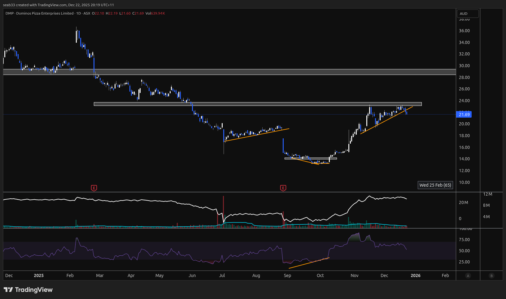
Bullish examples
GOLD
- OBV making HH before breakout
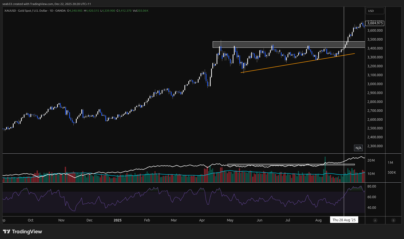
BM1
- New listing
- OBV flat into breakout and breakout in price in convergence with OBV
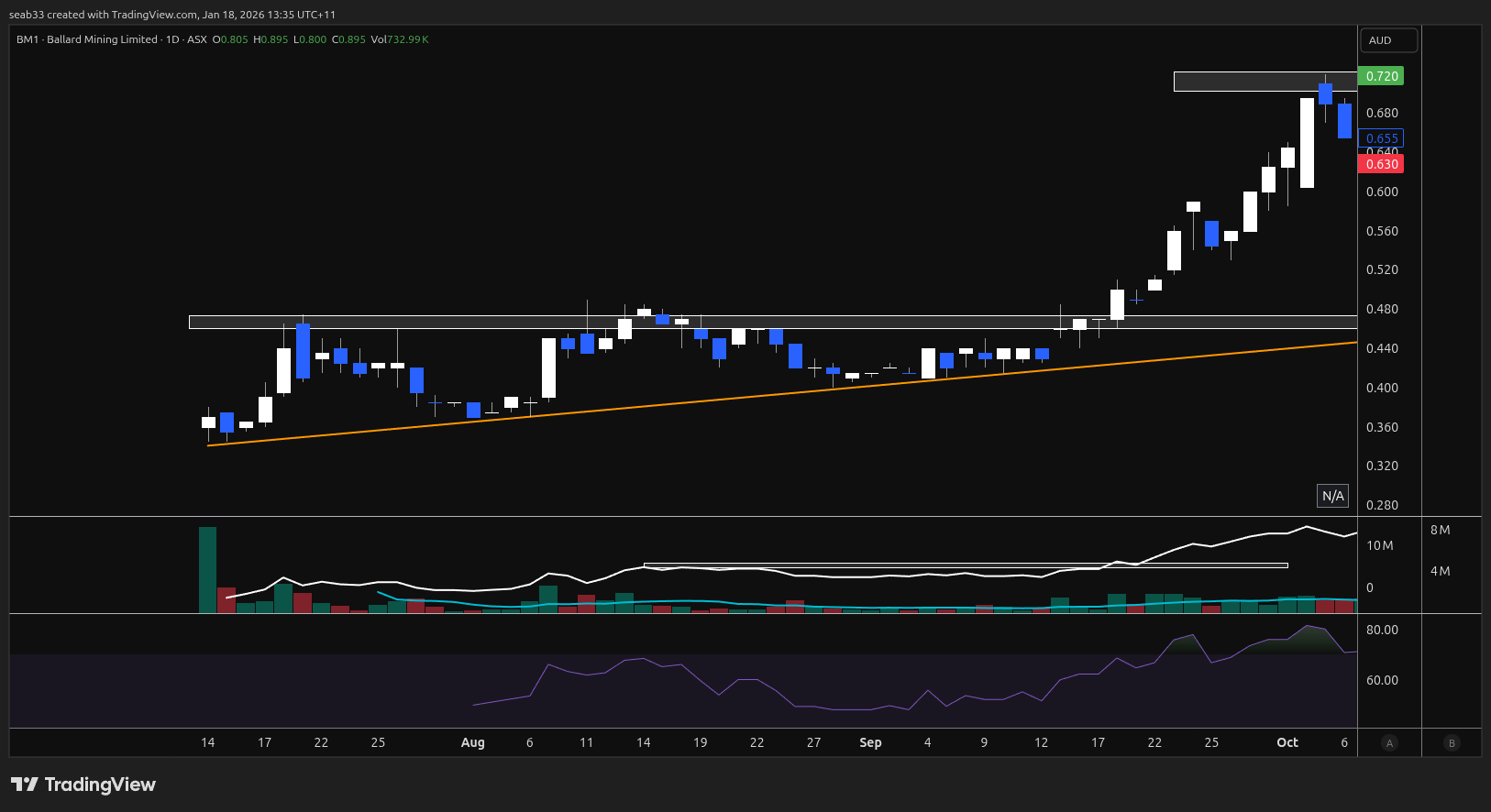
BM1
- OBV making a new high at each new price high
- Bearish div on the RSI just before breakout
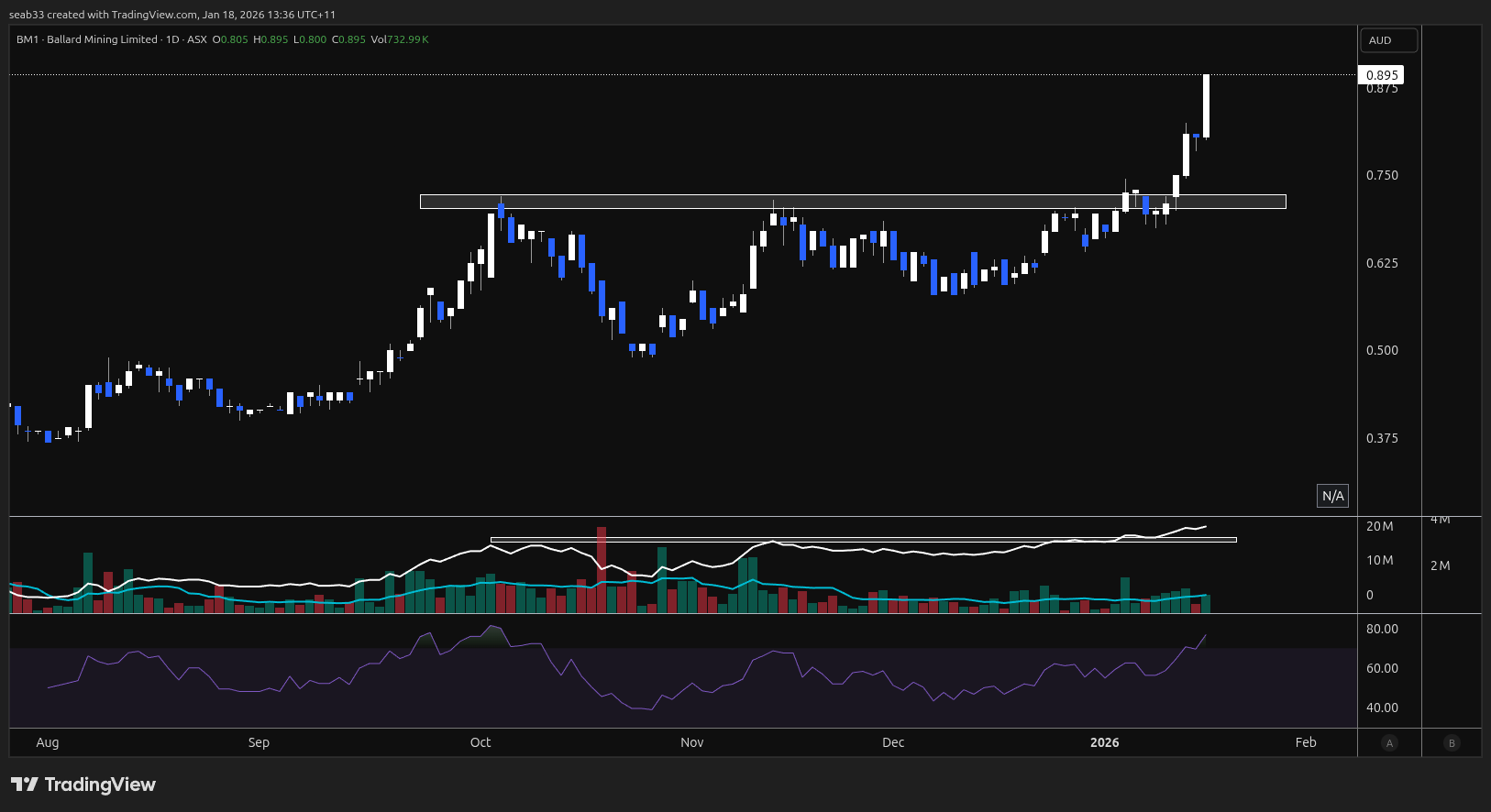
Gaps
Break and retest of DRO
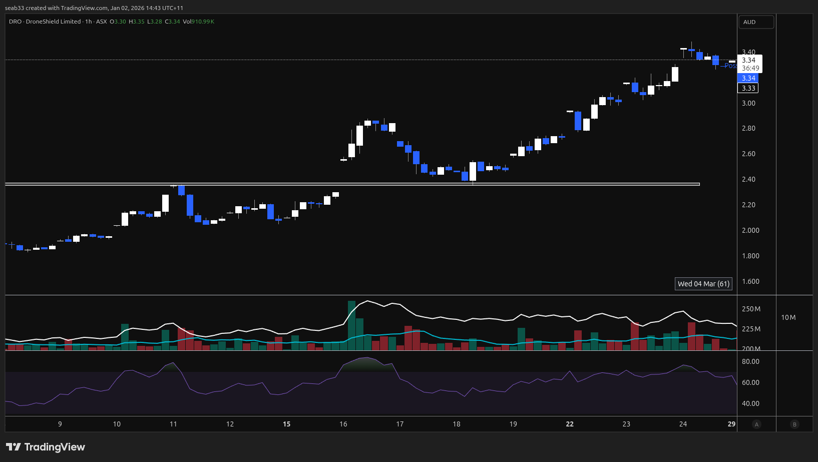
Fundamental notes
Summary
Companies move in stages
- Stage 1 construction
- Ramp Up (dangerous point)
Mine restart
FA Overview
MTM Fundamental Analysis Framework — Reference Notes
Distilled from weekly FA calls (March–May 2026). Filler removed, substance retained.
Core Philosophy
Resource companies move in stages: exploration → discovery → resource definition → studies (scoping → PFS → DFS/BFS) → permitting → construction → ramp-up → production. Every strategy he runs is built around specific stages and specific windows within those stages. Some strategies capture a month, some span years. He doesn't step outside the stages he plays.
The goal is always to find a "super, super value point" as an entry — a price where you're protected against all the things that happen through cycles. If you find the real undervalued point, you can hold through pullbacks (which are common and expected in resource companies) or take profit and re-enter on the next dip.
How He Evaluates a Company
1. Market Cap vs. What's Actually There ("Table Without Legs")
The first question is always: what is actually underpinning this market cap?
A company's valuation needs structural support — defined resources, cash, advanced studies, confirmed deposits, near-term production. Without those, the valuation is "a table without legs" and the share price naturally drifts back down. This is the most common pattern in early explorers: hype pumps the price, profits get taken, and it falls because there's nothing structural underneath.
He constantly stacks companies against each other on a market-cap-per-substance basis. The question is: what is your money actually getting you in terms of activity, opportunity, and asset backing?
Examples from the transcripts:
- MDI: $35M market cap, only ever drilled once (857m), no resource, no MRE. Held up by social media hype.
- AKA: Less than $35M market cap, 300,000 oz gold, millions in cash, potential to produce within a year.
- ALV: $8M market cap, 30,000m of diamond drilling, defined MRE (7.6Mt at 2% CuEq), VMS field with 30+ targets.
- His conclusion: "You're paying double for not much at all."
What to look for as "legs":
- A JORC-compliant mineral resource estimate (MRE)
- Multiple phases of drilling (not just one program)
- Cash in the bank relative to burn rate
- Advancing studies or near-term catalysts
- Existing infrastructure (mills, processing plants, roads, declines)
- Granted mining leases, completed environmental work
2. Resource Quality and Confidence (JORC Classification)
He pays close attention to the split between measured, indicated, and inferred resource.
- Indicated resource should cover the full payback period in any study. If a scoping study shows the first 11 years of production at 71% indicated, that's "actually quite good."
- A huge gap between indicated and inferred grades is a flag to investigate (e.g., WCE's silver resource: indicated at 137 g/t vs. inferred at 1,331 g/t — "massive disparity" that needs explaining).
- Exploration targets are low quality. "I don't pay much attention to exploration targets. They're not very high quality. I don't like them." They're becoming an industry norm for getting market attention, but they frequently don't get met on the first attempt.
3. Study Economics (Scoping → PFS → DFS)
He has personal benchmarks and checks every study against them.
What he looks at:
- CapEx — does it sit in a normal range for the commodity and project type? He had a specific expectation for LGM ($150–180M) and flagged the actual $220M as high but "not abnormal."
- NPV (post-tax) — the net present value of the project. If CapEx exceeds NPV, that's a serious problem (Vulcan: €2.2B to build, €1.15B NPV — "the money to get there is more than the NPV of the damn project").
- IRR (post-tax) — the internal rate of return. 13% is "not a good number at all." Most ASX resource projects with numbers like that "would get dumped. It wouldn't even go ahead."
- Mine life — funders like 10+ years. A 7-year mine life is short and surprising that it secured debt funding.
- Payback period — wants to see indicated resource covering the entire payback period plus extra.
- Recovery rates — early metallurgical test work showing 78% gold recovery and low-80s silver means there's room for improvement as they optimize, which will change study economics.
- What's included vs. excluded — LGM's scoping study only put half the gold and silver through, excluded copper/zinc/lead credits entirely. The next study (PFS) will likely be dramatically different and potentially "not even comparable."
Key principle: conservative base-case studies are a positive. "We want to see conservative studies done by companies so we know that they can withstand cycle pressures, cost pressures."
Study progression matters: a scoping study is early-stage and shouldn't be judged like a DFS. Resources grow, recovery rates improve, more metal credits get included, processing scale can increase. Understand what stage the study is at before judging the numbers.
4. Cash Position and Runway
He reads the quarterly 4C cash flow reports closely, going back three consecutive quarterlies (nine months) to spot patterns.
What he's looking for:
- Cash balance and quarterly burn rate
- Whether the company is actively spending on meaningful work or just treading water
- Whether "income" is real revenue or just asset sales (VSR sold shares to pad a quarterly)
- How many quarters of runway remain before a cap raise is needed
- Whether conditional grant funding or debt has strings attached that may not be met
Red flag pattern: a company that shows mapping, sampling, and interpretation quarter after quarter with minimal spend — "these guys have spent nine months doing pretty much nothing." Often signals they're actually hunting for an acquisition and haven't found one.
5. Capital Raises
He doesn't fear cap raises. "We always use cap raises to our advantage whenever we can. We don't be scared of cap raises." He treats them as potential entry points.
He can usually predict when one is coming based on cash runway and upcoming work programs, and factors that into his positioning.
6. Permitting and Development Pathway
De-risked permitting is highly valued:
- Granted mining leases (vs. exploration licenses)
- Gazetted township area = no native title = faster track
- Completed and accepted environmental baseline studies
- Old mine plans that can be leveraged
- Existing processing infrastructure nearby (mills on care and maintenance, toll-treating options)
Timeframes are long. Copper porphyries take 10–15 years from exploration to production and cost billions in CapEx. A two-year bore water monitoring program is "really, really normal" in that context. "Pretty much every single resource company that you see on the ASX are years away from production yet."
7. Management and Insider Alignment
Big-name billionaire investors do NOT provide extra confidence. On Gina Rinehart: "She has zero alignment with you as a shareholder. She does not care about you, even remotely. She can afford to drop 140 mil into a project and have that thing not pay off for 50 years." He cites the lithium games where billionaires bought blocking stakes to frustrate each other and destroyed projects in the process. "These big players, these individual big players, don't have any alignment with you at all."
Management transparency is a quality signal. He praised FMR for immediately telling shareholders they hadn't hit the porphyry core — no spin, no waiting for assays. They also stopped drilling early once they knew they'd missed, saving money for the next hole.
Presentation content is diagnostic. If a company's investor presentation spends most of its slides talking about the broader theme (battery markets, data centers) rather than their own assets and progress, that signals there's probably nothing imminent. "It kind of lets you know that these guys aren't suddenly going to bring a mine online."
8. Processing and Downstream Risk
Moving from mining into downstream processing (lithium hydroxide, graphite anodes, chemical conversion) is a fundamentally different and harder business. "You go from being a company who is extracting to being in the chemical space." Downstream qualification processes are onerous — graphite off-takers require small-scale production runs through multiple test phases before committing. Even base graphite needs qualification on flake sizes and specifications.
Example: IGO's Kwinana lithium hydroxide refinery — three years in and only at 51% availability/capacity. "Everyone thinks it's so easy."
Ramp-Up Rules
Ramp-up is the single highest risk period in any resource development company. "You don't just turn it on and it all works. That's almost impossible. Something usually breaks down, doesn't quite work as expected, or it just takes a lot longer."
His rule: "If you're not already in, taking a position in ramp up is fraught with danger and there's just no need to take on extra risk." If not already positioned, watch and wait through ramp-up, then reassess as the months pass.
What to watch during ramp-up:
- Are they hitting throughput and recovery targets?
- Do they need additional cap raises to cover expansion costs?
- How is the mill running (throughput consistency)?
- Are costs tracking to study estimates?
Always add a buffer to timelines. "Always give yourself three to six months buffer" beyond management guidance, especially for complex projects.
Positioning and Strategy
Entry Approach
He splits positions between two modes:
- Catalyst plays — smaller position ahead of a specific upcoming announcement (assays, study results, MRE update). If the catalyst is positive and FA improves but the share price doesn't fully respond, he adds.
- Value plays — the FA keeps getting better but the share price hasn't caught up. "The value's barely changed, but the actual intrinsic value and what's gotten better — that's where we want to be. The market hasn't seen it yet. Happy days. I want to get ready because when it does, it's going to move fast and I'll be very, very loaded into that space already."
Holding Period
Totally strategy dependent. Some strategies capture a month, some hold for 3–4 years through to first production. "The joy of value: if you find the real undervalued point, you can hold through all those moments or take profit at a good point and add again on the big pullbacks."
Peer Comparison for Valuation
He compares companies at similar development stages across:
- Market cap
- Resource size (converted to gold-equivalent ounces for cross-commodity comparison — e.g., 2.8M oz silver ≈ 40,000 oz gold equivalent)
- Construction cost
- Financial metrics (IRR, NPV, payback)
- Jurisdiction risk (Australia premium vs. South Africa discount, for example)
- Mine life
- Infrastructure advantage
Example: Rocks Resources at $550M market cap with 2M oz gold and still building, vs. Theta Gold Mines at $200M with 6M oz, cheaper construction, and early cash flow from surface processing. "There is a large gap in that valuation."
Sector-Specific Notes
Gold and Silver
- High-grade narrow-vein deposits (like Elizabeth Hill silver) are a completely different proposition to bulk tonnage. The goal isn't mass scale — it's maintaining grades and running a small, cheap, highly profitable operation.
- "Continuity of grade" is the key metric to watch for high-grade deposits through successive drill programs.
- Gold equivalent conversion is the standard way to compare across metals and put scale in perspective.
Copper Porphyries
- Very large, very low grade — you need 100–300m widths because grades are so low, compensated by mass tonnage.
- Geophysics may light up areas around the core rather than the core itself. Exploration is iterative: drill, miss, reinterpret, retarget.
- Extremely long development timelines (10–15 years) and billions in CapEx.
VMS Deposits
- Occur in clusters — finding one means there's likely more nearby. That's fundamental to the geology.
- Narrower drill intercepts (5–20m) but better grades with multiple metals (copper, zinc, lead, silver).
- The "equivalent" calculation (copper equivalent, gold equivalent) tells you the dominant contained metal, not necessarily the highest grade metal.
Lithium
- Ramp-up risk is acute. Brine operations face different challenges to hard rock.
- Downstream qualification (carbonate, hydroxide) is extremely difficult and time-consuming.
- Market cyclicality means financing can be delayed or restructured mid-development.
Agricultural / Soft Commodities
Don't blindly buy "ag stocks" when the soft commodity rotation narrative kicks in. Think through the actual mechanics:
- If farmers aren't planting → fertilizer companies lose customers, grain middlemen have nothing to sell
- High input costs squeeze margins even for fertilizer sellers unless they have diversified supply chains
- Drought → herds get panic-sold → cattle yard operators and middlemen still see churn. Cattle gives more consistent exposure than grain in uncertain conditions.
- Stock feed demand increases when farmers add cattle and can't grow their own feed.
What to look for: scale, pricing power, diversified supply chains, market dominance. Number one position in a market provides protection on both supply and demand sides.
Weather cycles (El Niño/La Niña) matter. He looks at when the cycle change is expected and factors it into timing. But cycles can be strong or weak versions — it's not a blanket prediction.
Ag stocks are rarely set-and-forget. Weather events (drought, flood, fire) can wipe out crops and wreck companies for three years. "The agricultural sector on the ASX is super varied and a lot of the agricultural companies actually don't touch crops or fruit or cattle."
Direct commodity exposure (ETFs, futures) is often better than trying to find an ASX company that perfectly fits the theme. Sugar, coffee, wheat — you can access the commodity directly rather than finding a company that meets all the criteria.
Biotech
- Trials take 8–15 years. Timeframes are similar to mining in terms of patience required.
- FDA approval thresholds are the key benchmark (e.g., BB1 needs 65% sensitivity/specificity; their testing shows 80s+).
- Stress-testing across the full spectrum (not cherry-picking easy cases) is the quality signal.
- Competitor benchmarking against already-approved products gives you a reference point for relative performance.
Oil and Gas
- Geopolitical price spikes don't change underlying fundamentals unless there's significant infrastructure damage.
- ASX oil/gas operates very differently to US — different money flow, different production access, different development models.
- US model: get a few wells working, use cash flow to fund more wells. ASX model: full field development studies, massive cap raises, long timelines.
Exploration Evaluation
Target Quality — "Stacking"
Good exploration targeting means independent data sets converging on the same area:
- Geology and mapping
- Geophysics
- Soil sampling
- Rock chipping
- Structural interpretation (faults, shear zones, intersections)
"You want targets lining up on top of each other." The more layers that stack, the higher confidence the target. If a company only has geology and no geophysics or assays, they don't have enough to make a high-quality target.
Fault Zones and Shear Zones
These are the conduits for mineralized fluid — they carry the gold. Intersections, kinks, and wobbles in faults are where fluids get trapped and gold gets deposited. Following faults and shear zones, especially where they intersect and crosscut, is fundamental to targeting.
Drilling Interpretation
- Not hitting the target is normal in exploration, especially for deep porphyries. What matters is what you learn and how you retarget.
- Companies that are transparent about missing targets (rather than spinning results) are a positive signal.
- Saving money by stopping a drill hole early when they know they've missed, rather than drilling to planned depth, shows good capital discipline.
- Resampling historical drill core is cost-effective — you don't have to drill it yourself, you just pay for new assays.
IPO Evaluation
Three sections to read from any prospectus:
- Chairman's letter — overview of the company story
- Asset/project overview — what they actually have, not what's around them
- Post-IPO work program — what they'll actually do with the money
Most IPO companies are far earlier than people assume. Heritage surveys, environmental work, permitting, and early targeting often need to happen before any drilling. Expect 6–9 months post-IPO before a first drill campaign in most cases. "There's often this assumption that this company is going to hit the ground running. A small number of companies actually do that off IPO."
TA Integration
He uses OBV (On Balance Volume) as a key indicator for accumulation vs. distribution patterns. Higher lows on OBV while price consolidates suggests accumulation — buyers are building positions.
He combines FA and TA in what he calls "Captain Planet" analysis. The best opportunities are where both align: strong FA (undervaluation, upcoming catalysts, resource growth) confirmed by TA (accumulation patterns, support levels, breakout potential).
He's clear that TA alone isn't enough. A stock can have a great chart but if the fundamentals are empty, it's not worth playing for anything beyond a short-term trade.
Psychology and Process
Decision Fatigue
The brain is evolved for ~200 decisions per day. Modern information overload pushes to 2,000–3,000. This directly impacts investing: ability to see setups, recognise signals, and execute (both buys and sells).
His approach: don't follow markets constantly. Check once or twice a day. Let your brain do background processing ("integration"). "I don't chase and follow everything all day. It doesn't help or benefit my investing and trading at all."
During Market Crises
During high-intensity geopolitical or market events, step back from the information flow. "Give yourself a break in these super high intense world moments. I guarantee your education, your thinking, your trading and investing will actually thank you for it."
Execution Discipline
"You have to make decisions. You have to see your strategy come into play and you have to execute. Whether that's execute your buy or execute your sell, you have to see it, recognise it, and act."
Strategies must be solid and defined before the moment arrives. Different strategies for different timeframes, but be disciplined about not stepping outside the stages you play.
Quick Reference Checklist
When evaluating a new company:
- What's the market cap? What's actually underpinning it?
- Is there a JORC-compliant MRE? What's the indicated/inferred split?
- How much cash is in the bank? What's the quarterly burn rate? When's the next cap raise?
- What stage are they at? (exploration / resource definition / studies / permitting / construction / ramp-up / production)
- What are the upcoming catalysts and their likely timeframes?
- Who are the significant holders and how did they acquire their positions?
- How does the market cap compare to peers at similar stages with similar assets?
- What does the study economics look like? (CapEx, NPV, IRR, mine life, payback, recovery rates)
- What's excluded from current studies that could improve future ones?
- Is there existing infrastructure that de-risks development?
- Is management transparent and capital-disciplined?
- What does the presentation spend most of its time on — their own assets, or the broader theme?
- Read three consecutive quarterlies — is the company progressing or stalling?
Crypto Bookmarks & Fees
Bookmarks
Dex
Borrow and lending
Perp Dex
Prediction Markets
Yield Aggregator
CEX fee pages
Support AUD Markets
- Kraken 0.2% maker / taker
- CoinSpot 0.1% maker - 0.1% taker
- CoinTree 0.75% maker / taker
- Independent Reserve 0.5% maker / taker
- Bitaroo 0.1% maker - 0.15% taker
- CoinJar 0.1% maker / taker
- CoinStash - 0.85% maker / taker
- swyftx - 0.6% maker/taker
Dont Support AUD
- OKX 0.5% maker / taker
- ByBit 0.1% maker / taker
- Binance 0.1% maker / taker
- Coins.xyz - 0.15 - 0.08 maker / taker
Risks & Mitigation
All Potential Crypto Risks
Clipboard Manipulator
- RIsk: A virus could view your clipboard and if it detects a wallet address, it could change it with an attackers address
- Mitigation: Check first and last 8 digits of address
Loosing Hardware wallet
- Risk: Someone could find the hardware wallet and try to brute force the pin
- Mitigation: Keep in a secure location
- Risk: Someone could find the seed phrase and drain the wallet
- Mitigation: Store 2 copies in 2 locations, on metal and paper
- Risk: Send stuff to wrong address and it's lost forever :(
- Mitigation: Send small test transaction first then for large sends, verify FULL address
Website DNS attack
- Risk: An attacker could hijack a website DNS to point it to a different location (domain is still the same but code is different)
- Mitigation 1: Set up a second wallet for ongoing transactions when interacting with sites and not ledger software
- Mitigation 2: Check website's twitter page for any announcements
Protocol code / private key attack
- Risk: A protocol's private keys or code gets hacked
- Mitigation: Don't hold too much % in a defi project / memecoin
CEX closes / limits account
- Risk: Exchange closes / limits account
- Mitigation: Sign up to multiple exchanges\
- Risk: Install a virus that steals all session cookies and can now log into any website already logged into
- Mitigation: Don't install software you don't 100% trust OR have a seperate computer / OS for crypto transactions
- Risk: Bank blocks a deposit from your account to a crypto exchange
- Mitigation 1: Sign up to multiple bank
- Mitigation 2: Buy the bitcoin ETF
- Risk: Someone sends an email / text / call pretenting to be an exchange or wallet
- Mitigation: Check sender from address, go directly to URL, don't click link, ensure 2FA is enabled on exchanges
- Risk: Someone finds out my phone number and sends my number to their phone to try and reset password linked to my phone
- Mitigation: Ensure app based codes are enabled over phone number based
Best Mitigation Techniques
In order of Hardest to easiest
- Have a seperate computer for crypto transactions (preperably with linux)
- Have a seperate browser profile with only ublock origin
- Check full address for big transactions
- Send a test transaction for new addresses
Watch lists
Everything has been moved to the market data site below (this page is an old archive now)
https://marketdata.conorbriggs.com.au/
Good exchange list (CEX & DEX)
https://pdb.conorbriggs.com.au/books/crypto/page/bookmarks-fees
Craigs TV lists:
- Crypto Miners - https://www.tradingview.com/watchlists/96738147/
- Commodities - https://www.tradingview.com/watchlists/91684472/
- Crypto - https://www.tradingview.com/watchlists/176445626/
- Forex - https://www.tradingview.com/watchlists/188938507/
- ASX - https://www.tradingview.com/watchlists/91684061/
- US - https://www.tradingview.com/watchlists/79028838/
- Commodities all on page https://www.tradingview.com/chart/M9HYycR2/
-
ASX Trader
- Weekly outlook - https://www.tradingview.com/watchlists/175586711/
- Small caps - https://www.tradingview.com/watchlists/202373542/
- Moomoo small caps portfolio - https://www.tradingview.com/watchlists/203669779/
Craig D List
- Holding list - https://www.tradingview.com/watchlists/314929828/
Community
- ASX Traders small cap 'rocks' - https://www.tradingview.com/watchlists/202780678/
- Platinum miners - https://www.marketindex.com.au/commodities/platinum
- Consolidation / sideways - https://www.tradingview.com/watchlists/204642275/
Screeners
- ASX Top 200 - https://www.tradingview.com/screener/p6XXnZO2/
- XMJ - Materials - https://www.tradingview.com/screener/P708Riva/
- XEJ - Energy - https://www.tradingview.com/screener/92xWdvH7/
Metrics to enter
Price
- COMS
- Support / resistance break
- Break through diagonal line
- Patterns
- Falling / rising wedge
- Double top / bottom
- Head & shoulders
- Ascending / Descending triangle
- Symmetrical triangle
- Bull / bear flag
- Darvis box
- Support / Resistance levels
- Channels
RSI
- Divergence / Divergence into the low (ensure to analyse after RSI reset)
Fibs
- Rejecting a zag zone then making a HL is a sign of strength
- Breaking through the 0.618
- Backtest - If the fibs suddenly line up with significant pivot points, you might be at a bottom
Volume
- Rising volume on the up side
- OBV making a HH (especially on the breakout)
Sectors / Confluency
- Sector / others confirming
Sunday scan checklist
- Sentiment
- Big indexes (S&P 500, ASX 200, IWM, ISO)
- Sectors
https://asxshort.app/top-shorted
https://www.marketindex.com.au/director-transactions
Stonk Links
ASX Open hours
https://www.asx.com.au/markets/market-resources/trading-hours-calendar/cash-market-trading-hours/trading-calendar
ASX Countdown to open
https://www.tradinghours.com/markets/asx
Long term ideas
SPX
- On the yearly, price back at the 20 SMA is a great opportunity to buy
crypto
- low interst rates
- increasing pmi
- increasing liquidity (US GLI)
Tips & Useful Info
Running collection of practical wisdom, rules of thumb, and insights from across the course — organised by topic, not by lesson.
Portfolio Management
- Everything in your portfolio should be in an uptrend (HH/HL) or putting in a reversal pattern. Nothing should have lower lows, lower highs. Seems simple because it is — the only reason people don't stick to it is psychology
- Frank's rule: drop your worst performer every month. The opposite of what most people do (selling winners to "lock in gains" to cover losses). Over time this improves performance by cutting the drag
- Don't hold trapped money. If your money is doing nothing going sideways for years, that's an opportunity cost. You don't have to buy the bottom — you can wait for the breakout
- The 1% rule: never risk more than 1% of your account on a single trade. With $100K, losing 1% = $1K. You'd have to be wrong 100 times in a row to blow your account
- Minimum 3:1 risk-to-reward on every trade. For every $1 risked, aim for $3+ reward. This means you only need to be right 30% of the time to be profitable. You're becoming the casino, not the gambler
- Forget price. Focus on risk to reward. A "cheap" stock with poor R:R is a bad trade. An "expensive" stock with great R:R is a good trade. Your goal isn't buy low sell high — it's risk little, make more
- Eliminate big losses and the rest takes care of itself. Small wins and small losses cancel each other out. Big wins grow your account. If you never have big losses (via stop losses), you'll grow over time
- If you're emotionally attached, you're over-risked. Can't sleep? Checking every minute? Getting defensive when someone is bearish? You've got too much in it
Retail Advantage Over Institutions
- Retail can buy an entire position in one hit. Big money can't — they have to accumulate over time (which is why accumulation phases exist and take so long). You can buy when it starts to trend instead of waiting years
- Don't try to buy the bottom or sell the top. Buy when the trend starts (breakout of accumulation, change of market structure). Faster gains than sitting in accumulation for years
Market Psychology & Discipline
- "If you can't handle the zags, you don't deserve the zigs." Corrections are as natural as day and night. Accept them as normal in an uptrend, or you'll panic sell every dip
- Your biggest enemy is your own psychology. People hold losers because admitting they were wrong is harder than watching money disappear. They sell winners early to "lock in gains." Both are ego-driven, not strategy-driven
- "Big money loves what you hate. Big money hates what you love." When you hate something, they typically love it. Do the opposite of the masses at extremes — the herd is always wrong at the peak and the trough
- "The market can remain irrational longer than you can remain solvent." Everything can say it's expensive — divergence, lowering volume, all the signals — but it can keep pushing. Sometimes the first signal reverses; sometimes it's the fourth
- "If it's in the news, it's old news." By the time mass media publishes, the inner circle already knew. Insiders accumulate before the news, then sell into the public buying after publication
- Three tools to identify a top: (1) Can you see you're in the third phase? (2) Is sentiment euphoric/universally bullish? (3) Do you have divergence on RSI and OBV? If all three = yes → start taking profits
- Quadruple witching dates (3rd Friday of March, June, Sept, Dec) — most major market tops and bottoms happen around these dates. Be aware of options max pain driving price toward specific levels near expiry
- VIX above ~45-50 = capitulation = historically marks bottoms. GFC bottom, COVID bottom, every major sell-off. When VIX is low and declining, the market is complacent
- Process over outcome. Focus on executing the process correctly, not whether individual trades win or lose
- You can afford to be caught in accumulation or public participation — you'll recover in the next phase. You cannot afford to be caught at the top of excess — the correction wipes out the entire move and can take 6-13 years to recover
- "Buy the dip" works until it doesn't. In a non-failure swing reversal, people keep buying the dip because it worked every other time. But if you can read market structure, you know this dip is different — big money is distributing INTO the dip. This is exactly how people get caught
- The market usually gives second and third chances. If you missed an exit, price often bounces back to your level before continuing. It's uncanny how often it happens. Don't panic — wait for the retest
- The 382-618 zone is the "golden pocket" / "zag zone." Every secondary correction should come back to this zone. It's where you look for buys in uptrends and where you take profit in downtrends. If price pushes through the 618 on strong volume, it's more likely a new trend than just a zag
- Successive deeper retracements = weakening trend. If pullbacks go 382 → 500 → 618 → break, the trend is dying. Each time, buyers need a bigger "discount" before stepping in. Fibonacci shows this clearly
- The "bread and butter" entry: Fib level + lowering volume + bullish divergence OBV + bullish divergence RSI + change of market structure = the complete setup. Don't buy just because it's on a Fib level
- Three steps forward, two steps back. Markets zig-zag-zig-zag-zig (3 forward), then correct the WHOLE move (2 back to the golden pocket). The three zigs = accumulation, public participation, excess. The two-step correction = the bear market/distribution phase. This is Elliott Wave simplified
- "We don't trade signals, we trade triggers." Divergence is the signal (blinker). Change of market structure is the trigger (the car actually turning). If you drive based on blinkers alone, you'll crash within a week. Same applies to trading divergence without price confirmation
- News creates catalysts for moves that were already due. The S&P showed weekly bearish divergence before Trump tariffs and before COVID. The divergence signalled weakness weeks/months before — the news just expedited the pullback. By the time news hits, the setup was already there
- Don't use multiple indicators that measure the same thing. RSI + MACD + Stochastic RSI = all price momentum = confirmation bias, not confirmation. Use RSI (price momentum) + OBV (volume momentum) — they measure different things
- "The glamour of wanting to pick the top or bottom is more about ego than profits." Divergence doesn't mean reverse immediately. It can take multiple divergences before the actual turn. Don't try to be a hero — wait for the trigger
- Build your toolkit. Take things from every educator, every session. You might only use small pieces from each, but over time your toolkit gets comprehensive. Reversals, S/R, volume, divergence — all go in the toolkit
Sector Rotation & Money Flow
- Money never leaves the market — it just rotates. When one sector tops (excess phase), big money is already accumulating in the next undervalued sector
- Look for sectors that are historically low, not historically high. If a bear market comes, things already at historical lows won't take as big a hit and will be the outperformers. Energy, uranium, lithium, healthcare when beaten down — that's where money rotates next
- "Bigger the base, bigger the explosion." A long accumulation period (large sideways range) tends to lead to a larger move when it finally breaks out
- When US tech goes down, Australian resources tend to go up — because money rotates from technology into precious metals, mining, and commodities. Australia didn't really have a recession in 2008 because of resources
Market Mechanics
- 80% of all market volume is done by bots — and those bots are trained on technical analysis. Good comeback for anyone who says TA is "reading tea leaves"
- For every buyer there is a seller, for every seller there is a buyer. Price doesn't magically go somewhere — when you sell, someone else is buying because they think it's a good deal. Always ask: why is someone buying here? Why is someone selling here?
- Everything has a price where someone thinks it's cheap. Even the worst assets eventually find a floor where demand steps in (AGL from $28 to $5 and back; ZIP from $14 to $0.20 and back). The same applies upward — everything has a price where people think it's too expensive
- Stock market gaps happen because the market is only open ~6 hours per day. News overnight (e.g. tariff announcements) causes gap ups/downs at open because of supply/demand imbalance. Crypto doesn't gap because it trades 24/7
- The CME gap — Wall Street trades Bitcoin futures during Wall Street hours only. When Bitcoin moves outside those hours, it creates a gap on the CME futures chart. This is what people mean by "fill the CME gap"
- Log vs Linear charts: Linear = $100 movement is the same size everywhere. Logarithmic = a 10% move is the same size everywhere. Use log when looking at very broad time periods or very large price ranges
- Rising volume is neither good nor bad — it just means the current trend is supported. If the trend is down and volume is rising, that CONFIRMS the downtrend. Don't confuse high volume with bullish
- "You can mask price action but you can't mask volume." Price can look really bullish due to one whale or manipulated move. But if volume doesn't confirm it, it's probably not the whole market behind the move
- "Price action is king, OBV is the queen." Always analyse price action first (market structure, reversals). Only then check if volume/OBV supports. Never look at indicators first and try to make price fit — you'll get wrecked doing it backwards. Detox your charts
Charting & TradingView
- Always start on the weekly timeframe. Dow himself never traded below the daily. The lower the timeframe, the more noise and the harder it gets. Stick to weekly while learning
- Match your timeframe to your investment horizon. Investing for years? Look at the 3-monthly (quarterly) chart. Trading for weeks? Weekly. Day trading? Daily. Your chart timeframe should reflect your holding timeframe
- Use the Replay tool to practice in real time. Bring a chart back to a historical date and hit play — it moves as if the market is happening live. This is how you train market structure identification without the benefit of hindsight. The more you practice, the better you get — trading is no different to any other skill
- If it's not clear, it's not there. If you can't see clean market structure on a chart, move on to a cleaner one. Especially avoid small caps with dodgy wicks everywhere while learning
- Don't overthink finding stocks to practice on. Pick any random chart, practice pivots and market structure. If that chart's messy, pick another. The key is in the process, not the ticker
- Unpack candles on lower timeframes. A bullish engulfing on the daily might show a double bottom on the hourly. A shooting star might show a strong downtrend on the 1min. Looking "inside" candles gives you the full picture
- Match your candlestick timeframe to your trading style. Position trader = weekly/monthly. Swing trader = daily/weekly. Day trader = daily/hourly. Scalper = 1min/5min. Using the wrong timeframe for your style is a common mistake
- "Long-term" means different things to different people. Your long-term might be 1-2 years, someone else's might be 10+ years for their kids. This is why personal financial advice requires licensing — everyone's time horizons and goals are different
- marketindex.com.au — good for browsing ASX sectors and finding tickers
- listcorp.com — lists all ASX indices and sectors
Trading Strategy Insights
- Craig only trades the public participation phase. Gets in on the change of market structure (breakout from accumulation), gets out when he sees bearish divergence near the top. Doesn't try to catch accumulation or ride excess — moves money into the next thing entering public participation. Replicable, consistent
- ASX Trader doesn't touch sideways markets — only trending markets. Bull or bear, doesn't matter, but sideways is where people lose the most money. They keep trying to go long or short and keep getting stopped out
- People don't lose money in bull or bear markets — they lose money in sideways markets. Lose a trade, lose a trade, lose a trade — the chop kills you
- The breakout + retest (R/S flip) is probably the best trading strategy. It gives two confirmations: (1) sellers exhausted, (2) sellers become buyers. Best risk:reward setup
- Retests are 100% the best entries, but only ~50% of breakouts will give you one. If your strategy is break-and-retest, accept that half the time you'll miss the trade. Come from a mindset of abundance — there are always more trades. Never FOMO into a trade that didn't give your setup
- Don't chase trades. If you FOMO in after missing a retest, you'll often get caught in the pullback and hit your stop loss. Then the trade rockets without you. Wait for your setup, every time
- Just because something reverses doesn't mean it'll give big gains. A lot of things change market structure and then go nowhere. A reversal is confirmation of a trend change, but you need other tools (volume, divergence) for higher probability that it'll actually move. "We work on probabilities — the more indicators confirming bullish intent, the more probable we see bullish price action"
- Craig looks for confluency: A change of market structure back through a major horizontal S/R level is double confirmation. That's his ideal trade — reversal + breaking a major resistance level
- "I will never take a trade unless I have a minimum of three points of confluency." This is why the educator maintains high win percentages. Market structure + divergence + volume + index confirmation + pattern = stacking chips in your favour
- Think like you're in front of a judge. Every signal is evidence for your case. You should be almost shocked when a trade with 5-7 points of confluency doesn't work. If you're not shocked, you didn't have enough evidence
- Best stocks break out before the sector. Big money flows into the best-of-the-best first. If a commodity is bottoming (e.g. gold triple bottom), the best miners (e.g. Northern Star) will already be making higher lows before the commodity confirms. This is a leading indicator
- Just because tech/NASDAQ is going down doesn't mean everything is. Sector rotation means some sectors are accumulating while others distribute. The educator had 22% of his portfolio in utilities (AGL) during a market collapse, up 60% while everyone else was losing
- Use the weekly outlook to scan sectors, then drill into individual stocks. If a sector is breaking out, find the individual stocks within it that are also breaking out — that's multi-chart confluency
- Phases are somewhat subjective. Where exactly accumulation ends and public participation begins can be debated. What matters is identifying when market structure actually changes (breakout above previous highs with confirmed HH/HL)
- Market cycles repeat roughly every 30 years. Within a ~30-year secular bull market you get multiple smaller cyclical bull/bear markets. The major resets (lost decades) happen roughly every 30 years — Great Depression, 1970s, 2000-2009
- Cyclical bull markets last ~3 years on average (sometimes 2, sometimes extends to 4). We get 3-4 of these between major resets
- The easier a trend is to spot, the closer it is to ending. When every man and his dog can see the trend line, it probably won't hold much longer
- Hidden divergence is for continuation patterns. Regular divergence is for reversal patterns. You cannot use hidden divergence on H&S or double tops — the trend hasn't flipped yet. Hidden = continuation of existing trend. Regular = weakening of existing trend. Using the wrong type for the wrong pattern is a common mistake
- Volume rules are OPPOSITE for continuation vs reversal patterns. Continuation: volume confirms the trend, not the corrections. Reversal: volume does NOT confirm the trend (weakening) but DOES confirm the reversal direction. Get this backwards and you'll misread every setup
- Look for change of market structure WITHIN a Darvas box before the breakout. Don't just trade the breakout — look for buyers stepping in higher inside the range first. Mini HH/HL forming before the actual breakout = much stronger signal
- Don't trade patterns in isolation. The educator would drop the patterns lesson if he had to drop one. All chart patterns are just market structure — if you can read pivots and HH/HL, you don't need the pattern name. The value is in combining patterns with volume + divergence for confluency
- Falling wedges are ASX Trader's favourite pattern to trade. They give phenomenal risk:reward — tight stop loss, target back to the top of the wedge. Look for bullish divergence on RSI and OBV as price descends the wedge
- Triangles come before the final move (excess phase). After a triangle breakout, expect one last push, then a correction. If the breakout comes back within the triangle on low volume, it was likely just a short wave 5
- Journaling is covered in week 10 — you're not supposed to be trading yet, you're still learning ingredients. Week 10 gives you the recipe card. Follow the data in your journal, not your feelings about what style suits you
- Redo the 10-week material after finishing. Logan (ex-student) did this and had major light bulb moments the second time through. Especially revisit pivot points, market structure, reversal patterns, and Fibonacci
- Set achievable first goals. Logan's first goal was just $1,000. Once you hit it, you know you can scale. Don't pressure yourself into full-time trading — build the track record first
- Paper trade before risking real money. It's boring because you want to make money NOW, but it removes risk from learning. Run paper trades alongside your real account to test strategies
- "Letting winners run" is the hardest psychological battle. Most people nail entries but exit too early for quick profits. Fix: before entering, make a promise to yourself about the plan and stick to it. The profits you give up from early exits compound massively over time
Concepts That Link Forward
- Phases → Elliott Wave: Understanding accumulation/public/excess translates directly to Wave 1/Wave 3/Wave 5 in a five-wave impulse. This foundation pays off in Term 3
- Volume confirmation covered in Week 4 (Tenet 6). Volume bars and OBV act as "blinkers" — showing underlying strength before the reversal confirms. OBV is a leading indicator that often breaks trends before price does
- Divergence (RSI) covered in Week 5, expanded in Term 2. Combined with reversal patterns, it's the "ball underwater" — divergence shows underlying strength/weakness, the reversal is when you let go of the ball. RSI = price momentum, OBV = volume momentum — use both for confluency
- Where divergence started = where the correction targets. The trend was genuine up to the point of divergence. Everything after was "fake" or weakening. The correction typically wipes out the weak portion and returns to where divergence began. Use this as a confluency point alongside Fibonacci
- Divergence across multiple timeframes = bigger expected move. Hourly divergence alone = hourly pullback. Monthly + weekly + daily + hourly divergence = major multi-month reversal. The timeframe tells you the magnitude
- Tops are easier to call than bottoms. Impulse waves follow predictable 5-wave patterns with divergence from wave 3 to wave 5. Corrections are complex and unpredictable — sharp, sideways, or extended. They usually end in the golden pocket, but exactly where within it is tricky
- Hidden divergence = continuation, not reversal. Hidden bullish (higher low price, lower low RSI) says the uptrend will continue. Hidden bearish (lower high price, higher high RSI) says the downtrend will continue. Regular divergence warns of reversal; hidden divergence warns that the trend has more legs
- Regular bullish divergence can lead into hidden bearish. A bounce on regular bullish might just be a setup for hidden bearish and continued downtrend. This is why you never trade divergence alone — market structure tells you which one wins
- Don't put all your weight on the newest tool. Every week you learn something new and you'll want to forget the basics. Market structure, S/R, and reversal patterns are ALWAYS primary. New tools are just additional confluency
- Divergence has three types, not just one. Regular (opposing directions = potential reversal), Hidden (same direction but inverse RSI/price = continuation), and Directionally Aligned (same direction but different rates = weakening). 99% of traders only know regular
- Don't panic on bearish divergence during a bull run. Regular bearish often turns into hidden bullish — the RSI just resets and the trend continues. 9 out of 10 times, bearish divergence in a bull run is NOT the end. Only a change of market structure confirms it's over
- The progression: convergence → directionally aligned → regular divergence → reversal. Trends start healthy, show early cracks (same direction, different rates), then obvious cracks (opposite directions), then break. Not every trend goes through all stages, but knowing the progression helps you see where you are
- Risk:reward and stop loss placement — covered later in the course, but the breakout+retest strategy gives optimal setups for it
- Failure swing vs ABC correction — a failure swing can lead into just an ABC correction (3 steps forward, 2 steps back) rather than a full trend reversal. Fibonacci and zig-zag zones (later) help distinguish them
- The most learning happens from peer collaboration, not from educators. Post charts in the chat, give each other feedback, explain concepts to each other. If you can explain it, you understand it